One of the most delightful experiences I had on the recent Modenus Blog Tour during Design and Construction Week in Las Vegas (which I'm sure you've all been following on social media) was a penthouse cocktail party located in the Residences at Mandarin Oriental. 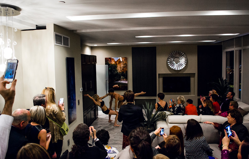 We toured three suites in the sky, more than forty floors up, all featuring products by Blanco, Poggenpohl and Cosentino, makers of Silestone and Dekton. These exclusive residences were host to private events for the press and the design community.
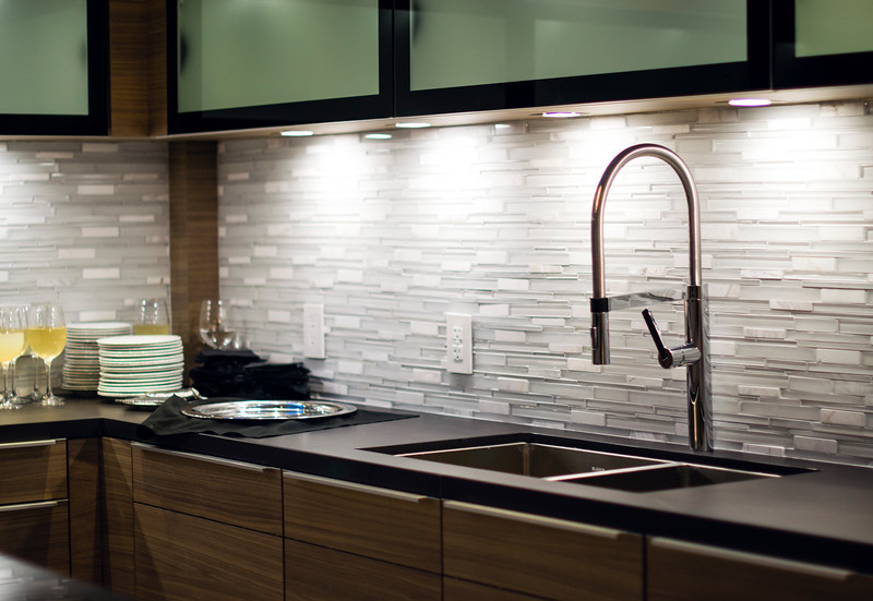 The theme of the evening was "The Art of Performance". Products were complemented by elegant bronze sculptures by California-based contemporary figurative artist Richard MacDonald.
 We also had living sculptures in the form of two very talented (and flexible) dancers.
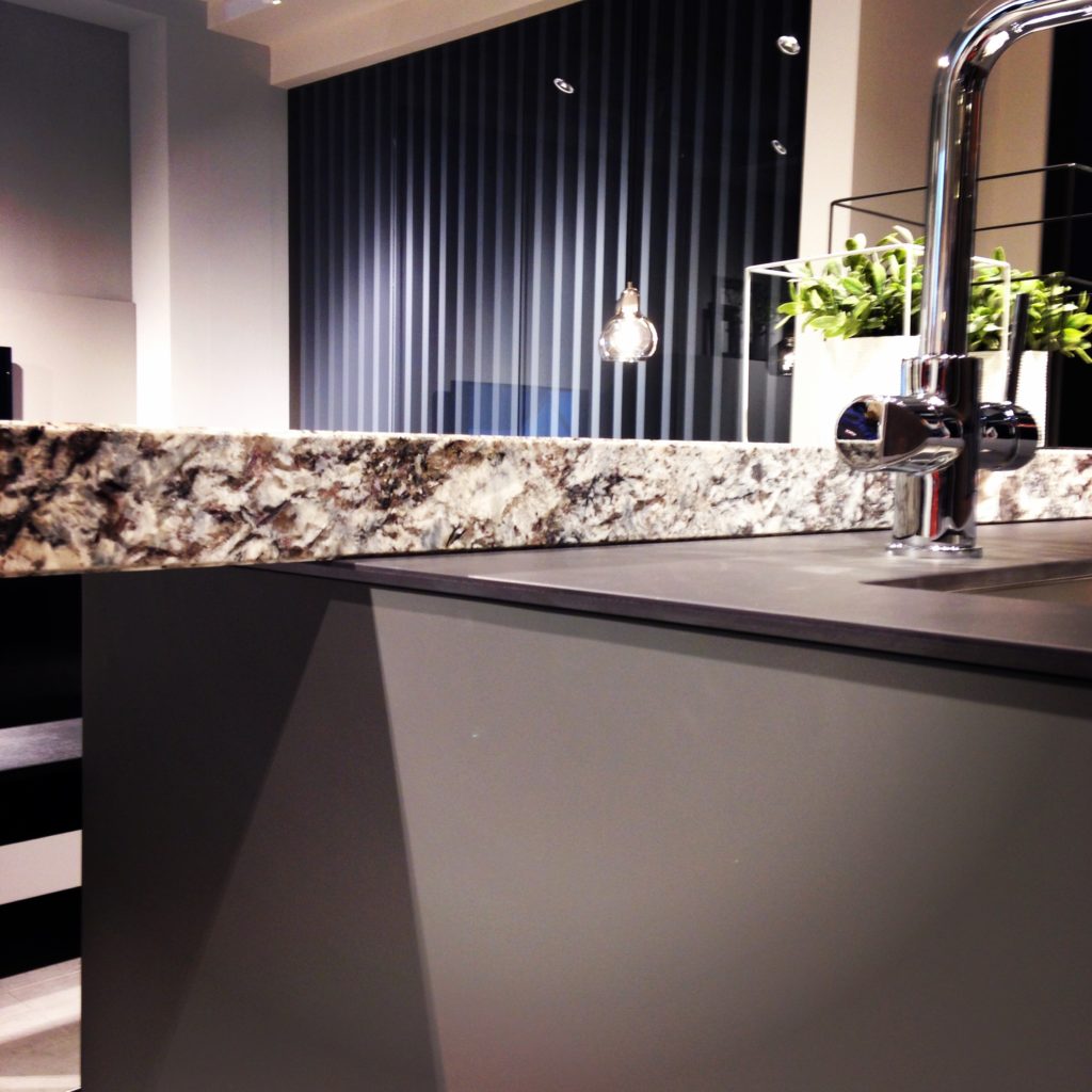
 Blanco's Precision Steel Art sinks were on show along with their edgy Culina faucets. Incidentally this popular sink style comes in a 16" smaller size perfect for prep or bar sinks.
 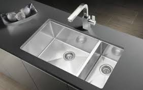 It features angular lines, something really original and different from your standard stainless steel sink.
 I had the pleasure of interviewing the lovely Christy Emens, Communications and Marketing Manager of Blanco. She touts "livable design" which is Blanco's version of personalization. This involves not only a variety of sink and faucet sizes, but also accessories to add convenience in the kitchen.
 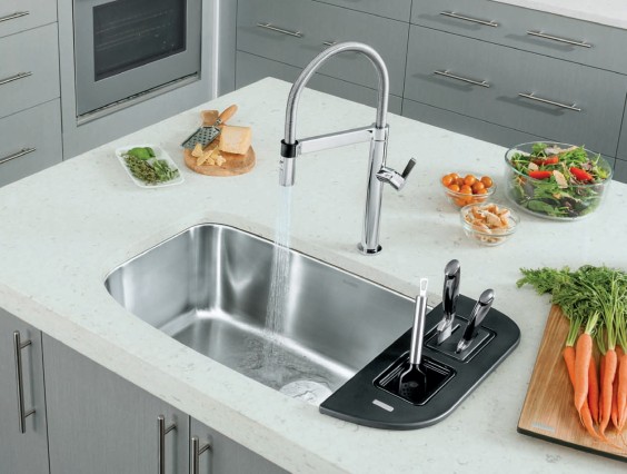 The Blanco One is a bit larger but still compact, plus you can trick it out with all kinds of goodies.Back to the party, The Art of Performance is all about how kitchens and baths can be beautiful as well as functional and I think they proved their point.
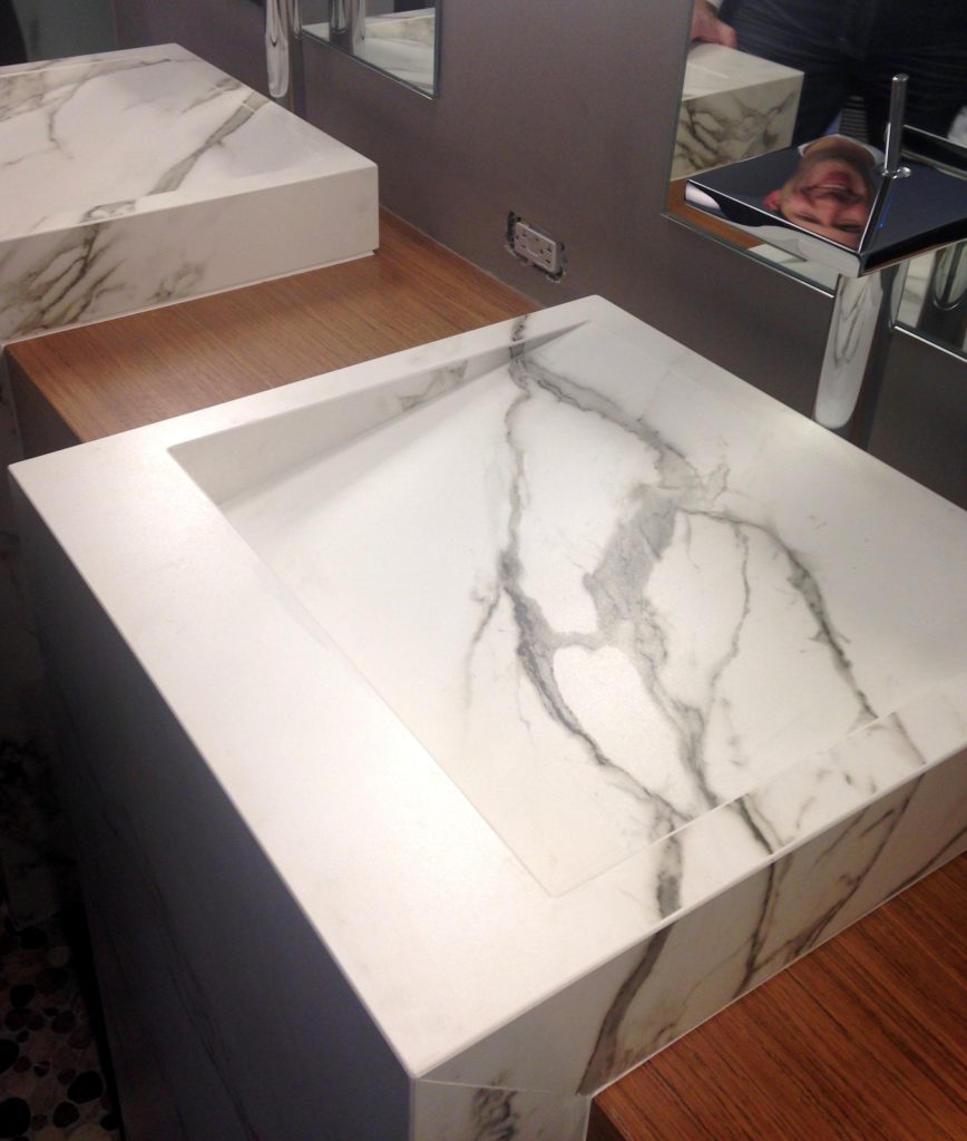 Cosentino showcased their new Dekton color, Aura. I love the continuous veining!
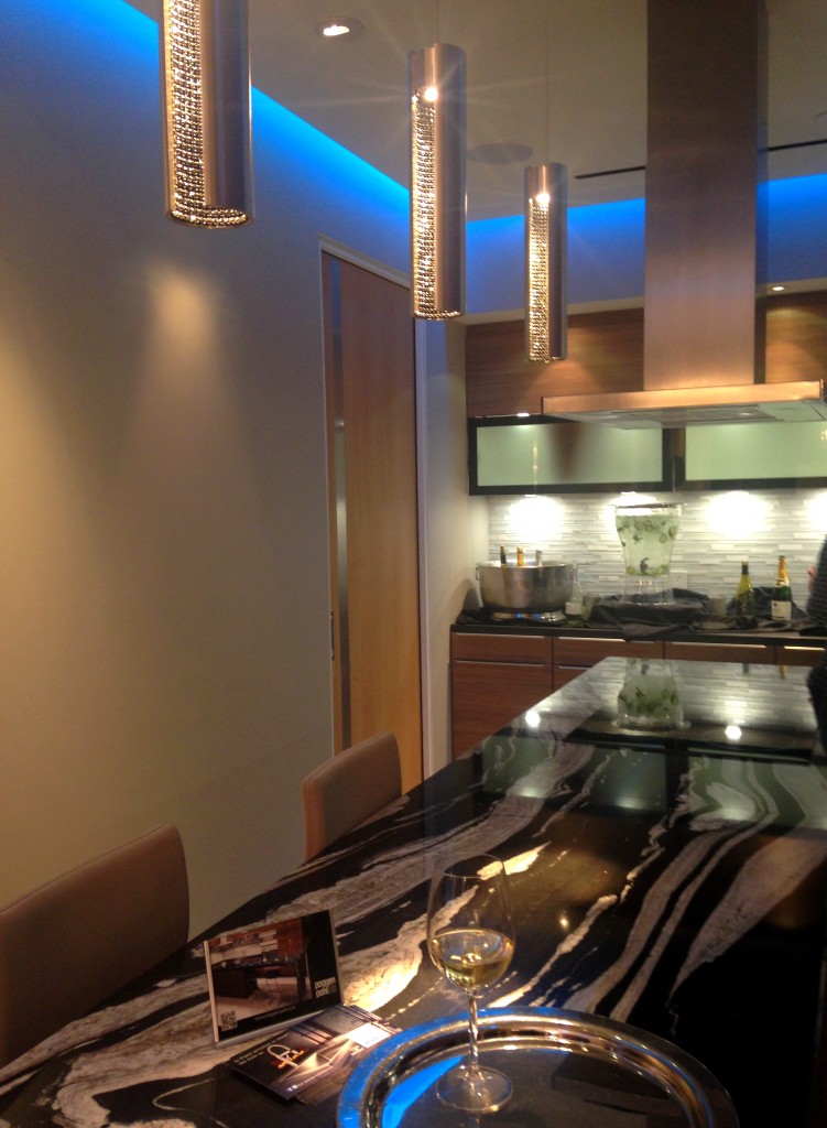 Poggenpohl's design statement continues the theme of "personalization", a major trend at the show. Your kitchen should be a reflection of your lifestyle.As a 123 year old company, Poggenpohl was instrumental in the development of the first modern day kitchens. The German company remains cutting edge in its design philosophy and use of materials. In 2014 they introduced Poggenpohl P´7350 Design by Porsche, the latest incarnation by Porsche Design Studio. The collection features a sleek new look achieved by the use of industrial mitering technology. Love!!
 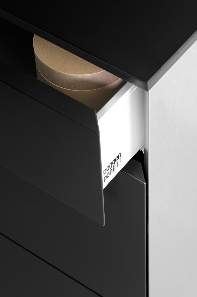 Back to the party. Poggenpohl kitchen designer Anne Kramer, says “Our vision is to personalize each kitchen to the homeowner’s needs for entertaining, for cooking, for storage and for lifestyle. Unlike traditional homes, these residences are at the height of the Las Vegas strip. A rarified atmosphere where anything is possible." I think they succeeded. Next up: The Big Show: KBIS Trend Recap
Hip To Be Square, Or Not
I've heard the saying " it's hip to be square" but that’s not always true, sometimes curvaceous qualifies. Here are three of my fave new products that sport some cool contours and are far from square. 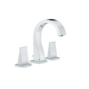
 Sometimes just the slightest suggestion of a curve is enough to soften a silhouette. This beautiful faucet by THG Paris is available in, get this, 35 finishes! The French excel when it comes to subtly, oui?
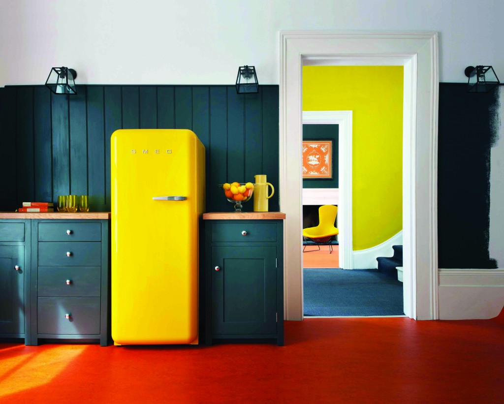 This is what you would call a "statement refrigerator"! Smeg is an Italian company largely known for these cool retro-style fridges. The other new colors just introduced are white and a highly anticipated Union Jack pattern (who knew?). The soft rounded corners are all about the 1950s. The 9.22 cubic foot capacity is a little more Euro than American but who can resist those sinuous lines and vibrant colors combined with cutting-edge technology?
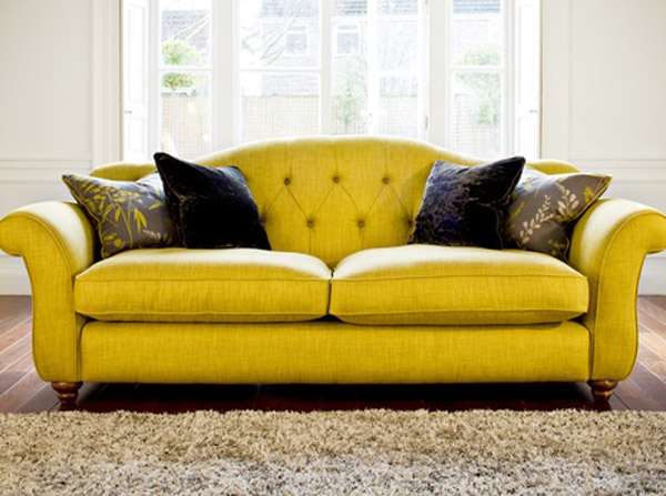 I even found you a sofa to partner with your new yellow Smeg :) Not bad, I must say. Last but in no way least is Infiore by Estiluz. It's a beautiful stylized flower sculpture masquerading as a lamp. This one is a pendant but it also comes as a floor or table lamp. The petals are available in different colors and sport a collection of bi-injected polycarbonate petals. I have no idea what that means but I do know it means the lamps feature an interesting two-color lighting effect. These are available at LightingbyGregory.com
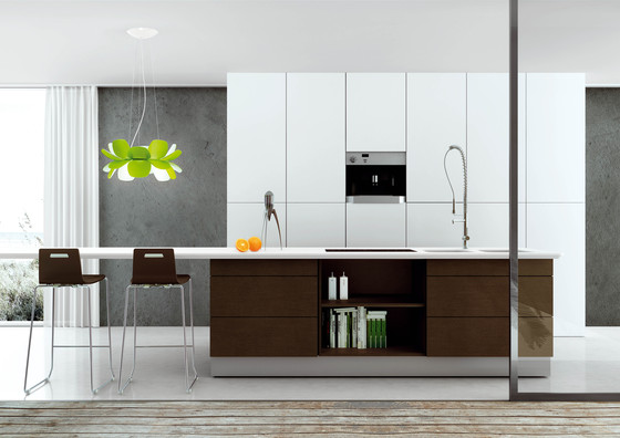 The organic curves of Infiore add a whimsical softness to this very linear contemporary kitchen (which I love) The larger-than-life scale also makes these flowers fun! I rest my case, curves are a beautiful thing ;)
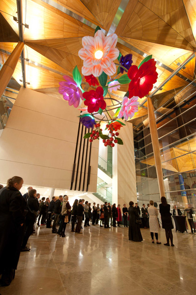
Euro Cucina 2014
I'm home and just about recovered from my jet lag. All pics are up for your perusal. It was a fabulous trip and my heartfelt gratitude goes out to the golden peeps at Blanco, including travel mate Christy Emens as well as Lori Dolnick of Frank Advertising. I was honored to be included with fellow bloggers Marilyn Russell (DesignMagnifique), Kelly Morisseau (KellyMorisseau.com) and Grace & Ken Kelly of (kitchendesigns.com). Having been to many trade shows in the US over the years, I've always wanted to experience the bigger, global picture. Now I have and it was amazing. I arrived on Monday morning ready to explore. Lori and I took a stroll and stumbled upon a delicious lunch and a very cool design museum but first things first. I'm dying to tell you about all the products and trends I saw at the big show. Euro Cucina only comes along every two years as a part of the Salone del Mobile. Milano. There is also a whole section devoted to the bath called Salone Internazionale del Bagno. Kitchen gadgets and appliances are shown in the FTK section. I did a pretty good job of covering those but I estimate that was only about 20% of the entire show, the rest being furniture and other aspects of design. Here's what caught my eye.
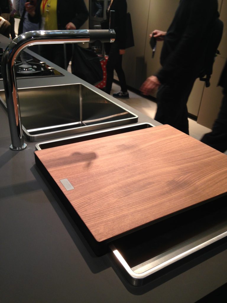
Counter tops were either very thin or chunky, like 1/2" for the thin and 3" for the chunky. I saw a lot of mixing of materials, in fact, that was probably the one biggest trend I saw for both counter tops and cabinets. It is also one that can easily be adapted to our US market. Counter top materials are much more adventurous than the usual granite or quartz that we are used to here. I saw wood, Corian, recycled composite material and more. The overlapping installation here was also quite common. The kitchen sink saw some new innovations including lots of accessories and different methods of installation. The inset style above, by Blanco, is factory installed by Leicht for a perfect fit. This particular one is not available to us in the US but we can get the Precision model with the distinctive square corner interior for undermount applications.
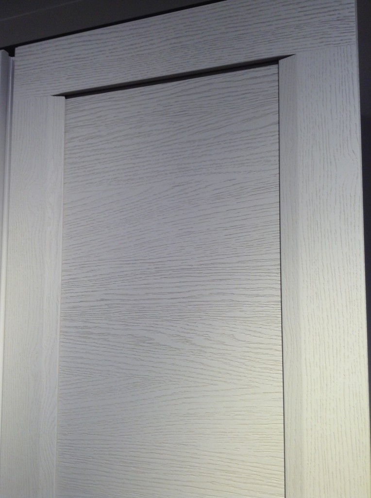
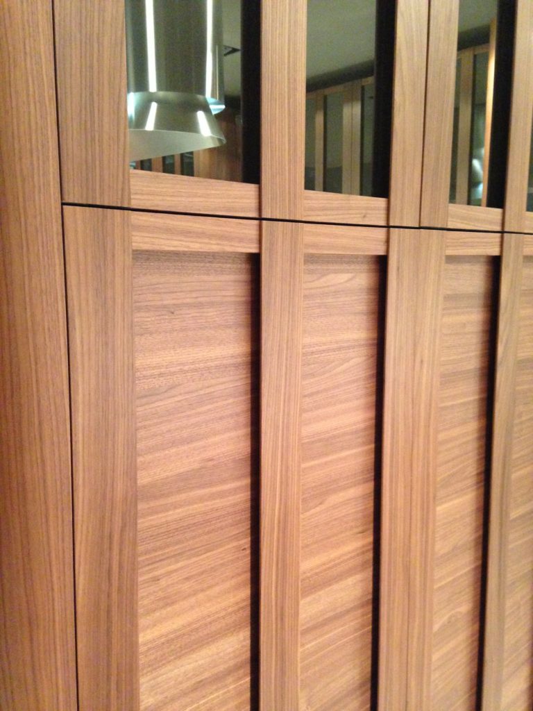 Cabinets featured lots of defined graining in woods such as white oak, rosewood and walnut in both horizontal and vertical directions, sometimes on the same door. I also saw some interesting variations on the popular slab and Shaker silhouettes.
 This is just the first in a series of posts about Milan and Salone Internazionale del Mobile. Upcoming posts will include our visits to Acheo and Poggenpohl showrooms and much more. So what do you think of these kitchen trends so far? I think some will make it over the pond but you can always know that whatever we do, we'll do it with an Americano twist. More later :)Click here for a peek at all my Milan photos!
The Rest of the "Hot Pepper" Kitchen Story
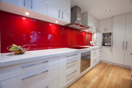
Happy new year peeps! Back at the drawing board this week after a nice holiday break. I got a lot of annoying little things done AND spend a little time in the studio but that's another story. Last post I told you about my dream kitchen. I don't know about you but I'm still dreaming and that was just enough to pique my interest. The lovely Shannon Pepper of Shannon Pepper Design in New Zealand, YES, New Zealand (who knew they were rocking such awesome design down under?) shared some of her musings with me:
KFL: What parameters were you given before designing this kitchen?Shannon: The kitchen needed to be very functional for a busy family of 5. The kitchen is very much centralised in the home so it also needed to be very " good looking " for better words. There needed to be space to tuck things away like appliances etc to keep the space tidy.KFL: What was the biggest challenge of the project?Shannon: Hmmm, I'm not sure there were any real challenges in this project as the client was very easy to deal with and realistic. The space was very proportional and easy to plan. I say that but originally, in the plans from the architect, there was a window on the hob (stove) wall which we were trying to work around. After much thought the client decided that since the space would only look out onto a hedge and wouldn't offer much light we opted to remove the window and add under cabinet lights to keep the space light.
KFL: Is there anything you'd have done differently if you could?Shannon: Not really, I love this kitchen and loved working with this client.KFL: Can you describe they type of client you were designing for? Shannon: The clients were both doctors and they have 3 children under 12. The family is busy with extra activities after school for the children and wanted a space that was functional and easy to maintain.KFL: What brand of cabinets did you use?Shannon: The cabinetry used is a Dezignatek vinyl wrapped (known here as thermofoil) product. The colour is white gloss and the profile of the doors and drawers is Milan. This product is great for giving you a painted finish look but without the chipping and scratching possibilities of paint.Not only is this a dream kitchen but it sounds like it was an all-around dream job too. Check out Shannon's website for more pics of her beautiful projects.
The Dope on Oak
Where have the days since Thanksgiving gone! Time is certainly flying by. This is traditionally our “quiet” time of year as no one want “remodel destruction” around the holidays. That said, some are looking ahead and beginning the planning process for the new year. One huge consideration that has to be made is what type of finish to choose for your cabinetry. 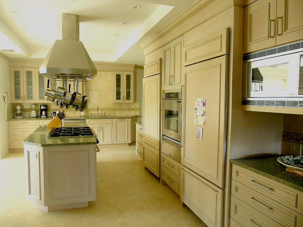 While “white” is the go-to choice for many nowadays, I do have certain designers looking for something special in the finish department.
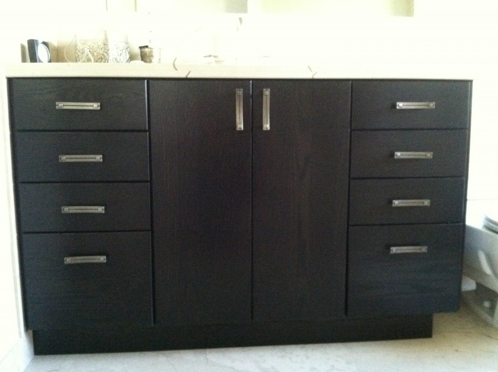 It used to be that oak was a bad word in Florida but grainy woods have made a comeback. I think it all started when someone figured out that you could achieve an interesting textural look by combining oak with a dark coffee, or espresso finish. The result actually looks a lot like the popular (and pricier) Wenge wood! There are two main types of oak to choose from, white oak and red oak. Red oak is what you’ll typically see here in the US. White oak is usually a custom option. Oak in any color is a sturdy choice and is classified as a hard wood, unlike pine for example. You can get knotty oak, sometimes referred to as character oak or you can get a clear oak with minimal or no knots.
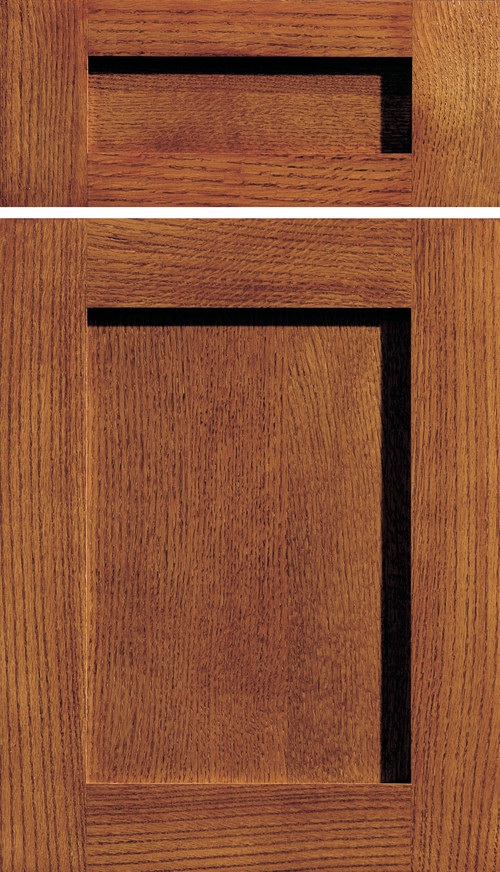
 The door below is an example of quarter sawn red oak and is by Dura Supreme as shown on Houzz. This is typical of what you would get if you were looking for a Craftsman style door for your kitchen. The hallmark of Arts and Crafts design is an emphasis on the natural quality of the material without excess ornamentation.
The other request I get is for quarter sawn oak. This refers to how the planks are cut from the log. It is a more expensive option and it incurs a lot of waste in the process. The benefit is even straighter wood graining and increased stability. Sometimes the terms "rift cut" and quarter sawn are used interchangeably but rift cutting is actually even more expensive and involves some complicated cutting. You can read about the differences here.  Another term that’s starting to come up is “cerused oak” which is really interesting. Basically the prominent oak grain is filled with white for an interesting textural effect. The British refer to this as “liming, or limed oak”. Pair this with all the popular shades of gray and you have a really updated version of a look that was also in vogue in the 1950s. (Yes, Mom, your china cabinet from the fifties is cerused oak) I found this great article if you want to know more. So there you have it. If you’re looking for cabinets with interesting natural texture, oak can be a great choice! Want to know more about how to specify the right cabinets for you or your clients? Drop me a line!
Tip 2: New Cabinets, All or Nothing?
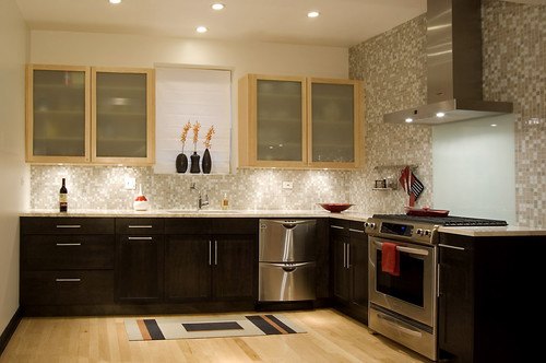
Anyway where were we?? Ah yes, I was sharing with you five big questions I get from clients. The first post in the series was about under cabinet lighting and here is number 2:2) Some of my cabinets are still really good, can I save money and just get more to match? While at first thought this may seem like a great way to save money, usually it's not. Even if your cabinet doors are simple, chances are you've had them a long time so the color may have changed. Also, each cabinet manufacturer makes their products slightly different so unless you can locate the original cabinet maker matching will be a challenge. Styles also get discontinued. If you're going to use a custom cabinet maker to replicate what you have you might as well just get new cabinets (unless he's a very very good friend). If you work within standard sizing parameters you can get some very good quality cabinets in today's competitive market. That said, there are some situations in which you can have the best of both worlds. Two toned kitchens are very popular. If you are replacing some cabinets, consider getting something totally different but complimentary to what you already have. Every situation is unique and it's worth investing in a little consultation with a kitchen design professional to see what can work for your case. The design solution below works because the lighter maple of the upper cabinets is picked up in the flooring. Usually I prefer to see a darker finish on the bottom rather than on the top. Darker colors are visually "weightier" so there is a "grounding" effect when you use them on the bottom. The operative word is "usually". Never say never as shown in the photo above. I love it. It works beautifully in this design. Lesson is don't be rigid. Think outside the box, pardon the pun!
A word about refacing- Refacing your cabinets means you will be replacing your drawer fronts and doors. The cabinet boxes themselves will remain including the drawer boxes. The thing to consider is that most of the cost of a cabinet is in the doors and drawer fronts. Along with that all exposed surfaces such as the ends and the frame around the front will have to be veneered or laminated to match the new doors. Depending on your existing cabinets, this could be a very labor intensive process resulting in less savings than you would have thought. One situation where I would recommend reface instead of replace is if you have already have great countertops which you now have a vested interest in saving. Then perhaps it would be worth it. Also, bear in mind, a reface doesn't allow you to improve your layout or add drawers. Whether new cabinets or just new doors and drawer fronts, remember that a clean simple flat slab style door is always the easiest on the wallet.Next up: #3: Where can I save money and what items are worth the splurge?

