My New Favorite Flooring Find

Flooring is the basis for every room in your house, ground zero if you will.  We want it to be a flattering backdrop for our decor, cabinetry and rugs BUT it's also got to be durable and easy to take care of.  Wood flooring is all the rage and, to be sure, nothing equals the warmth and richness of a real wood floor. 

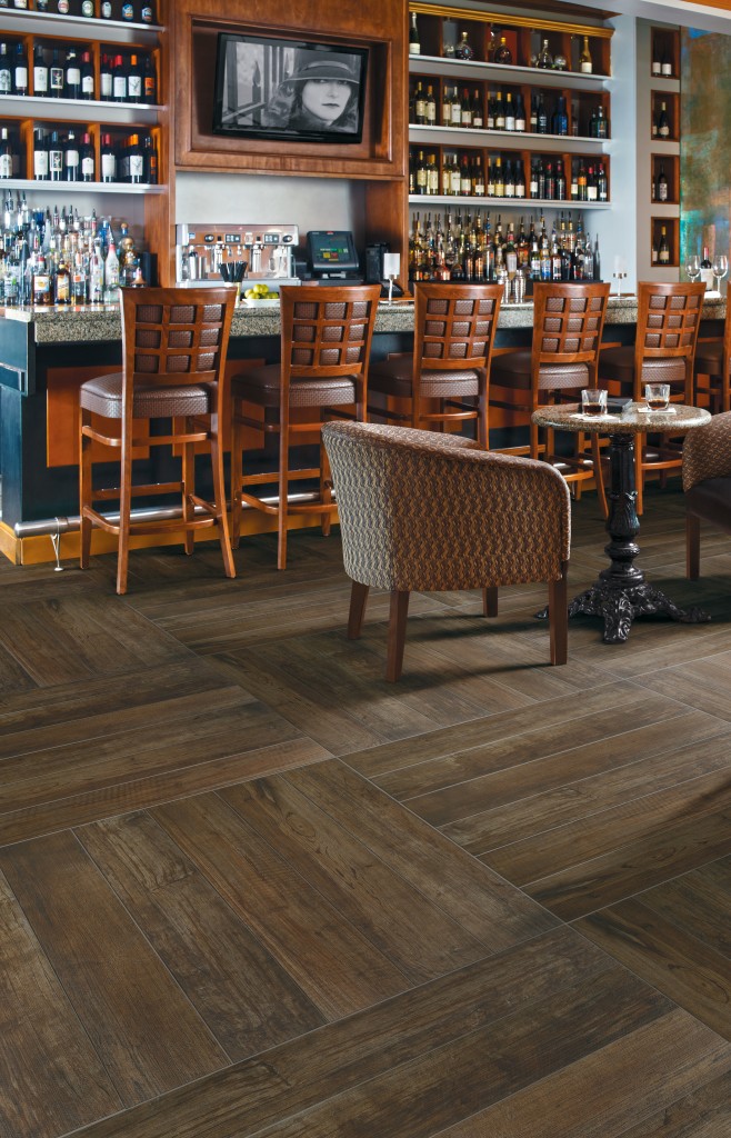
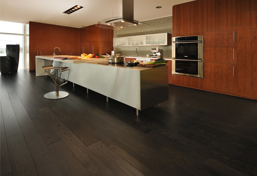
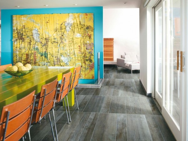
If you love the look of real wood but don't want to worry about finish, maintenance or potential water damage (leaks happen), this may be the product for you.  Meet Crossville, Inc.  Not only is it possible to get that "real wood" look in porcelain tile, but now you can even get that "weathered barn" look with SpeakEasy, their latest porcelain tile collection. Gray seems to be the new neutral.  Silver Screen from Crossville Inc.'s SpeakEasy Collection Sometimes my clients are afraid to use real wood in the kitchen or bath so this is a great alternative.  I also like the fact that the weathered finish is not slippery like polished marble.  I love pairing the distressed look with super modern design as in the photo above.  Then again this look always blends with traditional or rustic design.If you're craving shades of brown this could be a great option.The collection features five colors that mimic stained wood.  There's even a color called Sweet Georgia Brown!  Planks are 36" long and you can choose from 6", 8" or 12" widths.SpeakEasy is Green Squared certified and contains a minimum of 4% recycled pre-consumer content.  For more info  about this collection and all the other offerings over at Crossville visit crossvilleinc.com.

Hot Trends Make a Big Splash at KBIS 2014

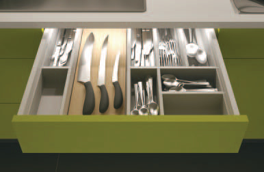
As many of you know, the Kitchen and Bath masses gathered in Las Vegas February 4-6 for their annual pilgrimage to KBIS, the Kitchen & Bath Industry Show. This year the event was part of Design & Construction Week, a new concept, merging KBIS with IBS, the International Builder’s Show. As a result, it was bigger and better than ever. Let’s hope that what happened there does NOT stay there !Kitchen-by-Marie-Claire-Reimann-3-600x400Maybe I should limit that to kitchen and bath industry products and trends ;)   Uber interior design resource Modenus hosted their latest Blogtour group who covered the event in a big way! You can get the entire scoop here.So what is trending, you may ask? Here’s the latest scoop from Kitchen & Bath Design News and KBIS co-sponsors, the National Kitchen & Bath Association:loox-led-in-drawerLet there be light.  Yes we’re used to lights in the refrigerator but now we’re adding LED lighting to cabinetry as well.
Make that matte.  Last year I noticed a growing interest in matte finishes and it’s even more so this year.  One such surface is the new Dekton by Cosentino.  It's an ultra compact surface including quartz, porcelain and glass.  This makes it perfect for both indoor and outdoor use, even better than quartz as it's UV resistant and can withstand extreme heat.
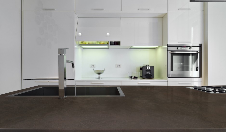
dekton-keranium-encimera

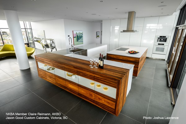
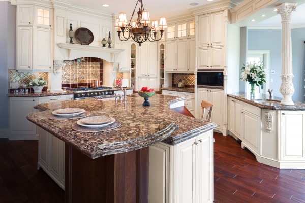
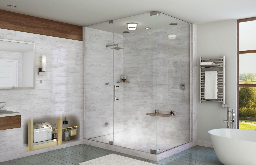
Keep it simple.   NKBA President John Petrie, CMKBDT tells us, "while transitional styles are still number one, we see kitchen design trending more contemporary this year, with clean , simple lines: less clutter and little ornamentation".Quartz rocks, especially if it’s patterned!  Homeowners have discovered quartz but they're not willing to give up the pattern and movement found in natural stone products like granite and marble.  New finishes by Cambria let you have the best of both worlds.Shirebrook from The Waterstone Collection by Cambria Cambria's  Waterstone Collection captures the depth and beauty of marble and granite while offering the superior strength and performance of quartz. (Here's something for you "traditionalists", they clearly didn't get the message about contemporary in this kitchen!)Gadgets, gadgets, gadgets, We may like our cabinetry look pared down but gimme the gadgets!  Technology reigns, ie anything  touch operated or digital.Temp20 Technology by Delta wins Best in Bath AwardThe new Temp20 Technology by Delta Faucets boasts a digital temperature display that saves you the shock or injury from water that's not the temperature you were expecting.   When the temperature is less than 80 degrees the LED display will glow blue.  It's magenta from 80-110 and red when it's above that.  You can get this feature on your Delta faucet  this spring.Home spa system by Mr. SteamA bath to come home to, trends in the bathroom focus on customization and spa ambiance.  In  the high end markets, free standing tubs are all the rage.  They are functional and sculptural at the same time. We are also understanding the benefits of hydrotherapy as in soaking tubs and steam baths.Additional features you may want to include in your new kitchens and baths include the following:-Induction cooktops (and now ranges too!)-Steam ovens-French-door refrigerators (duh, I think we all know that already!)-Bottom freezer drawers (ditto of above)-Touch activated faucets-Electronic (no touch) faucets-LED lighting-Charging stations-Pet stationsI believe all of the above are here to stay, at least in the foreseeable future, and the technology will only get better.

Get a Handle on Craftsman Design for Your Kitchen

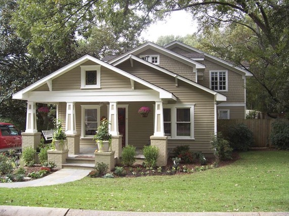
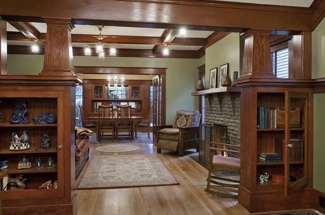
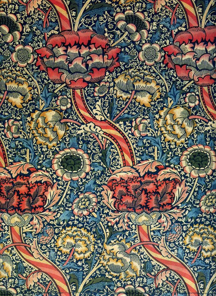
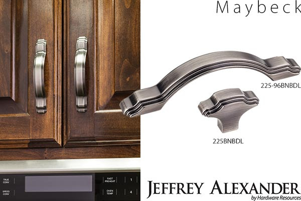
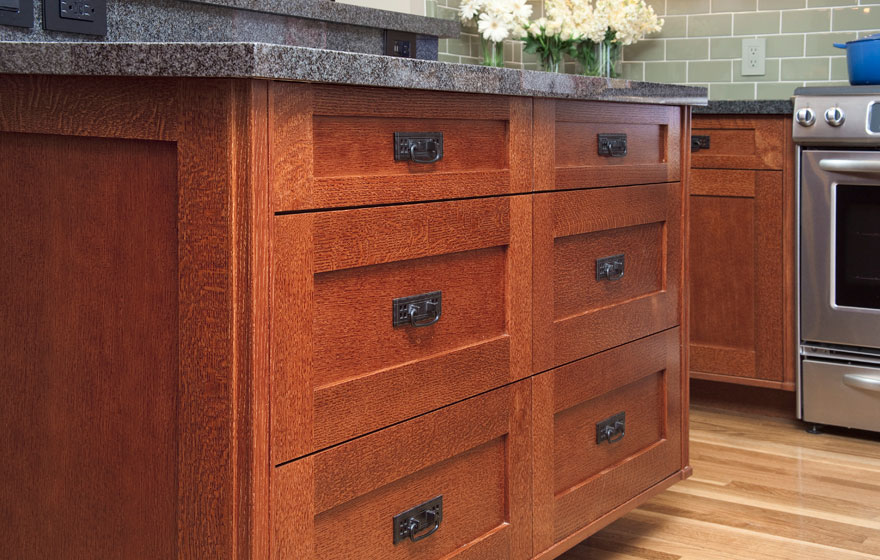
As you know by the last couple of posts I’m deeply in love with all things contemporary but then again I’m certainly no “one trick pony”. I have always been intrigued with Craftsman Design. Think bungalows, organic forms and warm rich woods. The quintessential Craftsman style bungalow Craftsman styling is warm and cozy with lots of natural elements and built-in book shelves. Textile design by American Arts & Crafts guru William Morris.  He is quoted as saying, "Have nothing in your home which is neither beautiful or useful."The Arts and Crafts Movement which occurred at the turn of the last century, was a response to the blossoming industrial age.  Mass production was coming into its own and a few intrepid souls were missing the personal human touch of household objects made by hand.  The leading proponent was William Morris, also known for his beautiful stylized floral prints.MaybeckOne of my “go to” hardware suppliers, Hardware Resources,  has just unveiled  cabinet hardware inspired by the period.  Named after Arts & Crafts architect Bernard Maybeck, these selections are a great way to jazz up existing cabinets and give you "the look".  Since they’re only inspired by, and not reproductions of, the Arts & Crafts Movement,  the design is fresh and new as well as being a stylized nod to the Craftsman style.  One beautifully styled knob and 3 cabinet pulls will be available in 5 trending finishes. In addition to the Maybeck design, by Jeffrey Alexander,  they will be introducing the Brenton (Elements)  and the Royce (also Jeffrey Alexander)  at the upcoming KBIS (Kitchen & Bath Industry Show). Shaker styled drawerfronts with a typical A&C handle.  Note warm woods and green tops! Photo by decore.comEmulating this look in cabinetry is easy.  The Shaker door style, which is all the rage, can be transformed to reflect the Arts & Crafts look by the addition of appropriate hardware.  You can get handles like these here.Here's your opportunity to get crazy with a tile back splash.  You will see a couple of motifs that scream A&C including the dragonfly and the ginko leaf.  Add some green to the mix and you've got it!You can get tiles like this one from etsy.com.  All you need is a few accent tiles.  Just make sure your field tile is a compatible thickness.If you're interested in this look or a stylized version of it I'd love to hear from you!

Kitchen Case Study: Update and Integrate

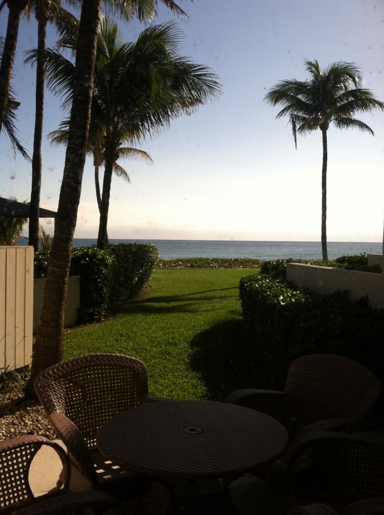
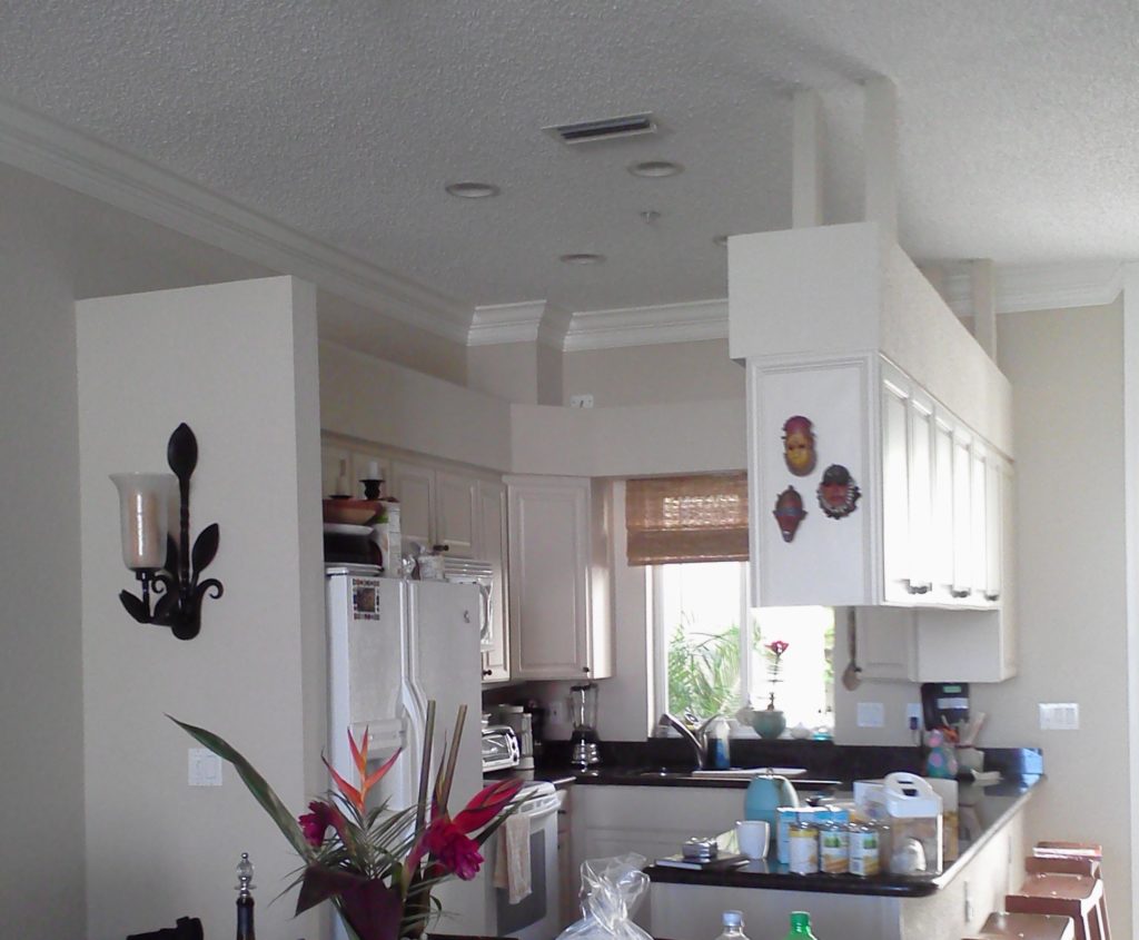
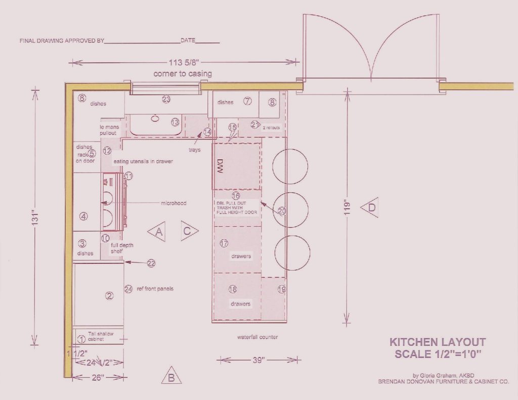
This is what we're dealing with, view out the back of the townhouse  One of the perks (not twerks) of my job is that I get to work in lovely homes on the beach.  If I'm having a "design panic moment" all I have to do is look out the window at the ocean and all is well.  This townhouse project came to me as a referral and is actually a winter home on the ocean in Delray Beach.  This homeowner is a potter with a keen eye for design and finishes.The kitchen was outdated and not very  functional.  My client enjoys cooking and entertaining and was seeking  to integrate her open kitchen with the stylish and artful adjacent dining and living room.The ChallengeMy first thought was that even though we would lose cabinets, the soffit structure had to go.  We could make up that loss of storage by going higher with the cabinets and by adding a tall cabinet to the left of the refrigerator. I wanted to open up the space yet ensure that it was integrated with adjoining areas.  The ceiling is so high we were able to increase the height of the cabinets without having to go all the way up which would have disrupted the existing crown molding.   We also gained storage by adding the two end cabinets on either side of the seating area.  The cabinet to the counter is also great storage and the open shelving to the right was included to showcase some of my client's pottery pieces.  Scroll down to see the solution.blogplan2-page-001 (1)


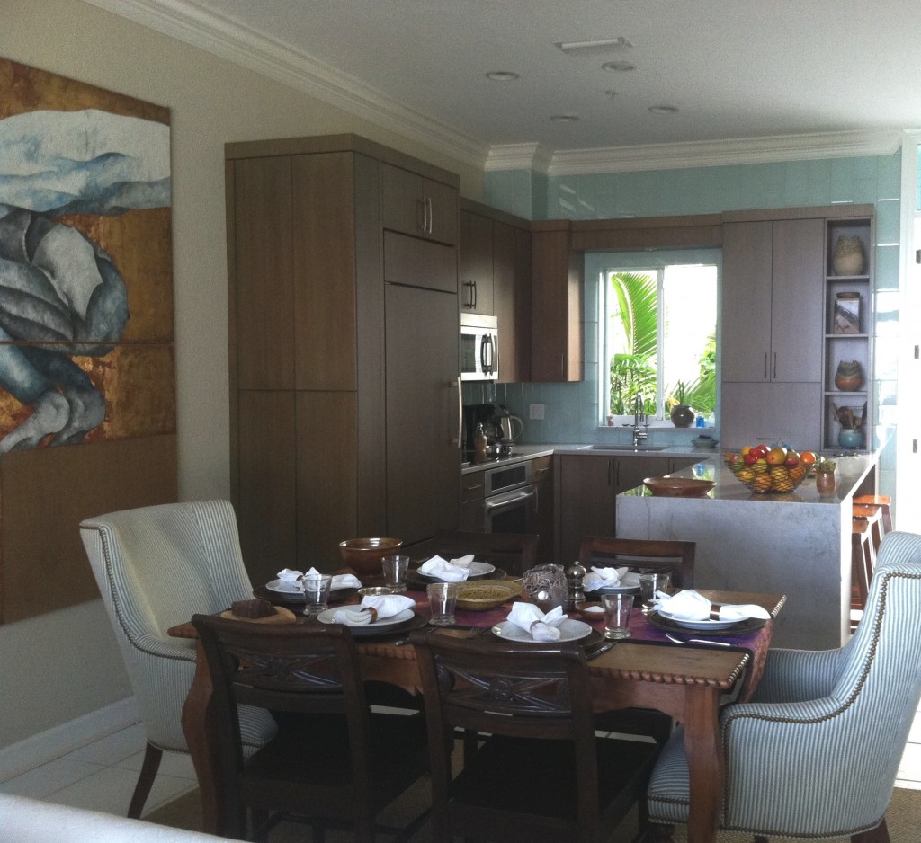
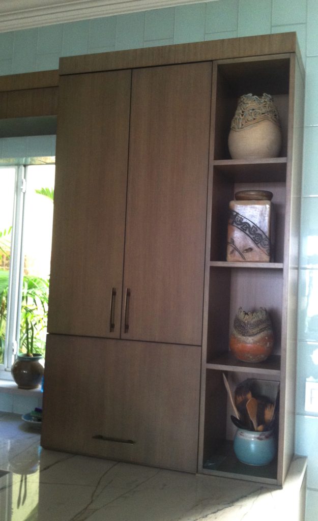
 THE SOLUTION!We used a warm stained bamboo with a subtle blue-green tint for the cabinetry.  The back wall is aqua glass tiles to reflect the ocean.  There is a pantry with touch latches to the left of the built-in refrigerator.  An appliance garage conceals toaster oven to the right of the sink and open shelves feature my clients beautiful pottery creations.

2013-01-18 10.01.34

My design was custom built by Brendan Donovan Furniture & Cabinet Co.  Cabinet  hardware is Top Knobs Sanctuary Collection in German Bronze. Refrigerator is Subzero with flush installation.  The rest of the appliances are by Jenn Air.  For this project we selected the Blanco Quatrus medium single sink  because it fit the space as well as the styling of the kitchen so well.  The faucet is Blanco Kontrole.  Again this stylish Blanco faucet provided the look and pull out functionality we needed. In addition,  the scale was appropriate for the space.  Counter tops are  grey granite from Cavastone fabricated by Stone Palace.  They feature a contemporary "waterfall" detail at the end of the peninsula.All in all I would say mission accomplish and my clients agree!

Tip #5: To Glass or Not To Glass?

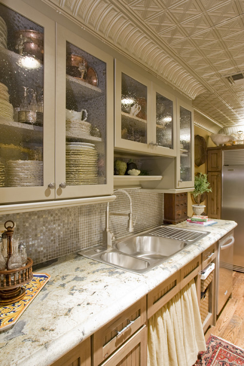
Acid etched glass obscures the contents of the cabinet and works well with a contemporary look.  Of course I always welcome questions from inquiring minds but today we’ll cover the final fifth question of the top five I get from my clients.  They want to know, “can I have glass doors on my cabinets if I’m not exactly tidy”?  I say YES!!  I love the look of glass doors on cabinets and there are so many different choices.  I even think that glass doors on food cabinets can be interesting and very "Parisian bistro looking".  I know most of you won’t go that far but for your dish storage they’re great.  You can see what’s where and score a little visual interest at the same time. This is what I'm talking about!.  I think it looks great.  Still not comfortable? You don’t have to go clear.  There are lots of patterned or frosted (acid etched) glass that “hide a little”.  If you’re traditional you might like the look of seeded glass whereas acid etched is definitely more contemporary. 

Eclectic Kitchen but mostly traditional with seeded glass (no mullions)


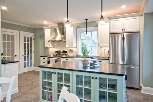
Contemporary Kitchen by Westfield General Contractors Michael Robert Construction    Be aware, mullions may not line up with shelves.  Use tempered glass for lower doors.  In this case it works as glass doors reflect the window and the French doors.

Mullions? What are these things? They are the little strips of wood that divide the glass opening.  This treatment is usually more traditional.  I usually prefer no mullions.  If you’re going for glass, go all the way.  Mullions can be visually busy and conflict with the shelves inside the cabinet if they don’t line up with the horizontal members.Mullions can get creative too.  For example the X shape will give you a design detail reminiscent of a British Colonial Bermuda style. 

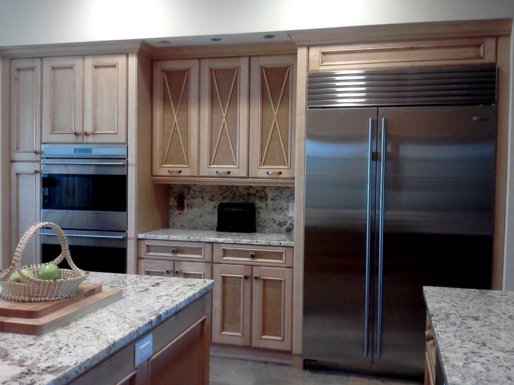
This client decided against glass at the last minute so we inserted rattan instead of glass for a beautiful original look!Adding a glass door to your cabinet can be a little more expensive because we typically have to finish the interior of the cabinet to match the outside and that is an upcharge for most cabinet manufacturers.  One or two shouldn't break the bank however.Glass doors are best added to upper cabinets for safety reasons.  You can add them to a lower cabinet but just remember to spend the extra money for tempered glass.Starting next month I will be answering more consumer questions over at  The Sun Sentinel.  Send me yours and you may get a reply in print!

Tip #4: Granite or Quartz?

 Nautical White Kitchen 1

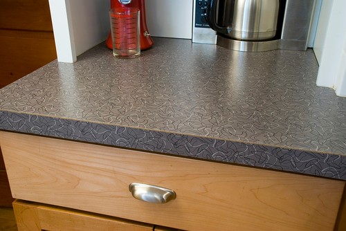
The last few posts we have been exploring the big questions I get from clients who are in the market for a new kitchen.  Today we are up to #4, and it's a biggie.  What counter top should we get?  Counter tops are a main component of the kitchen.  They have to look right but more importantly they must stand up to daily use.  During the 50s, 60s and 70s , other than the odd wood or tile counter top, most of us had laminate counters.  Formica ruled the roost.  To be fair, laminates have come a long way and are quite popular in Europe.  They are not as indestructible as granite or quartz but the price is right.  Truth be told, back in the day, it was not unheard of to have a laminate top last 30 years or more!

Remember those "Boomerang" Formica counter tops?  If not, then you might find one now in a Mid-Century Modern style kitchen of 2013.
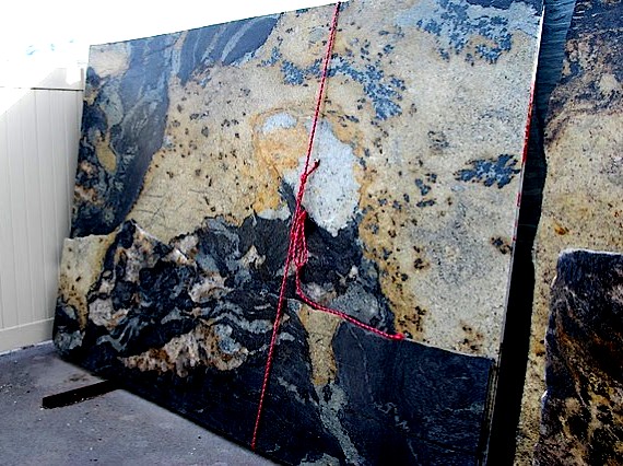
A great example of the natural variations inherent in granite.
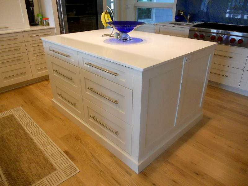
Today my clients  know about granite but what's this quartz all about ?  Here's what I tell them: If you love the uniqueness and natural variations of granite then it's the top for you.  If you can't stand that and you prefer consistent color and/or pattern then quartz is for you.  Quartz is man-made and is about 93% quartz with the other 7% being the resins that hold it all together.  Performance wise you can't do better than quartz.  It is non-pourous, very hard, heat resistant and does not require maintenance.   When it comes to price, at least in Florida, the price is comparable to granite.  Both materials are generally available in 2cm or 3cm material.  2cm is about 3/4" thick.  You can use it like that if you like the thin look but typically it gets doubled up to give you your 1 1/2" standard counter top thickness.  If you're planning a matching backsplash this is a good option since it can be 3/4".  Yes, the counter edge will have a seam in the middle but if your fabricator is worth his salt, you shouldn't really notice it.  A 3cm thickness will give you 1 1/4" thick counter top with no seam but it makes for a very thick back splash which may not leave you enough room for your faucet.  My favorite brands for quartz are Cambria because of the color selection and because all the colors are the same price.  That makes it easy!  Cambria is also made in the USA.  I also love Silestone which can be a little more expensive but is cutting edge when it comes to new textures and technologies.  Silestone is made in Spain and features their trademark Microban which enhances the antibacterial nature of quartz even more.  Granite can come from South America, Mexico, Europe and even India.  If opting for granite you'll need to make a trip to the yard to select your slabs since they vary so much.  If you need help deciding you know where to find me!
Next up: Tip #5: Glass Doors, Solid Doors or Open Shelves?