Tear Sheet Tuesday: Wine Storage

Welcome to another edition of the occasional series I call Tear Sheet Tuesday.   If you want to catch up you can do that right here  and here.  In a nutshell, I tear what strikes my fancy and I share that with you here.  It could really be anything. It’s all about what inspires me.

CookingLight-wine-rosé-winestorage-ArtfulKitchens


Now I'm all inspired to share with you some tips and ideas for storing your liquid treasure, wine! Here are some things to keep in mind along with some wine storage eye candy curated just for you. 

Climate Control

If you want to be technical about it wine should be stored at the perfect temperature with a touch of humidity.  The sweet spot for white wines is about 45 degrees Fahrenheit.  I'll admit it, I love an ice cold glass of white wine but my preference may be costing me when it comes to flavor.  Your refrigerator, by the way, is probably chilling in the thirties.  It is often said that red wine is served and stored at room temperature.  That could be true if you live in northern France but they definitely don't mean Florida!  The room temperature they refer to is 55 degrees Fahrenheit.  Sunlight and heat are deadly enemies of the vino. Many people store wine in the kitchen but that's not necessarily the best place for it.  If you do store it there, make sure to keep it out of the sun, away from heat and anything that is going to cause vibration, no matter how subtle.  There is an abundance of wine cooler appliances on the market in price ranges from the hundreds to several thousand dollars.  Call me for a wine cooler consult to make sure you get one that fits and will work in accordance with specifications. 

Sideways


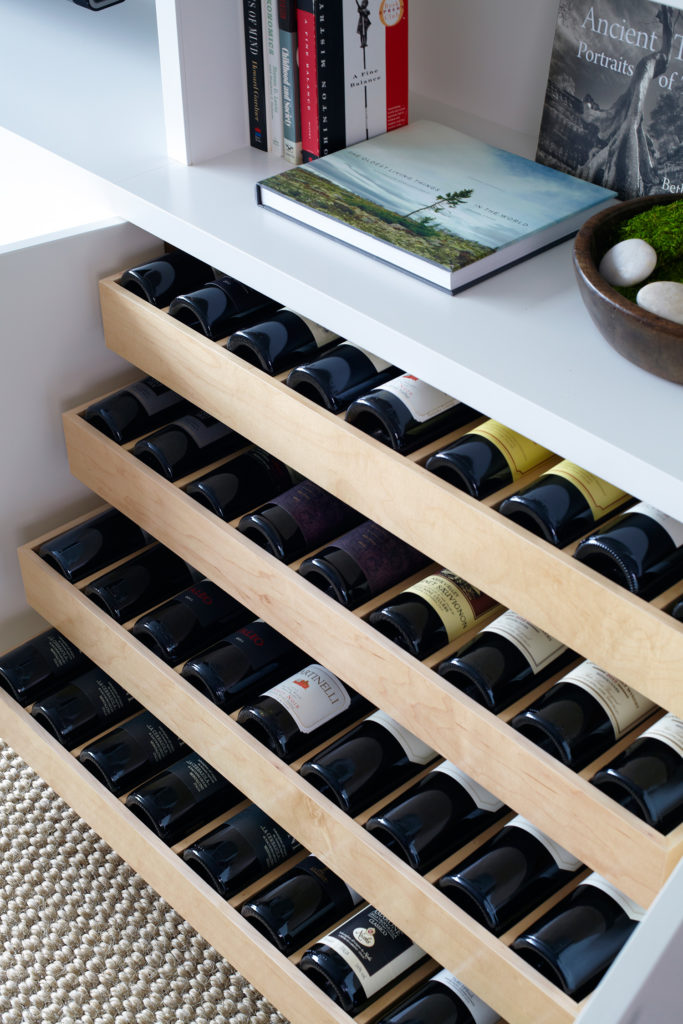
Sideways is Not Just a Movie 

Wine is traditionally stored sideways to keep corks from drying out BUT if you're going to drink it soon it doesn't really matter. I'm sure you've noticed a lot of wine these days doesn't even come with a cork.  That used to be anathema to a wine aficionado but no more. Increasingly, winemakers "prefer screw caps for white wines and reds meant to be drunk young," says Dave McIntyre, a wine writer whose columns appear in The Washington Post. For more on the cork vs screw top check out this interesting article. One big benefit of storing sideways is storage, it makes the most efficient use of space.

06.-West-Village-Waterfront-by-Chango-Co.-Living-Room-Millwork-Wine-Drawer-Detail-View, wine storage

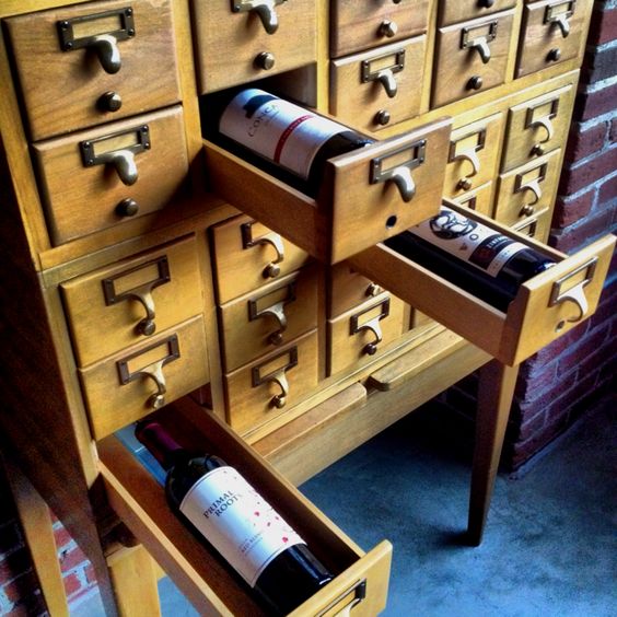
Clever or Kitchy?  You Decide

KRJHomeSweetHome, wine storage


Looks like a great idea to me, anything that suggests books and includes wine is a win!

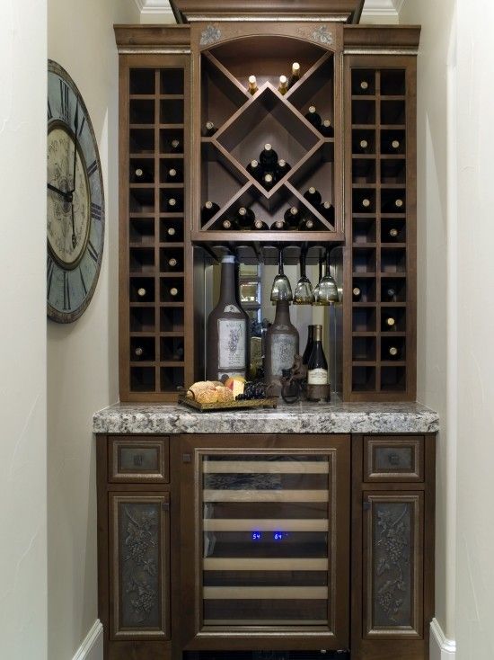
Breaking with Tradition

wine storage


I'm not a traditional gal and am one to prefer interesting asymmetric balance but there's just something about the perfect symmetry and classicism of this that rocks my world.  I am not alone.  This image has 5400 saves on Pinterest!


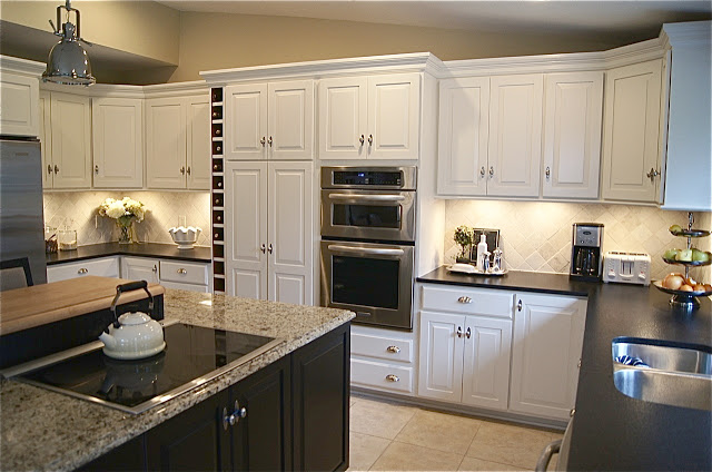
A Spot for Wine

theyellowcapecod, wine storage


If you're planning a new kitchen and you find yourself with an extra six inches you've got a spot for wine.  Notice it's insulated from the ovens by a decently sized pantry cabinet away from heat.  It's also not too close the window.


Retrofit Your Wine

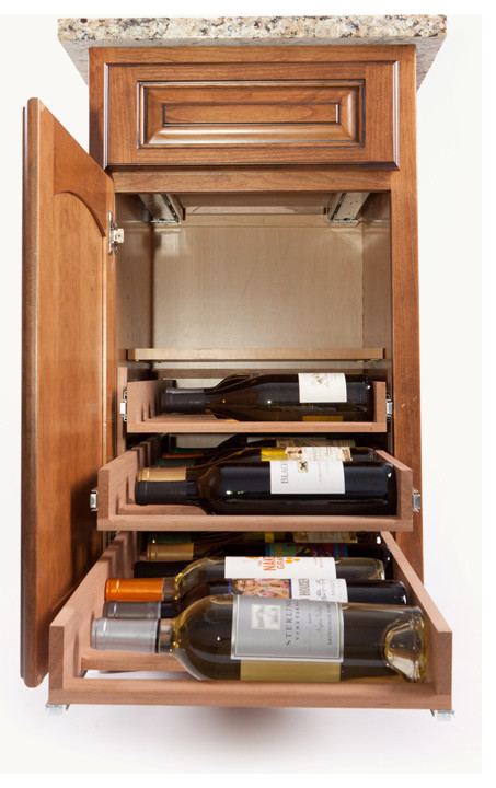
This wine storage system by Wine Logic can be inserted into your existing cabinetry.  Sounds logical to me! 

wine storage, wine logic
                                                                     By A Direct Cabinet Distributor Corp East Patchogue - See more Home Design Photos
 
Amazing what can come out of one image torn from a magazine, huh?  Please share your tears with me and don't forget to subscribe to Artful Kitchens.  There's a lot of excitement around the corner!
 
NEXT UP:  Part I of The Big Move, follow my journey as a new empty-nester with a behind-the- scenes look at what it takes to sell a house in the suburbs, remodel and downsize for the good life.

Zen Vanity for the Powder Room

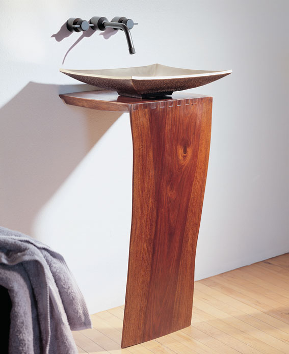
This gracefully elegant vanity is the epitome of simplicity and minimalism.
 

WOOD L – SLAB PEDESTAL & BRONZE ZEN VESSEL by Stone Forest
 
This natural sculptural vanity features the "live" edge of a tree bark.  It comes with a unique natural artfulness which can read rugged yet delicate at the same time.  It is available in two heights.  The butterfly joints ensure stability.  The lovely delicate bronze Zen Vessel sink is a perfect partner and has been hand crafted using traditional sand and casting techniques.  What do you think? I think it could be lovely in just the right situation, perhaps like this one inspired by the kimono.


Quartz VS. Quartzite Countertops: Make the Right Choice for Your Kitchen

One of the things I love about my job is that I get to shop.  Let's face it, I live vicariously through my clients.  A question that has been popping up a lot lately on my shopping excursions is, "what is the difference between a quartz vs. quartzite for countertops"? 

Quartz


They are definitely not the same thing and you shouldn't use the terms interchangeably.  Here's the scoop:

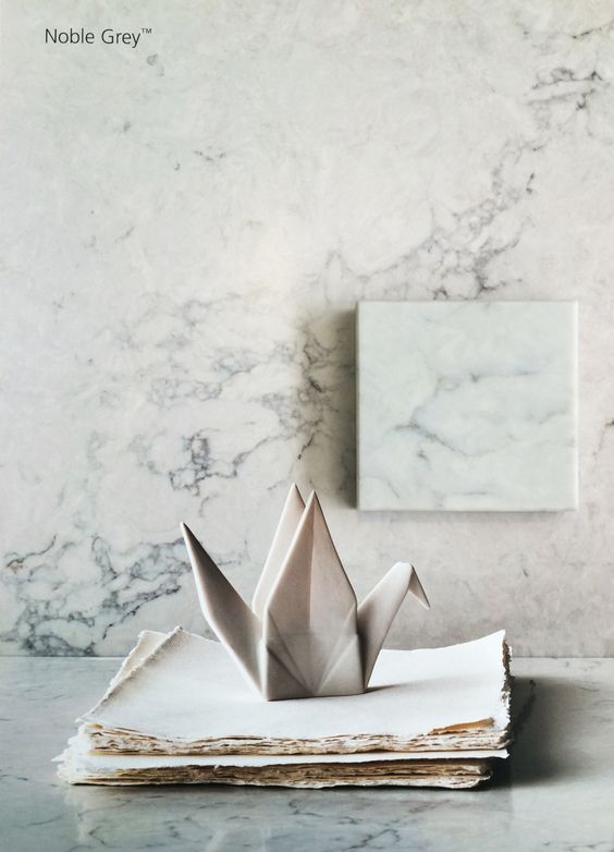
Quartz is arguably the most popular counter top material today and there is good reason for it.  It's composed of 93% quartz which is a mineral (see above).  It's gorgeous and exactly the same stuff you see sometimes in jewelry.  They ground this up and mix it with 7% resin to hold it all together.  The result is the hardest, most chip resistant and non-porous counter top you can buy.  This means it won't stain or etch.  Now between you and me, I've had it and I've even put hot pots on it BUT you should know that it is not recommended.  The resin bit has a melting point of about 300 degrees so it is possible that you could have a bad experience with the hot pot scenario.  


Quartz counter tops,Noble grey caesarstone


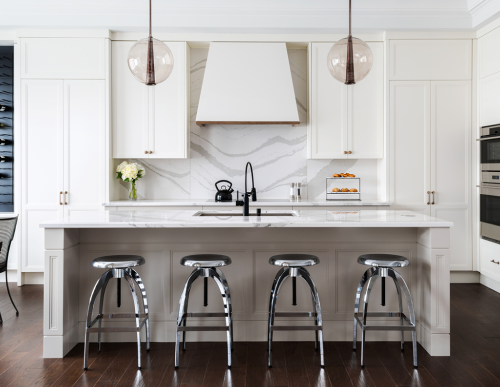
Two more nice things are you never ever have to worry about sealing quartz and today it comes in just about any look you could want from solid to a fine granite type pattern to the popular swirling vein marble look. Some well-known brand names of quartz counter tops include Cambria, Caesarstone, Silestone by Cosentino, Pompeii and Zodiaq but there are more.  Cambria is the only one manufactured in North America.  Silestone by Cosentino comes from Spain and Caesarstone from Israel.  Because quartz is non porous it is anti-bacterial by nature. The latest thing in quartz is leather finishes, as opposed to the usual polished look and BIG wild patterning such as in Cambria's Britannica. 

Cambria,Britannica,quatzcountertop


If you want variety (in price, pattern and color), consistency and no maintenance quartz is a perfect fit.


Sunny Pearl quartz countertop by Pompeii


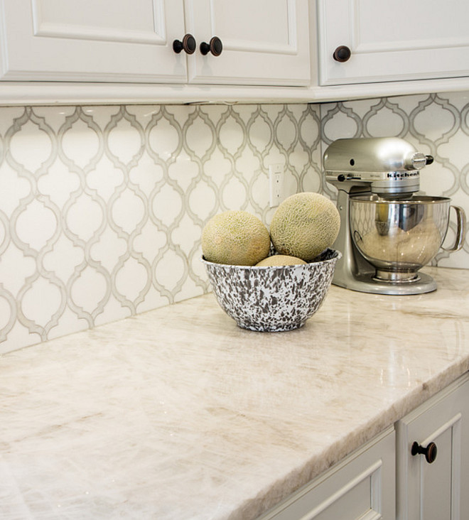
Enough about quartz.  So what the heck is quartZITE?  Quartzite is actually pretty different from quartz.  Where as quartz is a mineral, quartzite is actually sandstone that has been transformed through conditions of heat and pressure in the earth.  It is completely natural, mined from quarries just like granite.  It is also hard and durable and non-porous but not always to the same degree as quartz. Quartzite is a bit more heat resistant since there's no resin. Let's face it, it's breathtakingly beautiful.  Each slab is totally unique featuring beautiful patterns.  It can also be fabricated in a more matte, or leather, finish.  If you like that natural uncontrollable variation this could be for you.


If you love the natural, uncontrollable uniqueness found in nature choose granite or quartzite.  

Bear in mind, because quartzite is a natural material it can also vary in performance.  My best advice if you are considering quartzite is to get a sample and do your own science projects on it.  You know the drill, red wine, mustard, sharp knives, hot pots etc. All this goodness does not come without a price.  Quartzite does need to be sealed about twice a year and speaking of price, most quartzite prices out higher than quartz.


ceberg-Quartzite.-White-Quartzite.-Iceberg-Quartzite-Photos.-Iceberg-Quartzite-Countertop.-Quartzite-Stone-Countertop-IcebergQuartzite-Quartzite-WhiteQuartzite-QuartziteCountertop-Karr-Bick..jpg

One of the hallmarks of quartzite is its translucence, beautiful layers that you can almost see through!  If you are in South Florida and would like to find the perfect counter top for your own kitchen, I look forward to hearing from you. Drop me a line at Gloria@ArtfulKitchens.net


Check out some of the other counter tops I LOVE on Pinterest !


Tips for Creating a Minimalist Kitchen

For years my husband and I have thought about the day when we'd be able to live small in a big way.  That means less stuff and more meaningful moments, experiences and adventures.  

The Miminalist Kitchen is clean and uncluttered. Photo by Wilsonart

The suburban life has its advantages and I will certainly miss having the big kids :) around as well as my morning walk route and garage studio.  That said, we're trading it in for simplicity, morning coffee and sunset wine on the water.  Yes, we're selling the house and moving back to my chick pad on the intracoastal which will now be a sanctuary for two, plus one kitty.  My musings brought me to Minimalism, a very inspired documentary about how two guys made it happen in their lives. Check it out on Netflix. Downsizing and moving is kind of like a mandatory form of minimalism, it's the only way.  Scary? Yes, but also exciting and since kitchens is what I do I began exploring the idea of what makes the Minimalist Kitchen. Here are thoughts to get you started if the idea inspires you too.


"Have nothing in your house that you do not know to be useful, or believe to be beautiful."-  William Morris

These words by William Morris are the perfect place to begin when considering the Minimalist Kitchen.  The concept is, of course, not new.  Morris was a nineteenth century British designer, writer and social activist who espoused this principle and his advice is the perfect way to begin the journey to the Minimalist Kitchen.  Consider every single item in your kitchen in due course, i.e. not necessarily all at once but methodically and thoroughly.  If you're not sure, one way to decipher usefulness is to take note of the items you use every day, week, month and only on holidays.  Items used only once a year don't need to be stored in the kitchen if space is tight and if it's been more than a year why are you holding space for it? The kitchen remodeling process is very helpful in this regard. You're forced to empty all your cabinets then, as you live out of boxes during the process, you quickly become familiar with the items you really depend on.  Chances are there are less than you thought.  Usefulness is huge BUT remember the beauty too.  This means if you LOVE something you get to keep it!

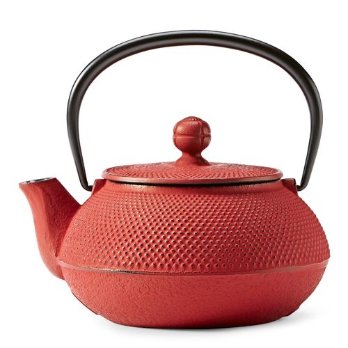
Hobnail teapot by Teavana Minimalist Kitchen


Consider Multi-Use Appliances

These appliances offer versatility and save space for things you love.

Aroma Rice cooker minimalist kitchen

My daughter's boyfriend got us this rice cooker for Christmas and we have never looked back.  Not only is it a convenient rice cooker but it's also a slow cooker and a steamer! You can even hard boil eggs with it. In my house it earns its space in the kitchen. The Aroma Professional Rice Cooker comes in a variety of sizes too.


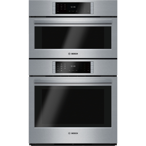
Bosch Benchmark steam combo oven minimalist kitchen


If your cooking goals are loftier there are many luxury appliances that combine convection, steam or microwave technologies into one appliance.  This Bosch Benchmark combo oven features steam on the top and regular convection on the bottom.  You can also get a microwave on the top if you prefer. These are just a couple of examples but you get the point, yes?


Ditch the Duplicates


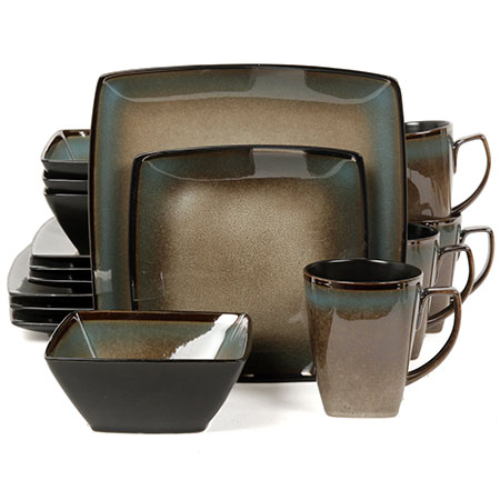
Do you really know how many you have? I certainly was surprised to see I had so many funnels!  Speaking of duplicates, when I move we're having one big set of dishes that we love and use everyday.  That is all and I give you permission to do that too.  If you have little ones you will have to strike the right balance between beauty, durability and price.  I love the variety of suggestions here.  If you must have a set of separate dishes for the holidays remember they can be stored outside the kitchen if space is tight.

Gibson Elite Tequesta Dinnerware Minimalist Kitchen


Detach & Re-Charge

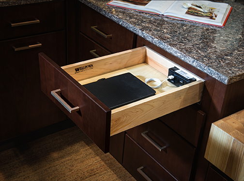
One nifty feature I've been working into most of my design lately is a charging station.  Give yourself and your devices time to re-charge.  This charging station gives you a safe place to store devices off the counter top and out of sight.  A few hours of detachment can work wonders.  It's a de-clutter strategy for your kitchen and your mind right in line with the Minimalist perspective.  See some of the options at  Docking Drawer Try it!

Charging Station Wellborn Minimalist kitchen

  Organize Your Recipes Digitally

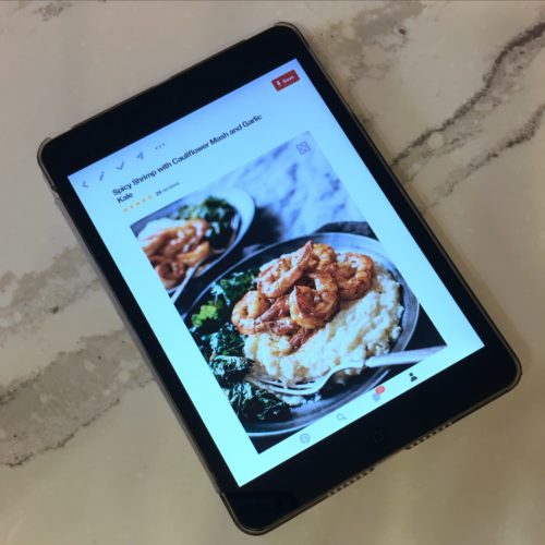
I don't know about you but I have a lot of cook books and most of them I don't use.  There are so many easy ways to organize and save your favorite recipes on line.  I usually use Pinterest or AllRecipes.com to curate my collection . If you're not too internet savvy just take a photo on your phone or tablet.  It's as easy as that.  Definitely keep cookbooks with sentimental value such as the ones with grandma's hand written notes.  I actually wish I had some of those!

Minimalist Kitchen Pinterest recipes

The goal for me is less stuff.  The payoff is saving money, easy cleaning, maintaining what I have,  knowing where everything is when I want it and having more time and resources to travel and enjoy the relationships and experiences in my life.  As The Minimalists, Joshua Fields Millburn & Ryan Nicodemus say  "Love people and use things because the opposite never works."  


Stay tuned for my downsizing moving adventures in the months to come and let me know how I can help you craft  your own Minimalist Kitchen.

Kitchen Case Study: Tips and Products that Can Bring Your Design to the Next Level

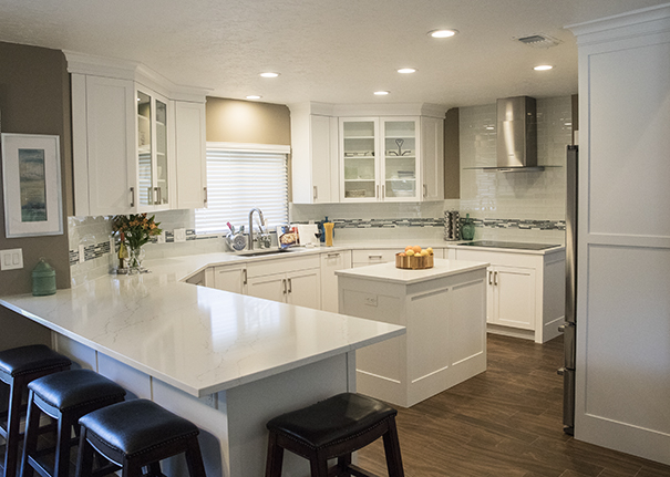
Designing a kitchen is a bit like solving a puzzle, eventually all the pieces come together and it all makes sense from both a visual as well as a functional perspective.  This new kitchen design in Wellington Florida is a great example of that. Today I'd like to share with you an inside peek at the process and how we got from drab to amazing in ten million easy steps.

White Shaker Cabinets,Style My Faucet, Kitchen Design, Kitchen Makeover


I jest, it was really only eight million.  Here's where we began.  Check out these before images.  As you can see the old kitchen was outdated and just didn't work from a layout point of view.  The challenge we faced was to create something light, modern and very user friendly for my client who loves to cook for her family.

Befores

First Things First: Layout Challenges

Kitchens generally work a lot better without too many angles so although we were stuck with the exterior angled walls, we could straighten out that peninsula.  Then there was the island in the center.  All the angles were affecting the usable storage inside so I wanted to square that up too.  Next up was that oppressive soffit at the top!  It was like a heavy weight pushing down on the kitchen.  Removing it would allow taller cabinets and a much more open feeling.  The refrigerator was crowded next to the stove so I really wanted to relocate it if possible.  Last but not least, where the fridge used to be is our new focal point,  a modern hood and beautiful reflective glass tile.


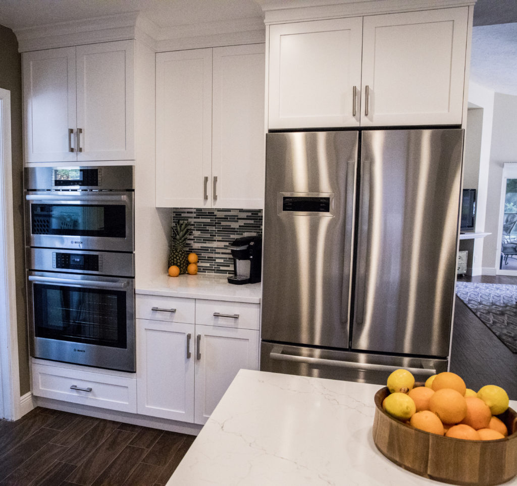
The above plan shows how it all panned out.  We accomplished all of our objectives.  The soffit was removed, peninsula reshaped with the addition of a beverage center, the island became a baking center with no angles and storage for a mixer lift.  We extended the pantry wall and created the perfect home for a new refrigerator and combination wall and microwave ovens with convenient counter space in between.

White Shaker Cabinets,Style My Faucet, Kitchen Design, Kitchen Makeover

Star Elements & The Power of Collaboration

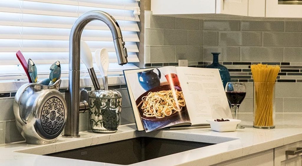
I always say the best projects are great collaborations and that is exactly what we had here.  My client didn't think she knew what she wanted but she really did.  She gave me lots of feedback and clues as to what is most important to her and her family.  The result was an appliance package by Bosch including an induction cooktop, all wood white Shaker style cabinets by Holiday Kitchens and Brendan Donovan Furniture & Cabinet Co., an undermount Silgranit kitchen sink by Blanco and the Beale Touchless Kitchen Faucet by American Standard.  This was the first kitchen I've done using this particular faucet.  In exchange for the faucet, American Standard offered me the opportunity to participate in a really fun project called Style My Faucet.  Designers all over the country played too.  We had fun staging the Beale and got some great shots.  Flowers and veggies had already been beautifully featured so we did pasta! 

"The best advice I can give my clients is to invest in a quality faucet."


Beale Touchless Kitchen Faucet, AmericanStandard,StyleMyFaucet


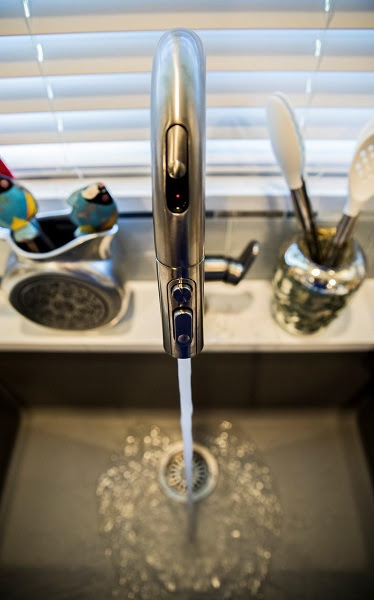
The Beale Touchless Kitchen Faucet was very easy to install,  the battery for the  Selectronic hands-free sensor is conveniently located below in the cabinet.  You can opt to leave it on manual mode too if you prefer.  Just slide the sensor door on the front and you can operate with a wave of your hand.  This is so nice to have when you're preparing things like raw chicken, right? I was also impressed with the Dock-Tite spray head docking system.  It feels really nice and secure.  I've seen faucets that dangle when they're not supposed too.  Yuck.  The best advice I can give to my clients is to invest in a quality faucet.  I will definitely be specifying the Beale again because I am impressed with not only the quality but also the sleek  styling that works so well with contemporary and transitional designs, just like this one.

White Shaker Cabinets,Style My Faucet, Kitchen Design, Kitchen Makeover


There you have it.  It's a wrap.  Drop me a line  at artfulkitchensbyglo@gmail.com and let's get started on your kitchen!

 This is a sponsored blog post.  All editorial content is entirely my own opinions and perspectives.


KBIS2017 Part III-Exploring Surfaces

This is Part III of my KBIS2017 recap.  You can find Part I  here and Part II here

Ok where were we?  Ah yes, I believe I promised you something to do with rhino poop and a surprise inside the shower.  In Part III, the final installment of my Kitchen & Bath Industry Show (KBIS2017)  recap, I’m going to deliver just that as I share with you two really cool surface manufacturers  that are game changers in the world of design.  The first is from the tradition of Ripley’s Believe It or Not!


MohawkFlooring,KBIS2017


Mohawk Flooring, known largely for their carpet, actually manufactures a wide variety of products including tile, hardwood, laminate and luxury vinyl.  The star of their show this year was SmartStrand Silk Reserve carpet which MUST be felt to be believed. The story is not only about the ultimate in comfort and beauty, but also unbelievable cleanability.  


To test this new generation of carpeting they had a rhino, yes a rhinoceros, live on it for two weeks! That includes peeing, pooping and God knows what.  This experiment compared SmartStrand Silk Reserve to other leading carpets.  The results were impressive. With the Pet Protection Warranty there’s never any worry about a little occasional cat puke. Here’s a little video so you know I’m not lying.


Not only did SmartStrand Silk Reserve stand up to the rhino test, it was also a welcome respite for the tired feet of 24 or so bloggers and social media influencers.  We got to enjoy the silky soft  experience at the Ritz, no less. It’s really really soft!

MohawkFlooring,SmartStrandSilkReserve,Carpet


Since we’re talking about cleaning, let’s move on the the shower.  That’s where Wilsonart comes in.  Wilsonart is a leader in engineered surfaces such as laminates, quartz, solid surfaces and even interesting wall paneling which is a look that has been so popular.


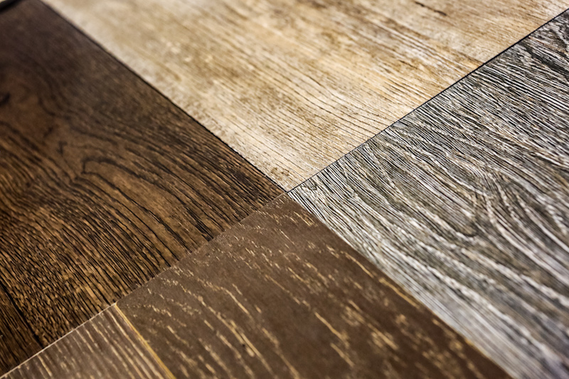
I love how they are always coming up with something new that is so relevant and on trend.  One such item is Wilsonart VDL Artfully Repurposed Woods (above left).  Yes these are laminates, no splinters here, soft as a baby’s butt (well nearly).  I digress. Let’s get back to the shower on show at KBIS2017.  This seamless laminate shower wall (below)  is easy to clean with no grout lines and they assure me it’s water friendly.  I also love the sleek contemporary look.


Wilsonart, KBIS2017,BlogTourKBIS

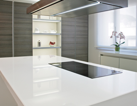
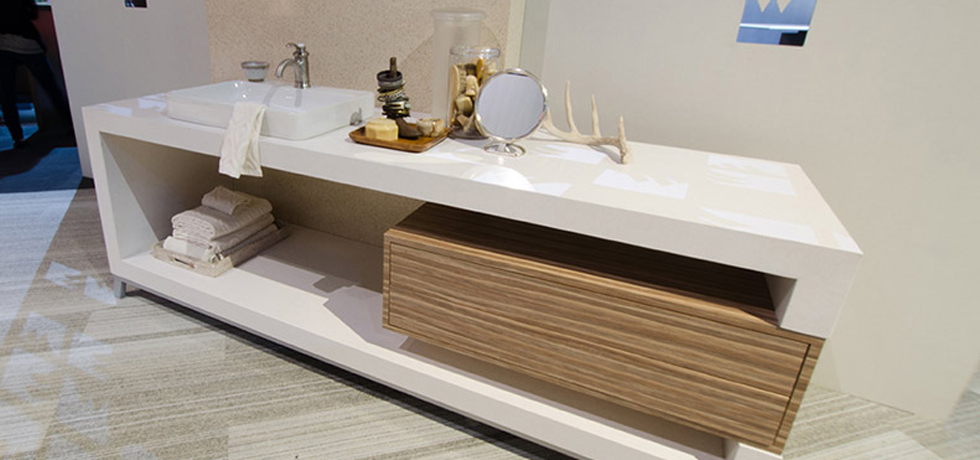
Wilsonart is also offering their own brand of quartz.  I often have clients who seek a pristine white counter top.  This one (Niwa Q1002) certainly fits the bill.   Quartz is a very popular choice these days because of it's durability and stain resistance. Check out their website here for more on the wide variety of products you can find at Wilsonart.

Wilsonart, WilsonartQuartz, BlogTourKBIS, KBIS2017, designhounds


There you have it!  Thank you so much to Modenus and all the sponsors of BlogTour KBIS.  It’s such a treat to have access to all this in depth knowledge that I can share with you.  All editorial content is entirely my own opinions and perspectives.