Quartz VS. Quartzite Countertops: Make the Right Choice for Your Kitchen

One of the things I love about my job is that I get to shop.  Let's face it, I live vicariously through my clients.  A question that has been popping up a lot lately on my shopping excursions is, "what is the difference between a quartz vs. quartzite for countertops"? 

Quartz


They are definitely not the same thing and you shouldn't use the terms interchangeably.  Here's the scoop:

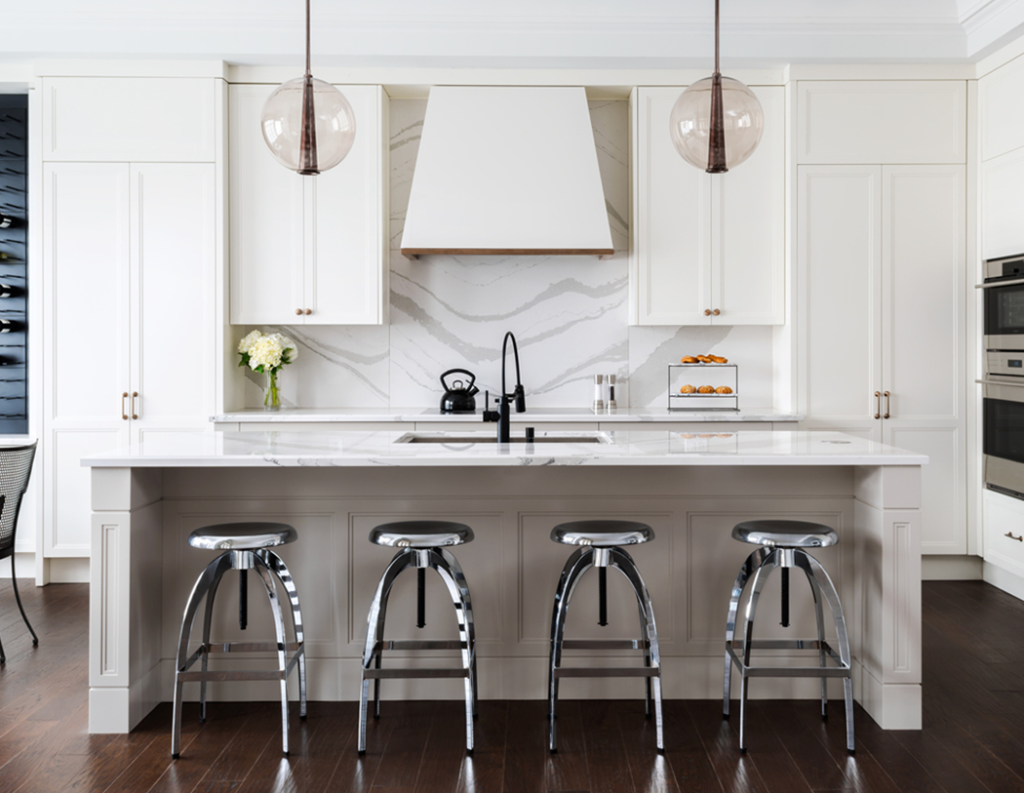
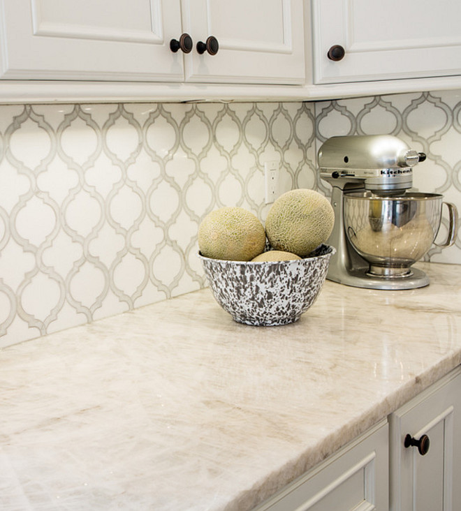
Quartz is arguably the most popular counter top material today and there is good reason for it.  It's composed of 93% quartz which is a mineral (see above).  It's gorgeous and exactly the same stuff you see sometimes in jewelry.  They ground this up and mix it with 7% resin to hold it all together.  The result is the hardest, most chip resistant and non-porous counter top you can buy.  This means it won't stain or etch.  Now between you and me, I've had it and I've even put hot pots on it BUT you should know that it is not recommended.  The resin bit has a melting point of about 300 degrees so it is possible that you could have a bad experience with the hot pot scenario.  


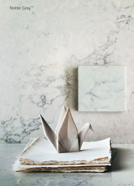
Quartz counter tops,Noble grey caesarstone


Two more nice things are you never ever have to worry about sealing quartz and today it comes in just about any look you could want from solid to a fine granite type pattern to the popular swirling vein marble look. Some well-known brand names of quartz counter tops include Cambria, Caesarstone, Silestone by Cosentino, Pompeii and Zodiaq but there are more.  Cambria is the only one manufactured in North America.  Silestone by Cosentino comes from Spain and Caesarstone from Israel.  Because quartz is non porous it is anti-bacterial by nature. The latest thing in quartz is leather finishes, as opposed to the usual polished look and BIG wild patterning such as in Cambria's Britannica. 

Cambria,Britannica,quatzcountertop


If you want variety (in price, pattern and color), consistency and no maintenance quartz is a perfect fit.


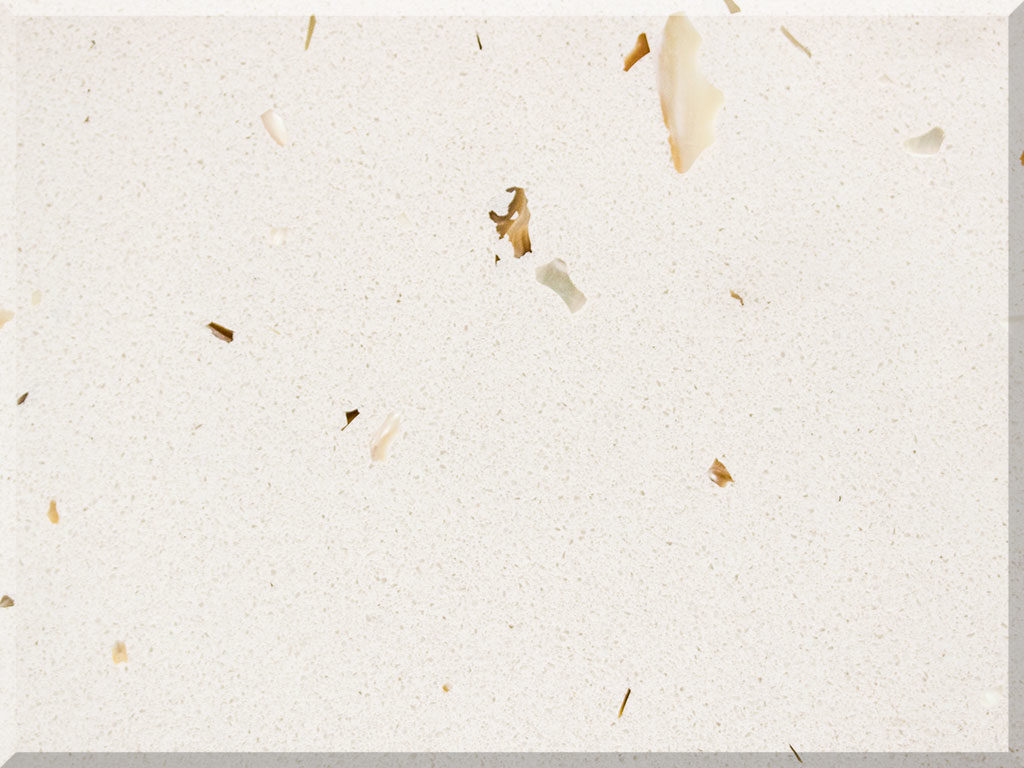
Sunny Pearl quartz countertop by Pompeii


Enough about quartz.  So what the heck is quartZITE?  Quartzite is actually pretty different from quartz.  Where as quartz is a mineral, quartzite is actually sandstone that has been transformed through conditions of heat and pressure in the earth.  It is completely natural, mined from quarries just like granite.  It is also hard and durable and non-porous but not always to the same degree as quartz. Quartzite is a bit more heat resistant since there's no resin. Let's face it, it's breathtakingly beautiful.  Each slab is totally unique featuring beautiful patterns.  It can also be fabricated in a more matte, or leather, finish.  If you like that natural uncontrollable variation this could be for you.


If you love the natural, uncontrollable uniqueness found in nature choose granite or quartzite.  

Bear in mind, because quartzite is a natural material it can also vary in performance.  My best advice if you are considering quartzite is to get a sample and do your own science projects on it.  You know the drill, red wine, mustard, sharp knives, hot pots etc. All this goodness does not come without a price.  Quartzite does need to be sealed about twice a year and speaking of price, most quartzite prices out higher than quartz.


ceberg-Quartzite.-White-Quartzite.-Iceberg-Quartzite-Photos.-Iceberg-Quartzite-Countertop.-Quartzite-Stone-Countertop-IcebergQuartzite-Quartzite-WhiteQuartzite-QuartziteCountertop-Karr-Bick..jpg

One of the hallmarks of quartzite is its translucence, beautiful layers that you can almost see through!  If you are in South Florida and would like to find the perfect counter top for your own kitchen, I look forward to hearing from you. Drop me a line at Gloria@ArtfulKitchens.net


Check out some of the other counter tops I LOVE on Pinterest !


The Best of KBIS 2016

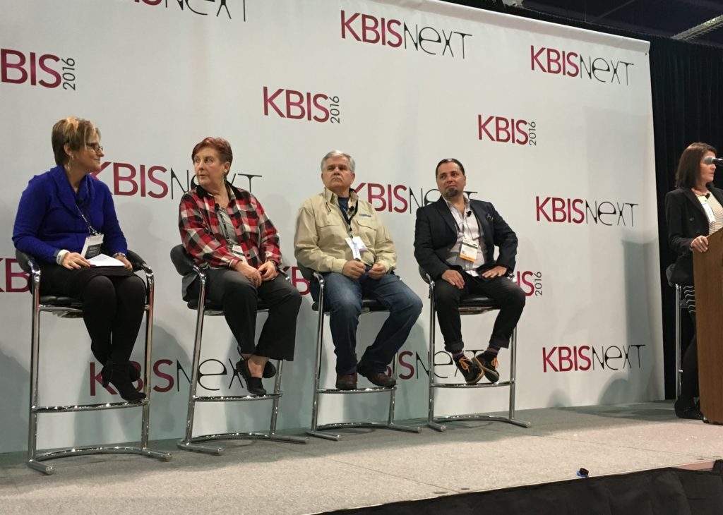
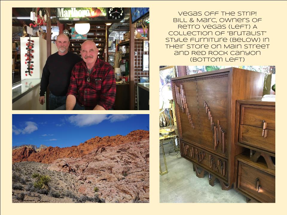
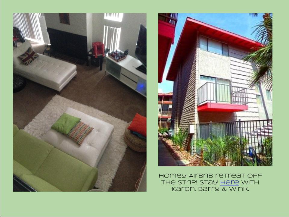
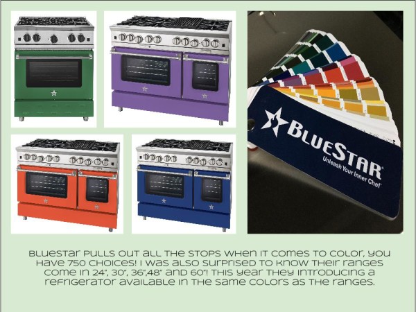
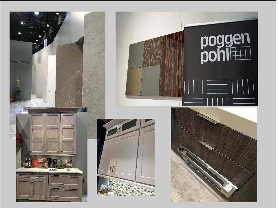
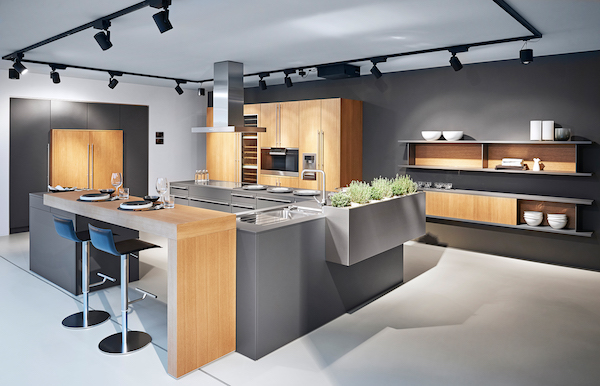
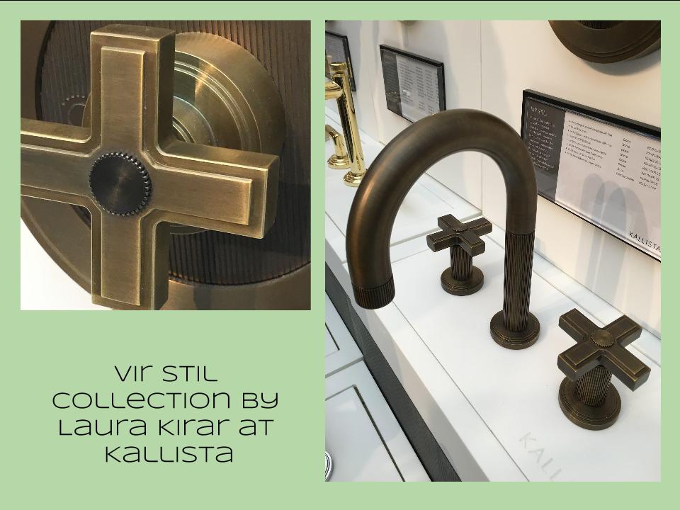
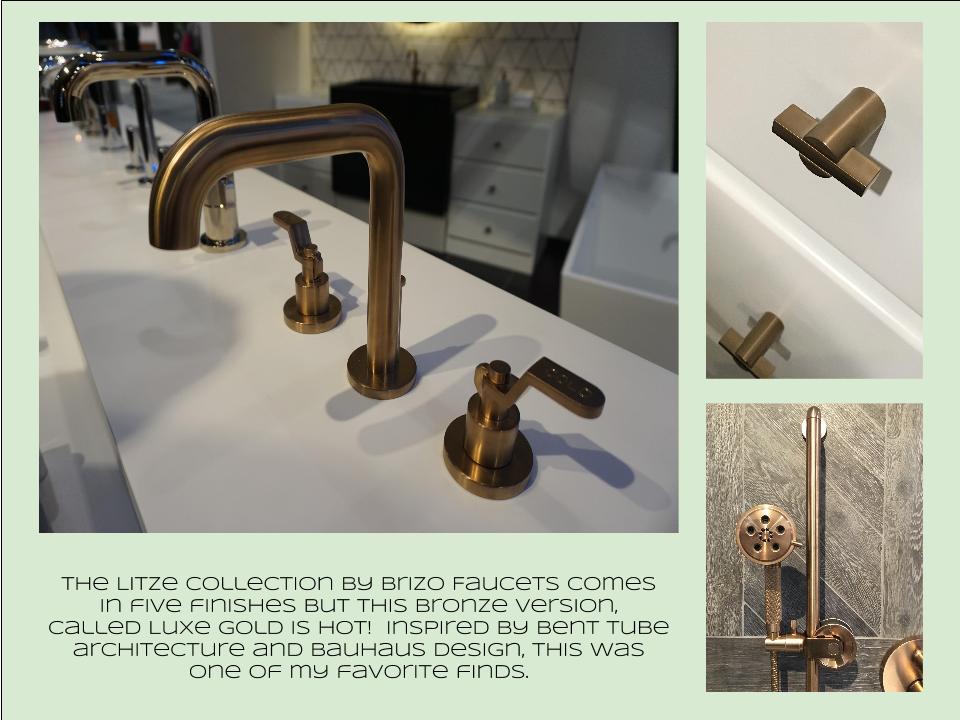
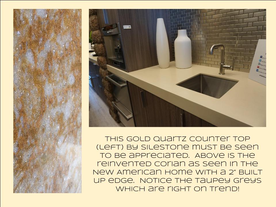
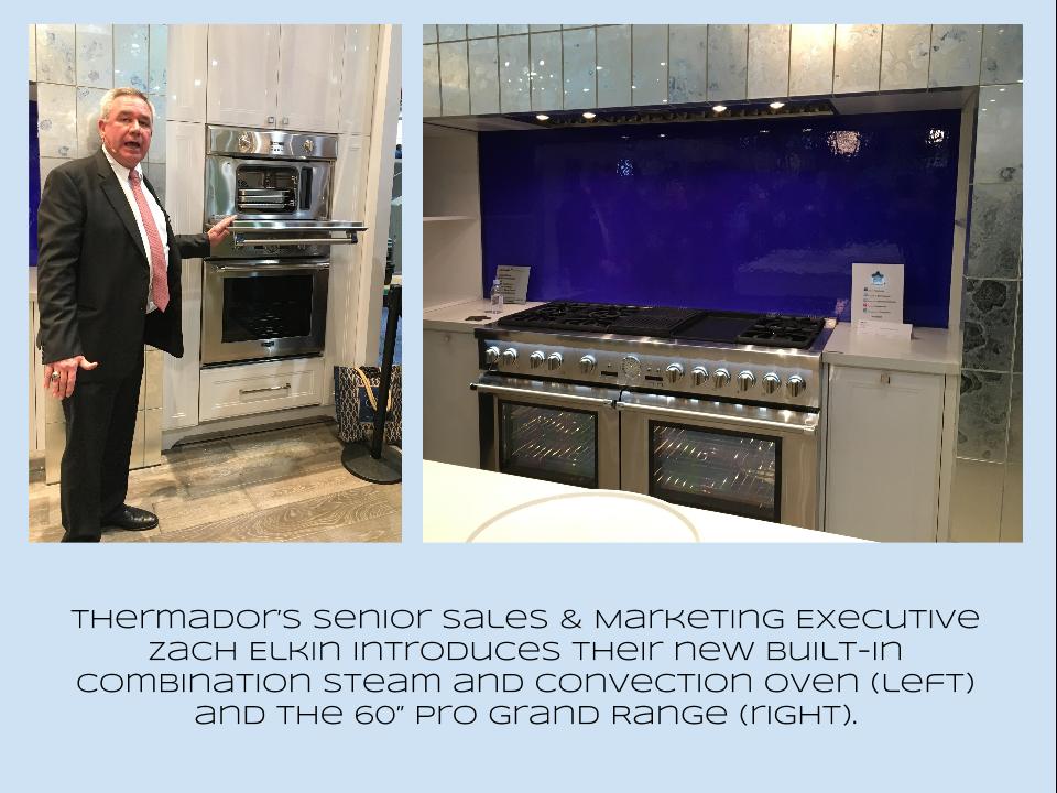
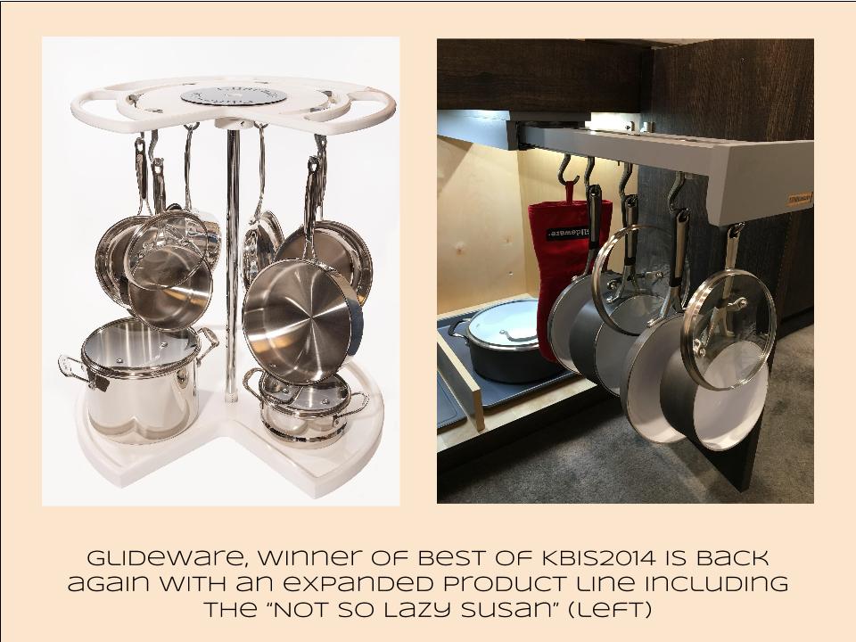
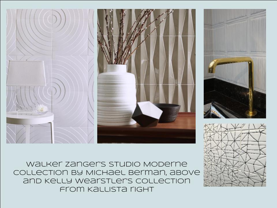
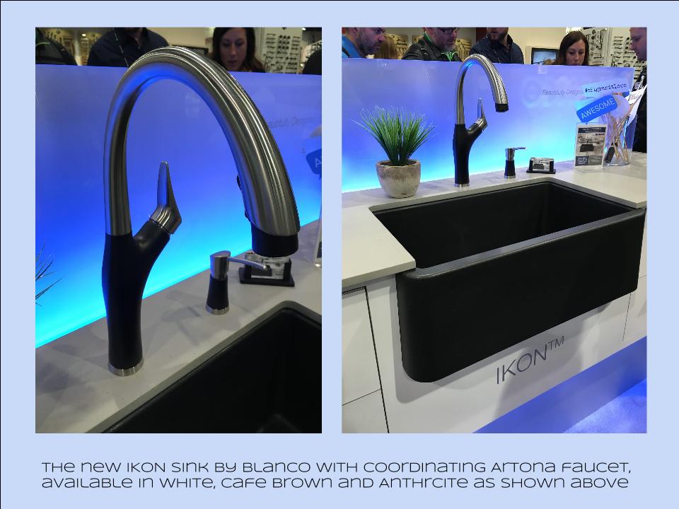
Bam!  Another show is in the books and although it's been a busy week "back at the ranch", I've been dying to share my finds with you right here on Artful Kitchens.2016-01-19_184543141_4F428_iOS (2)Las Vegas was host to three days of networking and education for the best of the Kitchen & Bath industry.  As a member of the Kitchen & Bath Business Magazine's Advisory Board,  I had the pleasure of appearing on the KBIS Next stage as a part of the panel discussion entitled Trials & Tribulations-Solutions to Your Biggest Kitchen & Bath Challenges. It was an exciting exchange of ideas between both the pros on the panel as well as a savvy and engaged audience.Vegas Off the Strip Karen (1)I also had the opportunity to spend some time in the Las Vegas I like best, off the strip! I hiked in the Red Rock Canyon and visited my friends at Retro Vegas on Main Street. My digs for this trip were with my dear pals Karen, Barry & Wink.  They live in a midcentury modern gem that, rumor has it, was briefly home to Lucille Ball!  They are avid Airbnb'ers and wonderful hosts.  Check it out if you find yourself in Vegas. This location is so convenient to the Convention center I could walk, which I did, once.  Mostly I Ubered. Enough walking happens on the show floor!  So without further ado, here's my recap of the biggest and most notable trends and products that caught my eye at KBIS2016. ColorWhite still reigns.  In fact paint giants Benjamin Moore and Sherwin Williams have both selected shades of white as their color of the year.  You know I am a huge white fan. It is always the best backdrop for art and design. It also continues to be the favorite cabinet color in my area.  Remember white is not just white, there are an infinite number of varieties you can have fun with.  If you need more punch in your kitchen you could find some great options at the big show.  I saw bright saturated colors in several appliance brands including Bertonazzi, Viking and BlueStar which offers 750 colors!  color (2)Grey has not left the stage.  The newest versions are warm, venturing into taupe territory. Textured wood grains such as cerused oak are really popular. Wood-Mode showed both traditional and contemporary versions of ribbon Mahogany.Cabinets Poggenpohl_Diamond Grey_Oak Honey BrownThe Perfect TouchTouch latch technology was EVERYWHERE!  If you prefer a sleek, uninterrupted look for your cabinets and appliances this is for you, a gentle nudge will open your cabinets. This is nothing new but it's taken off.  I also loved the button that allows you to close this cabinet when you're done without resorting to dangerous acrobatics (I'm short).Untitled drawing (5)Feeling BrassyActually brass, copper, bronze and myriad versions are hot for plumbing fixtures and hardware.  My favorites were the new BauHaus inspired Litze collection by Brizo Faucets. and Kallista's Vir Stil collection.LitzeNot Your Grandma's CorianIf you're like me Corian has been dead to you since about 1998.  That sentiment has now ended in my book.  I saw a 2"thick sleek contemporary version of Corian that was perfectly at home in The New American Home.  The other exciting thing I saw in counter tops was this quartz by Silestone.  Yes, it's GOLD!  I just wish the photo could capture it's sparkly beauty.CountersThrills from ThermadorAppliance brand Thermador held a press conference on the show floor to introduce a couple of impressive new products, the 60" pro range available with steam and a double oven featuring steam and convection.  These are firsts in the industry.ThermadorOrganize ItJust when I thought we had it all the category of organization it goes to the next level. There was a great representation of brands ranging from Hafele to Rev-A-Shelf to Hardware Resources but Glideware is taking the market by storm.  If you've got a mess lurking somewhere I guarantee there's a way to make it neat and accessibleRev A ShelfGlidewareTile StyleMy two tile favorites were Michael Berman's Collection from Walker Zanger and, of course, Ann Sacks who are featuring a new line by L.A. design maven Kelly Wearstler. Love!Tile (1)I can IKONIf you read my blog you know I love me my Silgranit sinks, meet IKON the apron front version which easily works in any style kitchen from Traditional to Contemporary. Their Artona  faucet perfectly complements the Silgranit sink.-BlancoStikwood Rocks!
Stikwood’s line of lightweight, real-wood planking offers designers and DIYers a peel-and-stick solution to achieve that perfect, sought-after blend of rustic and modern. It can be used on walls and ceilings and comes in tons of colors, even prints! I'm thinking this could be great on the back of a kitchen island.

stikwood

Believe me, all this is just the tip of the proverbial iceberg.  There was so much more to see and learn about at KBIS 2016.  Check out this year's winners of Best of KBIS for more info and of course if you'd like any more info on what you see here email me at artfulkitchensbyglo@gmail.com

Applying the Elements of Design to Your Kitchen

Elements of design are the building blocks of art for good reason. They also happen to work when it comes to planning and laying out your kitchen. Whether you are all about luxury or bound to the basics, awareness of these fundamentals can make all the difference.

Read more

Open Shelves Add Function and Style

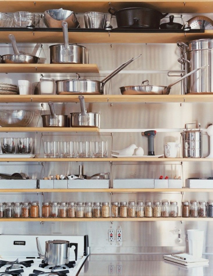
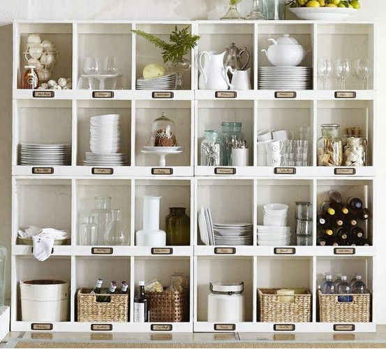
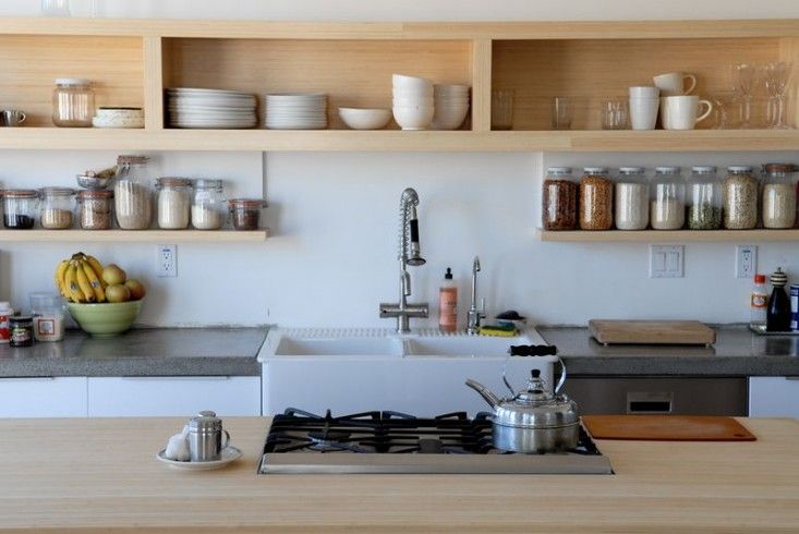
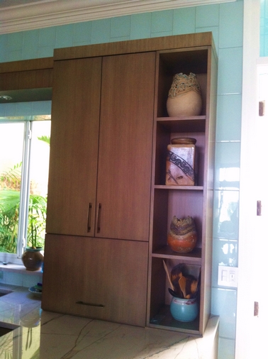
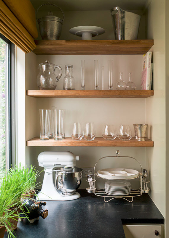
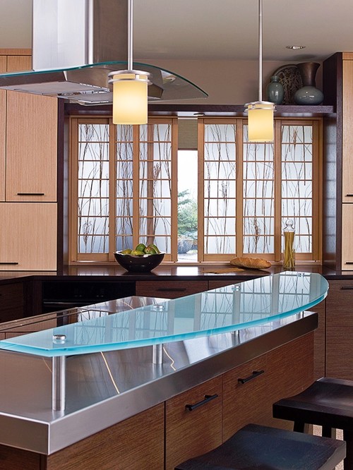
Open shelves, especially floating shelves happen to be all the rage at the moment, should you or shouldn’t you?  I often hear concerns about neatness.  Do we really want to see it all? Maybe we do.  Open shelves can greatly increase efficiency in the kitchen. Having our most used dishes, utensils and ingredients displayed and at our finger tips is very tempting!  This is how the chefs do it and there is even a term for it in French.open shelving in the kitchen Mise en place is a French culinary phrase which means "putting in place", as in set up. It is used in professional kitchens to refer to organizing and arranging the ingredients and items that a cook will require for preparing the menu items of the day. We can also apply this concept in our own kitchens. Here's an interesting story I came across on NPR about Mise en place. Listen and you will discover the perfect French pronunciation!open shelves in kitchenUsually storage space in the kitchen is too dear to squander on an area strictly for show so I urge you to incorporate an open shelf  or open cabinet only if it will be useful as well as visually interesting.  When you get right down to it, kitchens are comprised of boxes and row after row of doors can get pretty boring.  I like to add some variety with open shelves and glass doors.open shelves in kitchenThat said, if you do have a collection that you love to gaze upon and showcase , open shelves are perfect is hard to reach areas such as high up or on the far side of a peninsulaopen shelves in kitchenThis client is a talented potter.  What better way to show off her work?  Easy to get to for dusting when you’re on the other side of the peninsula but this area is not really accessible when you’re on the working side of the kitchen.floating shelves in kitchenhttp://www.shelterness.com/pictures/open-shelves-on-a-kitchen-30.jpeg

Eva Hesse: The Artist and The Kitchen

THE ARTISTThe biggest trend in design today is "personalization", the late painter and sculptor Eva Hesse spoke of personalization before many of us were even born! She was speaking in terms of her art when she said,"It just seems to me that "personal" in art, if really pushed, is the most valued quality & what I want so much to find in & for myself."HESSE_Studio_Kettwig_1Eva Hesse,  succumbed to a brain tumor in 1970 at the age of 34.  Although she only produced art for 10 years, from 1960 to 1970, she is known for her pioneering work in latex, fiberglass and plastic.  She was part of an art movement in the 1960s known as postminimalism. Hesse was among the first artists of the 1960s to experiment with the fluidity of the organic shapes of nature.  She used modern materials to portray organic forms including grid patterns and repetition. These themes were often found in minimalism, but Hesse typically made her works by hand while her contemporaries were using machines. This practice introduced a human element into her art.Sans II 1968 Fibreglass 96.5 x 218. 4 x 15.6 cm 38 x 86 x 6¼"No Title 1970 rope dipped in latex, made shortly before her death Photo courtesy of Whitney MuseumA new documentary about her life was released earlier this year and premiered at The Whitney Museum in New York City back in May.  I can't wait to see it! Below is a clip."Eva Hesse" feature doc Intro from Tracing the Rope on Vimeo.THE KITCHENI wonder what Eva's kitchen would look like.  I could find no photo to give me clues but when I think of Eva I think of organic elements, natural finishes, bold shapes and even a touch of the absurd, which she loved!  Here are some kitchens evocative of Eva.Lumicor showcases organic elements. Kitchen by Finne Architects 

Asian Kitchen- This style frequently features natural elements.  Kitchen by Seattle General Contractors Gaspar's Construction

 Mal Corby contmporary kitchen with organic element I believe this is it, the quintessential Eva kitchen. I think she would be very at home here. Photo courtesy of anangelatmytable.blogspot.comOn my morning walks, whenever I pass this spot I always look up and think of Eva.photo by Artful Kitchens

The Perfectly Practical Microwave Drawer

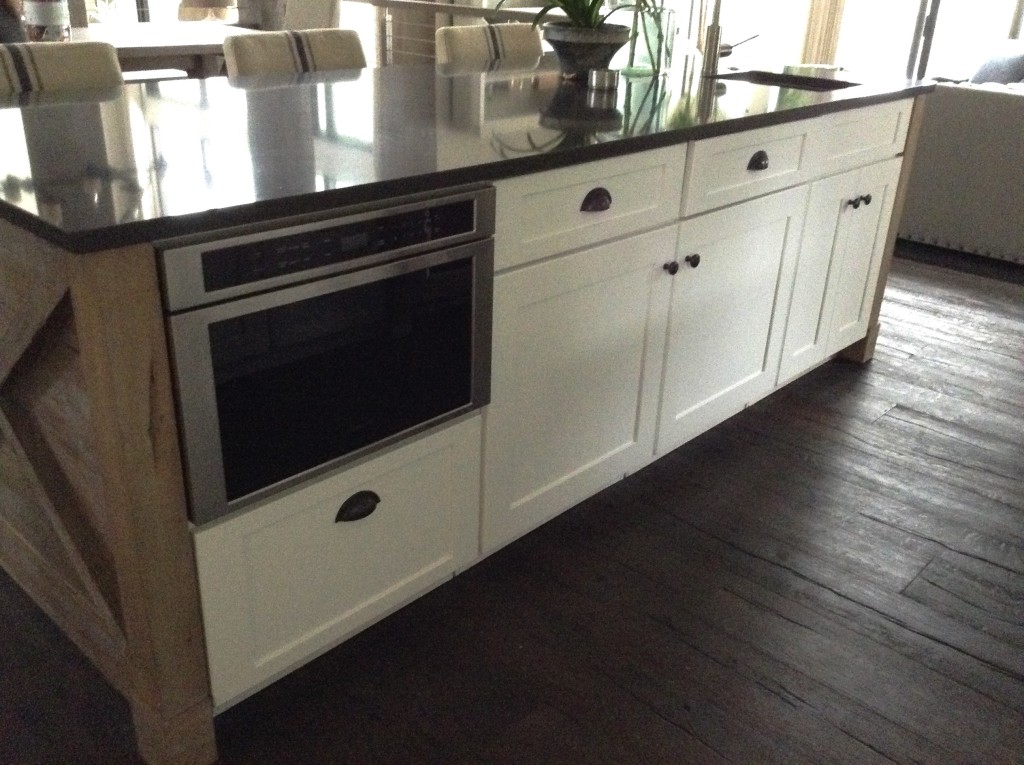
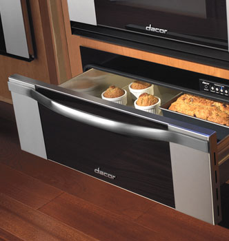
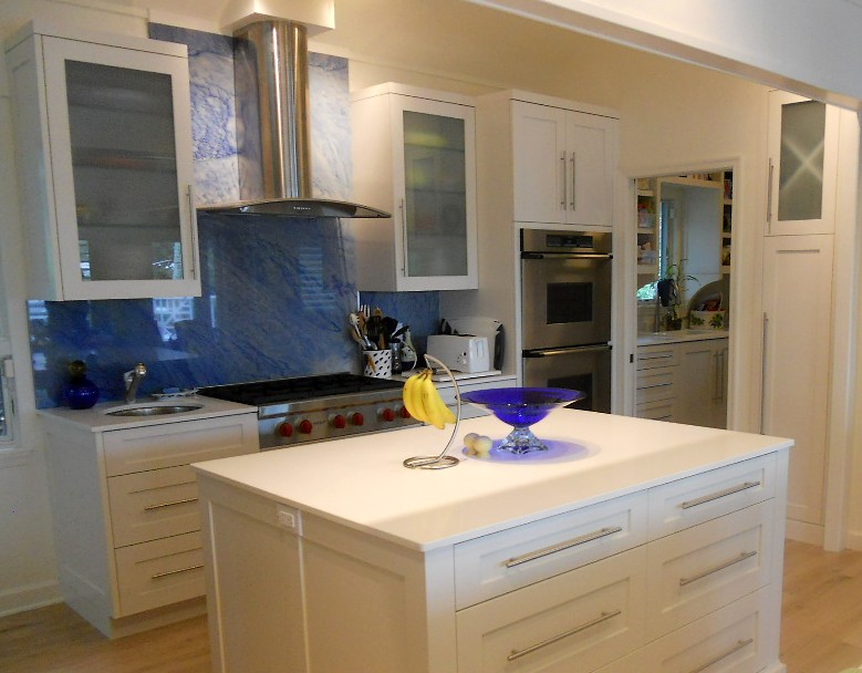
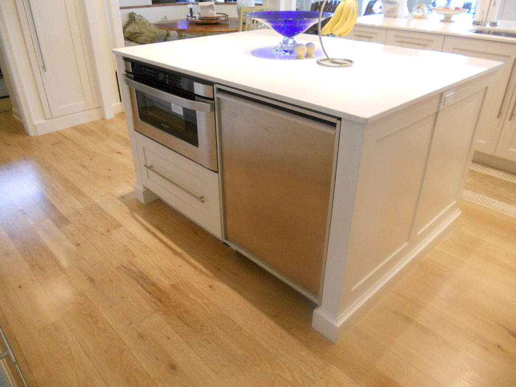
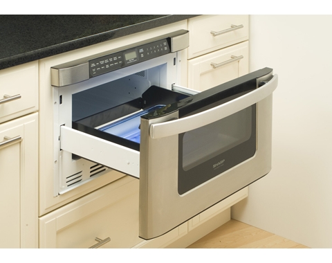
Every designer has a trademark.  One of mine definitely is the microwave drawer.  Why? It's safe, easy to use and very unobtrusive.  Yes, a microwave drawer will cost you a bit more than the over-the-range type but it's oh so worth it!Wolf microwave drawer Brendan Donovan Furniture and Cabinet Co. Artful KitchensA little known fact is that all microwave drawers happen to be made by Sharp.  Don't tell anyone I told you but whether you're springing for Wolf or Dacor they all come from the same place.  The only difference is the exteriors which are made to match the collections by various brands.A sleek exterior by DacorMicrowave drawers come in 24" or 30" wide and are built into a base or tall cabinet.  An island can also be the perfect location.  Typically you end up with a nice big drawer below which is perfect for storing microwavable cookware.The Sharp microwave drawerThe ergonomics of lifting on to the counter top, out of a drawer, as opposed to reaching 4 1/2 feet up over a hot burner to access the contents is so much more safe and efficient.white kitchen,blue granite,hood,artful kitchenI would rather look at this instead of a microwave any day.The backside hides additional refrigeration and the microwave drawer, handy and unobtrusiveThere are so many details involved in designing a new kitchen and bringing it to reality, so when it comes to budget you have to pick your battles.  If space allows, the microwave drawer is a great investment and the safest option for any age.