
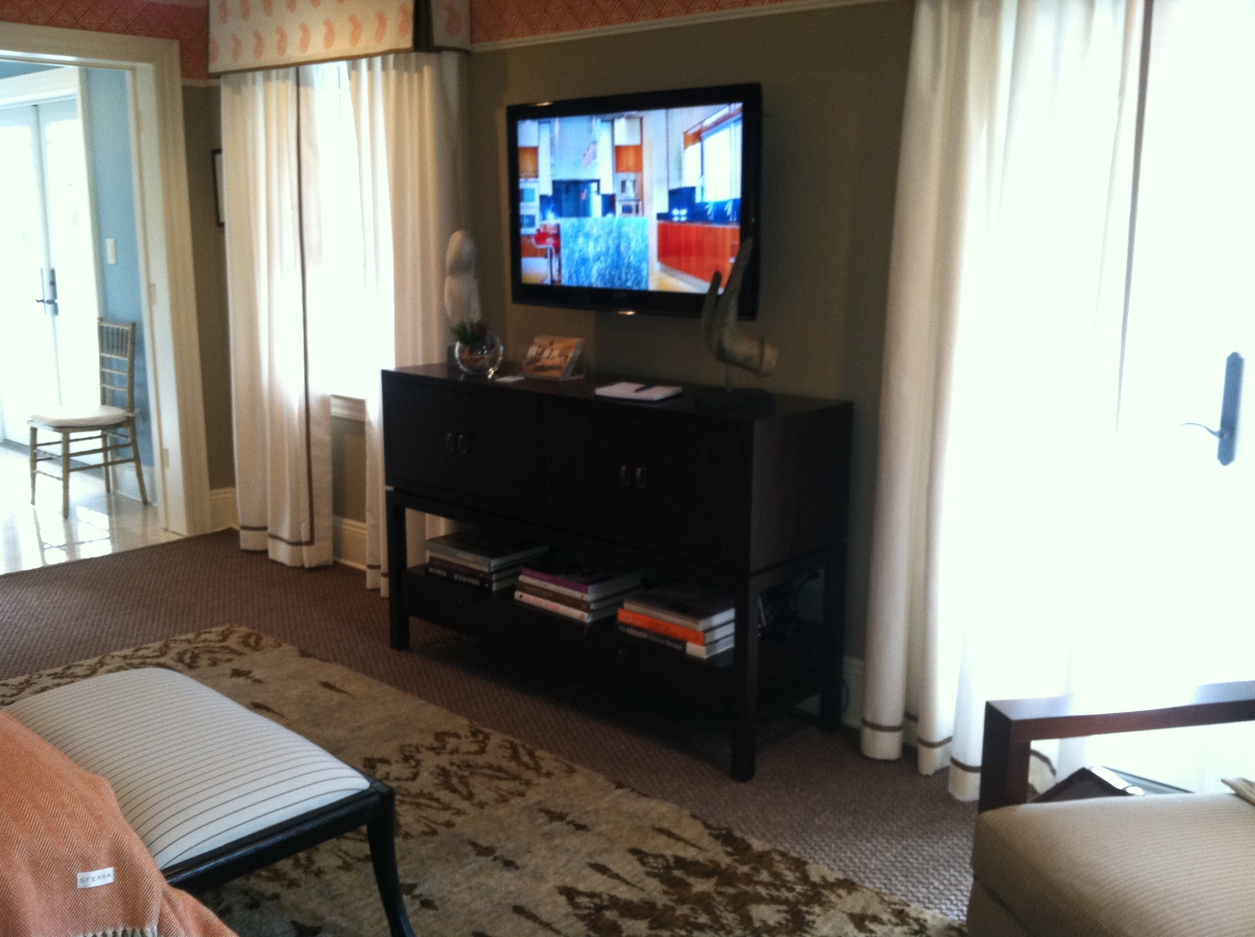
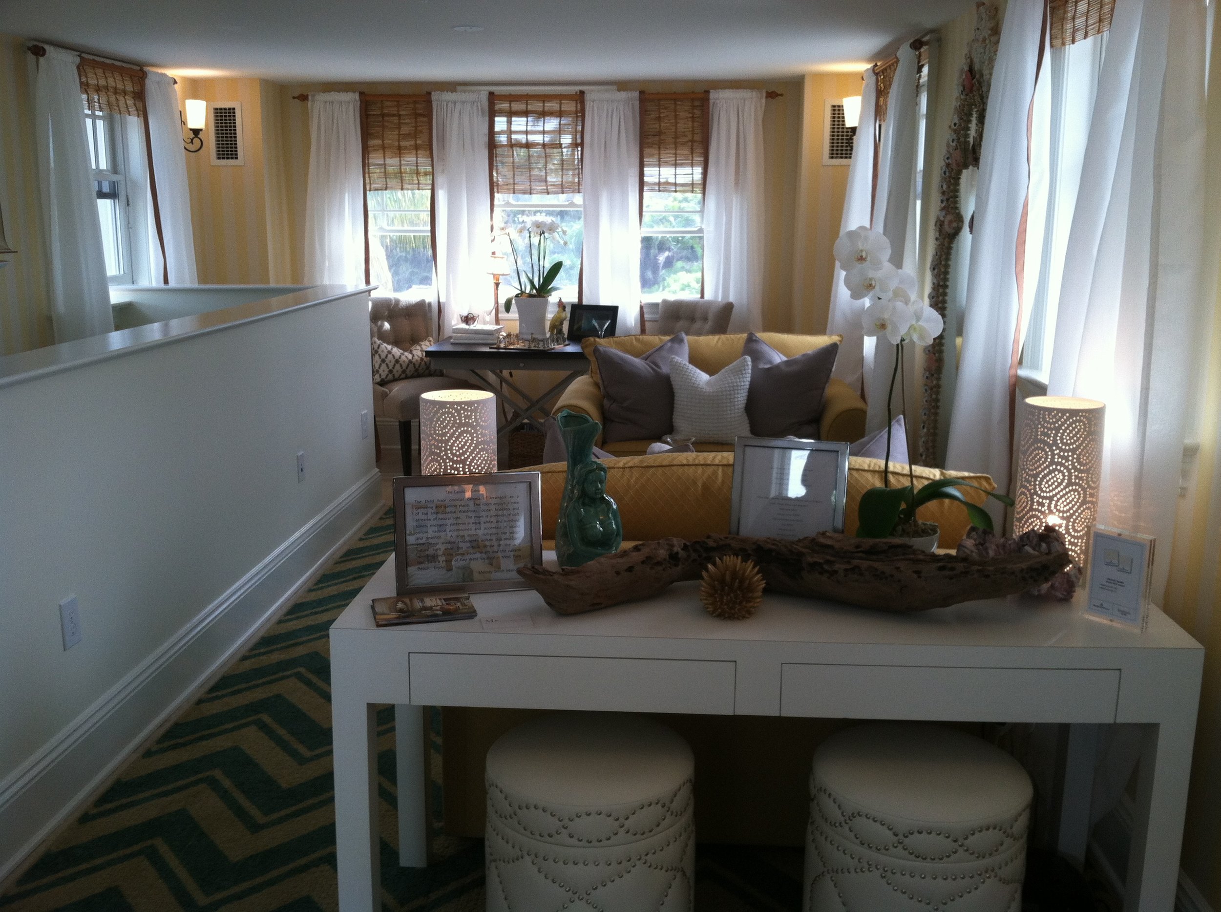
 I hope all you peeps up north survived the blizzard without too much hardship. As a public service to you I thought I'd serve up so toasty tropical visions to thaw you out. Read on! Here in South Florida we’re currently experiencing a phenomenon called “The Season”. November through April can be referred to as the season. Our population swells with snowbirds, the weather is usually beautiful and it’s when all the big events seem to happen. One annual tradition is our very own Red Cross Designer's Show House. Both local and national design talent converge to show us their creative skill. This year’s house is located in the historical West Palm Beach neighborhood known as SoSo (South of Southern Blvd) The theme this year is Tropical Island Living. Each designer, or design firm, is given a room. They can do whatever they want as long as it fits the theme. Brendan Donovan Furniture & Cabinet Co. was asked to build some custom cabinetry for the Master Bedroom Suite by Gary McBournie Inc. We were thrilled with what we were able to contribute and to be a part of this high profile and worthwhile event. I recently had the pleasure of exploring the completed house and I’m so excited to share my favorites! Without further ado, Kitchens for Living does the 2013 American Red Cross Designer’s Show House.
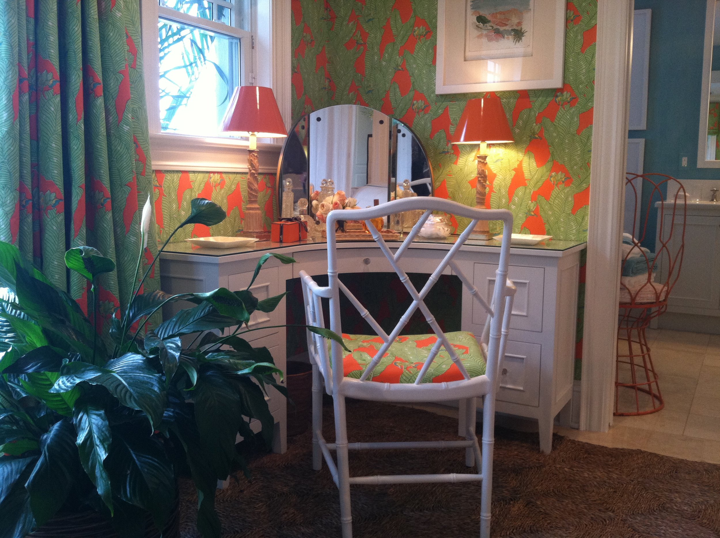


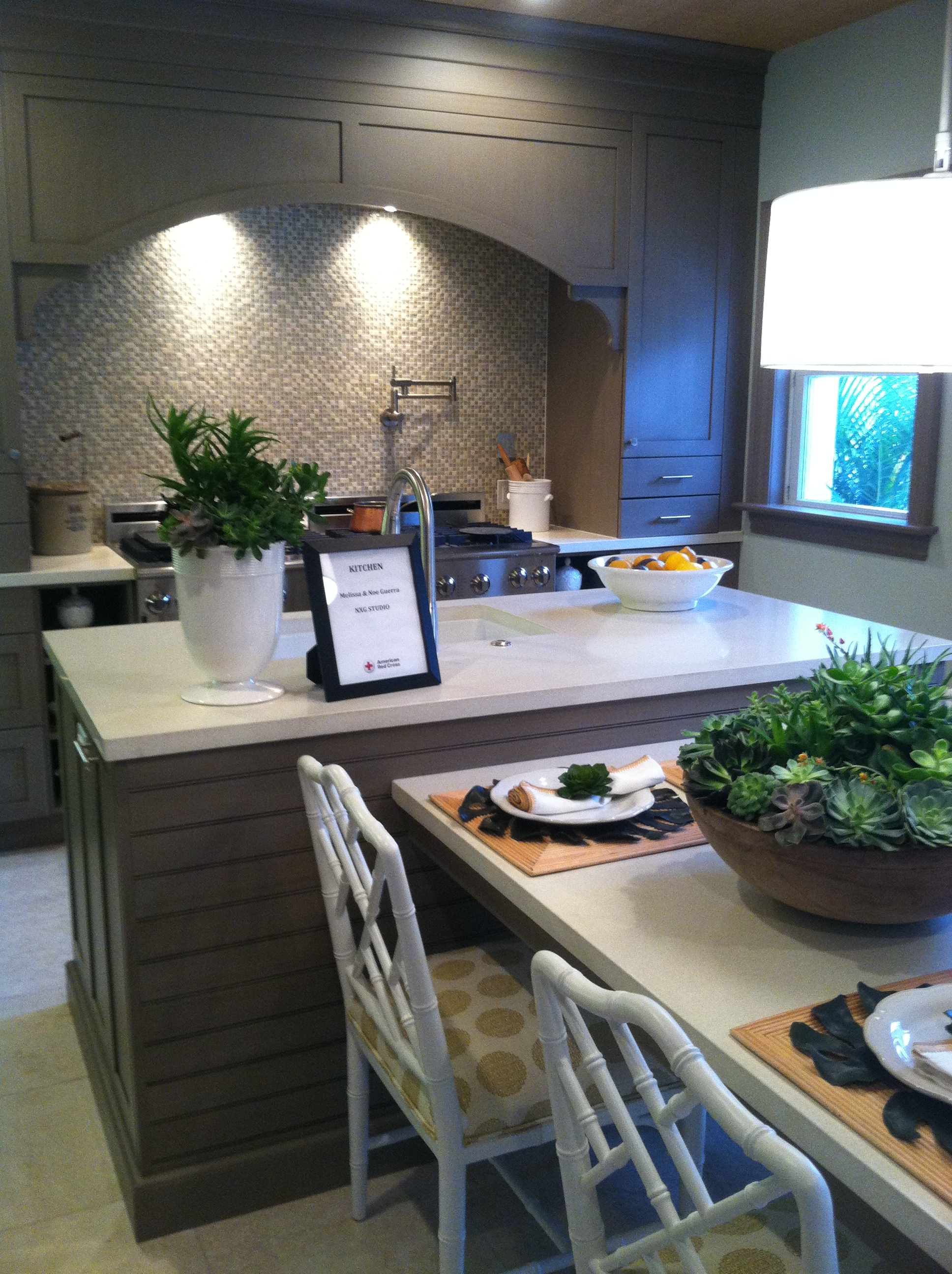


 The Designer Show House is open to the public through Saturday February 23rd, so there's still time to catch it. General admission tickets are $30 (for a good cause) and you can get them on line here.
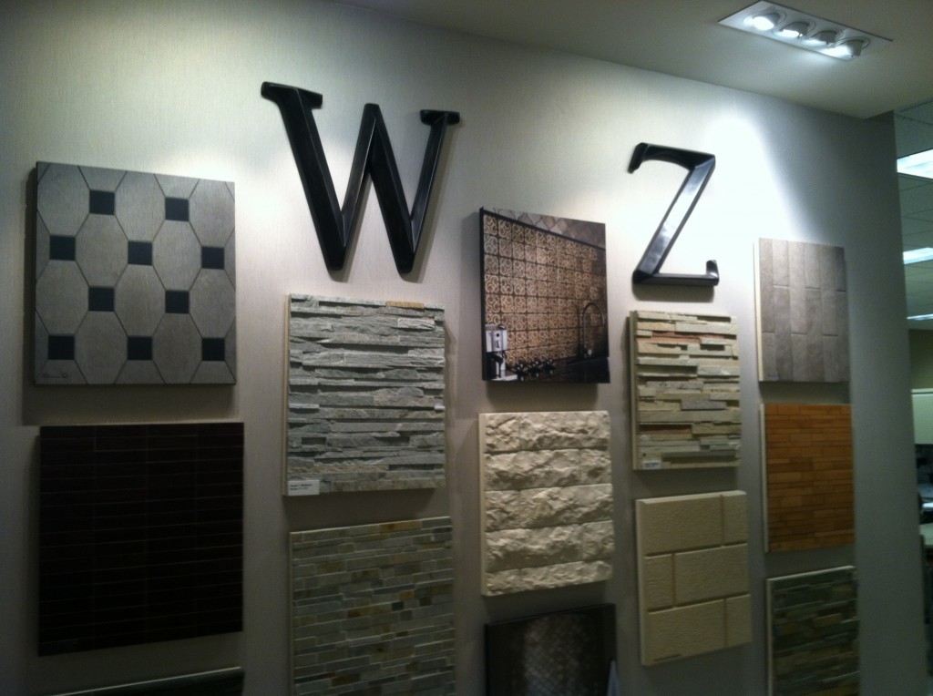
WALKER ZANGER WOWS NKBA MEETING!
 One week ago I had the pleasure of attending the first South Florida Chapter NKBA meeting of 2013. I was fired up by motivational speaker Dawnna St. Louis and her presentation about how to give your clients what they really want. I’m looking forward to more great events this year and to working with the enthusiastic board on the communications committee.
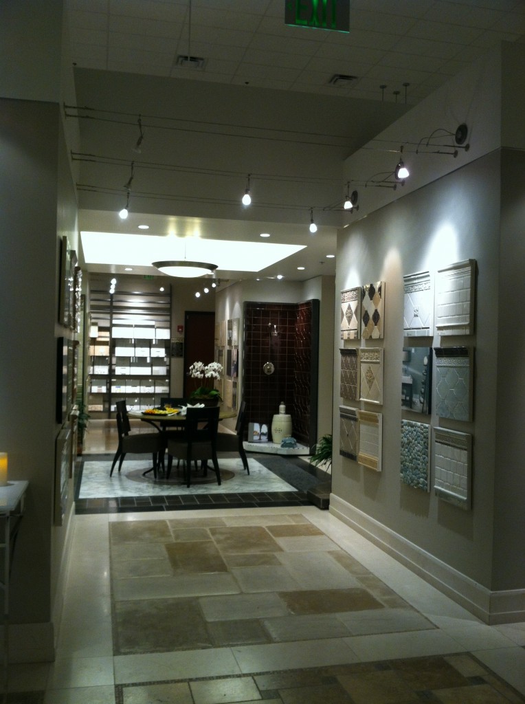
 Not only was it fun to get together once again with all my old kitchen friends but the beautiful venue was an added treat.We met at the amazing Walker Zanger showroom in Coconut Creek Florida. Walker Zanger is filled with designer eye candy! As soon as I walked in I felt an irresistible desire to explore every nook and cranny. Then I decided, if I were to do that, why not nab a tour guide? I found just that in Branch Manager, Drew Rust.
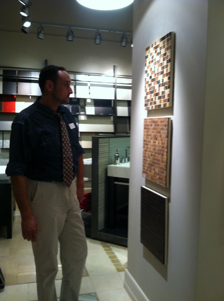 He explained that Walker Zanger has been around about 61 years beginning as a maker of marble tops evolving into a chain (15 ) of designer showrooms offering all types of tile and stone slabs from around the world. Their products can be seen at the Bellagio in Las Vegas as among many other notable locations. The showroom featured beautiful examples of glass, marble and all the usual materials we’re used to seeing tiles made out of. So I asked him, “what’s new”?
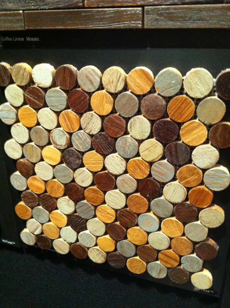
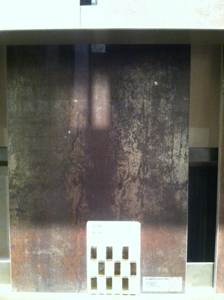
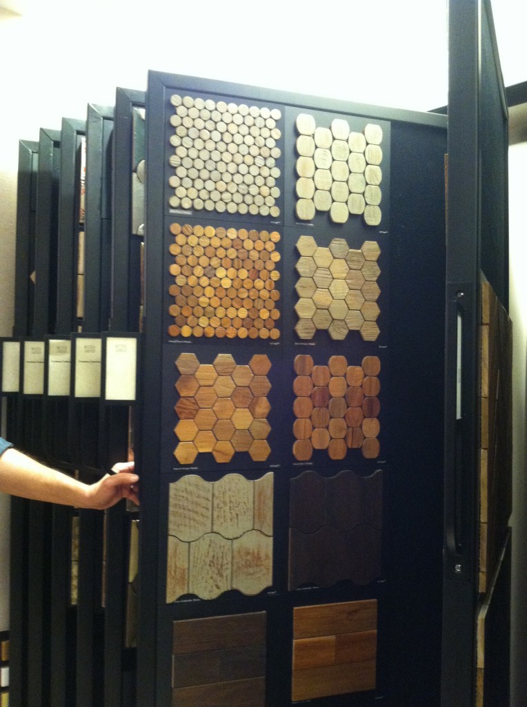 He promptly introduced me to the AnTeak Collection which is, you guessed it, tile made out of teak! It’s new, gorgeous and can be used in both flooring and wall applications. In addition to this they are working on a surface treatment that will allow it to be used on shower walls!
 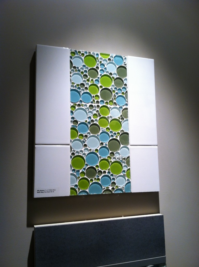 The offerings at WZ are upscale to be sure but the nice thing is that often a little goes a long way. Consider a border or an accent tile and you could get a lot of bang for the buck. Sometimes less is more. Speaking of budgets, WZ does offer some more affordable options as little as 2.50 per square foot.
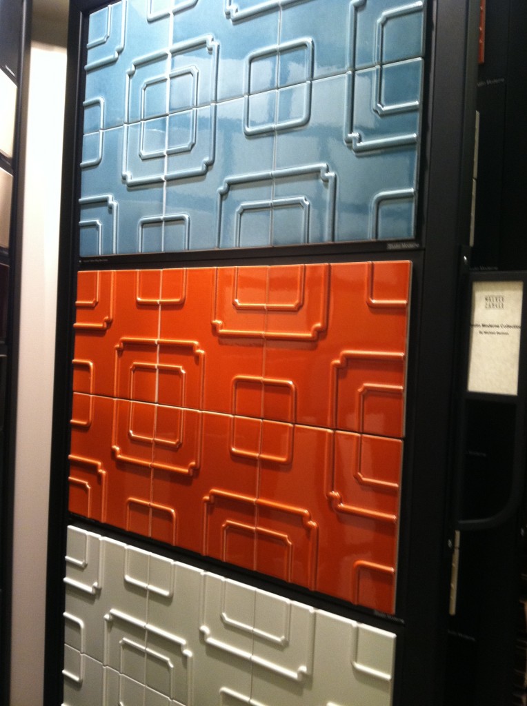
 Hours are Monday-Friday 8:30-4:30. You are welcome to have a look around but bring your designer if you want to seal the deal. I'm sure Showroom Manager Deanna Dolfi would be happy to show you around!
Elements Converge In Dream Kitchen
 Another year is winding down. We have been blessed again with many interesting projects. As we are in “finishing up mode” I thought I’d share with you one of the best of 2011. This project was a true collaboration. Our clients, a couple of sweet snowbirds from Chicago, were very hands on which made it fun to see this kitchen take shape. The existing space was on the small side, the cabinets a little dated.
 Our assignment was to add a whole range of state-of-the-art appliances and a clean unique contemporary feel that would flow into the existing family room. Naturally storage and function were also of the utmost importance but the real challenge was in fitting it all in!!
 They chose a rich coffee bean stain for the cabinets to match existing cabinetry in the family room. The cabinet fronts were not ordinary doors, no way. Together, with our clients, we designed the Soldono and the Soldono Pacifica Doors just for this job. The Soldono custom door features a cherry frame around a horizontal grained oak center panel all stained in a rich espresso color. The center panel is beveled on one end with stainless steel grip strip inset on the frame. No hardware sticking out in this kitchen! A select few of the upper cabinets sport the Soldono Pacifica custom door which received center panels in olive ash burl veneer for a huge shot of “unique”.
  Stainless steel serves as an accent finish and is found in the appliances and in the monster-multi-functional Hafele appliance garage. Refrigerators are Subzero, ovens are by Gaggenau, cooktop is by Miele and the dishwasher drawers are by Fisher Paykel. Thank you to Linda Roberts at House of Appliances for her guidance. Counter tops are Caesarstone quartz by Stone Palace and the backsplash is painted glass by Florida Shower Door & Mirror, Inc. Clearly they do much more that shower doors! Perhaps the "piece de resistance" however is the glass tile behind the hood. It truly looks like water cascading down the wall behind the hood! The sink is a Precision by Blanco and the glass theme is picked up again with the glass table. You can find a listing of all the trades on the Local Resources page here at Kitchens for Living.
")
")


NAUTICAL ZEN KITCHEN

Ta daaaaa! Another beautiful kitchen is complete, and yes it’s white with Shaker doors. Surprise! Not. There were two main challenges about working in this home. First of all the architecture is very unique and is an integral part of the space. It’s comprised of posts and beams, angles and open lofts which remind me of a ship. The second challenge was a lack of unity with way too much going on visually. The existing kitchen had three different types of counter tops, two different types of cabinets and more stuff than space. In addition, hinges and drawer slides were failing and paint was chipping.The homeowners came equipped with the most valuable of traits, an open mind. They were willing to see their kitchen and laundry area in a new way. Every step of the design process we would ask ourselves “does this unify and simplify”? Think “nautical zen”!First off I decided to make peace with the posts and beams. The layout remained the same and we didn’t even change the door style or color! What we did was improve the fit and function. Using all white counters unified the space and allowed the blue granite back splash to be the star of the show. Here are some “before” pix and “after” solutions which will pave the way for smooth sailing in this new kitchen.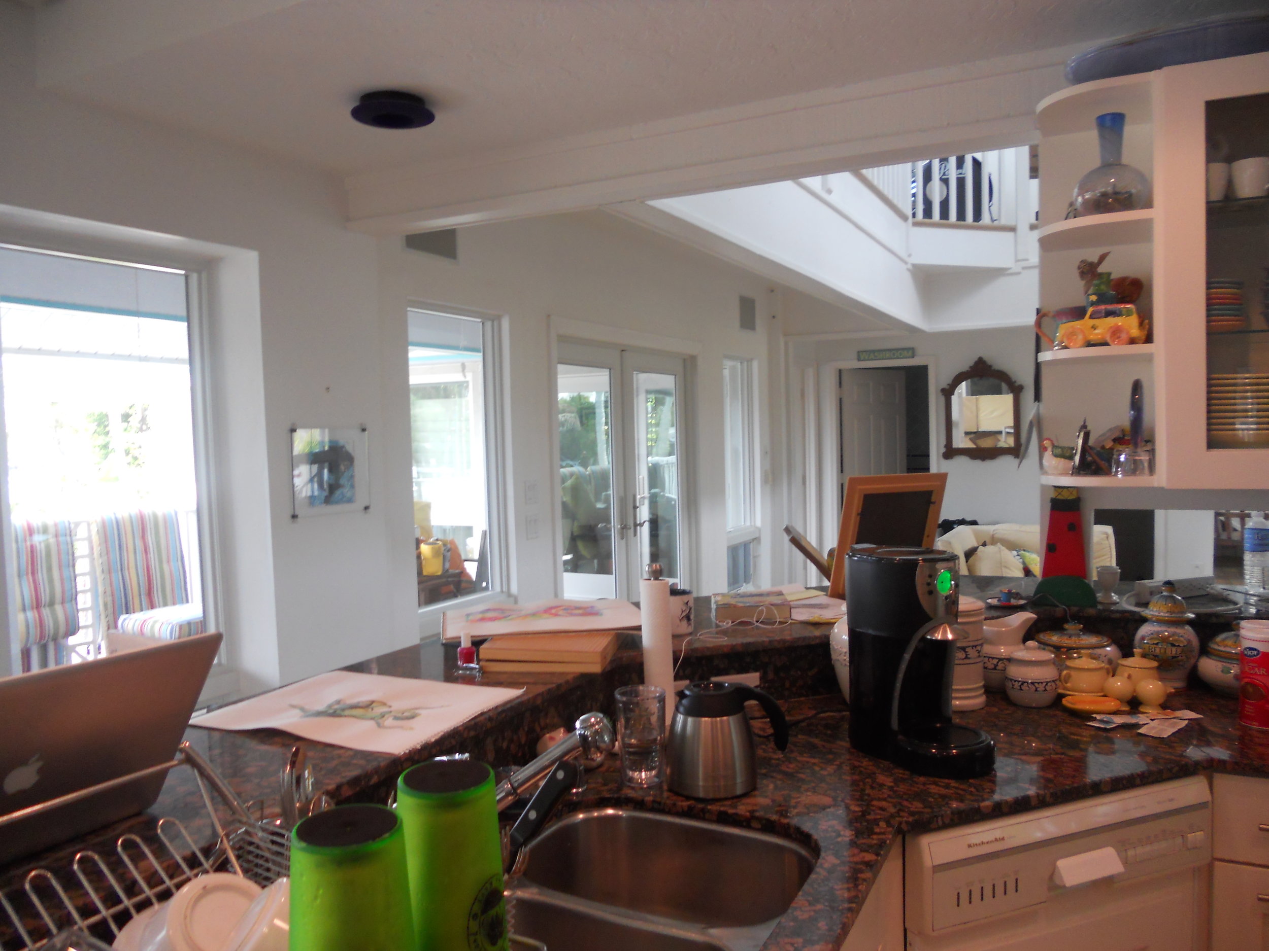


FIVE LOW COST KITCHEN UPGRADES
 You’ve heard of Snakes on a Plane. Well yesterday we had snakes in a Kitchen Design Studio. Ok I exaggerate. It was one snake, a juvenile black snake (according to Trevor’s iphone Googling). I think he slithered in to tell me it’s high time I write a blog post so here I am with a topic that is especially near and dear to our hearts nowadays, saving money.If you don’t have thousands of dollars to invest in a new kitchen, there are some small tricks that can make a big difference. Whether you just seek to make your tired dysfunctional kitchen great looking and user friendly, or you want to up the appeal for a potential buyer, these smaller upgrades fit the bill.Consumer Reports’ latest tests offers the home owner a variety of low investment ideas to freshen up the kitchen. Here's my twist on what they had to say.Paint!“Every artist dips his brush in his own soul, and paints his own nature into his pictures.”- Henry Ward Beecher (Love the quote and was going to find a way to work it in here no matter what) SO, how about painting your nature in your kitchen? Paint is the most inexpesive low-risk investment you can undertake to make a dramatic difference. Most of us can even tackle the walls ourselves. You can be bold as there typically isn't a whole lot of wall exposed in a kitchen (except this one!). Don't forget to consider adjoining rooms and how colors will work together. I prefer a satin or even a semi-gloss finish that is easy to wipe clean in the kitchen. If you’re more ambitious and want to paint your cabinets, do it right. Remove the doors, drawers and hardware, clean all surfaces, sand or de-gloss, use a primer and take your time!
 Make it work! (As Tim would say)You know what I’m talking about. Are you tired of falling spice containers? Do you yearn for a convenient trash receptacle? If you’ve lived in your kitchen for a while you will probably have a few functional pet peeves. Many of them can be addressed without breaking the budget. There are all kinds of ways to store those unruly spices. Check out my previous post Spaces for Spices. If you have a 15” to 21” wide cabinet to spare you can install a pull out trash container. I’d say this is the number one accessory for a kitchen and every kitchen needs one! How about roll out trays? You can also purchase these and install them yourself if you’re handy.
  Counter solutionOne of the most visible elements in your kitchen is the counter top and a new one can make a world of difference. Unless you’re going with a laminate, and there are some really nice selections out there, you’re going to spend more than $1,000. If that’s the case make sure your cabinets are worthy. Check for damage, especially for water damage in and around the sink cabinet. If the integrity of your cabinetry is compromised you certainly don’t want to set a butt load of money on top! Did you know that once granite or quartz are installed no one will guarantee it can be removed without breakage?
  Create a splashThe back splash is another visible element with a lot of impact. Here you can get even more creative than with the counter top because it’s purely decorative! Other than being cleaner- friendly it doesn’t have to do anything but look pretty. Tile, tin panels, or even wine bottle corks can make a unique statement on your back splash.
 Floor itWood flooring is hot at the moment and that’s because it’s a great look and it goes with almost everything but here’s the best kept secret in kitchen flooring. Traffic Master Allure Ultra Resilient Flooring.
 It looks great, it’s pet proof, kid proof and water proof. It’s really easy to install. I know, my hubs installed it for us and it still looks great after five years!No excuses. I find that even the smallest project completed yields such a sense of accomplishment. These are even things you can do to tide you over until you have saved enough for the full Monty! (At which time you will call me) In the meantime, send me pix. I want to see what you can do.
MY DESIGN PROCESS: A CASE STUDY
I write about a lot of varied things on this blog. Today I'm going to open my mind to you so you can step inside the creative (or whatever you want to call what goes on in there) process, as it pertains to cabinet design. The thing about designing kitchens and baths is that it doesn't only require vision in the aesthetic sense but also in the functional sense. We have to be creative in terms of the space constraints while being very aware of function.
 WHAT HAVE WE HERE? This is a nursery equipped to serve the nanny. She's got an under the counter refrigerator to store bottles, baby food and
 wine whatever she wishes for herself. In addition there is a small sink and a microwave. There is also storage and counter top work space (underneath all the debris). That's a lot of function packed into less that six lineal feet! The lucky owners of this oceanfront abode are away for the summer, as is the custom in Palm Beach.MY ASSIGNMENTI have been asked to replace this set up but to keep the same foot print and function. The cabinets are to be more in keeping for this traditionally styled beach house.MY OBSERVATIONSThe backsplash (area between counter and upper cabinets) is really high, about 22". Not only does this mean less cabinet space but it's a bit of a stretch unless you're a very tall nanny. In addition, there is nothing tying the upper cabinets to the lower cabinets and since they do not go wall to wall it looks as if the uppers are just hanging out, hovering over the base cabinets, not a great look. In general the layout is off kilter. The microwave requires a deeper cabinet and it sticks out unattractively on the left.WHERE DO I START?The appliances are old and will appear even older surrounded by new cabinets. Remember that if you are investing in a new kitchen it's penny wise and pound foolish to try to build your new cabinets around your older appliances. I will suggest that we replace the microwave with a small built-in model in stainless steel. For this I know I must use a minimum of 24" out of the 70" I have available. The refrigerator is important too. This one is old and it's an odd size, about 19". The new one will have to be 24" and I will reccommend that we build it in for a more custom look and to unify the small space. These types of built-in panel- accepting- under- the- counter refrigerators are either 15" wide or 24" wide. I certainly can't detract from the function by going smaller so I will give them more refrigerator space by going with 24" wide. Now that I know what I'm doing with the appliances I will work the cabinet layout around that. Here's phase one showing the larger ref, a built-in micro and an attempt to even things up and connect the uppers to the bases but it's still not quite there yet. I usually draw a free-hand sketch to work out my initial thoughts. The final solution (I drew it using Chief Architect) is to use 42" upper side cabinets instead of the existing 30" uppers. Then since the microwave needs a deeper cabinet (15"), I moved it to the middle and raised it up to create some design interest and to take advantage of the tall ceiling. I made the side backsplashes 16" high with the center at 19". I centered the 24" upper microwave over a 21" wide sink cabinet which allows the bigger refrigerator on the right and does not lessen the size of the existing drawers on the left. I'll need a minimum of 3/4" panel to the right of the ref. That makes a total of 24 3/4" with ref and panel. I will duplicate that on the left making the 4 drawer cabinet 24 3/4" wide as well. This allows the upper side cabinets to be equal at 23 1/4" each. Last but not least, I am going to suggest using matching wood beadboard above the 4" backsplash to tie the uppers to the lowers and add a small crown moulding on the top to finish it off.

 PRODUCTSHere are the goods and why I picked them:Kholer faucet K7342 in brushed nickel finish- It's a traditional faucet in a finish that will blend with the stainless steel of the microwave. The height makes it user friendly yet it will fit perfectly in the space.

Kohler undermount entertainment sink K5848- I love the shape of this sink. I double checked the size and it fits in our 21" wide cabinet. It's a more updated undermount model but it's still cast iron. I'm specifying Biscuit to go with the cabinets but I will also suggest a stainless option which would also work.

SHARP R1214OVER THE COUNTER MICROWAVE- This model fits into our 24" wide space. It requires a 15" deep cabinet, check. It has a light below and I happen to know that Sharp makes a kick-ass microwave. CABINETS BY HOLIDAY KITCHENS- flat panel with applied moulding. Finish, selected by designer, to be Snowdrift paint with Mink Wash. I chose Holiday cabinets because we have some custom size requirements and I can order Holiday in fractional increments. They also offer a wide array of finishes and door styles which is important in a higher end application.
 U-Line Under the counter refrigerator - This model offers an overlay trim kit option which will allow us to apply a door panel to match the cabinets.What do you think? You see there's no mystery behind the magic of design. Those are the steps in a nutshell. I would love to walk you through the steps of your own potential magic. It's really a lot of fun when it all comes together, kind of like solving a puzzle AND you get to continue to enjoy it everyday!