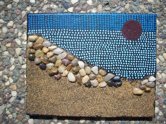
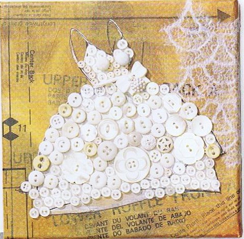
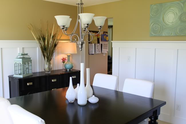
 Today's Let's Blog Off topic queries the source of our ideas. Where does creativity reside? Is it within or is it outside and all around awaiting discovery? For me the answer is both. Yes, it's all around us, for sure, but it also requires the eye of the beholder to breathe life into it. Here is a recent example in my life of something I saw which inspired a blog post.You may have the panache to pull off a monochrome white room that invites and stimulates the senses but for most of us going all the way with white runs the risk of BORING. Since white is so "white hot" at the moment, especially in the kitchen, I’m going to share with you the secret of how to make white pop.One thing to remember is white is a team player, it’s all about the colors around it. As you know, I love art (a big source of inspiration). I recently came across this image in Cloth Paper Scissors Magazine which is a perfect example of how white can glow when surrounded by the right color. I see it work time and again. White cabinets plus color equals stunning. If your taste runs more to the conservative think camels, taupes or warm beige walls to create the contrast.
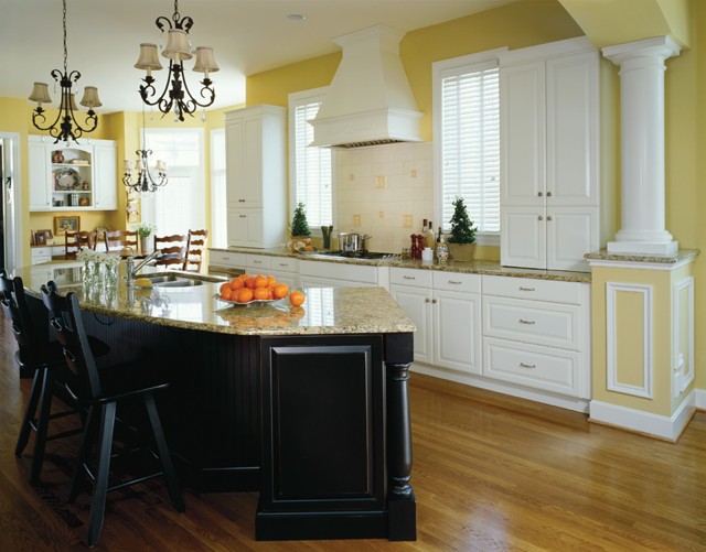 If you’re more daring go for Apple Martini Green or Sky Blue. The nice thing is if you want to go for the gusto paint is a safe bet. It’s one thing you can change fairly easily and reasonably.
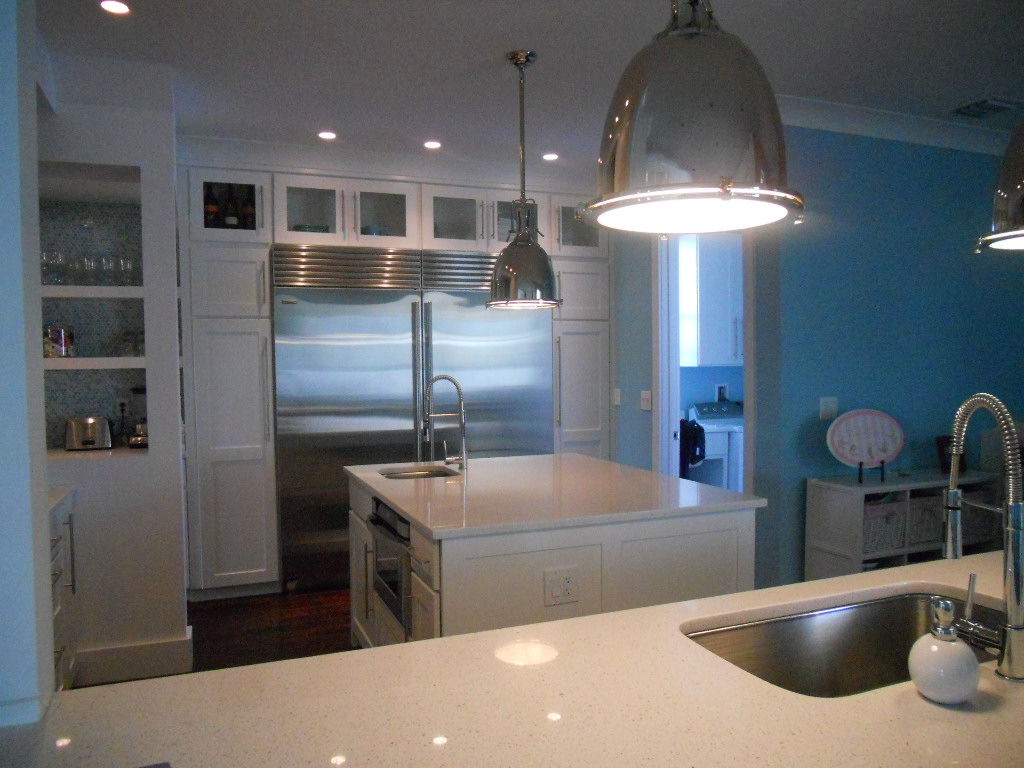 Another thing to remember about white is that it’s just not white. There are probably hundreds of whites and they all read differently depending on your lighting and location. The lesson here is to test your whites on site. Consider the color for a full 24 hours so you can see how it looks as lighting changes throughout the day.
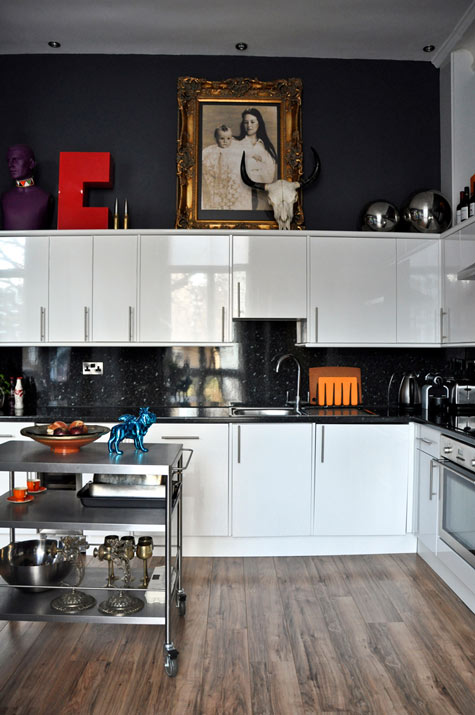 Many times wherever you find white you will also find black. You can tastefully mix black and white cabinets or if you have guts and great lighting the walls could be black, as in this example. This photo also serves as a great inspiration for many of the newer homes we have in my area with cathedral ceilings but short stumpy cabinets (thank you Mr. Builder). If you can't afford to change the cabinets take advantage of the great space above for art. Here, it carries the eye upwards taking attention away from shorty cabinets.
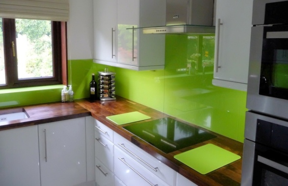 This stunning Apple Green back splash looks like glass but it's actually a colored plastic by Opticolor! So there you have it, inspiration of the day all inspired by a whimsical little piece of art!
G.E. HELPS YOU FIND YOUR DREAM KITCHEN
As a kitchen designer and writer, my inbox is always filled with news of all the latest products, websites and all manner of things to do with our favorite room, the kitchen. G.E. has always been known as the bread- and- butter of the appliance world. Not only have they been around forever but they have evolved with the times. Today they still offer the basic affordable options as well as higher end appliance packages under the names G.E. Profile, Monogram and the new Cafe' Series. These offer a wider variety of functions and integrated modern styling.
Another thing that really makes them a 21st century contender is their state of the art website. There is a wealth of information here whether you aim to use their products or not. Of course they hope you'll be seduced once you have entered their "web", so to speak.
One of my favorite features on the site is the kitchen design function. Simply choose a kitchen which is similar to your own space. Then simply click on the various color choices. It's a lot of fun and a great way to start to narrow your choices and make the big decisions like dark vs. white cabinets, black vs. stainless appliances. You get the picture (literally). You'll also find lighting ideas, safety tips and even recipes. Oh, and the "must have' G.E. product in my book is the Advantium Microwave Oven. My clients love it. You can use it as a regular oven or as a microwave, so it's like two ovens in one!
FLORIDA KITCHEN CHARM
Thank you for the out pouring of love and concern for our family. No matter what happens the sun always rises again and we begin another day.
As you guys up in the northern regions are beginning to crank up the heat, I thought I'd share a little warmth from down here in sunny Florida. If you love warm tropical beaches, even when there's snow (instead of sand) on the ground, here's how you can bring this ambiance to your "anywhere" kitchen.
Blue & White will give you an instant feel of sun and surf. White cabinets are hot! Blue calls to mind the ocean and may be added to your backsplash, walls or even used as accent color for an island or hutch cabinet.
A sea view is a must and you can have one even if you don't live by the sea. Think art! That way you can choose the sea view of your choice. It can be a painting, a photograph or even something more abstract like a mixed media work of art.
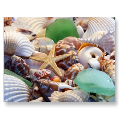
Gifts from the Sea are fun ways to add a beachy feel. Shells, starfish or even bits of beach glass are great accents. Try using a shiny glass tile backsplash for a watery feel or tiles with more of a honed finish look like glass that has been eroded by the sand over time.
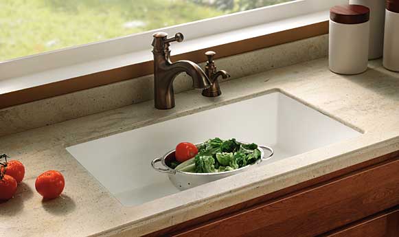
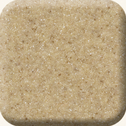
- Burled Beach Corian countertop by Dupont
Throw some sand into the mix with solid surface counter tops in colors like Dijon from the Elements collection by Denova or Burled Beach by Dupont's Corian.
The nice thing is you can add a little or you can pull out all the stops. If you have "Floridified" your kitchen sent me pix. I would love to show and tell. Oh, and by the way, it's nice to be back!
5 WAYS TO CREATE A SEXY KITCHEN
1) Roll outs Want easier access? Install shelves that roll out. These are great in the lower cabinets as well as in your pantry.
4) Dimmable light fixtures above your cabinets can create a subtle glow. Add them under your upper cabinets and they double as task lighting when turned up.
5) Art is One of my favorite additions to any kitchen. It's a great way to personalize your kitchen and create visual interest. (See my 3/18 post).
What are you passionate about in your kitchen? Dying to know and hoping you'll share.


