ART LIVES WITH DESIGN AT IDS 11

Check it out!  You will notice a new addition to my side bar.  That's right.  The folks over at Kitchen Improved (thank you)  decided I deserved a Best of the Web Award!


We came close in the last post about ROLLOUT Custom Wallpaper but you didn't think  I would finish my commentary on IDS 11 with out talking about ART, did you?  Well the decidedly nice thing about this design show was the mix and variety of products both utilitarian and beautiful.  Gorgeous paintings mingled with state of the art kitchens and avant garde fireplaces.

Can art and home decor live together without succumbing to the need to match the painting to the sofa?  I really hope so and I believe if you embrace the art you love and show it proudly, no matter what, the answer is YES! Art is also one of the best, and easiest, ways to personalize your kitchen.  If you have an open wall take advantage and hang some art.  Just remember to keep away from the grease, flames and wet areas. (Believe me, I have to say that. You know who you are.)

One exhibitor that I fell in love with at the show was  OPEN STUDIO.


Open Studio, located in the heart of downtown Toronto, is Canada’s leading artist-run
printmaking centre featuring works by over 150 artists.   It is a non-profit, charitable organization dedicated to producing, promoting and preserving contemporary original fine art prints.  The center rents studio space and equipment to printmaking artists as well as offering guided tours of the facility.   Original works produced and sold at Open Studio include etchings, lithographs, relief prints, screenprints and monoprints—and styles; from landscapes to abstracts.


Sales of these playing cards featuring the work of Open Studio artists are  for sale ($20 or 2 for $35)
Proceeds go towards supporting the studio.

Open Studio was just one of many galleries and artists exhibiting at the show.  Here are some of my other favorite bits of eye candy.


Oneo Gallery


Galerie D'Este


Mark Jeremy Gleberzon


Less than one week to go!

Don’t forget to enter your chance to win a free Orgaline drawer organizer by leaving a comment on any post between now and February 15th! Click here to read January 14th post for details


DESIGN YOUR OWN WALLPAPER


ROLLOUT, the wallpaper!

As you may have heard, wallpaper is in vogue once again.  I confess I am not naturally "wallpaper inclined" but what I saw recently in the intriguing Studio North & Prototype section at IDS11 in Toronto made me think again.   After all, I am slavishly devoted to art and what better way to " art"  than by utilizing the biggest canvas of all, your wall!
The innovative custom wallpaper manufacturer,  ROLLOUT , featured eight designs, including new work by founder/designers Anita Modha and Jonathan Nodrick.


Not only was I impressed by their edgy designs but, get this, you can design your own wallpaper.    It's pricey but that's so you keep  your taste in check.  Keep it to a focal wall such as in a powder room or dining room and you won't break the bank or run the risk of  "too much of a good thing".  This digitally printed eco-conscious wallpaper runs about $10 a square foot.  Get your own art printed for about $8 per square foot plus set up charges.    These premium, latex-based inkjet wallcoverings come in 36’’ wide rolls.  Custom design projects are quoted upon request.

ROLLOUT was recently featured on Canadian lifestyle and design talk show Steven & Chris.  Click here to see the show.  The ROLLOUT section is at 12:30.

In addition to their presence at IDS 11, ROLLOUT was also asked to re-design a Vitra Panton chair that was auctioned off with the proceeds going to Casey House, the first free-standing HIV/AIDs hospice in Canada which offers support and care to those that are affected in their communities.  20 one-off chairs by some of Canada's leading designers and architects were auctioned off during the opening night of the event.


IDS11 is Canada's largest contemporary design fair that has served to inform and support the growing Canadian design industry for the past fourteen years.  Thank you to Blanco for sending me to IDS 11!

ONE WEEK TO GO BEFORE THE DRAWING

Don’t forget to enter your chance to win a free Orgaline drawer organizer by leaving a comment on any post between now and February 15th! Click here to read January 14th post for details

G.E. HELPS YOU FIND YOUR DREAM KITCHEN

As a kitchen designer and writer,  my inbox is always filled with news of all the latest products, websites and all manner of things to do with our favorite room, the kitchen.  G.E. has always been known as the bread- and- butter of the appliance world.  Not only have they been around forever but they have evolved with the times.  Today they still offer the basic affordable options as well as higher end appliance packages under the names G.E. Profile,  Monogram and the new Cafe' Series. These offer a wider variety of functions and integrated modern styling.

Another thing that really makes them a 21st century contender is their state of the art website.  There is a wealth of information here whether you aim to use their products or not.  Of course they hope you'll be seduced once you have entered their "web", so to speak.

One of my favorite features on the site is the kitchen design function.  Simply choose a kitchen which is similar to your own space.  Then simply click on the various color choices.  It's a lot of fun and a great way to start to narrow your choices and make the big decisions like dark vs. white cabinets, black vs. stainless appliances.  You get the picture (literally).  You'll also find lighting ideas, safety tips and even recipes.  Oh, and the "must have' G.E. product in my book is the Advantium Microwave Oven. My clients love it.  You can use it as a regular oven or as a microwave, so it's like two ovens in one!

FLORIDA KITCHEN CHARM

Thank you  for the out pouring of love and concern for our family.  No matter what happens the sun always rises again and we begin another day.


As you guys up in the northern regions are beginning to crank up the heat,  I thought I'd share a little warmth from down here in sunny Florida.  If you love warm tropical beaches, even when there's snow (instead of sand) on the ground, here's how you can bring this ambiance to your "anywhere" kitchen.

Blue & White will give you an instant feel of sun and surf.  White cabinets are hot!  Blue calls  to mind the ocean and may be added to your backsplash, walls or even used as  accent color for an island or hutch cabinet.


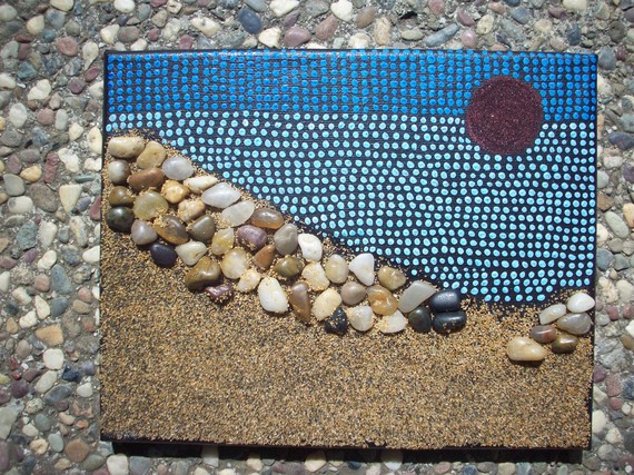
A sea view is a must and you can have one even if you don't live by the sea.  Think art!  That way you can choose the sea view of your choice.  It can be a painting, a photograph or even something more abstract like a mixed media work of art.

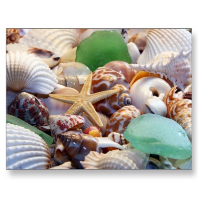
Gifts from the Sea are fun ways to add a beachy feel.  Shells, starfish or even bits of beach glass are great accents.  Try using a shiny glass tile backsplash for a watery feel or tiles with more of a honed finish look like glass that has been eroded by the sand over time.

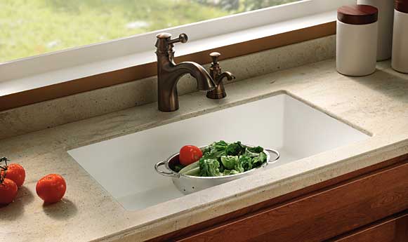
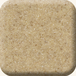
Burled Beach Corian countertop by Dupont

Throw some sand into the mix with solid surface counter tops in colors like Dijon from the Elements collection by Denova or Burled Beach by Dupont's Corian.

The nice thing is you can add a little or you can pull out all the stops.  If you have "Floridified" your kitchen sent me pix.  I would love to show and tell.  Oh, and by the way, it's nice to be back!


TILE STYLE

Today I thought I'd continue with the eye candy theme.  You see I'm actually helping you.  I parade all types of enticement across my blog so you can formulate your own kitchen creation strategy. So take note!  Today's yumminess comes in the form of Ann Sacks Tile, one of  the most cutting edge and innovative suppliers of tile, stone and plumbing fixtures today.  It all began in 1980 when Ann Sacks discovered a box of Mexican Talavera tiles being sold as trivets.  These inspired her to start her own company and open her first showroom in the living room of her home!  The rest is history.
The Kiss by Gustav Klimt
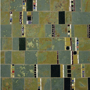
Fritza by Ann Sacks

Inspired by the art of Gustav Klimt, Ann Sacks has recently introduced Fritza, a colorful mosaic run between strips of tetra slate and black granite. This is a great way to add a little art to your kitchen.  What a great backsplash this would make!

Another one of my favorites is this tile from the Forms collection by Angela Adams (left).  This is perfect if you're going for a mid-century modern appeal. 
 
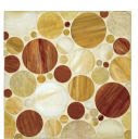
Erin Adam's Facet Mosaic features a circle design in tones that blend beautifully with just about any wood grain


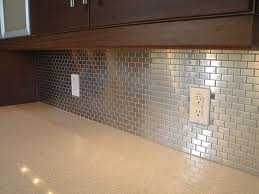
The stainless steel look is another interesting backsplash treatment for your kitchen.


5 WAYS TO CREATE A SEXY KITCHEN

The new sexy isn’t always sexual. In fact the Brits have coined the term “sex it up!” meaning to make something more interesting, attention grabbing or appealing. So, guess what? Now you can “sex up” your kitchen by updating and refreshing the look and function. Here are some tricks:

1) Roll outs Want easier access? Install shelves that roll out. These are great in the lower cabinets as well as in your pantry.

2) Open shelves can be extremely functional allowing you to view and easily grab and go.  I also love them for cookbooks and they break up the monontony of too many cabinet doors.
3) Color and texture  What's more seductive than color and texture?  Think sleek stainless steel paired with a rustic tumbled marble backsplash or a RED quartz counter top in the midst of a clean white kitchen.  

4) Dimmable light fixtures above your cabinets can create a subtle glow.  Add them under your upper cabinets and they double as task lighting when turned up. 

5) Art is One of my favorite additions to any kitchen.  It's a great way to personalize your kitchen and create visual interest.  (See my  3/18 post).


What are you passionate about in your kitchen? Dying to know and hoping you'll share.