Men in the Kitchen

Circa 1954, Betty is in the kitchen, apron tied just right.  Pearls in place.  She’s the queen of her domain turning out pineapple upside down cakes while her hubs brings home the bacon (for her to cook).A small mid century collage by yours truly. I call it "Embracing Routine".  6"by 6" by 2" canvasIn most cultures throughout history, the heart of the home has been a woman’s domain.  Even today though roles have shifted and functions of the kitchen have changed, it’s the woman who usually makes the decisions when it comes to the kitchen.  I say USUALLY because even 10 or 15 years ago the man of the house only had a voice when it came to his office or his bar, now he is collaborating on the design of the kitchen.  It was going to happen sooner or later.  According to this article by The Wall Street Journal, the men are catching up and we're letting them.  I wonder why it is that the upper echelons of “chefdom” belong to men but the foot soldiers of meal preparation are the women churning out meal after meal in middle America and beyond? Perhaps it's time to sit back and let the boys pamper us.  Truth be told I have always aligned myself with men who know their way around the kitchen.

 men-2560-1600-wallpaper

 Now that I've got your attention, over the next few posts we will be examining the elusive phenomenon known as  "men in the kitchen".  We will look at a man navigating the challenges of a tiny city kitchen, the suburban family guy in the kitchen, the Gen Y bachelor  and even and up and coming professional chef !  Good?  Yes I knew you were in the mood for something completely different. Oh and by the way if you like the photo above it's available as wall paper here and is courtesy of wallsave.com. Next Up: How a man cooks in the city that never sleeps...

10 Etsy Treasures For Your Kitchen

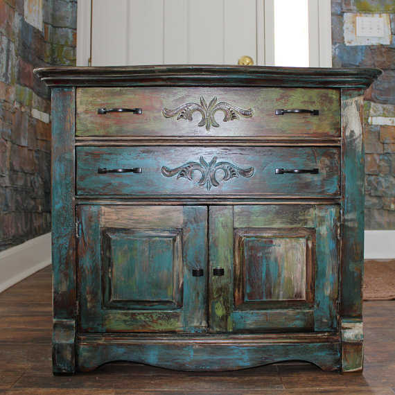
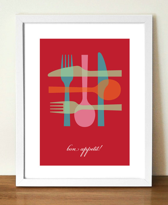
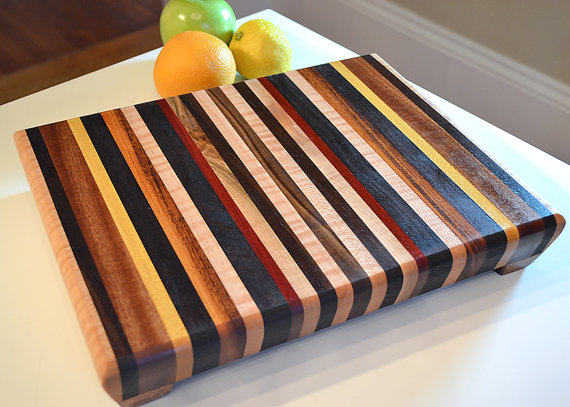
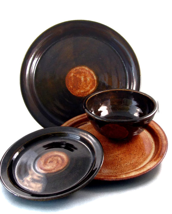
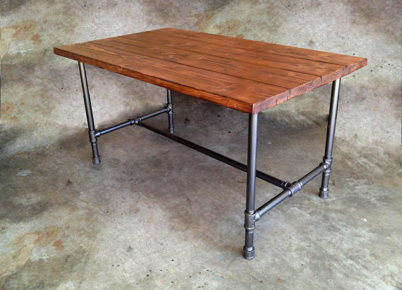
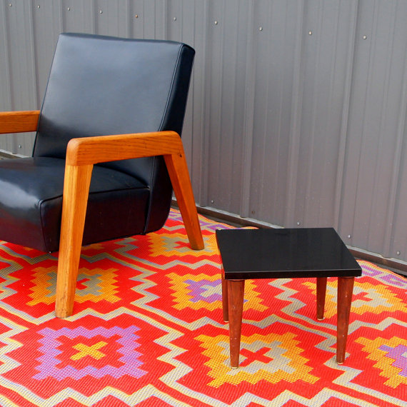
In case you enjoyed a fabulous holiday weekend and are finding the Monday grind somewhat anticlimactic, I thought we'd have a little fun today.Distressed Paint Vintage Oak Cabinet by PickersDesignCompanyRecently I wrote about the value of “the handmade” and the Arts and Crafts Movement of the turn of the last century.  (If you missed it, it's right here.)  It must be a part of our American cultural DNA, we like to make stuff and we like to have stuff people made.  Think of the wedding quilt made by your great grandma or even the home cooked meal.  Anything made with love is imbibed with soulfulness.   The website phenomenon etsy.com is evidence of this love affair with hand crafting.  I’ll be the first to admit you have to wade through a lot of “kitsch” to find the treasures but they can be found.  SO just for you, my peeps, I have uncovered ten treasures for your kitchen.  The Holidays are but a distant memory.  Maybe it’s time to treat yourself or a loved one with something beautiful, original and handmade just "because".  What are your Etsy favorites ?Mid Century Poster Print by visualphilosophy.  Handmade Cutting BoardHandmade Ceramic Dinnerware SetThe Jerry Kitchen Table by The Rum RoomPrimitive Farmhouse Pantry CabinetSage Bundle!1950s Minamalist Side Table Retro Inspired Bowl Print Stoneware Clay Tumblers by Pats Pottery PS  Unfortunately I have been in no way compensated or influenced by any of these shops.  I just give them my "cool" stamp of approval.  I have however, in the past, been a customer of Pats Pottery and probably will be again in the future, just in case you're wondering. 

Mad For Mid Century

A small mid century collage by yours truly. I call it "Embracing Routine".  6"by 6" by 2" canvasIf you're a Mid Century product of Florida, like me, you probably grew up in what's fondly known as a "ranch style house".  Our friends over at Wikipedia define the ranch abode as " a domestic architectural style  originating in the United States. The ranch house is noted for its long, close-to-the-ground profile, and minimal use of exterior and interior decoration. The houses fuse modernist ideas and styles with notions of the American Western period working ranches to create a very informal and casual living style."   In addition to the above, the Florida ranch house  usually came in pastel colors with what we call a "Florida room".  This is kind of like a family room with lots of windows. 

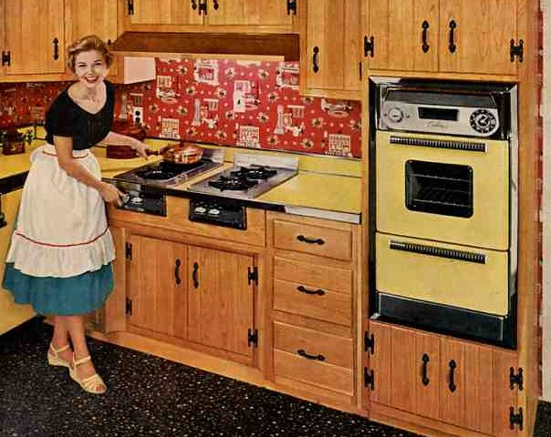
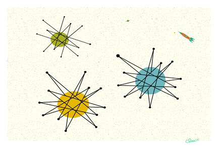
 Although not as grand as the house above, my childhood home shared several elements.  Our Florida Room ceiling had a similar wood treatment and it also had a stone feature wall.  We had lots of green and brown and that EXACT furniture.  The authentic flooring would have been terrazzo, like ours.  I never knew it was cool then but now it's all the rage.  Think about it, there are lots of these houses still around!  Mid-Century has firmly established its niche in design history and has left its mark on our culture.  We've got MadMen, Modernism Magazine, the website Atomic Ranch and numerous blogs. MOD_CVRIf you're looking for that 50s vibe in the kitchen, keep it simple.  Door styles were just flat and were either a warm wood finish or painted.  Guess what? Wall ovens with a separate cook top were much more common in the typical Mid Century kitchen.  Today most homes have ranges.1950s ad for Caloric ovens (bad name, huh?) atomicpattern2Throw in a little atomic patterning and you're there.  If you are really embracing this you can get the vintage look for your refrigerator.elmira_lg(2)Elmira Stove Works has introduced the latest addition to its retro Northstar collection, the French-door refrigerator.  By combining iconic 1950s-style with the modern amenities of contemporary appliances, this new model is larger capacity than previously available in the line.  It comes in a full-depth model as well as counter-depth.  You don't have to get red.  It comes in nine standard colors OR you can even get it custom-colored (for a price, I'm sure). 

DESIGN AND THE MODERN KITCHEN


Granted I'm biased, but I have to say that Counter Space:   Design and the Modern Kitchen is the most engaging exhibit I have had the pleasure of attending.  It opened at the Museum of Modern Art September 15th and closes on March 11th.  The thing about this show is that we can all identify and connect with the topic of kitchens.  They are an integral part of how we live but we seldom give thought to exactly how they came about.  You can find just about all there is to know right here.


The only critique I have is that I wish they would have included commentary post midcentury.  The concepts of the kitchen are so dynamic and there is a lot to be said with regard to the last half of the 20th century.   Nevertheless, especially for a kitchen professional or enthusiast this is an absorbing and engaging experience.  The exhibit is divided into three main segments.


"Toward the Modern Kitchen" examines the early research in efficiency and time management that culminated in the design of the Frankfurt kitchen in 1928 by Margrete Schutte Lihosky.   A post World War I housing crisis provided the impetus for such reasearch resulting in what is thought to be the first "modern" kitchen.  You can read more about this history on a previous post here.     It was believed that by transforming daily life at the level of he kitchen behavioral change and social well being would result.  Good old German efficiency and practicality were at the heart of these inventions and it was two women in particular who made the biggest contributions, researcher Christine Frederick, as well as architect Margrete Schutte Lihosky.


The second part of the show is "Visions of Plenty"  and deals with the post-war kitchens in America.  It was then that the ergonomic considerations begun by Ms. Lihosky were further refined and a standard counter height of 36" was established.  This was based on the average height of a woman at the time.  Kitchens also began to evolve into living areas at this time and were very influenced by food restrictions brought about by the second world war.In addition myriad everyday objects are on display throughout the show.  We never think about where the things we use everyday come from but they have a history and were shaped by our culture and time.The final part of the exhibit is entitled "Kitchen Sink Dramas" which deals with kitchens as they are portrayed in the media as a rich subject for artistic expression.If you would like to know more about this exhibit and rich history you can purchase a hard cover edition catalogue of Counter Space produced in conjunction with the exhibit and available by clicking here One final note that I have not seen mentioned is that this show was  sponsored by Silestone Quartz Surfaces.  I'm headed back home to the drawing board today with visions of tupperware and proto-type kitchens dancing in my head!

KITCHEN FUN IN NEW YORK (AGAIN)!

 That's right. Today I'm back in the BA (big apple but you should know that). If you recall, I was here only 6 months ago during fashion week courtesy of  Brizo Faucets. Click here for a journey 6 months back in time. Wouldn't you know it, the amazing exhibit Counter Space: Design and the Modern Kitchen at MOMA opened within days of my departure necessitating a return trip before it closes on March 11th.  Some savvy bloggers wrote about it on the front end so I'm going to wrap it up for you and send it out with a bang.   I'll be there on Sunday. Tomorrow I'll be visiting the new super slick Scavolini showroom in Soho.  I hear it's not to be missed so I will also be bringing you the latest in Italian kitchen design from this progressive cabinet manufacturer.  Now if you know me, you'll know I have to fit in a little art and guess what's happening this weekend? Yes that's right, the Armory Art ShowNEWSFLASH!!! You can now subscribe to Kitchens for Living on your Kindle!  Check it out here.If you're paying attention you'll notice yet another badge on my sidebar.   I am now officially an "expert" at EzineArticles.com with one published article and loads more to come,  as soon as I have time.    More from New York tomorrow.PS.   If there's anything you think I should check out while I'm there drop me a comment and I'll try to squeeze it in. Cheers!  

G.E. HELPS YOU FIND YOUR DREAM KITCHEN

As a kitchen designer and writer,  my inbox is always filled with news of all the latest products, websites and all manner of things to do with our favorite room, the kitchen.  G.E. has always been known as the bread- and- butter of the appliance world.  Not only have they been around forever but they have evolved with the times.  Today they still offer the basic affordable options as well as higher end appliance packages under the names G.E. Profile,  Monogram and the new Cafe' Series. These offer a wider variety of functions and integrated modern styling.

Another thing that really makes them a 21st century contender is their state of the art website.  There is a wealth of information here whether you aim to use their products or not.  Of course they hope you'll be seduced once you have entered their "web", so to speak.

One of my favorite features on the site is the kitchen design function.  Simply choose a kitchen which is similar to your own space.  Then simply click on the various color choices.  It's a lot of fun and a great way to start to narrow your choices and make the big decisions like dark vs. white cabinets, black vs. stainless appliances.  You get the picture (literally).  You'll also find lighting ideas, safety tips and even recipes.  Oh, and the "must have' G.E. product in my book is the Advantium Microwave Oven. My clients love it.  You can use it as a regular oven or as a microwave, so it's like two ovens in one!