5 STEPS TO A MINDFUL KITCHEN REMODEL

One of my favorite magazines, Cooking Light, contains a very interesting article that I love this month.  It’s about something called “mindful eating”.  I agree that we, as a culture, me included, eat way too much because we don’t do it mindfully.  Simply put it just means that if you make yourself 100% present and focused at the task at hand (eating) during mealtime you will enjoy your food more and you won’t feel the need to eat as much.  I happen to believe that you can easily carry this concept over to the kitchen design and remodel process.  These days when we are trying to get the most out of every dollar we want to know that every aspect of the complicated process of remodeling a kitchen has been well thought out.  Here are five ways you can do it.  
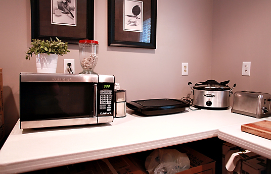
 1) Don’t be in a rush-  When you impose a drop dead date such as Thanksgiving or Christmas you will be more likely to rush your choices.  This is a complicated process and it needs to be planned out properly and executed in a certain order.  Collect your thoughts and ideas beforehand.  This should included concept photos, and ideas for products.  In this day of social media there is no excuse not to do the research.  It will allow your professional partners to do an even better job for you.  
 2)     Work with someone you feel good about-  I don’t care how knowledgeable your designer, or salesperson seems, if they don’t feel right for you, you’ll probably save much aggravation by partnering with someone you feel is your ally and can see your own unique vision.  Many designers are adept at working in a variety of styles.  However, if you love sleek, modern, minimal designs don’t select a designer who’s work is typically very traditional.  They’ll probably be able to help you but it not with the insight, enthusiasm and access to products as someone who specializes in your style.                3) Prepare for the downtime- Always insist on a schedule for your project.  This is NOT to say it won’t have to be tweaked from time to time but it’s always best to have a starting point.  It helps keep all the players on the same page. A big part of this is to plan how you’re going to get by when you’re without a kitchen.  Where are you going to put the refrigerator?  Do you have convenient place to put your microwave?  How close is your temporary set up to a sink?  Keep most used cups and utensils easy to access.                           4)   Pick your battles- Everyone has a budget and  most of us  can’t have it all.  That said, there are usually a couple of areas in which a judicious splurge can make all the difference.  One biggie is springing for a counter depth model refrigerator which is nearly flush with your counter top.  This makes a big difference in a small space. Although they’re more expensive they’re still a lot less than the super high end true built-in models.   5)   Don’t rush to judgement- If you are living on site during your remodel, resist the impulse to go into a seizure over every nick or crooked drawer front.  Again, it’s a process with a million details and steps.  At this point you should be trusting (if you did step 2) your professionals to do what they do.  Typically all doors and drawer fronts will be aligned before your installation is finished.  It is also typical practice for you and your designer to get together on a punch out list so all concerns, including touch ups are addressed before completion.If you have a question about your kitchen design or remodel I’d love to hear from you!
TROPICAL MEETS TRADITIONAL

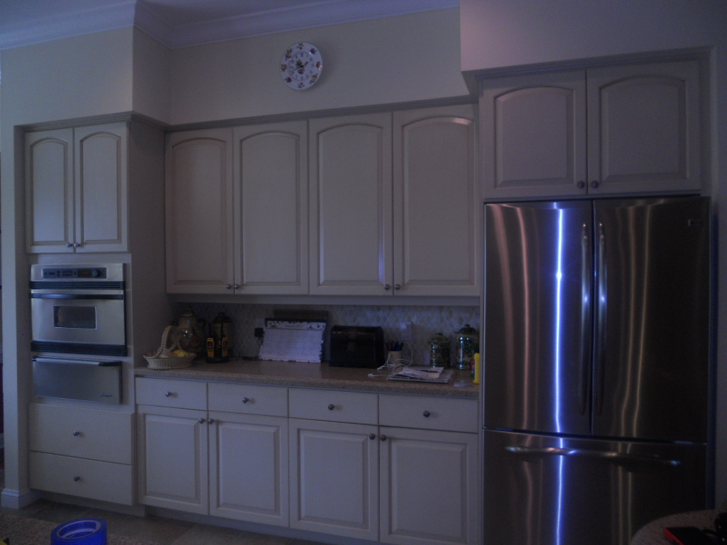
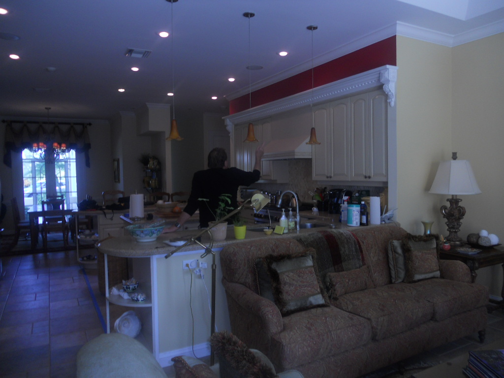
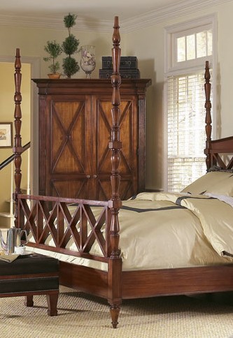
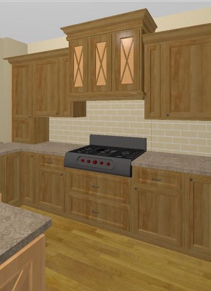
 Here in my little corner of South Florida the pendulum has swung , of late, to more contemporary designs in the kitchen.  This means less ornate with clean lines.  I love it but I realize it's not for everyone.  What if your whole house is more classic and traditional?  Your kitchen should always work with the architecture and theme of your home.  This is exactly the case with a job I am working on now.  This Florida home has a kitchen open on two sides, the dining room and the family room.  Here's what it looks like now.She's selected appliances which are slightly different and will be integrated into the new plan.  Because the kitchen is smack dab in the center of the home there is not much natural light, so no dark finishes.  We have about 95" to the soffits.  Last but not least, because the kitchen is so open and visible we need WOW!If you blend the tropical locale of this beautiful home with its traditional decor you find that  British Colonial or Bermuda Style is the perfect solution.  During the reign of  Queen Victoria, British subjects stationed in the British Colonial outposts of the Empire that included Singapore, East Africa, India and the British West Indies, brought with them their language, principles of government, architecture and furniture. There was just one little issue, climate.  Certain details had to be modified to accommodate the heat!  Some of these details were the use of light airy fabrics, lots of  big tall windows and high ceilings.  In addition to this they had to take advantage of local resources like mahogany, cane and bamboo.  So here's what we're gonna do!1) MOVING ON UP- We're going to remove the soffits so we can take advantage of the  high ceiling.2) LET THERE BE MORE LIGHT-  We're going to add lights above cabinets, wherever possible and more efficient fixtures in the ceiling and under the upper cabinets.  Cabinets will be a combination of medium and light stains with some cane detailing. 3) X MARKS THE SPOT-  You will frequently see the X motif as a part of the BC style so we are incorporating it into the design.4) A LUSH TROPICAL ISLAND- This tropical island has to grow.  We have the space to make it bigger and more funtional but we don't have the space to add the columns or legs that would make it look like a piece of furniture.  Instead we'll raise it off the floor and add some furniture feet and moulding.5) CROWNING DETAILS- Nothing says traditional like crown molding, columns and pilastersSee  a working elevation below.  Notice with the X detail, less is more equals WOW.  We're still fine tuning the details but I'll Keep you posted!  

KITCHEN FAVORITES GUEST POST

Today’s guest post is from Susi, a writer for Arcadian Lighting, a must-shop resource for beautiful light fixtures.  Susi is sharing some favorite kitchens, from traditional to contemporary, cottage to penthouse. There is a wide range of styles, fixtures, cabinets, flooring and lighting in these kitchens. We hope you see something that will inspire you. What is your favorite kitchen?

Kitchen Design Ideas

Pinterest via

Love the greenhouse feeling to this kitchen. The cream cabinets and countertops blend seamlessly with the architecture. Pantry & appliances are tucked further back so they don’t disrupt the view.

Kitchen Design Ideas

Pinterest via

This cottage kitchen is one of our favorites because of the island that feels like a farmhouse table. Classic white subway tiles are classic for a reason…they’re timeless.

Kitchen Design Ideas

Apartment Therapy via

Small doesn’t mean unstylish. Love this eat-in-kitchen that is small on space but large on style. High gloss cabinets reflect the light to make the room feel bigger. The pendant light over the table adds a stylish touch.

Kitchen Design Ideas

Fresh Home via

Colored cabinets are not a new trend but we love the high gloss aqua on these metal cabinets. Everything feels sleek and polished in this contemporary kitchen.

Kitchen Design Ideas

House and Home via

Luxury finishes and quality materials make this kitchen a favorite. Dramatic dark cabinets and contemporary lighting make this kitchen feel sophisticated.

 Kitchen Design Ideas

Abode Love via

This white kitchen is anything but sterile. Grey veined white marble, dark floors and punches of orange from the counter stools keep it lively. Love the kitchen pendant lights.

Kitchen Design Ideas

Shatter Boxx via

While many of our favorite kitchens are light and airy, we do love the drama of dark cabinets paired with dark floors. The island sink also makes this a fave, as does the professional range.

Kitchen Design Ideas

A Note on Design via

This contemporary farmhouse kitchen is a gorgeous blend of new and old. Love how the design incorporates the stone wall with contemporary cabinets and pendant lightsContent provided by Arcadian Lighting, a site that specializes in top quality lighting fixtures at extremely affordable prices. If you like this post, be sure to stop by the Arcadian Lighting blog and let us know you saw us here!

G.E. HELPS YOU FIND YOUR DREAM KITCHEN

As a kitchen designer and writer,  my inbox is always filled with news of all the latest products, websites and all manner of things to do with our favorite room, the kitchen.  G.E. has always been known as the bread- and- butter of the appliance world.  Not only have they been around forever but they have evolved with the times.  Today they still offer the basic affordable options as well as higher end appliance packages under the names G.E. Profile,  Monogram and the new Cafe' Series. These offer a wider variety of functions and integrated modern styling.

Another thing that really makes them a 21st century contender is their state of the art website.  There is a wealth of information here whether you aim to use their products or not.  Of course they hope you'll be seduced once you have entered their "web", so to speak.

One of my favorite features on the site is the kitchen design function.  Simply choose a kitchen which is similar to your own space.  Then simply click on the various color choices.  It's a lot of fun and a great way to start to narrow your choices and make the big decisions like dark vs. white cabinets, black vs. stainless appliances.  You get the picture (literally).  You'll also find lighting ideas, safety tips and even recipes.  Oh, and the "must have' G.E. product in my book is the Advantium Microwave Oven. My clients love it.  You can use it as a regular oven or as a microwave, so it's like two ovens in one!

FIND YOUR KITCHEN MOJO

If your new kitchen is going to be an expression of who you are and how you live it's helpful to have a little inspiration. One of the things I frequently mention is the benefit of something I call "kitchen scrapbooking".   When you get your first inkling that a new kitchen may be in your future, begin collecting pictures and ideas.  Use magazines, the internet or your camera.  Then pay attention to that inner voice. That's your intuition and your cue to tear, print or click that shutter.  Look for everything from specific details to general feeling. Let's begin today.  I will share with you all kinds of interesting tidbits.  Keep a file (real or virtual) of your inspirational loot.  Before you know it you'll have all kinds of useful information and you will begin to see the patterns in your selections.  For example you may find that in 5 out of  7 pictures, you selected kitchens with white cabinets, or glass doors, or shiny finishes.  Oh, and remember it doesn't even have to be a kitchen!  Your heart-of-the-home can also be inspired by non-kitchen images such as art, architecture, nature and more.  Here are three images to start you off.  

I love the juxtaposition of modern and African tribal elements in this photo of a Nolte kitchen.

  This one, from luxury-ideas.com, is all about feeling natural, open and a little luxurious.  Notice the interesting open shelves, the open island design and the lovely use of texture.     

Lastly, I just love the feeling of this black and white kitchen.  It represents a comfortable easy British Colonial aesthetic to me.  How about you?