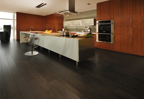
Day two of the Modenus Blog Tour was opening day for the 51st annual Kitchen and Bath Industry Show (KBIS). The Bloggers were given an inside peek into many of the booths at the show and as we toured, trends most certainly did emerge.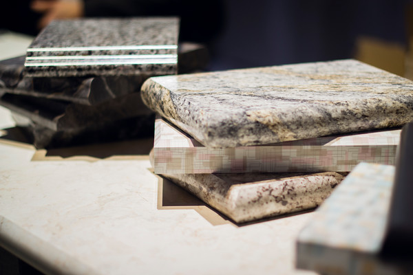 "There is a three year lag between Europe and North America when it comes to trends", says Warren Ramsland, President of Top Knobs. Taking that into account, there were many differences between what I saw here and what I witnessed in Italy at Euro Cucina last year. Perhaps the biggest European influence that continues to pick up steam is contemporary design for both the kitchen and bath.
 Laminates are enjoying a serge in popularity. This material is more widely used and experimented with by our friends across the pond but we're picking up speed. I was wowed by the offerings at Wilsonart who debuted their "Spirit of Mindfulness" collection of 27 exciting laminate colors and textures. Also introduced were a line of quartz counter tops in a great assortment of neutral, workable hues. By late spring, a selection of 50 patterns will showcase a full range of colors, textures and four structures: Fine and Small Scale, Medium Scale, Large Scale, and Veining and Movement. That is one of the things I love about quartz, the wide variety of pattern, or no pattern at all! I was impressed not only by the innovative product development at Wilsonart but also their philosophy. This press release statement says it all:"Fueled in part by a turbulent economy, today’s more budget-savvy and eco-conscious consumers have responded by making their homes the calm eye in the storm of life. For many, this translates to finding a spirit of mindfulness within themselves and expressing it in their surroundings."
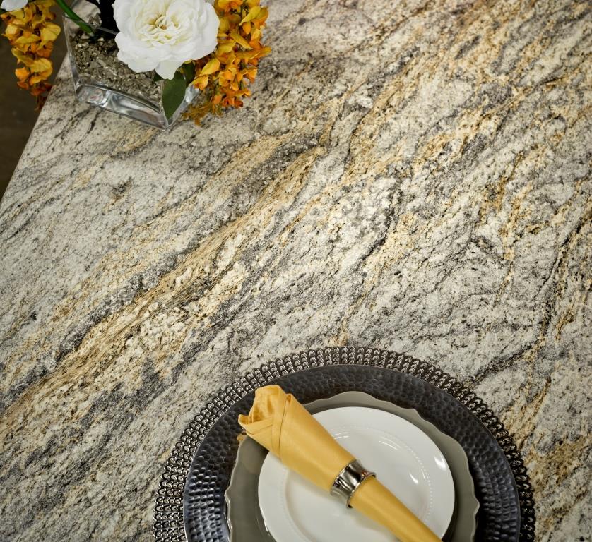 One of the new Wilsonart quartz options showing beautiful veining. Photo courtesy of WilsonartCheck out the Wilsonart Visualizer to help you pick your counter top color. It's easy, fun and very helpfulTechnology is also taking the kitchen and bath world by storm. There were numerous examples but two stood out for me. A company called TechTop took home the Best In Show Award for their counter top charging technology. Simply place your phone, tablet etc. on the counter top and viola' it will charge, no plug-in required.
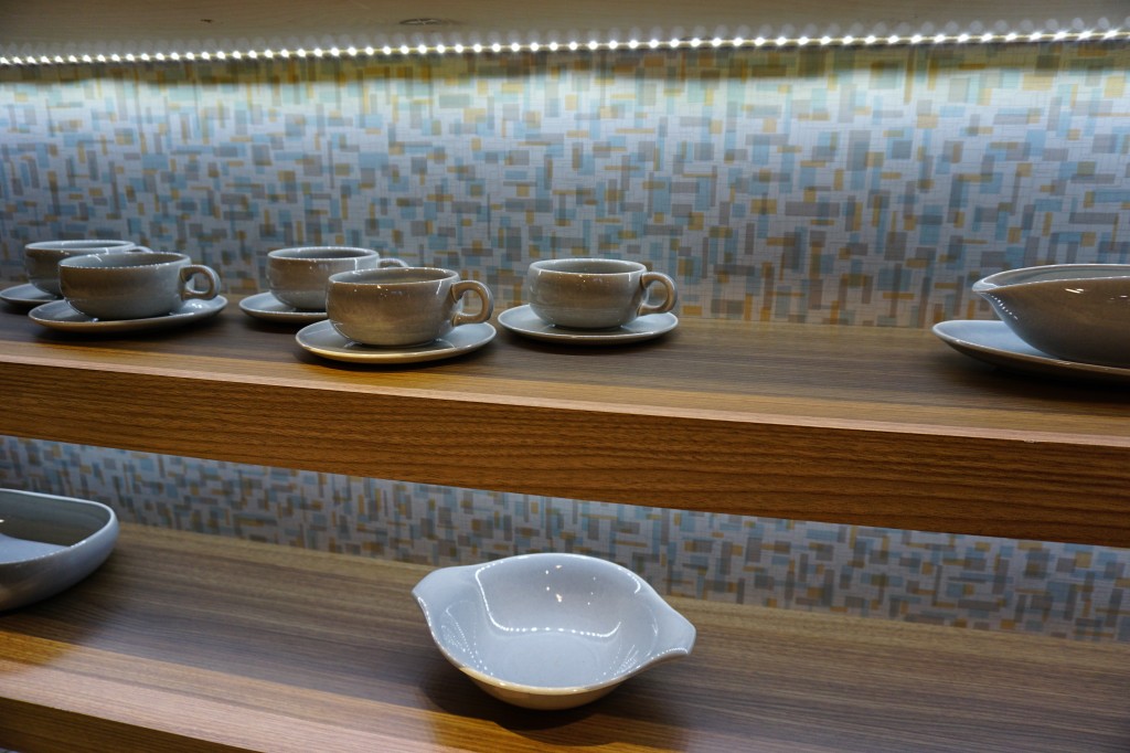
  This great idea is from LG Hausy, yes it's the same "Life's Good" LG that makes appliances. They make counter tops too. I also loved this Solna articulating faucet by one of my favorite brands, Brizo. How convenient, right?!Fifty Shades of Gray has moved on to what I call "greige". It's the new warm toned beigey-gray which I saw everywhere! Palettes are definitely neutral. A great example is the Tangent collection by Walker Zanger. Love the mid-century inspiration which I also saw a lot of at the show.
 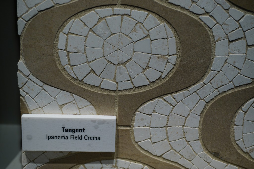 Walker-Zanger deals in tile, marble and stone artistry. Their collections are arguably the most innovative I've seen. Case in point is their Sterling Row collection, inspired by menswear and a favorite at the show. I found it to be extremely sophisticated, eye catching and innovative. The collection was a favorite at the show.
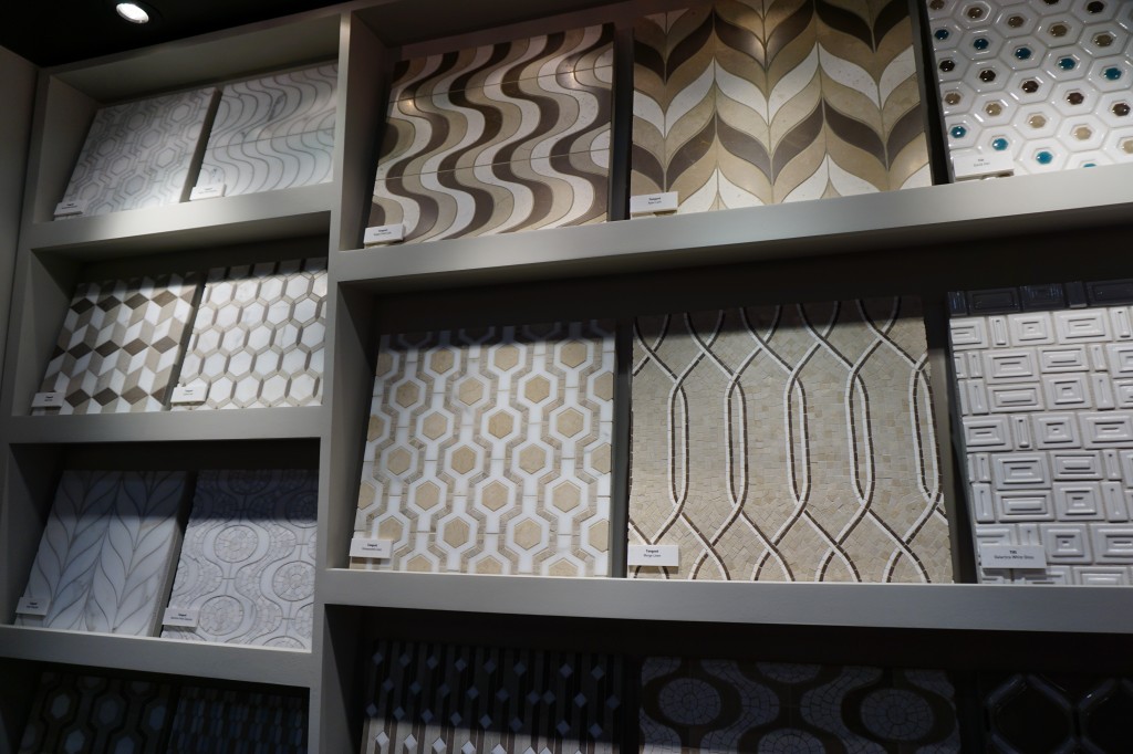
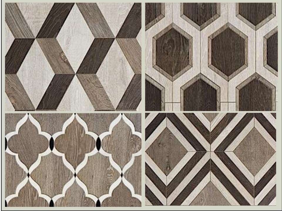 We saw more of the Sterling Row Collection later on the blog tour in The New American Home, so there's more to come!Perhaps the BIGGEST trend of the show was personalization. I mentioned this in the last post about Thermador but they were not alone. Here are a few more pics highlighting the concept. Frigidaire's SpaceWise Custom Flex refrigerators allow you to totally customize the shelves inside by moving the drawers and shelving to your desired configuration.
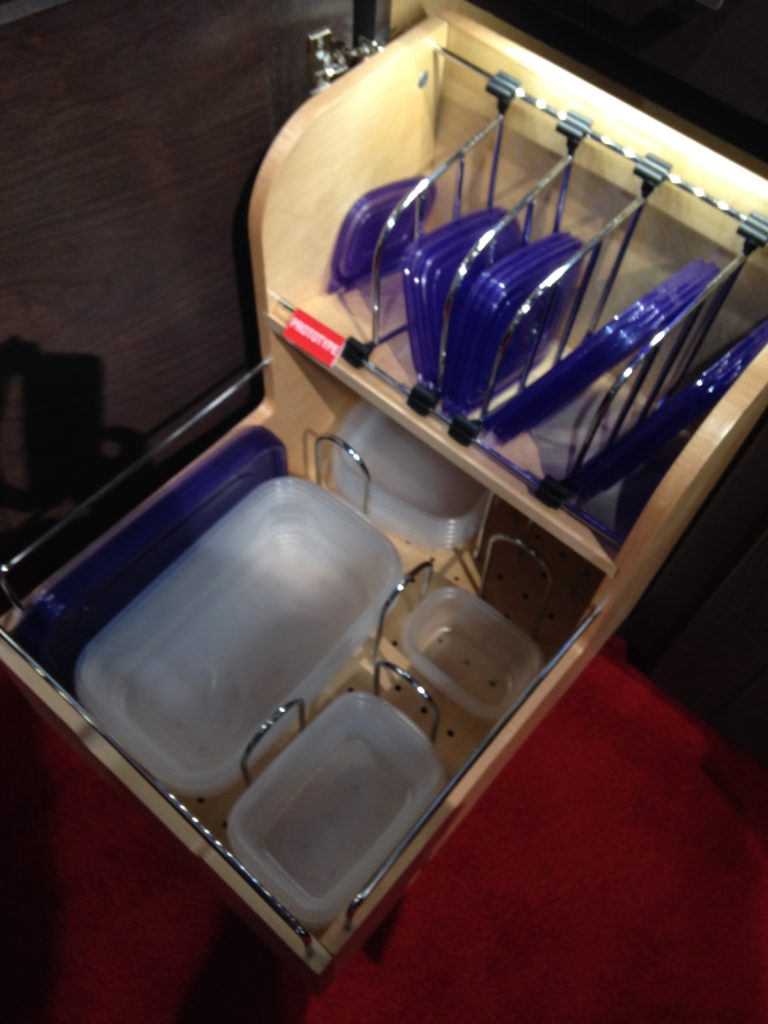
 How about this great storage system by Rev-A- Shelf? I know we all want this level of organization in our lives, yes? Right now this is a prototype but the response from the industry was good so I think we can expect to see this in the coming year.
 Enough for now? Well there's more to come.Up next: KBIS 2015 Part II where I'll tell you about all my great finds for the bath and more.
Getting Creative at Cavastone
Time to switch from "turkey talk" to tile! Hope you had a great holiday. If you haven't found the new Kitchens for Living page on Facebook, please check it out and give me some love (ok I'll settle for a like). Today I'd like to highlight a local resource that you should definitely know about if you live in South Florida.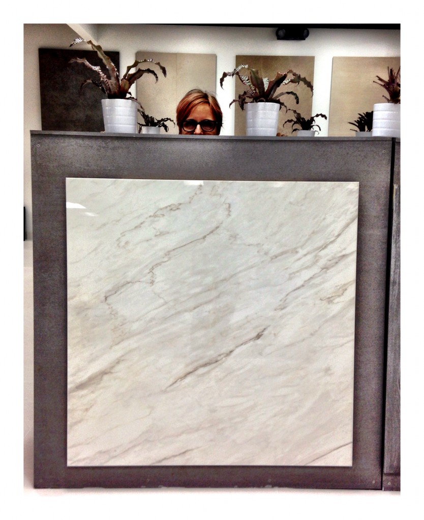 Cavastone is located in Boca Raton. I've worked with them before but I was recently in the neighborhood so I decided to make a pit stop and check out the latest in the world of tile. The showroom is stunning, sophisticated, and well lit which allows you to view the products to their full advantage. I was most impressed with the options they have for porcelain tile but there is also a large assortment of granite and marble slabs.
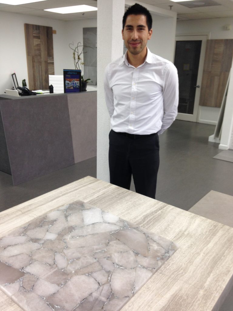 The tile above is gorgeous! It's a natural semi-precious stone accented with silver! Makes me think of a decadent boudoir or dressing area.
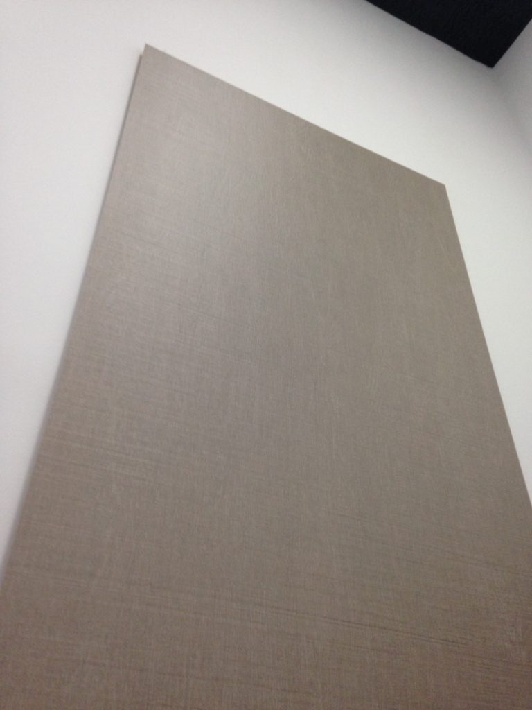
 Digital printing technology allows for an infinite number of options when it comes to porcelain tile. They've got the natural look down! The nice thing is if you ever need more it can be made for you. Those large sizes (see top) also come in 25" by 25" in case your abode is not quite that large.
  This dimensional look is also a big trend, used for walls in both interior and exterior applications. You can find all Cavastone info right here on the Kitchens for Living Local Resources page. If you've got a great local resource clue me in. I'd love to hear about it!
Spain Takes the Stage at Cersaie 2014
Tile of Spain, a collective of 90 Spanish ceramic wall and floor tile manufacturers, recently showcased new collections and innovations at the Cersaie 2014 show. Held last month in Bologne, Italy, Cersaie is THE yearly international exhibition of ceramic tile.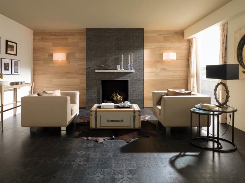 I love to note the trends at this show as they are a barometer of what we’ll be seeing here in the near future. It’s not only the tile itself but how it’s being used that intrigues me and can offer us a wealth of design ideas.Tile has been used in building as far back as 3000BC in ancient Greece. First used to replace thatch roofs, they were desired for their fire resistance. Today tile finishes are vast, varied and constantly reinvented through the advent of new technologies affecting both performance and aesthetics.This year Spanish manufacturers, reflecting the latest design trends, showed vintage styles, hexagon shapes, three dimensional profiles and more.Here are some of my favorites from Tiles of Spain showcased at Cersaie 2014Porcelanosa (above) makes a complete contemporary statement with this combination of tiles. I especially like the subtle injection of Old World suggested by the matte black floor tile.
 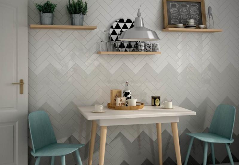 Other than the fact that chevrons are always cool, I love the gradient shades of grey shown here by Equipe Ceramicas, so original! The grey and white are also neutral and easy to design around.
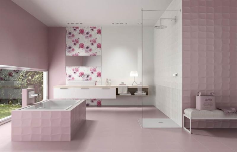 Think pink! A lot of chick-pad-pink from Unicer (above). It's all tile, the white, the print the textured and the matte. Would you?
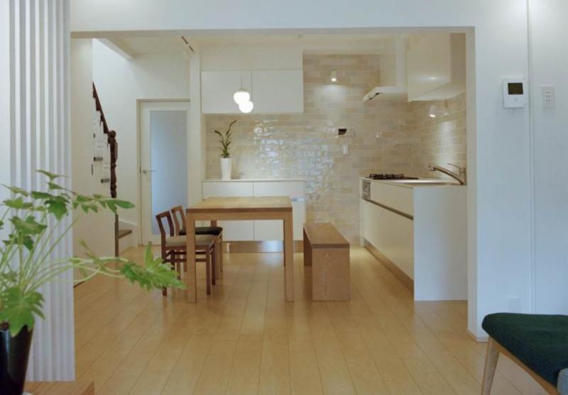 If you're going to use tile in the kitchen, go big! It really makes a statement.For more ideas check out the Tile of Spain USA Inspiration Gallery.
My New Favorite Flooring Find
Flooring is the basis for every room in your house, ground zero if you will. We want it to be a flattering backdrop for our decor, cabinetry and rugs BUT it's also got to be durable and easy to take care of. Wood flooring is all the rage and, to be sure, nothing equals the warmth and richness of a real wood floor.
If you love the look of real wood but don't want to worry about finish, maintenance or potential water damage (leaks happen), this may be the product for you. Meet Crossville, Inc. Not only is it possible to get that "real wood" look in porcelain tile, but now you can even get that "weathered barn" look with SpeakEasy, their latest porcelain tile collection. 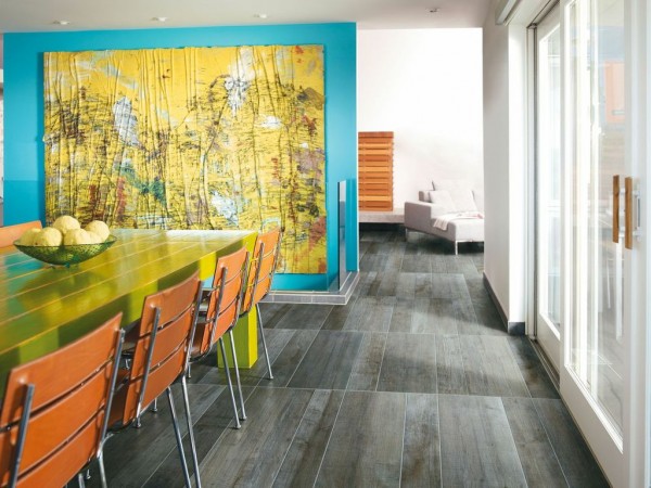 Sometimes my clients are afraid to use real wood in the kitchen or bath so this is a great alternative. I also like the fact that the weathered finish is not slippery like polished marble. I love pairing the distressed look with super modern design as in the photo above. Then again this look always blends with traditional or rustic design.
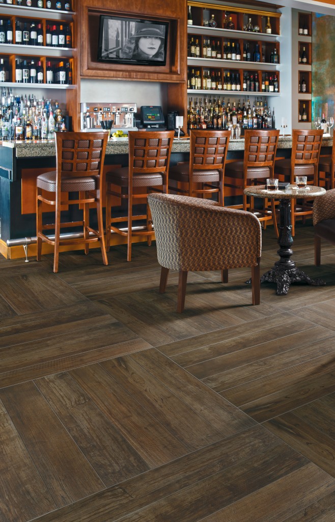 The collection features five colors that mimic stained wood. There's even a color called Sweet Georgia Brown! Planks are 36" long and you can choose from 6", 8" or 12" widths.SpeakEasy is Green Squared certified and contains a minimum of 4% recycled pre-consumer content. For more info about this collection and all the other offerings over at Crossville visit crossvilleinc.com.
Get a Handle on Craftsman Design for Your Kitchen
As you know by the last couple of posts I’m deeply in love with all things contemporary but then again I’m certainly no “one trick pony”. I have always been intrigued with Craftsman Design. Think bungalows, organic forms and warm rich woods. 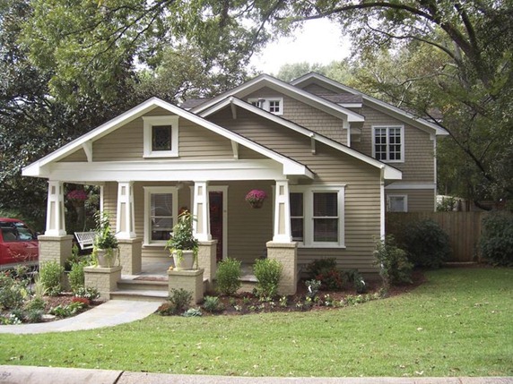
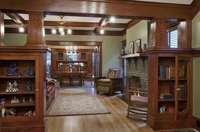
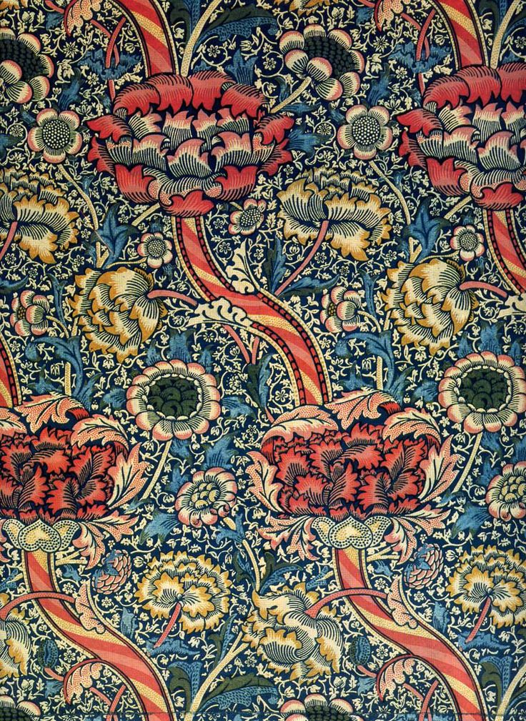 The Arts and Crafts Movement which occurred at the turn of the last century, was a response to the blossoming industrial age. Mass production was coming into its own and a few intrepid souls were missing the personal human touch of household objects made by hand. The leading proponent was William Morris, also known for his beautiful stylized floral prints.
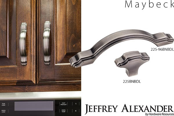 One of my “go to” hardware suppliers, Hardware Resources, has just unveiled cabinet hardware inspired by the period. Named after Arts & Crafts architect Bernard Maybeck, these selections are a great way to jazz up existing cabinets and give you "the look". Since they’re only inspired by, and not reproductions of, the Arts & Crafts Movement, the design is fresh and new as well as being a stylized nod to the Craftsman style. One beautifully styled knob and 3 cabinet pulls will be available in 5 trending finishes. In addition to the Maybeck design, by Jeffrey Alexander, they will be introducing the Brenton (Elements) and the Royce (also Jeffrey Alexander) at the upcoming KBIS (Kitchen & Bath Industry Show).
 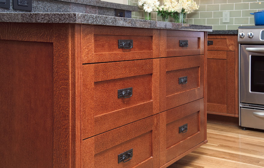 Emulating this look in cabinetry is easy. The Shaker door style, which is all the rage, can be transformed to reflect the Arts & Crafts look by the addition of appropriate hardware. You can get handles like these here.Here's your opportunity to get crazy with a tile back splash. You will see a couple of motifs that scream A&C including the dragonfly and the ginko leaf. Add some green to the mix and you've got it!
 If you're interested in this look or a stylized version of it I'd love to hear from you!
WALKER ZANGER WOWS NKBA MEETING!
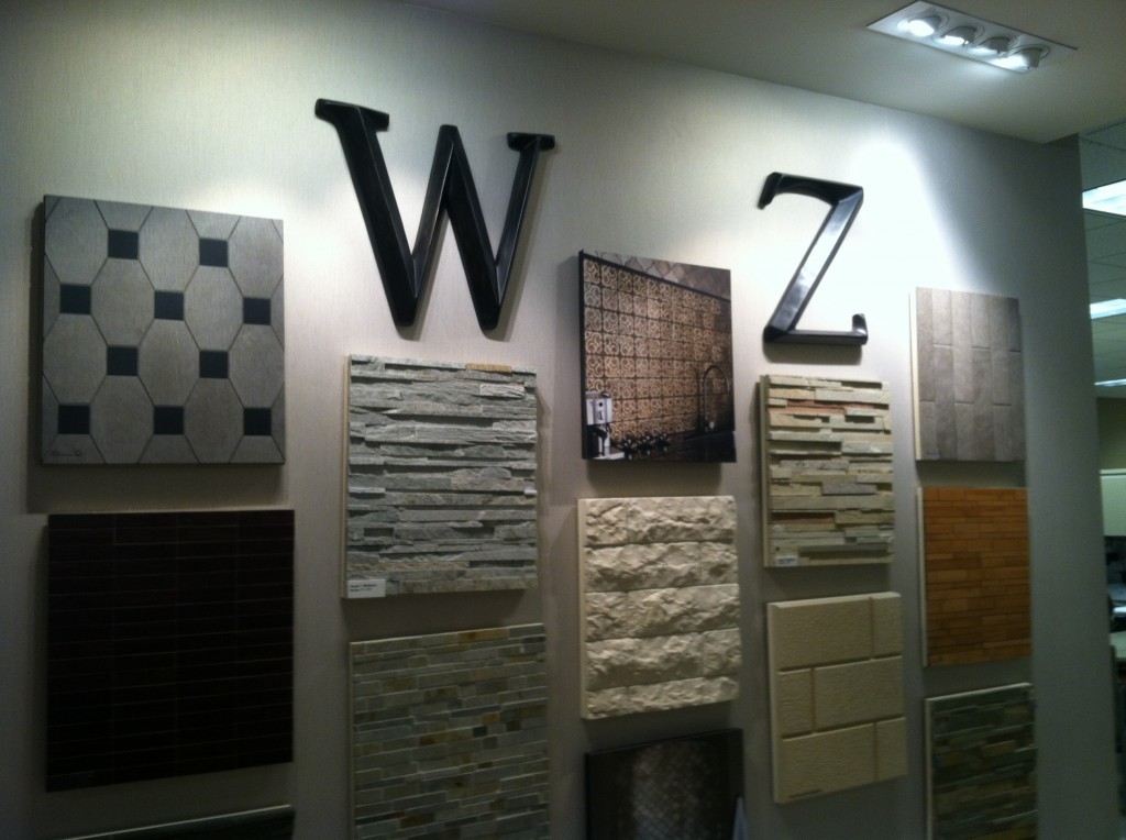 One week ago I had the pleasure of attending the first South Florida Chapter NKBA meeting of 2013. I was fired up by motivational speaker Dawnna St. Louis and her presentation about how to give your clients what they really want. I’m looking forward to more great events this year and to working with the enthusiastic board on the communications committee.
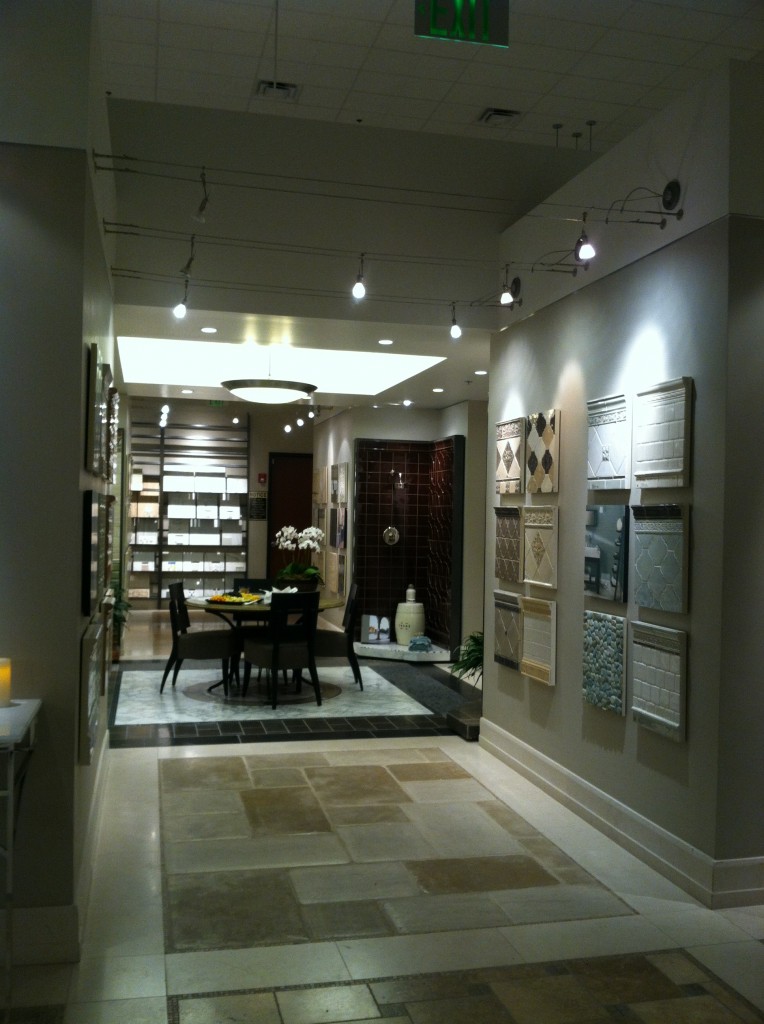
 Not only was it fun to get together once again with all my old kitchen friends but the beautiful venue was an added treat.We met at the amazing Walker Zanger showroom in Coconut Creek Florida. Walker Zanger is filled with designer eye candy! As soon as I walked in I felt an irresistible desire to explore every nook and cranny. Then I decided, if I were to do that, why not nab a tour guide? I found just that in Branch Manager, Drew Rust.
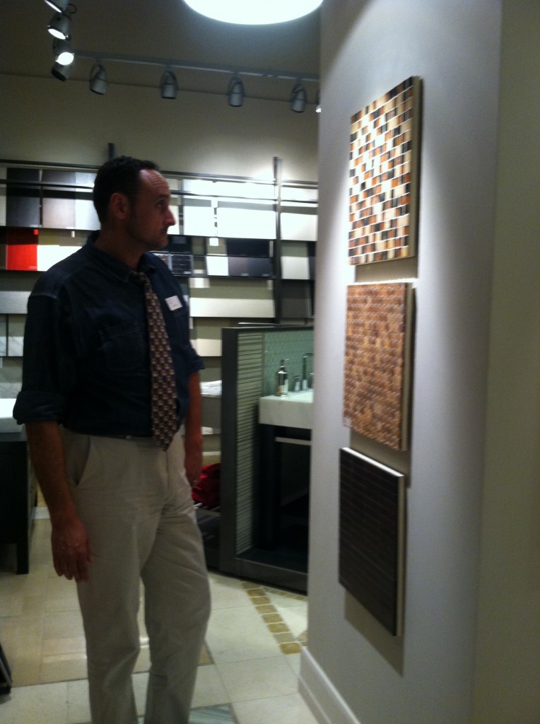 He explained that Walker Zanger has been around about 61 years beginning as a maker of marble tops evolving into a chain (15 ) of designer showrooms offering all types of tile and stone slabs from around the world. Their products can be seen at the Bellagio in Las Vegas as among many other notable locations. The showroom featured beautiful examples of glass, marble and all the usual materials we’re used to seeing tiles made out of. So I asked him, “what’s new”?
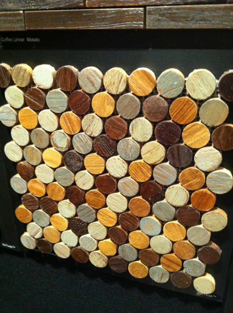
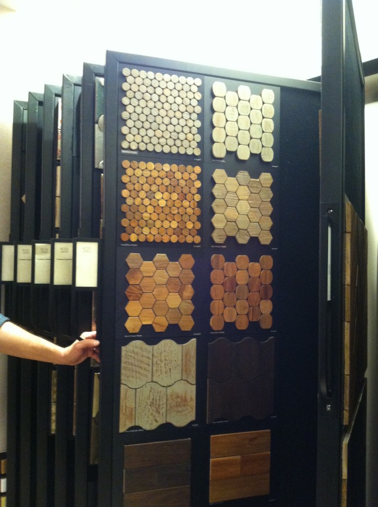 He promptly introduced me to the AnTeak Collection which is, you guessed it, tile made out of teak! It’s new, gorgeous and can be used in both flooring and wall applications. In addition to this they are working on a surface treatment that will allow it to be used on shower walls!
 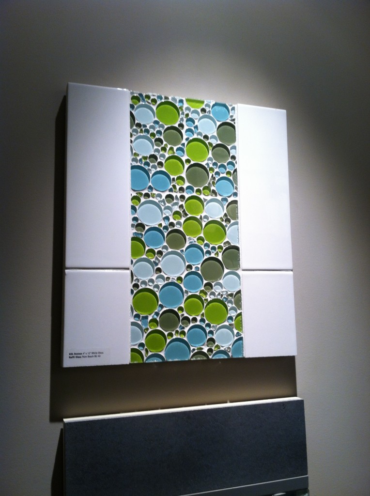 The offerings at WZ are upscale to be sure but the nice thing is that often a little goes a long way. Consider a border or an accent tile and you could get a lot of bang for the buck. Sometimes less is more. Speaking of budgets, WZ does offer some more affordable options as little as 2.50 per square foot.
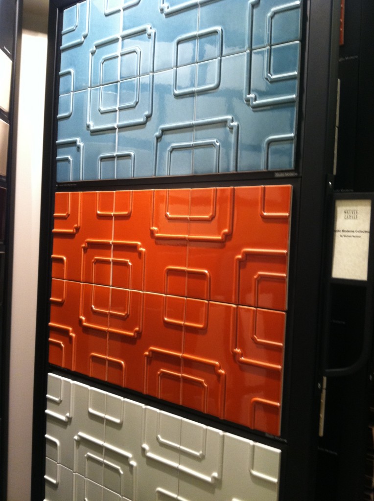
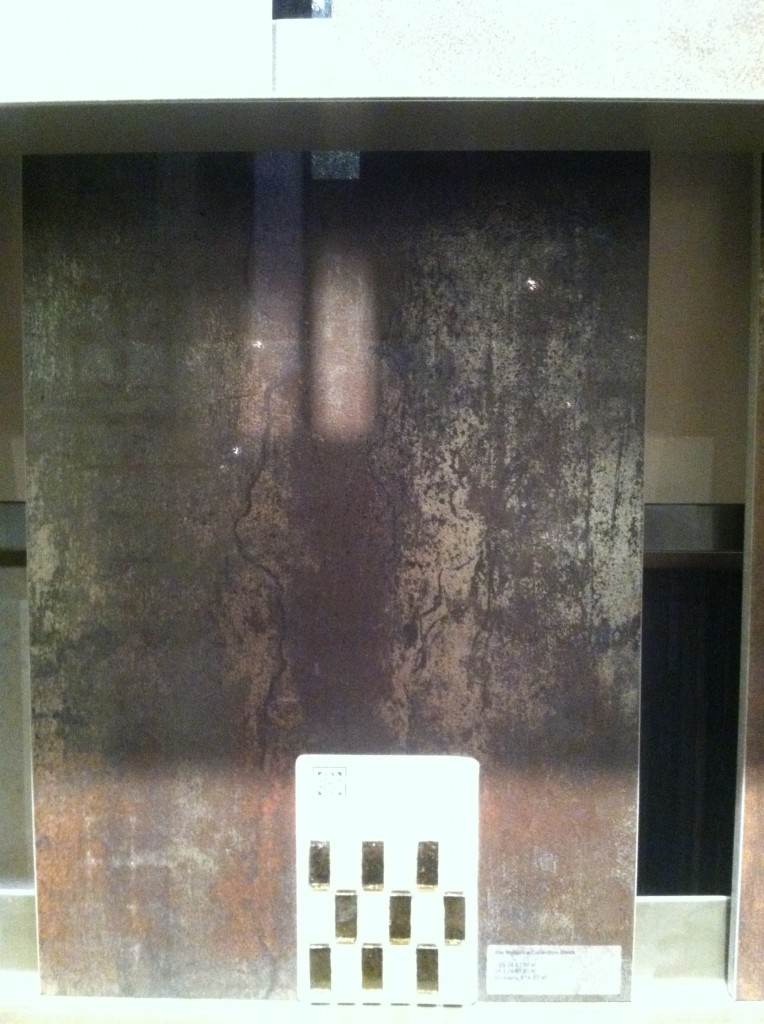 Hours are Monday-Friday 8:30-4:30. You are welcome to have a look around but bring your designer if you want to seal the deal. I'm sure Showroom Manager Deanna Dolfi would be happy to show you around!

