5 Ways to Make Any Kitchen Your Own Stylish Sanctuary

Do you get frustrated looking at all the beautiful images on Houzz and Pinterest? If only, right?  The good news is you don't always have to shoot the budget to have a kitchen that is your own unique design statement.  This means you're going to have to forgo the temptation to slavishly emulate the trend of the moment in exchange for investing in a look that is authentically your own.  Yes! Inject your own personality, make it versatile to allow for your moods and you will have something timeless that will always give you joy. Read on and I'll show you how.

5 Ways to Make Any Kitchen Your Own Stylish Sanctuary

5 Ways to Make Any Kitchen Your Own Stylish Sanctuary

Own Your Color

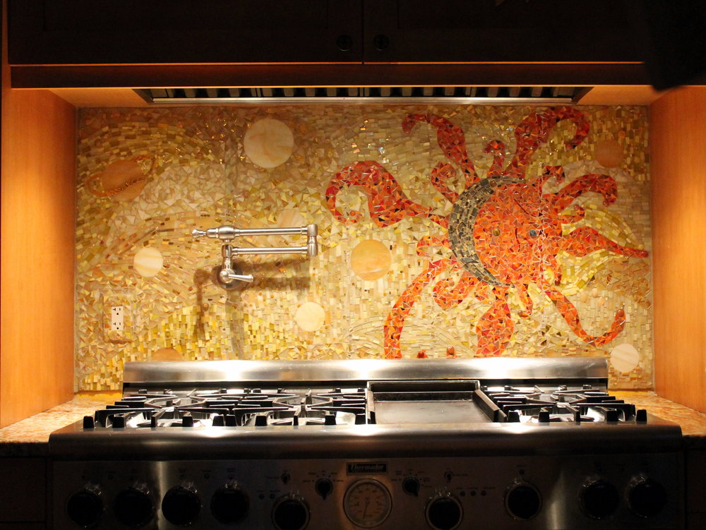
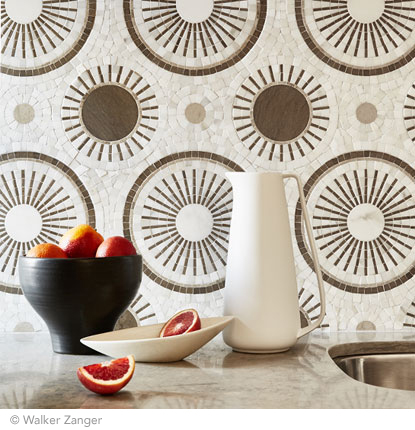
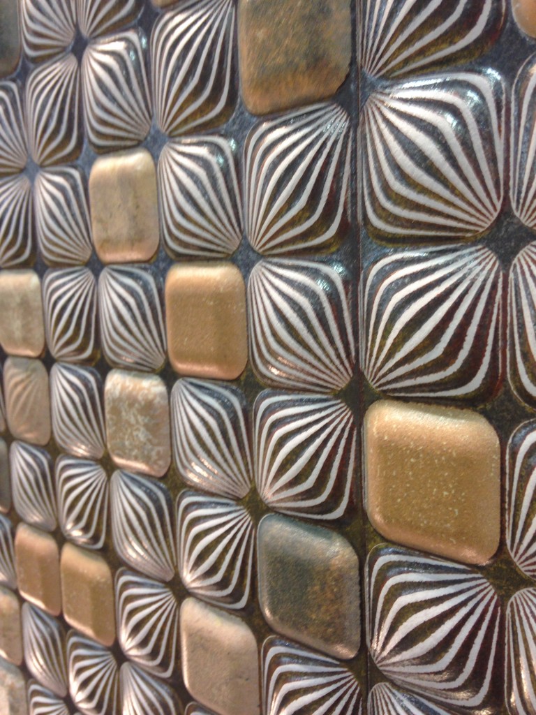
A favorite color is one way to create a personal statement in your kitchen.  Perhaps you embrace all color bright an bold.  If this is your cup of tea allow yourself open space and glass front cabinets to show your true color in all its glory.  I recommend keeping the fixed elements such as flooring and countertops neutral so you can play more with color in ways that are versatile. This would include paint, dishes, artwork and decorative items.   A nice crisp white is always a great backdrop to vibrant hues. If you are an adventurous soul because that's your personality, create a focal point like this beautiful back splash using your favorite color.  Just keep it over one area such as the stove.  Less is more and you don't want to dilute the power of the statement, right?

5 Ways to Make Any Kitchen Your Own Stylish Sanctuary

5 Ways to Make Any Kitchen Your Own Stylish Sanctuary

5 Ways to Make Any Kitchen Your Own Stylish Sanctuary

5 Ways to Make Any Kitchen Your Own Stylish Sanctuary

"Artful detail can literally be art such as paintings and sculpture but it can also be beautiful hand made utilitarian items, family treasures or books."

Embrace Your Architecture

Believe me, I have tried to "correct".  Sometimes you can but often it just doesn't work. I have had much better results when I embrace the fixed conditions I am faced with when creating a new design.  These issues can include angles, bump outs, ceiling height differences and last but not least the age and era in which a home was built.  Your space should look like it belongs.  This happens when you match the style of your design to your home.  In fact, I always try to look for clues such as arches and fixed architectural elements that I will repeat in the design. If your kitchen "goes with" your home it will always be right.

5 Ways to Make Any Kitchen Your Own Stylish Sanctuary

5 Ways to Make Any Kitchen Your Own Stylish Sanctuary

In this kitchen which you can read more about here, we were stuck with some of the angles (yes there were more) as they are exterior walls. What we did do was move the refrigerator. It used to be where the hood is. It opens up space and gives us a focal point. We also eliminated angles on both the island and the peninsula. Now my client has a kitchen that makes sense and functions perfectly for her lifestyle.

Go Within

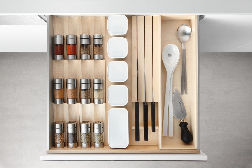
The way you customize your cabinet interiors is always based on the way you live.  Think about it.  Is there one particular item that just doesn't have a home with enough space in your kitchen? It could be food storage containers, pots or even trash!  It's different for everybody. Even if you have a small kitchen you can maximize function.  There are solutions.

Dish drawer, dish pegs, black plates, drawer cabinet

5 Ways to Make Any Kitchen Your Own Stylish Sanctuary

If you're short (like me;-) or you're just short on upper cabinets, this drawer insert featuring dish pegs can be used to customize your dish storage. Food storage containers are so necessary but can be a PIA, if you know what I mean. You may even be able to retrofit one of your cabinets with one of these handy pull out organization systems by Revashelf.  These are just two examples but there are so many options.

5 Ways to Make Any Kitchen Your Own Stylish Sanctuary

5 Ways to Make Any Kitchen Your Own Stylish Sanctuary

Customize Work Centers

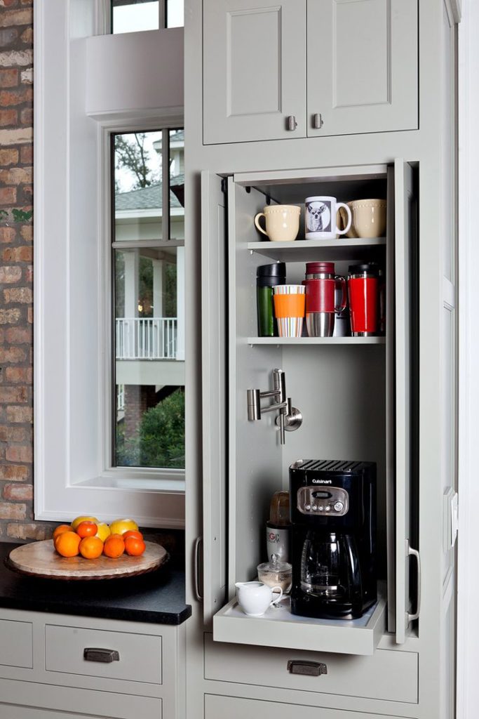
Every kitchen has a work center for food prep, clean up and cooking. Sometimes in small kitchens, they overlap but those are the basics.  Add your own as needed to customize your kitchen.  Think media center or beverage center to house your coffee or tea stash and accoutrements. Those are two popular ones that come to mind.  How about a pet center? It could be as easy as designating a certain space or cabinet and tricking out the inside. It can be planned in a new kitchen or created in your existing space.

5 Ways to Make Any Kitchen Your Own Stylish Sanctuary

5 Ways to Make Any Kitchen Your Own Stylish Sanctuary

A media center in a drawer! Measure your devices and make sure you have enough USB outlets and  you're good to go.  Sometimes it's nice to put the phone away.  Who knows what could happen ;)

5 Ways to Make Any Kitchen Your Own Stylish Sanctuary

5 Ways to Make Any Kitchen Your Own Stylish Sanctuary

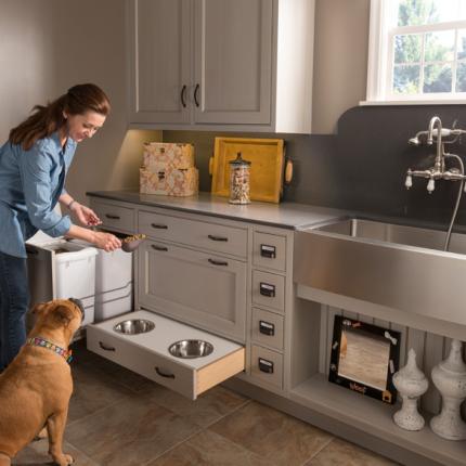
This is WoodMode's version of a pet center.  They call it a Pet Parlor and you can create this with most cabinetry

Artful Detail 

Artful detail can literally be art such as paintings and sculpture but it can also be beautiful hand made utilitarian items, family treasures or books.  If you have the room I encourage you to try and leave some open space to display such items and change them out as the mood strikes you.  This is perhaps the easiest way to make a neutral space very personal and joyful to be in.

5 Ways to Make Any Kitchen Your Own Stylish Sanctuary

5 Ways to Make Any Kitchen Your Own Stylish Sanctuary

Many kitchens have a wall on at least one end which is a perfect place for a small gallery of paintings, floating shelves or one big piece of art.

5 Ways to Make Any Kitchen Your Own Stylish Sanctuary

5 Ways to Make Any Kitchen Your Own Stylish Sanctuary

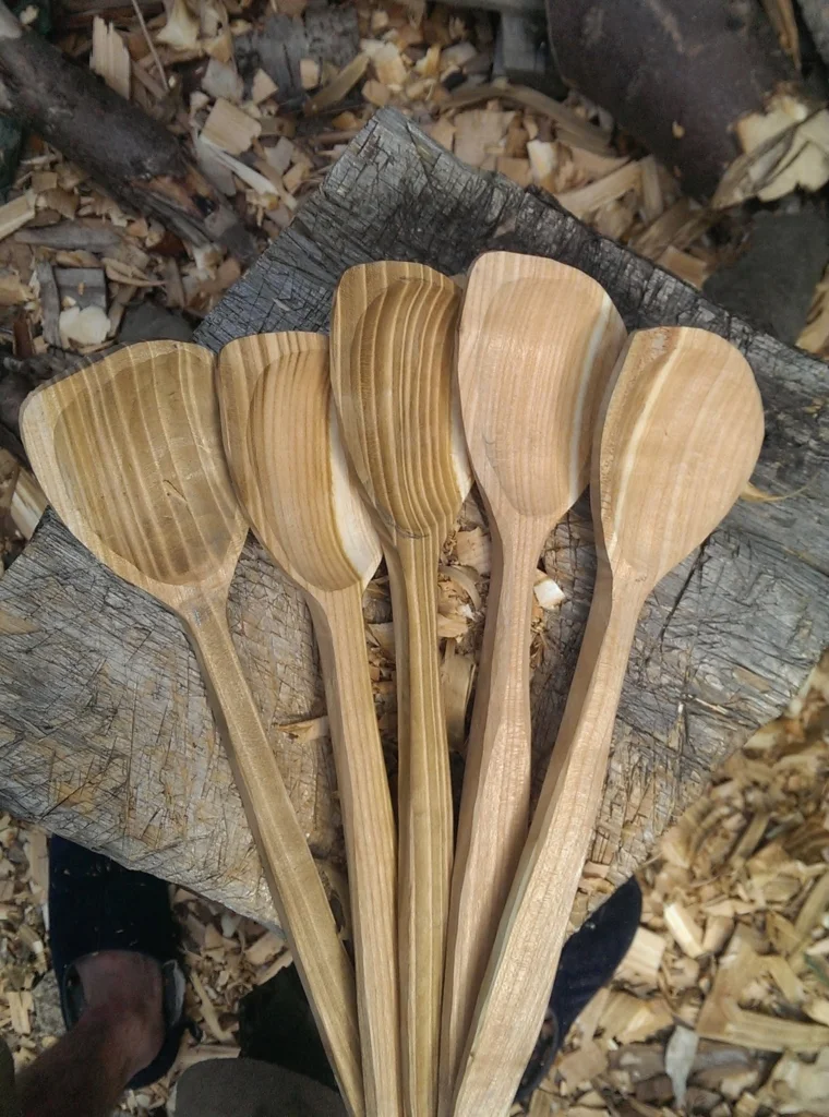
These hand-carved spoons could be considered "working sculpture" in my book.  Speaking of books, I think they enhance every space.  I love my well-worn cookbooks that probably contain bits of all the meals cooked from them!

5 Ways to Make Any Kitchen Your Own Stylish Sanctuary

5 Ways to Make Any Kitchen Your Own Stylish Sanctuary

This is a home run for me books + art!!  I love it and if you do too we'd probably get along :) 

COMING SOON!

My quarterly newsletter is coming soon.  See what I've been up to in my real life Palm Beach County projects along with new products and where you can shop locally for the best selections and value. Subscribe below so I can keep you in the loop! xoxo

The Best of KBIS 2016

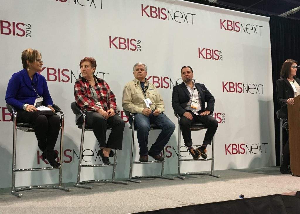
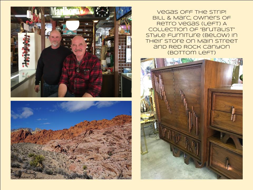
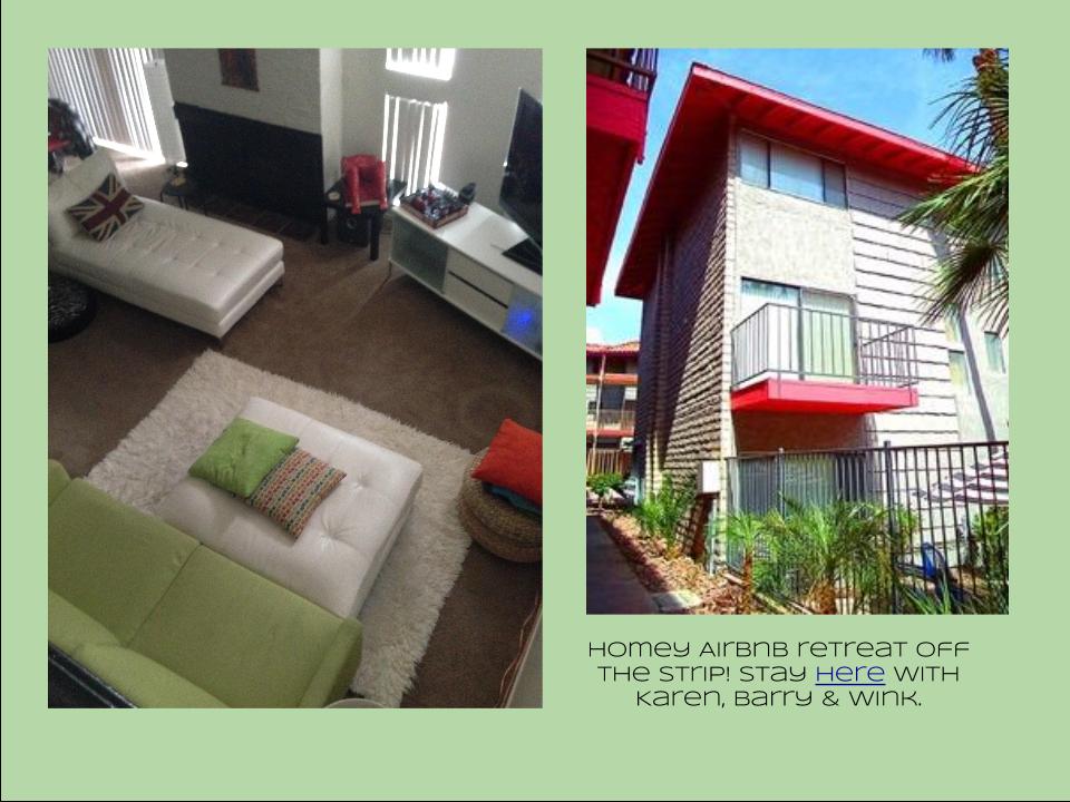
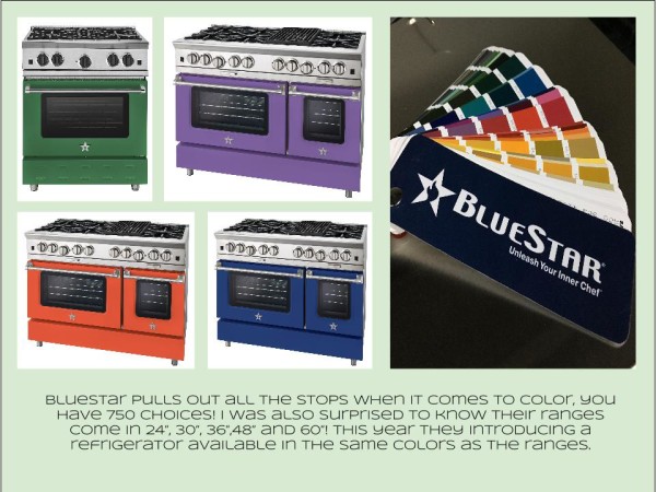
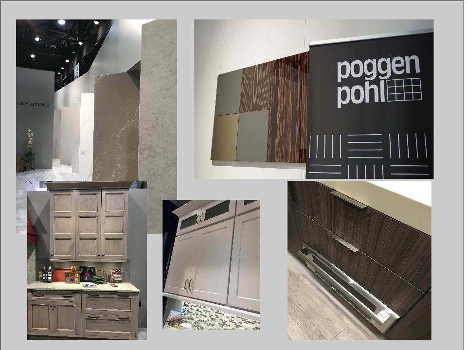
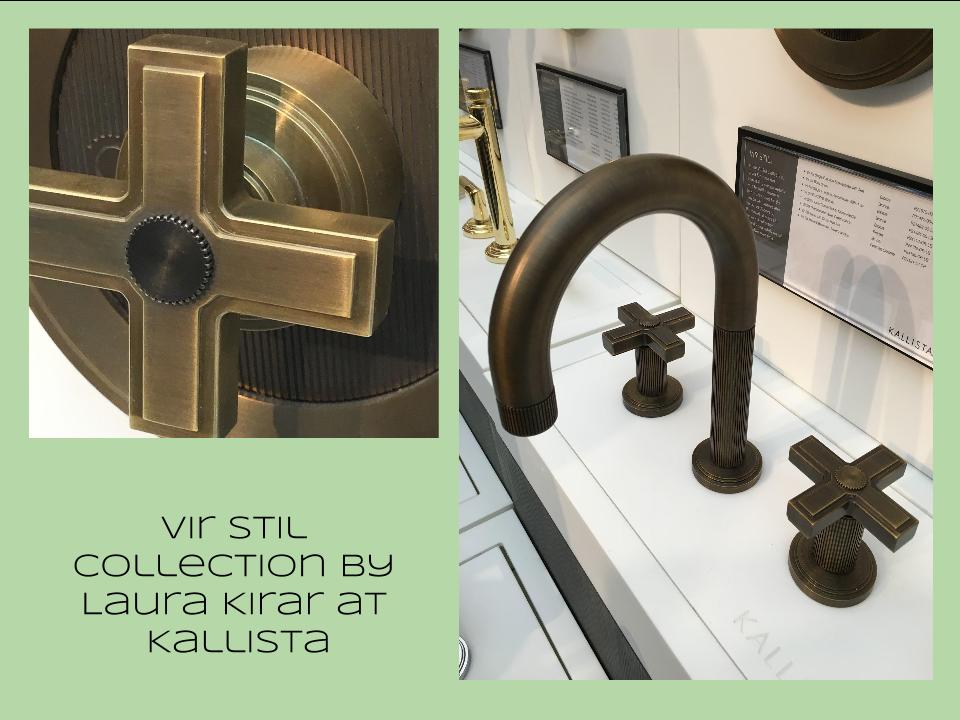
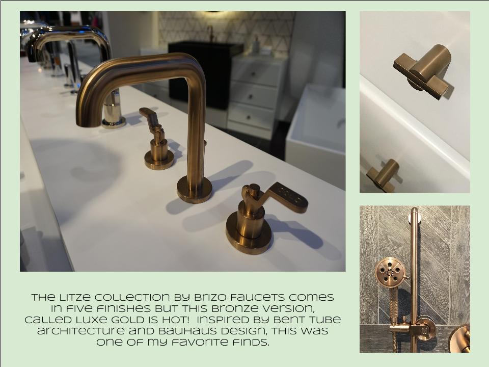
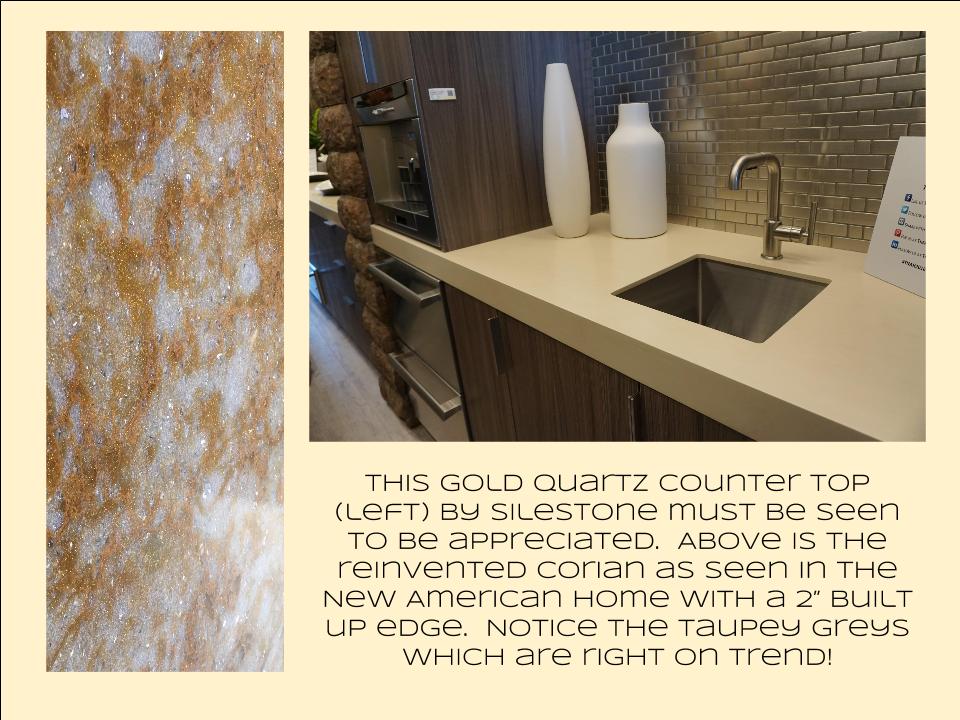
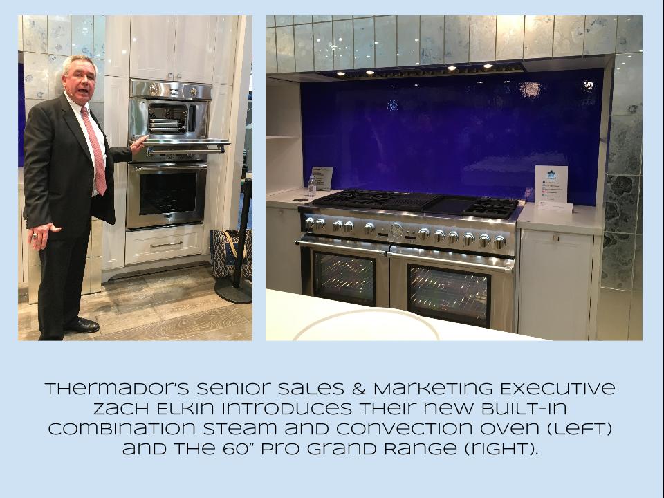
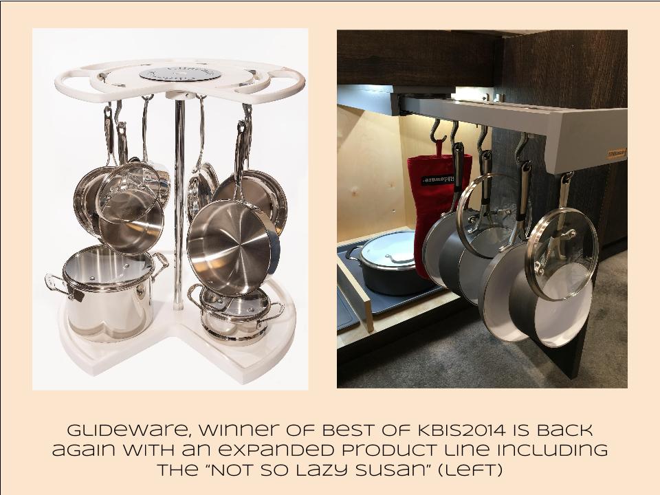
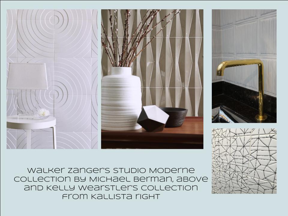
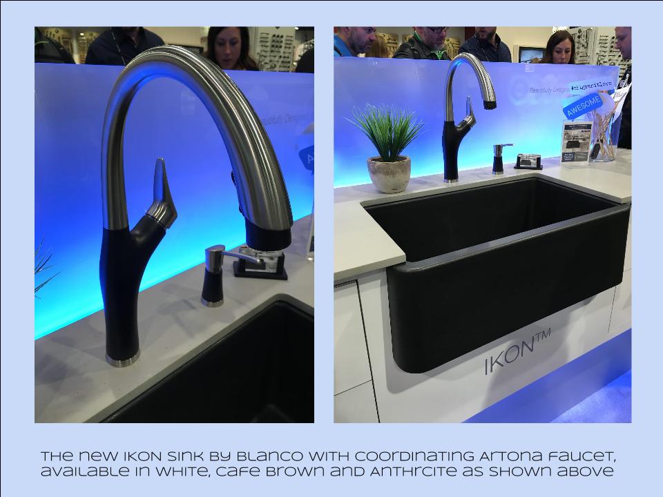
Bam!  Another show is in the books and although it's been a busy week "back at the ranch", I've been dying to share my finds with you right here on Artful Kitchens.2016-01-19_184543141_4F428_iOS (2)Las Vegas was host to three days of networking and education for the best of the Kitchen & Bath industry.  As a member of the Kitchen & Bath Business Magazine's Advisory Board,  I had the pleasure of appearing on the KBIS Next stage as a part of the panel discussion entitled Trials & Tribulations-Solutions to Your Biggest Kitchen & Bath Challenges. It was an exciting exchange of ideas between both the pros on the panel as well as a savvy and engaged audience.Vegas Off the Strip Karen (1)I also had the opportunity to spend some time in the Las Vegas I like best, off the strip! I hiked in the Red Rock Canyon and visited my friends at Retro Vegas on Main Street. My digs for this trip were with my dear pals Karen, Barry & Wink.  They live in a midcentury modern gem that, rumor has it, was briefly home to Lucille Ball!  They are avid Airbnb'ers and wonderful hosts.  Check it out if you find yourself in Vegas. This location is so convenient to the Convention center I could walk, which I did, once.  Mostly I Ubered. Enough walking happens on the show floor!  So without further ado, here's my recap of the biggest and most notable trends and products that caught my eye at KBIS2016. ColorWhite still reigns.  In fact paint giants Benjamin Moore and Sherwin Williams have both selected shades of white as their color of the year.  You know I am a huge white fan. It is always the best backdrop for art and design. It also continues to be the favorite cabinet color in my area.  Remember white is not just white, there are an infinite number of varieties you can have fun with.  If you need more punch in your kitchen you could find some great options at the big show.  I saw bright saturated colors in several appliance brands including Bertonazzi, Viking and BlueStar which offers 750 colors!  color (2)Grey has not left the stage.  The newest versions are warm, venturing into taupe territory. Textured wood grains such as cerused oak are really popular. Wood-Mode showed both traditional and contemporary versions of ribbon Mahogany.Cabinets Poggenpohl_Diamond Grey_Oak Honey BrownThe Perfect TouchTouch latch technology was EVERYWHERE!  If you prefer a sleek, uninterrupted look for your cabinets and appliances this is for you, a gentle nudge will open your cabinets. This is nothing new but it's taken off.  I also loved the button that allows you to close this cabinet when you're done without resorting to dangerous acrobatics (I'm short).Untitled drawing (5)Feeling BrassyActually brass, copper, bronze and myriad versions are hot for plumbing fixtures and hardware.  My favorites were the new BauHaus inspired Litze collection by Brizo Faucets. and Kallista's Vir Stil collection.LitzeNot Your Grandma's CorianIf you're like me Corian has been dead to you since about 1998.  That sentiment has now ended in my book.  I saw a 2"thick sleek contemporary version of Corian that was perfectly at home in The New American Home.  The other exciting thing I saw in counter tops was this quartz by Silestone.  Yes, it's GOLD!  I just wish the photo could capture it's sparkly beauty.CountersThrills from ThermadorAppliance brand Thermador held a press conference on the show floor to introduce a couple of impressive new products, the 60" pro range available with steam and a double oven featuring steam and convection.  These are firsts in the industry.ThermadorOrganize ItJust when I thought we had it all the category of organization it goes to the next level. There was a great representation of brands ranging from Hafele to Rev-A-Shelf to Hardware Resources but Glideware is taking the market by storm.  If you've got a mess lurking somewhere I guarantee there's a way to make it neat and accessibleRev A ShelfGlidewareTile StyleMy two tile favorites were Michael Berman's Collection from Walker Zanger and, of course, Ann Sacks who are featuring a new line by L.A. design maven Kelly Wearstler. Love!Tile (1)I can IKONIf you read my blog you know I love me my Silgranit sinks, meet IKON the apron front version which easily works in any style kitchen from Traditional to Contemporary. Their Artona  faucet perfectly complements the Silgranit sink.-BlancoStikwood Rocks!
Stikwood’s line of lightweight, real-wood planking offers designers and DIYers a peel-and-stick solution to achieve that perfect, sought-after blend of rustic and modern. It can be used on walls and ceilings and comes in tons of colors, even prints! I'm thinking this could be great on the back of a kitchen island.

stikwood

Believe me, all this is just the tip of the proverbial iceberg.  There was so much more to see and learn about at KBIS 2016.  Check out this year's winners of Best of KBIS for more info and of course if you'd like any more info on what you see here email me at artfulkitchensbyglo@gmail.com

5 Elements of an Artful Kitchen

Summer projects are underway in South Florida!  In fact, it's the height of the busy season for most design professionals here.

Oceanside_OA5 (3)

I don't have to tell you that a new kitchen is a big investment, in fact the kitchen is the most expensive renovation you're ever likely to undertake. It stands to reason that you'd want a kitchen that is tailor-made for you whether you can afford custom or not. This is what we're all about at Artful Kitchens.

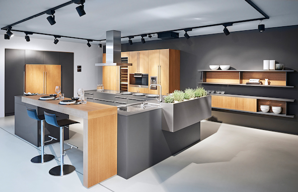
Flawless function behind the scenes from Poggenpohl

The concept of an "artful kitchen" has many different facets.  It is not just about budget or the amount of space you have but the skill you employ using what is available to you. Here are five tips to consider along with some visual inspiration featuring products I saw this year at the Kitchen & Bath Industry (KBIS) trade show in Las Vegas. Implement these with style and confidence and you will be the proud owner of an artful kitchen!


1. Flawless Function

I'm all about artistic expression but a major part of creativity in the kitchen comes from devising flawless function. This quality is not something you see but something you can experience if artfully accomplished.  When I say function, I mean work centers comprised of cooking, clean up and food prep areas.Steve Jobs quote

Those are the basics but you could have more such as a beverage center (think coffee, tea, wine), a computer station or a baking center.  If you have a two-cook kitchen, your layout should be designed so that any one of the major functions can be performed without anyone getting underfoot.

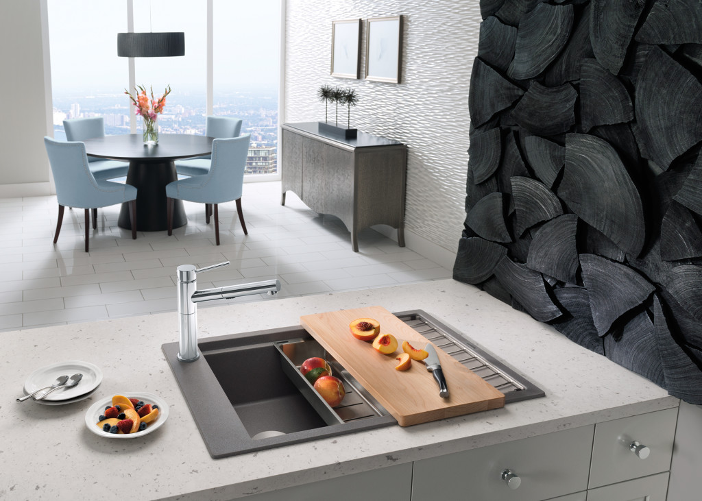
Precis sink by Blanco

Following the guidelines set by the NKBA is a must to make sure all clearances are adequate. Sometimes we don't have a lot of choice about where to locate our sink or appliances but we can organize our utensils, dishes, pots and food items in a more efficient way.  Don't forget the more flawlessly your kitchen functions the safer it is. You don't have to be an expert at this, just think about how you use your kitchen so that you will be a good collaborator when it comes time to work with a professional.

quote by Gloria Graham Sollecito, AKBD

2. Personalization

This is, without a doubt, the biggest movement in the design world.  An artful kitchen is your own personal statement customized to the way you live.  It could be a steam oven because healthy eating is your passion or it could be a lovely furniture piece with glass doors to display your grandmother's china. Include the colors you love.  Even though you must be mindful of your budget (everyone has one), strive to retain the essence of what you see as your dream kitchen.

The Pet Parlor concept can be built into your laundry or utility room

3. Harmony

Harmony is one of the principles of design and a must for your kitchen.  Whenever I design a two-toned kitchen I like to ensure that different finishes and details are carried through the space to create a cohesive whole.  It's about how the floor relates to the cabinets and  how the cabinet hardware relates to the faucet. You get the picture!  It does not mean that everything has to match perfectly, it means elements should relate to and complement each other. It also does not mean that every element has to be perfectly symmetrical.  In fact, consider this permission NOT to be! I find that the best rule of thumb is to follow the architecture and style of the home you're in.  If, for example, the kitchen window is way off center you should work with that not against it.  Never force solutions by sacrificing function.

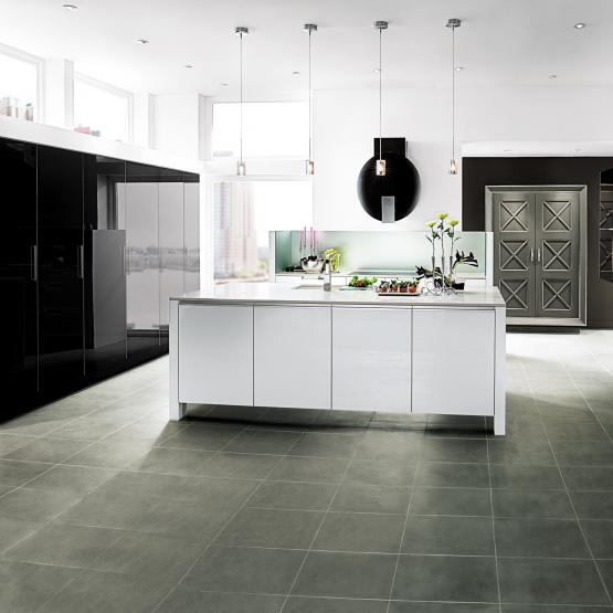
Wood-Mode Contemporary penthouse kitchen


4. Focal Point

Every piece of great artwork has a focal point.  It is the "star of the show", so to speak.  In a kitchen it can be a sculptural range hood, a granite counter with big bold movement or actually a piece of art! It is the item that makes you say WOW when you enter the kitchen.  Just remember less is more here.  One great focal point is probably enough.  Too much and the statement gets lost. Less is definitely more.

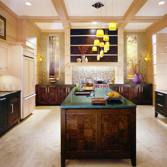
Transitional kitchen by Wood-Mode

5. Texture

The element of texture involves at least two of our senses, touch and sight.  The textures you are likely to come across include the glossy finishes popular in contemporary design, prominent wood grains which can be traditional or modern and smooth honed surfaces that are more matte.  A flat slab cabinet door is a great choice if you plan to use a wood with a lot of pattern and graining.  In this case the material is the decorative element of the cabinet.  On the other hand, if you are traditional and you are using white cabinets you can select a door with some molding or detail.  Also let the wild patterns either be on your cabinets or on your counter, both would be busy and distracting.

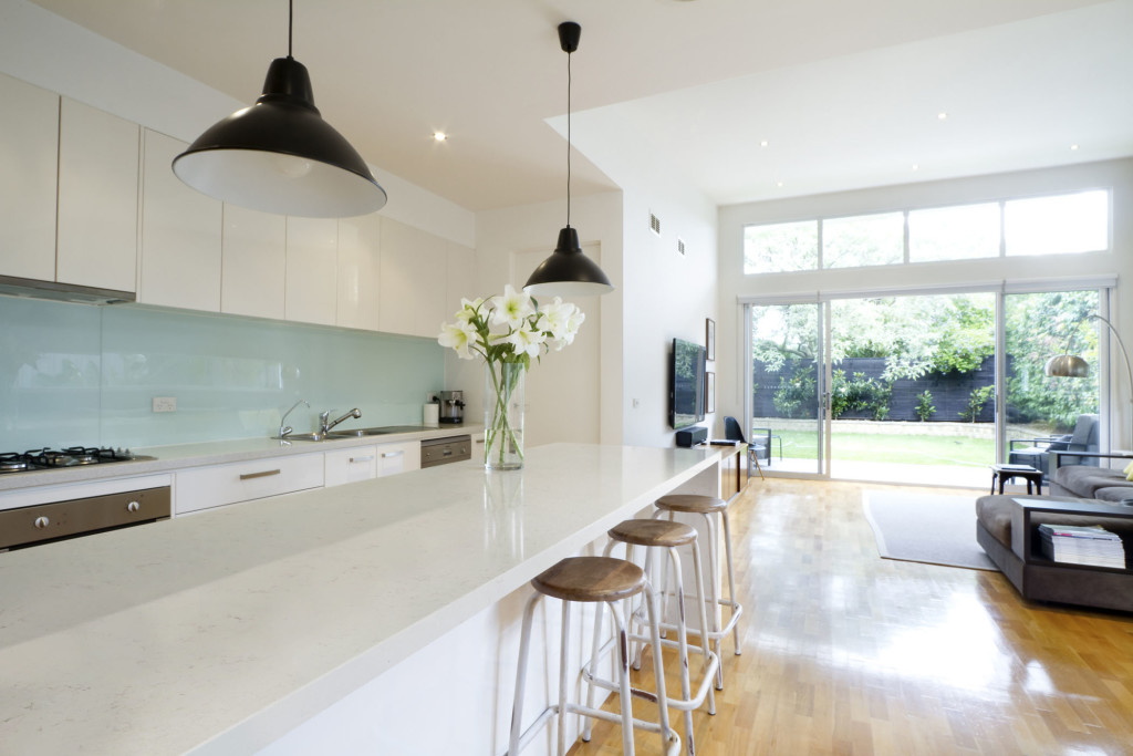
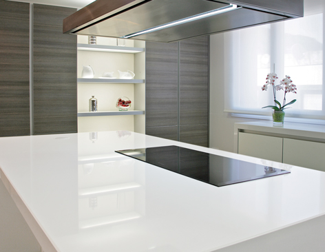
Contemporary kitchen with Sileston Nebula Alpha

This is only the tip of the iceberg, so to speak.  There are many more tricks and methods to create an artful kitchen. What are yours?  Please keep in touch and contact me. Whether you need a quick consult or a full design layout I can help in person or virtually.

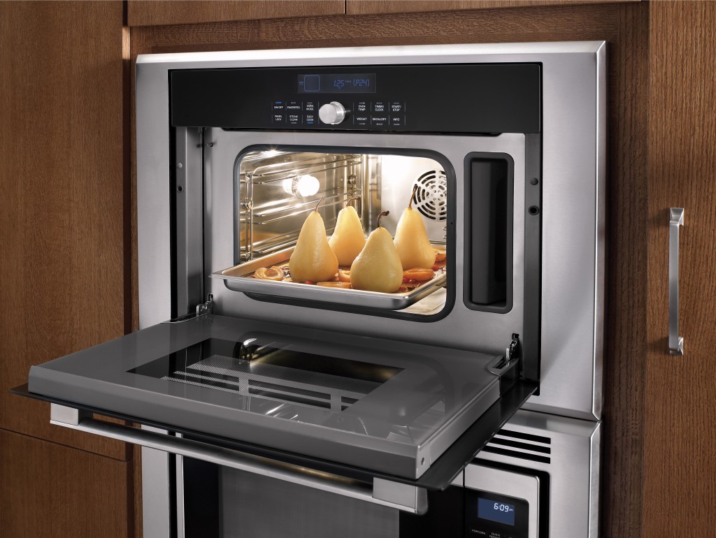
Steam oven by Thermador

I'm located in the West Palm Beach area, so if you're local I can also help you shop for your kitchen products.


Kitchen Work Centers, the New "Triangle"

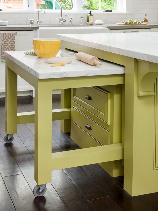
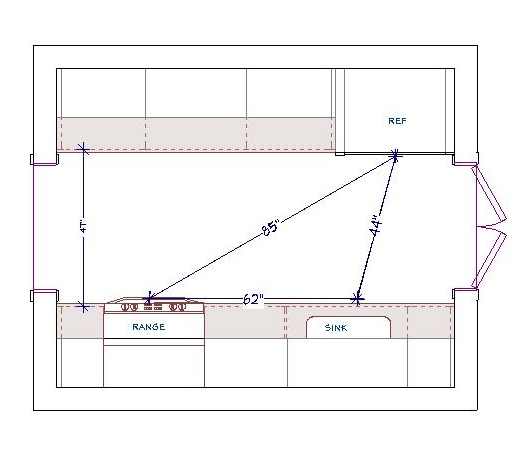
Whether you are a design professional or an educated homeowner you’ve probably heard the term “kitchen work triangle”. In fact it’s probably one of the first things you learn when endeavoring to create a new kitchen. Who thought this up? It is actually the result of a study made at the University of Illinois in the 1950s! If you’re wondering if it could be outdated, just think of how much kitchens have changed since then in terms of products, appliances and how we use them.The National Kitchen and Bath Association (NKBA) defines the kitchen “work triangle” an imaginary straight line drawn from the center of the sink, to the center of the cook top, to the center of the refrigerator and finally back to the sink.Speaking of TRIANGLES, I thought this was really artfulThe NKBA suggests the following guidelines for determining a work triangle:- The sum of the work triangle's three sides should not exceed 26 ft. and each leg should measure between 4 ft. and 9 ft.Triangle- The work triangle should not cut through an island or peninsula by more than 12 inches.- If the kitchen has only one sink, it should be placed between or across from the cooking surface, preparation area or refrigerator.Yes, this makes kitchen design sound a bit like solving a puzzle and, actually, it really is. I know my design is “right” when the layout works from every angle in terms of safety, ease of function and, of course, aesthetics.{29B28645-DCE3-4BC1-A625-A85A38654059}Img400Some of the design solution is just good sound common sense but much of it should be directed by the individual needs of the client. I don’t “do” the triangle as a rule. Today we have multiple cook kitchens and no end of possible appliances. Modern kitchens are so unlike those of 60 years ago, so I use the more updated concept of “work centers”. The basic ones are food prep, cooking, clean up and storage. The Pet Parlor concept can be built into your laundry or utility roomSo while efficiency is still at the forefront, the thinking is a bit more evolved to address twenty first century needs.In a perfect world, work centers should be situated to allow someone to work in one area without getting in the way of someone using another. However, let’s face it, in a very small kitchen that is just not going to happen! The focus then is twofold: enough storage and enough counter space.64a6706c99de3aa50964a366b524c19fThe types of work centers you can have is only limited by your imagination. Here are some good ones:-Beverage center- It can be coffee/tea, smoothies, wine or cocktails-Media center-It can be sit down area for menu planning, computer, charging station or TV-Baking center- You can trick this area out with customized storage for bake ware, bowls, utensils and a marble top for rolling dough.This baking center only comes out when you need it! Photo courtesty of BHGRemember that an “artful kitchen” employs what I call “practical creativity”. Function is the infrastructure, beauty comes next, the art is getting both just right.

An Artful New Adventure!

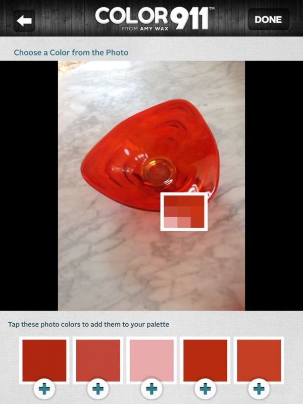
Let’s face it, things change.  As we navigate those twists and turns of fate we can only hope to move forward, seeing new things with a fresh eye. Like it or not, change is a constant.  You can dread it (understandable) or you can choose to embrace it.  That said, it has been more than five years since I began my adventure as Kitchens for Living.Jason Wu 2 (2) I believe I have been true to my promise to share the latest design trends and product info for the heart of your home. We have frequently ventured out of the kitchen and even around the globe! I am so grateful for all the wonderful and talented kindred souls I have met along the way, fellow bloggers, designers and great organizations such as Modenus, Blanco, Brizo, Tile of Spain and many more.  This blog has afforded me the opportunity to travel and bear witness to marvelous destinations and inspiring trade shows. Before this starts sounding too sad, let me tell you I have never felt so excited about the future and eager to explore new opportunities. DSCF9449-L This will be the last post for Kitchens for Living.  From now on I will be able to merge two of the things I love,  kitchen design and art with my new site, Artful Kitchens.  A big THANK YOU to Leslie Carothers of The Kaleidoscope Partnership for her guidance and insight which lead me to discover a new path full of promise and possibilities. tangent_astral88_Square_01Artful Kitchens will focus on all the ways you can use  creativity to personalize your kitchen. Artful spaces reflect who you are and the way you live.Blanco, Residences at Mandarin Oriental, Modenus Blog Tour, #blogtourvegasThe stunning tile above,  by Walker Zanger, was featured at KBIS 2015 which I had the pleasure of attending with The Modenus Blog Tour Vegas. Wilsonart is introducing quartz counter tops!New products like this perfectly white quartz by Wilsonart enhance the kitchen with a feeling of crisp clean freshness!297b3d62-06a8-5ab9-e9d3-5e0d7b88ef14  Color is a primary element of the Artful Kitchen. We'll be talking a lot about that in an upcoming interview with Amy Wax of Color 911Color 911 is an app that allows you to create color schemes with ease!We will continue to incorporate new products and technologies as they emerge and we will explore all the artful ways of creating a kitchen that reflects who you really are. I’m so excited, I hope you’ll join me and spread the word.  Last but certainly not least, whether you are a brand or a consumer, I want to collaborate with you! 2015-02-12 10.56.28Continue the conversation on Face Book or email me at ArtfulKitchensbyGlo@gmail.com 

Wood-Mode and Top Knobs, Makings of a Dream Kitchen

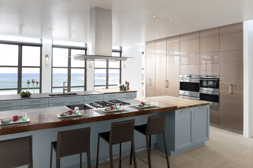
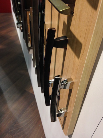
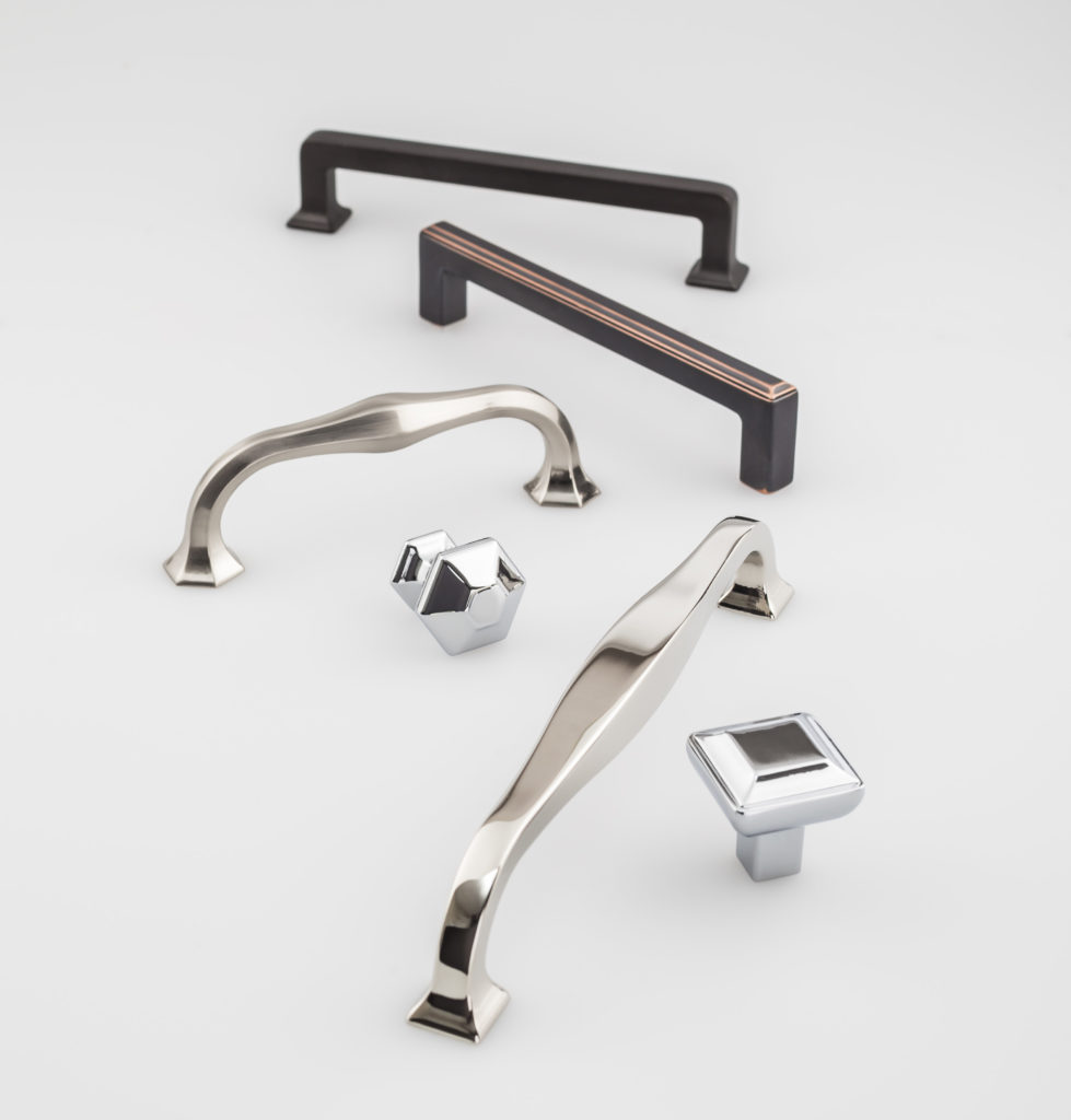
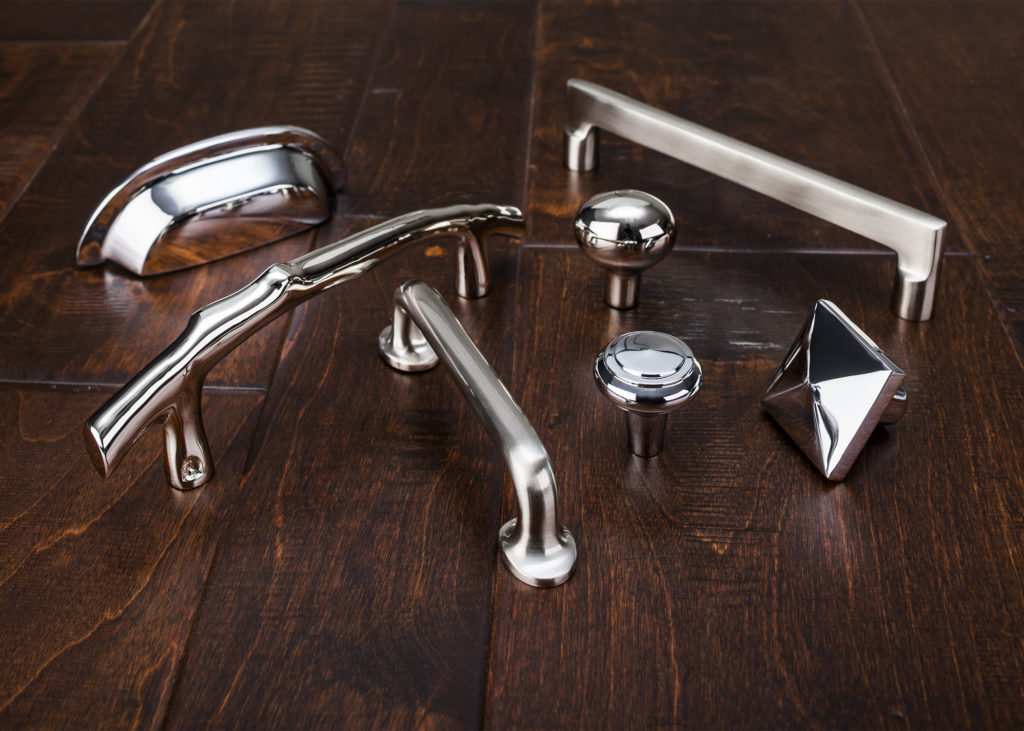
If you've spent any time researching cabinets for your new kitchen or bath you've probably come across then name Wood-Mode. It's the nation’s largest manufacturer of custom cabinetry for kitchens, baths and other rooms throughout the home and they've been around for 42 years.  I learned that Wood-Mode has great name recognition in the industry for good reason.  Their booth at KBIS was impressive and fun!  Four yellow Lab pups were on hand to demonstrate  one of their  lifestyle concepts, The Pet Parlor.The Pet Parlor concept can be built into your laundry or utility roomThere's a place for everything from food storage, food bowls, bathing and more.  Great idea, yes? To highlight it Wood-Mode had the most interesting gig going at the show.  For all selfies posted with the dogs they donated $5 to the Susquehanna Service Dogs.  This will be an ongoing partnership.  They call it a PAWSitive partnership. You can read more about it here.2015-01-21 13.36.04 Wood-Mode's newest lifestyle concept, Oceanside,  is right after my own heart.  This coastal style is a modern fresh mix of contemporary and transitional.  The subtle aqua and sandy shades of beige are on point. The Oceanside approach includes a very open plan with efficient hidden storage.  I see this as a reflection of the trends I saw in Italy last year, fewer or no upper cabinets but high function tall cabinets instead.  The combination of materials and finishes add lots of visual interest.Dual Maple Islands featuring Linear Recessed door style in Aqua Shade.With over 200 doors to choose from as well as furniture finishing techniques and options for built-in storage, Wood-Mode can create the perfect solution for your lifestyle, whether is be Coastal, pet-perfect or both!2015-01-20 10.21.58 If you're going to be needing cabinets, you're also going to need to get into them.  That's where Top Knobs comes in.  Another brand with great name recognition, TopKnobs specializes in fine decorative hardware for the kitchen and bath.  You can tell the quality of a cabinet knob or handle by the weighty feel of it and I have always noticed that about TopKnobs products. The other important thing the finish which they guarantee for life!Transcend Collection by Top KnobsThey introduced the Transcend Collection at KBIS.  This includes the Podium, Ascendra and Contour Series which come in Brushed Satin Nickel, Polished Chrome, Polished Nickel, Sable and Umbrio.Aspen II Collection by Top KnobsAlso new at the show was Aspen II in three finishes, Polished Chrome, Polished Nickel and Brushed Satin Nickel.  “The Aspen II collection combines old-world shape and style with contemporary finishes,” states Christine Zimmer, product manager for Top Knobs. “They bring to the market a unique look that designers can use in transitional spaces. Made with solid castings of artisan grade bronze, you can feel the quality of Aspen II in the palm of your hand.”With Wood-Mode and Top Knobs your dream kitchen can come to life!