Euro Cucina 2014

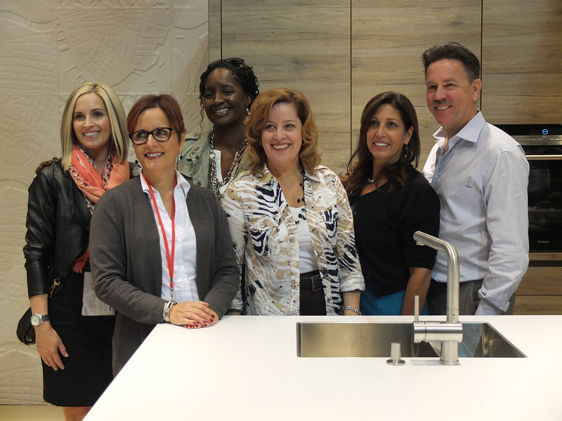
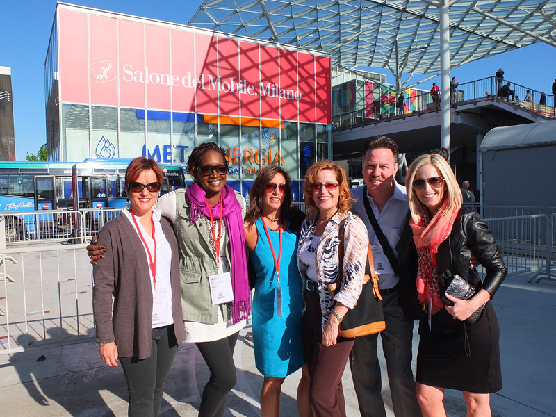
I'm home and just about recovered from my jet lag.  All pics are up for your perusal.  It was a fabulous trip and my heartfelt gratitude goes out to the golden peeps at Blanco, including travel mate Christy Emens as well as Lori Dolnick of Frank Advertising.  I was honored to be included with fellow bloggers Marilyn Russell (DesignMagnifique), Kelly Morisseau (KellyMorisseau.com) and Grace & Ken Kelly of (kitchendesigns.com).  Having been to many trade shows in the US over the years, I've always wanted to experience the bigger, global picture.  Now I have and it was amazing.DSCF9449-L I arrived on Monday morning ready to explore.  Lori and I took a stroll and stumbled upon a delicious lunch and a very cool design museum but first things first.  I'm dying to tell you about all the products and trends I saw at the big show.  Euro Cucina only comes along every two years as a part of the Salone del Mobile. Milano.  There is also a whole section devoted to the bath called Salone Internazionale del Bagno. Kitchen gadgets and appliances are shown in the FTK section.  I did a pretty good job of covering those but I estimate that was only about 20% of the entire show, the rest being furniture and other aspects of design.  Here's what caught my eye.
2014-04-08 12.12.09

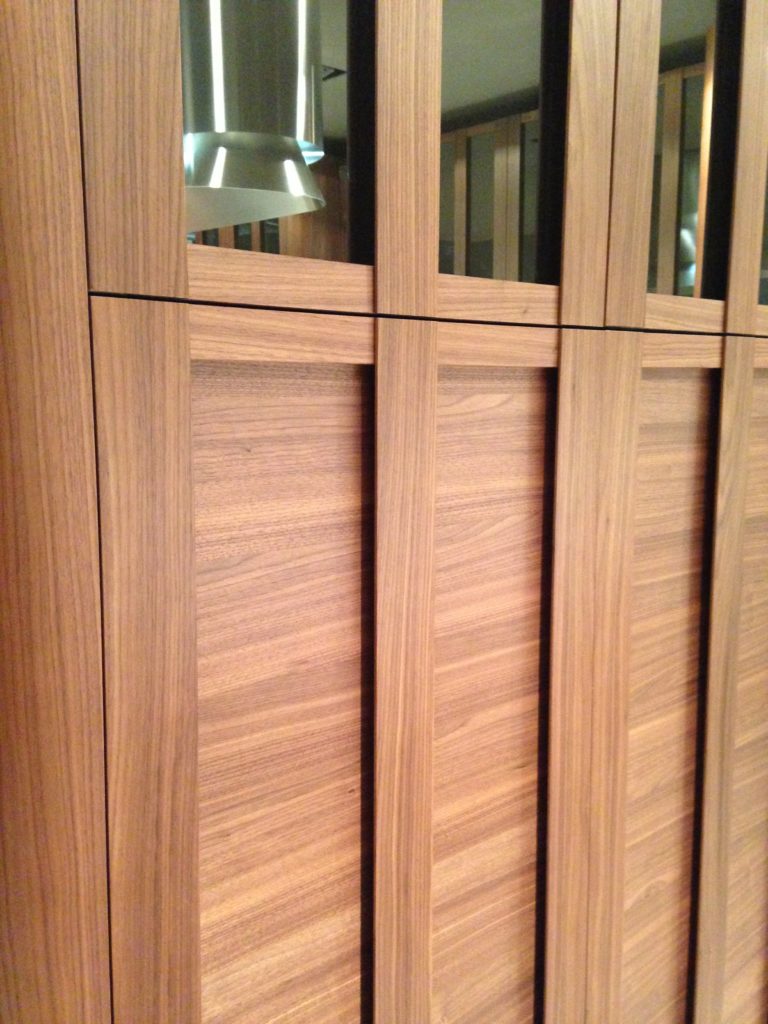
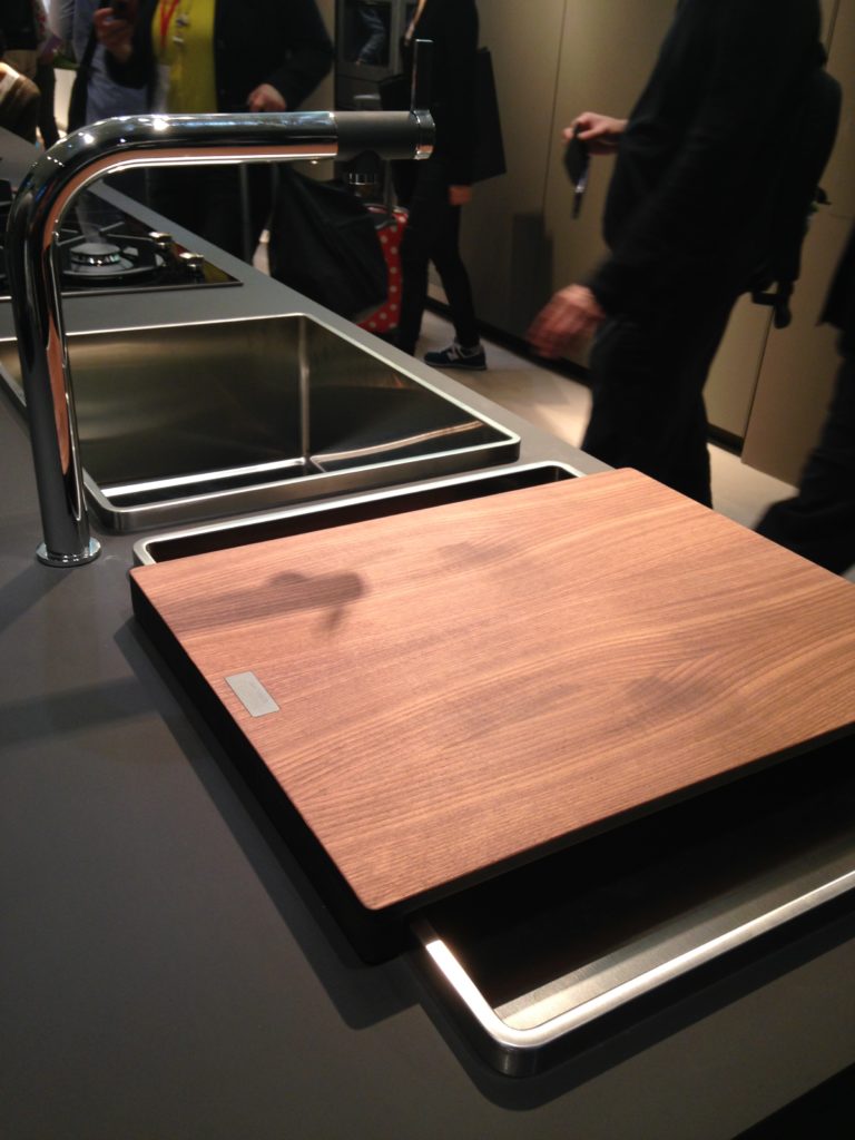
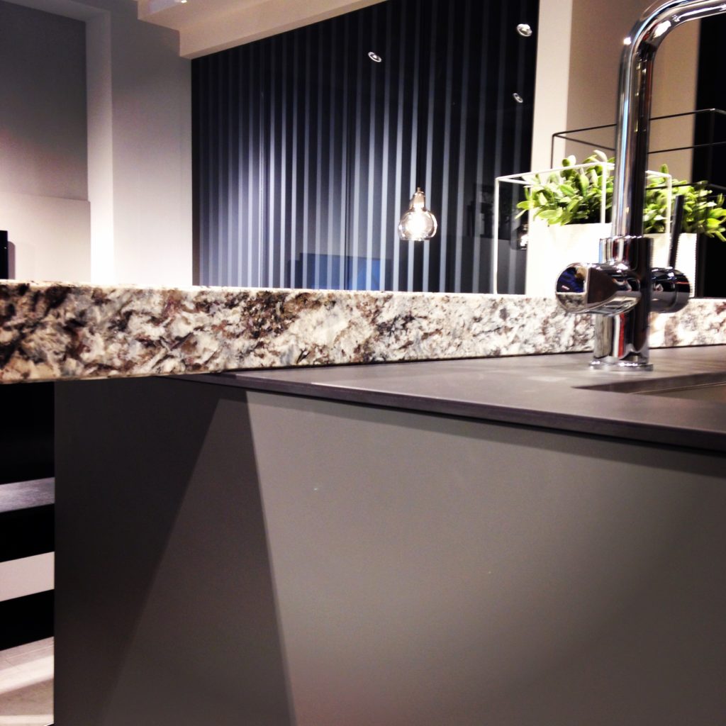
Counter tops were either very thin or chunky, like 1/2"  for the thin and 3" for the chunky.   I saw a lot of mixing of materials, in fact, that was probably the one biggest trend I saw for both counter tops and cabinets.  It is also one that can easily be adapted to our US market.  Counter top materials are much more adventurous than the usual granite or quartz that we are used to here. I saw wood, Corian, recycled composite material and more.  The overlapping installation here was also quite common.Blanco Steel Art Precision Sink KitchensforlivingThe kitchen sink saw some new innovations including lots of accessories and different methods of installation.  The inset style above, by Blanco, is factory installed by Leicht for a perfect fit.  This particular one is not available to us in the US but we can get the Precision model with the distinctive square corner interior for undermount applications. The sculptural Attika sink also by Blancowood cabinets glass doors Composit Cabinets featured lots of defined graining in woods such as white oak, rosewood and walnut in both horizontal and vertical directions, sometimes on the same door.  I also saw some interesting variations on the popular slab and Shaker silhouettes.
2014-04-08 11.28.43


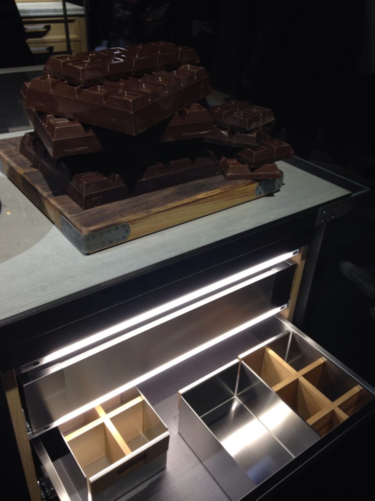
LED lights illuminated the interior of all cabinets including drawers.  Just open the drawer and contents are illuminated.  Cabinetry, for the most part was sleek on the outside, party on the inside!  By that I mean that interiors were tricked out to the max to ensure convenient and efficient storage. Oh and yes, that 's a truck load of chocolate on the top, almost as intriguing as the drawer.  If you think that's eye candy, just wait till you get to the end of the post!
eurocucina2014 drawers led light drawer organizer
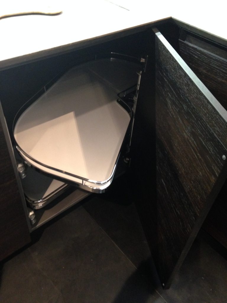
CleverStorageUS by Kessebohmer showed this blind corner pull out (below) which I specify all the time.  I think it's really the best way to take advantage of an awkward space.
2014-04-09 15.27.05
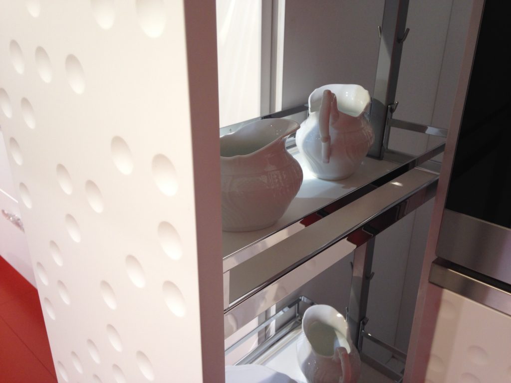
CleverStorageUS Pantry Pullout Kessebohmer Schiffini
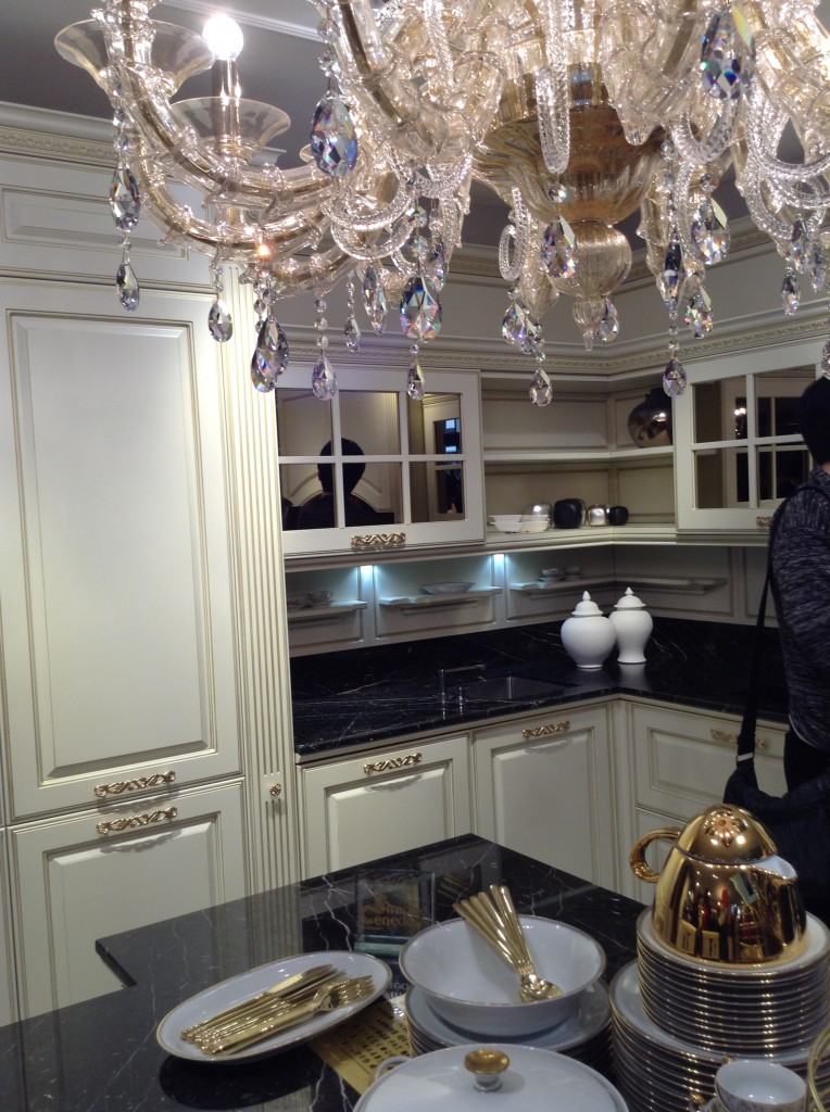
Traditional styling was represented but examples were relatively few.  Some very opulent looks, traditional with high tech functionality
Traditional Cabinets EuroCucina Whitecabinetswithgolddetail
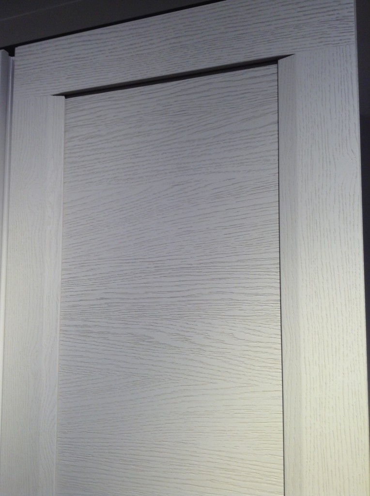
Visual Texture was abundant on cabinet fronts with laminates that look like the real deal.  But don't let looks deceive, these laminate fronts behind us (below) are by Leicht and are smooth as the proverbial baby's bottom!
Leicht Eurocucina2014 blancodesigncouncil
Italian men were also on display and I would be remiss if I didn't cover that aspect of the show.  So there I was minding my own business, when a fashion show erupted (it was actually in the Bath section of the show).
Fashion show sponsored by Ceramics Sant Agostino This is just the first in a series of posts about Milan and Salone Internazionale del Mobile.  Upcoming posts will include our visits to Acheo and Poggenpohl showrooms and much more.  So what do you think of these kitchen trends so far? I think some will make it over the pond but you can always know that whatever we do, we'll do it with an Americano twist. More later :)Click here for a peek at all my Milan photos!
A New View into Kitchen Design

This year marks my twentieth anniversary in this industry.  I was originally a fashion major but when I fled the retail life for this industry I came to it totally green.  I still clearly remember my first day looking at a floor plan.  I couldn't tell a door apart from a bathtub. My, have we come along way!  Around 5 years ago I converted from hand drafting to computer, yes I was a hold out.  I taught myself Chief Architect and never looked back (although I still look forward to learning it much more in depth). Today there is a wealth of real photos at your disposal on websites like houzz.com or modenus.com available to help with design ideas and options.  We live the adage that "a picture is worth a thousand words"!  One company is taking it a step further, meet VDS (Virtual Design Studio) This tool was developed for Austrian Laminate Maker EGGER.  Choosing an exact finish for your new cabinetry can be daunting.  This tool allows you through HD video projectors, to see wooden textures on real objects.   This touch screen interface allows you to choose out of Egger's 700 options.  For the first time the viewer has the option of making a choice  in  full scale mode and with a truly realistic impression.The days of color sample chips are quickly coming to a close.What could be next?   Follow me April 6-11 as I cover iSalone, a part of Design Week in Milan. As a member of BLANCO’s Design Council, I’ll be traveling with a small group of my fellow members Marilyn Russell of Design MagnifiqueKelly Morriseau , and Ken and Grace Kelly of Kitchen Designs,  I'm thrilled to be included with with such talent and will  be Instagram-ing, FaceBooking, blogging and Tweeting up a storm! I hope you join me. 

This New Sink is Definitely THE ONE

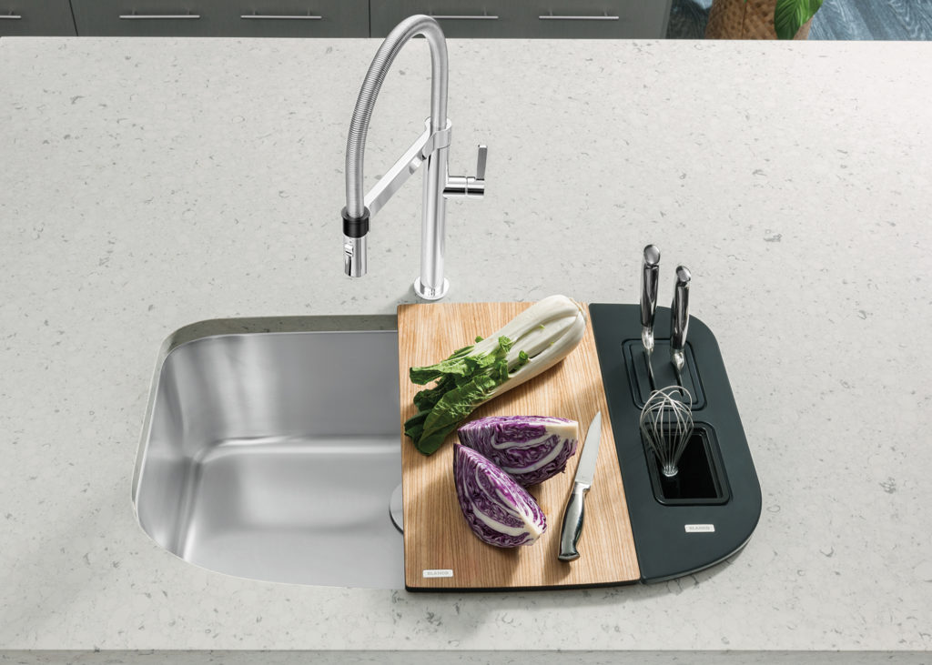
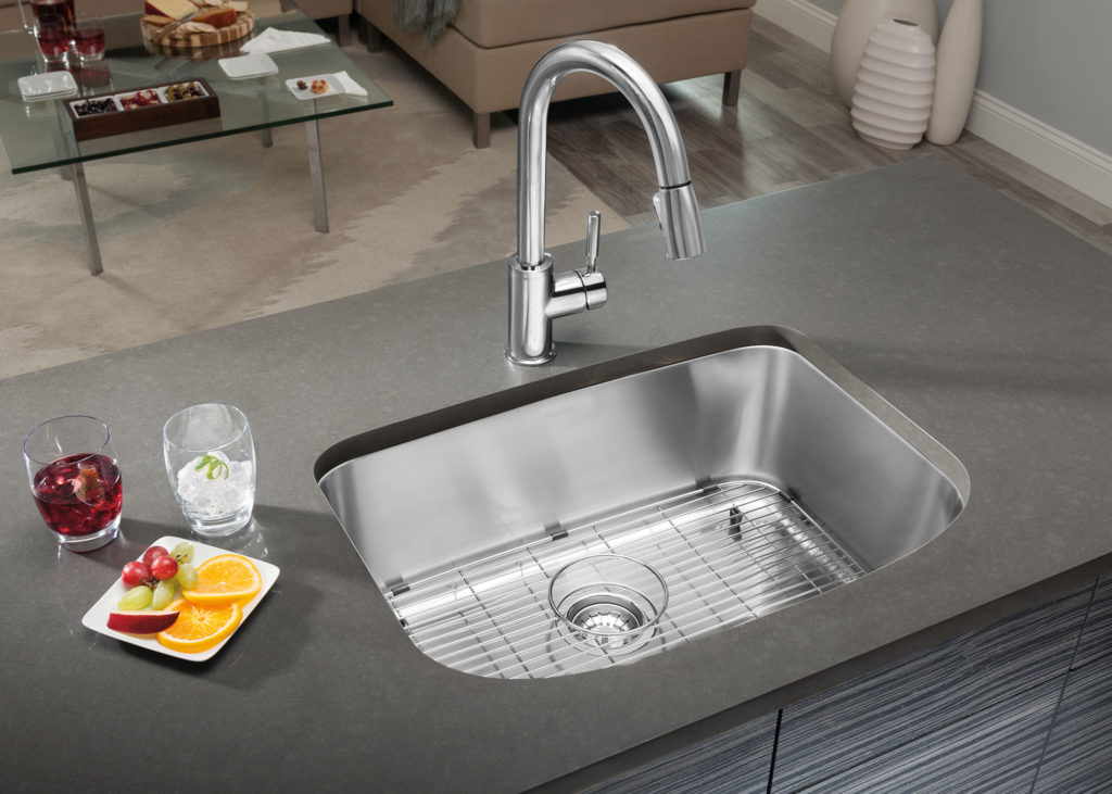
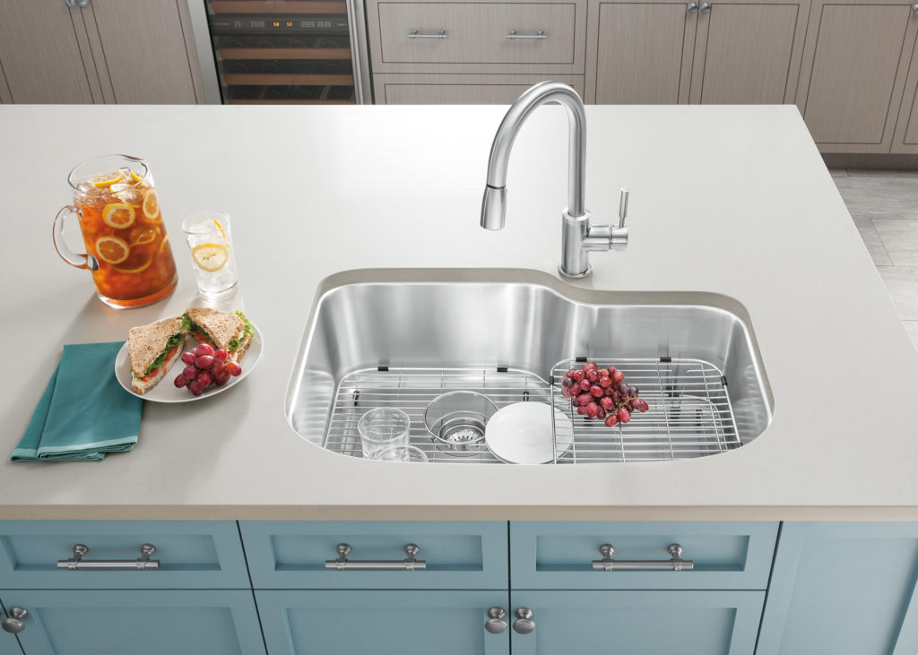
Organization and efficient use of space will make or break your kitchen. It all starts at the sink which, it may be argued, is the heart of your kitchen. Living in South Florida, I do my fair share of condo kitchens where space is a precious commodity. It’s not always practical to devote 36” (the standard) to a sink base cabinet when every inch counts.The One by BlancoThat is why I’m so pleased that my go-to sink manufacturer, Blanco, has introduced something very good in a small(er) package. It’s called Blanco ONE. These stainless steel single bowl sinks are not only sized right to fit in 30" or even 27” sink cabinets but they can be customized to the way you work.    They come in three sizes XL Single Bowl, Super Single Bowl  and Medium Bowl.  All are 9" deep which is a good thing when it comes time to insert that spaghetti pot.The Medium Bowl shown with stainless steel grid optionPerhaps the best thing of all is that you have lots of accessory options sold either as kits or a la carte.  They include grids, work stations, cutting boards, magnetic drain covers and sink caddies to hold that necessary evil, the sponge.XL Single Bowl with multi-level grid that can be used in or out of the sink.Click here for more information about Blanco ONE.

Kitchen Case Study: Update and Integrate

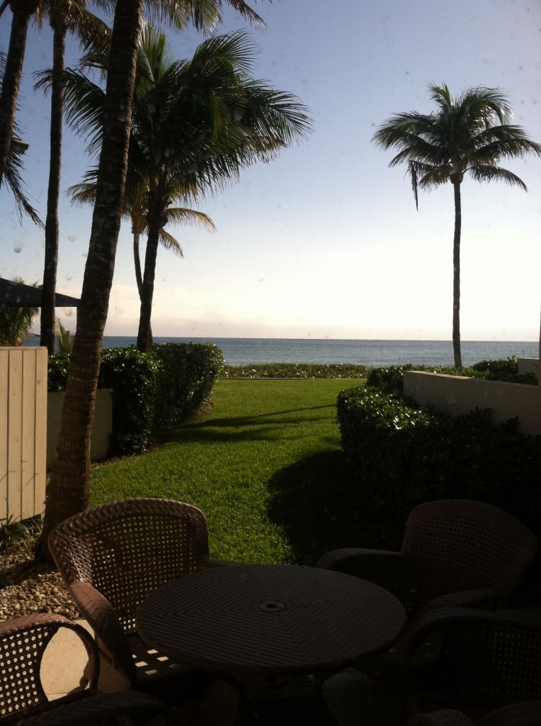
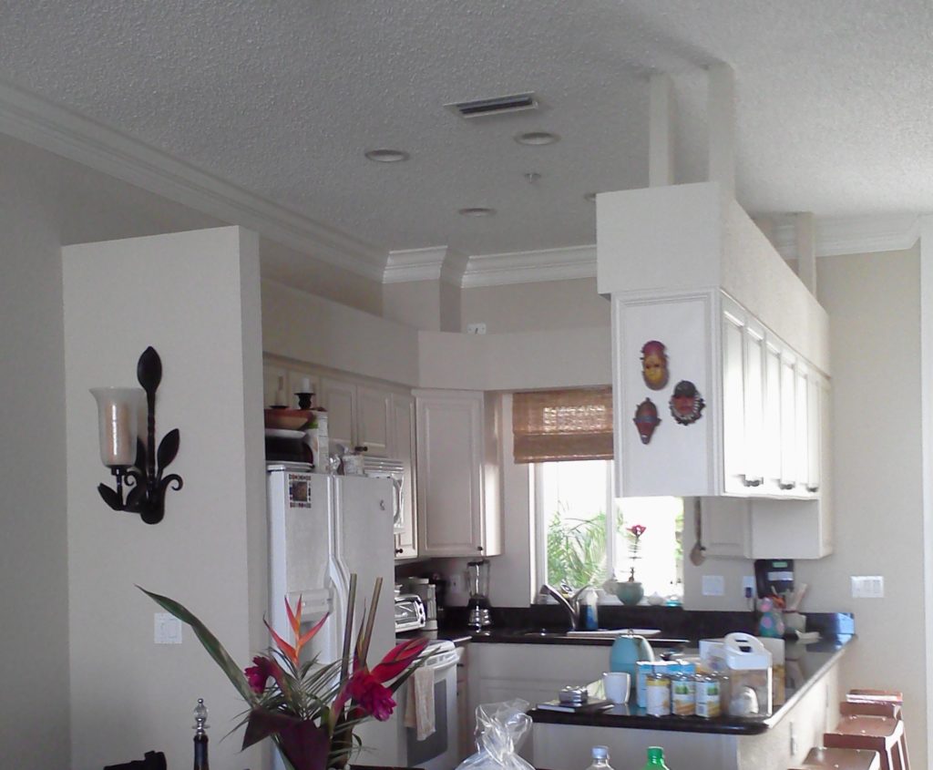
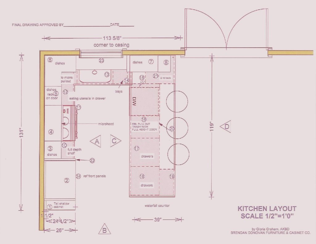
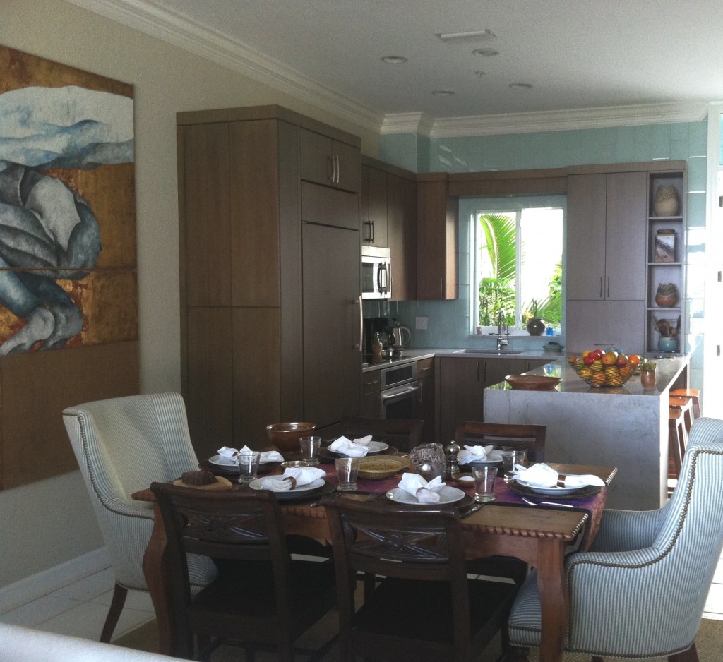
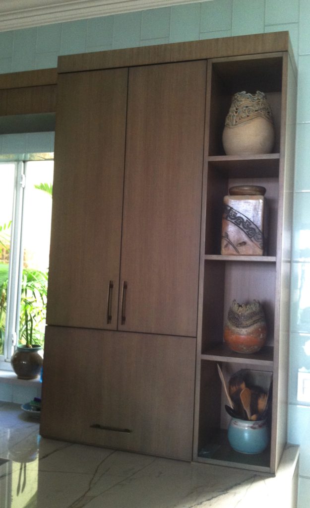
This is what we're dealing with, view out the back of the townhouse  One of the perks (not twerks) of my job is that I get to work in lovely homes on the beach.  If I'm having a "design panic moment" all I have to do is look out the window at the ocean and all is well.  This townhouse project came to me as a referral and is actually a winter home on the ocean in Delray Beach.  This homeowner is a potter with a keen eye for design and finishes.The kitchen was outdated and not very  functional.  My client enjoys cooking and entertaining and was seeking  to integrate her open kitchen with the stylish and artful adjacent dining and living room.The ChallengeMy first thought was that even though we would lose cabinets, the soffit structure had to go.  We could make up that loss of storage by going higher with the cabinets and by adding a tall cabinet to the left of the refrigerator. I wanted to open up the space yet ensure that it was integrated with adjoining areas.  The ceiling is so high we were able to increase the height of the cabinets without having to go all the way up which would have disrupted the existing crown molding.   We also gained storage by adding the two end cabinets on either side of the seating area.  The cabinet to the counter is also great storage and the open shelving to the right was included to showcase some of my client's pottery pieces.  Scroll down to see the solution.blogplan2-page-001 (1)


 THE SOLUTION!We used a warm stained bamboo with a subtle blue-green tint for the cabinetry.  The back wall is aqua glass tiles to reflect the ocean.  There is a pantry with touch latches to the left of the built-in refrigerator.  An appliance garage conceals toaster oven to the right of the sink and open shelves feature my clients beautiful pottery creations.

2013-01-18 10.01.34

My design was custom built by Brendan Donovan Furniture & Cabinet Co.  Cabinet  hardware is Top Knobs Sanctuary Collection in German Bronze. Refrigerator is Subzero with flush installation.  The rest of the appliances are by Jenn Air.  For this project we selected the Blanco Quatrus medium single sink  because it fit the space as well as the styling of the kitchen so well.  The faucet is Blanco Kontrole.  Again this stylish Blanco faucet provided the look and pull out functionality we needed. In addition,  the scale was appropriate for the space.  Counter tops are  grey granite from Cavastone fabricated by Stone Palace.  They feature a contemporary "waterfall" detail at the end of the peninsula.All in all I would say mission accomplish and my clients agree!

Blanco Makes a Splash!

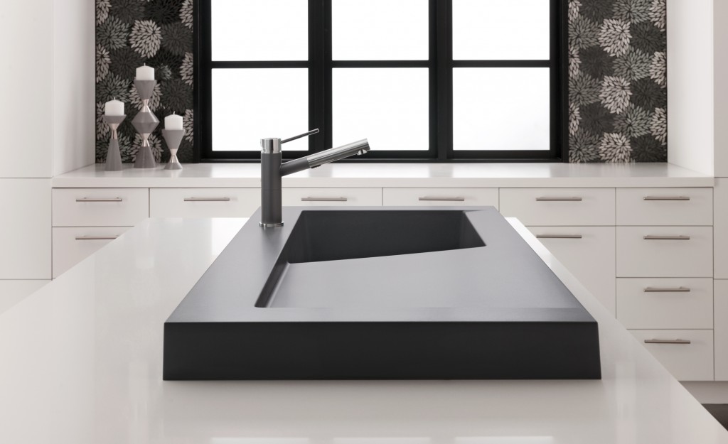
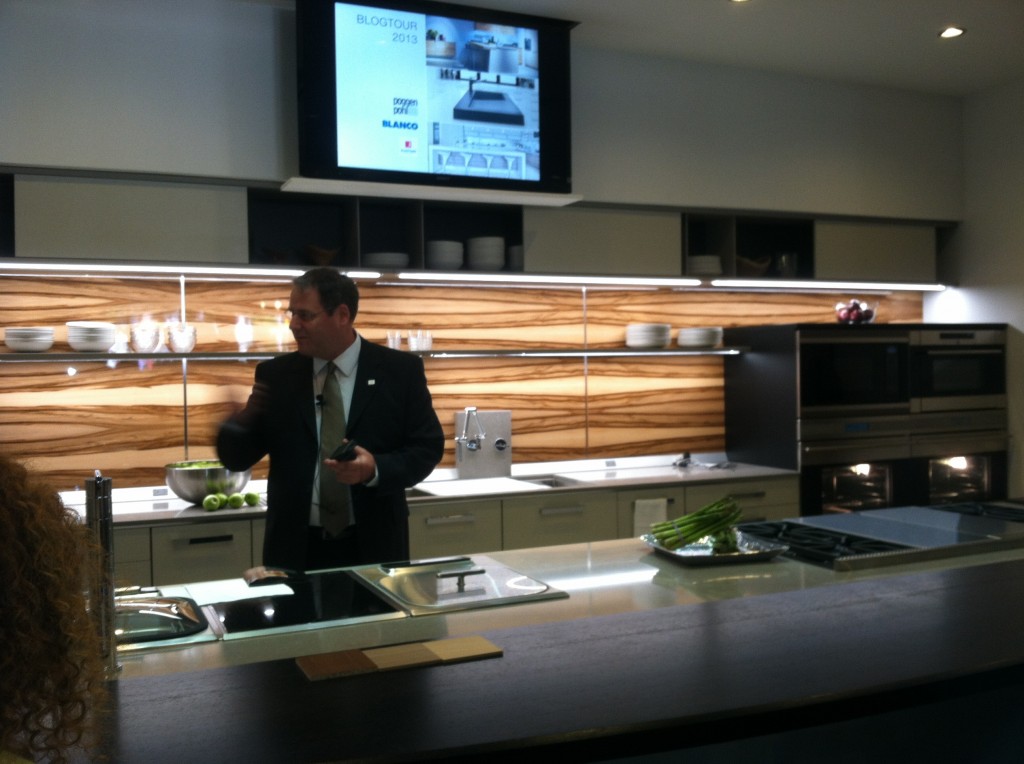
Modex SILGRANIT II sink in Cinder is kitchen architectureFor the last few years I have been honored to be a member of the Blanco Design Council.  This means I’m on the main line when it comes to inside information about their products. BLANCO, of course, is the German manufacturer of finely crafted sinks and faucets.  Their SILGRANIT II sinks are a particular favorite of mine and you should definitely know about them if you’re considering a kitchen remodel.  If you don’t know about SILGRANIT II, see my previous post here.   As a kick off to KBIS2013,  I got to see the newest BLANCO happenings  in New Orleans with a Cajun-styled experience called The Kitchen Unmasked.  This joint venture featuring Blanco, Poggenpohl and Silestone was held at the beautiful Nordic Kitchens showroom and was one of our stops on the Modenus Blog Tour.

The Kitchen Unmasked, at Nordic Kitchens

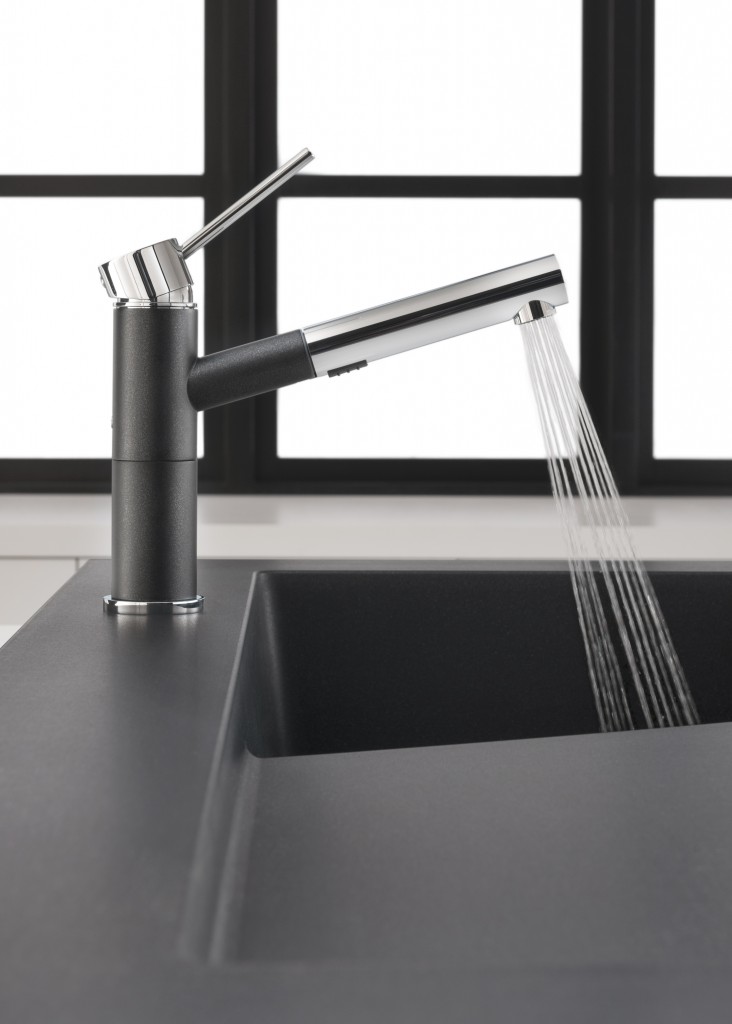
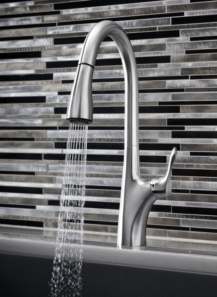
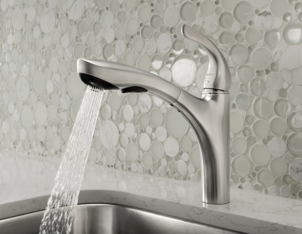
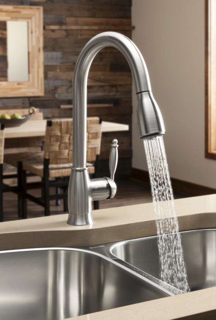
The latest SILGRANIT II color, Cinder, is all the rage.  It’s a stormy striking combo of dark gray with some black and rich brown thrown into the mix.  I think it’s the perfect color to go with all the new luscious shades of gray we’re seeing.  It’s on trend yet neutral at the same time. The new SILGRANIT II series of sinks also includes HYGIENIC+PLUS a patented formula that acts as a shield against dirt and bacteria. Independent laboratory tests confirm that the unique built-in hygiene protection reduces bacterial growth by an average of 98%.My favorite addition to the SILGRANIT II collection is the Modex sink (at top).  The next kitchen I design for myself (hoping) will have this sink.  I love it.  It adds a bit of architecture to the kitchen!  Modex features a unique 3” profile that sits on the counter and includes a large integrated cutting board.  It’s not just a sink, but a workstation.Speaking of work, did you know your faucet is the most abused item in your kitchen?  BLANCO's well known German engineering ensures that you have a product that will stand up to the test.  BLANCO also launched a new line of water saving faucets including Grace II, Alta, Highland and Napa. ALTANAPAHILANDGRACE“Our latest collection of faucets offer livable style,” stated Tim Maicher, Director of Marketing for BLANCO. “When we say livable style, we are referencing style that leads trends while integrating into any kitchen design. At the same time, we are talking about the faucets’ functionality. We engineer BLANCO faucets to last, to use less water, to provide unmatched cleaning and to be as easy to use as they are to maintain.” I’ve had a blast telling you about all the products I learned about on the Modenus Blog Tour.  A big thank you to Veronika Miller and her team at Modenus as well as all the fabulous sponsors including Blanco, Poggenpohl, Cosentino, National Kitchen & Bath Association, Kitchen & Bath Industry Show 2013, Mr. Steam, TOTO and Du Verre Hardware.   It truly was a most memorable and enjoyable experience to see New Orleans in this way.  To me, the best part of all was the people, both meeting the sweet good- natured, perservering locals as well as enjoying the community of those who I’m honored to call my peers.  I hope you’ve enjoyed following along and have learned a thing or two in the process that will help you know what to look for when shopping for kitchen and bath products. Click here to see ALL my photos and commentary from Blog Tour NOLA!     

A Kitchen With A Happy Ending!

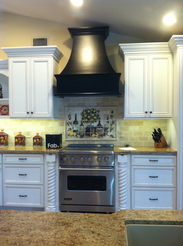
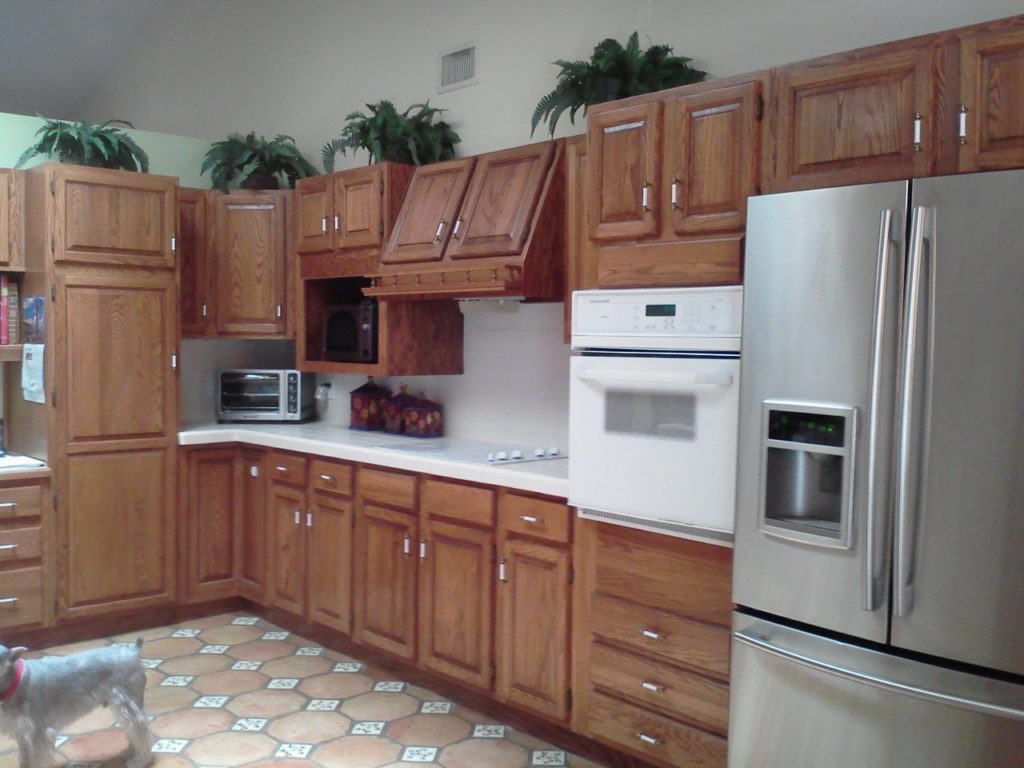
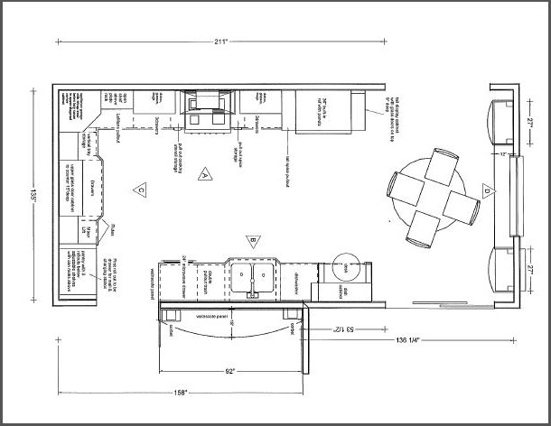
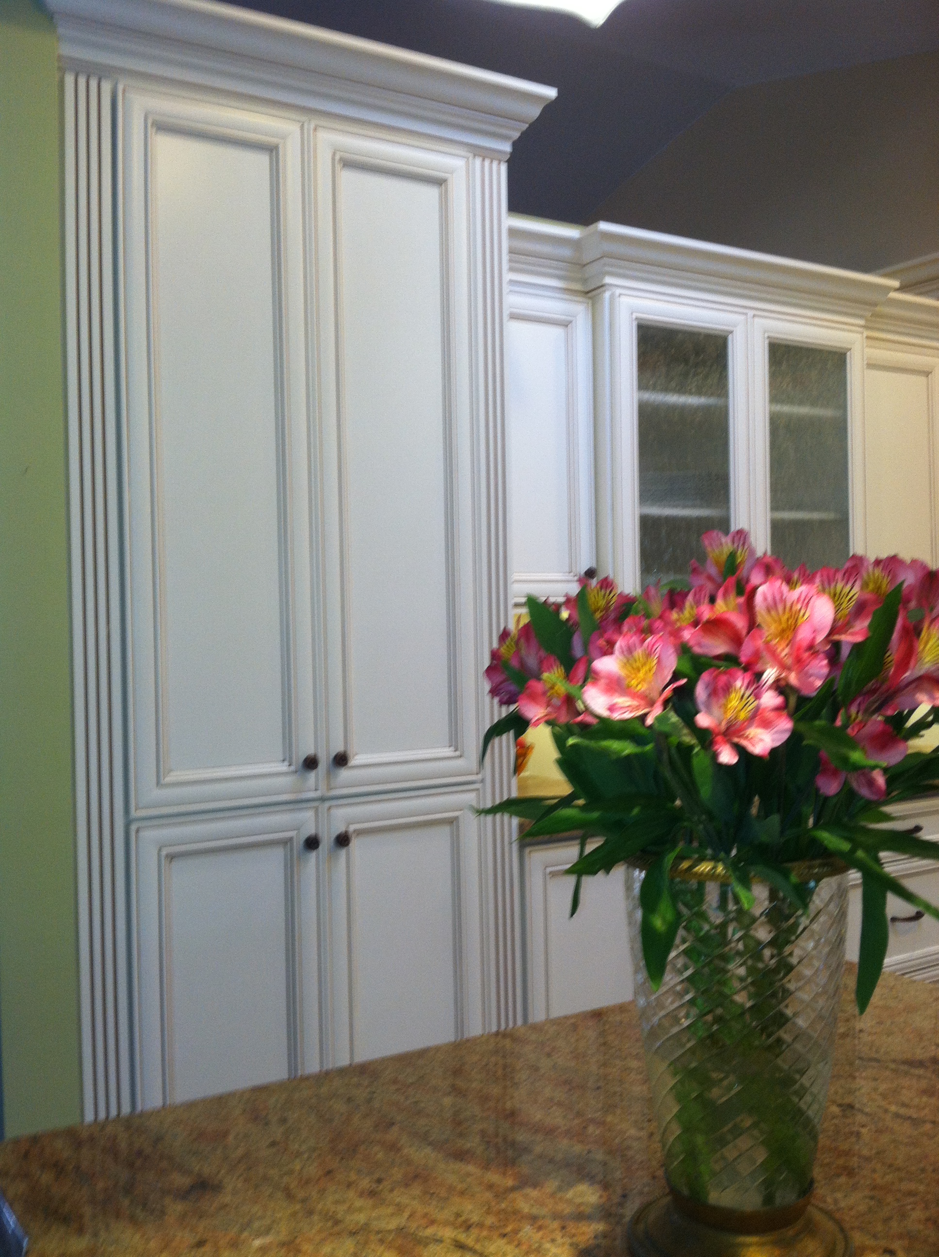
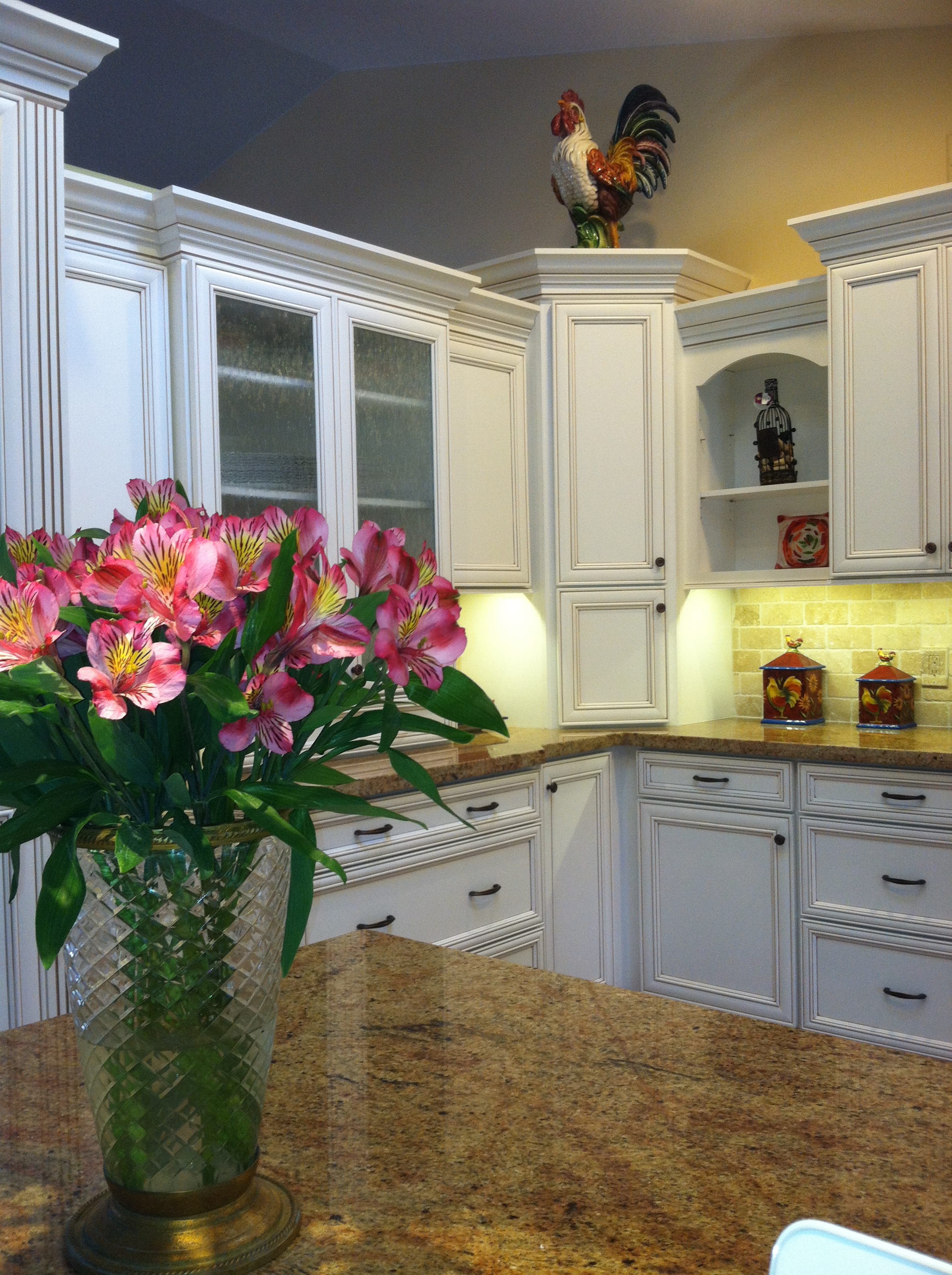
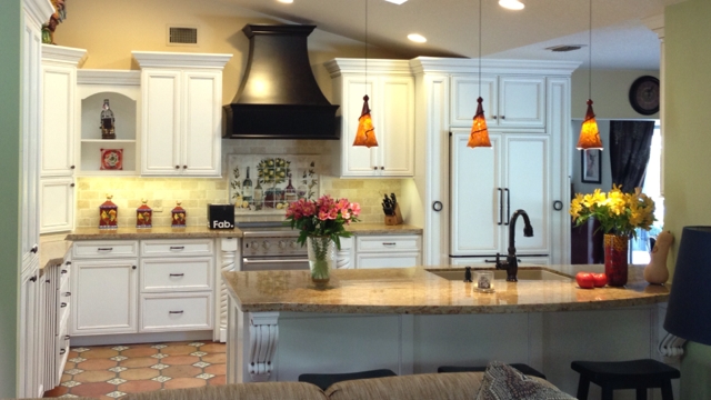
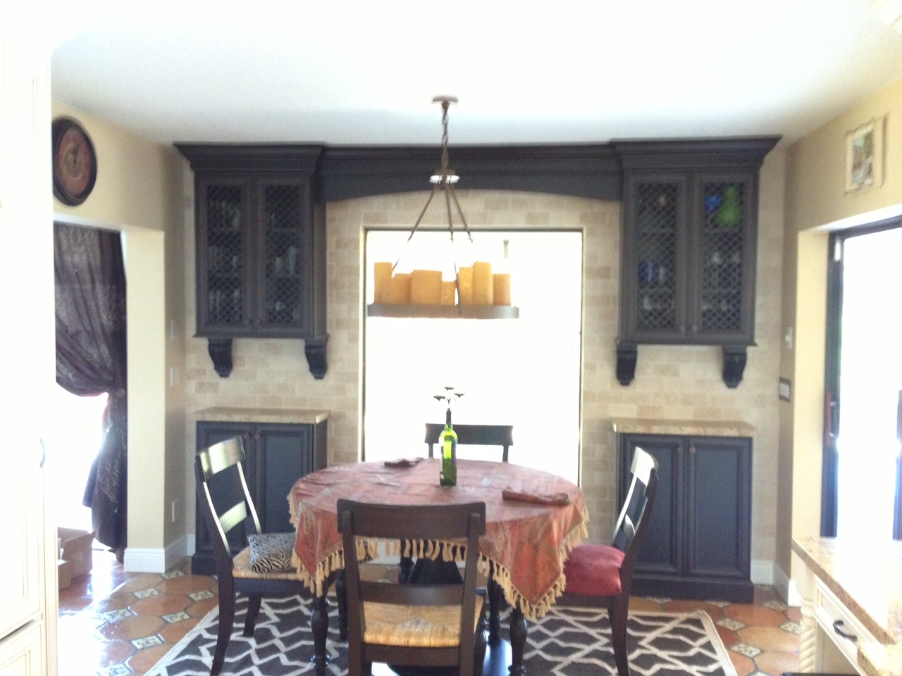
This was my client's vision.Today we wrapped up some final details in this new kitchen.  The client was going for a Mediterranean vibe, elegant but at the same time warm and inviting.  She loves to entertain so the kitchen had to be a focal point for her guests and it had to tell the story of her vision.  All these bells and whistles can really run up the price of your cabinets but we were able strike a good deal with Kith Cabinets.  Here's what she had.  We knew we could improve the function, incorporating her appliance wish list in the style she was dreaming of.  An added challenge was that we had to incorporate the existing floor because it had to stay.  She selected white painted cabinets with a warm brown glaze which really worked well.Here's the planWe were able to include a range by Viking, a Dacor microwave drawer, a beautiful Silgranit sink by Blanco, and some really nifty accessories including a mixer lift which she uses to store her juicer.  We devoted one roll out in the pantry to be used as a charging station and a place to throw the mail so the lovely counter can remain clutter free.  Notice that we also incorporated some gentle curvy shapes with the counter top and the wood hood.This pantry has the charging station as well as racks on the doors for can storage.2013-01-23 09.42.18

IMG_7653That FAB box on the counter is a nifty gift for our client, gourmet salts that magnetically attach to pull out next to range.  They are something like this.IMG_5935This client had a clear direction from day one which really helped keep the project on track.  This very traditional design comes with a maximum of detail and I'm happy to say we have left a very happy couple to enjoy years of romantic dinners in their new kitchen.Design was a collaboration between the client and myself.  Cabinets by Kith Kitchens, counter tops by Stone Palace, appliances by House of Appliances and installation by Brendan Donovan Furniture & Cabinet Co.  See local resources for more info and contact details.