As you know by the last couple of posts I’m deeply in love with all things contemporary but then again I’m certainly no “one trick pony”. I have always been intrigued with Craftsman Design. Think bungalows, organic forms and warm rich woods. 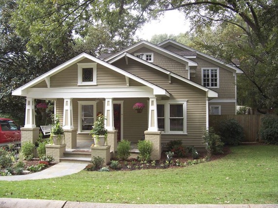
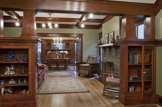
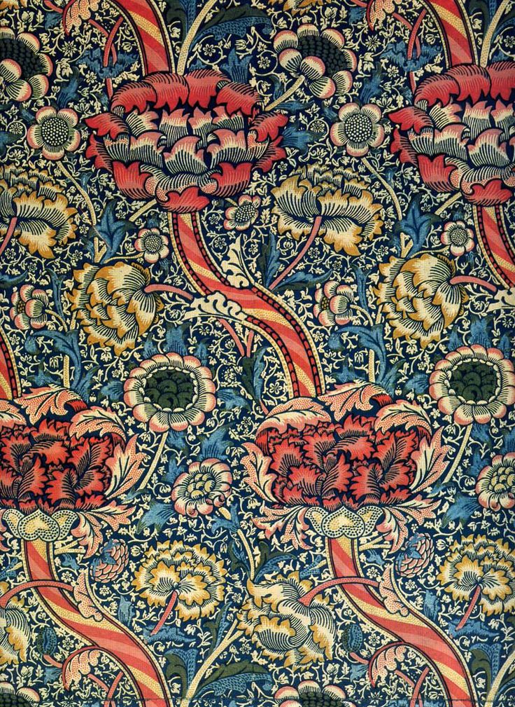 The Arts and Crafts Movement which occurred at the turn of the last century, was a response to the blossoming industrial age. Mass production was coming into its own and a few intrepid souls were missing the personal human touch of household objects made by hand. The leading proponent was William Morris, also known for his beautiful stylized floral prints.
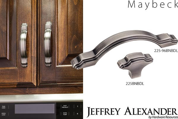 One of my “go to” hardware suppliers, Hardware Resources, has just unveiled cabinet hardware inspired by the period. Named after Arts & Crafts architect Bernard Maybeck, these selections are a great way to jazz up existing cabinets and give you "the look". Since they’re only inspired by, and not reproductions of, the Arts & Crafts Movement, the design is fresh and new as well as being a stylized nod to the Craftsman style. One beautifully styled knob and 3 cabinet pulls will be available in 5 trending finishes. In addition to the Maybeck design, by Jeffrey Alexander, they will be introducing the Brenton (Elements) and the Royce (also Jeffrey Alexander) at the upcoming KBIS (Kitchen & Bath Industry Show).
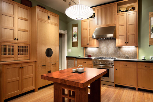
 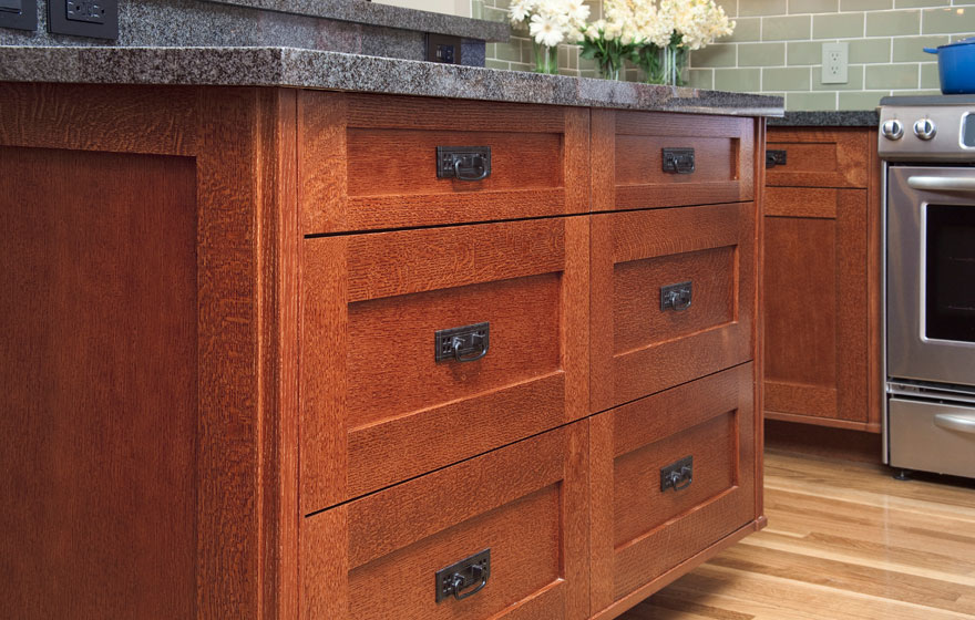 Emulating this look in cabinetry is easy. The Shaker door style, which is all the rage, can be transformed to reflect the Arts & Crafts look by the addition of appropriate hardware. You can get handles like these here.Here's your opportunity to get crazy with a tile back splash. You will see a couple of motifs that scream A&C including the dragonfly and the ginko leaf. Add some green to the mix and you've got it!
 If you're interested in this look or a stylized version of it I'd love to hear from you!
Kitchen Case Study: Update and Integrate
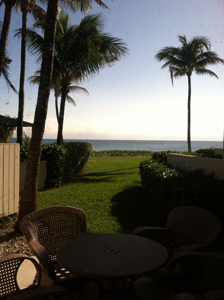 One of the perks (not twerks) of my job is that I get to work in lovely homes on the beach. If I'm having a "design panic moment" all I have to do is look out the window at the ocean and all is well. This townhouse project came to me as a referral and is actually a winter home on the ocean in Delray Beach. This homeowner is a potter with a keen eye for design and finishes.The kitchen was outdated and not very functional. My client enjoys cooking and entertaining and was seeking to integrate her open kitchen with the stylish and artful adjacent dining and living room.
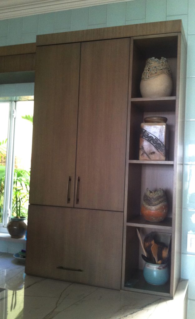
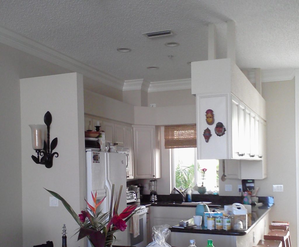 My first thought was that even though we would lose cabinets, the soffit structure had to go. We could make up that loss of storage by going higher with the cabinets and by adding a tall cabinet to the left of the refrigerator. I wanted to open up the space yet ensure that it was integrated with adjoining areas. The ceiling is so high we were able to increase the height of the cabinets without having to go all the way up which would have disrupted the existing crown molding. We also gained storage by adding the two end cabinets on either side of the seating area. The cabinet to the counter is also great storage and the open shelving to the right was included to showcase some of my client's pottery pieces. Scroll down to see the solution.
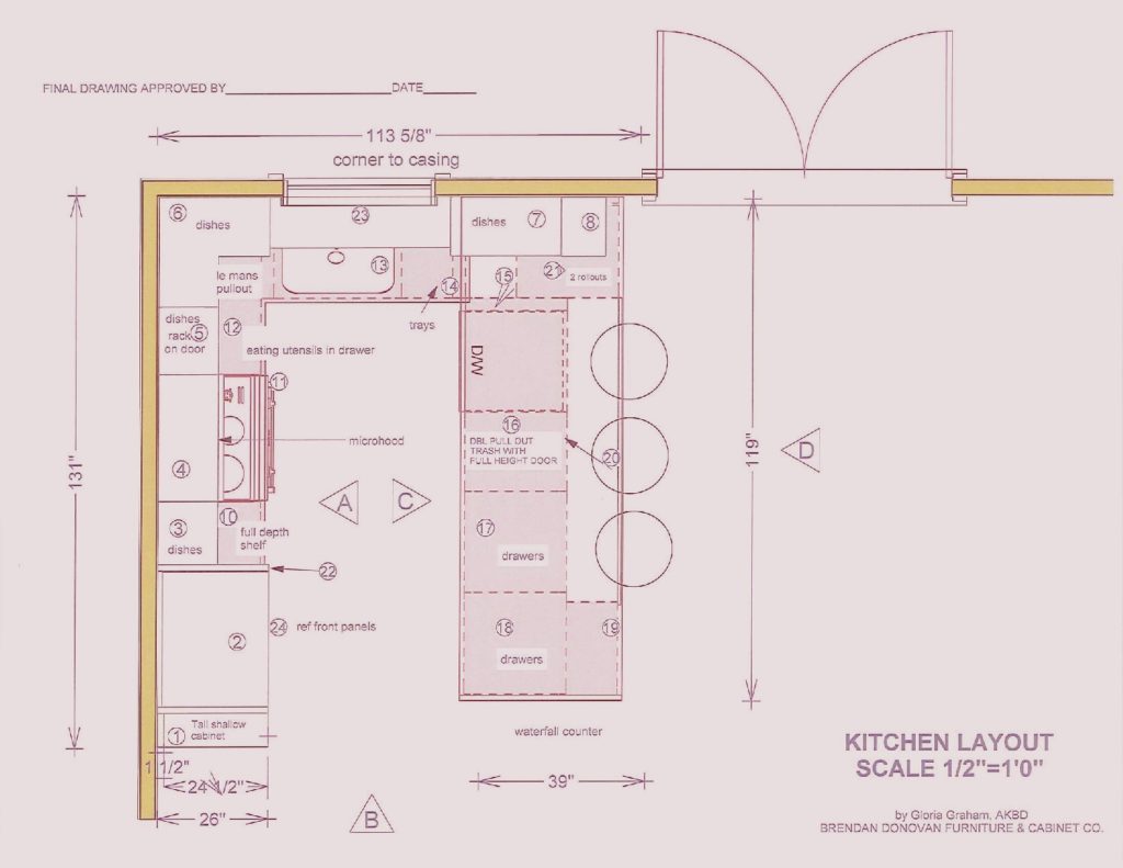
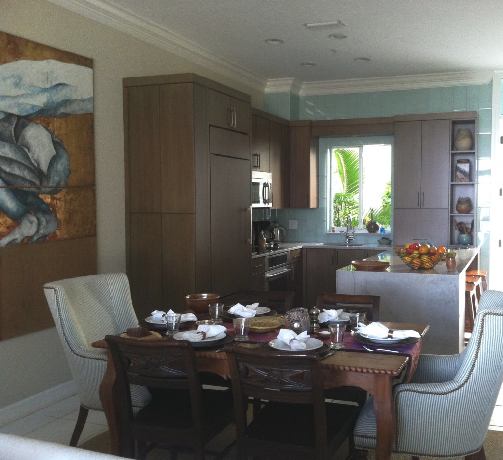 We used a warm stained bamboo with a subtle blue-green tint for the cabinetry. The back wall is aqua glass tiles to reflect the ocean. There is a pantry with touch latches to the left of the built-in refrigerator. An appliance garage conceals toaster oven to the right of the sink and open shelves feature my clients beautiful pottery creations.
My design was custom built by Brendan Donovan Furniture & Cabinet Co. Cabinet hardware is Top Knobs Sanctuary Collection in German Bronze. Refrigerator is Subzero with flush installation. The rest of the appliances are by Jenn Air. For this project we selected the Blanco Quatrus medium single sink because it fit the space as well as the styling of the kitchen so well. The faucet is Blanco Kontrole. Again this stylish Blanco faucet provided the look and pull out functionality we needed. In addition, the scale was appropriate for the space. Counter tops are grey granite from Cavastone fabricated by Stone Palace. They feature a contemporary "waterfall" detail at the end of the peninsula.All in all I would say mission accomplish and my clients agree!
Tip #3: Where can I save money and what items are worth the splurge?
Many of our clients begin kitchen remodeling projects in the summer. Kids are out of school and our commitments tend to be less (for some of us) in the summer months. Today's client query is one that I hear a lot. Naturally we all want to get the most for our money in all our investments but where can you save money in a kitchen remodel and what items are worth the splurge?The answer to that is largely subjective as we all have differing needs and priorities. That said, there are some principles that should never be compromised and those include efficient use of space, safety and the best quality you can afford.
SplurgeI must confess, there are some standards in the kitchen industry that are just plain wrong. One of them is the standard depth refrigerator. A standard base cabinet depth is 24" (25" including doors). A standard refrigerator is about 33" deep! It might look perfect standing solo at the appliance store but it could look like a beast in your kitchen! Yes, they stick out. Depending on the layout of the kitchen we can sometimes work around the depth by surrounding the fridge with extra deep side panels and a cabinet above pulled forward. But if you're tight on space it is worth investing in what's known as a counter, or cabinet depth refrigerator. This means that the cabinet box will be flush with your counter top and your "stick out" will just be the thickness of the door. It makes a big difference. Here GE shows the difference between standard, or free-standing and counter depth. A standard GE french door refrigerator would be about 26 cubic feet and retails at about $2,100 vs. a comparable counter depth model which is around 21 cubic feet and retails at $2,700.00. Yes, you will have less cubic footage with a counter depth fridge and I suggest keeping the old fridge in the garage if that's an option. If the kitchen is large enough you can add a beverage cooler. When water, soda, beer and wine are taken out of the main fridge you get all kinds of space. There is also a third category if you've got the big bucks and that is true built-in or integrated. Those are even shallower but they are also more than a foot taller to compensate. Whether you opt for Sub Zero or GE. a built-in refrigerator is pricey but the most visually seamless, particularly if you add matching cabinet panels.
SaveYou can save money on your cabinets if you can keep to standard, or stock, sizes. Simpler cleaner lines with minimal molding can also save you enough money to splurge on that refrigerator! There are just two things to keep in mind. Make sure the quality of the cabinetry you buy is sound and backed by a warranty.SplurgeMany professional kitchen designers will be happy to consult with you on the layout and selections for your kitchen. An hourly fee is well worth it to have your plan validated by a pro. In many cases, if you purchase your cabinetry through your kitchen designer, design services are included.
SaveI love unique artsy cabinet handles as much as the next person but did you know that you can spend anywhere from $1.99 to upwards of $50 a piece for them? Aim towards the $5-$10 for really good quality knobs or pull. If you happen to fall in love with one of the $50 buggers maybe you can use just a couple for a special area.
Next up, Tip#4: Granite or Quartz?
Du Verre, The Hardware Co., Sustainably Beautiful
Trend Spotting at KBIS 2013
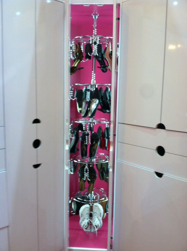
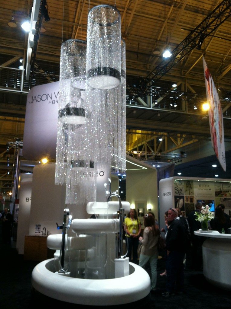 The last two days of my exciting visit to New Orleans with the Modenus Blog Tour centered around the Kitchen & Bath Industry Show (KBIS). This annual trade show is produced by the National Kitchen & Bath Association which is celebrating 50 years as the industry leader (more on that later). I love to attend the show as it allows me to see the trends emerging in the American market and keeps me up to date with products and technology. This year I had an additional behind-the-scenes perspective as a member of the Tour. We were there for opening day, Friday April 19th and enjoyed a whirlwind tour of products followed by time for solo exploration and networking on Saturday. Every year has a theme and this year I thought it was particularly appropriate. The show as all about the concept of "evolution". This is really a common theme across the board as it applies to everything from design and products and how we are evolving the way we do business in 2013. Here are some of my discoveries:Let there be lightLighting always plays a crucial role in kitchen and bath design but this year it was all about the light within. Why didn't we think of this before? LED lights inside cabinetry, particularly closets is a great idea!
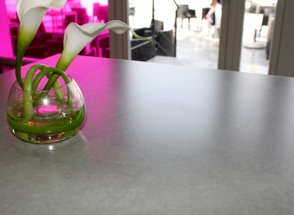
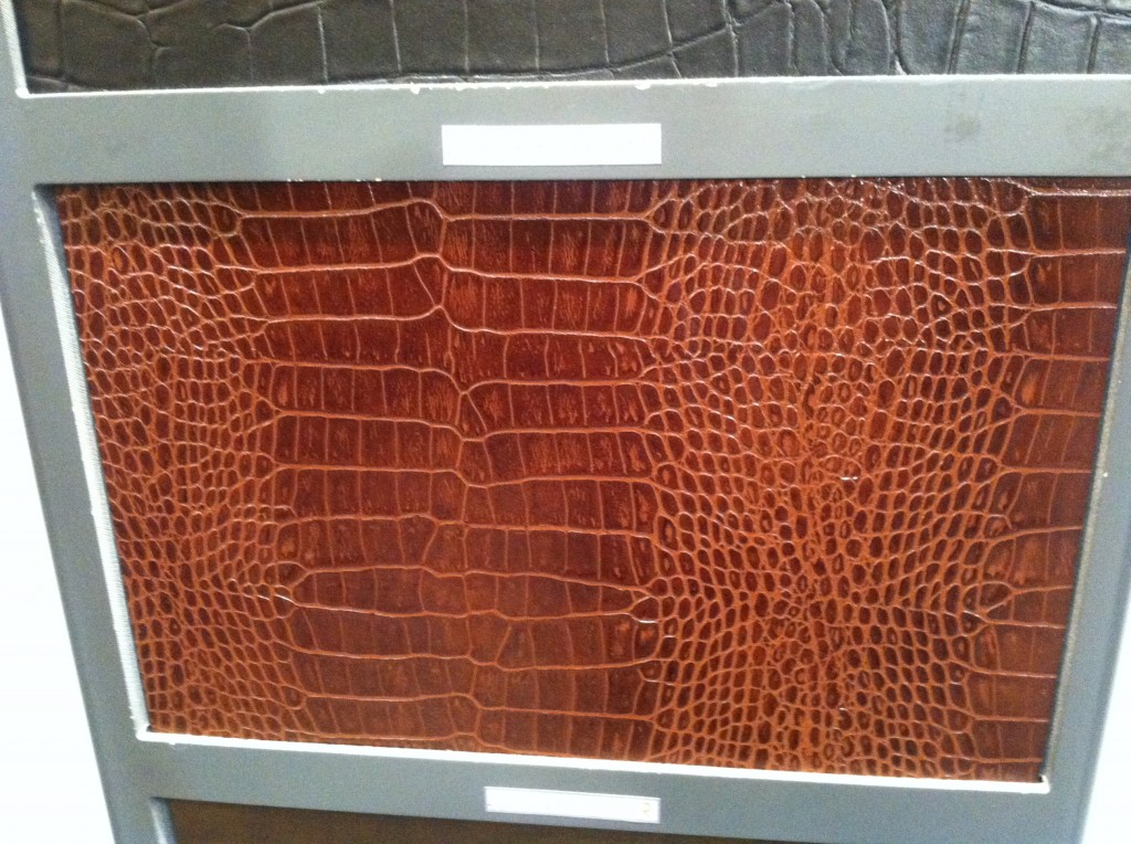
  The look of leatherLeathery textures made a big appearance. Silestone by Cosentino debuted their new Suede line of quartz counter tops. Gator Mills ( a very local Louisiana company) showed leather (and leather look ) vanities and Richelieu is offering recycled, reconstituted leather veneer.

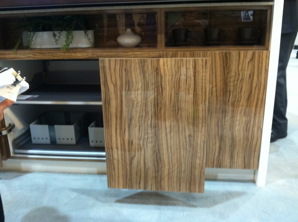
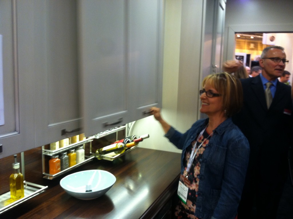
 Sliding doorsCabinet doors no longer have to swing out due to new hinging technologies that allow doors to slide. Hafele calls theirs Frontino
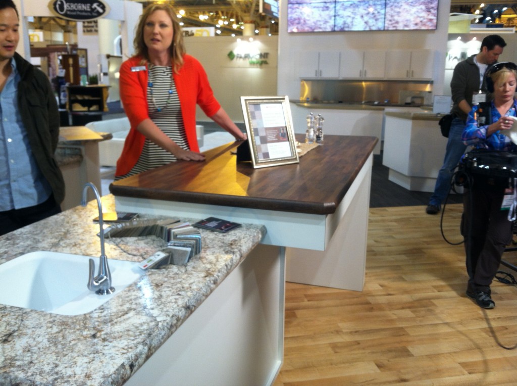
 Glaminates take the stageIt's not your grandma's laminate anymore! Taking a cue from our friends across the pond, American laminate manufacturer Wilsonart has upped their game introducing two new seamless edge details and increased durability and sustainability.
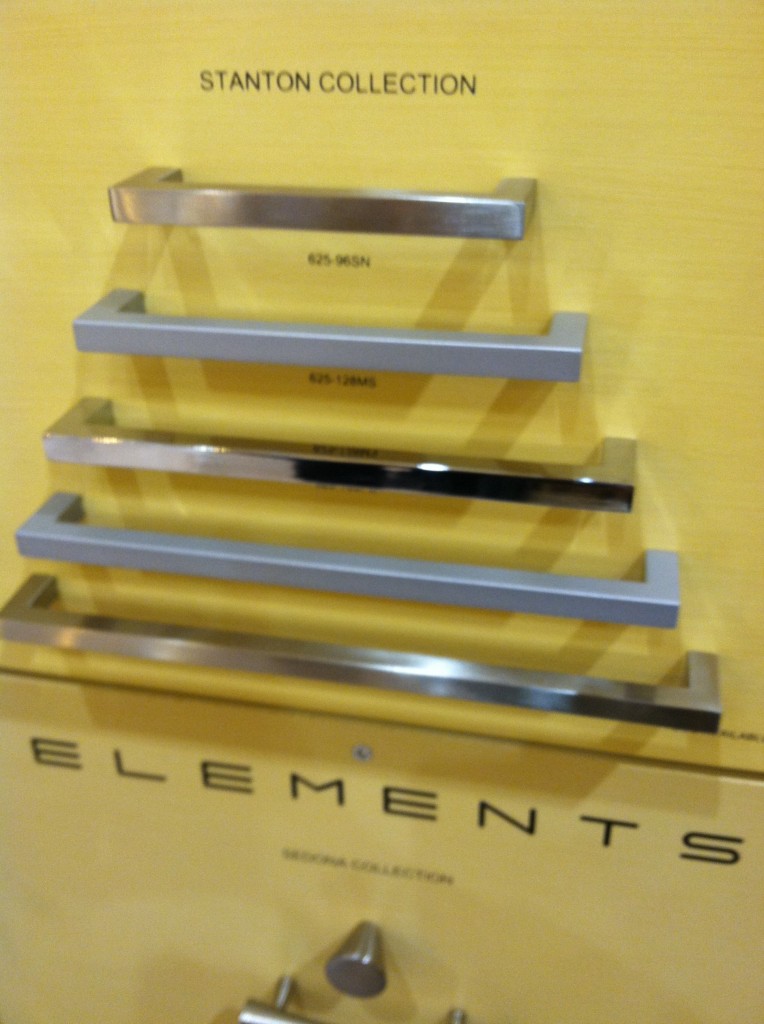
 Blingy to sculptural When it comes to handles you can go for the bling or the sculptural. Cabinet hardware manufacturer Duverre is all about very artful sculptural shapes and while I saw a lot of matte finishes, very shiny made an appearance too.

 Look, no hands!Hands free faucet technology has quickly become the norm across the industry and was shown by not only the original, Brizo but also Rohl, Kohler and Moen and Delta Faucets.
 This year's best in show award went to Toto for their awesome Neorest 550H toilet. Believe me when I tell you it can just about do anything but drive you to work! Stay tuned for an entire post about Toto and the Neorest 550
 In a nutshell KBIS2013 was largely about technology and texture. Cabinet manufacturers are touting what's inside more than ever as they maximize the ease of living in the kitchen. White cabinets, cleaner lines and pops of natural and engineered wood veneers are strong trends.Next up: Poggenpohl, the cutting edge in kitchen cabinet design, inside and out
KITCHEN BLING
A great way to combine art and function in the kitchen is through your cabinet hardware. We think of it as jewelry, or bling, for your cabinets. Check out this assortment of stunning handles by Glass Fancy, Art Glass Interior Design Elements.  Glass adds a water element as well as vibrant color to your kitchen or bath. These particular handles are handmade fused glass created by a glass jewelry artist who segued into creating cabinet hardware when contemplating ways to beautify her own kitchen. The result was so successful she decided to add knobs and pulls to her store selection. The nice thing is that you don't have to use them on every single door and drawer, just a select few to create a focal point of interest. Check out her Etsy store knobsandtiles
You can also find her at the following links:http://glassfancy.wordpress.comhttps://www.facebook.com/pages/GlassFancy/55206902579Thanks to my pal and jewelry artist Vicki of Skygypsy Studio for the heads-up!

