Frida, Diego and Their Kitchen

There’s new exhibit in town and I’m excited!   Frida Kahlo and Diego Rivera from the Jacques and Natasha Gelman Collection & 20th Century Mexican Art from The Stanley and Pearl Goodman Collection  opened Wednesday at the NSU Art Museum in Fort Lauderdale.Frida Kahlo's self-portrait "Diego En Mis Pensamientos" (Diego On My Mind) Frida Kahlo and husband Diego Rivera are arguably the most well known twentieth century Latin American artists.  This exhibit draws on their popularity to introduce us to some other names in Mexican art we should know.  These include Lenora Carrington (1917-2011), Gerhard Gerzso (1915-2000), José Clemente Orozco (1883-1949) and many more.   Works on show consist of paintings, sculptures, photographs and works on paper.  The exhibit runs through May 31st.  I am planning on going on March 27th  when Kahlo scholar Dr. Salomon Grimberg will be speaking on Frida Kahlo: The Still Lifes-But let's talk about the kitchen! Frida at her easel from here. There are many published photos of Frida's kitchen which got me to wondering what it would look like today.  Wouldn't it be great to have her essence around when you're making enchiladas? What are the elements you could include to give you that vibe?gallery_couple_5 Frida learned to cook for Diego, oddly enough, from Diego's previous wife! She became an accomplished cook but also spent leisurely mornings in the kitchen reading the newspaper with Diego. 

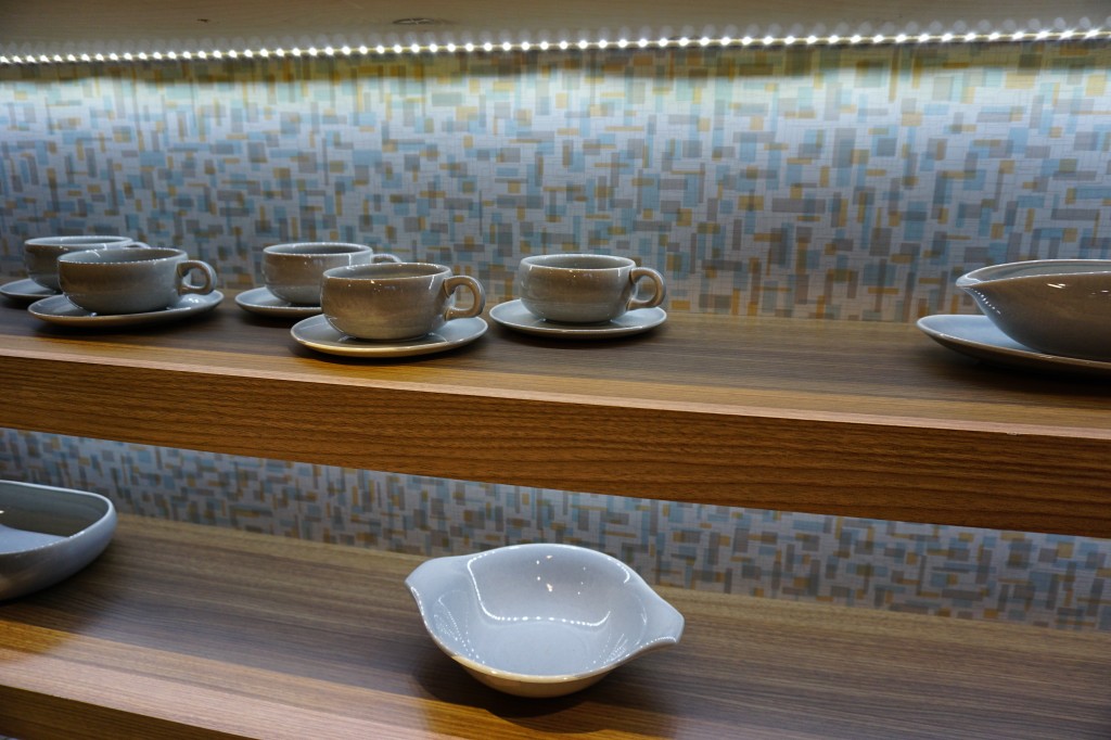
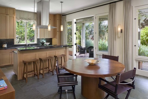
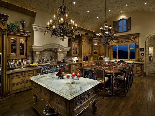
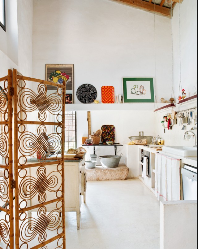
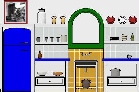
 This kitchen is located in La Casa Azul, a home Frida was born in and continued to return to throughout her turbulent life. You can tour it if you find yourself in Coyoacán, Mexico City. Check out this  article if you'd like to know more. A kitchen with "Frida elements"The rustic simplicity, white walls, high ceilings, windows and use of rustic materials make me think of Kahlo.FridaKitchen2 In this fantasy kitchen  I used bright colors with a few contemporary twists in homage to the Mexican diva.  Design elements of a "Frida kitchen" include the following:-Liberal use of tile-Open shelf storage-Bright colors-White walls-Rustic wood-Lots of light!If you've never seen the movie Frida, don't stop, click here immediately and get it!! Today I leave you with my favorite scene from the movie.  I must warn you it's hot, steamy and not for the feint of heart.  Consider yourself warned and enjoy ;) Happy Friday and have a fantastic weekend. 
BigTrends from KBIS2015 Part I

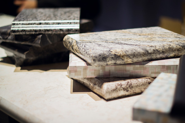
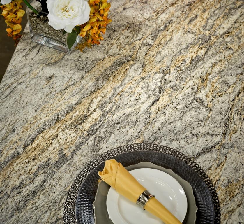
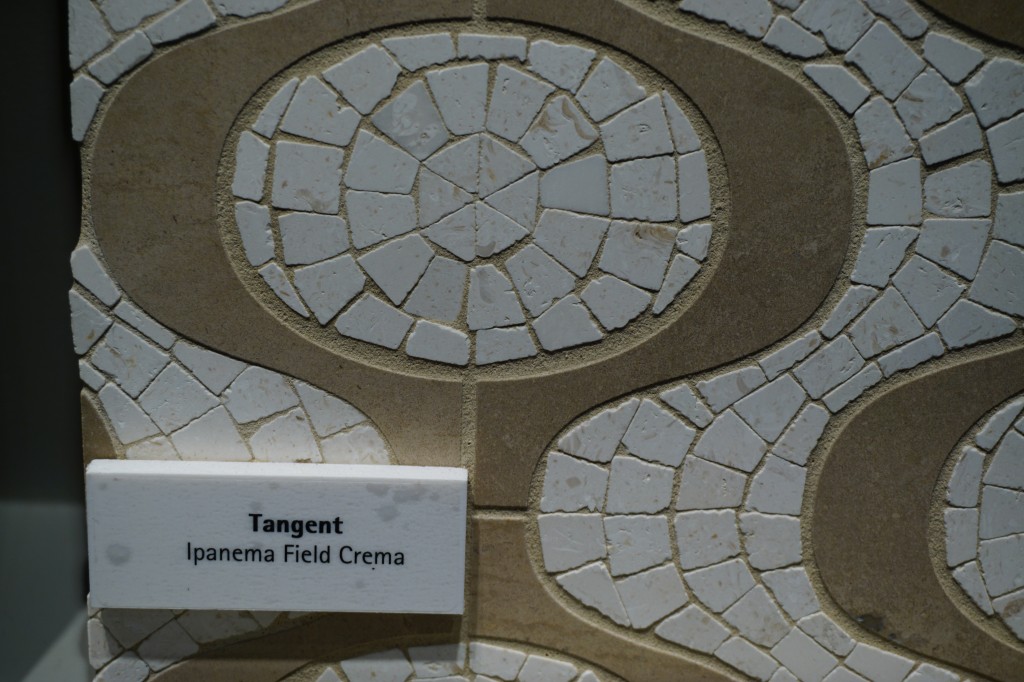
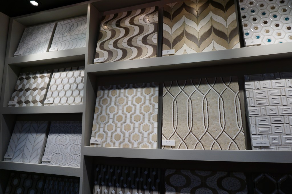
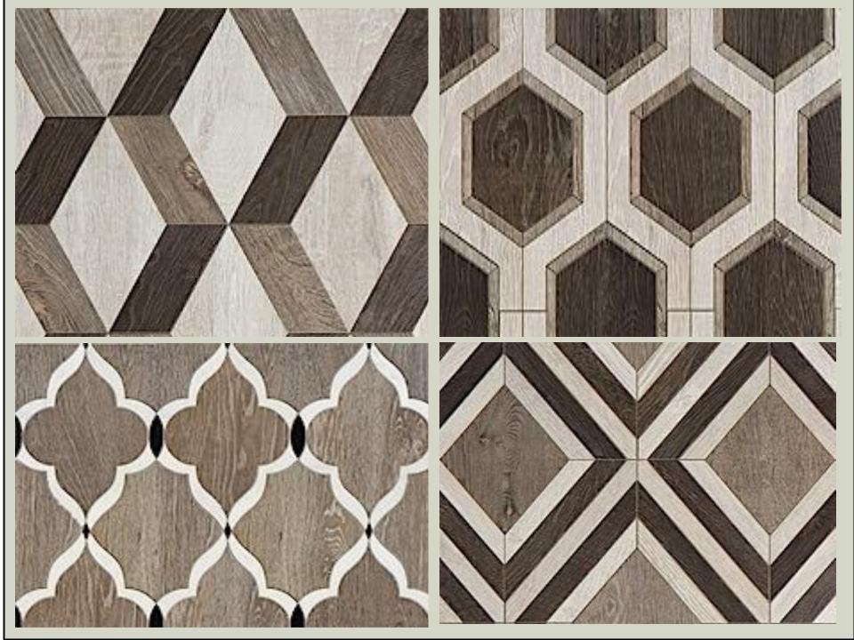
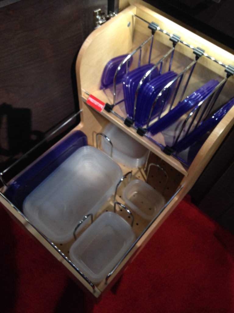
Day two of the Modenus Blog Tour was opening day for the  51st annual Kitchen and Bath Industry Show (KBIS).  The Bloggers were given an inside peek into many of the booths at the show and as we toured,  trends most certainly did emerge.New laminates by Wilsonart are not your grandma's counters! "There is a three year lag between Europe and North America when it comes to trends", says Warren Ramsland, President of Top Knobs. Taking that into account, there were many differences between what I saw here and what I witnessed in Italy at Euro Cucina last year.  Perhaps the biggest European influence that continues to pick up steam is contemporary design for both the kitchen and bath.KBIS2015,Wilsonart,#blogtourvegas,ModenusLaminates are enjoying a serge in popularity.  This material is more widely used and experimented with by our friends across the pond but we're picking up speed.  I was wowed by the offerings at Wilsonart who debuted their "Spirit of Mindfulness" collection of  27  exciting laminate colors and textures.   Also introduced were a line of quartz counter tops in a great assortment of neutral, workable hues.  By late spring, a selection of 50 patterns will showcase a full range of colors, textures and four structures: Fine and Small Scale, Medium Scale, Large Scale, and Veining and Movement. That is one of the things I love about quartz, the wide variety of pattern, or no pattern at all! I was impressed not only by the innovative product development at Wilsonart but also their philosophy.  This press release statement says it all:"Fueled in part by a turbulent economy, today’s more budget-savvy and eco-conscious consumers have responded by making their homes the calm eye in the storm of life. For many, this translates to finding a spirit of mindfulness within themselves and expressing it in their surroundings."Wilsonart Quarts, blogtourvegas,modenus,kbis2015One of the new Wilsonart quartz options showing beautiful veining. Photo courtesy of WilsonartCheck out the Wilsonart Visualizer to help you pick your counter top color.  It's easy, fun and very helpfulTechnology is also taking the kitchen and bath world by storm.  There were numerous examples but two stood out for me.  A company called TechTop took home the Best In Show Award for their counter top charging technology.  Simply place your phone, tablet etc. on the counter top and viola' it will charge, no plug-in required.  Untitled drawing (2)This great idea is from LG Hausy, yes it's the same "Life's Good" LG that makes appliances.  They make counter tops too. I also loved this Solna articulating faucet by one of my favorite brands, Brizo.  How convenient, right?!Fifty Shades of Gray has moved on to what I call "greige".  It's the new warm toned beigey-gray which I saw everywhere! Palettes are definitely neutral.  A great example is the Tangent collection by Walker Zanger.  Love the mid-century inspiration which I also saw a lot of at the show. This is Ipanema from the Tangent stone mosaic collection by Walker ZangerWalker-Zanger  deals in tile, marble and stone artistry.  Their collections are arguably the most innovative I've seen.  Case in point is their Sterling Row collection, inspired by menswear and a favorite at the show.   I found it to be extremely sophisticated, eye catching and innovative.  The collection was a favorite at the show. Walker Zanger was rocking the neutrals with innovative patterning and designSterling Row Collection, porcelain tile by Walker ZangerWe saw more of the Sterling Row Collection later on the blog tour in The New American Home, so there's more to come!Perhaps the BIGGEST trend of the show was personalization.  I mentioned this in the last post about Thermador but they were not alone.  Here are a few more pics highlighting the concept.  Frigidaire's SpaceWise Custom Flex refrigerators allow you to totally customize the shelves inside by moving the drawers and shelving to your desired configuration.2015-01-20 11.27.20 How about this great storage system by Rev-A- Shelf?  I know we all want this level of organization in our lives, yes? Right now this is a prototype but the response from the industry was good so I think we can expect to see this in the coming year.RevaShelf's prototype organizerEnough for now?  Well there's more to come.Up next:   KBIS 2015 Part II where I'll tell you about all my great finds for the bath and more.

5 STEPS TO A MINDFUL KITCHEN REMODEL

One of my favorite magazines, Cooking Light, contains a very interesting article that I love this month.  It’s about something called “mindful eating”.  I agree that we, as a culture, me included, eat way too much because we don’t do it mindfully.  Simply put it just means that if you make yourself 100% present and focused at the task at hand (eating) during mealtime you will enjoy your food more and you won’t feel the need to eat as much.  I happen to believe that you can easily carry this concept over to the kitchen design and remodel process.  These days when we are trying to get the most out of every dollar we want to know that every aspect of the complicated process of remodeling a kitchen has been well thought out.  Here are five ways you can do it.  

 1) Don’t be in a rush-  When you impose a drop dead date such as Thanksgiving or Christmas you will be more likely to rush your choices.  This is a complicated process and it needs to be planned out properly and executed in a certain order.  Collect your thoughts and ideas beforehand.  This should included concept photos, and ideas for products.  In this day of social media there is no excuse not to do the research.  It will allow your professional partners to do an even better job for you.  
 2)     Work with someone you feel good about-  I don’t care how knowledgeable your designer, or salesperson seems, if they don’t feel right for you, you’ll probably save much aggravation by partnering with someone you feel is your ally and can see your own unique vision.  Many designers are adept at working in a variety of styles.  However, if you love sleek, modern, minimal designs don’t select a designer who’s work is typically very traditional.  They’ll probably be able to help you but it not with the insight, enthusiasm and access to products as someone who specializes in your style.                3) Prepare for the downtime- Always insist on a schedule for your project.  This is NOT to say it won’t have to be tweaked from time to time but it’s always best to have a starting point.  It helps keep all the players on the same page. A big part of this is to plan how you’re going to get by when you’re without a kitchen.  Where are you going to put the refrigerator?  Do you have convenient place to put your microwave?  How close is your temporary set up to a sink?  Keep most used cups and utensils easy to access.                           4)   Pick your battles- Everyone has a budget and  most of us  can’t have it all.  That said, there are usually a couple of areas in which a judicious splurge can make all the difference.  One biggie is springing for a counter depth model refrigerator which is nearly flush with your counter top.  This makes a big difference in a small space. Although they’re more expensive they’re still a lot less than the super high end true built-in models.   5)   Don’t rush to judgement- If you are living on site during your remodel, resist the impulse to go into a seizure over every nick or crooked drawer front.  Again, it’s a process with a million details and steps.  At this point you should be trusting (if you did step 2) your professionals to do what they do.  Typically all doors and drawer fronts will be aligned before your installation is finished.  It is also typical practice for you and your designer to get together on a punch out list so all concerns, including touch ups are addressed before completion.If you have a question about your kitchen design or remodel I’d love to hear from you!

STEP ONE, ORGANIZE YOUR KITCHEN

Happy new year!  Thank you for showing up here at Kitchens for Living where my new year's resolution is to continue to bring you the latest in products, trends and  kitchen related (mostly) tidbits as they cross  my path as a professional kitchen designer.  Whether you are planning a new kitchen, thinking about planning a new kitchen (someday) or just want to make the one you have better you're in the right place.  I am here to help as little or as much as you want!

Do you feel like these babies? Quite often we come to the conclusion that we need help when we realize how powerless and out of control our lives have become.  Well, guess what?  This happens in the kitchen too.  Do you want to have more time, less stress?  Organizing what you have in your kitchen is definitely a step in the right direction.  Here's how you can start.

DOWNSIZE

One of the number one trends for 2011 is downsizing in all aspects.  This includes not only your waistline but your schedule, your closet and yes, your kitchen.  Gone are the "McMansion" days.  Today we are learning about living smaller with quality instead of quantity.  The smaller the space the more each element counts and the more organization matters.  The Intuitive Kitchen philosophy agrees with 19th century creative William Morris who said, "Have nothing in your house that you do not know to be useful, or believe to be beautiful."


One of my favorite books about downsizing, prioritizing and organizing your life is Susan Susanka's The Not so Big Life.  She uses the metaphor of a house and its architecture and interior to show us a different way of looking at how we live.  She's actually written a whole series on this theme but this is the one I know.

SITUATE WHAT YOU HAVE

Now that you're down to the nitty gritty, the point is to store it so we can see it.  This is necessary for the items we use on a daily basis.  There is also what I call remote storage, or the hard to reach or up high areas which are ideal for storing seasonal items.  The biggest organizational day to day kitchen challenges are pots and pans, especially the lids, (according to my clients), spices, tupperware and cutlery.  Today we'll start with  solutions for pots and pans.

POTS & PANS


Seriously, you can easily get into a fight with your kitchen cabinets over pots.  I like to store mine in a deep drawer.  I keep the flat pans under the range but I love tray dividers or vertical partitions for storing cookie sheets, pizza pans, cutting boards and serving platters.  This type of cabinet can be located over a wall oven or better yet it's the best solution for a small base cabinet.


If you thought the space over your windows was wasted, think again.  An over-the window-hanging-pot-rack can be convenient adding visual interest at the same time.

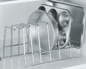
Now a word about those lids.  They do make door racks to hold them but my favorite solution is this nifty chrome rack that fits in an upper cabinet or in a deep drawer.  It's great for the lids or other items and you can get one at  organize-it.com for $9.99

So now you have some idea how to stash your pot pots for easy access.  Next post we'll organize your herb spices and cutlery.  ALSO COMING UP IS A GIVEAWAY! Yes Kitchens for Living is going to give one lucky winner some kitchen love!!  (I'm not really a pot head.  It was just funny so I had to run with it.)


TAP INTO YOUR CREATIVE ZONE

I live in a hectic family household  but Sundays are sacred.  Joe is off at work and kids sleep late, sometimes really late.  That is when I am blessedly alone.  That is when my spirit flies.  I catch up with all the blogs I haven’t been able to read during the busy week, maybe I do a little art and I dream.  Despite all my financial responsibilities,  my parenting realities and my work I get into a place where, for a moment,  I think just because I’m alive I can do ANYTHING.  Here are some things I become capable of on Sunday morning:

1. Going back to India to take up where I left off.


2. Buy and decorate a hip Mid-Century modern apartment in Miami


3.Become a full time artist exploring and developing my many ideas and musings at my leisure. This is one of my collages.  If you want to see more visit www.papermoongoddess.blogspot.com


4. Go back to California to study more art


Ok, you get the picture.  When you want to create or remodel your own kitchen or design a kitchen for a client this is a very good space to be in.  Get in the mood and the ideas will come.  This is truly the first step in the Intuitive Kitchen process. When you have returned to earth you can edit.  Trust me it works.  Now tell me, don't be shy (that's counter intuitive). How do you get in the zone?

Happy (Kitchen Design) Endings

It's been one of those weeks.  I'm happy to be busy but struggling to keep up!  I have been working on a big traditional kitchen design for a client trying to recreate her favorite kitchen back in Toronto.  Since lots of walls are being removed to create a large open space we ended up with a situation which will locate the end of the refrigerator in the hallway! One of the most unsightly kitchen endings would be the side of a refrigerator.  Who wants to look at that?
With the enduring popularity of the open kitchen plan we are faced with including a seamless transition between the "kitchen proper" and the adjacent living area.  Even if you opt to spend a little extra for a decorative finish to the sides or backs of cabinets that are fully exposed there are some other creative solutions.  This got me thinking about how to end it all, in a happy way, of course.  I decided to employ a technique I have used previously.
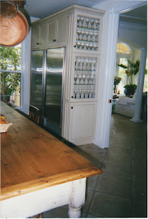
We accomplished this fine ending with less than 12" of spaceI will use this solution in my new design

If you're short on space, you can implement this solution with only 6" of extra space.  Make the top doors glass for a place to display a collection or if you can squeeze out 12" in depth, use solid doors and you have a handy pantry. Don't forget you'll have to finish side of the end cabinet so it looks great from the front too.

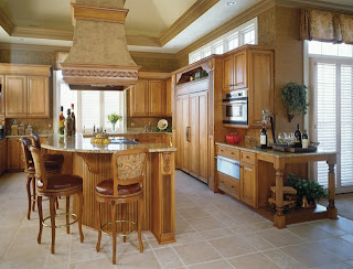
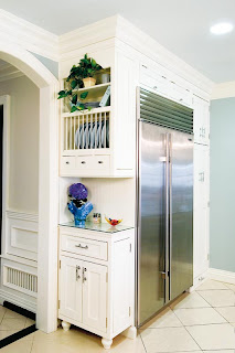
Photo courtesy of Holiday Kitchens

This traditional example by Holiday Kitchens, becomes warm and inviting with the addition of an attractive end unit which, not only creates a beautiful spot to display that special something, but it's also a great way to transition from kitchen to living area.

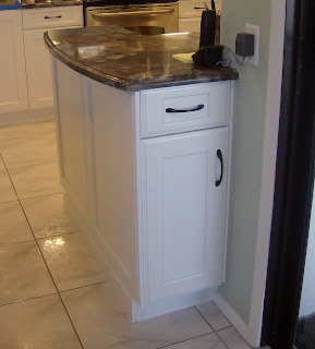
Mini peninsula placed at the end adds counter, storage and visual appeal

Easy access to BBQ tools from porch

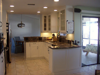
Here's a handy solution for a client with a smallish kitchen who was looking for a little extra counter space as well as a handy place to store his barbeque paraphanalia.  The back of the cabinet opens right at the opening to a sliding glass door leading to his barbeque on the porch.  It also visually defines the end of the kitchen.

This solution by Holiday Kitchens uses 12" deep cabinets and offers a little extra counter space