Tips for Creating a Minimalist Kitchen

For years my husband and I have thought about the day when we'd be able to live small in a big way.  That means less stuff and more meaningful moments, experiences and adventures.  

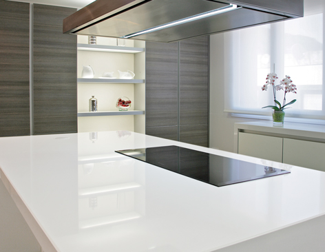
The Miminalist Kitchen is clean and uncluttered. Photo by Wilsonart

The suburban life has its advantages and I will certainly miss having the big kids :) around as well as my morning walk route and garage studio.  That said, we're trading it in for simplicity, morning coffee and sunset wine on the water.  Yes, we're selling the house and moving back to my chick pad on the intracoastal which will now be a sanctuary for two, plus one kitty.  My musings brought me to Minimalism, a very inspired documentary about how two guys made it happen in their lives. Check it out on Netflix. Downsizing and moving is kind of like a mandatory form of minimalism, it's the only way.  Scary? Yes, but also exciting and since kitchens is what I do I began exploring the idea of what makes the Minimalist Kitchen. Here are thoughts to get you started if the idea inspires you too.


"Have nothing in your house that you do not know to be useful, or believe to be beautiful."-  William Morris

These words by William Morris are the perfect place to begin when considering the Minimalist Kitchen.  The concept is, of course, not new.  Morris was a nineteenth century British designer, writer and social activist who espoused this principle and his advice is the perfect way to begin the journey to the Minimalist Kitchen.  Consider every single item in your kitchen in due course, i.e. not necessarily all at once but methodically and thoroughly.  If you're not sure, one way to decipher usefulness is to take note of the items you use every day, week, month and only on holidays.  Items used only once a year don't need to be stored in the kitchen if space is tight and if it's been more than a year why are you holding space for it? The kitchen remodeling process is very helpful in this regard. You're forced to empty all your cabinets then, as you live out of boxes during the process, you quickly become familiar with the items you really depend on.  Chances are there are less than you thought.  Usefulness is huge BUT remember the beauty too.  This means if you LOVE something you get to keep it!

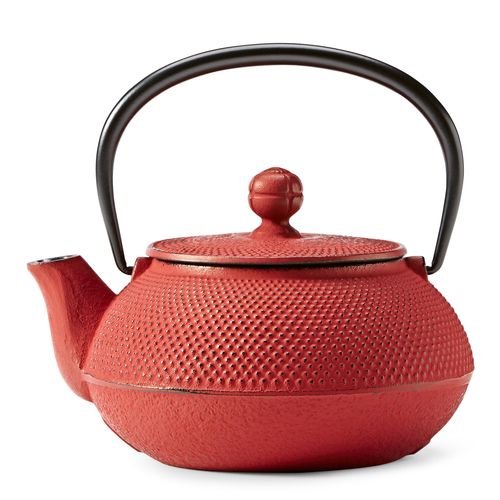
Hobnail teapot by Teavana Minimalist Kitchen


Consider Multi-Use Appliances

These appliances offer versatility and save space for things you love.

Aroma Rice cooker minimalist kitchen

My daughter's boyfriend got us this rice cooker for Christmas and we have never looked back.  Not only is it a convenient rice cooker but it's also a slow cooker and a steamer! You can even hard boil eggs with it. In my house it earns its space in the kitchen. The Aroma Professional Rice Cooker comes in a variety of sizes too.


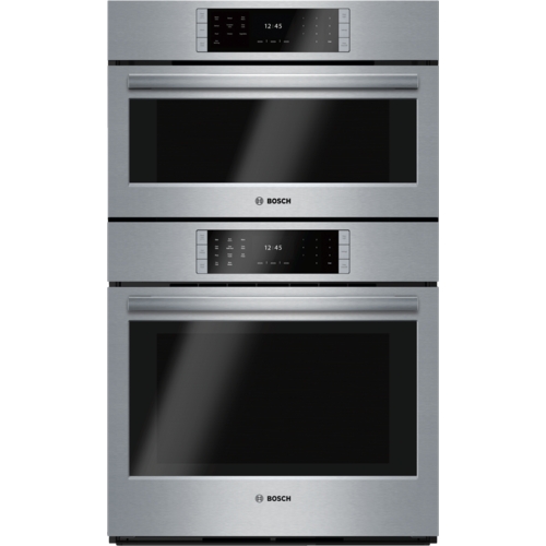
Bosch Benchmark steam combo oven minimalist kitchen


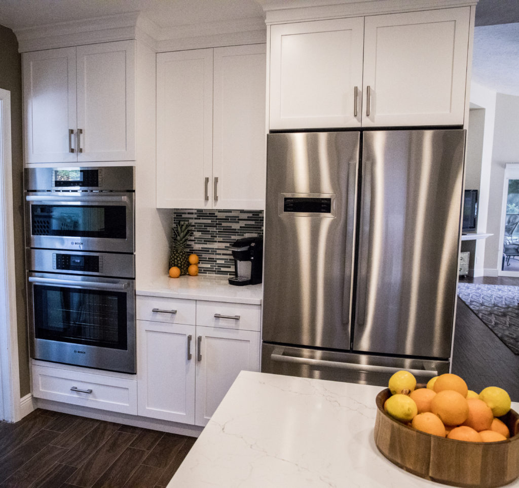
If your cooking goals are loftier there are many luxury appliances that combine convection, steam or microwave technologies into one appliance.  This Bosch Benchmark combo oven features steam on the top and regular convection on the bottom.  You can also get a microwave on the top if you prefer. These are just a couple of examples but you get the point, yes?


Ditch the Duplicates


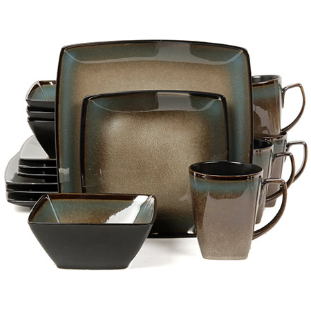
Do you really know how many you have? I certainly was surprised to see I had so many funnels!  Speaking of duplicates, when I move we're having one big set of dishes that we love and use everyday.  That is all and I give you permission to do that too.  If you have little ones you will have to strike the right balance between beauty, durability and price.  I love the variety of suggestions here.  If you must have a set of separate dishes for the holidays remember they can be stored outside the kitchen if space is tight.

Gibson Elite Tequesta Dinnerware Minimalist Kitchen


Detach & Re-Charge

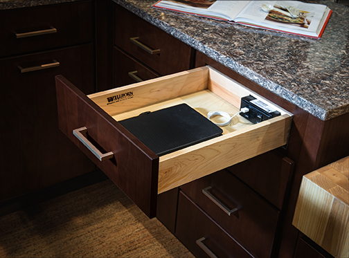
One nifty feature I've been working into most of my design lately is a charging station.  Give yourself and your devices time to re-charge.  This charging station gives you a safe place to store devices off the counter top and out of sight.  A few hours of detachment can work wonders.  It's a de-clutter strategy for your kitchen and your mind right in line with the Minimalist perspective.  See some of the options at  Docking Drawer Try it!

Charging Station Wellborn Minimalist kitchen

  Organize Your Recipes Digitally

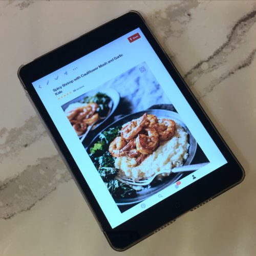
I don't know about you but I have a lot of cook books and most of them I don't use.  There are so many easy ways to organize and save your favorite recipes on line.  I usually use Pinterest or AllRecipes.com to curate my collection . If you're not too internet savvy just take a photo on your phone or tablet.  It's as easy as that.  Definitely keep cookbooks with sentimental value such as the ones with grandma's hand written notes.  I actually wish I had some of those!

Minimalist Kitchen Pinterest recipes

The goal for me is less stuff.  The payoff is saving money, easy cleaning, maintaining what I have,  knowing where everything is when I want it and having more time and resources to travel and enjoy the relationships and experiences in my life.  As The Minimalists, Joshua Fields Millburn & Ryan Nicodemus say  "Love people and use things because the opposite never works."  


Stay tuned for my downsizing moving adventures in the months to come and let me know how I can help you craft  your own Minimalist Kitchen.

Kitchen Case Study: Tips and Products that Can Bring Your Design to the Next Level

Designing a kitchen is a bit like solving a puzzle, eventually all the pieces come together and it all makes sense from both a visual as well as a functional perspective.  This new kitchen design in Wellington Florida is a great example of that. Today I'd like to share with you an inside peek at the process and how we got from drab to amazing in ten million easy steps.

White Shaker Cabinets,Style My Faucet, Kitchen Design, Kitchen Makeover


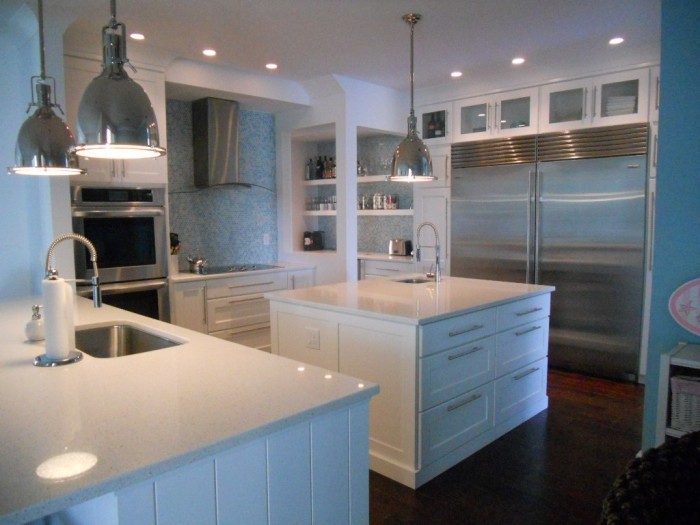
I jest, it was really only eight million.  Here's where we began.  Check out these before images.  As you can see the old kitchen was outdated and just didn't work from a layout point of view.  The challenge we faced was to create something light, modern and very user friendly for my client who loves to cook for her family.

Befores

First Things First: Layout Challenges

Kitchens generally work a lot better without too many angles so although we were stuck with the exterior angled walls, we could straighten out that peninsula.  Then there was the island in the center.  All the angles were affecting the usable storage inside so I wanted to square that up too.  Next up was that oppressive soffit at the top!  It was like a heavy weight pushing down on the kitchen.  Removing it would allow taller cabinets and a much more open feeling.  The refrigerator was crowded next to the stove so I really wanted to relocate it if possible.  Last but not least, where the fridge used to be is our new focal point,  a modern hood and beautiful reflective glass tile.


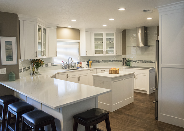
The above plan shows how it all panned out.  We accomplished all of our objectives.  The soffit was removed, peninsula reshaped with the addition of a beverage center, the island became a baking center with no angles and storage for a mixer lift.  We extended the pantry wall and created the perfect home for a new refrigerator and combination wall and microwave ovens with convenient counter space in between.

White Shaker Cabinets,Style My Faucet, Kitchen Design, Kitchen Makeover

Star Elements & The Power of Collaboration

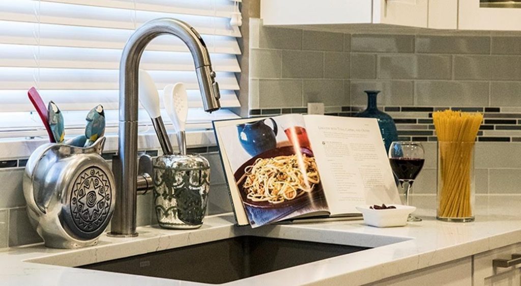
I always say the best projects are great collaborations and that is exactly what we had here.  My client didn't think she knew what she wanted but she really did.  She gave me lots of feedback and clues as to what is most important to her and her family.  The result was an appliance package by Bosch including an induction cooktop, all wood white Shaker style cabinets by Holiday Kitchens and Brendan Donovan Furniture & Cabinet Co., an undermount Silgranit kitchen sink by Blanco and the Beale Touchless Kitchen Faucet by American Standard.  This was the first kitchen I've done using this particular faucet.  In exchange for the faucet, American Standard offered me the opportunity to participate in a really fun project called Style My Faucet.  Designers all over the country played too.  We had fun staging the Beale and got some great shots.  Flowers and veggies had already been beautifully featured so we did pasta! 

"The best advice I can give my clients is to invest in a quality faucet."


Beale Touchless Kitchen Faucet, AmericanStandard,StyleMyFaucet


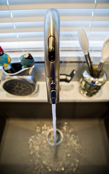
The Beale Touchless Kitchen Faucet was very easy to install,  the battery for the  Selectronic hands-free sensor is conveniently located below in the cabinet.  You can opt to leave it on manual mode too if you prefer.  Just slide the sensor door on the front and you can operate with a wave of your hand.  This is so nice to have when you're preparing things like raw chicken, right? I was also impressed with the Dock-Tite spray head docking system.  It feels really nice and secure.  I've seen faucets that dangle when they're not supposed too.  Yuck.  The best advice I can give to my clients is to invest in a quality faucet.  I will definitely be specifying the Beale again because I am impressed with not only the quality but also the sleek  styling that works so well with contemporary and transitional designs, just like this one.

White Shaker Cabinets,Style My Faucet, Kitchen Design, Kitchen Makeover


There you have it.  It's a wrap.  Drop me a line  at artfulkitchensbyglo@gmail.com and let's get started on your kitchen!

 This is a sponsored blog post.  All editorial content is entirely my own opinions and perspectives.


Using the Holidays for Kitchen Planning

'Tis the season, although definitely not the season to begin tearing your kitchen apart to begin a renovation.  However if you’re kitchen planning for the new year  holidays can be a very helpful tool.

Silestone by Cosentino, kitchen planning, red countertops, quartz countertop

Think about it.  We are probably using our kitchens the most from Thanksgiving through the new year.  Guests are visiting and there’s a lot of cooking, entertaining and eating going on. Now is the time to pay attention.  What’s working for you?  What do you long for? Supplying this type of information to your design pro is invaluable.  I always say the best projects are tight collaborations between client and designer.  We’re good but we’re only as good as what you give us.  This doesn’t mean you have to know the solutions, give us your problems and we can figure them out.  As we roll through the holidays, here are some questions to ask yourself and  things you may want to consider when kitchen planning. 

  1. Are your counters a top priority?  
  • Do you have enough counter top space and is it located where you need it?
  • If you need more, where do you need it? Are you short on space for food preparation or would you love a buffet top for serving? Do you have a place to put groceries down before you put them away?
  • Is you counter top material working for you? Is it easy to clean?

white shaker, florida kitchen, quartz countertop, subzero, kitchen planning

       2.  Moving and grooving

  • Can you move easily around your kitchen without tripping over someone or something?
  • Do you have defined work centers, one for food preparation, cooking and cleanup? There could be additional work centers but these are the minimums.


  • WoodMode, oceanside, beach kitchen, kitchen planning

       3.    Storage 

  • Granted you’ll be needing the most storage through the holidays. Do you have enough? If you can say yes right now you’re probably golden for the rest of the year too.
  • Remember there is storage and then there is accessible storage.  Shoot for both.  You need certain items everyday but others only once a year. Is there a certain item you always have to hunt for?  Is there a place for all your stuff and does your stuff go back there when not in use?
  • modern-kitchen, white cabinets, contemporary kitchen, high gloss cabinets, red accents, LED lighting, kitchen planning

       4.   Make it Safe

  • When kitchen planning this is important for everyone but especially children and physically handicapped people.
  • Is your floor slippery? Do you have enough space on either side of the stove so that pot handles don’t stick out? Are knives located in a place that’s easy for you to access but hidden from little ones? A “touch on” faucet can reduce the risk of accidental scalding.

    5.  Let there be Light

  • Can you see what you’re doing? Consider adequate overall light as well as task lighting which focuses on your work areas.  Do you need to add more or better lighting underneath your upper cabinets to illuminate the counter? Does the room get enough natural light or do you need to bump it up with some recessed ceiling lights or pendants?

This is only the beginning!  You can create a really helpful kitchen planning list from answering these questions. A kitchen is a big investment so it only makes sense to invest in planning carefully before you begin.  I'd love to hear from you!


Reinventing White Shaker Cabinets

There's a reason why white Shaker  cabinets are so hot; it's because they are so versatile, just like pasta, the final result depends on what you put with it.  Not only can you get this style in any price point but you can make it work with your own unique design style. Today I thought we'd take a look at some very different successful results all using garden- variety white Shaker cabinets.

Traditional to Transitional white Shaker cabinets with 2 1/4" frame (stiles and rails)


First of all, in case you've been off somewhere living in a cave, Shaker cabinets feature what we call flat panel doors. There's a flat panel in the center surrounded by a frame.  That frame is typically 2 1/4" wide which will give you a traditional look or 3" wide which is a bit more contemporary.  A word of caution, if your kitchen will have small doors (less than 15" wide) and you're going to be using glass in the center, go with the 2 1/4" or the glass section will be too small.


Encyclopedia of Shaker Furniture


The modern Shaker style gets its name from the original Shaker furniture.  "Shaker furniture is a distinctive style of furniture developed by the United Society of Believers in Christ's Second Appearing, commonly known as Shakers, a religious sect that had guiding principles of simplicity, utility and honesty. Their beliefs were reflected in the well-made furniture of minimalist designs.- Wikipedia  American Shaker furniture originated in the 1700s and has changed little since then. Original Shaker doors typically had natural wood finishes but today white is all the rage.  Fast forward to the twenty-first century where all that white simplicity can get a bit  boring and generic.  With the big movement towards personalization and custom design you can rock that Shaker look and make it your own.  Here are just a few examples:

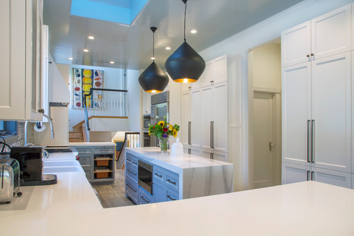
                                                                                                                                              Los Gatos kitchen

                                                                                                                                                  Photo by Margot Hartford Photography - Discover kitchen design ideas -Houzz
 
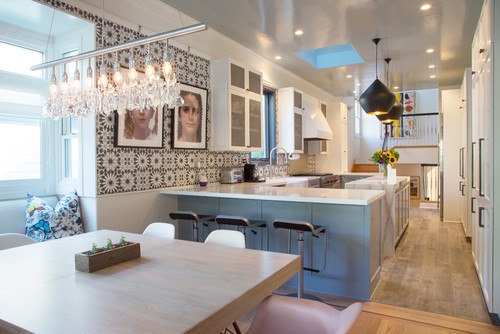
                                                                                                                                              Los Gatos kitchen
                                                                                                                                                    Photo by Margot Hartford Photography - Browse kitchen ideas - Houzz


21st Century Victorian

The kitchen above is situated in an 1892 Queen Anne Victorian home in California and features a totally different take on white Shaker.  Accents include a luscious blue color for the peninsula and gorgeous Mamounia tile from  the Martyn Lawrence Bullard Collection for Ann Sacks. I love the mixture of natural wood, white, the pattern of the tile and that perfect shade of blue.

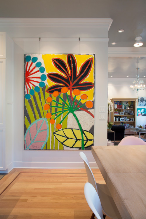
                                                                                                                                           Los Gatos kitchen
                                                                                                                                                                        Photo by Margot Hartford Photography - More kitchen ideas - Houzz


Since white Shaker cabinets are pretty much a blank canvas, they offer a great opportunity to showcase bold colorful art!  This painting installed in the kitchen/dining area is by Gordon Hopkins.

Mad for Mid-Century Mod

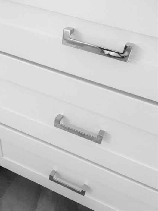
This new white Shaker kitchen is in a 1950's Mid-Century home in South Florida.  The homeowners wanted to retain certain elements such as this original planter and room divider to retain the fifties feel.  I always love to honor that concept when choosing finishing touches for the kitchen.  These handles complement the room divider perfectly and the Cambria quartz top emulates the original refurbished terrazzo floor in the main part of the home.   You don't have to retain all the original details but it can be very striking to tie a few elements together like we did here.
   white shaker cabinets, chrome cabinet pulls, chrome handles, midcentury modern, south florida kitchen


Cool Contemporary

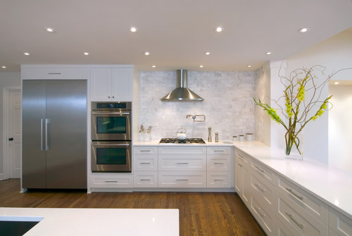
If you have embraced the clean crisp appeal of contemporary design,  you can also have that with white Shaker cabinets.  The example below from Houzz shows achieves a chic contemporary effect through long sleek bar pulls on the cabinets, the clean look of no upper cabinets and stainless steel accents.  The rich wood floor lends warmth to the space.  

                                                                                                                       Raleigh Hills Kitchen
                                                                                                                                              Photo by Rockwood Cabinetry - Browse transitional kitchen ideas- Houzz


There you have it! I would love to help you "shake things up" with your own white Shaker cabinets. Email me at artfulkitchensbyglo@gmail.com  If you would like to have Artful Kitchen blog posts conveniently delivered to your inbox, please subscribe by entering your email in the sidebar.


Natural Stone 101

Natural stone is sexy.  There, I've said it.  If you want a countertop that makes a unique statement with lots of movement and natural variations I recommend natural stone.


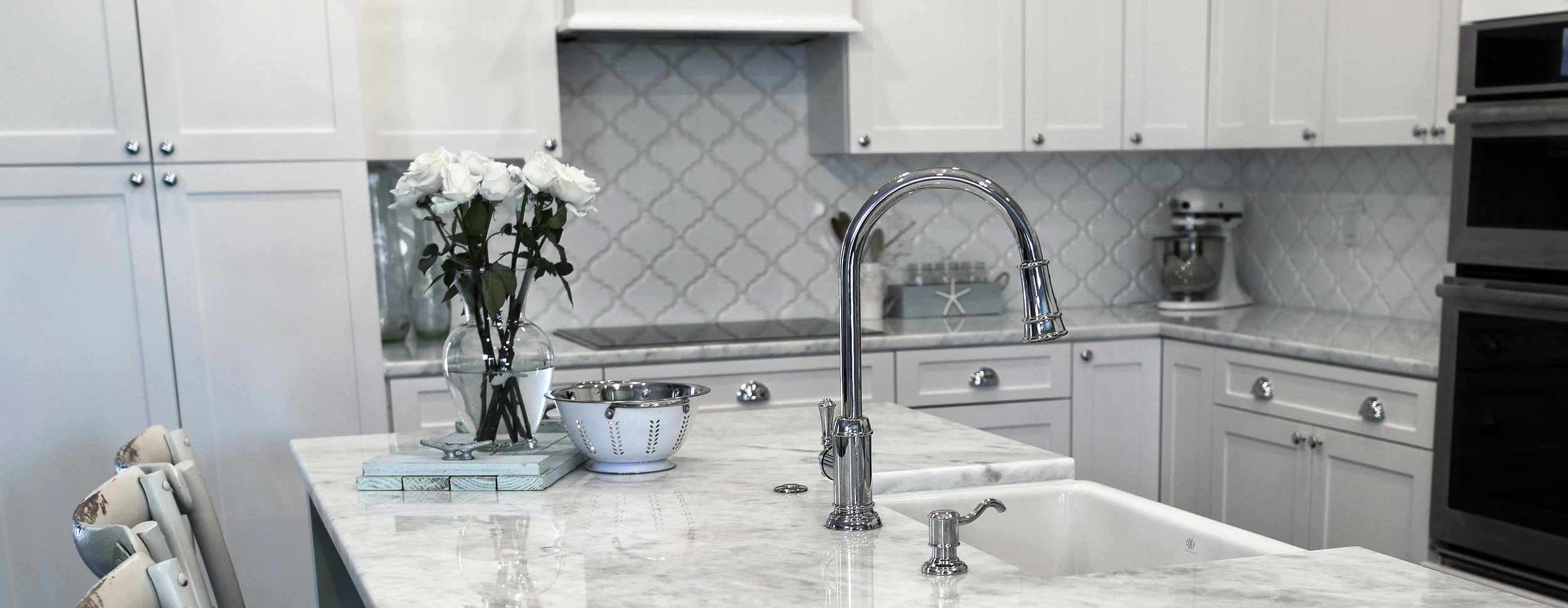
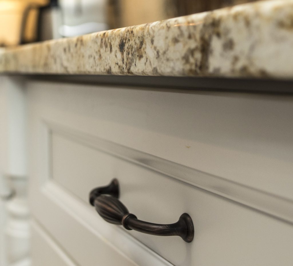
granite countertop detail, oil rubbed bronze handle, white cabinets


A big part of your new kitchen investment lies in the countertop material you decide to use. It’s definitely one of the key players both in terms of function and aesthetics.  It is your work surface and it is one of the most visible features of your kitchen.   In terms of user friendliness and durability it usually comes down to natural stone or man made products such as quartz. There's nothing wrong with the other options, I love them too in the right applications, but if you're looking to personalize your kitchen and be, wait for it, DIFFERENT, go natural.   When I say natural stone I mean granite, quartzite, marble, limestone, soapstone, slate and onyx.  There are a variety of choices that can be used in various applications.  So what’s the difference and what’s the best option for you?
 

Dorado soapstone by Latera Architectural Surfaces

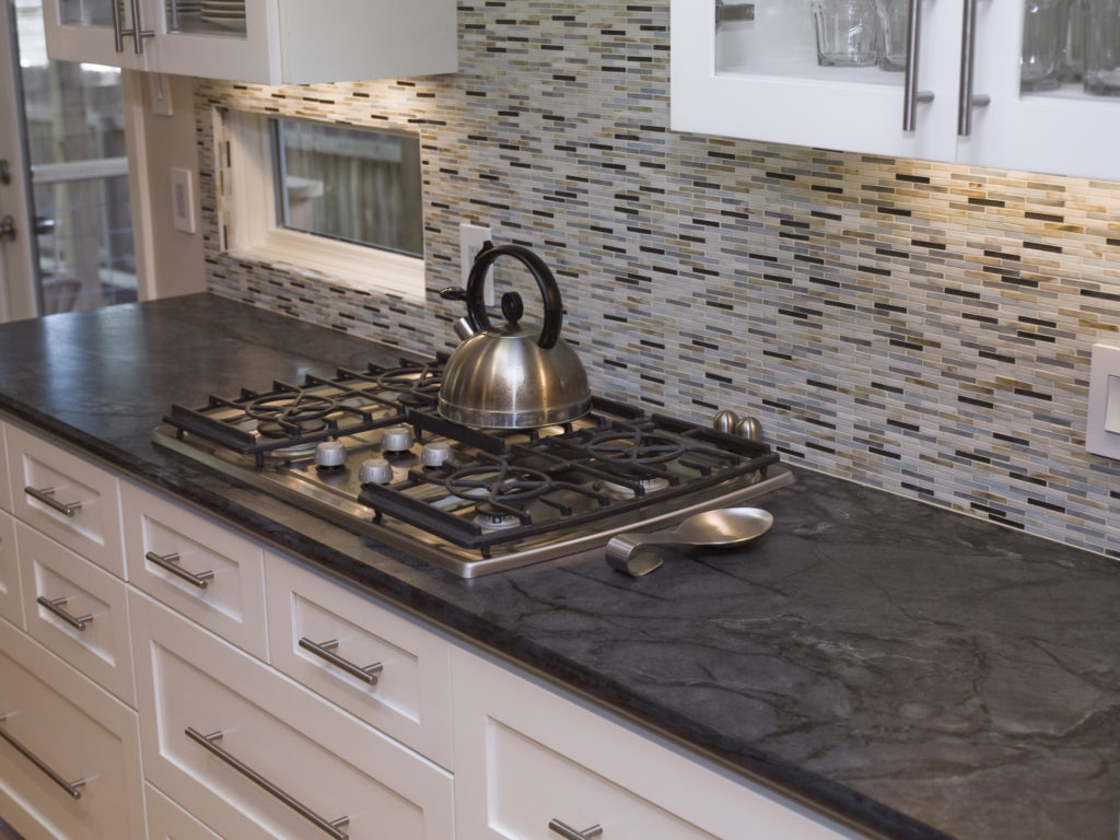
Soapstone-  This is a very viable option for both indoor and outdoor countertops.  It’s unaffected by heat, acid and alkalis.  It’s also non-porous which means it is inherently antibacterial and won’t stain. On the other hand it is soft and can scratch but can be sanded and repaired.  Colors are pretty much limited to greys, greens, blues and blacks with subtle lighter veining.  Like with all natural stone, price is largely determined by how close you are to the source (quarry or port).  You can expect to pay at least as much as you would for granite in most places.

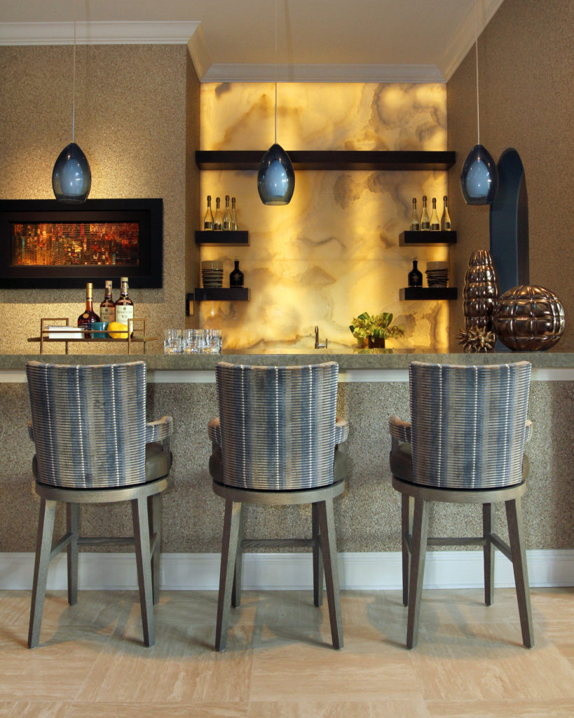
Backlit onyx is a dramatic backsplash for this bar! Source

Onyx- The biggest appeal of onyx is its beauty.  It’s absolutely gorgeous! If it’s a statement you’re after this could be it.  It’s found in a variety of colors,  known for its translucent quality and is frequently enhanced with back lighting. It’s not particularly durable but could be a good choice for a dramatic powder room or bar top.  This is also one of the most expensive of the natural stone choices.

Granite- This is the natural stone that you are probably the most familiar with.  It is found in a wide variety of patterns and colors.  It is typically heat resistant and non porous although less so than quartzite.  This stone is usually offered at various price levels, 1 being the most inexpensive and easy to come by and 5 being at the pricier end.  

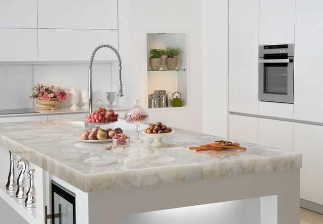
Quartzite- Not to be confused with quartz which is a man-made product, quartzite is the Rolls Royce of natural stone tops.  It’s the ultimate in both beauty and durability which is why it is so expensive.  It is also extremely hard, requiring a diamond saw to fabricate.

white quartzite counter Marble of the World

Marble-At the moment, nothing is more popular than the look of white Calacatta marble.  It is beautiful but sadly it is not the best choice for your kitchen countertop.  Marble is porous which means it will stain and etch.  If you throw caution to the wind and decide to use it anyway, make sure you seal it regularly and  just expect it to season with time like something you’d find in an old French bistro. Oui?

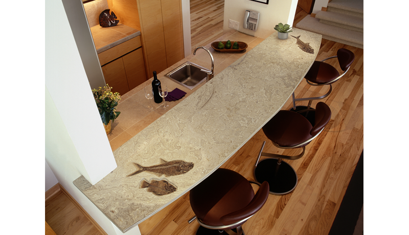
Limestone countertop with honed finish features 50 million year old fossils

Limestone-  This is a very “Florida” look, great for floors and walls but it’s going to require maintenance if you decide to use it for a countertop..  It is very porous and must be maintained regularly with a sealer.  I do love the look of embedded shells and fossils you can get with some limestone. Choices include beiges to soft browns.

Slate-This is another stone that’s great for flooring and exterior as well as interior applications. It can be rustic or modern and is usually found in dark colors like blacks and grays. 

There you have it, natural stone 101.  I’d like to thank the folks at MIA+BSI: The Natural Stone Institute who sponsored this post.  You can find more info at  www.usenaturalstone.com.  

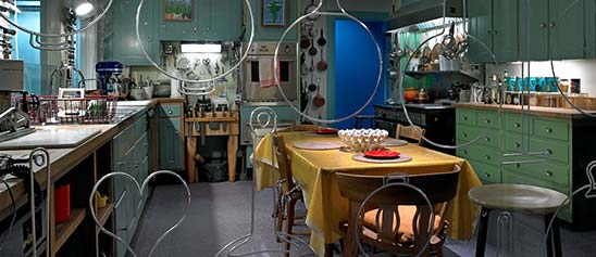
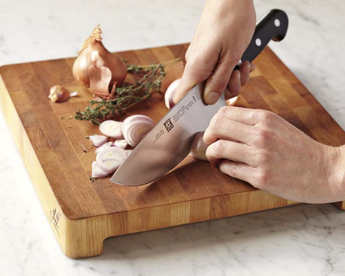
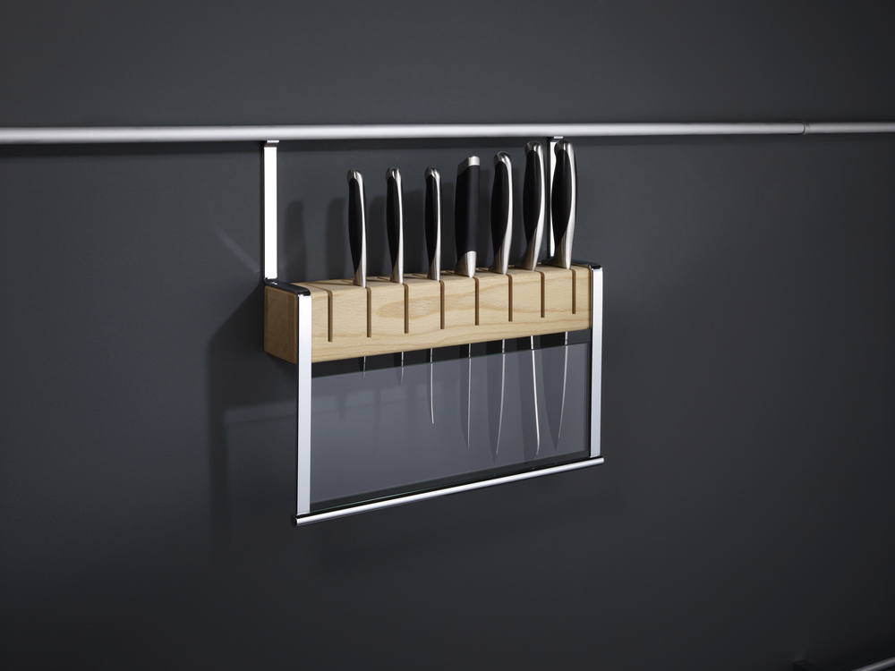
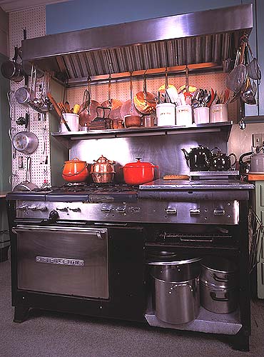
Design Tips Inspired by The French Chef

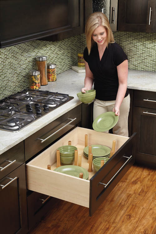
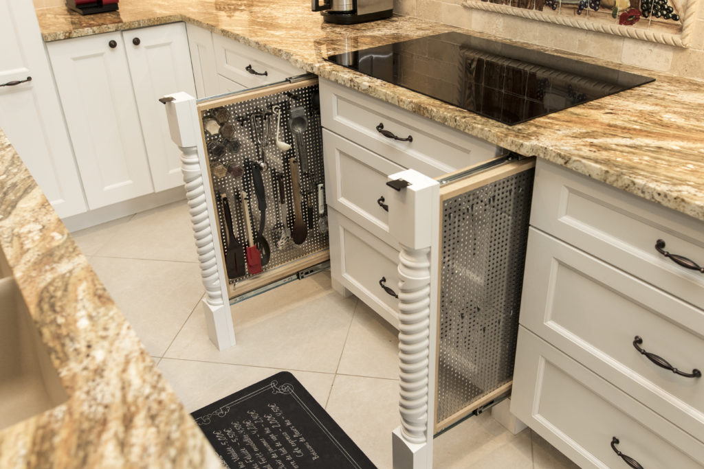
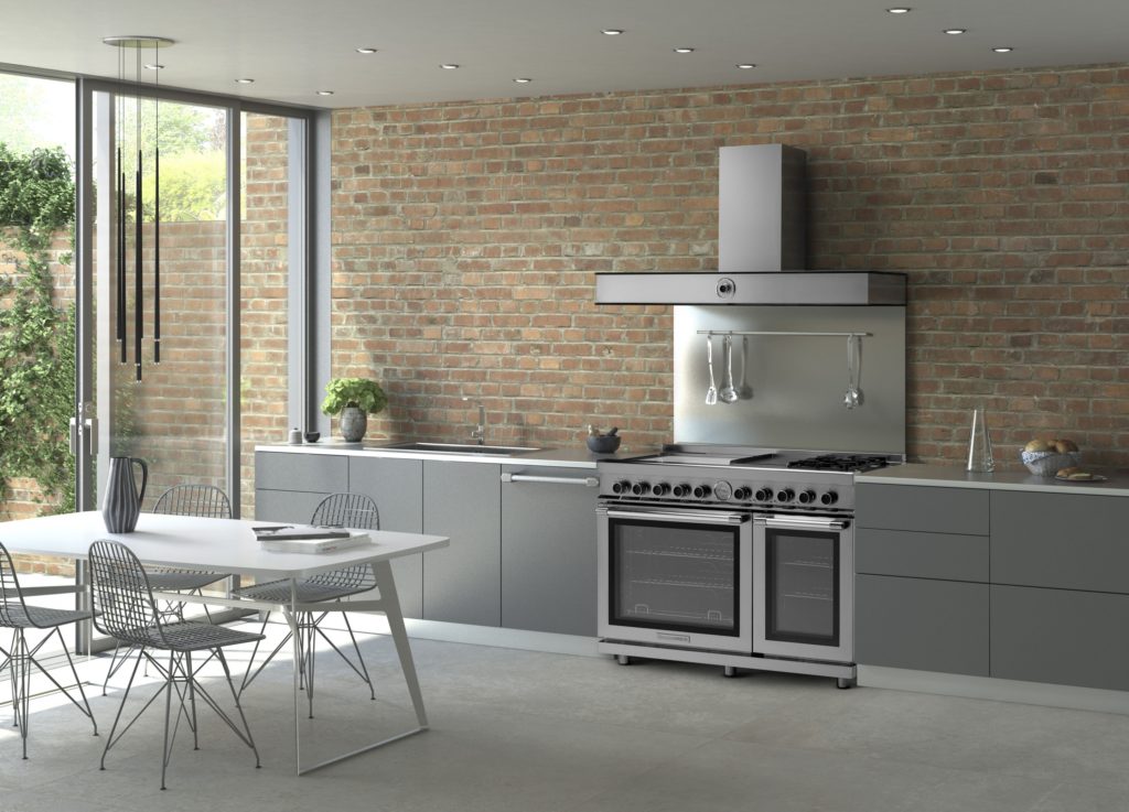
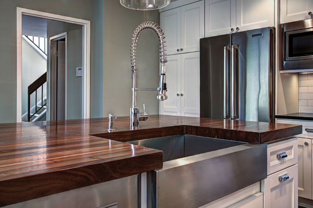
Julia Child was a pioneer in the world of haute cuisine at a time when celebrity "chefdom" was a decidedly manly occupation.  She didn’t care.  The kitchen was her natural habitat and she had her own ways of making it work for her whether she was whipping up a soufflé or flaming a creme brûlée. The French Chef, Julia Child   Child is credited with bringing French cuisine to America in the 1960s and was host of The French Chef on PBS which aired from 1963-1973.   Interestingly, she did not learn to cook until she met her husband Paul Child, an American diplomat with a refined palate. Julia also worked for the government during WWII as a research assistant in the Secret Intelligence division of the OSS (Office of Strategic Services). It was in this capacity that she created her first recipe which was for shark repellent! It worked and is still in use today.  After the war the couple settled in Paris where Paul worked for the US Foreign Service and Julia attended the renowned Le Cordon Bleu cooking school.  She had fallen in love with French cuisine.  Julia stood 6’2”, never had any children and left this world in 2004, two days shy of her 92nd birthday.  She was quoted as saying, “with enough butter, anything is good”.  Apparently her health was none the worse for it. Julia Child kitchen, National Museum of American History Julia’s real life kitchen was donated, moved and reassembled in the Smithsonian's National Museum of American History in 2001. The layout was devised by Julia and her husband and customized to her cooking needs, including higher counter tops to accommodate her height. Pots and cooking utensils are all placed exactly as they were in her home.   Today Julia would be utterly amazed at the advancements in appliances, materials and new storage options. Although her kitchen goes back 50 years she had ideas and practices that are very relevant today.  Here is what I think today’s kitchen would look like through the eyes of The French Chef. Peg Board system by Rev A Shelf Organization and Easy AccessJulia was known for her handy and efficient peg board system.  Companies like Rev-A-Shelf have taken this concept and expanded it so that it doesn’t have to be on the wall.  Moving pegs allow these inserts to be customized.  This is especially handy for dish storage in new kitchens that feature fewer upper cabinets.  A "Julia kitchen" includes a place for everything and everything in it’s place. Rev A Shelf peg boardTo Make the Cut You Must Have Great KnivesA self-proclaimed knife freak, Julia collected them all her life and never met one that was sharp enough for her! Check out this delightful anecdote from the New England Historical Society and you'll see what I mean.  I agree that there is nothing more frustrating in the kitchen than dull knife. The winner in my book is J.A. Henckels International 8" Classic Chef's Knife in terms of quality and value for the money.J A Henckels pro chef knifeHaving a great knife is half of the equation, now we have to store them.  Julia preferred to house them on a magnet attached to the wall.  Today she would love this railing system by Clever Storage that allows you to take advantage of the space between upper and lower cabinets.  It's safe, attractive and accessible.  Win! Wooden Knife Block by Clever Storage The Mother Ship of RangesJulia used a 1950s six burner used commercial gas range by Garland.  This company is still in business so you can get a modern version today but I’m betting Julia would fall for the TriFuel range by Tecnogas Superiore for its state of the art versatility.  In fact, it was just announced Product Innovator Award winner for 2016 by Kitchen & Bath Business Magazine.  It features dual gas burners plus four induction zones and an electric griddle. Below are dual gas ovens equipped with two convection fans and a broiler.The Garland Commercial Range in Julia Child's kitchen in Cambridge, Massachusetts Trifuel Range by Tecno Superiore The Beauty of Butcher BlockThe French Chef was fond of her extra high maple counter tops for food preparation.  You may not want an entire kitchen with wood tops but, if you can, it's great to have a section of it for food prep.  Wood butcher block counters are a natural eco-friendly choice, absorb noise, are gentle on dishes and can be refinished.  In addition to this, wood has inherent antibacterial qualities and can add a beautiful warmth to your kitchen. If you're going to use your counter for food prep it should have an oiled finish which does need to be maintained. Walnut counter tops by J. Aaron  Last but not least never enter the kitchen without a sense of humor and adventure Child was never without it!  She said, “in cooking you’ve got to have a what-the-hell attitude!”-If you'd like to experience cooking like a French chef  you can stay at what was once Julia and Paul's part-time residence in Provence, France courtesy of Airbnb.