The Artful Kitchen: Permission to Dream

Welcome to Artful Kitchens!  I have so much to share with you in the world of art and design and especially how you can successfully merge the two to find your own personal style in the kitchen. Thank you to Leslie Carothers of  The Kaleidescope Partnership and Brian McDaniel of bkmacdaddy designs for their excellent help! In the coming posts I will be writing about color, elements of design, the art and artists that inspire me and much more.  Please share, share, share and help me spread the word!  Oh, and I would love to collaborate with YOU!! Email me at: ArtfulKitchensbyGlo@gmail.com

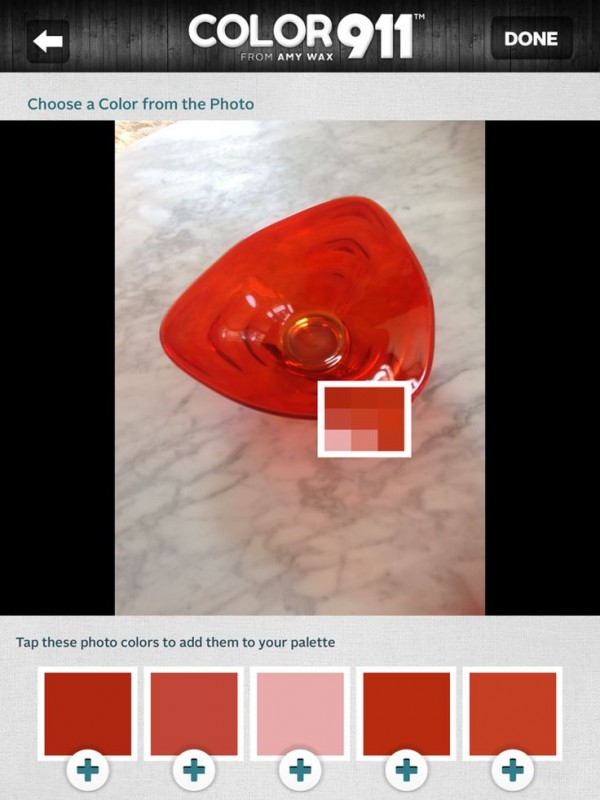
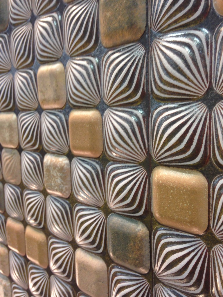
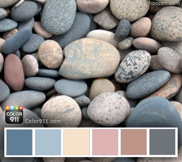
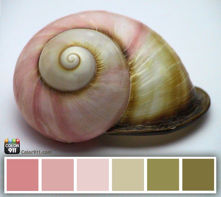
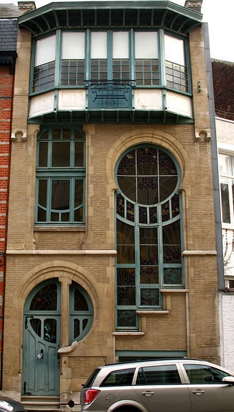
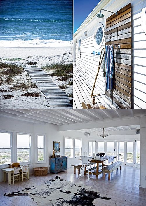
The first step in creating an artful kitchen is to give yourself permission to dream.  Doesn't that sound wonderful?bb5bc55fef5f679a17a4167a9cb93aa7As a kitchen designer I have several priorities in mind when I begin a kitchen plan.  Aesthetics, lifestyle and especially function come into play.  All are critical components.  I also have observed that the most effective and complex kitchen creations are the result of evolution.  The details reveal themselves from each decision that has come before. That said, you still need a starting place, one that will hopefully evolve into your own unique personal statement.  The buzzword today is personalization and it’s here to stay.  That’s where dreaming comes in. Create color palettes from nature with Color911 by Amy Wax.These color schemes from Color911 are inspired by nature.  If you love them they go in your “dream file”.  Don’t worry about “the hows” just yet.f360df0239fedc01b10ec36fd224d162Just think if you could take function out of the equation!  Heck, what if you didn’t even have space parameters? What would you like to see if you could do ANYTHING? With no editing allowed, at least not yet, you would get to the essence of your of personal style. These interesting shapes intrigue me! Photo from curbly.comThis is step one.  Have fun with it.  The only rule is that you enjoy the process.  Only the things that please and excite you are allowed.  Seriously. it doesn’t even have to be a kitchen!! Use good old paper and colored pencils, crayons, markers, paint, a computer or Pinterest.  It’s all good. Don’t think too much just dive in and do it!546aa1718ec85956ac35de75260ddf93Share your vision with me and if you are chosen you may see your own artful kitchen come to life right here on my blog.  Email me at artfulkitchensbyGlo@gmail.com Next in this series: Creating An Artful Kitchen, Step Two: Defining the Essence
An Artful New Adventure!

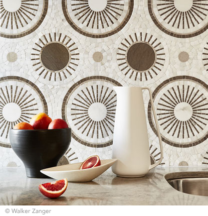
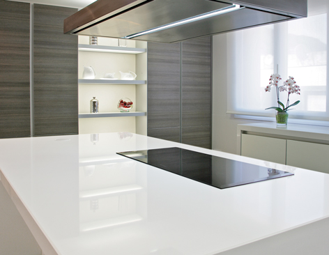
Let’s face it, things change.  As we navigate those twists and turns of fate we can only hope to move forward, seeing new things with a fresh eye. Like it or not, change is a constant.  You can dread it (understandable) or you can choose to embrace it.  That said, it has been more than five years since I began my adventure as Kitchens for Living.Jason Wu 2 (2) I believe I have been true to my promise to share the latest design trends and product info for the heart of your home. We have frequently ventured out of the kitchen and even around the globe! I am so grateful for all the wonderful and talented kindred souls I have met along the way, fellow bloggers, designers and great organizations such as Modenus, Blanco, Brizo, Tile of Spain and many more.  This blog has afforded me the opportunity to travel and bear witness to marvelous destinations and inspiring trade shows. Before this starts sounding too sad, let me tell you I have never felt so excited about the future and eager to explore new opportunities. DSCF9449-L This will be the last post for Kitchens for Living.  From now on I will be able to merge two of the things I love,  kitchen design and art with my new site, Artful Kitchens.  A big THANK YOU to Leslie Carothers of The Kaleidoscope Partnership for her guidance and insight which lead me to discover a new path full of promise and possibilities. tangent_astral88_Square_01Artful Kitchens will focus on all the ways you can use  creativity to personalize your kitchen. Artful spaces reflect who you are and the way you live.Blanco, Residences at Mandarin Oriental, Modenus Blog Tour, #blogtourvegasThe stunning tile above,  by Walker Zanger, was featured at KBIS 2015 which I had the pleasure of attending with The Modenus Blog Tour Vegas. Wilsonart is introducing quartz counter tops!New products like this perfectly white quartz by Wilsonart enhance the kitchen with a feeling of crisp clean freshness!297b3d62-06a8-5ab9-e9d3-5e0d7b88ef14  Color is a primary element of the Artful Kitchen. We'll be talking a lot about that in an upcoming interview with Amy Wax of Color 911Color 911 is an app that allows you to create color schemes with ease!We will continue to incorporate new products and technologies as they emerge and we will explore all the artful ways of creating a kitchen that reflects who you really are. I’m so excited, I hope you’ll join me and spread the word.  Last but certainly not least, whether you are a brand or a consumer, I want to collaborate with you! 2015-02-12 10.56.28Continue the conversation on Face Book or email me at ArtfulKitchensbyGlo@gmail.com 

Interpreting Houzz and Pinterest Inspiration for Your Kitchen

Ever go shopping and find that PERFECT pair of shoes, you try them on and arghhh your feet look like animals trying to escape the confines of a cage too small? :( Really, even though you LOVE lime green, the look does not even remotely go with the rest of your wardrobe.  I know it's happened to me.  Guess what?  Apparently it also happens to the poor unsuspecting homeowner looking for a new kitchen. 

Today Kitchens for Living is going spill the beans on the correct way to use Houzz and Pinterest as inspiration for your own heart of the home. 


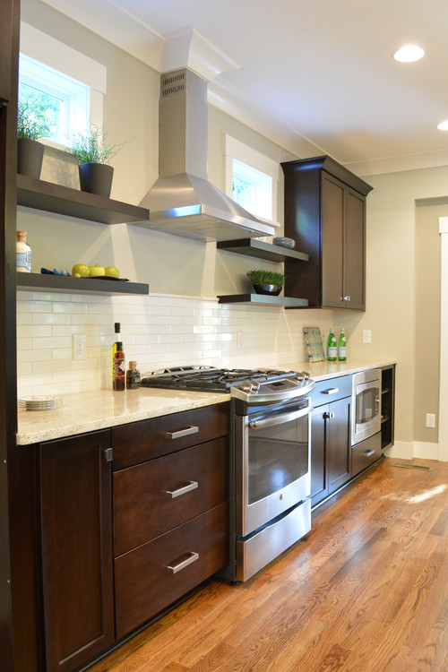
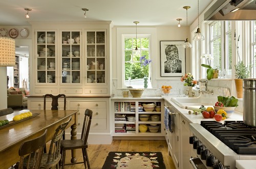
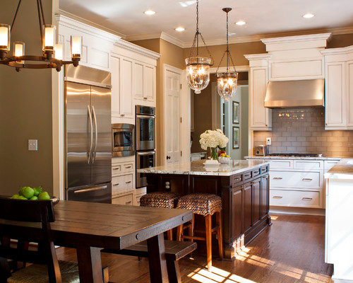
Pinterest and Houzz are excellent places to go for ideas.  I even peruse my idea books there when I'm feeling stuck. However the best way to use them is not to copy verbatim but for inspiration. If your footprint is small but you have height, for heaven's sake go up! Just remember the upper reaches are what I call "remote storage", not for the everyday items.If you have a fourteen foot, uninterrupted span of wild wall wilderness perhaps four floating shelves are not the best choice. This is your opportunity to stack cabinets.The space you have to work with and how it is configured are the starting points for your design.  Once you've got that down and it's functional then you can start inserting those design details that inspire you such as glass doors, textured finishes etc.  Use the colors, finishes, door and molding styles that you loved in the pics to create your own interpretation that will be unique and right for your home. 

Hopefully from these examples you can see the things that work and don't work in certain situations, and more importantly why.  If you're not sure, a quick consult might be all you need.  You know where to find me :)

Frida, Diego and Their Kitchen

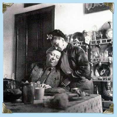
There’s new exhibit in town and I’m excited!   Frida Kahlo and Diego Rivera from the Jacques and Natasha Gelman Collection & 20th Century Mexican Art from The Stanley and Pearl Goodman Collection  opened Wednesday at the NSU Art Museum in Fort Lauderdale.Frida Kahlo's self-portrait "Diego En Mis Pensamientos" (Diego On My Mind) Frida Kahlo and husband Diego Rivera are arguably the most well known twentieth century Latin American artists.  This exhibit draws on their popularity to introduce us to some other names in Mexican art we should know.  These include Lenora Carrington (1917-2011), Gerhard Gerzso (1915-2000), José Clemente Orozco (1883-1949) and many more.   Works on show consist of paintings, sculptures, photographs and works on paper.  The exhibit runs through May 31st.  I am planning on going on March 27th  when Kahlo scholar Dr. Salomon Grimberg will be speaking on Frida Kahlo: The Still Lifes-But let's talk about the kitchen! Frida at her easel from here. There are many published photos of Frida's kitchen which got me to wondering what it would look like today.  Wouldn't it be great to have her essence around when you're making enchiladas? What are the elements you could include to give you that vibe?gallery_couple_5 Frida learned to cook for Diego, oddly enough, from Diego's previous wife! She became an accomplished cook but also spent leisurely mornings in the kitchen reading the newspaper with Diego. 
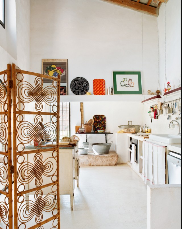
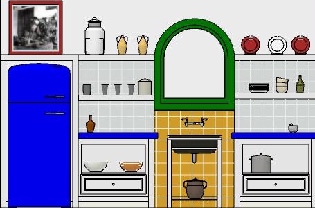
 This kitchen is located in La Casa Azul, a home Frida was born in and continued to return to throughout her turbulent life. You can tour it if you find yourself in Coyoacán, Mexico City. Check out this  article if you'd like to know more. A kitchen with "Frida elements"The rustic simplicity, white walls, high ceilings, windows and use of rustic materials make me think of Kahlo.FridaKitchen2 In this fantasy kitchen  I used bright colors with a few contemporary twists in homage to the Mexican diva.  Design elements of a "Frida kitchen" include the following:-Liberal use of tile-Open shelf storage-Bright colors-White walls-Rustic wood-Lots of light!If you've never seen the movie Frida, don't stop, click here immediately and get it!! Today I leave you with my favorite scene from the movie.  I must warn you it's hot, steamy and not for the feint of heart.  Consider yourself warned and enjoy ;) Happy Friday and have a fantastic weekend. 

Tile Tuesday: Parente to Parasol, Old Tradition-New Expression

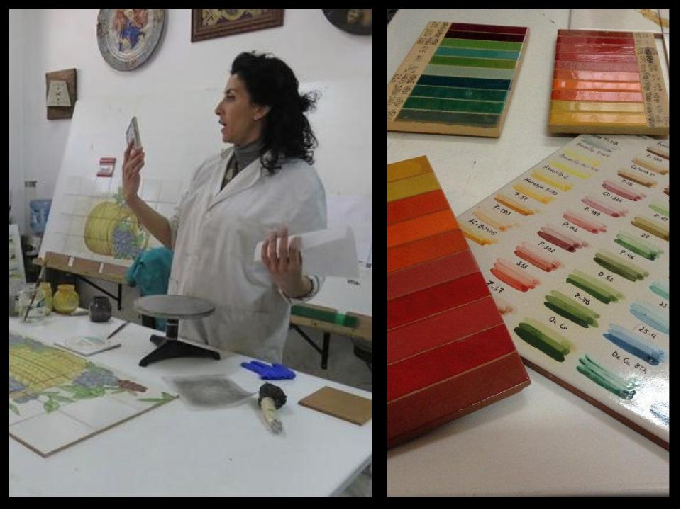
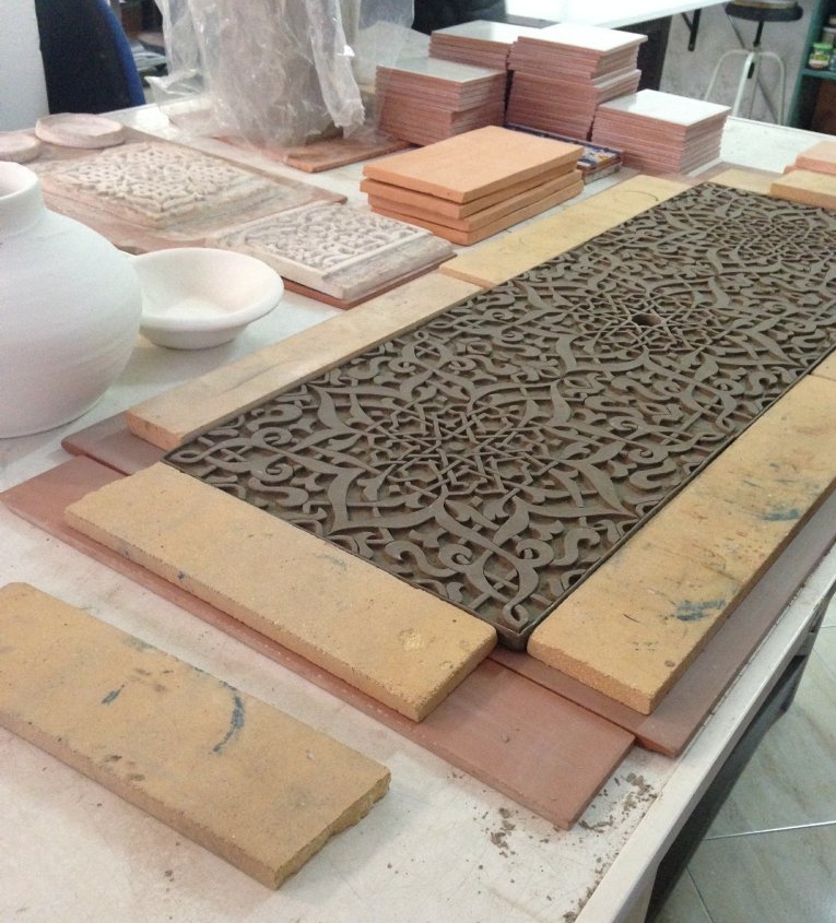
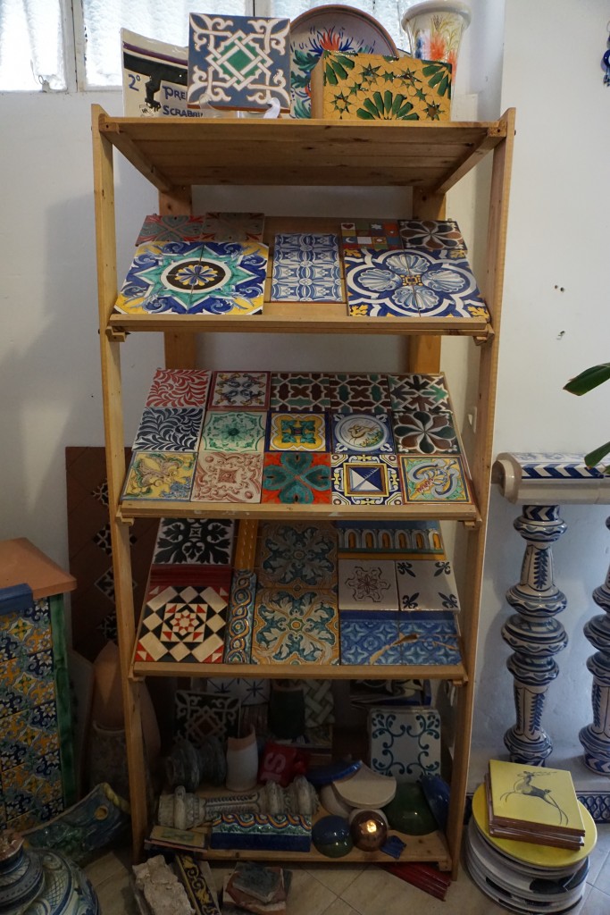
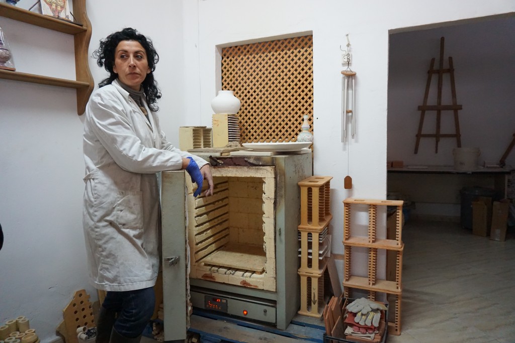
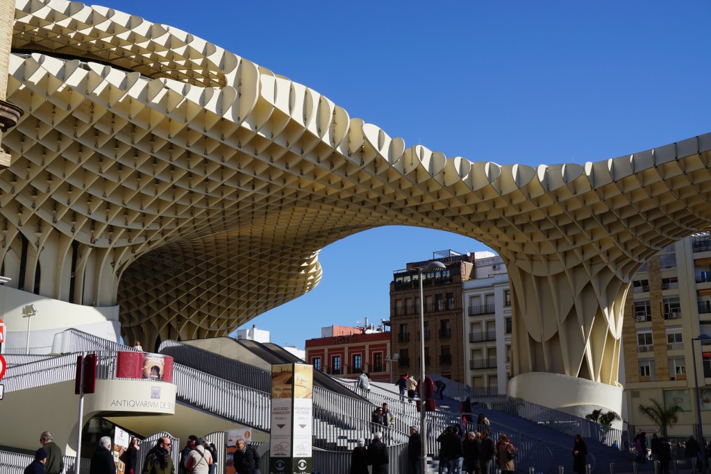
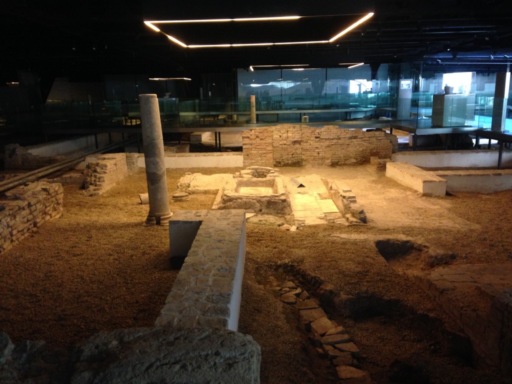
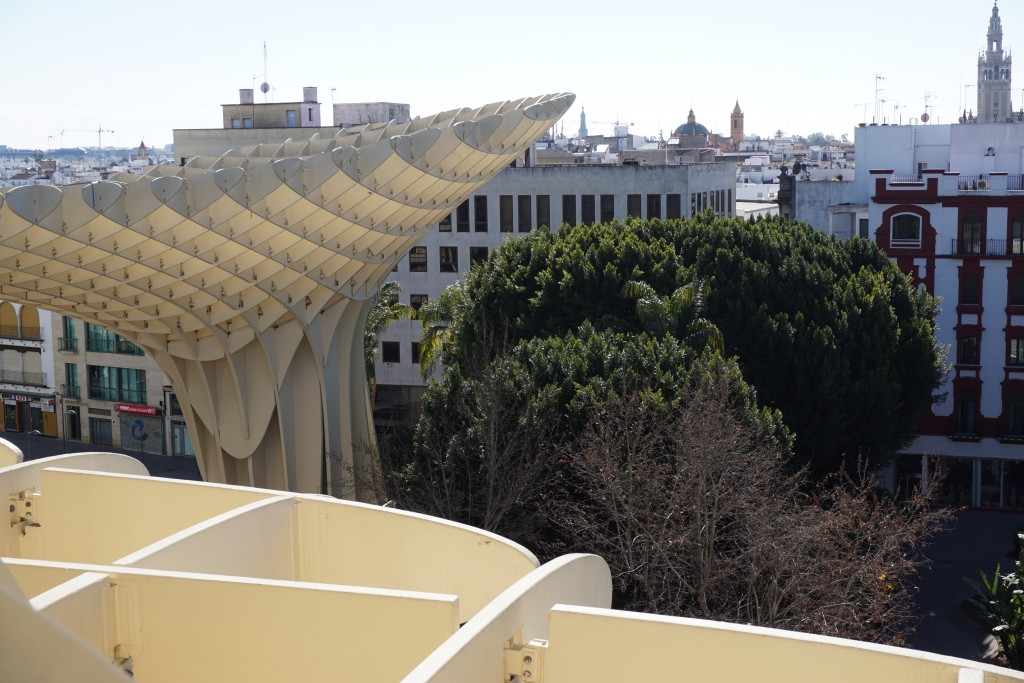
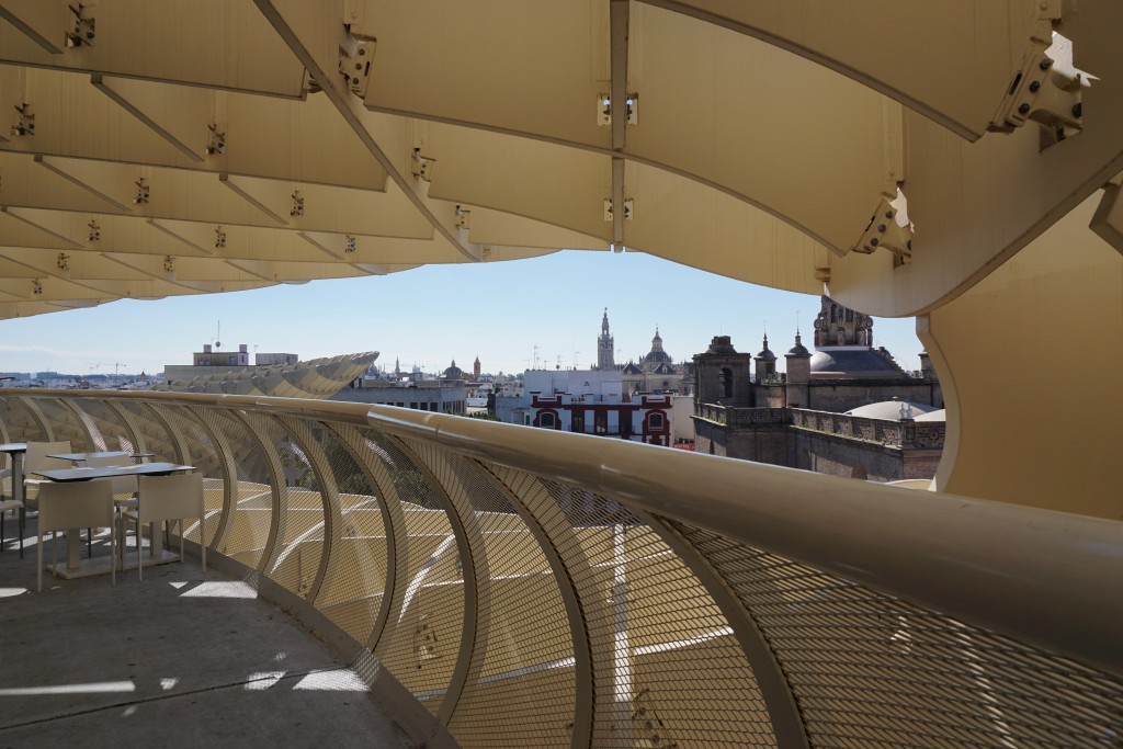
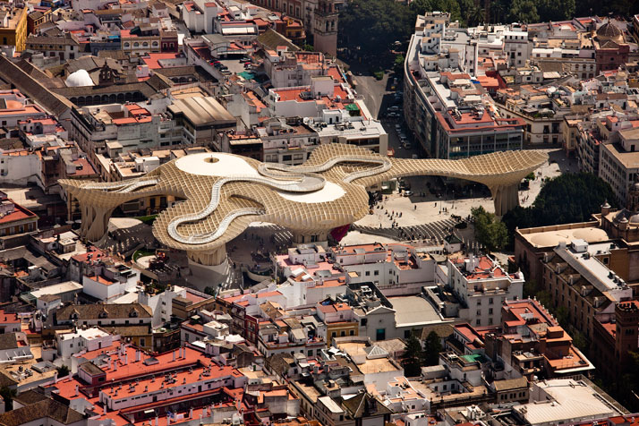
Welcome to the second installment of the Tile Tuesday series! If you missed part one you can find it right here.  If there is one big takeaway from last week's post it is that there are two sides to Sevilla, the constant play between old and new.We were able to really dig in to both aspects on our Tile of Spain tour of Sevilla led by architect Gonzalo Cantos.2015-02-08 12.29.17 As we explored not only tile but the culture from which it originates, we were constantly presented with old and new, separate but not entirely mutually exclusive.  What came before certainly influences the contemporary production.Isabel Parente Later in the series we will take a look at modern state-of-the- art tile production in Spain but today I want to introduce you to a true old world style artisan, living and working in Sevilla.  Meet Isabel Parente.  We visited the studio where she creates her handmade tile and custom glazes.  By the way, did you know that most ceramic glazes used today come from Spain?eJZ0uVz5PrSrDUm3Q1jrlHjn_3-qSKhx-P7cKWM01hULAYspN Isabel is mostly self-taught but briefly attended art school in Sevilla, followed by an internship in Perugia, Italy.  She demonstrated a few different traditional methods including hand painting.  Her practice includes the creation of new commissions as well as restoration.Beautiful tile samples at Ceramica Isabel Parente It is interesting to note that with old world techniques (she doesn't even utilize a computer), Isabel is addressing the very current trend towards personalization.  You can't get much more custom than what she does!This is where the transformation happens. Isabel does not see the true color of her glazes until ceramics go through the firing process in the kiln. Just about a five minute walk from Isabel's studio you will find Encarnacion Square, the oldest part of Seville and home to one of its most controversial residents, Metropol Parasol.  I posted our visit to Parasol in real-time.  If you were one of those who wondered exactly what this was, today's your lucky day. Metropol ParasolEncarnacion Square was home to a neighborhood market starting in the 19th century up until the 1970s when the area began to languish.  Excavation to create a parking lot in the 1990s uncovered ancient Roman ruins below! Ancient Roman ruins below the Metropol ParasolIt wasn't until 2004 that the city decided to develop the property. Architect Jurgen Mayer-Hermann was selected and his Metropol Parasol was completed in 2011 at approximately double the 50 million Euro budgeted for the project. Part of the expense was due to technical flaws in his design that had to be overcome.  This paired with the fact that its unexpected dramatic  presence rubs "traditionalists" the wrong way, is what makes the Parasol a continuing subject of controversy. One "mushroom" of the Parasol joins the trees to provide much needed shade from the Spanish sun.Here's my another perspective.  Mayer-Hermann's inspiration came from the cathedral vaults of nearby Seville cathedral as well as from the large shade producing ficus trees of a neighboring park. In fact shade from the sweltering summer sun was one of his major objectives. In this way it does reference its location quite well.  The project is an excellent example of the modern Spanish architecture of undulating curves and waves.  Sevillanos refer to it as "Las Setas"(The Mushrooms).  Giant "waffles" are made of birch hardwood with a polyurethane finish. I felt cradled inside this giant structure. High but safe!The excavation and restoration of the ruins below continue.  On level zero you will find an Antiquarium where you can walk among old Roman buildings. The Parasol above is wholly supported on 8 points so as not to disturb the ruins below. On level one there is, once again, a market. The upper levels house restaurants and a meandering walkway offering various views of the city below.I will say that because of the design of the structure, I felt safely embraced on these walkways, sort of nice if you have a fear of heights!This puts things in perspective.  Photo by Fernando AldaSo what's your take?  Ugly intrusion or a dramatic blending of old and new concepts exemplifying the new Spanish architecture?Before we leave Seville I want to share my pics with you.   In addition to what I have written about here, and in part one, photos include: Plaza de España, Alfonso XIII Hotel, Royal Alcazar of Seville and Seville Cathedral.  Now go grab some sangria, kick back and enjoy the sights.Next Tile Tuesday:  On to Valencia and what I learned about tile and trends I saw at Cevisama 2015 
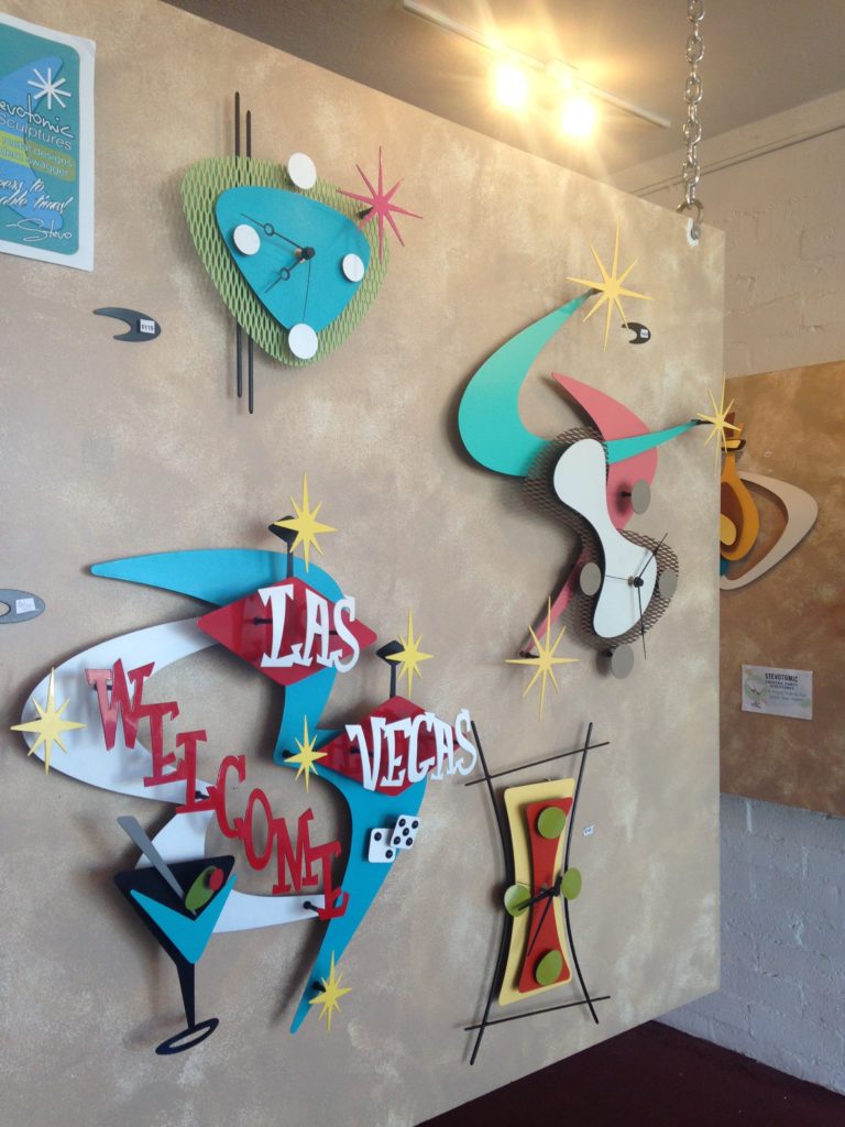
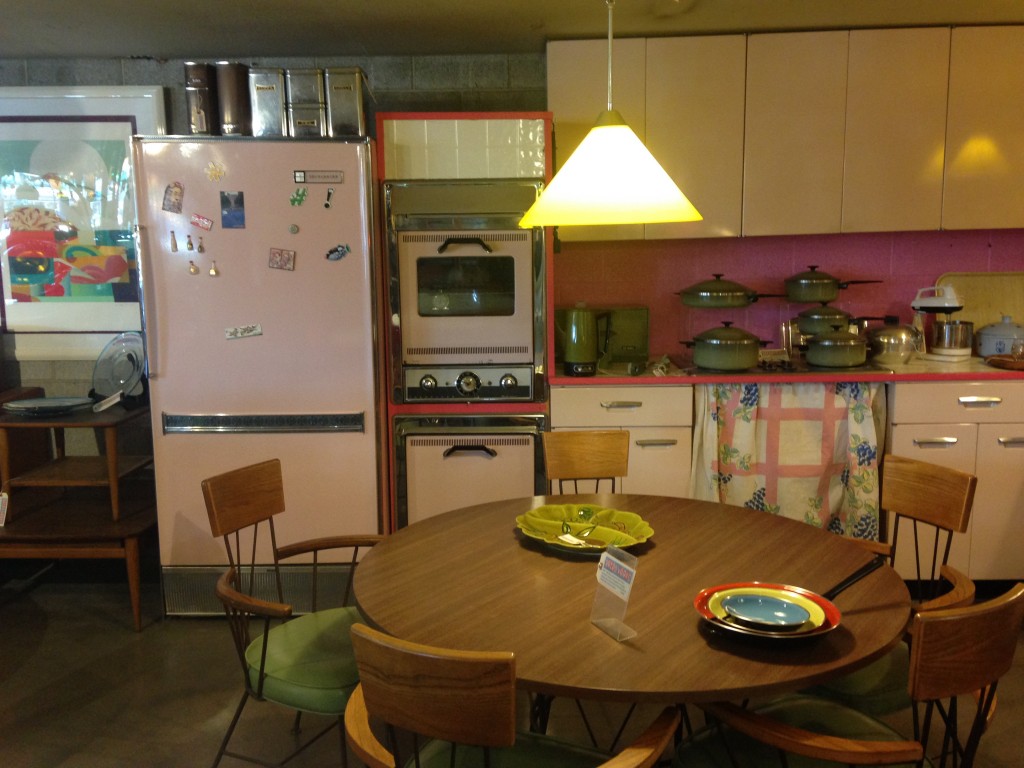
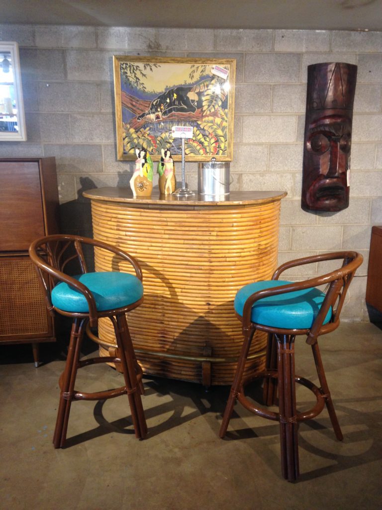
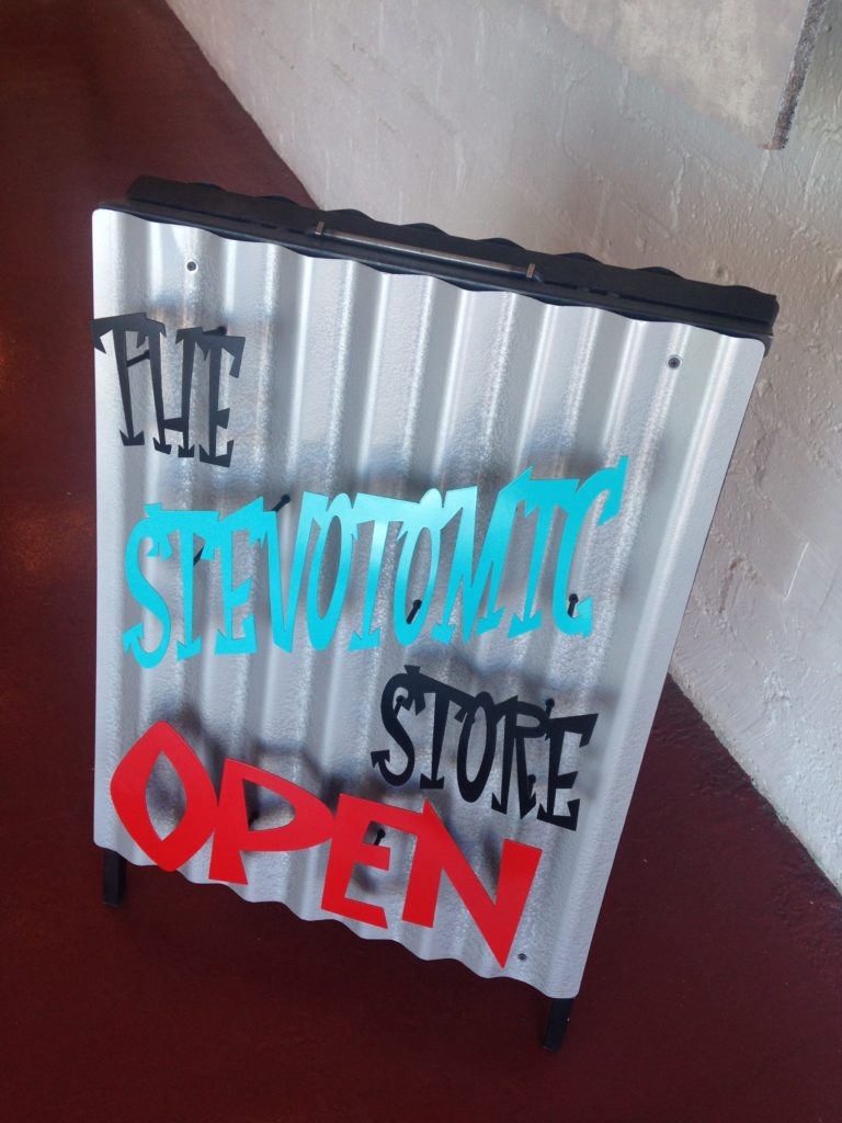
Mid Century Magic Off the Strip

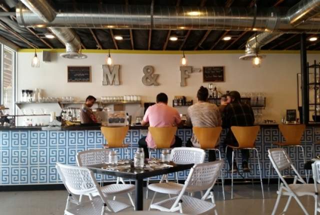
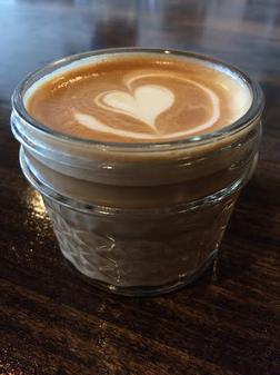
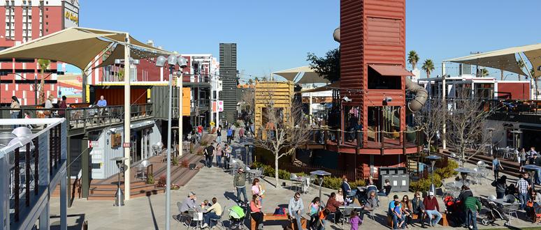
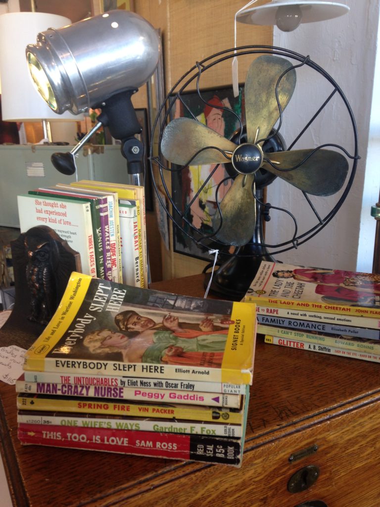
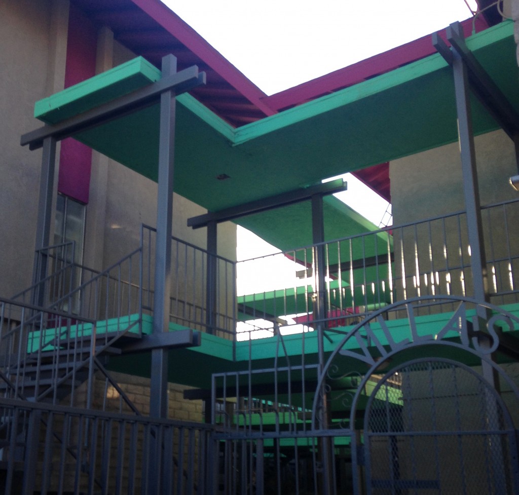
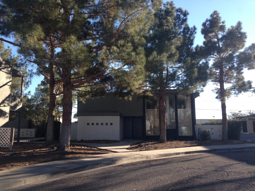
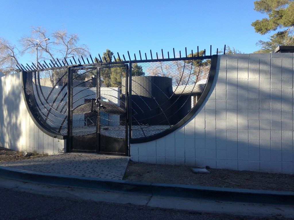
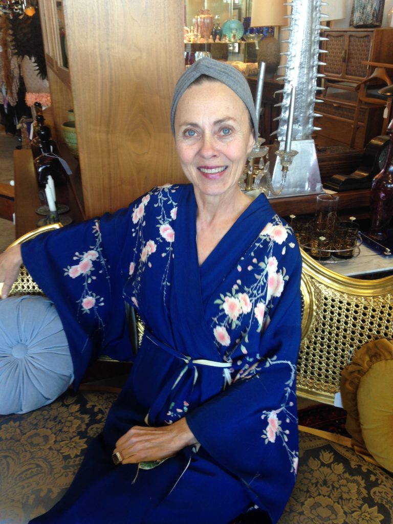
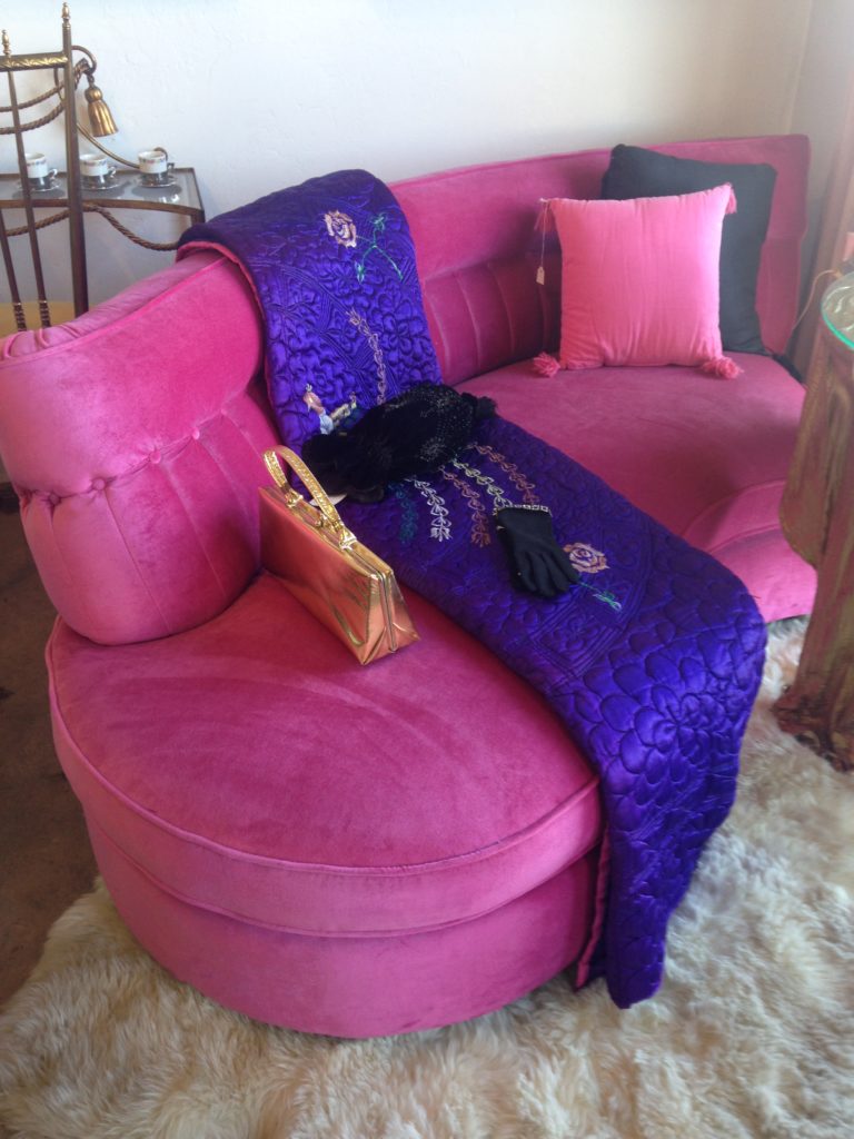
I certainly had a great time experiencing the luxury and  glitz of the Las Vegas strip with my recent Blog Tour Modenus adventure,  but there is another Las Vegas where regular people live, love, work and play.  I was fortunate enough to get a couple days of Vegas from a different perspective.  Big “thank you” shout out to Karen and Barry!Markers and Finders, Las Vegas, photo courtesy of Las Vegas Journal ReviewYou can find great food off “the strip”.  For example brunch at   Makers & Finders  was tasty, fresh and very creative.4e6d79a24c3f3f9637e56d9b9f6f9c50Another fun place to visit is the Downtown Container Park.  Comprised entirely of old shipping containers, you will find some fun bars, restaurants and a generally happy place to hang out and people watch. I can attest to the barbecue scrumptiousness at Big Ern's!  The park is located in "old" Vegas on Fremont Street which dates back to 1905 and was the first paved street in Las Vegas in 1925. Downtown Container Park located on Fremont Stree in "old" Las VegasMain Street, Las Vegas is a treasure trove of mid century magic!  This is no surprise as Vegas was ground zero for the “Rat Pack” of the 1950s,  nearby Palm Springs was a mid century mecca and let’s not forget Liberace!  Prices are reasonable to boot.  If you have a yen for this style I suggest you hook up a UHaul and head west!  Here are some of the shops I discovered.2015-01-23 13.28.12First stop after lunch was the fabulous fifties Stevotomic Store. Stevo is a mid century inspired metal artist creating wall art, clocks, bar decor, home accessories and aerial sculptures.  He also takes custom work on request.  His work is very inventive and reasonably priced.2015-01-23 13.27.57 Down the street from Stevotomic's you will find Retro Vegas, a treasure trove of fifties fab! Talking to owner, Bill Johnson, I learned that due to tax purposes many movies are filmed in Nevada and when producers are looking for mid century sets guess where they go?  That's right, Retro Vegas.  This pink kitchen has been in a few films.2015-01-23 16.39.07 The quintessential tiki bar at Retro Vegas!Before we leave Main Street I must tell you about Kate. Kate Aldrich is the proprietress of Patina Decor, a wonderland specializing in vintage home, lighting, accessories and even apparel.2015-01-23 14.43.57Little known fact, my degree is in Merchandising and I can tell  you this shop takes that concept to a new level.  At Patina I meandered through a series of perfectly appointed vignettes.  Products are combined to enhance each other which perfectly sets the mood.  All I needed was a smoldering cigarette and a martini to complete the experience!2015-01-23 14.25.492015-01-23 14.27.49If you take the time to explore Vegas off the strip you can find many mid century gems.  Some are well loved and taken care of and some are diamonds in the rough, yet to be recognized. This lovely example is where I had the pleasure of staying off the strip.  2015-01-23 15.16.58    2015-01-23 15.12.07 2015-01-23 15.13.17Fifties icon Tony Curtis once said, “If you know how to live in Vegas you can have the best time.” I think he's right.  Just remember to be intrepid in your travels.  Follow the paths not already trampled by the masses and you will find so much more!Continue the conversation on FaceBook...