5 Elements of an Artful Kitchen

Summer projects are underway in South Florida!  In fact, it's the height of the busy season for most design professionals here.

Oceanside_OA5 (3)

I don't have to tell you that a new kitchen is a big investment, in fact the kitchen is the most expensive renovation you're ever likely to undertake. It stands to reason that you'd want a kitchen that is tailor-made for you whether you can afford custom or not. This is what we're all about at Artful Kitchens.

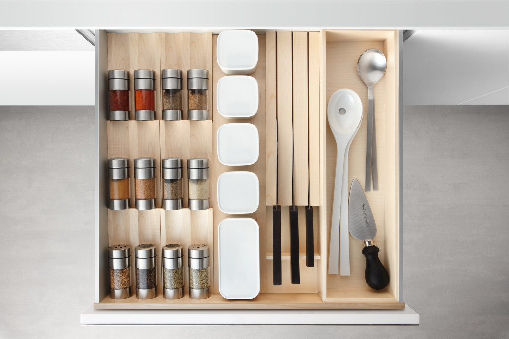
Flawless function behind the scenes from Poggenpohl

The concept of an "artful kitchen" has many different facets.  It is not just about budget or the amount of space you have but the skill you employ using what is available to you. Here are five tips to consider along with some visual inspiration featuring products I saw this year at the Kitchen & Bath Industry (KBIS) trade show in Las Vegas. Implement these with style and confidence and you will be the proud owner of an artful kitchen!


1. Flawless Function

I'm all about artistic expression but a major part of creativity in the kitchen comes from devising flawless function. This quality is not something you see but something you can experience if artfully accomplished.  When I say function, I mean work centers comprised of cooking, clean up and food prep areas.Steve Jobs quote

Those are the basics but you could have more such as a beverage center (think coffee, tea, wine), a computer station or a baking center.  If you have a two-cook kitchen, your layout should be designed so that any one of the major functions can be performed without anyone getting underfoot.

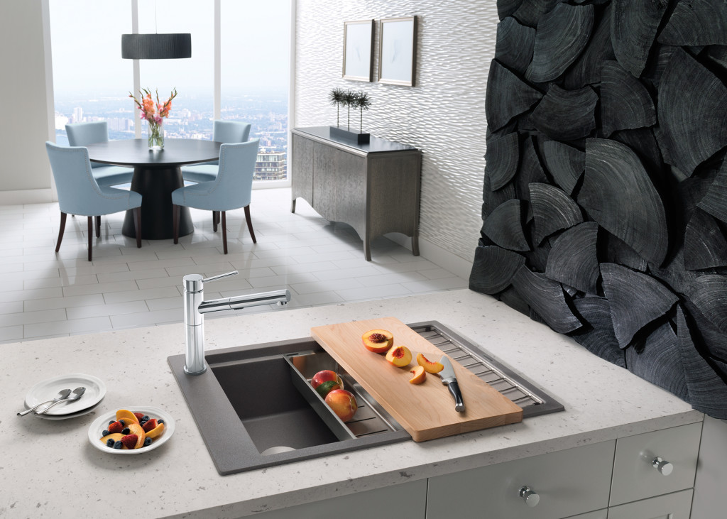
Precis sink by Blanco

Following the guidelines set by the NKBA is a must to make sure all clearances are adequate. Sometimes we don't have a lot of choice about where to locate our sink or appliances but we can organize our utensils, dishes, pots and food items in a more efficient way.  Don't forget the more flawlessly your kitchen functions the safer it is. You don't have to be an expert at this, just think about how you use your kitchen so that you will be a good collaborator when it comes time to work with a professional.

quote by Gloria Graham Sollecito, AKBD

2. Personalization

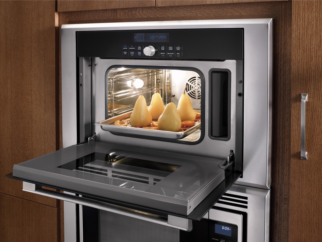
This is, without a doubt, the biggest movement in the design world.  An artful kitchen is your own personal statement customized to the way you live.  It could be a steam oven because healthy eating is your passion or it could be a lovely furniture piece with glass doors to display your grandmother's china. Include the colors you love.  Even though you must be mindful of your budget (everyone has one), strive to retain the essence of what you see as your dream kitchen.

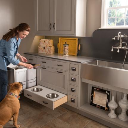
The Pet Parlor concept can be built into your laundry or utility room

3. Harmony

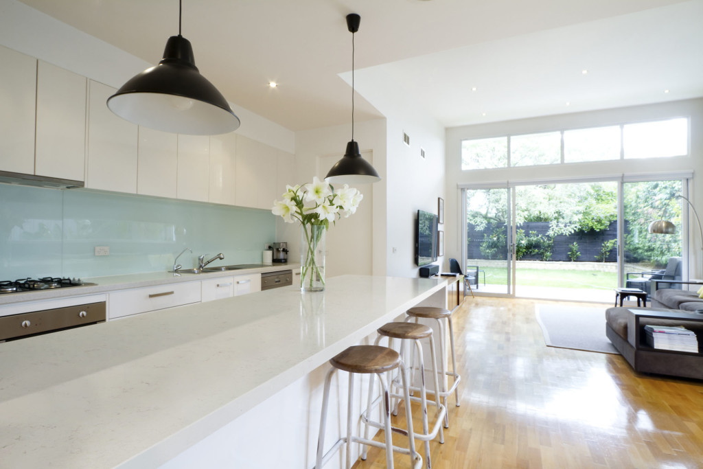
Harmony is one of the principles of design and a must for your kitchen.  Whenever I design a two-toned kitchen I like to ensure that different finishes and details are carried through the space to create a cohesive whole.  It's about how the floor relates to the cabinets and  how the cabinet hardware relates to the faucet. You get the picture!  It does not mean that everything has to match perfectly, it means elements should relate to and complement each other. It also does not mean that every element has to be perfectly symmetrical.  In fact, consider this permission NOT to be! I find that the best rule of thumb is to follow the architecture and style of the home you're in.  If, for example, the kitchen window is way off center you should work with that not against it.  Never force solutions by sacrificing function.

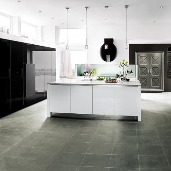
Wood-Mode Contemporary penthouse kitchen


4. Focal Point

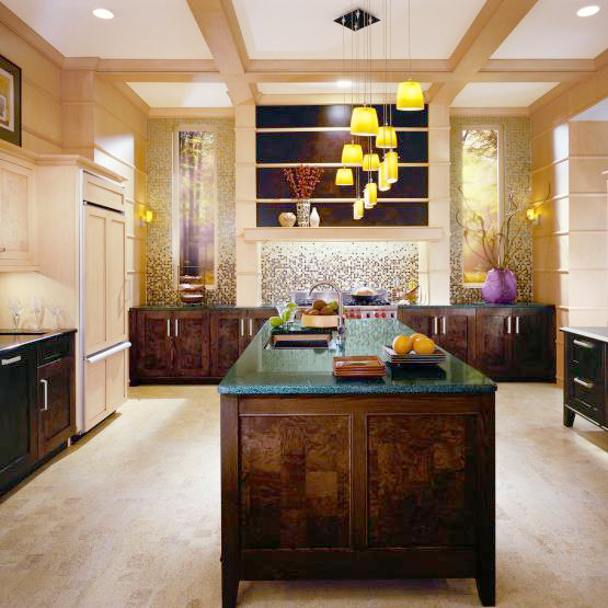
Every piece of great artwork has a focal point.  It is the "star of the show", so to speak.  In a kitchen it can be a sculptural range hood, a granite counter with big bold movement or actually a piece of art! It is the item that makes you say WOW when you enter the kitchen.  Just remember less is more here.  One great focal point is probably enough.  Too much and the statement gets lost. Less is definitely more.

Transitional kitchen by Wood-Mode

5. Texture

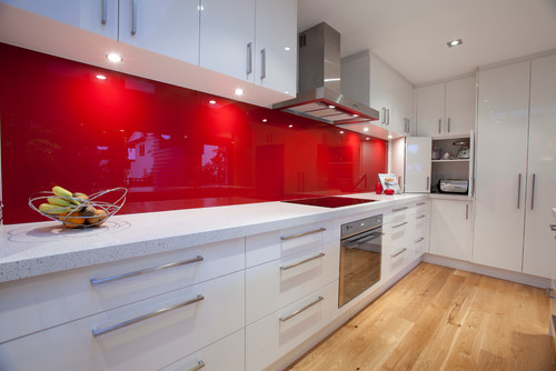
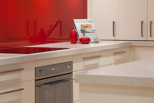
The element of texture involves at least two of our senses, touch and sight.  The textures you are likely to come across include the glossy finishes popular in contemporary design, prominent wood grains which can be traditional or modern and smooth honed surfaces that are more matte.  A flat slab cabinet door is a great choice if you plan to use a wood with a lot of pattern and graining.  In this case the material is the decorative element of the cabinet.  On the other hand, if you are traditional and you are using white cabinets you can select a door with some molding or detail.  Also let the wild patterns either be on your cabinets or on your counter, both would be busy and distracting.

Contemporary kitchen with Sileston Nebula Alpha

This is only the tip of the iceberg, so to speak.  There are many more tricks and methods to create an artful kitchen. What are yours?  Please keep in touch and contact me. Whether you need a quick consult or a full design layout I can help in person or virtually.

Steam oven by Thermador

I'm located in the West Palm Beach area, so if you're local I can also help you shop for your kitchen products.

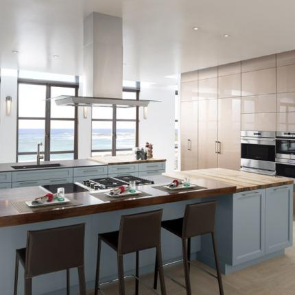
 

The Rest of the "Hot Pepper" Kitchen Story

Happy new year peeps! Back at the drawing board this week after a nice holiday break. I got a lot of annoying little things done AND spend a little time in the studio but that's another story. Last post I told you about my dream kitchen. I don't know about you but I'm still dreaming and that was just enough to pique my interest. The lovely Shannon Pepper of Shannon Pepper Design in New Zealand, YES, New Zealand (who knew they were rocking such awesome design down under?)  shared some of her musings with me:

 KFL:  What parameters were you given before designing this kitchen?Shannon:  The kitchen needed to be very functional for a busy family of 5. The kitchen is very much centralised in the home so it also needed to be very " good looking " for better words. There needed to be space to tuck things away like appliances etc to keep the space tidy.KFL: What was the biggest challenge of the project?Shannon:  Hmmm, I'm not sure there were any real challenges in this project as the client was very easy to deal with and realistic.  The space was very proportional and easy to plan. I say that but originally, in the plans from the architect, there was a window on the hob (stove) wall which we were trying to work around. After much thought  the client decided that since the space would only look out onto a hedge and wouldn't  offer much light  we opted to remove the window and add under cabinet lights to keep the space light.

 KFL:  Is there anything you'd have done differently if you could?Shannon: Not really,  I love this kitchen and loved working with this client.KFL:  Can you describe they type of client you were designing for? Shannon:  The clients were both doctors and they have 3 children under 12. The family is busy with extra activities after school for the children and wanted a space that was functional and easy to maintain.KFL: What brand of cabinets did you use?Shannon:  The cabinetry used is a Dezignatek vinyl wrapped (known here as thermofoil)  product. The colour is white gloss and the profile of the doors and drawers is Milan. This product is great for giving you a painted finish look but without the chipping and scratching possibilities of paint.Not only is this a dream kitchen but it sounds like it was an all-around dream job too.  Check out Shannon's website for more pics of her beautiful projects. 
Tip #3: Where can I save money and what items are worth the splurge?

Many of our clients begin kitchen remodeling projects in the summer.  Kids are out of school and our commitments tend to be less (for some of us) in the summer months.  Today's client query is one that I hear a lot.  Naturally we all want to get the most for our money in all our investments but where can you save money in a kitchen remodel and what items are worth the splurge?The answer to that is largely subjective as we all have differing needs and priorities.  That said, there are some principles that should never be compromised and those include efficient use of space, safety and the best quality you can afford.

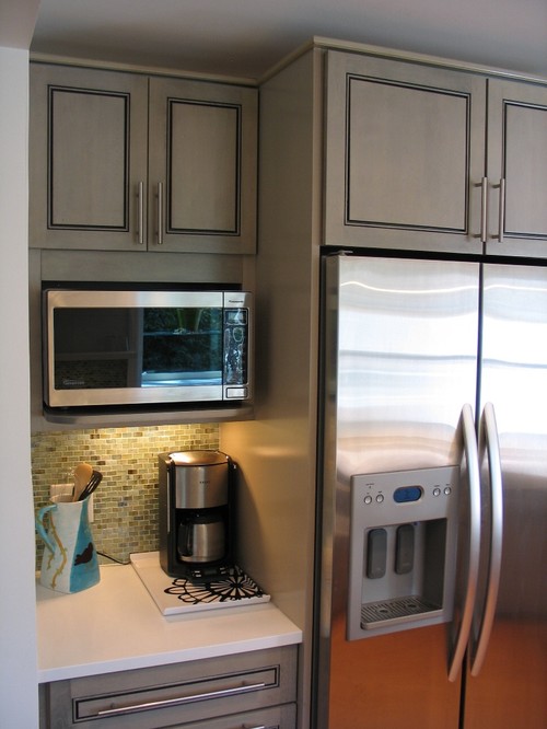
Contemporary Kitchen with standard depth refrigerator.  Courtesy of Houzz.com


refrigerator is a much better fit.  Courtesy of  Houzz.com

 SplurgeI must confess, there are some standards in the kitchen industry that are just plain wrong.  One of them is the standard depth refrigerator.  A standard base cabinet depth is 24" (25" including doors).  A standard refrigerator is about 33" deep!  It might look perfect standing solo at the appliance store but it could look like a beast in your kitchen!  Yes, they stick out.  Depending on the layout of the kitchen we can sometimes work around the depth by surrounding the fridge with extra deep side panels and a cabinet above pulled forward.  But if you're tight on space it is worth investing in what's known as a counter, or cabinet depth refrigerator.  This means that the cabinet box will be flush with your counter top and your "stick out" will just be the thickness of the door.  It makes a big difference.  Here GE shows the difference between standard, or free-standing and counter depth.  A standard GE french door refrigerator would be about 26 cubic feet and retails at about $2,100 vs. a comparable counter depth model which is around 21 cubic feet and retails at $2,700.00. Yes, you will have less cubic footage with a counter depth fridge and I suggest keeping the old fridge in the garage if that's an option.  If the kitchen is large enough you can add a beverage cooler.  When water, soda, beer and wine are taken out of the main fridge you get all kinds of space. There is also a third category if you've got the big bucks and that is true built-in or integrated.  Those are even shallower but they are also more than a foot taller to compensate.  Whether you opt for Sub Zero or GE. a built-in refrigerator is pricey but the most visually seamless, particularly if you add matching cabinet panels. 

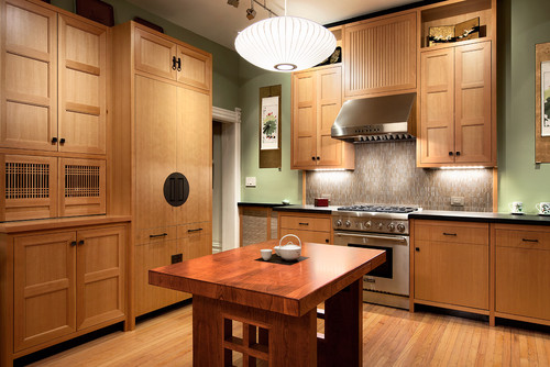
This kitchen was created using stock cabinet.  Courtesy of  Houzz.com

 SaveYou can save money on your cabinets if you can keep to standard, or stock, sizes.  Simpler cleaner lines with minimal molding can also save you enough money to splurge on that refrigerator!  There are just two things to keep in mind.  Make sure the quality of the cabinetry you buy is sound and backed by a warranty.SplurgeMany professional kitchen designers will be happy to consult with you on the layout and selections for your kitchen.  An hourly fee is well worth it to have your plan validated by a pro.  In many cases, if you purchase your cabinetry through your kitchen designer, design services are included. 

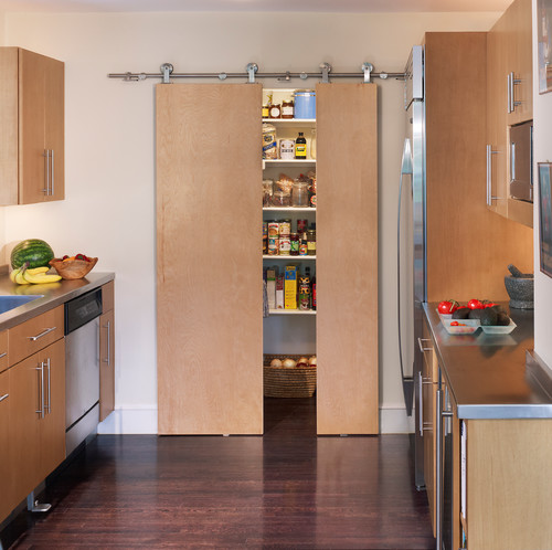
Here they saved on cabinetry by selecting clean simple slab doors with no moldings and
they splurged on the counter depth refrigerator and focal point pantry door.
Splurge
You may have heard me say this before but I'll say it again.  Buy a good quality faucet.  Your faucet is arguably one of, if not the most, used items in your kitchen.  Splurge up front and you won't be sorry.  Buy a cheap faucet and within a couple years you will have drips and leaks.  By the time you pay the plumber and replace the faucet you haven't saved anything. If you buy a stainless steel sink make sure the gauge 18 or lower to avoid denting and horrible water spots.
 

You can get this Solna faucet by Brizo for under $400.
Save
If you've decided on granite counter tops, think about using 2cm material with no build up so that your total cabinet thickness is 3/4".  The minimal look works especially well with contemporary designs.  You'll get the functional advantages of a stone counter top without the extra labor to build up the edge to 1 1/2".  The look happens to be great, especially in dark counter tops.  If funds are tight you can also leave the back splash for last.  The area between your counter and upper cabinets can be tile or otherwise and it can always be finished at a later date.  However if you have enough material leftover from your tops maybe you'll want to use it for the backsplash. A word of caution: if you're using a slide in style range you'll want to make sure it's compatible with the finished height of your cabinets.
Skinny top in Antique Brown from Granitegurus.com

 SaveI love unique artsy cabinet handles as much as the next person but did you know that you can spend anywhere from $1.99 to upwards of $50 a piece for them?  Aim towards the $5-$10 for really good quality knobs or pull.  If you happen to fall in love with one of the $50 buggers maybe you can use just a couple for a special area. 

Focal point hardware is on refrigerator (true built-in).  The rest are simpler designs
in the same finish.  It works!  Courtesy of Houzz.com

 Next up, Tip#4: Granite or Quartz?            

A Kitchen With A Happy Ending!

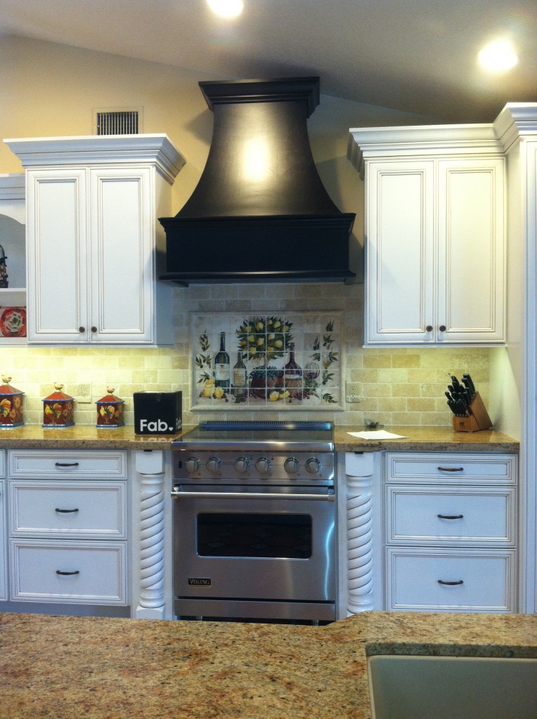
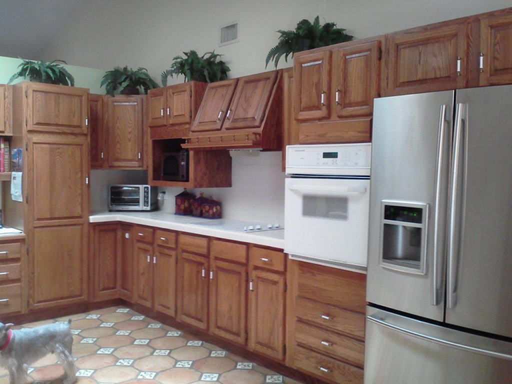
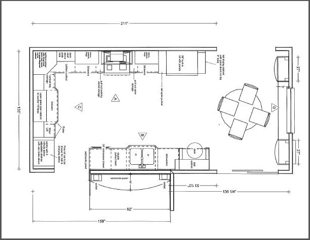
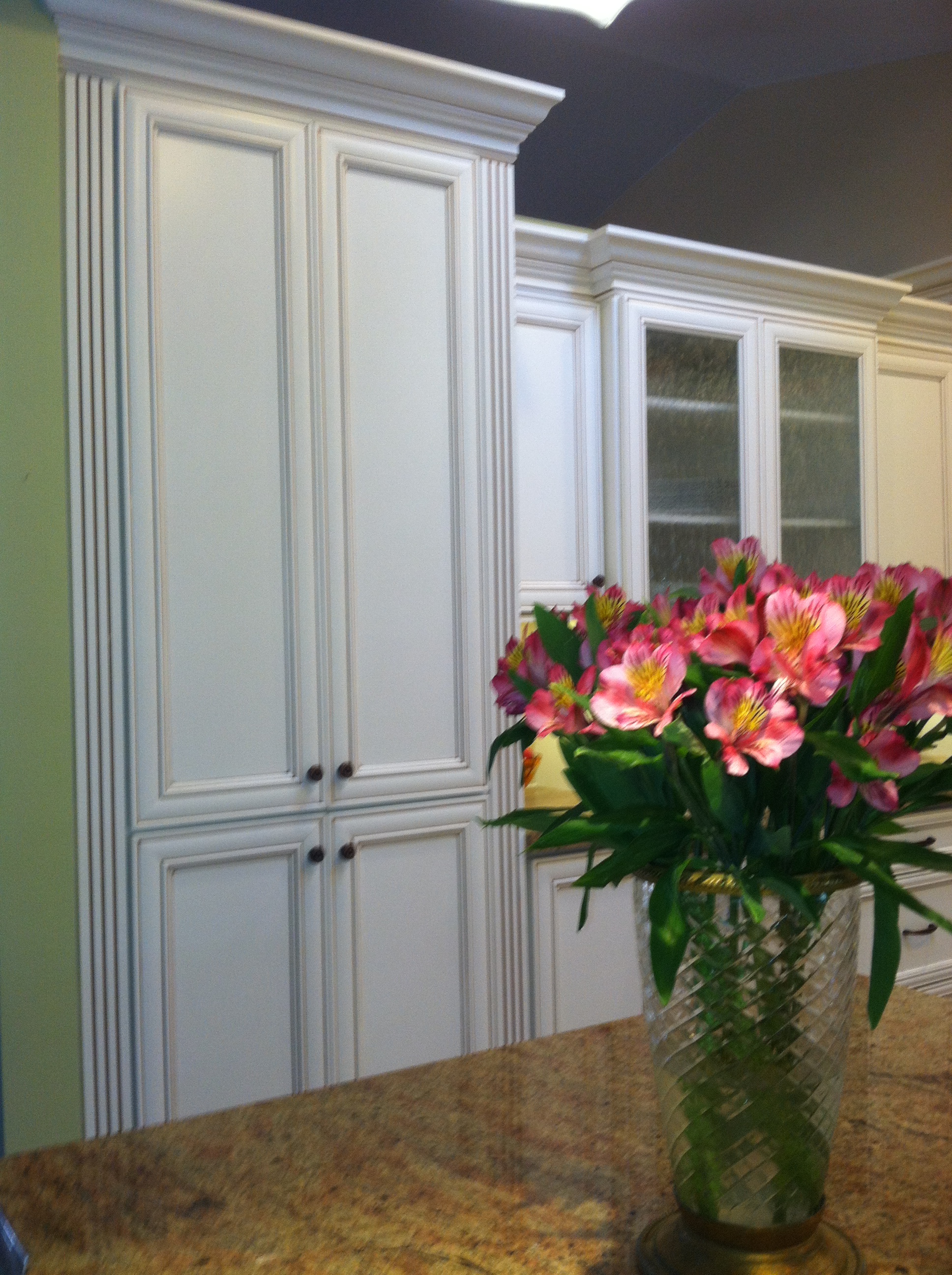
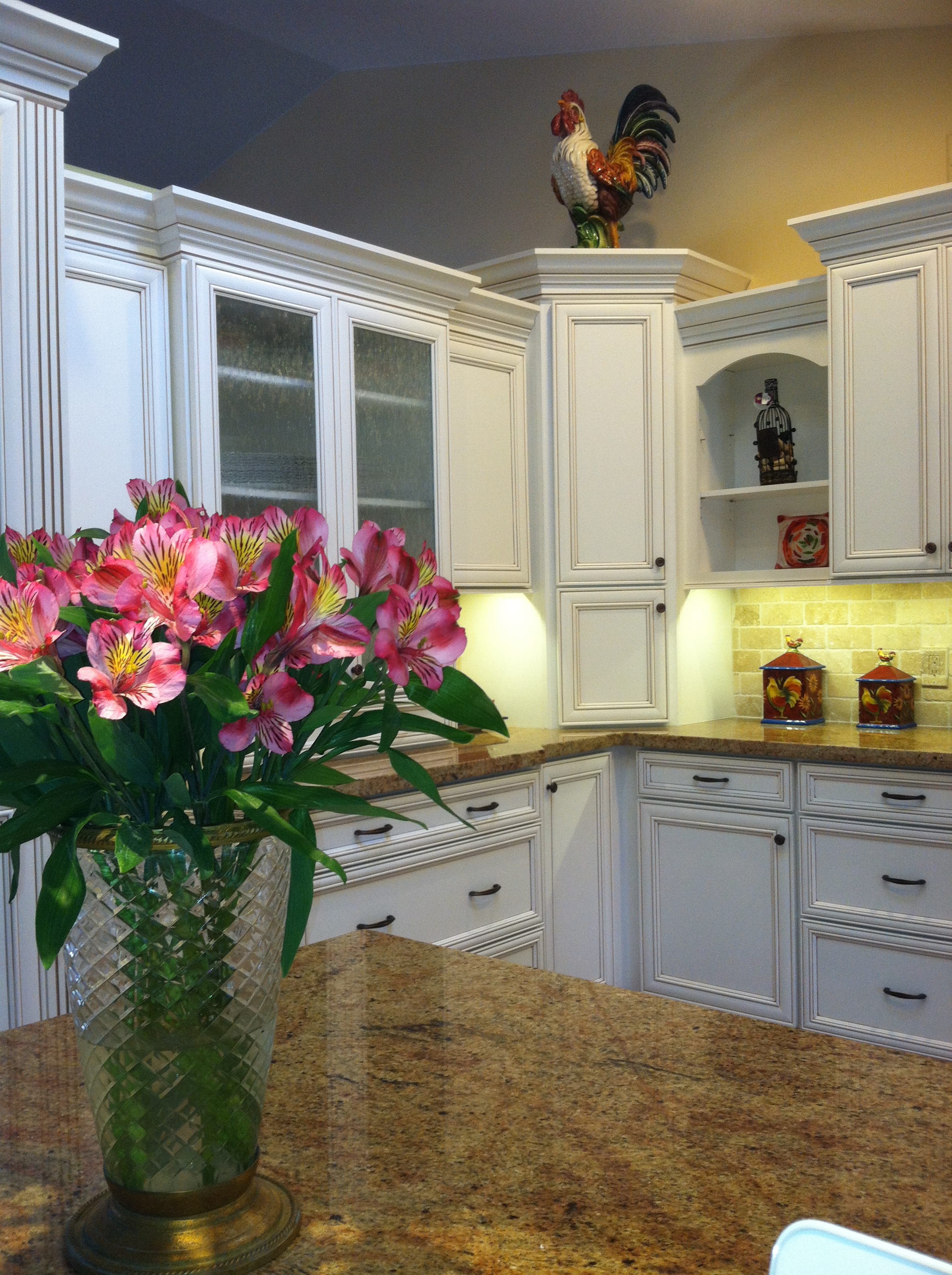
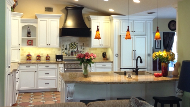
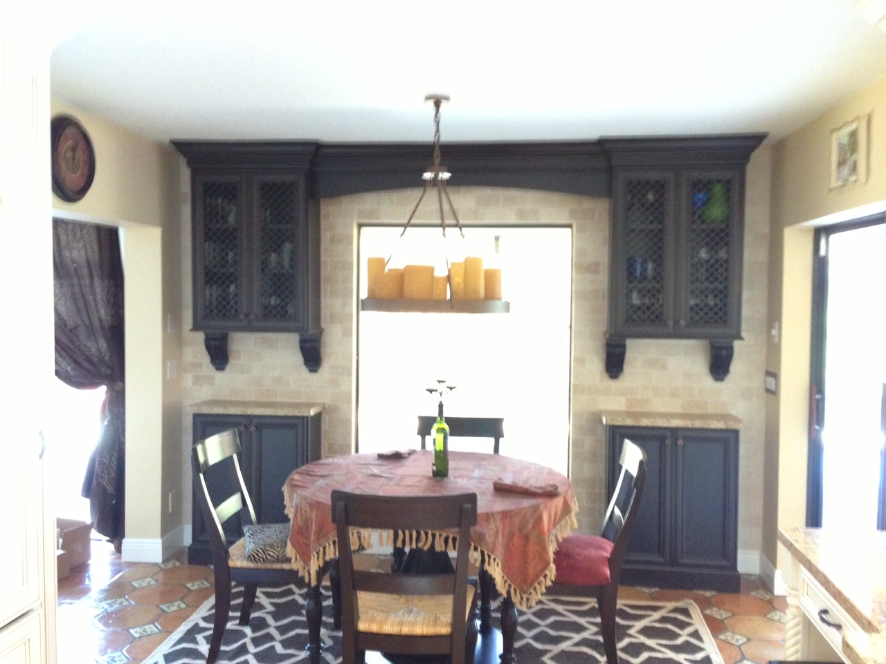
This was my client's vision.Today we wrapped up some final details in this new kitchen.  The client was going for a Mediterranean vibe, elegant but at the same time warm and inviting.  She loves to entertain so the kitchen had to be a focal point for her guests and it had to tell the story of her vision.  All these bells and whistles can really run up the price of your cabinets but we were able strike a good deal with Kith Cabinets.  Here's what she had.  We knew we could improve the function, incorporating her appliance wish list in the style she was dreaming of.  An added challenge was that we had to incorporate the existing floor because it had to stay.  She selected white painted cabinets with a warm brown glaze which really worked well.Here's the planWe were able to include a range by Viking, a Dacor microwave drawer, a beautiful Silgranit sink by Blanco, and some really nifty accessories including a mixer lift which she uses to store her juicer.  We devoted one roll out in the pantry to be used as a charging station and a place to throw the mail so the lovely counter can remain clutter free.  Notice that we also incorporated some gentle curvy shapes with the counter top and the wood hood.This pantry has the charging station as well as racks on the doors for can storage.2013-01-23 09.42.18

IMG_7653That FAB box on the counter is a nifty gift for our client, gourmet salts that magnetically attach to pull out next to range.  They are something like this.IMG_5935This client had a clear direction from day one which really helped keep the project on track.  This very traditional design comes with a maximum of detail and I'm happy to say we have left a very happy couple to enjoy years of romantic dinners in their new kitchen.Design was a collaboration between the client and myself.  Cabinets by Kith Kitchens, counter tops by Stone Palace, appliances by House of Appliances and installation by Brendan Donovan Furniture & Cabinet Co.  See local resources for more info and contact details.

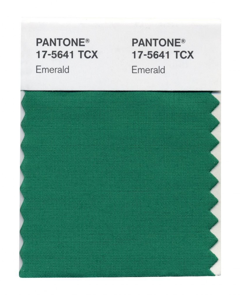
GREEN WILL COLOR 2013

It's official.  The "color gods" have spoken.   Who are these "color gods"?  They would be an organization known as Pantone.  Pantone, Inc. is the authority on color, provider of color systems and leading technology for accurate communication of color. The market leader in color has officially named Emerald THE color for the year 2013.  When I think of emerald a number of things come to mind including:  my birthstone, mermaids, deep sea, summer AND  then I think about all the other greens and how we use them in our interior environments.  One thing I love about green is that it brings outside in.  As Pantone notes here it represents regeneration, healing and unity.Just for fun I thought I'd share with you some of my fave Houzz.com ideabook finds containing the color green. 

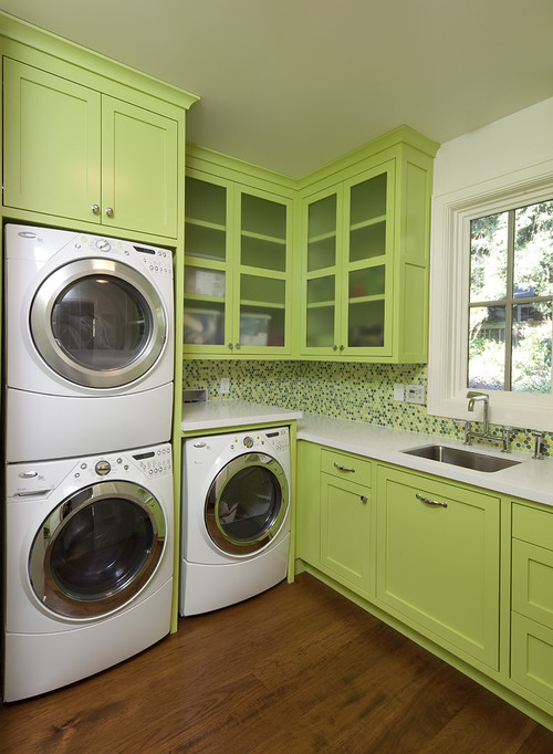
This is another kind of green that I love.  It almost makes me want to wash clothes. 

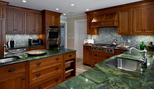
These green marble tops definitely bring the lovely outside in. Hints of brown tie in the warm wood cabinets. 

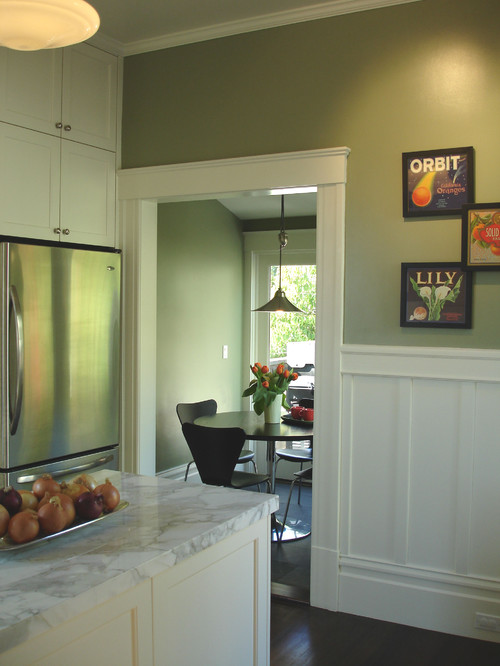
White cabinets are the rage and what better way to highlight them but with a clever shade of green on the walls? 

Here's the same color palette, warm wood and green marble.  As you can see, it works equally well whether the theme is contemporary or traditional. 

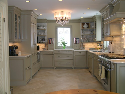
This is a totally different green, almost grey suggesting elegance and refinement.  So whether your taste runs to emerald or chartreuse, green is a great option.  In fact there are two other greens on the hit parade for 2013, Tender Shoots and Grayed Jade.  You can see the complete Pantone Color Report for Spring 2013 here.


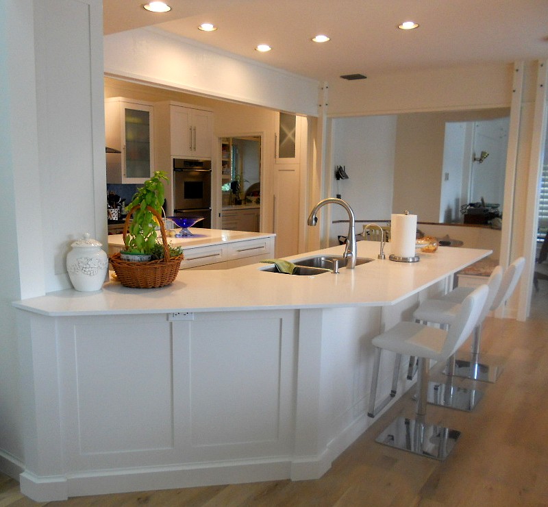
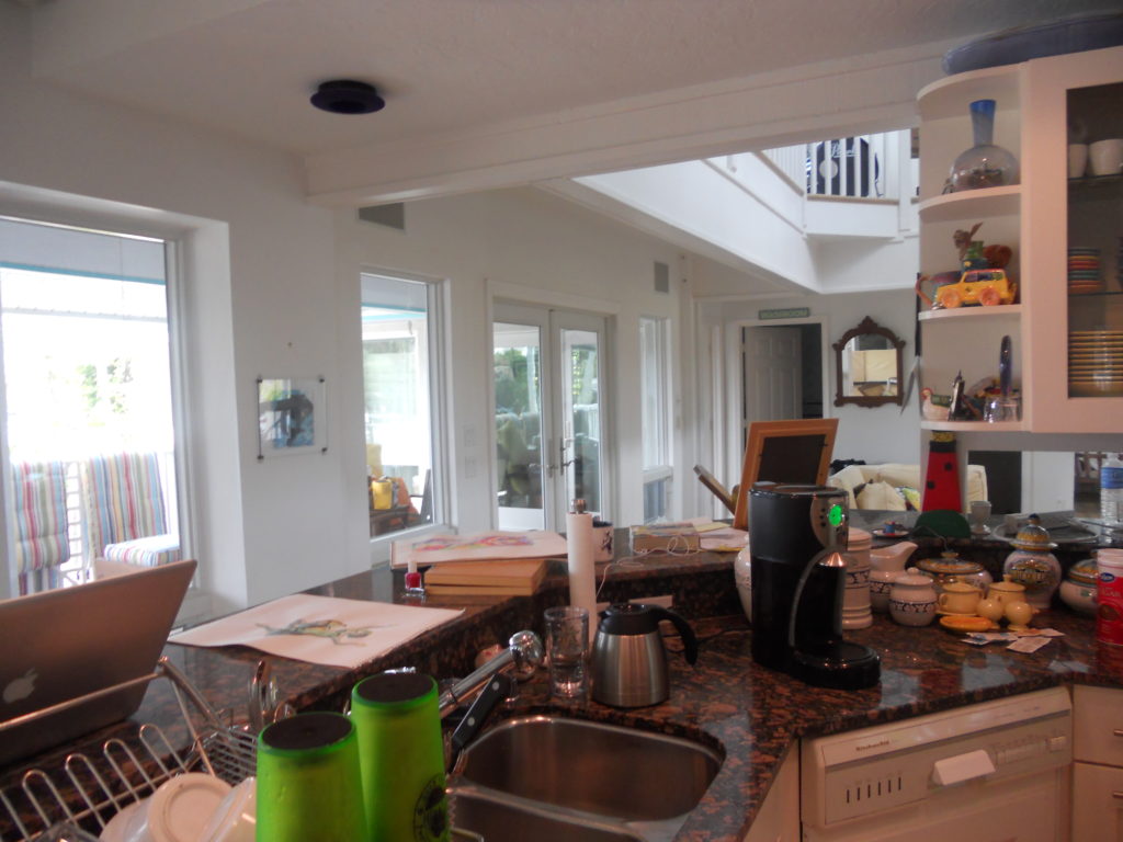
NAUTICAL ZEN KITCHEN

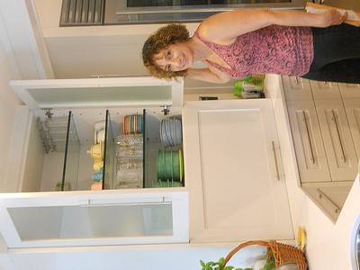
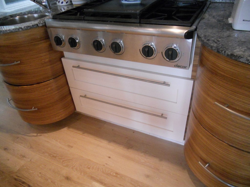
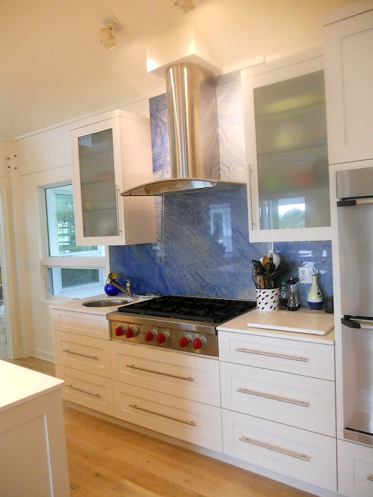
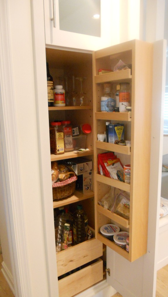
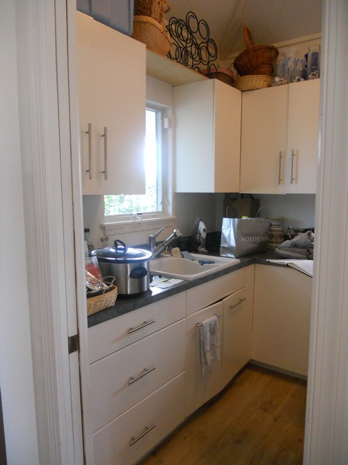
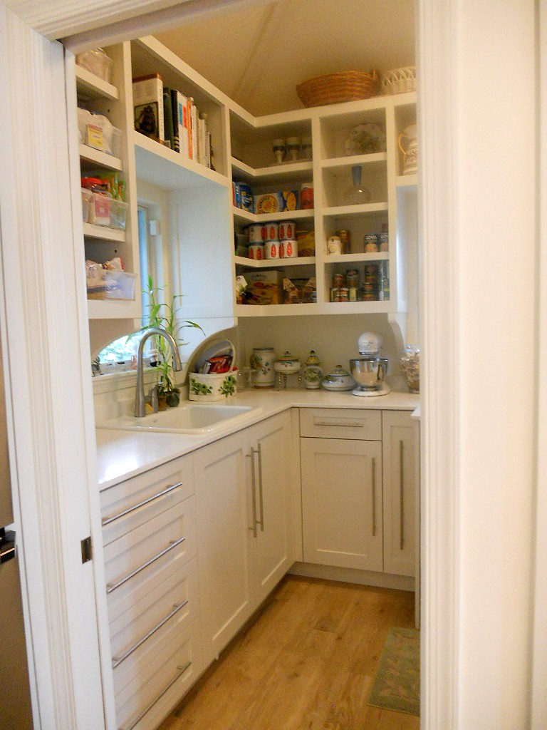
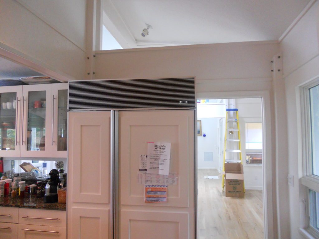
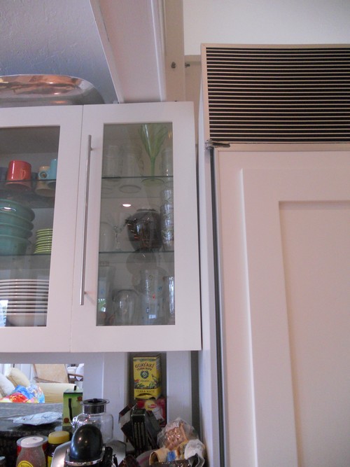
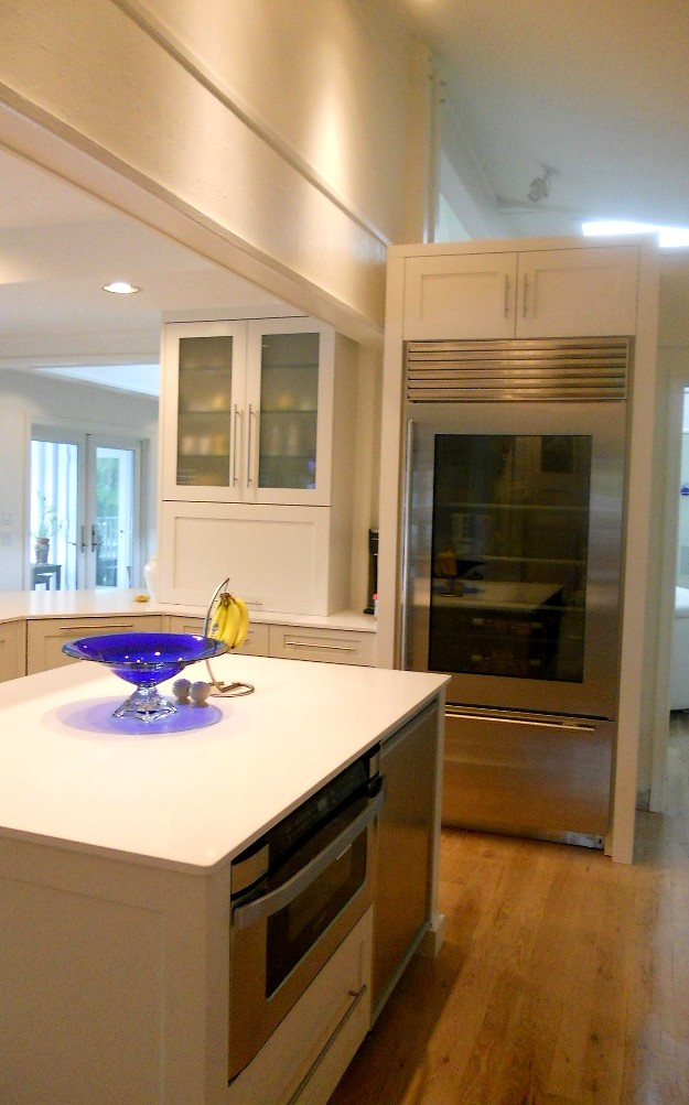
Ta daaaaa!  Another beautiful kitchen is complete, and yes it’s white with Shaker doors.  Surprise!  Not.  There were two main challenges about working in this home.  First of all the architecture is very unique and is an integral part of the space.  It’s comprised of posts and beams, angles and open lofts which remind me of a ship.  The second challenge was a lack of unity with way too much going on visually.  The existing kitchen had three different types of counter tops, two different types of cabinets and more stuff than space.  In addition, hinges and drawer slides were failing and paint was chipping.The homeowners came equipped with the most valuable of traits, an open mind.  They were willing to see their kitchen and laundry area in a new way.  Every step of the design process we would ask ourselves “does this unify and simplify”?  Think “nautical zen”!First off I decided to make peace with the posts and beams.  The layout remained the same and we didn’t even change the door style or color!  What we did was improve the fit and function.  Using all white counters unified the space and allowed the blue granite back splash to be the star of the show.  Here are some “before” pix and “after” solutions which will pave the way for smooth sailing in this new kitchen.