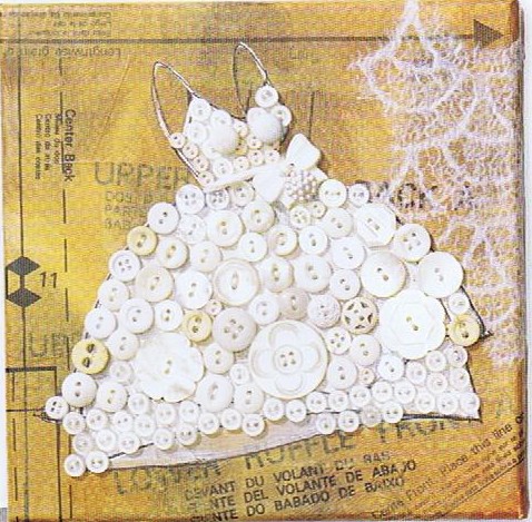
 Today's Let's Blog Off topic queries the source of our ideas. Where does creativity reside? Is it within or is it outside and all around awaiting discovery? For me the answer is both. Yes, it's all around us, for sure, but it also requires the eye of the beholder to breathe life into it. Here is a recent example in my life of something I saw which inspired a blog post.You may have the panache to pull off a monochrome white room that invites and stimulates the senses but for most of us going all the way with white runs the risk of BORING. Since white is so "white hot" at the moment, especially in the kitchen, I’m going to share with you the secret of how to make white pop.One thing to remember is white is a team player, it’s all about the colors around it. As you know, I love art (a big source of inspiration). I recently came across this image in Cloth Paper Scissors Magazine which is a perfect example of how white can glow when surrounded by the right color. I see it work time and again. White cabinets plus color equals stunning. If your taste runs more to the conservative think camels, taupes or warm beige walls to create the contrast.
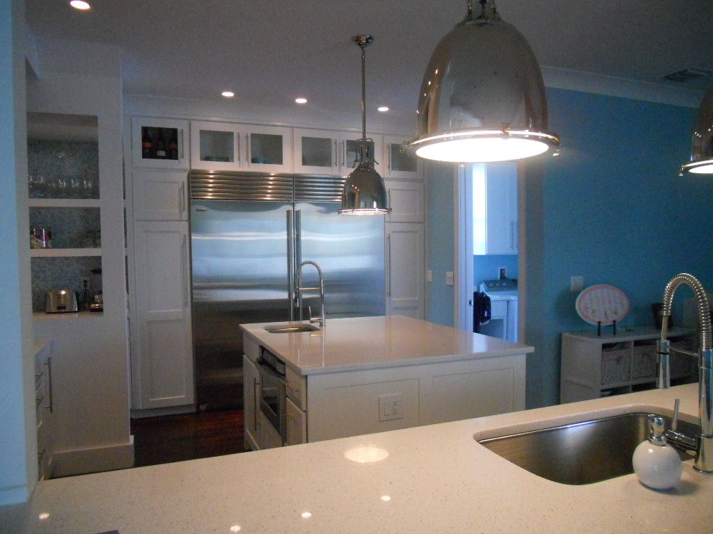
 If you’re more daring go for Apple Martini Green or Sky Blue. The nice thing is if you want to go for the gusto paint is a safe bet. It’s one thing you can change fairly easily and reasonably.
 Another thing to remember about white is that it’s just not white. There are probably hundreds of whites and they all read differently depending on your lighting and location. The lesson here is to test your whites on site. Consider the color for a full 24 hours so you can see how it looks as lighting changes throughout the day.
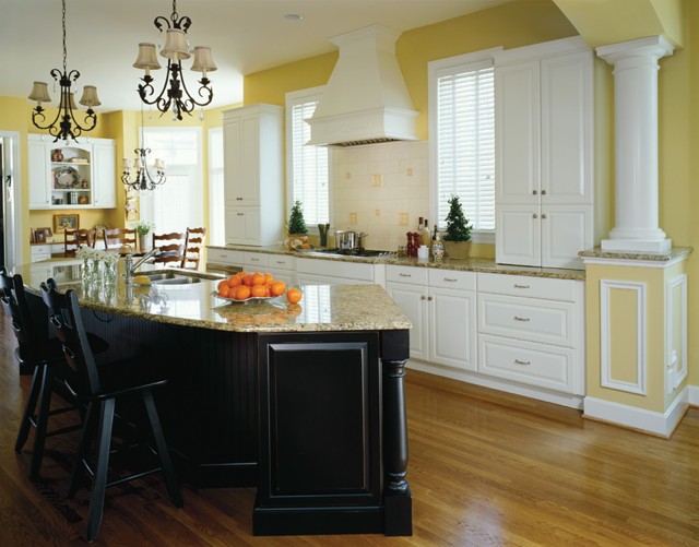
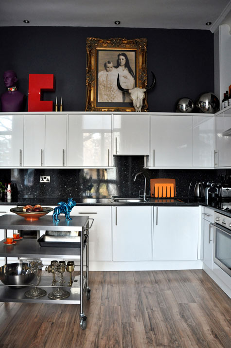 Many times wherever you find white you will also find black. You can tastefully mix black and white cabinets or if you have guts and great lighting the walls could be black, as in this example. This photo also serves as a great inspiration for many of the newer homes we have in my area with cathedral ceilings but short stumpy cabinets (thank you Mr. Builder). If you can't afford to change the cabinets take advantage of the great space above for art. Here, it carries the eye upwards taking attention away from shorty cabinets.
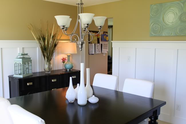
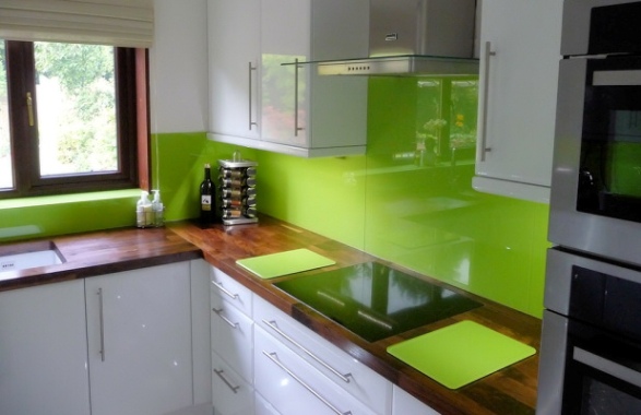 This stunning Apple Green back splash looks like glass but it's actually a colored plastic by Opticolor! So there you have it, inspiration of the day all inspired by a whimsical little piece of art!
DESIGN AND THE MODERN KITCHEN
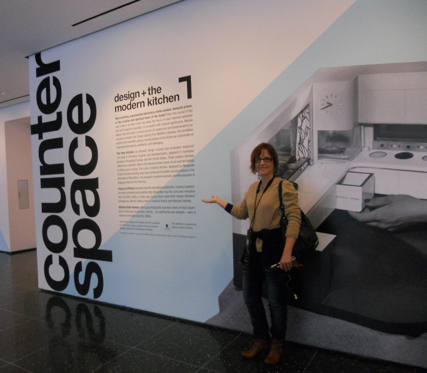 Granted I'm biased, but I have to say that Counter Space: Design and the Modern Kitchen is the most engaging exhibit I have had the pleasure of attending. It opened at the Museum of Modern Art September 15th and closes on March 11th. The thing about this show is that we can all identify and connect with the topic of kitchens. They are an integral part of how we live but we seldom give thought to exactly how they came about. You can find just about all there is to know right here.
 The only critique I have is that I wish they would have included commentary post midcentury. The concepts of the kitchen are so dynamic and there is a lot to be said with regard to the last half of the 20th century. Nevertheless, especially for a kitchen professional or enthusiast this is an absorbing and engaging experience. The exhibit is divided into three main segments.

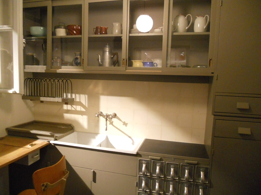 "Toward the Modern Kitchen" examines the early research in efficiency and time management that culminated in the design of the Frankfurt kitchen in 1928 by Margrete Schutte Lihosky. A post World War I housing crisis provided the impetus for such reasearch resulting in what is thought to be the first "modern" kitchen. You can read more about this history on a previous post here. It was believed that by transforming daily life at the level of he kitchen behavioral change and social well being would result. Good old German efficiency and practicality were at the heart of these inventions and it was two women in particular who made the biggest contributions, researcher Christine Frederick, as well as architect Margrete Schutte Lihosky.
 The second part of the show is "Visions of Plenty" and deals with the post-war kitchens in America. It was then that the ergonomic considerations begun by Ms. Lihosky were further refined and a standard counter height of 36" was established. This was based on the average height of a woman at the time. Kitchens also began to evolve into living areas at this time and were very influenced by food restrictions brought about by the second world war.In addition myriad everyday objects are on display throughout the show. We never think about where the things we use everyday come from but they have a history and were shaped by our culture and time.
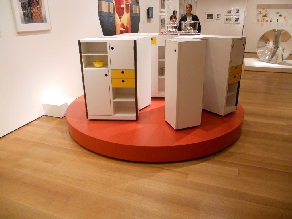 The final part of the exhibit is entitled "Kitchen Sink Dramas" which deals with kitchens as they are portrayed in the media as a rich subject for artistic expression.
 If you would like to know more about this exhibit and rich history you can purchase a hard cover edition catalogue of Counter Space produced in conjunction with the exhibit and available by clicking here One final note that I have not seen mentioned is that this show was sponsored by Silestone Quartz Surfaces. I'm headed back home to the drawing board today with visions of tupperware and proto-type kitchens dancing in my head!
Dream Kitchens Made In Italy
 Daniele Busca lives for Scavolini. After spending an hour chatting with him and touring the showroom and US headquarters in Soho I can understand why. Daniele is the Manager and Creative Director who makes it all work on this side of the pond. The new location which has been open since last October is enjoying a brisk business and I think it's largely due to Daniele's knack for tweaking this Italian product for an American market. "American kitchens are generally bigger", he says, "and where you would have an island in America we might have a kitchen table instead in Italy." Another major difference is the appliances. American refrigerators are almost always bigger." White still reigns.
 I thought it was interesting to hear that home owners are requesting glossy finishes and architects prefer the matte look. A artful mixing of textures, both tactile and visual, is also important. I asked Daniele to define a trend. He says, "in the end a trend is what sells." The showroom spans two floors. Displays were designed in Italy and re-designed by Daniele for an exact fit both in size and taste for the US market. "Americans also tend to prefer symmetry in kitchen design," he added. Scavolini is a family business based in Pesaro, Italy and has been the largest cabinet manufacturer in Italy since 1984 with 40 dealers in the US. This year marks the company's 50th anniversary. Clientele for the New York location is largely an international group who keep an apartment in New York City as well as elsewhere. This year Scavolini will roll out seven new models. Four new displays are already in the works for this new showroom. The Tetrix line, as seen at IDS, designed by internationally-famous British designer Michael Young, is also being featured. Tetrix is not yet on display here but Daniele's sending me some pix to share with you. Designers may be interested to know that Scavolini has developed their own design and pricing program. Scavolini is very involved in the Green movement. I was surprised to hear that the manufacturing facility in Italy is 85% powered by solar panels and they are planning to make it 100% by the end of the year. All cabinet boxes and door panels are made from 100% recycled fire retardant and water resistant wood. All lacquers used are water-based. Scavolini is involved in the local community offering the showroom for fund raising events organized by trade associations and design schools. Generally speaking, a Scavolini kitchen can be yours for from about 10K to upwards of 90K.


 Thank you to Daniele for hosting my visit. I really enjoyed chatting with him. I asked a million questions and he was up to the task, warm and most gracious. If you're ever in Soho stop in and see for yourself. Tomorrow I will be back with more from New York.
KITCHEN FUN IN NEW YORK (AGAIN)!
 That's right. Today I'm back in the BA (big apple but you should know that). If you recall, I was here only 6 months ago during fashion week courtesy of Brizo Faucets. Click here for a journey 6 months back in time. Wouldn't you know it, the amazing exhibit Counter Space: Design and the Modern Kitchen at MOMA opened within days of my departure necessitating a return trip before it closes on March 11th. Some savvy bloggers wrote about it on the front end so I'm going to wrap it up for you and send it out with a bang. I'll be there on Sunday. Tomorrow I'll be visiting the new super slick Scavolini showroom in Soho. I hear it's not to be missed so I will also be bringing you the latest in Italian kitchen design from this progressive cabinet manufacturer. Now if you know me, you'll know I have to fit in a little art and guess what's happening this weekend? Yes that's right, the Armory Art Show.
  NEWSFLASH!!! You can now subscribe to Kitchens for Living on your Kindle! Check it out here.If you're paying attention you'll notice yet another badge on my sidebar. I am now officially an "expert" at EzineArticles.com with one published article and loads more to come, as soon as I have time. More from New York tomorrow.PS. If there's anything you think I should check out while I'm there drop me a comment and I'll try to squeeze it in. Cheers!
TIPS TO AVOID KITCHEN REMODEL RIPPOFFS
Seems like the consumer is a little leery lately. Everyone's radar is on high alert looking to avoid the big RIPOFF. I can only speak for myself but I'm confident that I am in the majority. All we kitchen and bath industry professionals want is to make you happy. Do we have to eat? Yes, and so do all the hard working people that make your life possible. That said, I do understand where you're coming from. After all, I am a consumer too. With that in mind I have come up with a cheat sheet for you. Run through these 5 tips as a prelude to your decision making and you should be able to trust once again. Oh and remember there is a difference between cheap and value for the money. I know cheap is tempting but it isn't cheap anymore if you have to replace a product that doesn't make the cut.
1. KNOWLEDGE IS POWER- Today there is no excuse not to educate yourself before you go shopping. There is a wide array of media at your disposal. Use the internet and talk to people! Yes, people, in person (ok can be online too). Talk to the experts. Read blogs. Ask questions and talk to other consumers. One of the best ways to feel good about your choices is to know other people who have made them before you and been happy. No, you can never know for sure but the more knowledge you have the more equipped you are to make the right selection for yourself.
2. RESEARCH-This goes hand in hand with #1 but it is really the next step. Once you have defined the scope of your project you will be ready to select specific products such as appliances, counter tops, cabinets etc. that fit into the big picture. Research the choices. What are other people saying? How long has a company been in business? The National Kitchen & Bath Association (NKBA) Consumer Reports and the Better Business Bureau are good national and local resources and can indicate if you're headed in the right direction.
3. TO THINE OWN SELF BE TRUE- Take a little time to find out what your style is. Who wants to spend a butt-load of money on something they're going to hate looking at? The best way to find what floats your boat is to do something I call "kitchen scrap booking". Time to have fun. Collect images from magazines, catalogs and the internet. These don't even have to be photos of kitchens. They should be anything that appeals to you, a style, product or just a general ambiance. In this way you will begin to see the patterns and perhaps even discover some things you never consciously knew! For example you may find that 7 of 10 photos contain white cabinetry but maybe you never considered that. Getting what you love is good value. It just takes a little vision.
4. LET THE PROFESSIONALS DO THEIR JOB- A WORD OF CAUTION: Don't get carried away here. You've all heard "a little knowledge is a dangerous thing". It's true. Never succumb to thinking you know it ALL. That's why there are people who have studied and spend a large part of their waking lives becoming certified experts so they can get paid to help you. Use them.
5. COMMUNICATE FOR GOD SAKES! Once you've got some semblance of a plan in your head it's time to take it (along with your scrapbook) to the magician professional who can make it happen for you. This is not about money. You have to buy your products somewhere and that place should have a professional on hand to take your vision and translate it into your dream. That's all we do folks. It is my experience that the best projects are really good collaborations between client and designer. Getting what you want equates to good value for money invested. The NKBA is a good source for qualified professionals in your area. Many of us are also willing to work on a consultation basis, so ask!
G.E. HELPS YOU FIND YOUR DREAM KITCHEN
As a kitchen designer and writer, my inbox is always filled with news of all the latest products, websites and all manner of things to do with our favorite room, the kitchen. G.E. has always been known as the bread- and- butter of the appliance world. Not only have they been around forever but they have evolved with the times. Today they still offer the basic affordable options as well as higher end appliance packages under the names G.E. Profile, Monogram and the new Cafe' Series. These offer a wider variety of functions and integrated modern styling.
Another thing that really makes them a 21st century contender is their state of the art website. There is a wealth of information here whether you aim to use their products or not. Of course they hope you'll be seduced once you have entered their "web", so to speak.
One of my favorite features on the site is the kitchen design function. Simply choose a kitchen which is similar to your own space. Then simply click on the various color choices. It's a lot of fun and a great way to start to narrow your choices and make the big decisions like dark vs. white cabinets, black vs. stainless appliances. You get the picture (literally). You'll also find lighting ideas, safety tips and even recipes. Oh, and the "must have' G.E. product in my book is the Advantium Microwave Oven. My clients love it. You can use it as a regular oven or as a microwave, so it's like two ovens in one!


