I often tout the benefits of designing to the architecture of a building. Integrating your interiors with your architecture makes for a look that is always right. This is the best way to avoid a strictly trendy or out-of-place look.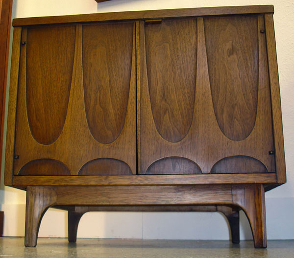 For example, if you have a MidCentury ranch style home, honor that and incorporate it with your furniture, cabinets and finishes. If your choices go with the house they'll never go out of style. Look to the structure for cues. If you have arched windows then complement them with a few arch details in the kitchen.
 One style that exemplifies this concept on a grand scale is Brasilia furniture by Broyhill. Contemporary architecture of Brasilia, the capital of Brazil circa 1956-1960, was the inspiration for this style of furniture. The line was first introduced at the 1962 World's Fair in Seattle. It is easy to see how the city influenced the furniture inspired by it.
 One place you can find Brasilia furniture today is at Retro Vegas on Main Street in Las Vegas Nevada. Owner Bill Johnson says, "The principal architect of Brasilia, Oscar Niemeyer, loved the parabolic arch and used it frequently.In addition, the aerial view of the city was designed to look like a plane or bird from which Broyhill used a bird symbol in some of the tiles and fabrics on their pieces.
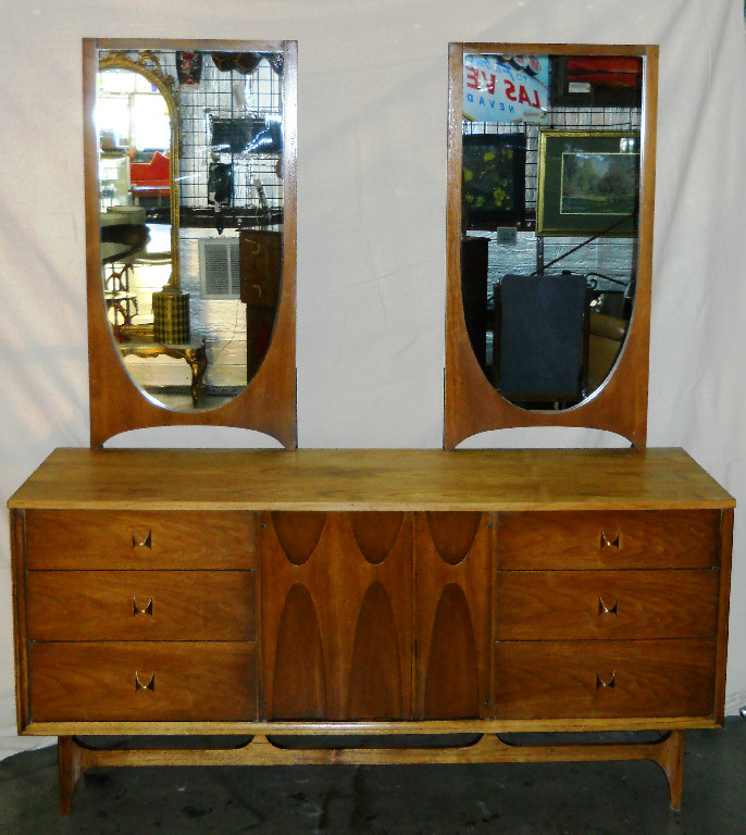 For more on the latest pieces and prices at Retro Vegas, please visit their website www.retro-vegas.com
Open Shelves Add Function and Style
Open shelves, especially floating shelves happen to be all the rage at the moment, should you or shouldn’t you? I often hear concerns about neatness. Do we really want to see it all? Maybe we do. Open shelves can greatly increase efficiency in the kitchen. Having our most used dishes, utensils and ingredients displayed and at our finger tips is very tempting! This is how the chefs do it and there is even a term for it in French.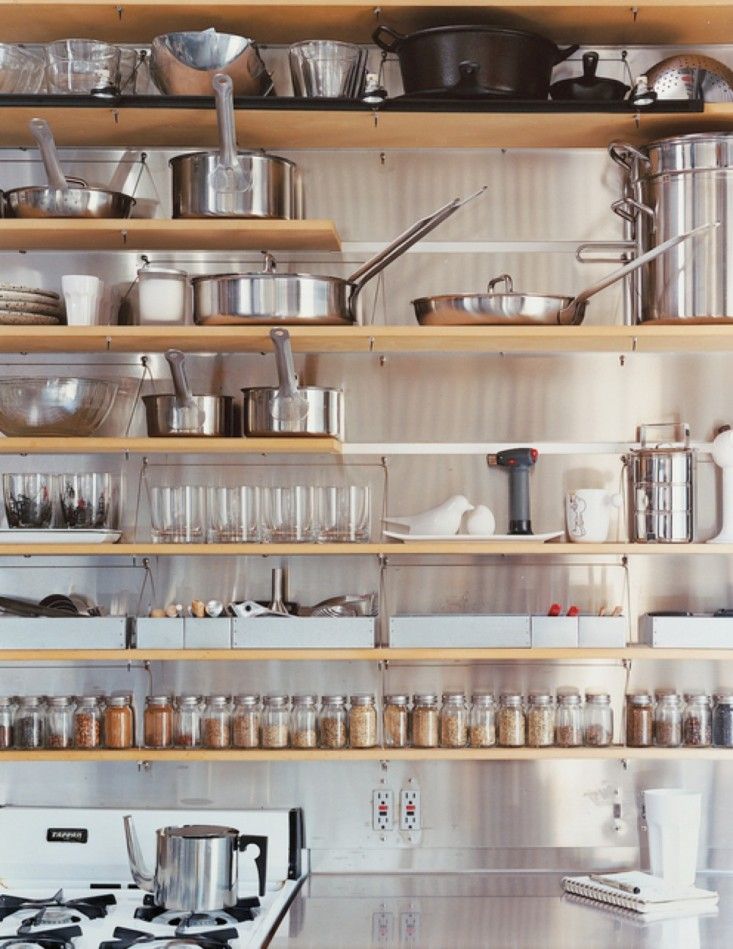 Mise en place is a French culinary phrase which means "putting in place", as in set up. It is used in professional kitchens to refer to organizing and arranging the ingredients and items that a cook will require for preparing the menu items of the day. We can also apply this concept in our own kitchens. Here's an interesting story I came across on NPR about Mise en place. Listen and you will discover the perfect French pronunciation!
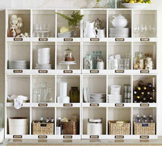 Usually storage space in the kitchen is too dear to squander on an area strictly for show so I urge you to incorporate an open shelf or open cabinet only if it will be useful as well as visually interesting. When you get right down to it, kitchens are comprised of boxes and row after row of doors can get pretty boring. I like to add some variety with open shelves and glass doors.
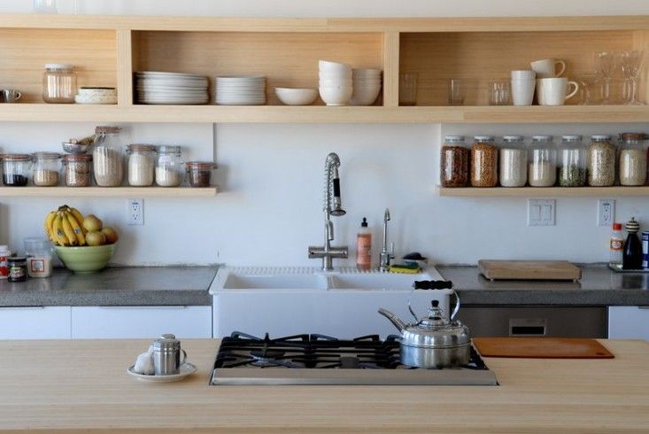 That said, if you do have a collection that you love to gaze upon and showcase , open shelves are perfect is hard to reach areas such as high up or on the far side of a peninsula
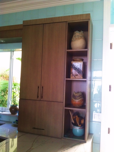 This client is a talented potter. What better way to show off her work? Easy to get to for dusting when you’re on the other side of the peninsula but this area is not really accessible when you’re on the working side of the kitchen.
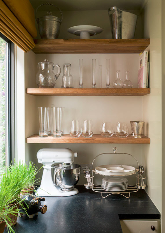 http://www.shelterness.com/pictures/open-shelves-on-a-kitchen-30.jpeg
Show House Features Tropical Island Living
 I hope all you peeps up north survived the blizzard without too much hardship. As a public service to you I thought I'd serve up so toasty tropical visions to thaw you out. Read on! Here in South Florida we’re currently experiencing a phenomenon called “The Season”. November through April can be referred to as the season. Our population swells with snowbirds, the weather is usually beautiful and it’s when all the big events seem to happen. One annual tradition is our very own Red Cross Designer's Show House. Both local and national design talent converge to show us their creative skill. This year’s house is located in the historical West Palm Beach neighborhood known as SoSo (South of Southern Blvd) The theme this year is Tropical Island Living. Each designer, or design firm, is given a room. They can do whatever they want as long as it fits the theme. Brendan Donovan Furniture & Cabinet Co. was asked to build some custom cabinetry for the Master Bedroom Suite by Gary McBournie Inc. We were thrilled with what we were able to contribute and to be a part of this high profile and worthwhile event. I recently had the pleasure of exploring the completed house and I’m so excited to share my favorites! Without further ado, Kitchens for Living does the 2013 American Red Cross Designer’s Show House.
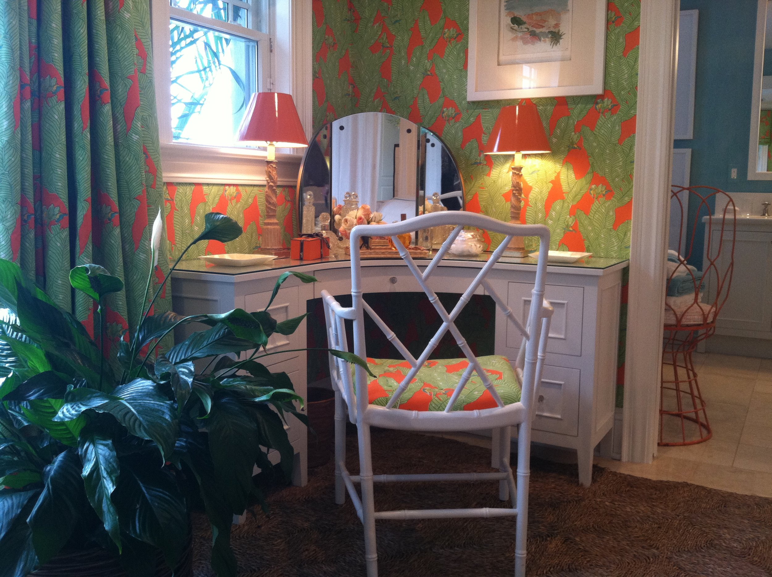


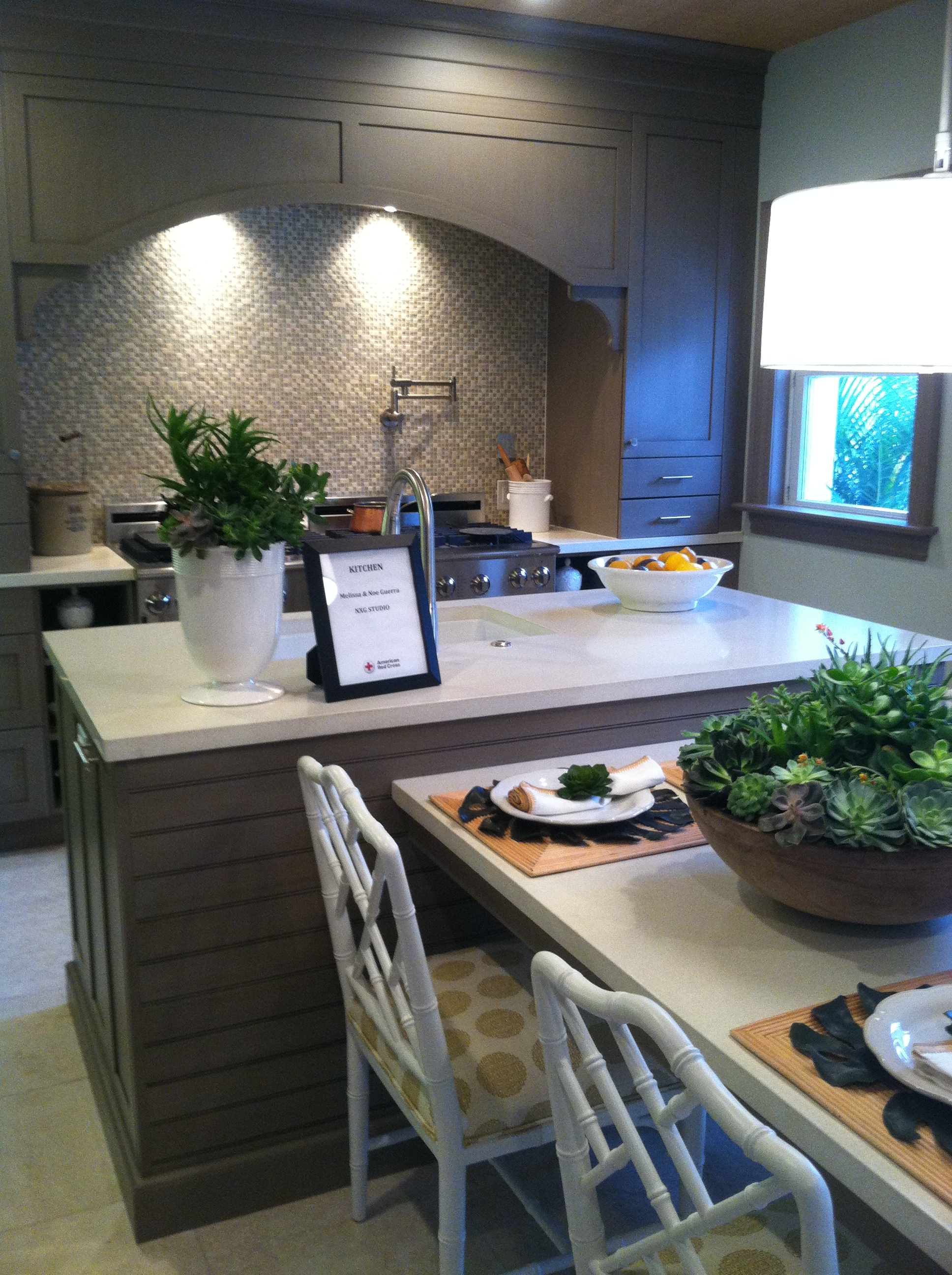


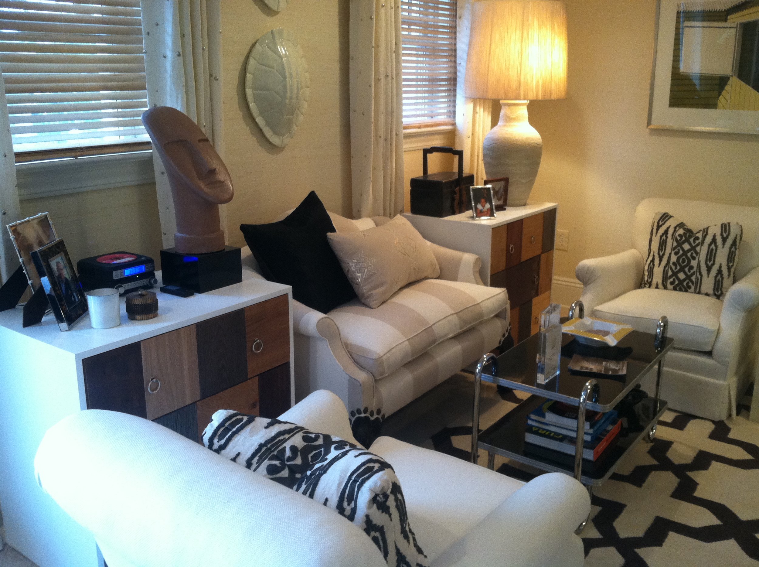
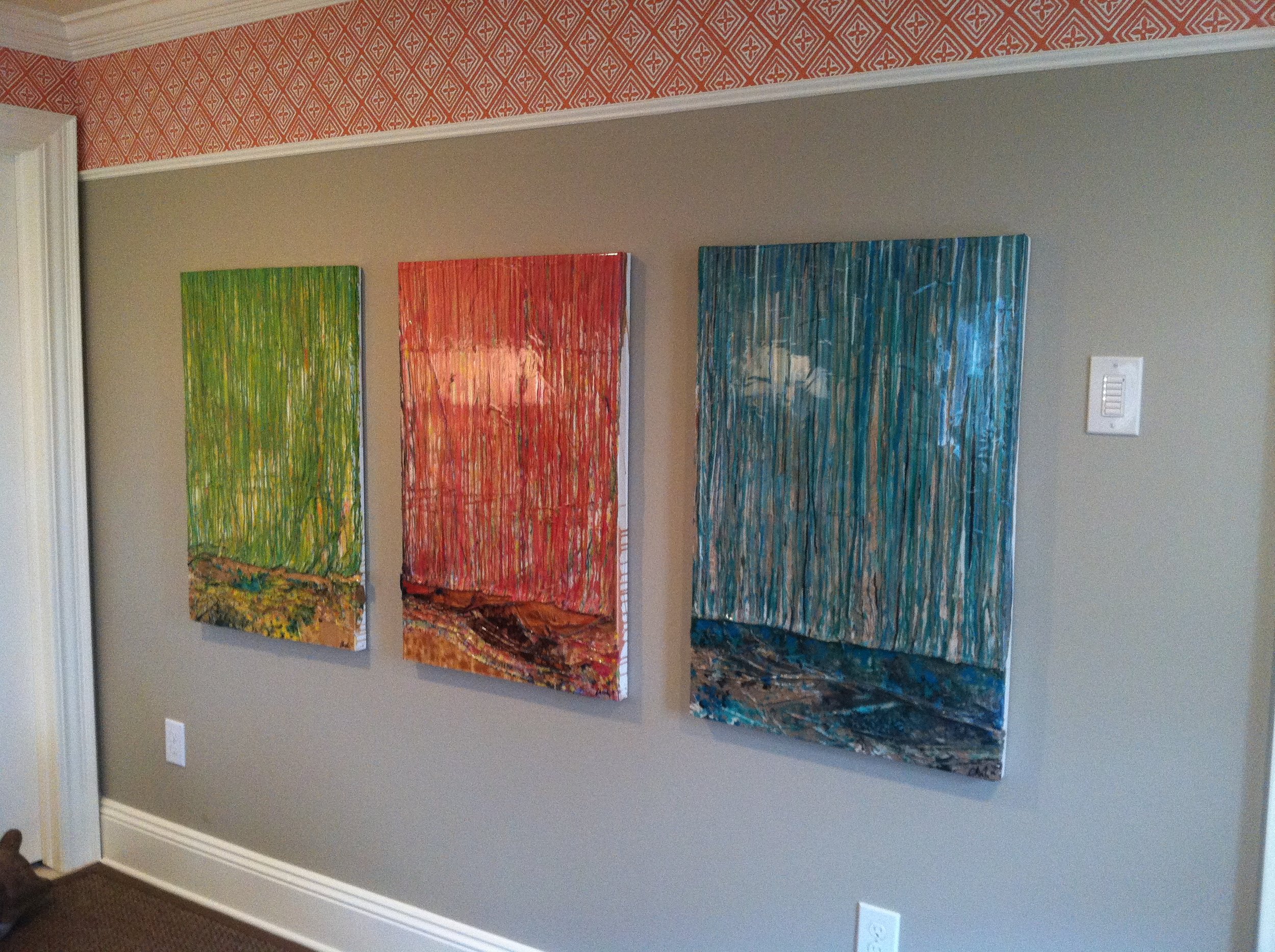

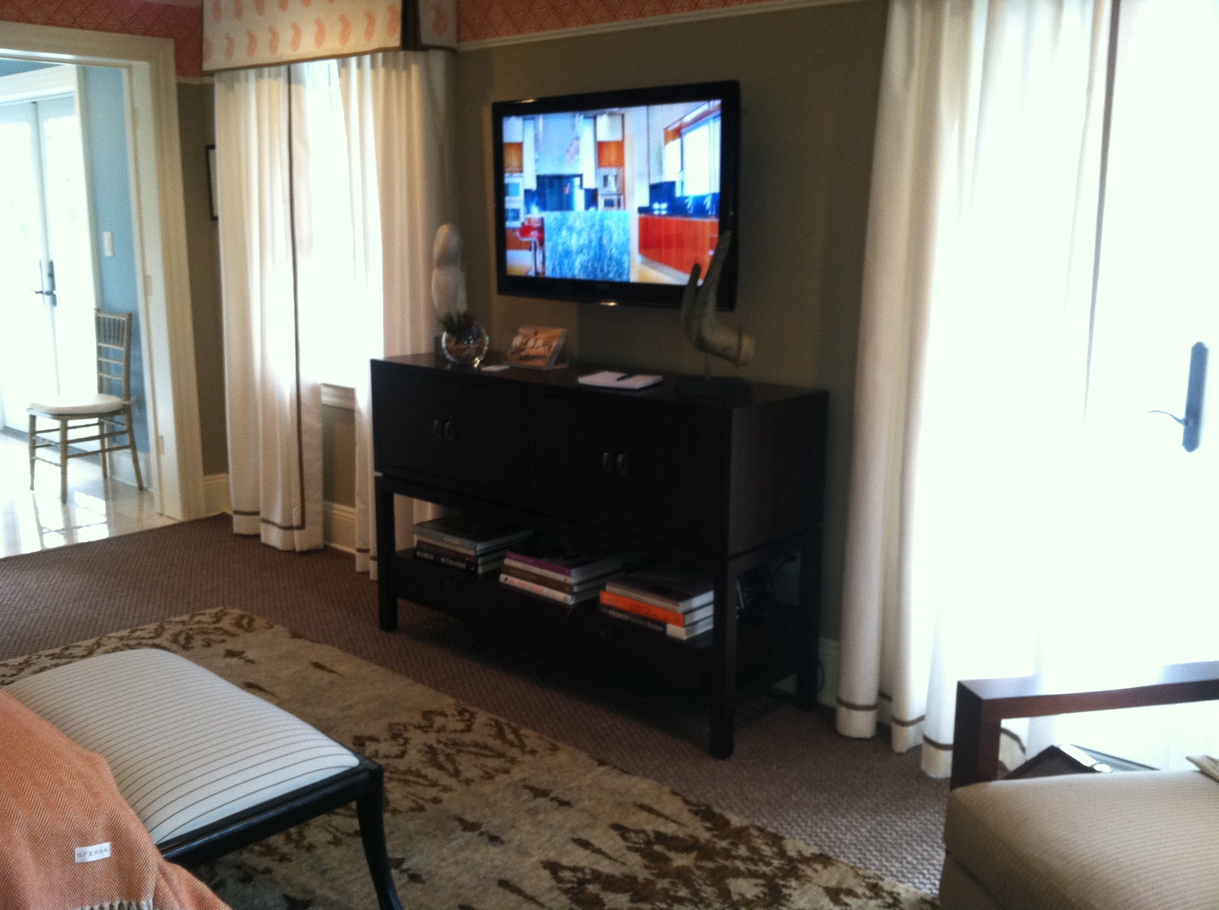

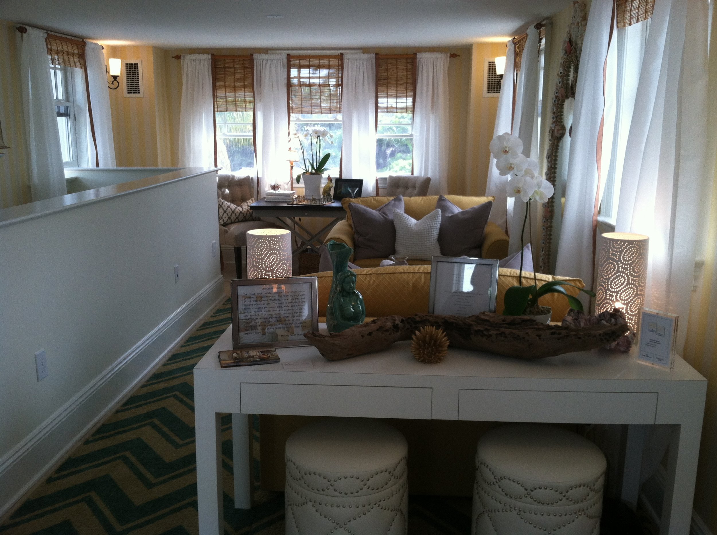


 The Designer Show House is open to the public through Saturday February 23rd, so there's still time to catch it. General admission tickets are $30 (for a good cause) and you can get them on line here.
BRING IN THE HOLIDAYS WITH SURROUNDINGS!
 One of the nice things about the internet is the presence of on line magazines. Of course, in my book, nothing could take the place of a nice fat, glossy, sensuous paper magazine. However, the on line versions are a nice addition to the mix. Two of my favorites are Lonny and Surroundings. Surroundings is published by fellow Blogger 19 member Linda Merrill. She always does a great job of making the magazine not only pretty and visually inspiring but it's always filled with practical info as well.
 The holiday issue has just landed in my inbox. Check it out and you will see my contribution to this issue on page 4! Happy Thanksgiving, dear readers. I am grateful for you!
KITCHEN BLING
A great way to combine art and function in the kitchen is through your cabinet hardware. We think of it as jewelry, or bling, for your cabinets. Check out this assortment of stunning handles by Glass Fancy, Art Glass Interior Design Elements.  Glass adds a water element as well as vibrant color to your kitchen or bath. These particular handles are handmade fused glass created by a glass jewelry artist who segued into creating cabinet hardware when contemplating ways to beautify her own kitchen. The result was so successful she decided to add knobs and pulls to her store selection. The nice thing is that you don't have to use them on every single door and drawer, just a select few to create a focal point of interest. Check out her Etsy store knobsandtiles
You can also find her at the following links:http://glassfancy.wordpress.comhttps://www.facebook.com/pages/GlassFancy/55206902579Thanks to my pal and jewelry artist Vicki of Skygypsy Studio for the heads-up!
KITCHEN FAVORITES GUEST POST
Today’s guest post is from Susi, a writer for Arcadian Lighting, a must-shop resource for beautiful light fixtures. Susi is sharing some favorite kitchens, from traditional to contemporary, cottage to penthouse. There is a wide range of styles, fixtures, cabinets, flooring and lighting in these kitchens. We hope you see something that will inspire you. What is your favorite kitchen?

Pinterest via
Love the greenhouse feeling to this kitchen. The cream cabinets and countertops blend seamlessly with the architecture. Pantry & appliances are tucked further back so they don’t disrupt the view.

Pinterest via
This cottage kitchen is one of our favorites because of the island that feels like a farmhouse table. Classic white subway tiles are classic for a reason…they’re timeless.

Apartment Therapy via
Small doesn’t mean unstylish. Love this eat-in-kitchen that is small on space but large on style. High gloss cabinets reflect the light to make the room feel bigger. The pendant light over the table adds a stylish touch.

Fresh Home via
Colored cabinets are not a new trend but we love the high gloss aqua on these metal cabinets. Everything feels sleek and polished in this contemporary kitchen.

House and Home via
Luxury finishes and quality materials make this kitchen a favorite. Dramatic dark cabinets and contemporary lighting make this kitchen feel sophisticated.

Abode Love via
This white kitchen is anything but sterile. Grey veined white marble, dark floors and punches of orange from the counter stools keep it lively. Love the kitchen pendant lights.

Shatter Boxx via
While many of our favorite kitchens are light and airy, we do love the drama of dark cabinets paired with dark floors. The island sink also makes this a fave, as does the professional range.

A Note on Design via
This contemporary farmhouse kitchen is a gorgeous blend of new and old. Love how the design incorporates the stone wall with contemporary cabinets and pendant lightsContent provided by Arcadian Lighting, a site that specializes in top quality lighting fixtures at extremely affordable prices. If you like this post, be sure to stop by the Arcadian Lighting blog and let us know you saw us here!

