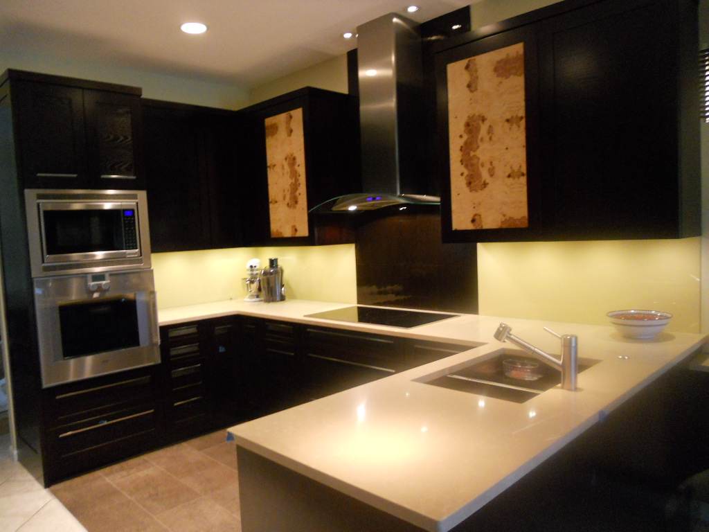
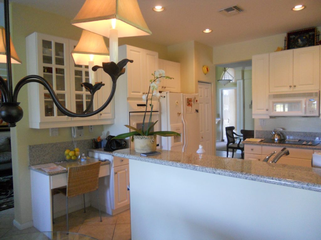
 Another year is winding down. We have been blessed again with many interesting projects. As we are in “finishing up mode” I thought I’d share with you one of the best of 2011. This project was a true collaboration. Our clients, a couple of sweet snowbirds from Chicago, were very hands on which made it fun to see this kitchen take shape. The existing space was on the small side, the cabinets a little dated.
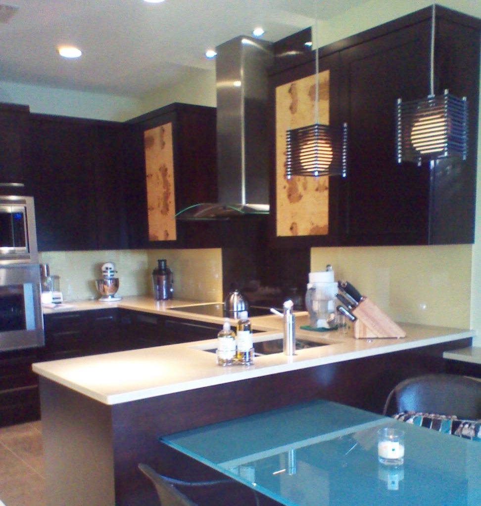
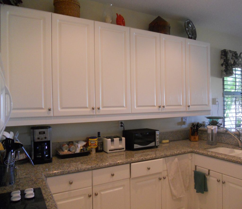 Our assignment was to add a whole range of state-of-the-art appliances and a clean unique contemporary feel that would flow into the existing family room. Naturally storage and function were also of the utmost importance but the real challenge was in fitting it all in!!
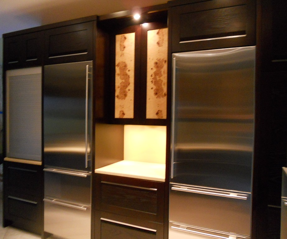
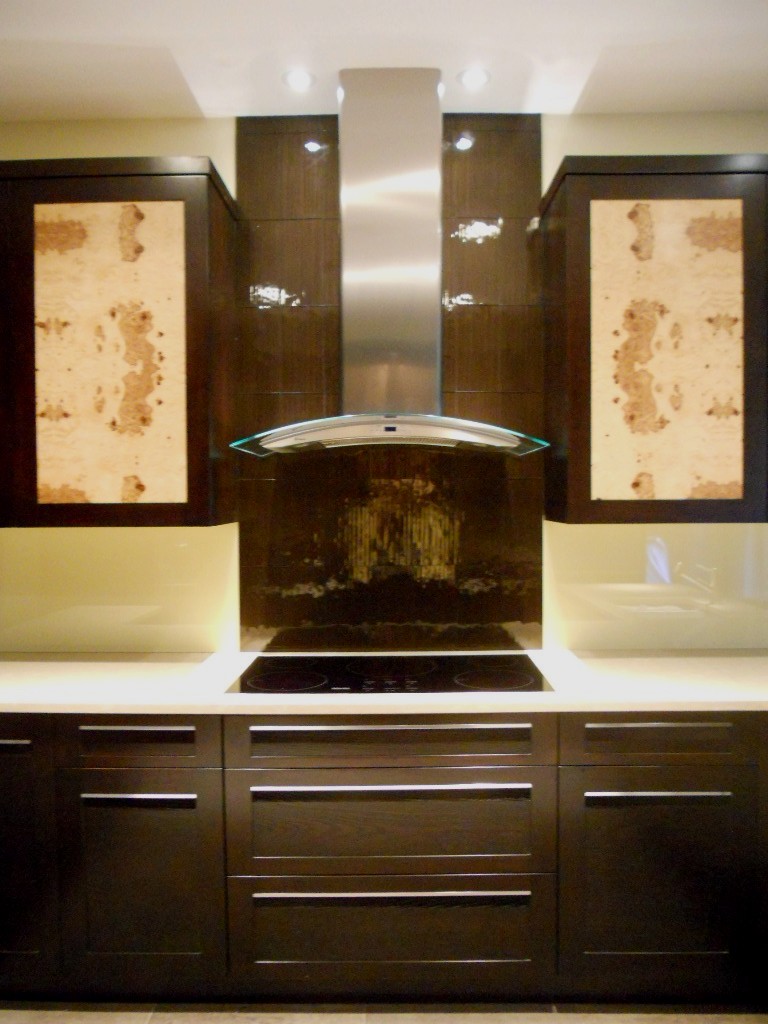
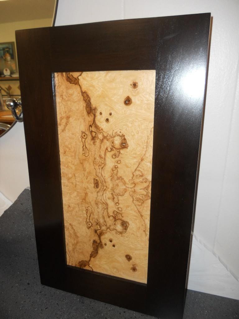
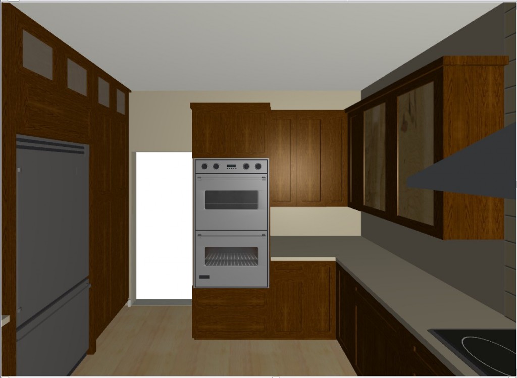 They chose a rich coffee bean stain for the cabinets to match existing cabinetry in the family room. The cabinet fronts were not ordinary doors, no way. Together, with our clients, we designed the Soldono and the Soldono Pacifica Doors just for this job. The Soldono custom door features a cherry frame around a horizontal grained oak center panel all stained in a rich espresso color. The center panel is beveled on one end with stainless steel grip strip inset on the frame. No hardware sticking out in this kitchen! A select few of the upper cabinets sport the Soldono Pacifica custom door which received center panels in olive ash burl veneer for a huge shot of “unique”.
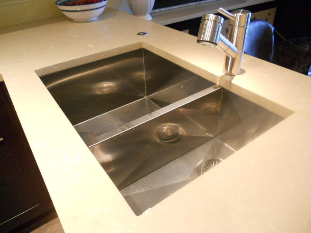
  Stainless steel serves as an accent finish and is found in the appliances and in the monster-multi-functional Hafele appliance garage. Refrigerators are Subzero, ovens are by Gaggenau, cooktop is by Miele and the dishwasher drawers are by Fisher Paykel. Thank you to Linda Roberts at House of Appliances for her guidance. Counter tops are Caesarstone quartz by Stone Palace and the backsplash is painted glass by Florida Shower Door & Mirror, Inc. Clearly they do much more that shower doors! Perhaps the "piece de resistance" however is the glass tile behind the hood. It truly looks like water cascading down the wall behind the hood! The sink is a Precision by Blanco and the glass theme is picked up again with the glass table. You can find a listing of all the trades on the Local Resources page here at Kitchens for Living.
KITCHEN FAVORITES GUEST POST
Today’s guest post is from Susi, a writer for Arcadian Lighting, a must-shop resource for beautiful light fixtures. Susi is sharing some favorite kitchens, from traditional to contemporary, cottage to penthouse. There is a wide range of styles, fixtures, cabinets, flooring and lighting in these kitchens. We hope you see something that will inspire you. What is your favorite kitchen?

Pinterest via
Love the greenhouse feeling to this kitchen. The cream cabinets and countertops blend seamlessly with the architecture. Pantry & appliances are tucked further back so they don’t disrupt the view.

Pinterest via
This cottage kitchen is one of our favorites because of the island that feels like a farmhouse table. Classic white subway tiles are classic for a reason…they’re timeless.

Apartment Therapy via
Small doesn’t mean unstylish. Love this eat-in-kitchen that is small on space but large on style. High gloss cabinets reflect the light to make the room feel bigger. The pendant light over the table adds a stylish touch.

Fresh Home via
Colored cabinets are not a new trend but we love the high gloss aqua on these metal cabinets. Everything feels sleek and polished in this contemporary kitchen.

House and Home via
Luxury finishes and quality materials make this kitchen a favorite. Dramatic dark cabinets and contemporary lighting make this kitchen feel sophisticated.

Abode Love via
This white kitchen is anything but sterile. Grey veined white marble, dark floors and punches of orange from the counter stools keep it lively. Love the kitchen pendant lights.

Shatter Boxx via
While many of our favorite kitchens are light and airy, we do love the drama of dark cabinets paired with dark floors. The island sink also makes this a fave, as does the professional range.

A Note on Design via
This contemporary farmhouse kitchen is a gorgeous blend of new and old. Love how the design incorporates the stone wall with contemporary cabinets and pendant lightsContent provided by Arcadian Lighting, a site that specializes in top quality lighting fixtures at extremely affordable prices. If you like this post, be sure to stop by the Arcadian Lighting blog and let us know you saw us here!
ALL THAT GLITTERS COULD BE GLASS!
You've heard me talk about glass before and it's place as a progressive material used in all sorts of innovative ways in the 21st century kitchen. The following is a press release I recently received for a company called Think Glass.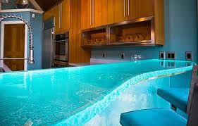 "One of the coolest products just unveiled at the National Kitchen Bath Show in Las Vegas was a stunning 4-inch glass countertop that looked like the luminescent ocean and actually glowed from within. The powerful LED lights embedded inside gave the glass countertop a radiance. ThinkGlass offers a variety of light colors and even the ability to create a “light show” via remote control with special effects such as flashing and fading lights to create an ambiance.ThinkGlass has quickly become a leader in the thermoforming industry by pioneering a versatile technique that allows the creation of new or repetitive textures at a very low molding cost. This process allows the creation of glass slabs without thickness constraints opening the door to all kinds of design possibilities that far exceed anything that can be accomplished with stone, granite or marble."This truly is a revolutionary break through. Previously the thickest counter top any sane glass expert would offer is 3/4". When glass reaches a thickness of 1.4" it becomes hard as stone and it is naturally antibacterial because of its totally nonporous nature.
 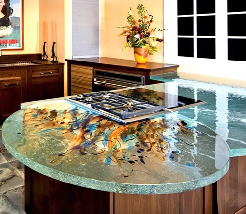 ThinkGlass has been around for about 11 years and here's how they do it. The process begins with 8' by 11' sheets of 1/2" glass which is cut to size according to project specs. The glass is stacked and placed on a bed of sand in an oven. Any desired texture or design is drawn into the sand before the glass is placed on it. The glass is then baked for one day for every 1/2" of thickness. The finished product is then polished by hand. Pretty cool, huh? The sand is even reused so there is no waste.The addition of LED lighting for illumination really takes glass to the next level and is sure to deliver lots of "wows". Glass is easy to clean and the addition of a texture is a crafty way to hide finger prints.If you'd like just a little wow that's good too and can be enough. How about a raised glass top on your island? If you go this route make sure to employ a qualified professional who will know the best way to install and secure your top. Last but not least, don't forget that if you are a follower of Feng Shui, glass is a great way to add the water element to your kitchen. The element of water is said to attract wealth and health!
CREATING AN INSPIRING WHITE KITCHEN
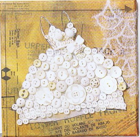 Today's Let's Blog Off topic queries the source of our ideas. Where does creativity reside? Is it within or is it outside and all around awaiting discovery? For me the answer is both. Yes, it's all around us, for sure, but it also requires the eye of the beholder to breathe life into it. Here is a recent example in my life of something I saw which inspired a blog post.You may have the panache to pull off a monochrome white room that invites and stimulates the senses but for most of us going all the way with white runs the risk of BORING. Since white is so "white hot" at the moment, especially in the kitchen, I’m going to share with you the secret of how to make white pop.One thing to remember is white is a team player, it’s all about the colors around it. As you know, I love art (a big source of inspiration). I recently came across this image in Cloth Paper Scissors Magazine which is a perfect example of how white can glow when surrounded by the right color. I see it work time and again. White cabinets plus color equals stunning. If your taste runs more to the conservative think camels, taupes or warm beige walls to create the contrast.
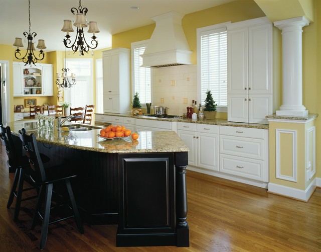 If you’re more daring go for Apple Martini Green or Sky Blue. The nice thing is if you want to go for the gusto paint is a safe bet. It’s one thing you can change fairly easily and reasonably.
 Another thing to remember about white is that it’s just not white. There are probably hundreds of whites and they all read differently depending on your lighting and location. The lesson here is to test your whites on site. Consider the color for a full 24 hours so you can see how it looks as lighting changes throughout the day.
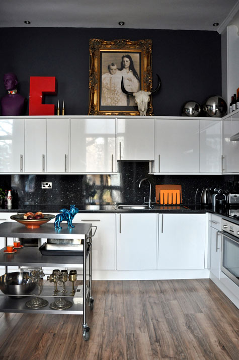 Many times wherever you find white you will also find black. You can tastefully mix black and white cabinets or if you have guts and great lighting the walls could be black, as in this example. This photo also serves as a great inspiration for many of the newer homes we have in my area with cathedral ceilings but short stumpy cabinets (thank you Mr. Builder). If you can't afford to change the cabinets take advantage of the great space above for art. Here, it carries the eye upwards taking attention away from shorty cabinets.
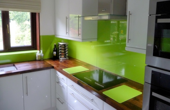 This stunning Apple Green back splash looks like glass but it's actually a colored plastic by Opticolor! So there you have it, inspiration of the day all inspired by a whimsical little piece of art!
ONE FLORIDA KITCHEN WITH A TWIST
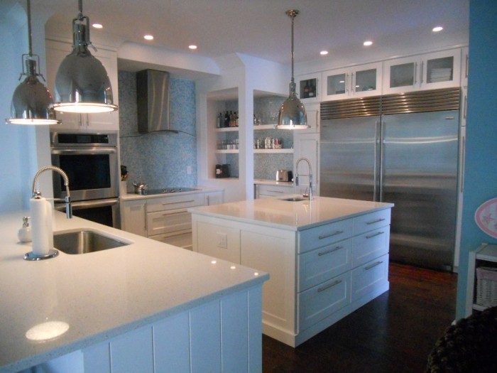 I can’t believe I’ve been back a week already! I guess it’s time to refocus on Florida. What better way than to share this kitchen from my portfolio? Yes, it is the quintessential “Florida” kitchen but you don’t have to live in Florida to have one. If you have a yearning for the tropics year-round, this could be the perfect
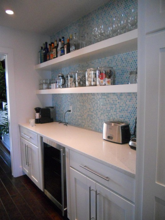
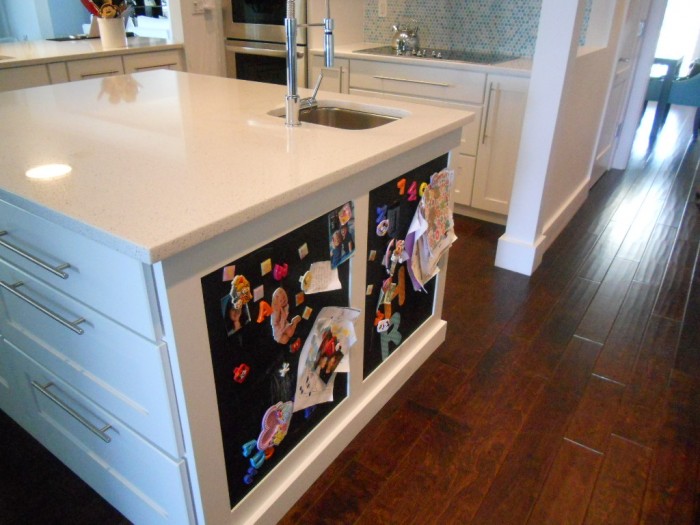
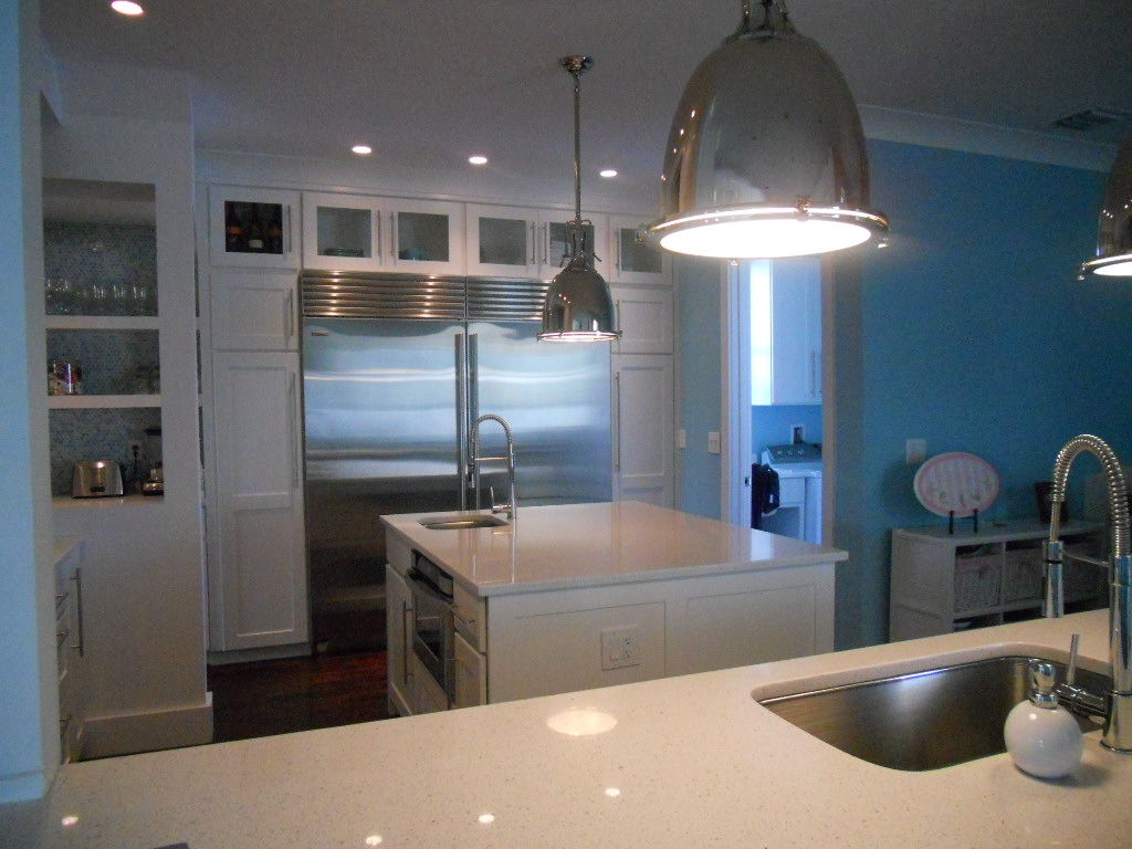
 storm (poor choice of words) solution for you. This combination of white, stainless and shades of blue green that call to mind the ocean make this a Florida dream kitchen that you can apply to your own home.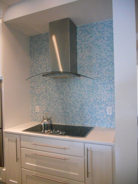 I always say the best projects are the result of great collaboration and this beautiful kitchen was certainly the result of that. The house is located in a new development and came with a builder-grade offering of unremarkable cabinetry. The new design includes a few tweaks. One priority for this young mom was to have a very open feel to her kitchen. We even wanted to remove the wall between the kitchen and butler’s pantry. That was not to be as it turned out to be structural. Plan two was to open it up so that you could at least see through it. I think you’ll agree it worked really well.
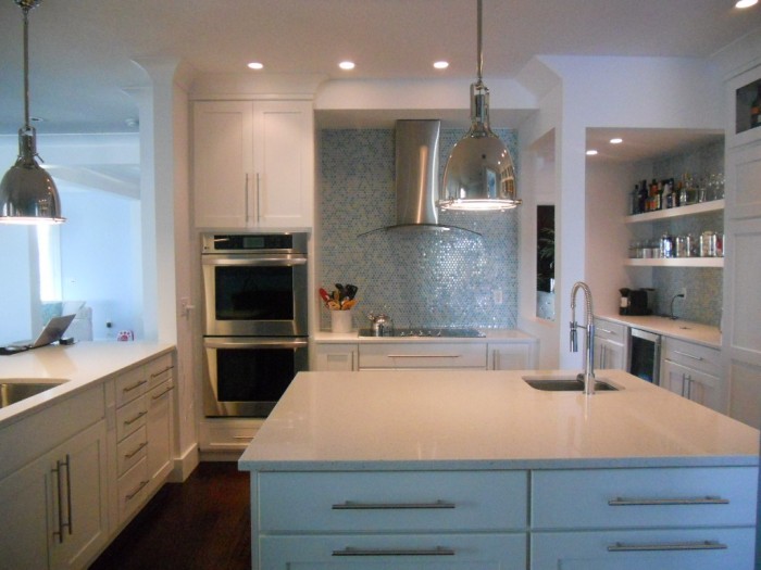 The cabinetry is by Holiday Kitchens, Inc. The door style is called Seattle and it is wood with white paint. Counter tops are white quartz and the dramatic backsplash is penny tile. A penny tile is a round penny-sized mosaic tile that comes in sheets for easy installation. Appliances include a full sized 36” refrigerator and freezer by SubZero, a built-in wall oven and a handy microwave drawer by Sharp. Now all you need is a sturdy pair of flip flops and a stylin pair of shades to complete the ensemble.
SPIRAL WINE CELLARS?
I received an email from one of my fave clients the other day. She is contemplating a dream kitchen for 2011 (Maybe you should too!) Anyway she sent me some of these amazing photos. Check out this dreamy spiral-trapdoor-otherworldly-cool wine cellar! Was this an internet hoax, an urban legend, I wondered?
NO! It's for real and you can check out the UK firm that builds them here. The appeal is not only novelty but efficient design. The concept was designed in 1978 by a Frenchman (of course). It's not a basement, as I first thought, but an actual hole in the ground!
It's not only space efficient but it's Green as well. They claim the temperature stays constant at 55 degrees. Ok, so it's probably still only a dream for us in Florida. If you dug that deep under my kitchen you'd have an undersea wine cellar. Now there's an idea!

