Elements of design are the building blocks of art for good reason. They also happen to work when it comes to planning and laying out your kitchen. Whether you are all about luxury or bound to the basics, awareness of these fundamentals can make all the difference.
Read moreThe Many Facets of Custom Cupboards
Who says the art of printing is dead? You may be devouring novels on your Kindle but printing is very much alive at Custom Cupboards. Their Facets program allows you to bring a new level of personalization to your kitchen, bath or anywhere you have cabinets through digital printing. 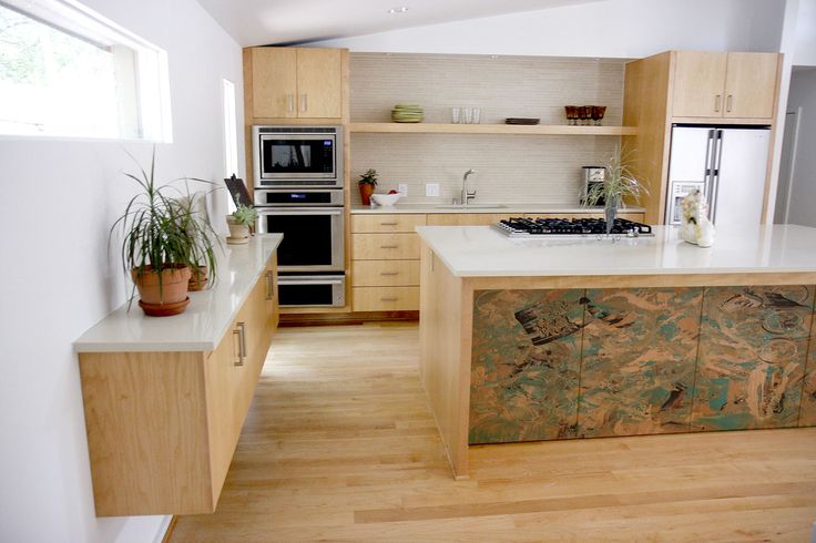 With Facets you can have a truly artful kitchen enhanced with your own original artwork or photography. If you can dream it they can do it. Just remember you can't reproduce work that is copyrighted. That is a no no, but you knew that, yes?
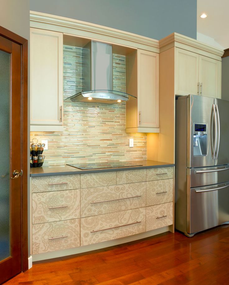 Mael Hernandez, President of this Wichita Kansas based company, was quoted in the Wichita Business Journal as saying,“It’s all about the trend in personalization. We think this is going to change the cabinet industry. It’s very exciting for us.”
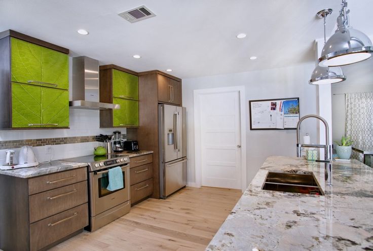 Custom Cupboards uses patent pending digital printing technology to stylize cabinet fronts with textures, patterns, art, photography and even typography.
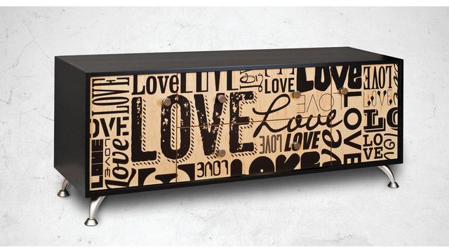 What do you think? Remember it's just an accent, doesn't have to be on every cabinet. In fact, less is definitely more in this case. You're creating a focal point which gets diluted when over done. In case you're wondering, Facets would add about 15% to the cost of an average 13 cabinet, L-shaped kitchen if you did it on say three doors. If you'd like to explore adding a new "facet" to your kitchen, I'd love to help you do it!
Tile Tuesday: In Valencia Art is a Way of Life
Welcome to today's installment of Tile Tuesday! The second half of my adventure with Tile of Spain took us to Valencia, location of Cevisama the annual trade show held to showcase the latest innovations introduced by the Spanish tile industry.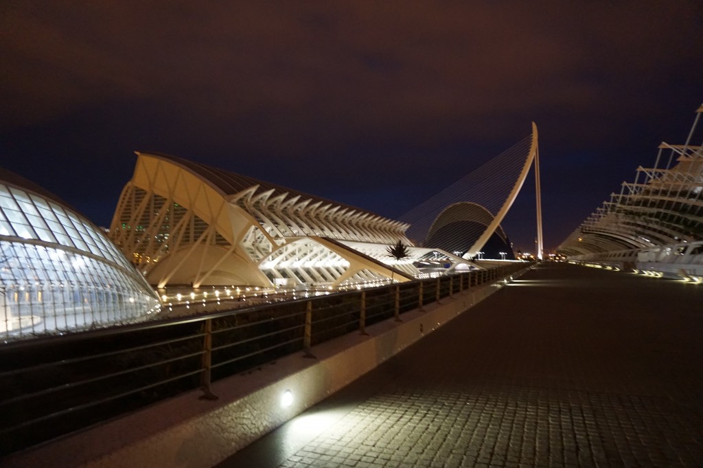 We traveled by train east from Sevilla to Valencia, which is situated on the coast about 300 miles south of Barcelona. At first glance Valencia appears to be very modern with a predominance of what I call “the new Spanish architecture” featuring waves, curves and a visually interesting asymmetry.
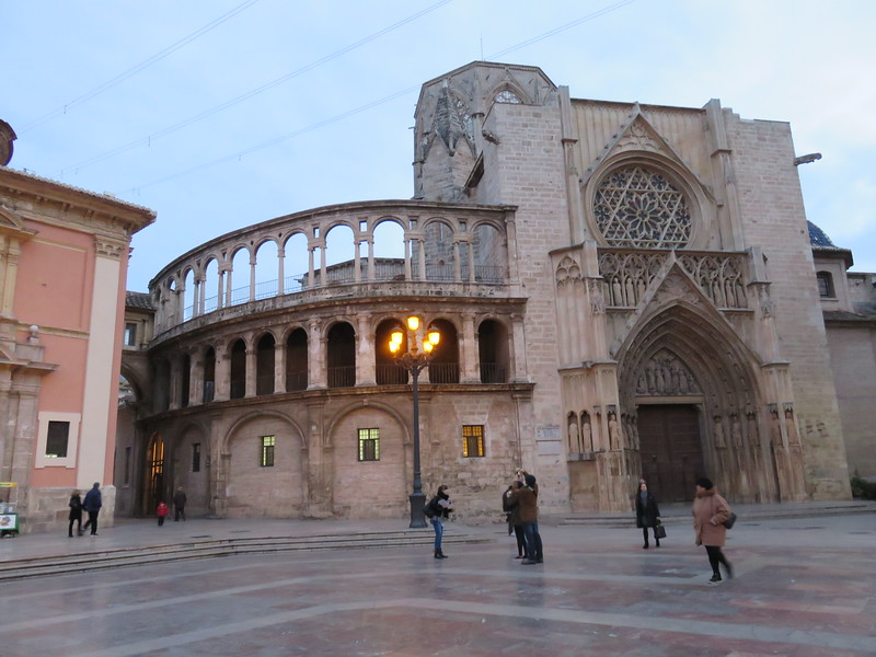 But there is an older Valencia to explore as well. The heart of the city features structures such as The “Iglesia de San Juan del Hospital” which dates back to the 1200s! The current city grew from this center. What a crazy combination of styles! You can see Roman, Gothic, Renaissance and more because different sections were constantly added to the original structure.
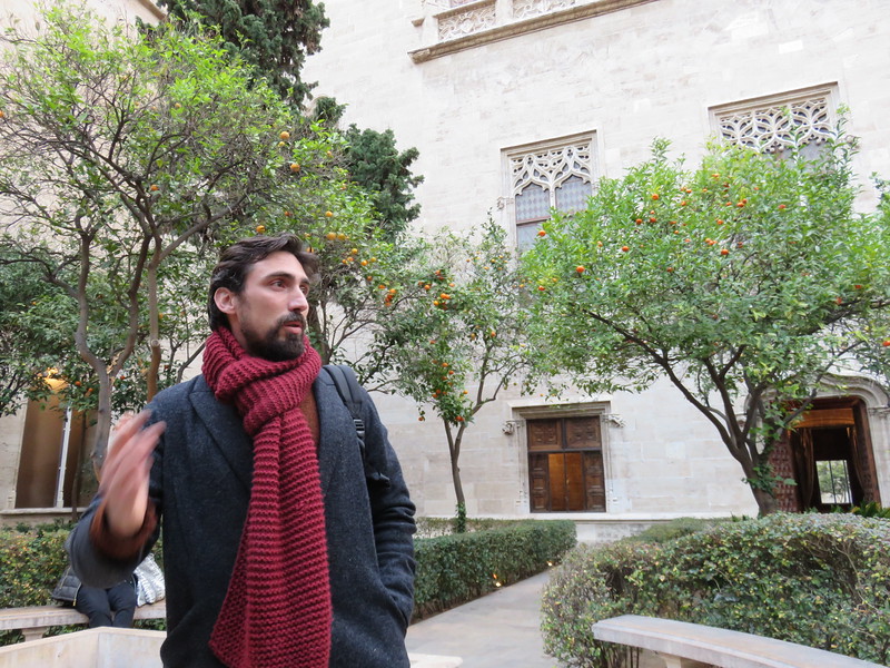 Again we had a passionate knowledgeable tour guide who did not allow us to leave one inch of Valencia uncovered!
 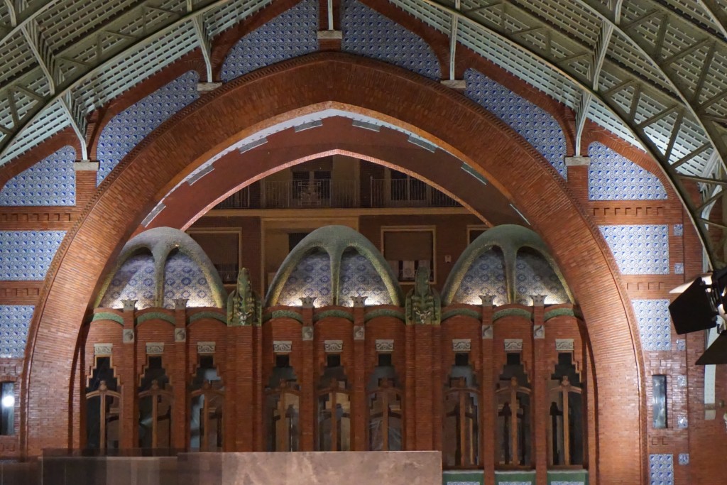 One of my favorite spots was the Mercado de Colón, a beautiful example of the Art Nouveau style. Glass and tile adorn this early twentieth century marketplace, now a gathering place full of interesting bars and restaurants.
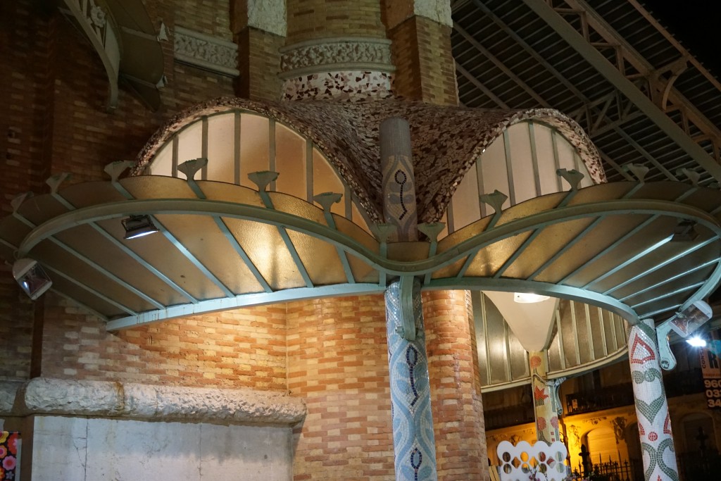 Hallmarks of the Art Nouveau style include free flowing organic shapes, rich earth tones and lots of tile! At the turn of the nineteenth century there was no aspect of living that was not touched by the movement. It was a global trend as well. In Germany it was known as Jugendstil, in Spain Arté Joven and Secession in Austria. The American version evolved into the what we know as the Arts and Crafts Movement, a simplified, more linear version. According to Art Nouveau philosophy, art should be a way of life. No wonder I'm always intrigued by it!
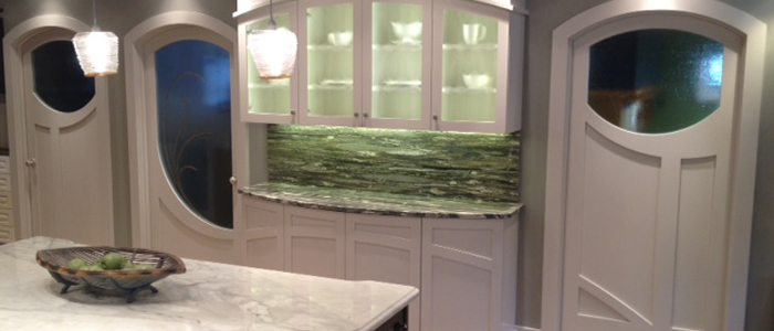 If you're looking to "Nouveau" your kitchen here are somethings you can include:-Rich brown wood stains-Green, green and green
-Some curvy shapes (more affordable to do this with your counter top than with cabinets)-Oak wood floors or cabinets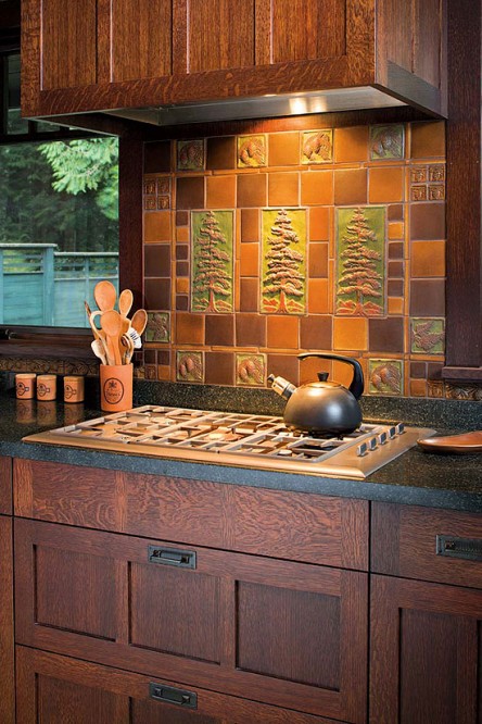 -Certain flora and fauna like the dragonfly, the ginko leaf and the thistle are all images often seen in Art Nouveau styling-Ceramic tile backsplashes (preferably with the above motifs)Next Tile Tuesday: More Cevisama and the future of tile.
Frida, Diego and Their Kitchen
There’s new exhibit in town and I’m excited! Frida Kahlo and Diego Rivera from the Jacques and Natasha Gelman Collection & 20th Century Mexican Art from The Stanley and Pearl Goodman Collection opened Wednesday at the NSU Art Museum in Fort Lauderdale.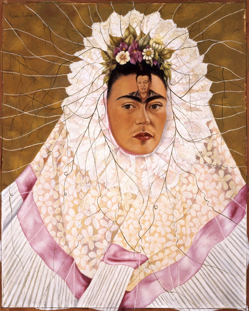 Frida Kahlo and husband Diego Rivera are arguably the most well known twentieth century Latin American artists. This exhibit draws on their popularity to introduce us to some other names in Mexican art we should know. These include Lenora Carrington (1917-2011), Gerhard Gerzso (1915-2000), José Clemente Orozco (1883-1949) and many more. Works on show consist of paintings, sculptures, photographs and works on paper. The exhibit runs through May 31st. I am planning on going on March 27th when Kahlo scholar Dr. Salomon Grimberg will be speaking on Frida Kahlo: The Still Lifes-But let's talk about the kitchen!
 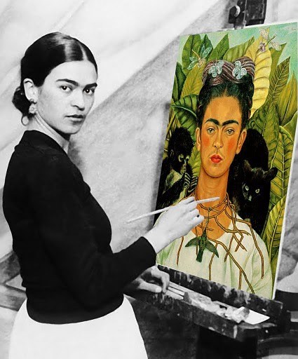 There are many published photos of Frida's kitchen which got me to wondering what it would look like today. Wouldn't it be great to have her essence around when you're making enchiladas? What are the elements you could include to give you that vibe?
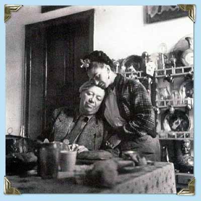 Frida learned to cook for Diego, oddly enough, from Diego's previous wife! She became an accomplished cook but also spent leisurely mornings in the kitchen reading the newspaper with Diego.
This kitchen is located in La Casa Azul, a home Frida was born in and continued to return to throughout her turbulent life. You can tour it if you find yourself in Coyoacán, Mexico City. Check out this article if you'd like to know more. 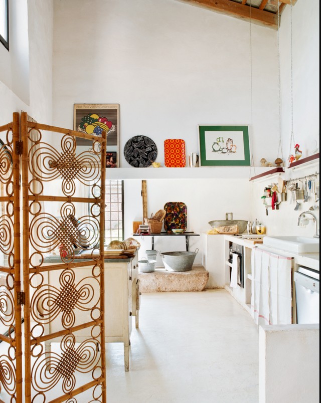 The rustic simplicity, white walls, high ceilings, windows and use of rustic materials make me think of Kahlo.
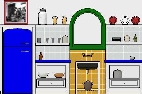 In this fantasy kitchen I used bright colors with a few contemporary twists in homage to the Mexican diva. Design elements of a "Frida kitchen" include the following:-Liberal use of tile-Open shelf storage-Bright colors-White walls-Rustic wood-Lots of light!If you've never seen the movie Frida, don't stop, click here immediately and get it!! Today I leave you with my favorite scene from the movie. I must warn you it's hot, steamy and not for the feint of heart. Consider yourself warned and enjoy ;) Happy Friday and have a fantastic weekend.
Spain Takes the Stage at Cersaie 2014
Tile of Spain, a collective of 90 Spanish ceramic wall and floor tile manufacturers, recently showcased new collections and innovations at the Cersaie 2014 show. Held last month in Bologne, Italy, Cersaie is THE yearly international exhibition of ceramic tile.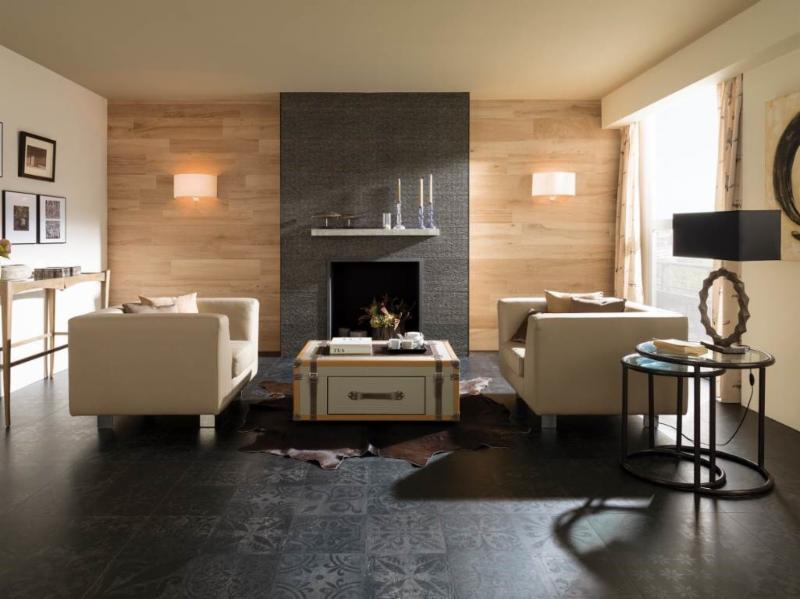 I love to note the trends at this show as they are a barometer of what we’ll be seeing here in the near future. It’s not only the tile itself but how it’s being used that intrigues me and can offer us a wealth of design ideas.Tile has been used in building as far back as 3000BC in ancient Greece. First used to replace thatch roofs, they were desired for their fire resistance. Today tile finishes are vast, varied and constantly reinvented through the advent of new technologies affecting both performance and aesthetics.This year Spanish manufacturers, reflecting the latest design trends, showed vintage styles, hexagon shapes, three dimensional profiles and more.Here are some of my favorites from Tiles of Spain showcased at Cersaie 2014Porcelanosa (above) makes a complete contemporary statement with this combination of tiles. I especially like the subtle injection of Old World suggested by the matte black floor tile.
 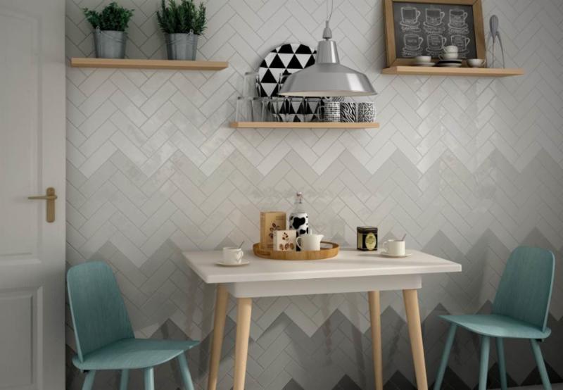 Other than the fact that chevrons are always cool, I love the gradient shades of grey shown here by Equipe Ceramicas, so original! The grey and white are also neutral and easy to design around.
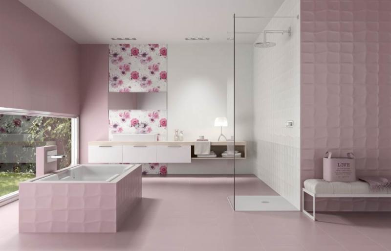 Think pink! A lot of chick-pad-pink from Unicer (above). It's all tile, the white, the print the textured and the matte. Would you?
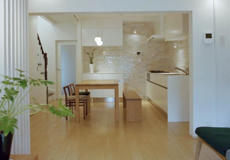 If you're going to use tile in the kitchen, go big! It really makes a statement.For more ideas check out the Tile of Spain USA Inspiration Gallery.
Hip To Be Square, Or Not
I've heard the saying " it's hip to be square" but that’s not always true, sometimes curvaceous qualifies. Here are three of my fave new products that sport some cool contours and are far from square. 
 Sometimes just the slightest suggestion of a curve is enough to soften a silhouette. This beautiful faucet by THG Paris is available in, get this, 35 finishes! The French excel when it comes to subtly, oui?
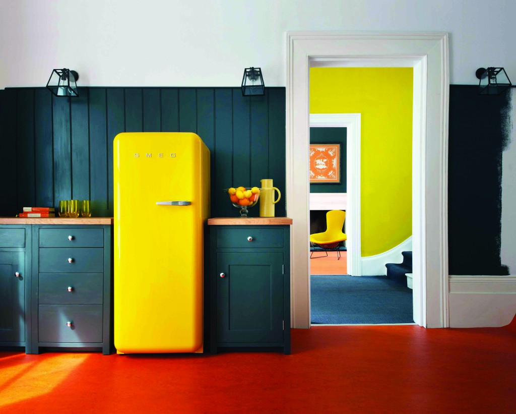 This is what you would call a "statement refrigerator"! Smeg is an Italian company largely known for these cool retro-style fridges. The other new colors just introduced are white and a highly anticipated Union Jack pattern (who knew?). The soft rounded corners are all about the 1950s. The 9.22 cubic foot capacity is a little more Euro than American but who can resist those sinuous lines and vibrant colors combined with cutting-edge technology?
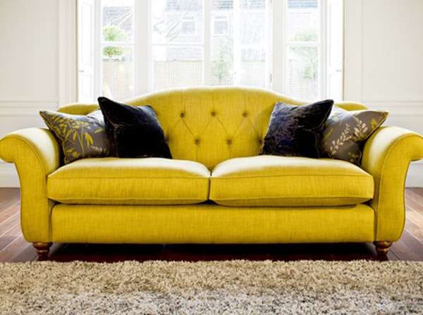 I even found you a sofa to partner with your new yellow Smeg :) Not bad, I must say. Last but in no way least is Infiore by Estiluz. It's a beautiful stylized flower sculpture masquerading as a lamp. This one is a pendant but it also comes as a floor or table lamp. The petals are available in different colors and sport a collection of bi-injected polycarbonate petals. I have no idea what that means but I do know it means the lamps feature an interesting two-color lighting effect. These are available at LightingbyGregory.com
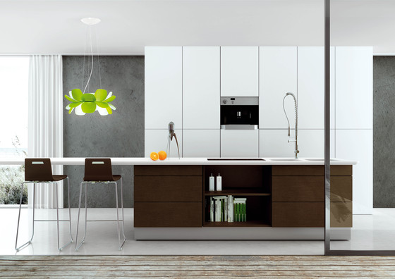 The organic curves of Infiore add a whimsical softness to this very linear contemporary kitchen (which I love) The larger-than-life scale also makes these flowers fun! I rest my case, curves are a beautiful thing ;)