Day two of the Modenus Blog Tour was opening day for the 51st annual Kitchen and Bath Industry Show (KBIS). The Bloggers were given an inside peek into many of the booths at the show and as we toured, trends most certainly did emerge.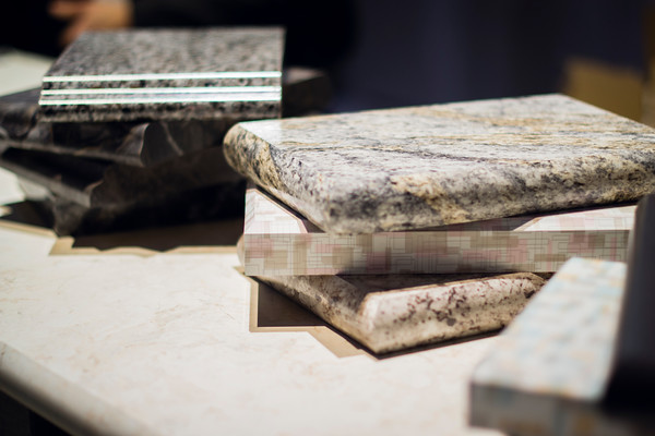 "There is a three year lag between Europe and North America when it comes to trends", says Warren Ramsland, President of Top Knobs. Taking that into account, there were many differences between what I saw here and what I witnessed in Italy at Euro Cucina last year. Perhaps the biggest European influence that continues to pick up steam is contemporary design for both the kitchen and bath.
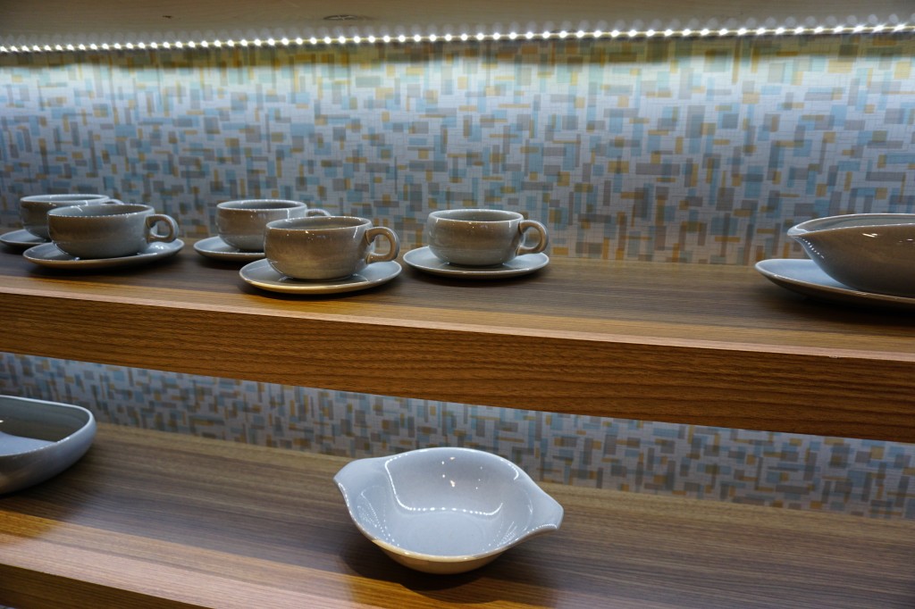 Laminates are enjoying a serge in popularity. This material is more widely used and experimented with by our friends across the pond but we're picking up speed. I was wowed by the offerings at Wilsonart who debuted their "Spirit of Mindfulness" collection of 27 exciting laminate colors and textures. Also introduced were a line of quartz counter tops in a great assortment of neutral, workable hues. By late spring, a selection of 50 patterns will showcase a full range of colors, textures and four structures: Fine and Small Scale, Medium Scale, Large Scale, and Veining and Movement. That is one of the things I love about quartz, the wide variety of pattern, or no pattern at all! I was impressed not only by the innovative product development at Wilsonart but also their philosophy. This press release statement says it all:"Fueled in part by a turbulent economy, today’s more budget-savvy and eco-conscious consumers have responded by making their homes the calm eye in the storm of life. For many, this translates to finding a spirit of mindfulness within themselves and expressing it in their surroundings."
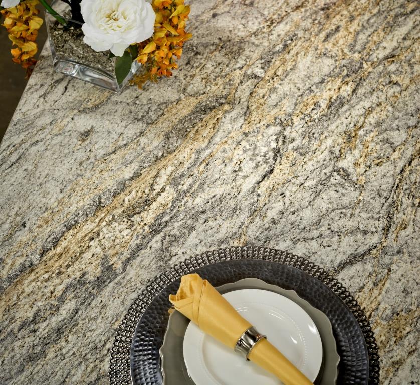 One of the new Wilsonart quartz options showing beautiful veining. Photo courtesy of WilsonartCheck out the Wilsonart Visualizer to help you pick your counter top color. It's easy, fun and very helpfulTechnology is also taking the kitchen and bath world by storm. There were numerous examples but two stood out for me. A company called TechTop took home the Best In Show Award for their counter top charging technology. Simply place your phone, tablet etc. on the counter top and viola' it will charge, no plug-in required.
  This great idea is from LG Hausy, yes it's the same "Life's Good" LG that makes appliances. They make counter tops too. I also loved this Solna articulating faucet by one of my favorite brands, Brizo. How convenient, right?!Fifty Shades of Gray has moved on to what I call "greige". It's the new warm toned beigey-gray which I saw everywhere! Palettes are definitely neutral. A great example is the Tangent collection by Walker Zanger. Love the mid-century inspiration which I also saw a lot of at the show.
 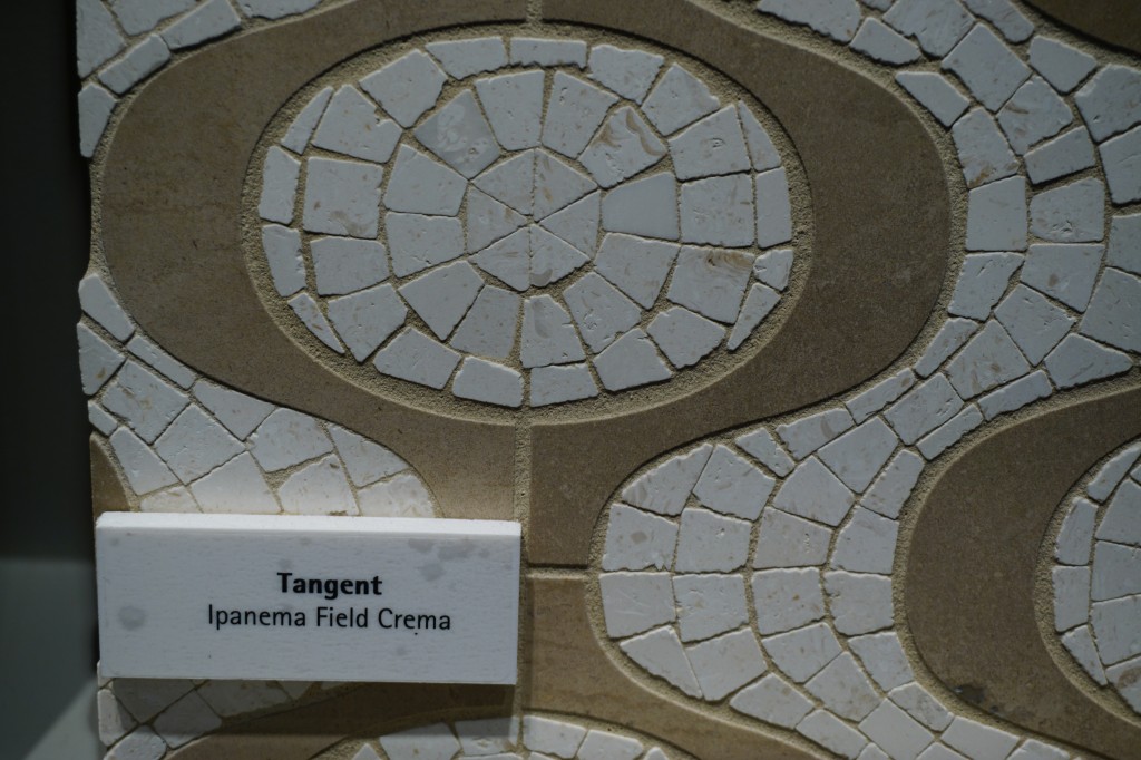 Walker-Zanger deals in tile, marble and stone artistry. Their collections are arguably the most innovative I've seen. Case in point is their Sterling Row collection, inspired by menswear and a favorite at the show. I found it to be extremely sophisticated, eye catching and innovative. The collection was a favorite at the show.
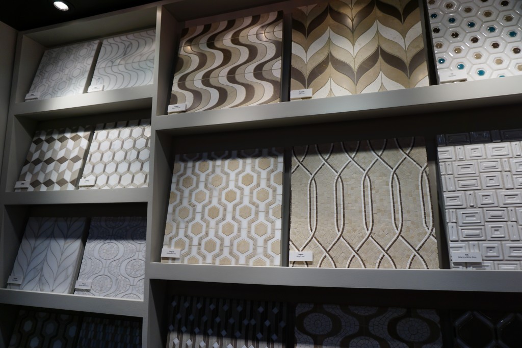
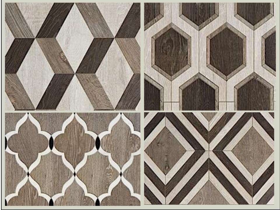 We saw more of the Sterling Row Collection later on the blog tour in The New American Home, so there's more to come!Perhaps the BIGGEST trend of the show was personalization. I mentioned this in the last post about Thermador but they were not alone. Here are a few more pics highlighting the concept. Frigidaire's SpaceWise Custom Flex refrigerators allow you to totally customize the shelves inside by moving the drawers and shelving to your desired configuration.
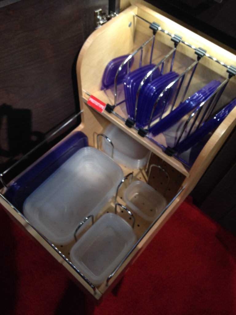
 How about this great storage system by Rev-A- Shelf? I know we all want this level of organization in our lives, yes? Right now this is a prototype but the response from the industry was good so I think we can expect to see this in the coming year.
 Enough for now? Well there's more to come.Up next: KBIS 2015 Part II where I'll tell you about all my great finds for the bath and more.
Locker Up! Storage, Style and Savings
The more we crowd our environments with "stuff" the more we need to find a place to put all of it! Pair that with a very real need to recycle and reuse (to keep the new "stuff" to a minimum) and you can see that the concept of "used lockers" can be very relevant.
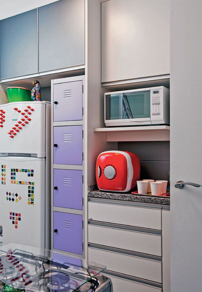
Aside from being cost effective, they can be a very creative storage option. Buyusedlockers.com is the place to go if you want to know more, so that's just what I did. I had the pleasure of interviewing Chance Cook who had some reavealing and insightful things to say about the business of using used lockers. All photos are from their Pinterest page and there are more pics here.
AK: BuyUsedLockers inhabits a very unique niche in the market. How did it come about?
Chance Cook: "BuyUsedLockers is part of a larger, family-owned business named Jorgenson Industrial Companies. Jorgenson Industrial Companies has many divisions specializing in machine tools and material handling—one of which is a very successful division named SchoolLockers.com. Several years ago after doing a very large install of brand new lockers here in Salt Lake City, Utah, the owner purchased the used lockers he was removing that were heading out to be sold as scrap metal. Instead he bought them. After looking on the Internet late one evening, he found there was a huge need out there across the country by people looking to buy used lockers over brand new lockers. He quickly assembled a business model, began buying used lockers from just about everywhere, and built a website that specialized that focused on buying and selling just used lockers."
AK: Who is your customer and are you noticing any clear trends?
Chance Cook: BuyUsedLockers.com finds our customer base ranges from someone looking for a DIY project in their home (such as a mudroom or laundry application for locker storage) to any other client that would need new lockers for their business facility. Savings over new lockers can be upwards of 40%.
There are in fact trends with many of the home applications as well. Currently we find that for home applications, people are looking for the really cool aged, vintage lockers for their studio apartments, mud rooms and just about every other corner of a home. Most of these are being done as a Do It Yourself (DIY) décor project. Look around on eclectic boutique shops and especially Pinterest and you’ll see that all things vintage are commanding high prices as people are enjoying that retro, vintage and rustic look for their homes.
AK: What is the best way for homeowners to incorporate your product into a residential design?
Chance Cook: Of course color is the best way to incorporate our product into a home. A vintage locker that you paint and age works as a great way to add accent colors along with storage into your home. If you go onto our Pinterest page you can see the many, wonderful ways that normal, everyday people have done this in their own homes. By using a vintage locker, you can add that awesome hint of color you are looking for to further accentuate an accent wall, or even add the sole accent color a home’s otherwise neutral color scheme.
The ideas and ways to incorporate a used locker into a residence are as endless as the imagination desires. People have turned lockers into tables, rolling storage units, laundry hamper storage cabinets, mud rooms, dressers and so forth. Plus the additional storage capacity makes them perfect for any room of the house where any other piece of furniture can be set up. We even see people who have added chalkboards to the locker’s exterior doors to make ‘quote boards’ and ‘dream walls’ for the home, and I have even seen resourceful people take the doors off sections of the lockers and turn them into chic bookcases for living rooms and dens. It's anything you can dream up.
AK: What do we need to know about sizes to work lockers into a design plan?
Chance Cook: That is the great part about using used lockers in your home. Most people think lockers only come in the tall, single tier style they used in high school. But little do they know there are MANY styles and designs to choose from! Box lockers for instance are essentially small cubbies that can stand upright or even come as a bridge; with two locker columns as bases and then a horizontal locker across the top. This currently popular style further adds to maximize a garage or mud room’s limited storage and design. There are 2-tier, 3-tier and many other styles and all have shelves which you can easily adjust, remove or add all depending on your needs.
AK: How about color, can they be painted as needed?
Chance Cook: Any locker can be stripped, sanded and painted any new color you would like. It is surprisingly easy and since lockers are built from quality, cold rolled steel, you don’t have to worry about breaking or harming the locker! Our BuyUsedLockers.com blog has many detailed and helpful tutorials on how to paint a used locker and a list of supplies you will need, but suffice it to state that painting a locker is just like painting something like a metal vase or rustic home décor items that are made from metal and need a new paint job, aging or just refinishing.
AK: How much can one expect to invest per lineal foot?
Chance Cook: There are many many variables. The closest I can get, depending on the style, it could be anywhere between $45.00 to $200.00 per linear foot.
Thank you so much to Chance and the folks at buyusedlockers.com for taking the time to visit with me at Artful Kitchens. If you are rocking the "used locker look" I'd love to see it!
Number One Kitchen Trend for 2014
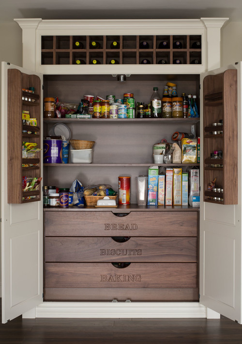
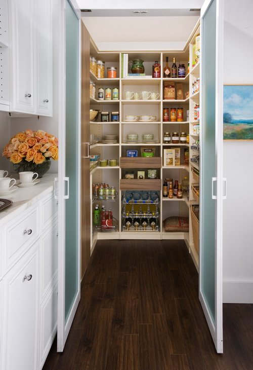
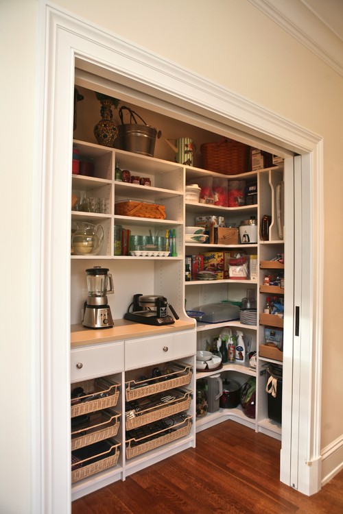
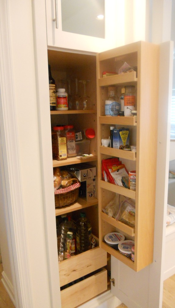
Houzz.com recently posted the top kitchen storage trends for 2014 and I would say most of them involved the pantry in some way. If space allows, tall pantries are a must for the versatile storage they offer.
If quarters are too tight, pantry storage can be created without the use of a tall cabinet. Here are a few of my favorite ideas. The photos above and below feature spice racks on the doors which is a great option. You can also use the same racks in any cabinet to store medicine and vitamins!
Furniture Islands Lend Style & Function to the Kitchen
If you've always wanted the convenience and look of a kitchen island within your budget, today may be your lucky day-after-St. Patrick's Day! One of the perks of writing a design blog is all the press releases that come my way. I'm always being informed on where to go to find the latest for greatest function, design and value. Furniture kitchen islands by Jeffrey Alexander found their way into my inbox and caught my eye. Here are a couple of my favorites.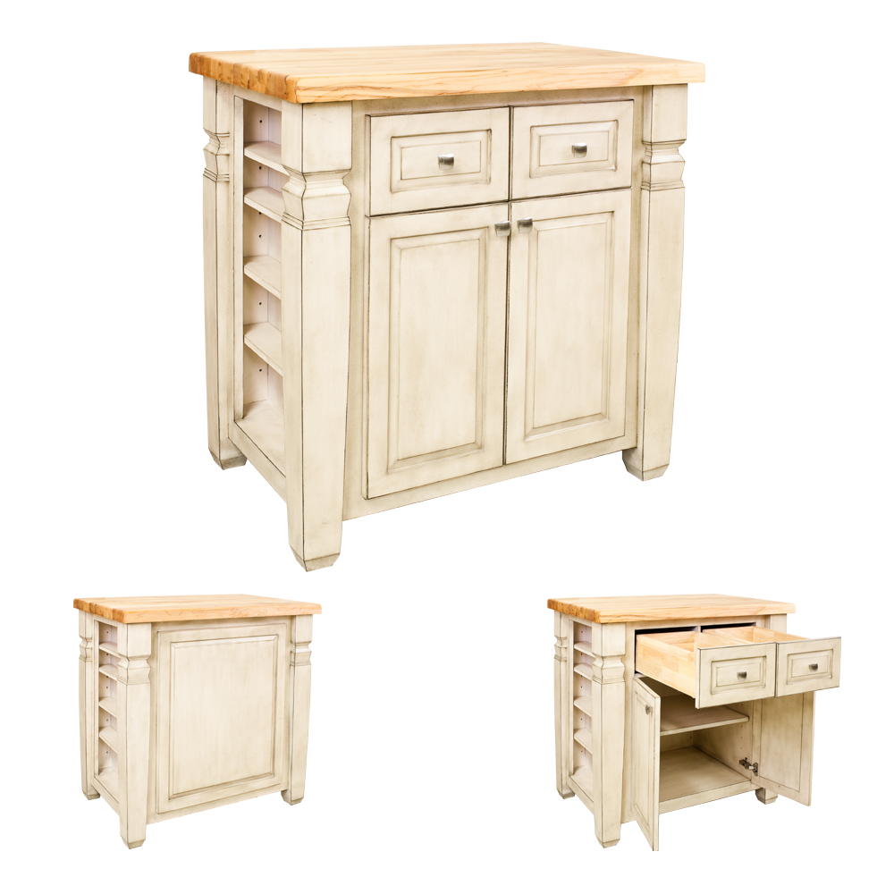 Cabinet hardware and accessory maker Hardware Resources, debuts the Jeffrey Alexander Loft Island. I love it because it packs a whole lot of function and storage into such a small foot print! It's 36" wide by 24" deep. The furniture look easily blends into an existing kitchen and no plumbing or wiring are required! It comes in Aged Black or sophisticated French White Designed to perfection, the island gives extra space for storage while increasing counter work area for cooking prep. The butcher block top is optional.
- If contemporary is more your cup of tea. Jeffrey Alexander also makes this island called, of course, The Contemporary. This one is a bit larger at 54" by 34" and features 6 working drawers, 3 on each side. The butcher block top is optional. Click here to view the many other furniture island options.
ADD SOME SPICE TO YOUR KITCHEN
 Ok I admit I was having a quick peak around the internet desperate for "quick post" material. I just couldn't resist this
 space spice rack, not JUST a spice rack but a KITCHEN ART PRO CAROUSEL. If you're looking for a space for your spice you can even have it with a "space" theme. AND check this out, with each click of the dial you'll get a precisely measured 1/4 teaspoon drop of your selected spice. Yours for $27.85, deal? More substance coming soon.
NAUTICAL ZEN KITCHEN
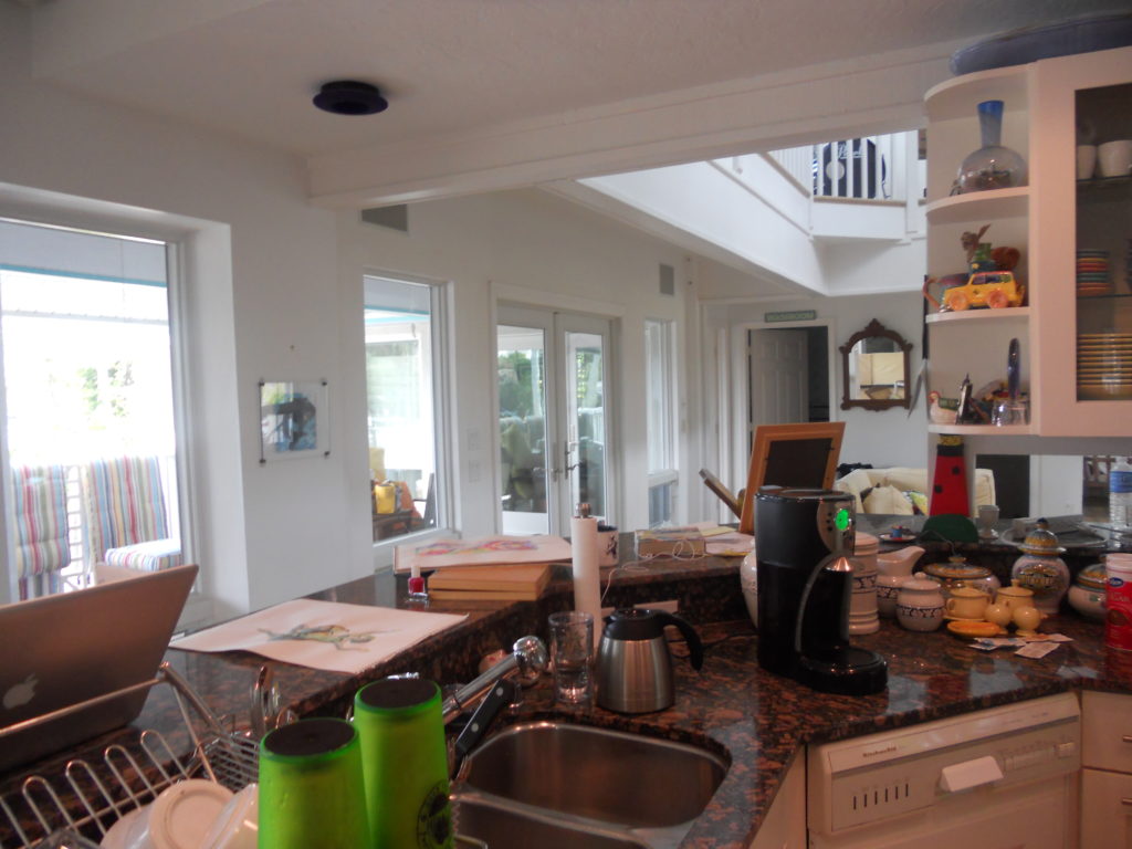
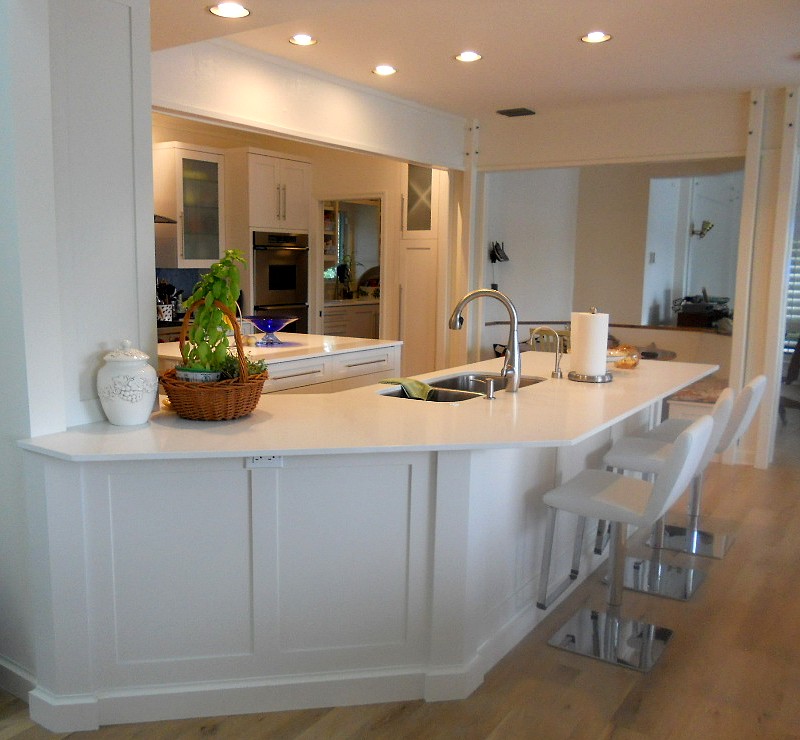
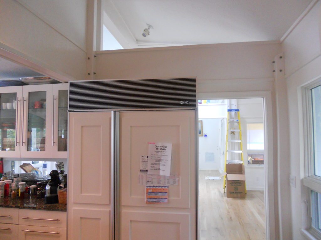
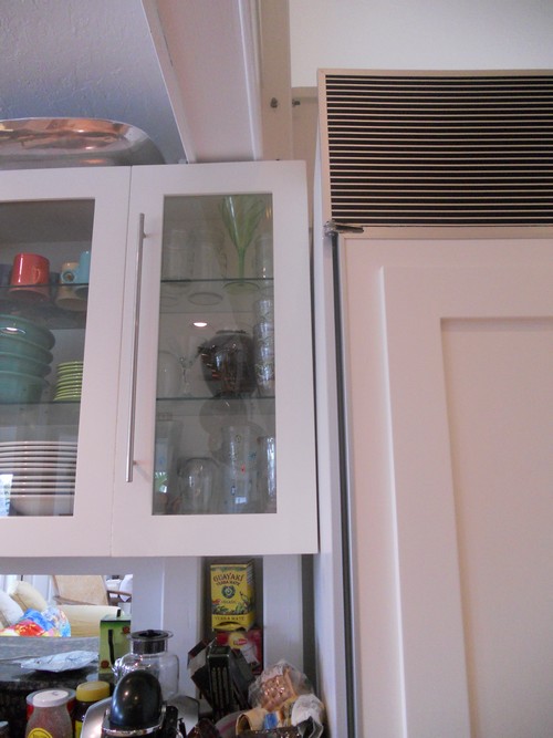
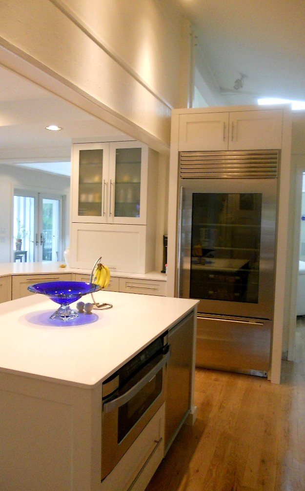
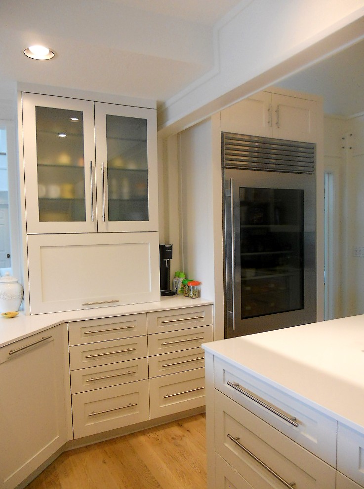
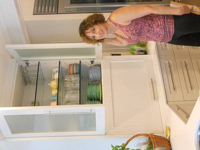
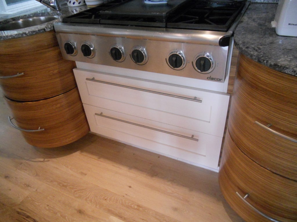
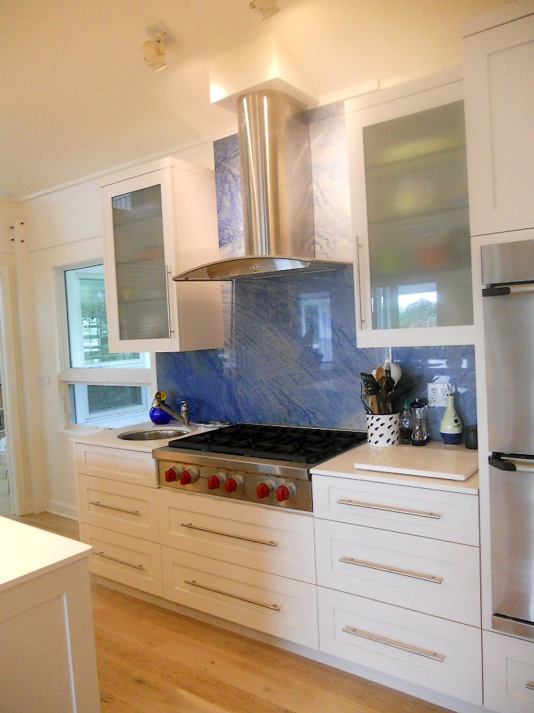
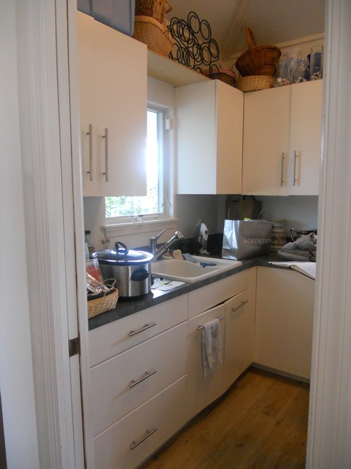
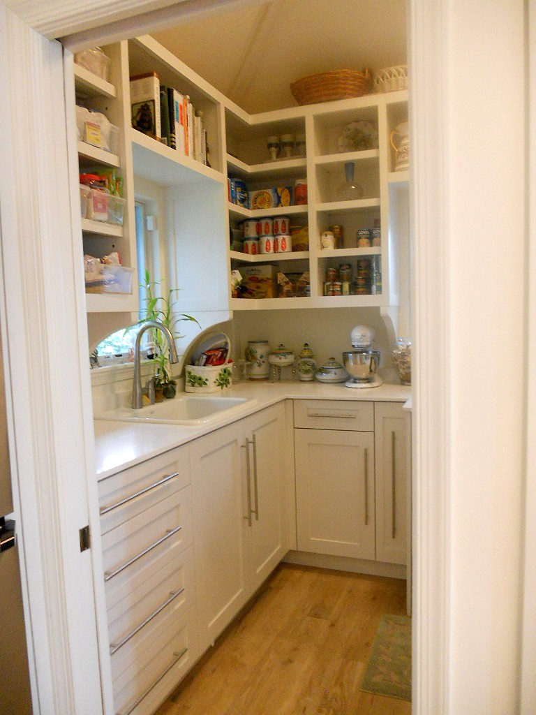
Ta daaaaa! Another beautiful kitchen is complete, and yes it’s white with Shaker doors. Surprise! Not. There were two main challenges about working in this home. First of all the architecture is very unique and is an integral part of the space. It’s comprised of posts and beams, angles and open lofts which remind me of a ship. The second challenge was a lack of unity with way too much going on visually. The existing kitchen had three different types of counter tops, two different types of cabinets and more stuff than space. In addition, hinges and drawer slides were failing and paint was chipping.The homeowners came equipped with the most valuable of traits, an open mind. They were willing to see their kitchen and laundry area in a new way. Every step of the design process we would ask ourselves “does this unify and simplify”? Think “nautical zen”!First off I decided to make peace with the posts and beams. The layout remained the same and we didn’t even change the door style or color! What we did was improve the fit and function. Using all white counters unified the space and allowed the blue granite back splash to be the star of the show. Here are some “before” pix and “after” solutions which will pave the way for smooth sailing in this new kitchen.