The Big Move: Episode 8 The Big Reveal

Yes, it certainly has been a while since our last episode but guess what? The Big Move is complete and it's time for THE BIG REVEAL. We are done for the most part.  I guess the truth is the homeowner is really never done.


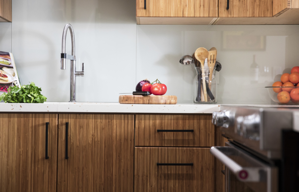
bamboo, painted glass backsplash, quartz counter top, Blanco faucet, Culina, matte black,

There's always something, right? Anyway, we are enjoying our new home immensely and in this episode I will give you a tour of the kitchen, show you some of the of the work we've been up to since we met last, share some final words of wisdom and then THE BIG REVEAL!!! Please comment and let me know what you think.  I think the final result is so Glo&Joe.  You'll see my art and Joe's music represented.  Then there's Mac. =^..^= These personal touches are what make a house a home.  Special THANK YOU for following our adventure we are so grateful to all the generous souls who contributed to making it happen.  Without further ado, THE BIG REVEAL


If you just happened to find my video, there are seven more on my YouTube channel. You can tag along with me, a South Florida kitchen and bath designer, as I, with my husband, transition from suburban family living to a cozy condo by the water. As new empty nesters, we're downsizing, minimalizing and taking a property with potential from sad to fab. Follow The Big Move series as I encounter all the choices and issues my own clients face from the other side!

Join me in my upcoming kitchen design workshops in 2018 if you're thinking about a new kitchen in the new year.  Email me at Gloria@ArtfulKitchens.net and I'll let you know the dates and locations.

Going Topless...In Your Kitchen

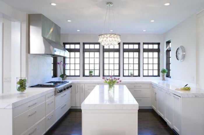
Unless you've been living under a rock you know that the less-is-more look of the topless kitchen is hot!! When I say topless I mean no upper cabinets. There are certainly pluses and minuses to this design decision. But "how can I live without half my kitchen", you ask.  Fear not. Today we will examine the possibilities.

white kitchen, traditional kitchen, stainless steel hood, island, white countertop, kitchen windows, crystal chandelier,no upper cabinets

white kitchen, traditional kitchen, stainless steel hood, island, white countertop, kitchen windows, crystal chandelier,no upper cabinets

Less is Now

No complaining if you haven't done a thorough kitchen purge in the last year.  We all have "stuff" and if it never sees the light of day it's stagnant energy taking up real estate that could be otherwise useful or beautiful.But what about dishes? They always go in the upper cabinets. Actually, dishes work perfectly in drawers if you have this drawer peg system.  You'll find that they're easier to access too, particularly if you're short like me ;)

Dish drawer, dish pegs, black plates, drawer cabinet

Dish drawer, dish pegs, black plates, drawer cabinet

Clever Corners

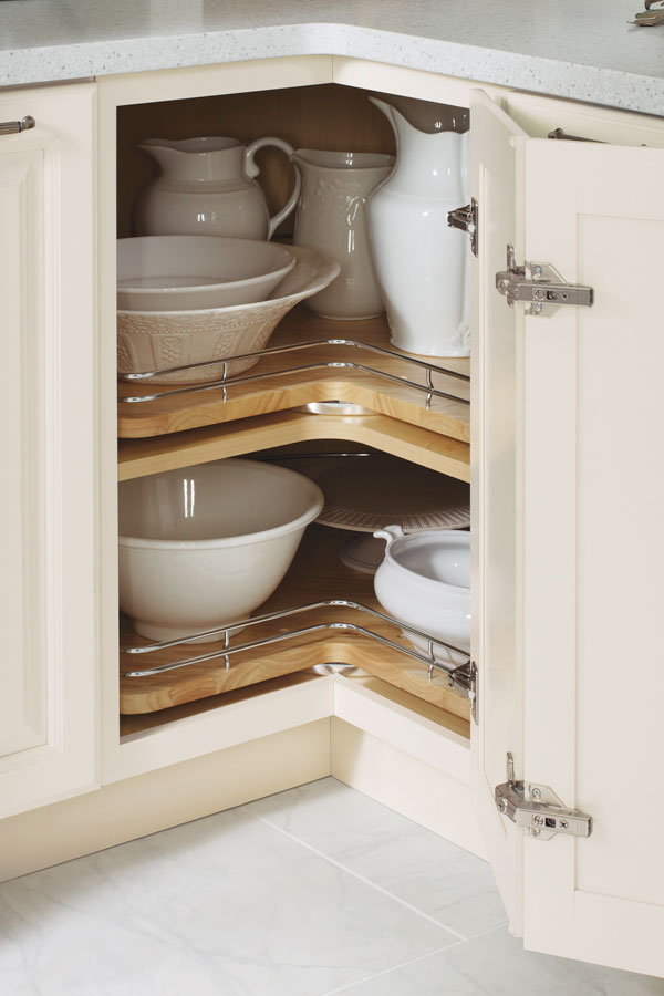
Another way to maximize the space you have below deck is to use the corner space.  My favorite way to do this is with a base lazy susan cabinet. It's versatile storage for almost anything. Just be sure to get this type, without the pole.  With trays mounted on shelves, you won't lose things to the Twilight Zone if they fall over.  (Chrome rails are optional) The only caveat is that you will need 36" on both sides of the corner to make this work.

base corner cabinet with lazy susan chrome rails

base corner cabinet with lazy susan chrome rails

If you can't swing the 36" in each direction you can perhaps use the Cloud which fits in a blind corner cabinet.  We can discuss more when you call me to help you with your new kitchen.

white cabinets, contemporary, chrome, blind corner cabinet, revashelf

white cabinets, contemporary, chrome, blind corner cabinet, revashelf

Ultimate Simplicity

The most simple solution of all is the open shelf.  They are both feared and widely popular.  Some feel like it would look way too messy but I say it doesn't have to be all or nothing.  A few open or floating shelves can add a lot of lightness and visual interest as well as storage above the counter in lieu of cabinets.

farmhouse kitchen, HGTV, white cabinets, apron sink, open shelves

farmhouse kitchen, HGTV, white cabinets, apron sink, open shelves

Artful Arrangement

In the photo below, they actually did not eliminate uppers entirely but it feels like it.  Here they are using the shortened uppers for remote storage, i.e. the stuff you don't need to access every day. The "go to" storage is in tall pantry cabinets.  That's right, you don't have to use the pantry only for food, they are great for everything.  If your pantry is full depth, like these, rollouts work great for easy access and to avoid items getting lost in the back. If you're observant you'll also notice the last cabinet sits on top of the counter.  If you have the counter space this is a great way to conceal countertop items for less clutter.

contemporary kitchen Dekton wood cabinets pantries

contemporary kitchen Dekton wood cabinets pantries

Creative Compromise

As we've seen, one does not necessarily need to banish the upper cabinet entirely to score an updated and functional result.  Here is a loft kitchen I recently designed.  My clients were in love with the idea of floating shelves and this look worked for their urban vintage style. Since space was at a premium in this condo we did opt to keep a few good sized upper cabinets.  The look is actually a blend of contemporary and transitional. A full pantry also would've worked to the right of the refrigerator but my clients preferred this arrangement which is very symetrical and offers a bit of extra counter space.  Hey, I always say the best jobs are good collaborations. :)

ArtfulKitchens 3DRendering kitchendesign

ArtfulKitchens 3DRendering kitchendesign

.

No matter what your situation, creativity can offer you choices. In over 20 years I have found that there is always a solution that will work in your space and I would love to help you find it.

The New Farmhouse Kitchen

If you're a die-hard traditionalist the trend towards contemporary and transitional design may leave you feeling lost for fresh new inspiration in the familiar classic look you love, but no more!

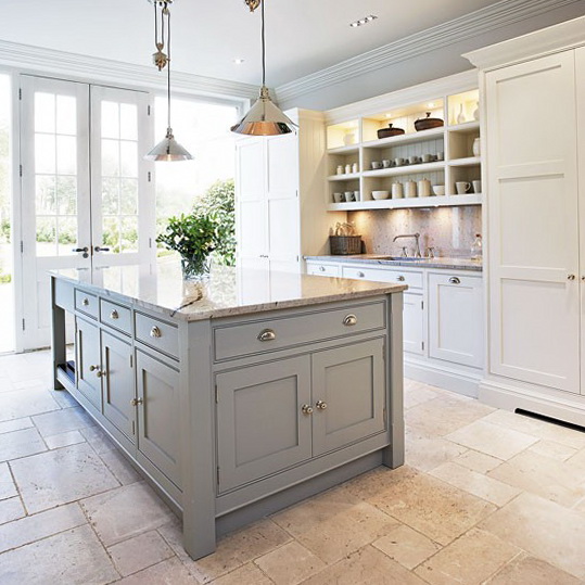
4-kitchens-ideas-modern-designers-Tom-Howley

As they say, everything old is new again and that couldn't be more true for Traditional design. If you yearn for that farmhouse feel you're right in step with what's going on in the design world right now.  Today's country kitchen has been reinvented with design details that reflect the cleaner lines and stepped-up function of today with the welcoming warmth you want.  Here's how you can update without selling the farm.


New Direction for Paneling

Traditional beadboard runs vertically.  It's called beadboard because in between each plank there is this detail which is called a bead in molding lingo.


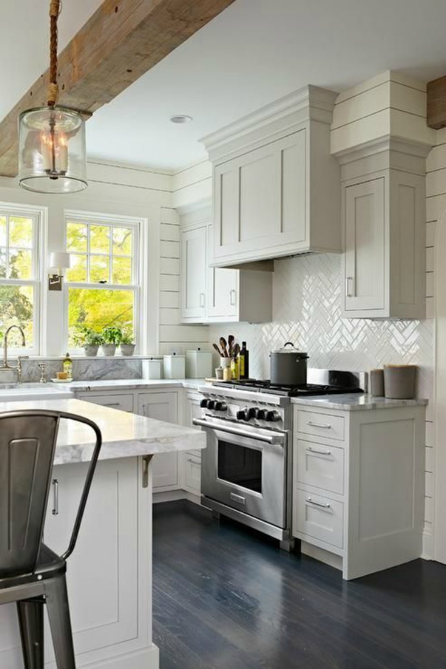
The new look is called shiplap and it goes horizontal instead of vertically for a fresh new interpretation.  For a cleaner look, you can even remove the bead and have a v-groove or a nickel sized space between planks.  This works for coastal looks too since it's actually inspired by ship design details, thus the name shiplap.

Aprons Rule

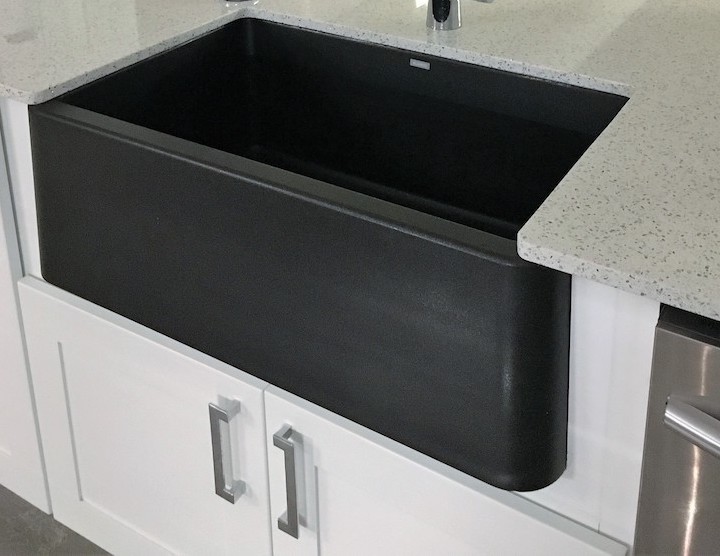
Apron sinks, also called farmhouse sinks, are all the rage and they come in a large variety of materials from the original cast iron and clay to the newer stainless steel and granite composite versions.  They can also be under mounted so you can wipe those crumbs right off the counter and into the sink. Don't overlap the sink edge though or you'll have a concealed seam underneath between sink and counter that can get pretty gross and be hard to clean.

ArtfulKitchensIKONsmall


Less is More

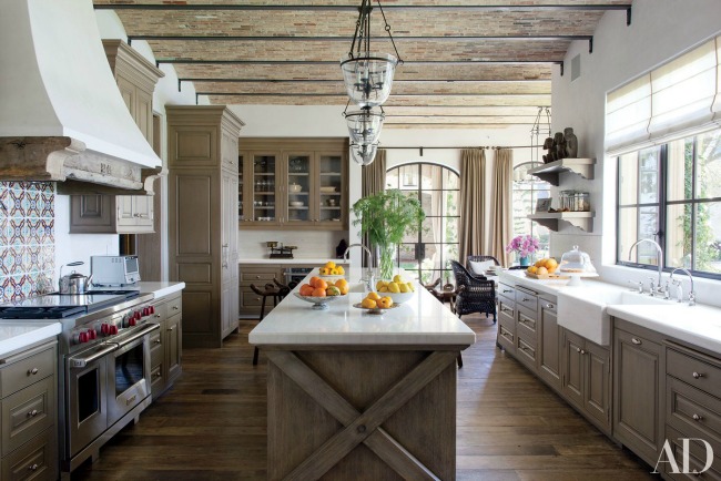
One of the hallmarks of a traditional farmhouse kitchen is lots of moldings, legs, bun feet etc. It used to be the more the merrier but that has changed.  You can still have your legs and even corbels but they are simplified and clean lined.  Speaking of clean, these less detailed versions of the originals are much easier to keep clean.  Less detail can also be easier on the wallet. Win win!

modern farmhouse-Architectural Digest

Time for Recess

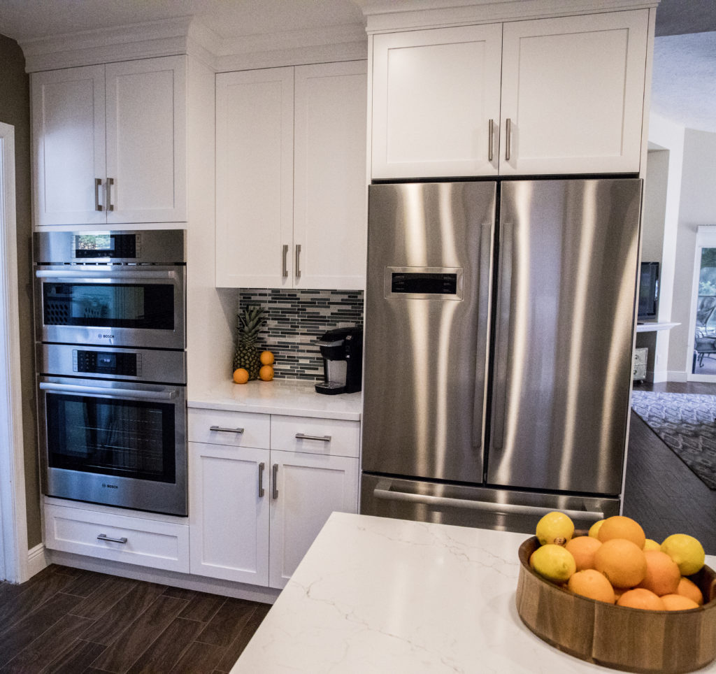
Attractive and innovative framed doors are the perfect choice for the new farmhouse kitchen and we are seeing flat recessed panel doors as a popular alternative to the traditional raised panel styles.  In fact simply switching from a raised panel door to what we call a flat panel door is an instant update.  If you want to take it even further consider a flat, or slab drawer front which allows you complete freedom when it comes to selecting your pulls or knobs.

Decorpad-modern farmhouse kitchen

More Inspiration

I found these books which are right on topic.  Add them to your library if you are looking for more tips and inspiration on how to achieve the new farmhouse look in the kitchen and other areas of your home. A Touch of Farmhouse Charm: Easy DIY Projects to Add

a Warm and Rustic Feel to Any Room features easy DIY projects for all parts of your home. The Farmhouse: New Inspiration for the Classic American Home has great examples how to add updated farmhouse details to new or existing homes.  Last but not least City Farmhouse Style: Designs for a Modern Country Life is my personal favorite as it adds a touch of sophistication that could make your farmhouse look totally at home in city or country. This book is not out for a few months yet but if you can't wait, check out Kim Legget's website for a preview.
 

Now for the Cow

Art can also be a style defining element of your kitchen. Nothing says farmhouse like the quintessential cow.  Are you cow A, or are you the more minimalist modern version that is cow B ? 

The Farmhouse cows are available through my affiliate Dot & Bo.  The books can be found on Amazon. Purchases through the links above can help fund my blog. If you choose to indulge I thank you for your support. 


Please keep in mind this is one approach and is reflective of what I'm seeing in the design world.  The best advice I can give you is to always design to the style of your home and your heart that way you will never go wrong.  It's your investment and you get to choose what you like and leave the rest.  I can help you make the best choices for your own unique situation and would love to hear from you. Email me at Gloria@ArtfulKitchens.net to explore how we can work together.

Coming Friday: Parts III & IV of The Big Move  

Subscribe above to catch all the episodes!


Kitchen Case Study: Tips and Products that Can Bring Your Design to the Next Level

Designing a kitchen is a bit like solving a puzzle, eventually all the pieces come together and it all makes sense from both a visual as well as a functional perspective.  This new kitchen design in Wellington Florida is a great example of that. Today I'd like to share with you an inside peek at the process and how we got from drab to amazing in ten million easy steps.

White Shaker Cabinets,Style My Faucet, Kitchen Design, Kitchen Makeover


I jest, it was really only eight million.  Here's where we began.  Check out these before images.  As you can see the old kitchen was outdated and just didn't work from a layout point of view.  The challenge we faced was to create something light, modern and very user friendly for my client who loves to cook for her family.

Befores

First Things First: Layout Challenges

Kitchens generally work a lot better without too many angles so although we were stuck with the exterior angled walls, we could straighten out that peninsula.  Then there was the island in the center.  All the angles were affecting the usable storage inside so I wanted to square that up too.  Next up was that oppressive soffit at the top!  It was like a heavy weight pushing down on the kitchen.  Removing it would allow taller cabinets and a much more open feeling.  The refrigerator was crowded next to the stove so I really wanted to relocate it if possible.  Last but not least, where the fridge used to be is our new focal point,  a modern hood and beautiful reflective glass tile.


The above plan shows how it all panned out.  We accomplished all of our objectives.  The soffit was removed, peninsula reshaped with the addition of a beverage center, the island became a baking center with no angles and storage for a mixer lift.  We extended the pantry wall and created the perfect home for a new refrigerator and combination wall and microwave ovens with convenient counter space in between.

White Shaker Cabinets,Style My Faucet, Kitchen Design, Kitchen Makeover

Star Elements & The Power of Collaboration

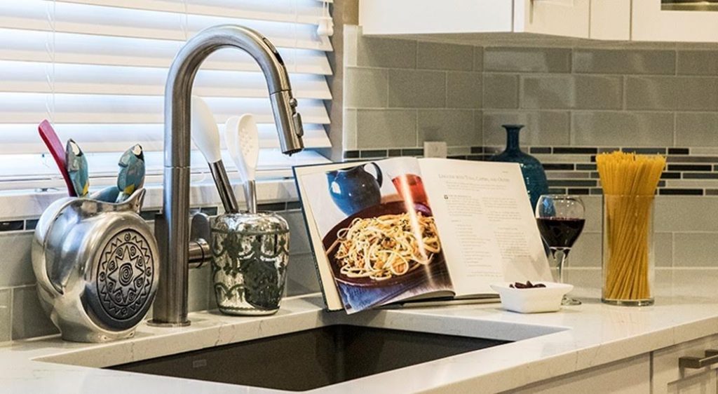
I always say the best projects are great collaborations and that is exactly what we had here.  My client didn't think she knew what she wanted but she really did.  She gave me lots of feedback and clues as to what is most important to her and her family.  The result was an appliance package by Bosch including an induction cooktop, all wood white Shaker style cabinets by Holiday Kitchens and Brendan Donovan Furniture & Cabinet Co., an undermount Silgranit kitchen sink by Blanco and the Beale Touchless Kitchen Faucet by American Standard.  This was the first kitchen I've done using this particular faucet.  In exchange for the faucet, American Standard offered me the opportunity to participate in a really fun project called Style My Faucet.  Designers all over the country played too.  We had fun staging the Beale and got some great shots.  Flowers and veggies had already been beautifully featured so we did pasta! 

"The best advice I can give my clients is to invest in a quality faucet."


Beale Touchless Kitchen Faucet, AmericanStandard,StyleMyFaucet


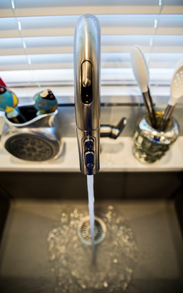
The Beale Touchless Kitchen Faucet was very easy to install,  the battery for the  Selectronic hands-free sensor is conveniently located below in the cabinet.  You can opt to leave it on manual mode too if you prefer.  Just slide the sensor door on the front and you can operate with a wave of your hand.  This is so nice to have when you're preparing things like raw chicken, right? I was also impressed with the Dock-Tite spray head docking system.  It feels really nice and secure.  I've seen faucets that dangle when they're not supposed too.  Yuck.  The best advice I can give to my clients is to invest in a quality faucet.  I will definitely be specifying the Beale again because I am impressed with not only the quality but also the sleek  styling that works so well with contemporary and transitional designs, just like this one.

White Shaker Cabinets,Style My Faucet, Kitchen Design, Kitchen Makeover


There you have it.  It's a wrap.  Drop me a line  at artfulkitchensbyglo@gmail.com and let's get started on your kitchen!

 This is a sponsored blog post.  All editorial content is entirely my own opinions and perspectives.


KBIS2017 Part II- Color Splash!

This is Part II of my KBIS2017 recap.  You can find Part I  here.

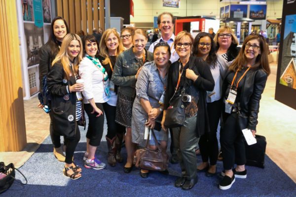
If you've read part one you know that I was off meeting old and new friends earlier this month at our big annual trade show known as KBIS2017.  One of the best perks of being on Modenus Blog Tour is always the people.  What a huge source of friends this whole blog adventure has been for me!  Now back to the trends you need to know. 

BlogTourKBIS, Modenus

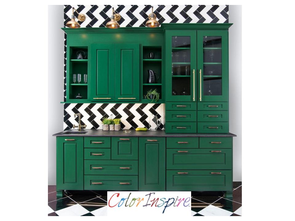
One of the huge trends at the recent Kitchen & Bath Show (KBIS2017)  in Orlando was bold brilliant color. I saw bright color across all product lines including cabinets, appliances and even faucets.  Cabinet Manufacturer Wellborn was no exception.  This vibrant  green was a big hit and showcases their custom color options.   The Color Inspire program offers a broad selection of hues from Sherwin Williams, Benjamin Moore, and Valspar. The possibilities are only limited by your imagination. 


ColorInspireWellborn

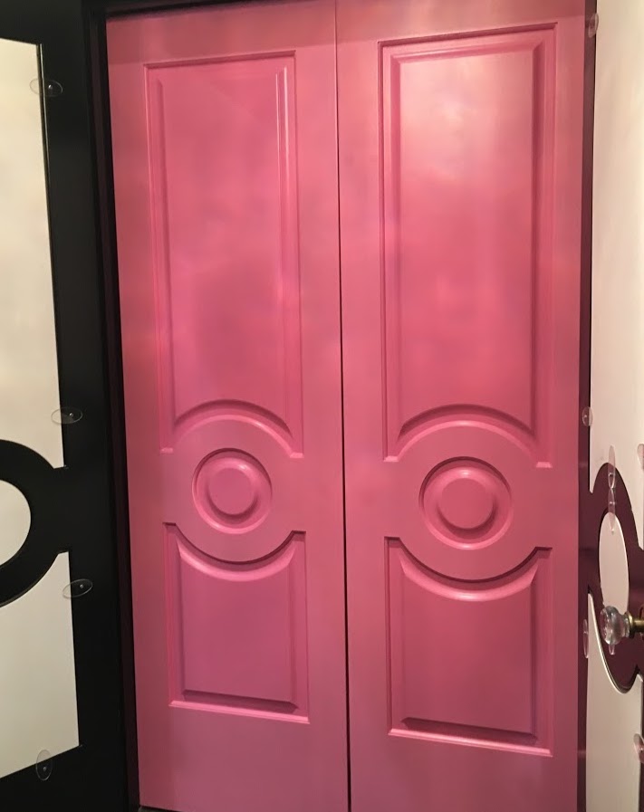
Color was also the star of the show for me at Metrie, North America's largest solid wood and MDF moulding company.  These stunning pink doors are a part of their Then & Now Finishing Collections.  This is actually a great concept that allows you to take a boring space and make it sing with character.  They have curated perfectly coordinated mouldings and interior doors to create "the look".  The styles range from the cutting edge "Fashion Forward", to girly "French Curves", to Minimalism with "Pretty Simple".  There are even a few more.  It's an awesome option for designers as it saves time spent hunting for the right crown to go with the perfect base board etc.  It's a one stop shop for  beautiful millwork and moulding details.

Metrie,KBIS2017,BlogTourKBIS


Just think of the chic "chick pad" you could create with Metrie...and then there were shoes.  I'm sorry my attention wanders sometimes.  Who can blame me for loving these shoes worn by Christine DaCosta aka Glamamama.

Grohe,Essence semi pro faucet, KBIS2017


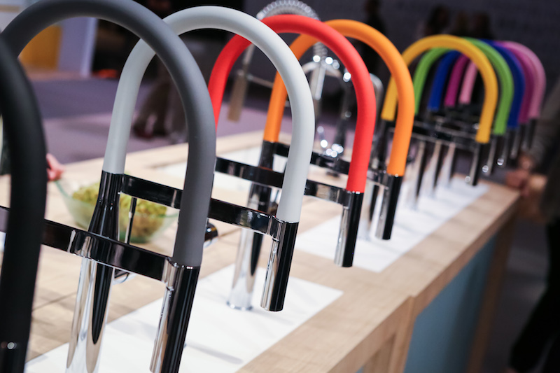
I've got more color!  Check out these faucets by Grohe.  This is the Essence Semi Pro Faucet, available April 2017.  Notice the extended spout for added convenience in the kitchen.  The display is showing limited edition brightly colored silicon hoses. Change your mind, change your faucet, just like a chameleon!

American Standard exhibited this smart faucet that actually measures water for you. Just think, it’s easy, accurate and environmentally friendly.  Turn the dial and you get the perfect amount every time.  So simple. Kudos to the team at American Standard for thinking of it.  Speaking of good ideas, what could be better than a self cleaning toilet? The ActiClean toilet features a turbo type flush system that they call VorMax, with a fully integrated self-cleaning system. The CleanCurveRim omits that rim cavity and holes inside the bowl where dirt gets trapped and EverClean antimicrobial surface helps everything stay clean longer.  Egaads!! I'm just the messenger but it's a good thing.  I'm all for minimal toilet cleaning time.

Modulus, DXV,KBIS2017,BlogTourKBIS


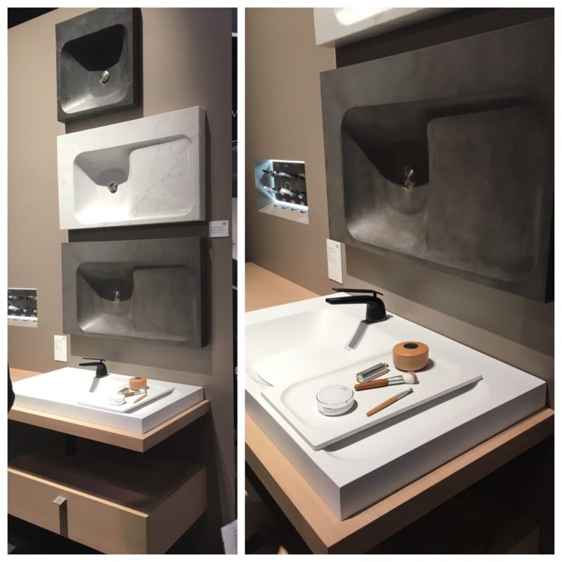
Another American Standard company, the luxury line DXV showed their Modulus line for the bath.  I loved the sensuous sculptural line of these vanity tops BUT how cool is this tray? it fits perfectly on the top and then tucks away in it’s own spot underneath when you’re done. Voilá!

   Guess what folks? I've got more. Stay tuned for KBIS III -Just a hint, it has to do with rhino poop and a surprise in the shower (but not together)

L                   

Kitchen Design 2017- What's Next?

Fashion is a fickle phenomena.  What's in today quickly morphs into the the next new sensation.  It doesn't matter if it's clothes or cabinets.  Granted, interior trends are slower to transition but it works the same way.


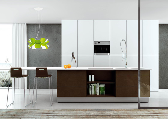
Infiore Flower Light


Lately I've been giving a lot of thought to the huge love affair with contemporary design.  The pendulum is deep into the greys, floating shelves, waterfall counters, clean lines, simplicity, slab style cabinet doors or wide stile and rail shaker fronts. Don't get me wrong, I love it and I think it's going to be many years before these looks  become "outdated." If you've followed my advice in the past, you know I believe in designing to the structure.  If you follow the styling and architecture of your home when designing your cabinetry your kitchen will never be dated.  Then, of course, you have to have what you LOVE!  That is numero uno.


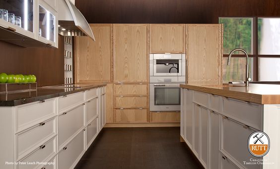
Rutt Cabinetry, Prairie Series


But what's next?  As sure as the sun rises the pendulum will eventually swing the other way and when it does it's going to be in a completely new direction.  I just can't see us going back to the traditional looks of the past with glazes, heavy molding etc.  Will the pendulum swing back to Traditional territory and what will the new Traditional look like? What's next on the horizon? “We are all familiar with consumers’ constant desire to see something new, yet they still want, in many cases, to have somewhat of a familiar comfort level,” said  Leatrice (Lee) Eiseman – executive director of the Pantone Color Institute. I think she's right.  We want fresh and new but we want to feel a connection to qualities we've enjoyed in the past. This kitchen by Rutt HandCrafted Cabinetry has got me thinking about what a "new Traditional" would look like.


Clean lines continue but now soft elegant detail makes an appearance


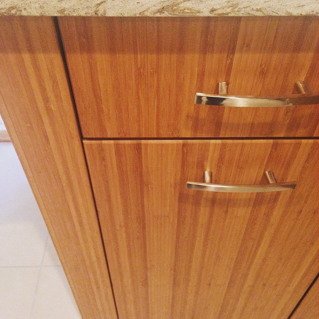
Darryl Minch, manufacturer's rep with the Baronet Group International, Inc., says "I'm seeing less extreme contrasts of color in the kitchen, think softer palettes , white and off -whites used in the same space".  My own prediction is that we will see a big resurgence of natural wood finishes.  I see hints of this all over.  For quite a while white painted finishes and dark espresso stains have ruled.  Neither shows the beauty of wood grain.  Textured laminates round out the top choices at the moment but how about the real deal?

bamboo cabinets, bookmatched, Brendan Donovan


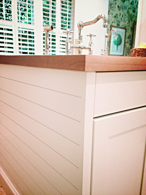
Take your paneling in a different direction.  If you have an island in your plan, chances are you're going to need some paneling to tie it all together.  Take the traditional vertical beadboard and turn it for a "new traditional" effect. I'm loving this option for a coastal look as it's reminiscent of ship lap.  I started to use this design detail in my projects and now I'm seeing it more and more.


shiplap paneling, BrendanDonovan


If you're a design lover or savvy pro I'd love to hear your predictions for kitchen and bath design 2017.