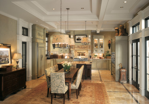
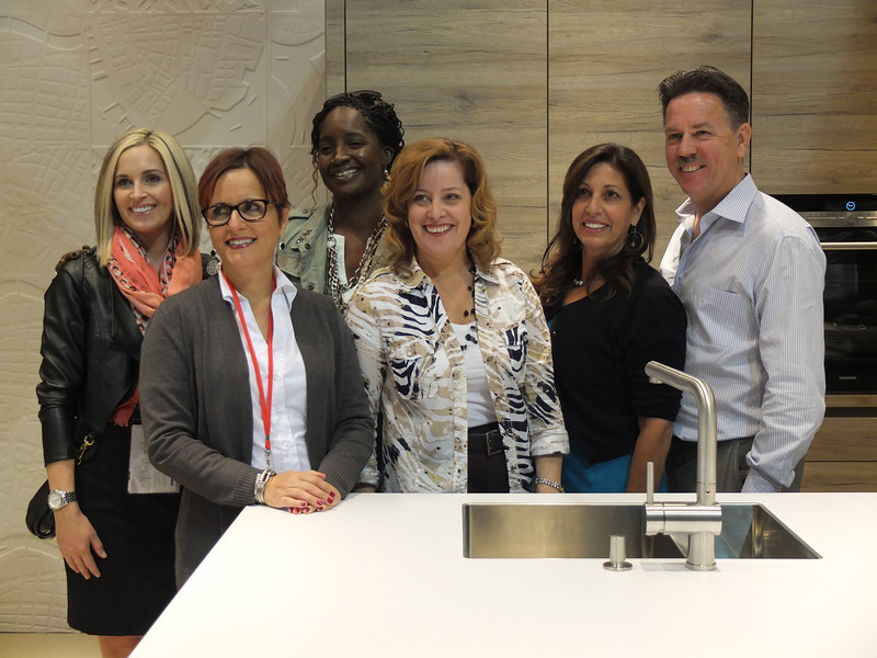
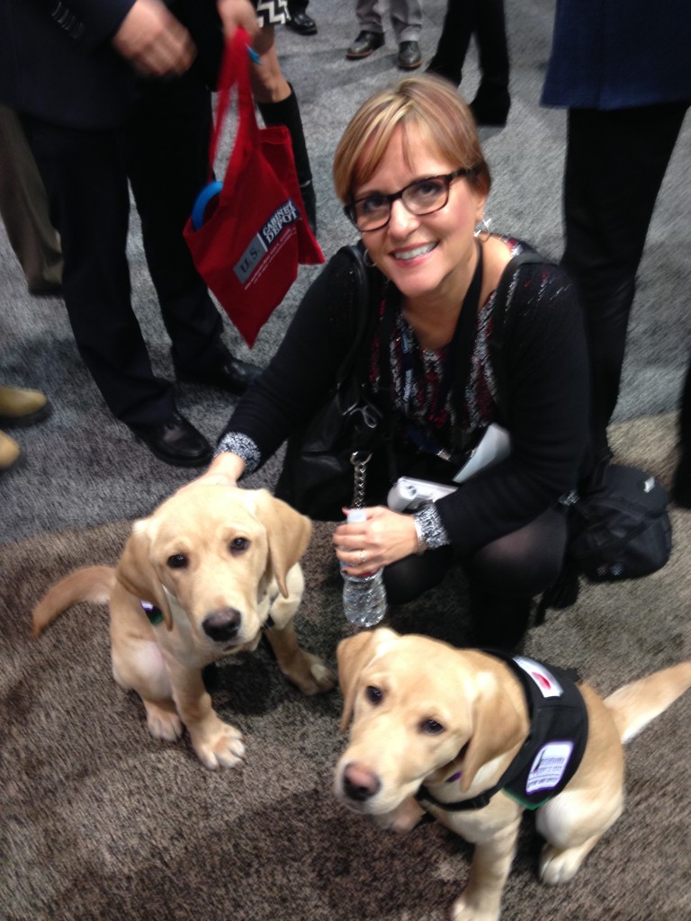
If you've spent any time researching cabinets for your new kitchen or bath you've probably come across then name Wood-Mode. It's the nation’s largest manufacturer of custom cabinetry for kitchens, baths and other rooms throughout the home and they've been around for 42 years. I learned that Wood-Mode has great name recognition in the industry for good reason. Their booth at KBIS was impressive and fun! Four yellow Lab pups were on hand to demonstrate one of their lifestyle concepts, The Pet Parlor.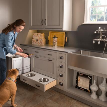 There's a place for everything from food storage, food bowls, bathing and more. Great idea, yes? To highlight it Wood-Mode had the most interesting gig going at the show. For all selfies posted with the dogs they donated $5 to the Susquehanna Service Dogs. This will be an ongoing partnership. They call it a PAWSitive partnership. You can read more about it here.
 Wood-Mode's newest lifestyle concept, Oceanside, is right after my own heart. This coastal style is a modern fresh mix of contemporary and transitional. The subtle aqua and sandy shades of beige are on point. The Oceanside approach includes a very open plan with efficient hidden storage. I see this as a reflection of the trends I saw in Italy last year, fewer or no upper cabinets but high function tall cabinets instead. The combination of materials and finishes add lots of visual interest.
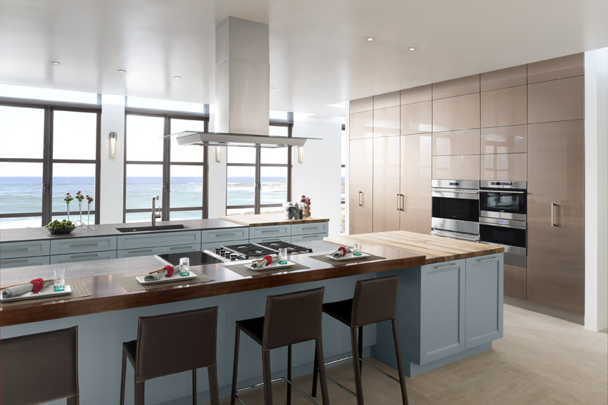 With over 200 doors to choose from as well as furniture finishing techniques and options for built-in storage, Wood-Mode can create the perfect solution for your lifestyle, whether is be Coastal, pet-perfect or both!
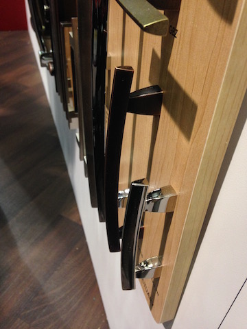 If you're going to be needing cabinets, you're also going to need to get into them. That's where Top Knobs comes in. Another brand with great name recognition, TopKnobs specializes in fine decorative hardware for the kitchen and bath. You can tell the quality of a cabinet knob or handle by the weighty feel of it and I have always noticed that about TopKnobs products. The other important thing the finish which they guarantee for life!
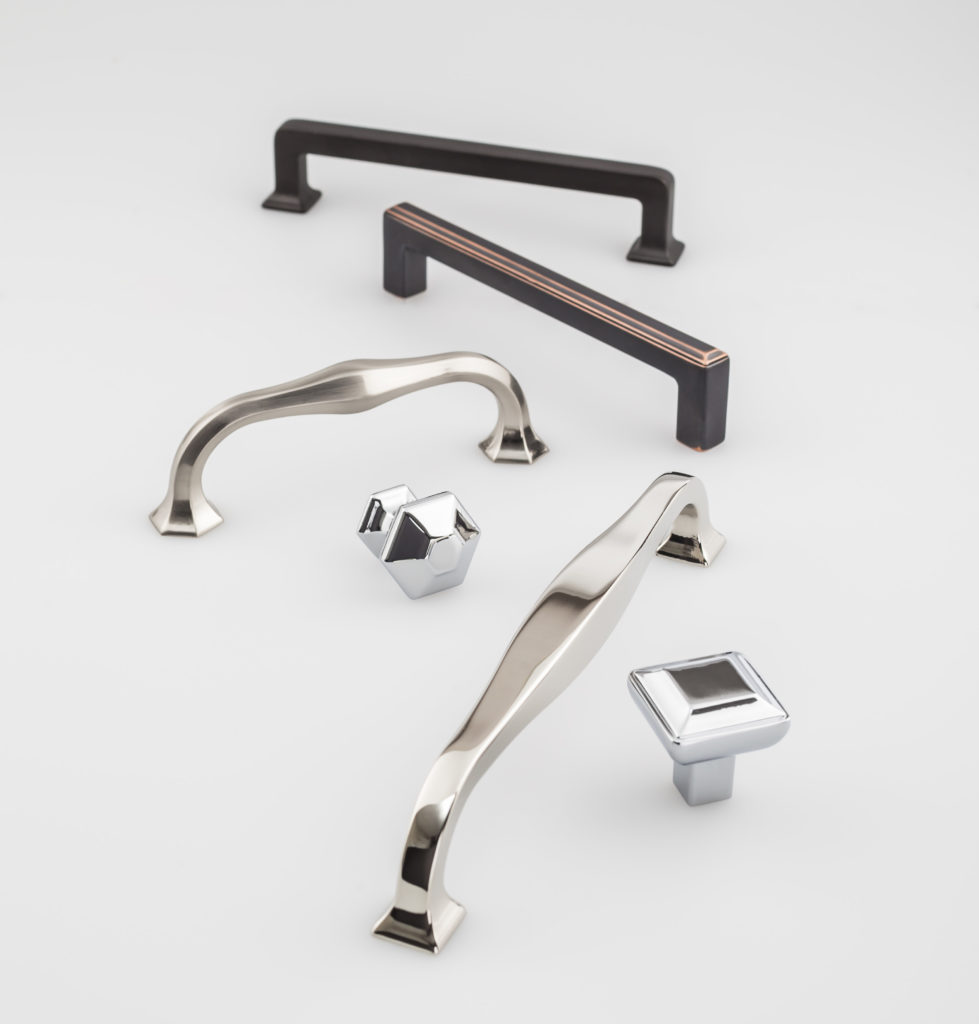 They introduced the Transcend Collection at KBIS. This includes the Podium, Ascendra and Contour Series which come in Brushed Satin Nickel, Polished Chrome, Polished Nickel, Sable and Umbrio.
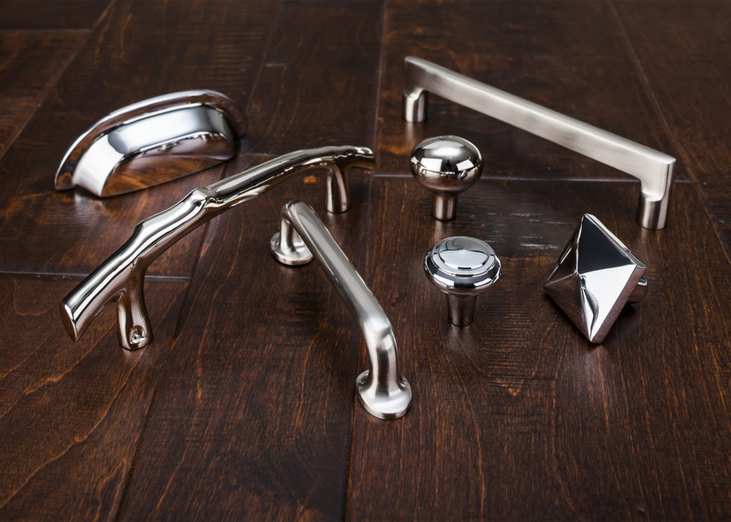 Also new at the show was Aspen II in three finishes, Polished Chrome, Polished Nickel and Brushed Satin Nickel. “The Aspen II collection combines old-world shape and style with contemporary finishes,” states Christine Zimmer, product manager for Top Knobs. “They bring to the market a unique look that designers can use in transitional spaces. Made with solid castings of artisan grade bronze, you can feel the quality of Aspen II in the palm of your hand.”With Wood-Mode and Top Knobs your dream kitchen can come to life!
The Ultimate Designer Kitchen
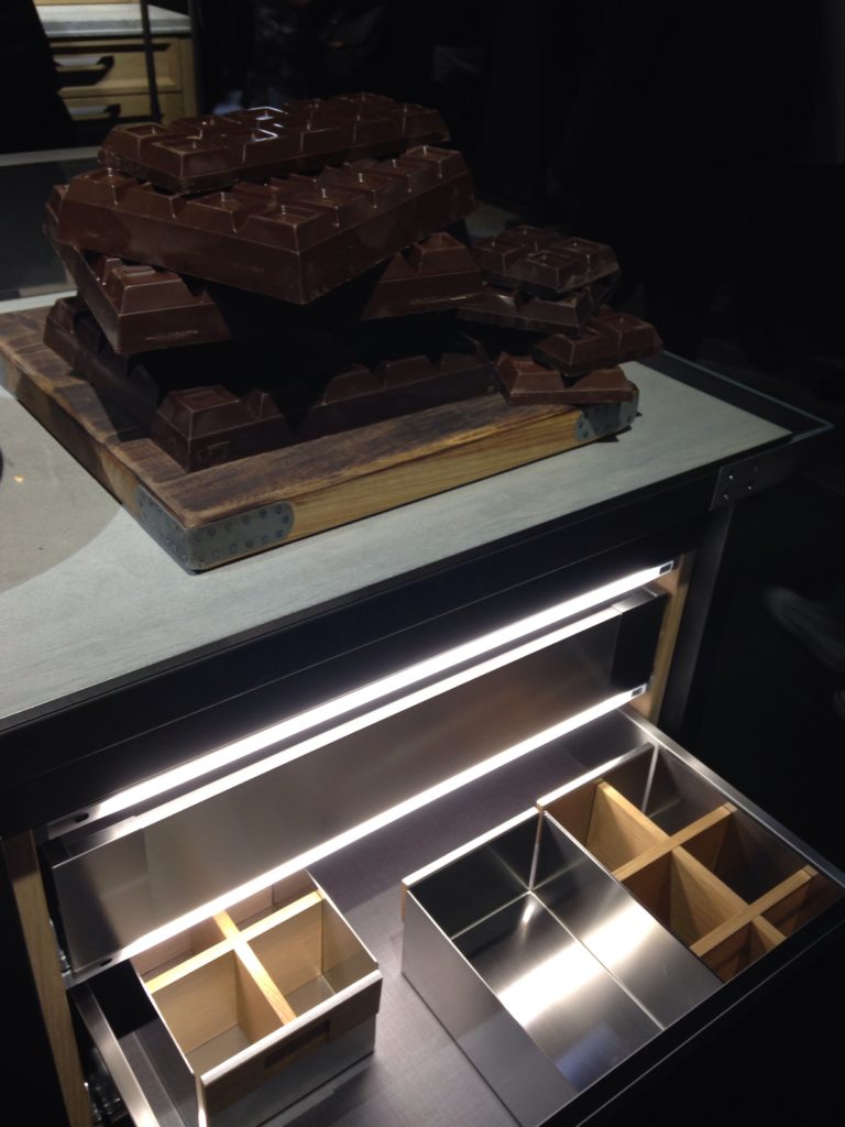
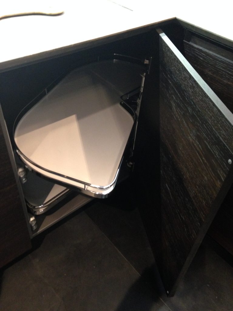
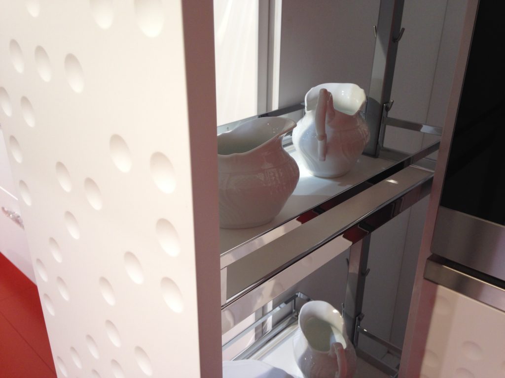
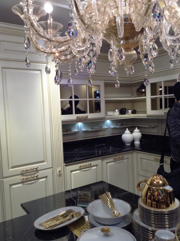
What do a luxurious high-end handbag and a kitchen have in common? Give up? Fendi! One of the most impressive exhibits I viewed earlier this year at EuroCucina in Milan was the one featuring Fendi. As you can imagine, a show like EuroCucina (a part of the even larger Salone Internazionale del Mobile) encompasses pretty much everything you could ever think of when it comes to kitchen design. Not only that, I saw things I've never imagined in my wildest dreams! The Fendi's Casa Ambiente Cucina line fits squarely in that category.  Styling can be described as elegant and sophisticated with details that call to mind to a fancy buckle or luxurious lining on your favorite expensive bag. Speaking of linings, I was impressed with the cabinet interiors too. In this case beauty isn't only skin deep it extends to what's inside. This includes clear (yes CLEAR) roll outs and LED illumination which activates when you open the door or drawer.
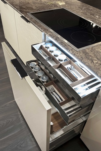 Fendi Kitchens made its debut at Salone two years ago with its first line of kitchen designs known as Ambienta Cucina, produced for them by SCIC, a high-end Italian kitchen manufacturer.
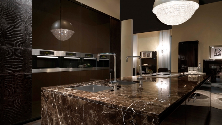 The Fendi exhibit was kept strictly under wraps, no peeking from outside and once you were cleared to enter photography was verboten! Big burly bouncer type guys were on hand to enforce the no pic policy. Sadly I witnessed one enthusiastic viewer caught in the act. She was made to show her phone and delete all photos in presence of bouncer! I thought the whole point of showing at a trade show was to garner publicity, no?
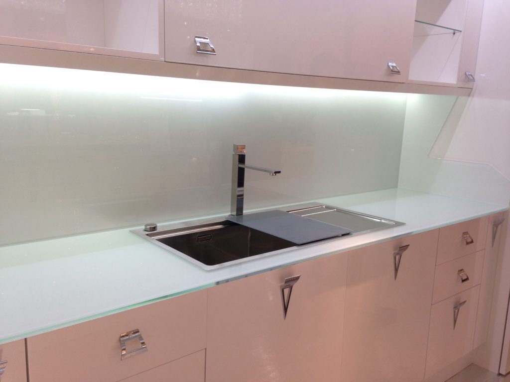 Fendi Casa Ambiente Cucina can be ordered in the U.S. exclusively through the Luxury Living Group in Los Angeles, Miami, and New York. Their offerings are truly a marriage of quality and fine design
  Check out Kitchens for Living On the Road to view all my pics and comments from Eurocucina 2014 and more!
The New English Kitchen
A bazillion years ago (circa 1994) when I first began my adventure in this business, the “English Kitchen” was all the rage in the high end market. I learned to design, by hand, in metric and things like astragal mouldings (yes moUldings with a “u”) were all the rage. Distressed, fly specked finishes were hot and no one wanted a white kitchen unless it was encrusted with glazing. I learned the English style by apprenticing with a true Englishman and gentleman who I shall be forever grateful to.
Those kitchens looked something like these photos from Houzz.com. Back in those days I did not work for a top notch custom shop like Brendan Donovan's. I worked for a top notch cabinet dealer so we actually imported this type of cabinetry from the UK. This came with its own set of challenges, to say the least. Just think of how long it would take to get a parts order and how expensive it was to transport! Charming and beautiful in their own way, these kitchens are full of detail and working on something like this was good training ground for a budding kitchen designer such as myself. That was then. 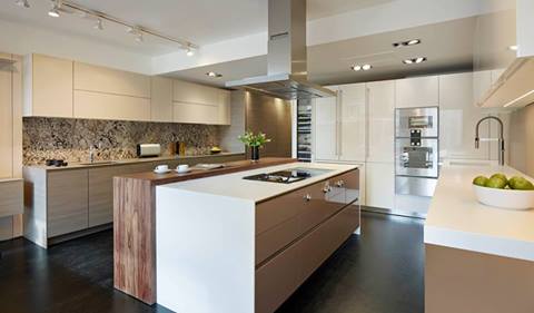 This is now.
 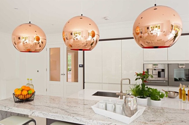 Today ground zero for the latest in high end kitchen design in London is located in the West End, in and around Wigmore Street. It's home to exclusive brands such as Bulthaup, Poggenpohl and the Nicholas Anthony showroom featuring the latest by SieMatic.
  The new English style is exactly that, new! Cleaner more modern design utilizing the latest technologies are now the order of the day. With the advent of the internet I believe it really is a small world. Ideas and trends fly over the web at the speed of light. We all influence each other cross pollinating our designs but there is still an appeal in wanting what the other peeps have. Many of us here want the new, slick, Euro styled kitchen and, dare I say, many Euros and Brits are amazed at our American sized appliances, namely the quintessential 36” refrigerator!
 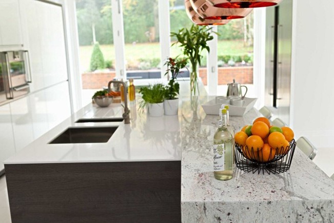 I feel the advances in technology when it comes to laminates and counter top material lend themselves to these new clean- lined looks. Decorative detail is found in interesting wood grains and the random markings of stone rather than from moldings and corbels. So what do you think? Are you yearning for the "olde world" look again? Do you think it's coming back or are we here to stay for the time being?
Kitchen Love, Italian Style at Acheo and Poggenpohl
Ok so you got me, Poggenpohl is not Italian. They are German, except when they're in Milan, then they're Italian. Good enough? I can hardly believe I’ve been home for over a week! Images and impressions are still swirling around in my head from the wonderful time I spent with Blanco and some fellow members of the Blanco Design Council in Milan. Design Week was not limited to the extensive exhibition at the Rho Fairgrounds but also included events all over town. We visited two memorable and cutting edge showrooms on our visit. 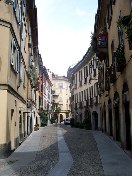 The first was Acheo (pronounced AH-kee-oh), located in the Brera district. Brera is also known today as the design district. It is also one of the few really old areas of Milan which saw 80% destruction during WWII. Acheo opened it’s showroom there in 2010. Today they are a showcase of quintessential contemporary Italian design for the kitchen.
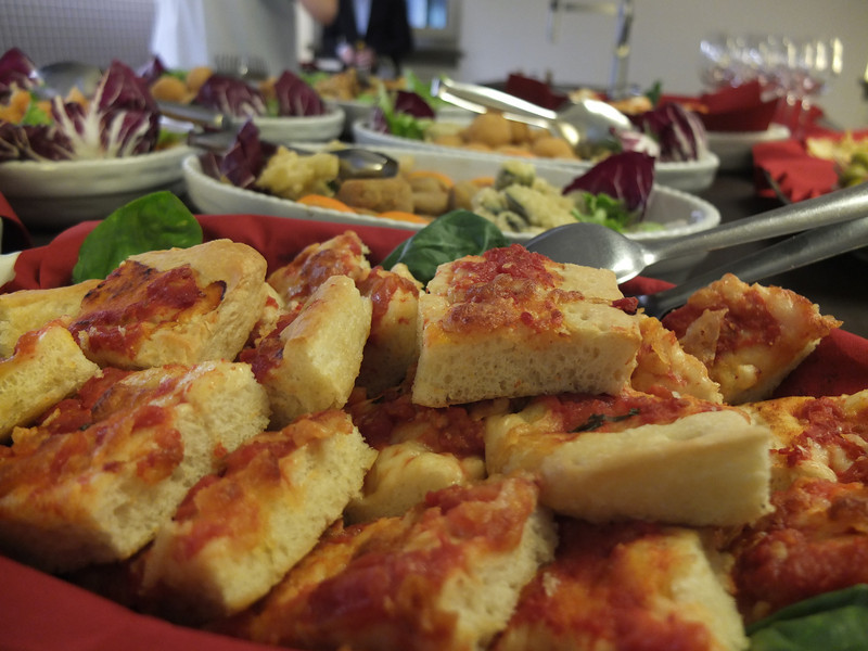
 They put on an impressive pre-dinner spread for us and the peeps from Modenus Blogtour Milan.
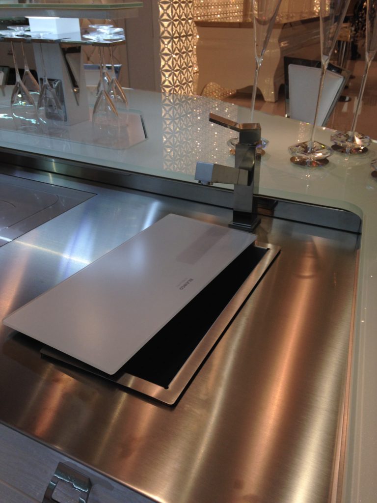
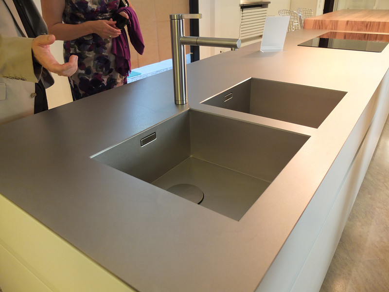
 All through our trip we saw many products not available here in the US. Some will become available, perhaps in other versions. One such item is this Durinox work top and sink (below) which is a part of the Blanco Steel Art collection. Think stainless steel on steroids!! Seriously, it is made with a finishing process used in the auto and aerospace industries so it is super scratch resistant and more than twice as hard as stainless steel. It is available, as shown, in Europe from Blanco in Germany. The sinks only will be available for undermount installation here in the US.
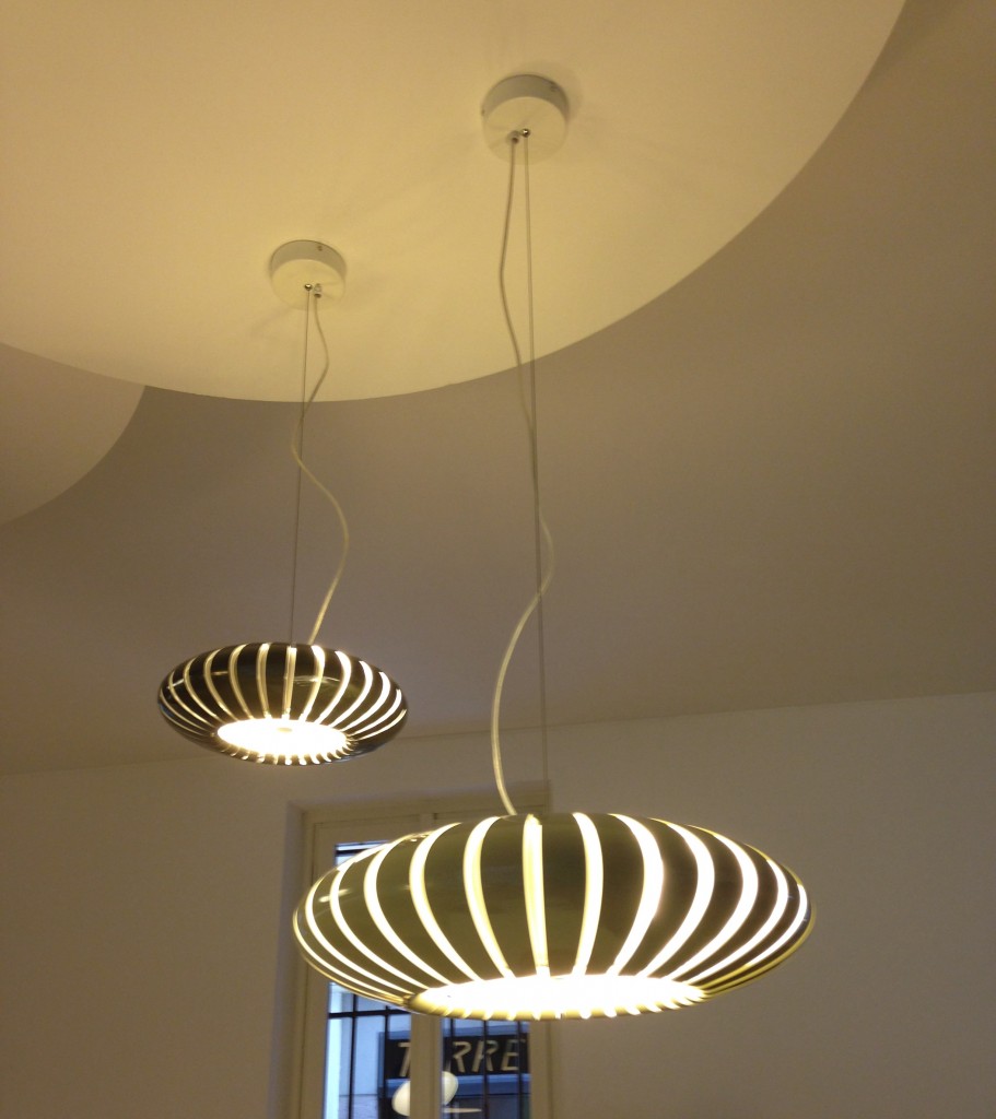
 We found that in Milan you could miss half the experience if you failed to look up! Look at these cool light fixtures at Acheo!
 The other showroom we had the pleasure of visiting during our visit was Poggenpohl. I think you could argue that they set the bar when it comes to innovation in contemporary cabinet design. As I mentioned, Poggenpohl is a German company and they claim to be the oldest kitchen brand in the world!
 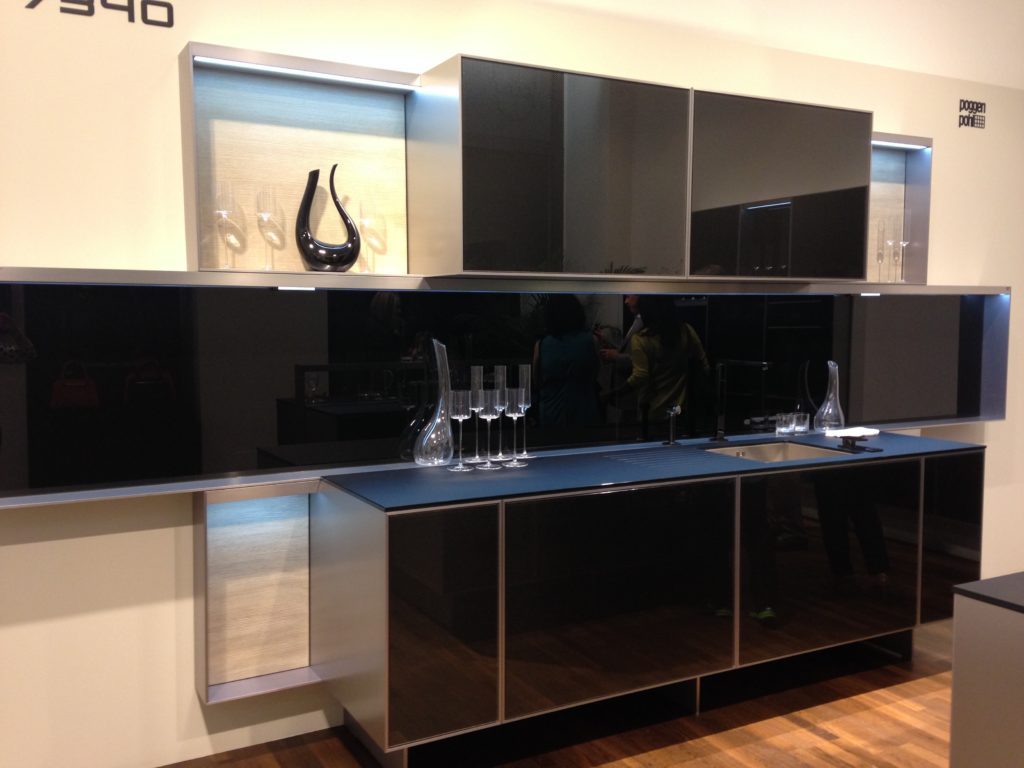 Some years ago Poggenpohl teamed up with the Porsche Design Studio to develop the P'7340 line of cabinets. Both companies focus their concentration on the overall line as well as providing unsurpassed quality of product. Above is a Porsche Design Kitchen P'7340 by Poggenpohl. It's hallmark is the aluminum frame which surrounds each box. Originally designed with men in mind, it has evolved into a brand appealing to discerning contemporary design devotees of either sex. Chief Poggenpohl designer Manfred Junker was on hand to explain the intricacies of design detail that go into the product including their trademark, no handle, fronts. In fact, he claims, they are the first to offer touch control on the refrigerator and dishwasher. Here's what they have to say about that on their website: "Handleless fronts emphasize the clean, uncompromised lines of the kitchen furniture."
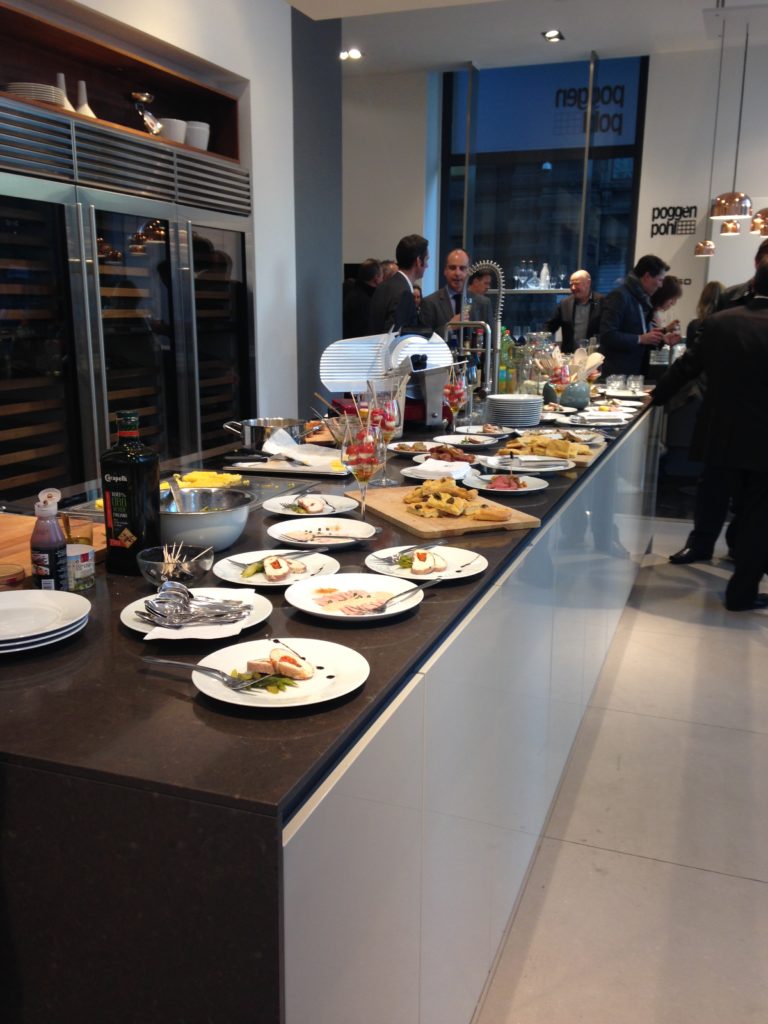
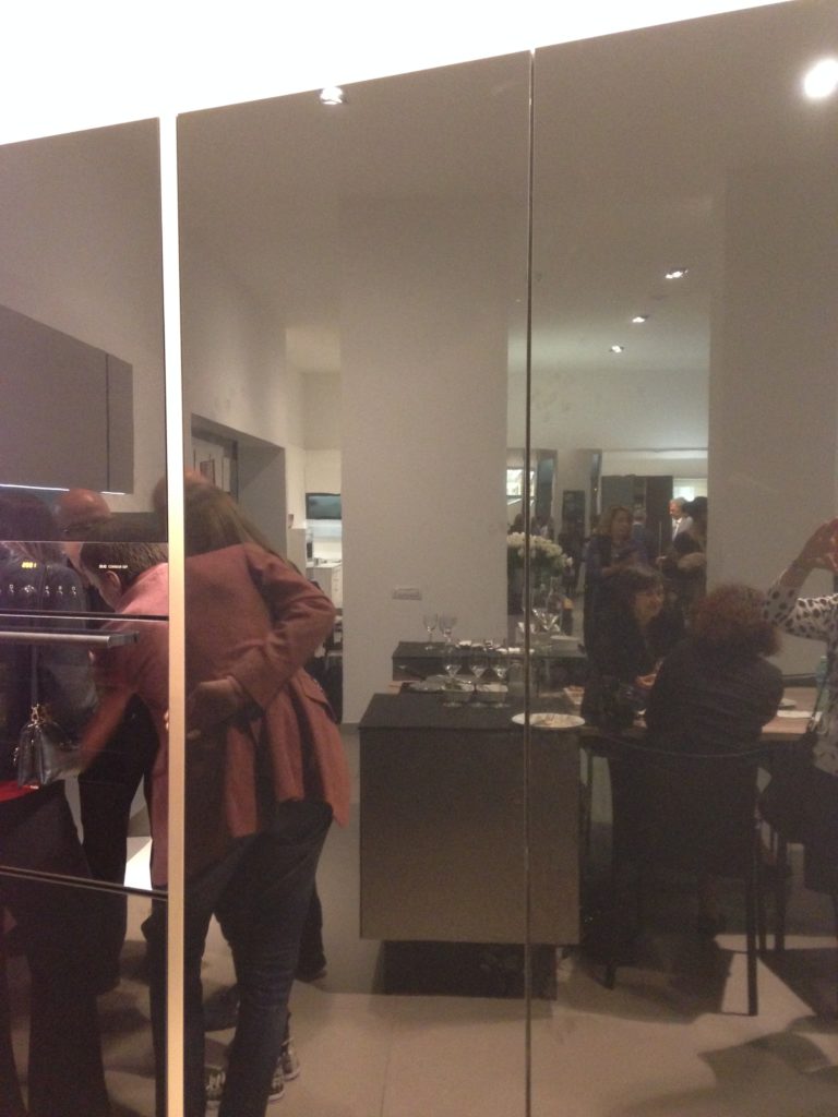 Poggenpohl took care of our tummies too. After all, design spotting can work up one hell of an appetite!
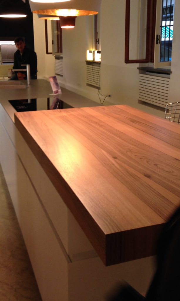
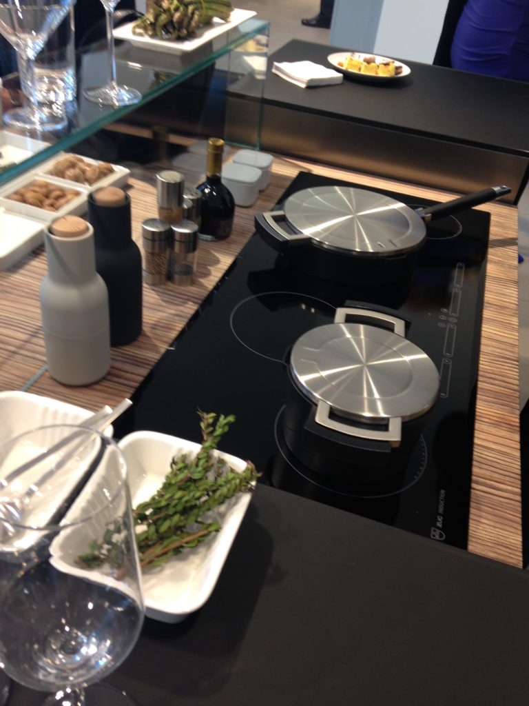
 This newest version of P'7340 (see below) features a contrasting counter top inset made of solid New Zealand pine with a wire brushed finish.
 Next up: FTK (Technology for the Kitchen) This was the section of iSaloni featuring the latest trends and products in kitchen appliances.Click here for a peek at all my Milan photos!own and automatically completes the closing cycle
Euro Cucina 2014
I'm home and just about recovered from my jet lag. All pics are up for your perusal. It was a fabulous trip and my heartfelt gratitude goes out to the golden peeps at Blanco, including travel mate Christy Emens as well as Lori Dolnick of Frank Advertising. I was honored to be included with fellow bloggers Marilyn Russell (DesignMagnifique), Kelly Morisseau (KellyMorisseau.com) and Grace & Ken Kelly of (kitchendesigns.com). Having been to many trade shows in the US over the years, I've always wanted to experience the bigger, global picture. Now I have and it was amazing.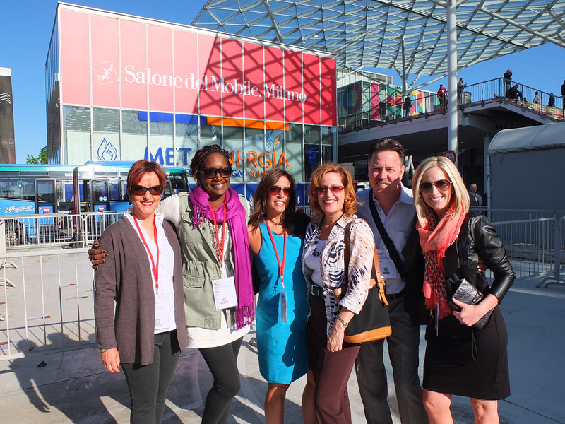 I arrived on Monday morning ready to explore. Lori and I took a stroll and stumbled upon a delicious lunch and a very cool design museum but first things first. I'm dying to tell you about all the products and trends I saw at the big show. Euro Cucina only comes along every two years as a part of the Salone del Mobile. Milano. There is also a whole section devoted to the bath called Salone Internazionale del Bagno. Kitchen gadgets and appliances are shown in the FTK section. I did a pretty good job of covering those but I estimate that was only about 20% of the entire show, the rest being furniture and other aspects of design. Here's what caught my eye.
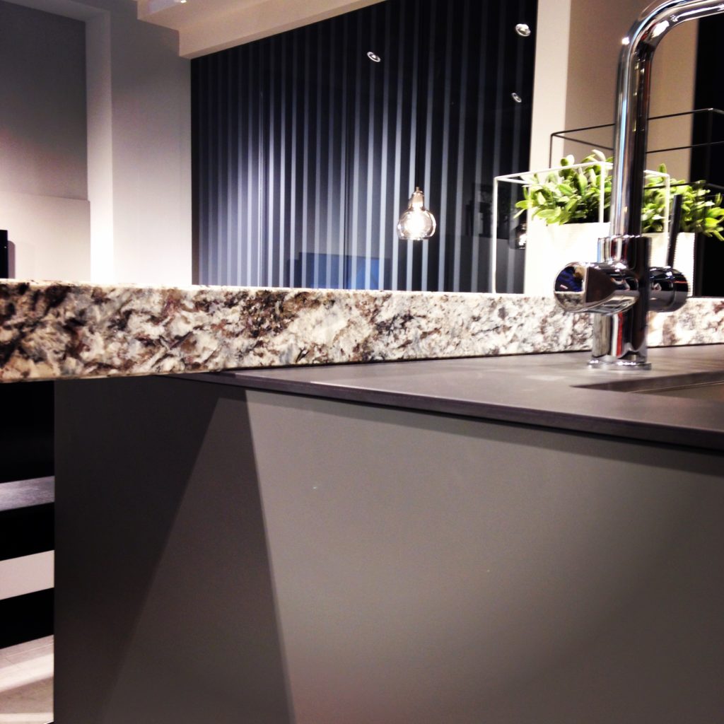
Counter tops were either very thin or chunky, like 1/2" for the thin and 3" for the chunky. I saw a lot of mixing of materials, in fact, that was probably the one biggest trend I saw for both counter tops and cabinets. It is also one that can easily be adapted to our US market. Counter top materials are much more adventurous than the usual granite or quartz that we are used to here. I saw wood, Corian, recycled composite material and more. The overlapping installation here was also quite common. The kitchen sink saw some new innovations including lots of accessories and different methods of installation. The inset style above, by Blanco, is factory installed by Leicht for a perfect fit. This particular one is not available to us in the US but we can get the Precision model with the distinctive square corner interior for undermount applications.
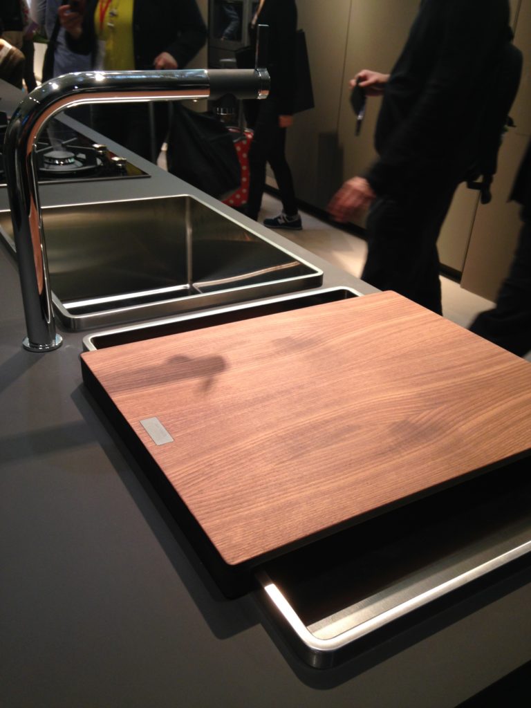
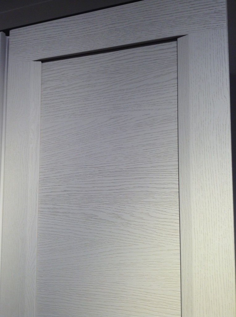
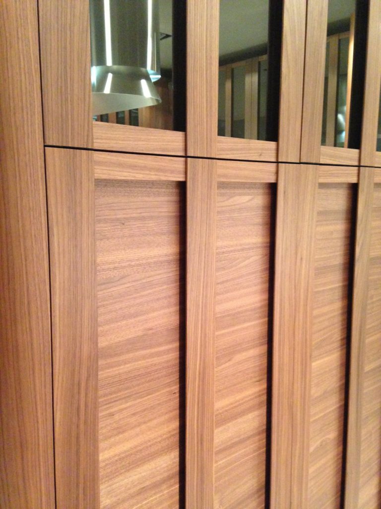 Cabinets featured lots of defined graining in woods such as white oak, rosewood and walnut in both horizontal and vertical directions, sometimes on the same door. I also saw some interesting variations on the popular slab and Shaker silhouettes.
 This is just the first in a series of posts about Milan and Salone Internazionale del Mobile. Upcoming posts will include our visits to Acheo and Poggenpohl showrooms and much more. So what do you think of these kitchen trends so far? I think some will make it over the pond but you can always know that whatever we do, we'll do it with an Americano twist. More later :)Click here for a peek at all my Milan photos!
Cabinet Doors + Art=Maple Craft Doors
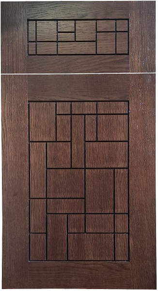
One of the benefits of working for a custom cabinet shop like Brendan Donovan Furniture & Cabinet Co. is OPTIONS! Many of the projects I work on are combinations of both manufactured and custom cabinets. We can order it. We can make it all (including doors) or we can make the cabinet boxes and order the doors. Speaking of doors, how about these doors?!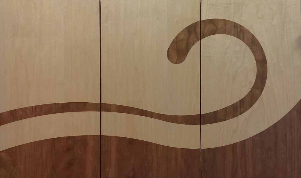 If you know me you know I’m drawn to anything different, quirky, off the beaten path. I think these cabinet fronts by Maple Craft Doors fit the bill. They’re definitely at the higher end of the price spectrum but consider this: you don’t have to use them for the whole kitchen. In fact because they’re so striking less is actually more.Frank Dyck, Administrator/Sales at Maple Craft had this to say about these uber cool doors (MY COMMENTS INSERTED IN CAPS):


