I've heard the saying " it's hip to be square" but that’s not always true, sometimes curvaceous qualifies. Here are three of my fave new products that sport some cool contours and are far from square. 
 Sometimes just the slightest suggestion of a curve is enough to soften a silhouette. This beautiful faucet by THG Paris is available in, get this, 35 finishes! The French excel when it comes to subtly, oui?
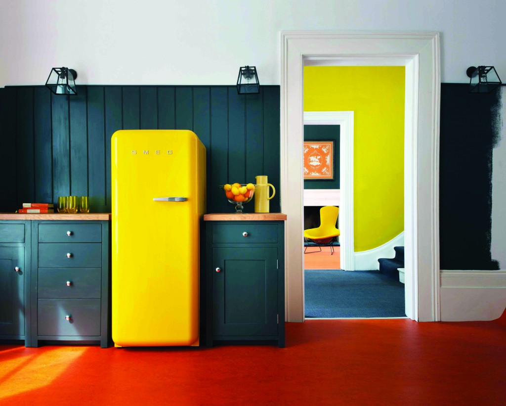 This is what you would call a "statement refrigerator"! Smeg is an Italian company largely known for these cool retro-style fridges. The other new colors just introduced are white and a highly anticipated Union Jack pattern (who knew?). The soft rounded corners are all about the 1950s. The 9.22 cubic foot capacity is a little more Euro than American but who can resist those sinuous lines and vibrant colors combined with cutting-edge technology?
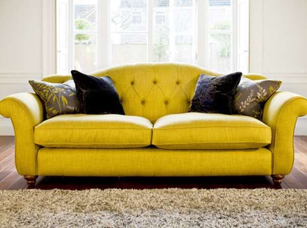 I even found you a sofa to partner with your new yellow Smeg :) Not bad, I must say. Last but in no way least is Infiore by Estiluz. It's a beautiful stylized flower sculpture masquerading as a lamp. This one is a pendant but it also comes as a floor or table lamp. The petals are available in different colors and sport a collection of bi-injected polycarbonate petals. I have no idea what that means but I do know it means the lamps feature an interesting two-color lighting effect. These are available at LightingbyGregory.com
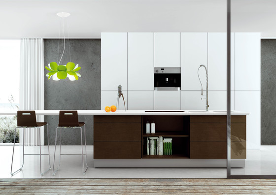 The organic curves of Infiore add a whimsical softness to this very linear contemporary kitchen (which I love) The larger-than-life scale also makes these flowers fun! I rest my case, curves are a beautiful thing ;)
Kitchen Love, Italian Style at Acheo and Poggenpohl
Ok so you got me, Poggenpohl is not Italian. They are German, except when they're in Milan, then they're Italian. Good enough? I can hardly believe I’ve been home for over a week! Images and impressions are still swirling around in my head from the wonderful time I spent with Blanco and some fellow members of the Blanco Design Council in Milan. Design Week was not limited to the extensive exhibition at the Rho Fairgrounds but also included events all over town. We visited two memorable and cutting edge showrooms on our visit. 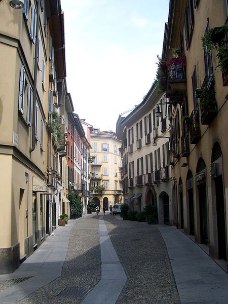 The first was Acheo (pronounced AH-kee-oh), located in the Brera district. Brera is also known today as the design district. It is also one of the few really old areas of Milan which saw 80% destruction during WWII. Acheo opened it’s showroom there in 2010. Today they are a showcase of quintessential contemporary Italian design for the kitchen.
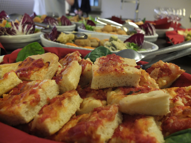
 They put on an impressive pre-dinner spread for us and the peeps from Modenus Blogtour Milan.
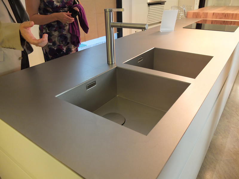
 All through our trip we saw many products not available here in the US. Some will become available, perhaps in other versions. One such item is this Durinox work top and sink (below) which is a part of the Blanco Steel Art collection. Think stainless steel on steroids!! Seriously, it is made with a finishing process used in the auto and aerospace industries so it is super scratch resistant and more than twice as hard as stainless steel. It is available, as shown, in Europe from Blanco in Germany. The sinks only will be available for undermount installation here in the US.
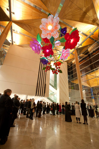
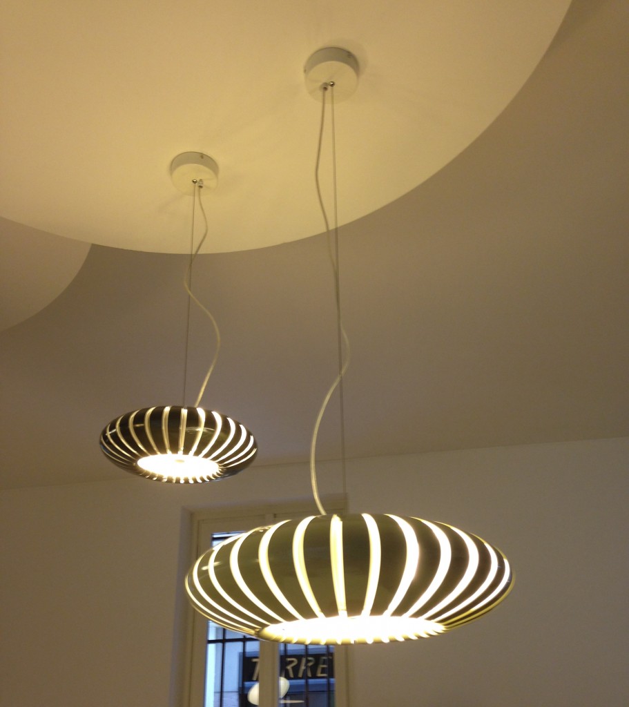
 We found that in Milan you could miss half the experience if you failed to look up! Look at these cool light fixtures at Acheo!
 The other showroom we had the pleasure of visiting during our visit was Poggenpohl. I think you could argue that they set the bar when it comes to innovation in contemporary cabinet design. As I mentioned, Poggenpohl is a German company and they claim to be the oldest kitchen brand in the world!
 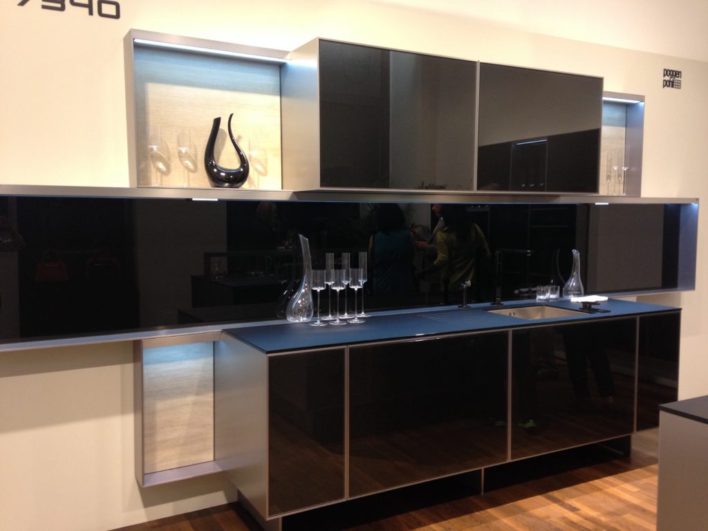 Some years ago Poggenpohl teamed up with the Porsche Design Studio to develop the P'7340 line of cabinets. Both companies focus their concentration on the overall line as well as providing unsurpassed quality of product. Above is a Porsche Design Kitchen P'7340 by Poggenpohl. It's hallmark is the aluminum frame which surrounds each box. Originally designed with men in mind, it has evolved into a brand appealing to discerning contemporary design devotees of either sex. Chief Poggenpohl designer Manfred Junker was on hand to explain the intricacies of design detail that go into the product including their trademark, no handle, fronts. In fact, he claims, they are the first to offer touch control on the refrigerator and dishwasher. Here's what they have to say about that on their website: "Handleless fronts emphasize the clean, uncompromised lines of the kitchen furniture."
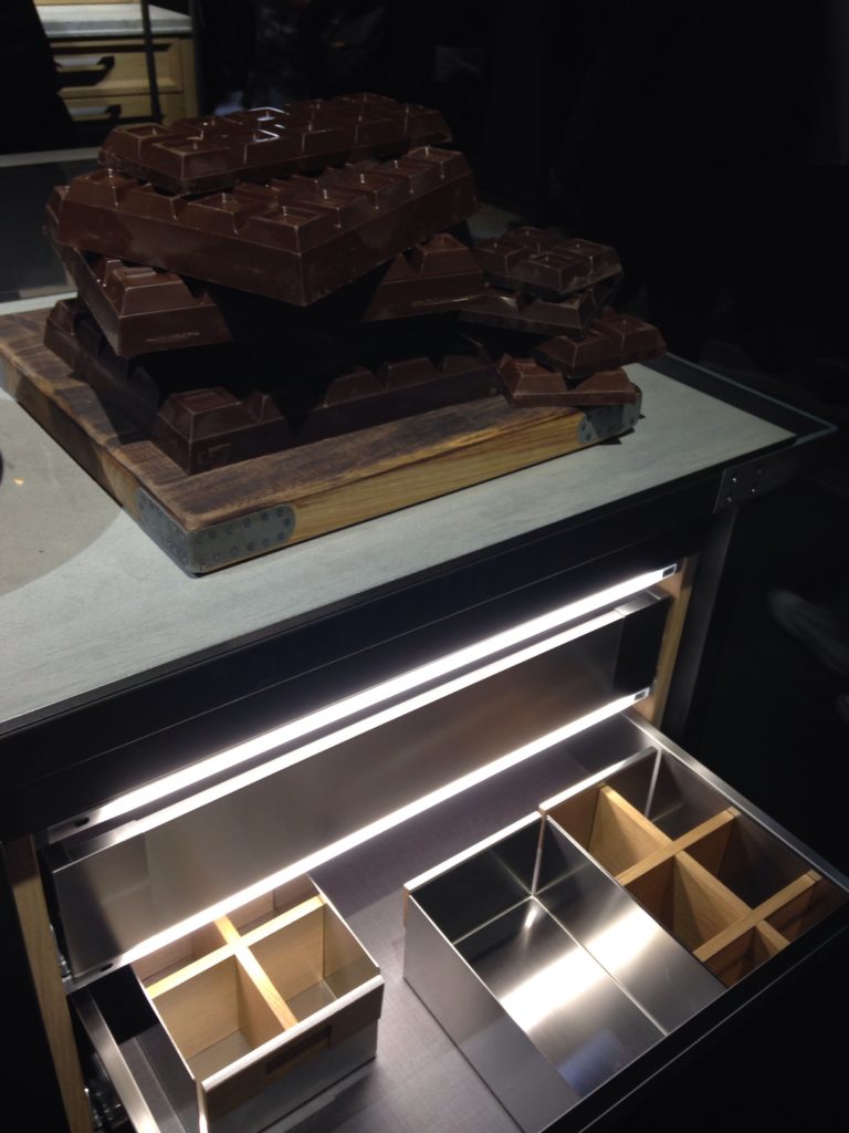
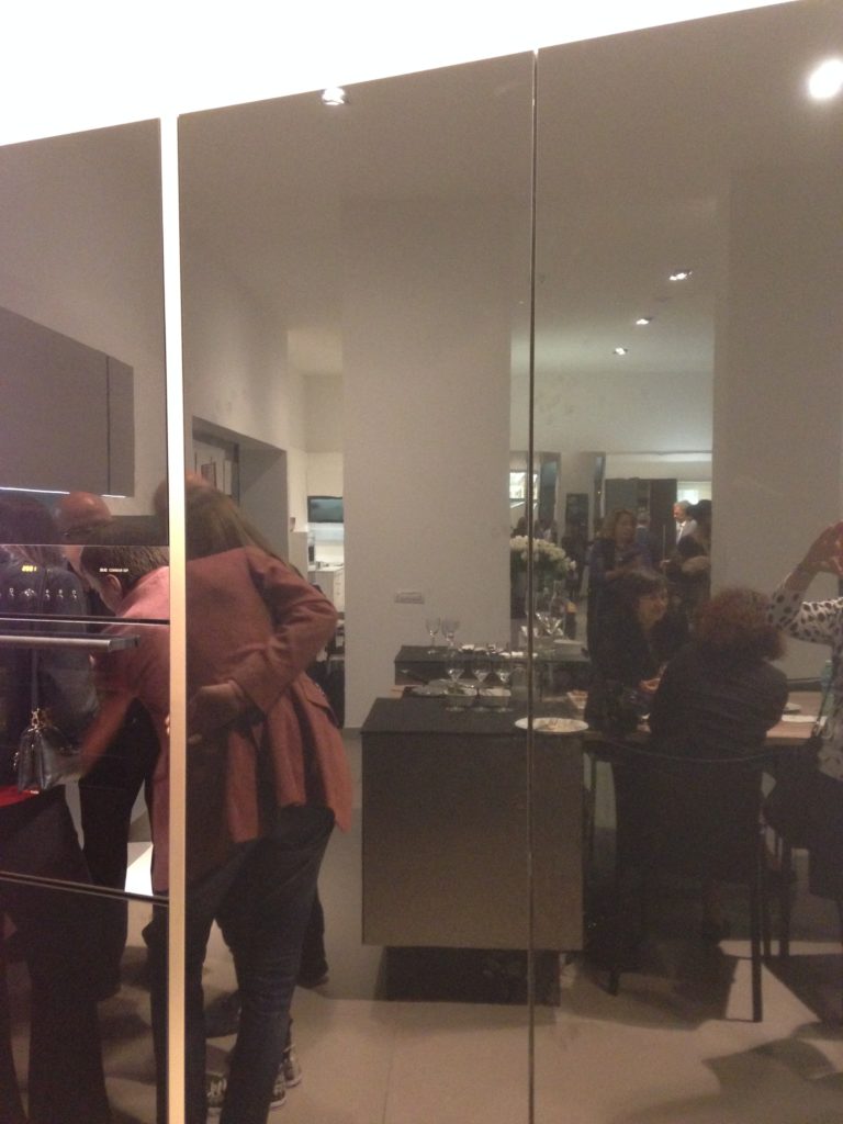 Poggenpohl took care of our tummies too. After all, design spotting can work up one hell of an appetite!
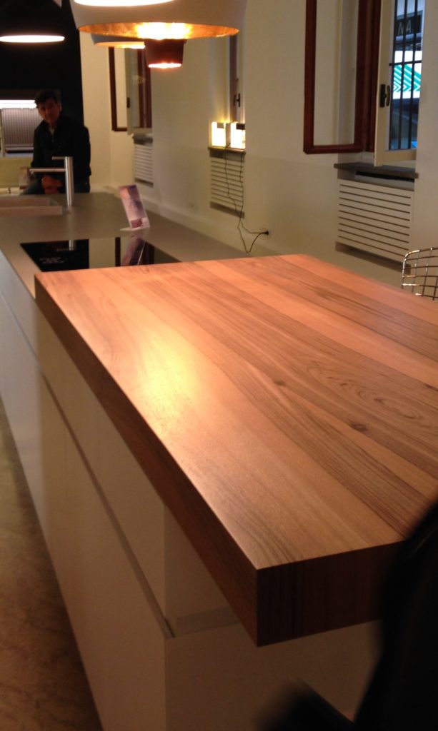
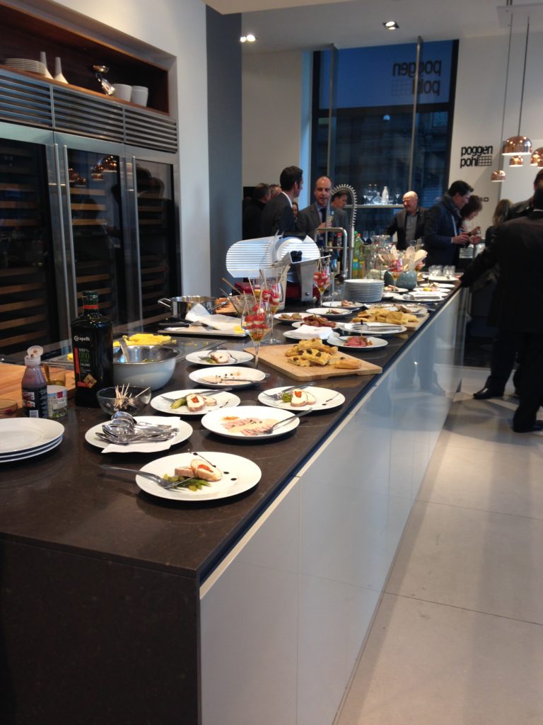 This newest version of P'7340 (see below) features a contrasting counter top inset made of solid New Zealand pine with a wire brushed finish.
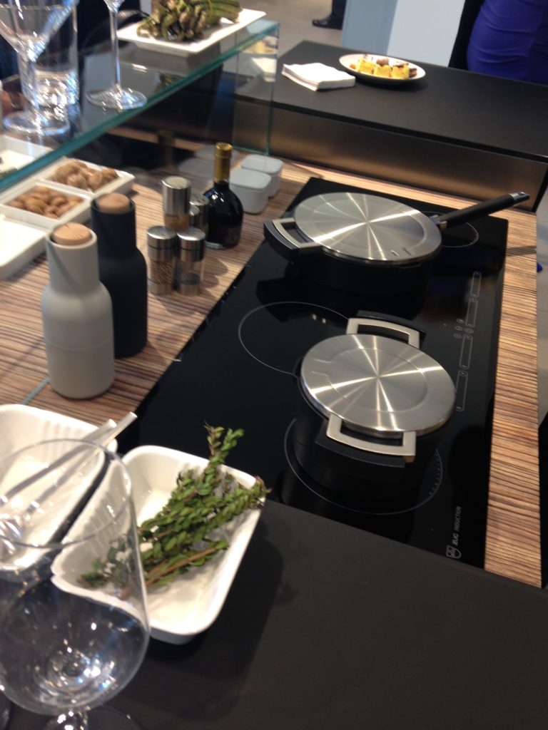 Next up: FTK (Technology for the Kitchen) This was the section of iSaloni featuring the latest trends and products in kitchen appliances.Click here for a peek at all my Milan photos!own and automatically completes the closing cycle
Euro Cucina 2014
I'm home and just about recovered from my jet lag. All pics are up for your perusal. It was a fabulous trip and my heartfelt gratitude goes out to the golden peeps at Blanco, including travel mate Christy Emens as well as Lori Dolnick of Frank Advertising. I was honored to be included with fellow bloggers Marilyn Russell (DesignMagnifique), Kelly Morisseau (KellyMorisseau.com) and Grace & Ken Kelly of (kitchendesigns.com). Having been to many trade shows in the US over the years, I've always wanted to experience the bigger, global picture. Now I have and it was amazing.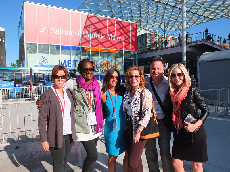 I arrived on Monday morning ready to explore. Lori and I took a stroll and stumbled upon a delicious lunch and a very cool design museum but first things first. I'm dying to tell you about all the products and trends I saw at the big show. Euro Cucina only comes along every two years as a part of the Salone del Mobile. Milano. There is also a whole section devoted to the bath called Salone Internazionale del Bagno. Kitchen gadgets and appliances are shown in the FTK section. I did a pretty good job of covering those but I estimate that was only about 20% of the entire show, the rest being furniture and other aspects of design. Here's what caught my eye.
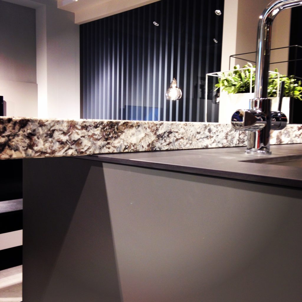
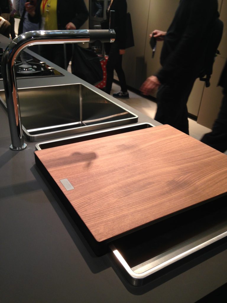
Counter tops were either very thin or chunky, like 1/2" for the thin and 3" for the chunky. I saw a lot of mixing of materials, in fact, that was probably the one biggest trend I saw for both counter tops and cabinets. It is also one that can easily be adapted to our US market. Counter top materials are much more adventurous than the usual granite or quartz that we are used to here. I saw wood, Corian, recycled composite material and more. The overlapping installation here was also quite common. The kitchen sink saw some new innovations including lots of accessories and different methods of installation. The inset style above, by Blanco, is factory installed by Leicht for a perfect fit. This particular one is not available to us in the US but we can get the Precision model with the distinctive square corner interior for undermount applications.
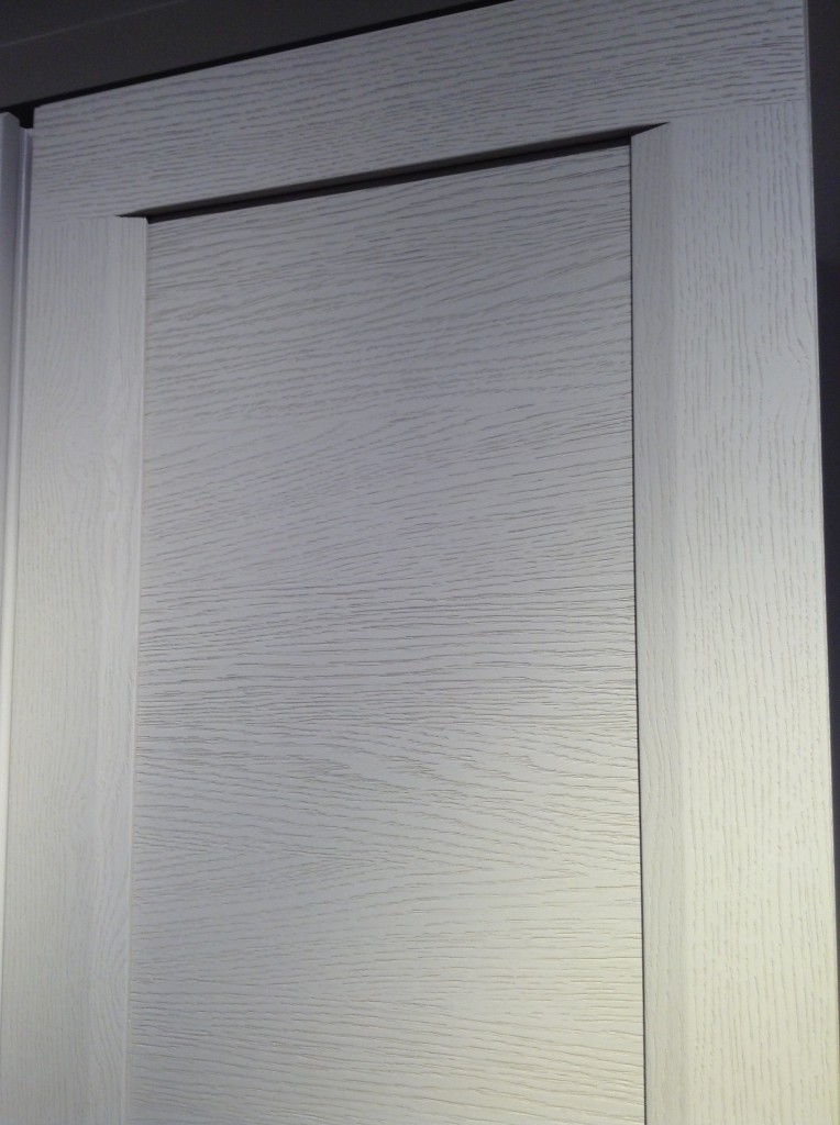
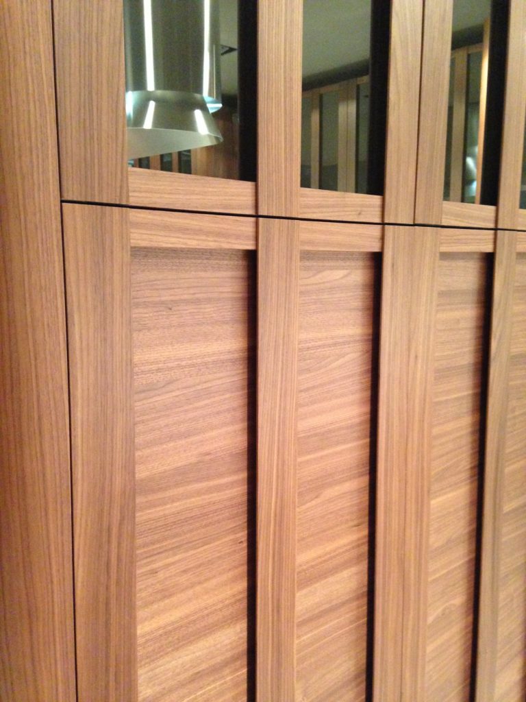 Cabinets featured lots of defined graining in woods such as white oak, rosewood and walnut in both horizontal and vertical directions, sometimes on the same door. I also saw some interesting variations on the popular slab and Shaker silhouettes.
 This is just the first in a series of posts about Milan and Salone Internazionale del Mobile. Upcoming posts will include our visits to Acheo and Poggenpohl showrooms and much more. So what do you think of these kitchen trends so far? I think some will make it over the pond but you can always know that whatever we do, we'll do it with an Americano twist. More later :)Click here for a peek at all my Milan photos!
The Rest of the "Hot Pepper" Kitchen Story
Happy new year peeps! Back at the drawing board this week after a nice holiday break. I got a lot of annoying little things done AND spend a little time in the studio but that's another story. Last post I told you about my dream kitchen. I don't know about you but I'm still dreaming and that was just enough to pique my interest. The lovely Shannon Pepper of Shannon Pepper Design in New Zealand, YES, New Zealand (who knew they were rocking such awesome design down under?) shared some of her musings with me:
KFL: What parameters were you given before designing this kitchen?Shannon: The kitchen needed to be very functional for a busy family of 5. The kitchen is very much centralised in the home so it also needed to be very " good looking " for better words. There needed to be space to tuck things away like appliances etc to keep the space tidy.KFL: What was the biggest challenge of the project?Shannon: Hmmm, I'm not sure there were any real challenges in this project as the client was very easy to deal with and realistic. The space was very proportional and easy to plan. I say that but originally, in the plans from the architect, there was a window on the hob (stove) wall which we were trying to work around. After much thought the client decided that since the space would only look out onto a hedge and wouldn't offer much light we opted to remove the window and add under cabinet lights to keep the space light.
KFL: Is there anything you'd have done differently if you could?Shannon: Not really, I love this kitchen and loved working with this client.KFL: Can you describe they type of client you were designing for? Shannon: The clients were both doctors and they have 3 children under 12. The family is busy with extra activities after school for the children and wanted a space that was functional and easy to maintain.KFL: What brand of cabinets did you use?Shannon: The cabinetry used is a Dezignatek vinyl wrapped (known here as thermofoil) product. The colour is white gloss and the profile of the doors and drawers is Milan. This product is great for giving you a painted finish look but without the chipping and scratching possibilities of paint.Not only is this a dream kitchen but it sounds like it was an all-around dream job too. Check out Shannon's website for more pics of her beautiful projects.
Dreaming of a White Kitchen...
I’m always designing, writing about and thinking about kitchens. It’s what I do. Today I started thinking about what MY dream kitchen would look like and thanks to our uber talented design pals over at houzz.com I think I found it.
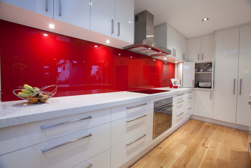
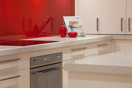
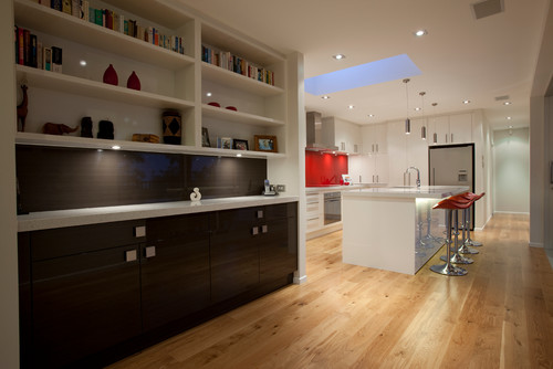
It’s this stunning kitchen by Shannon Pepper Designs in New Zealand. Not only is it a visual pleasure, but it would also be a blast to cook in! It features glossy white cabinetry with contemporary slab fronts, white marble counters and a stunning red painted glass backsplash. I’m loving how the red is picked up by the bar stools too. I love, love, love. I wonder if she calls this “Pepper Red”? If not, she should!
I also love the contrasting cabinetry in the adjacent bar. Now for me I must confess I would tweak just a couple of things because that’s what I do. I take a dream and I tailor-make it to suit YOU. But wait we were talking about me today! I would have run that HOT “Pepper Red” backsplash all the way up behind the hood and I would have lowered those upper cabinets because I’m short and because it would give me more storage. Something like this: As they say, a girl can dream. Wishing you and yours a very Merry Christmas, Happy Holidays and tons of beauty, love, health and prosperity in the new year!! Thanks for reading Kitchens for Living. XOXOXOX
Kitchen Case Study: Update and Integrate
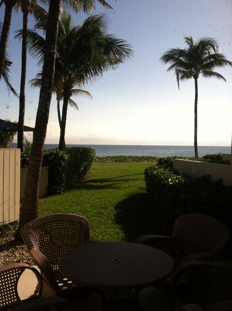 One of the perks (not twerks) of my job is that I get to work in lovely homes on the beach. If I'm having a "design panic moment" all I have to do is look out the window at the ocean and all is well. This townhouse project came to me as a referral and is actually a winter home on the ocean in Delray Beach. This homeowner is a potter with a keen eye for design and finishes.The kitchen was outdated and not very functional. My client enjoys cooking and entertaining and was seeking to integrate her open kitchen with the stylish and artful adjacent dining and living room.
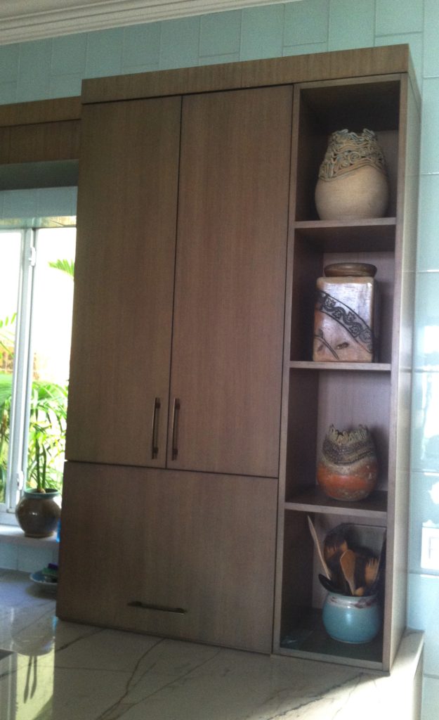
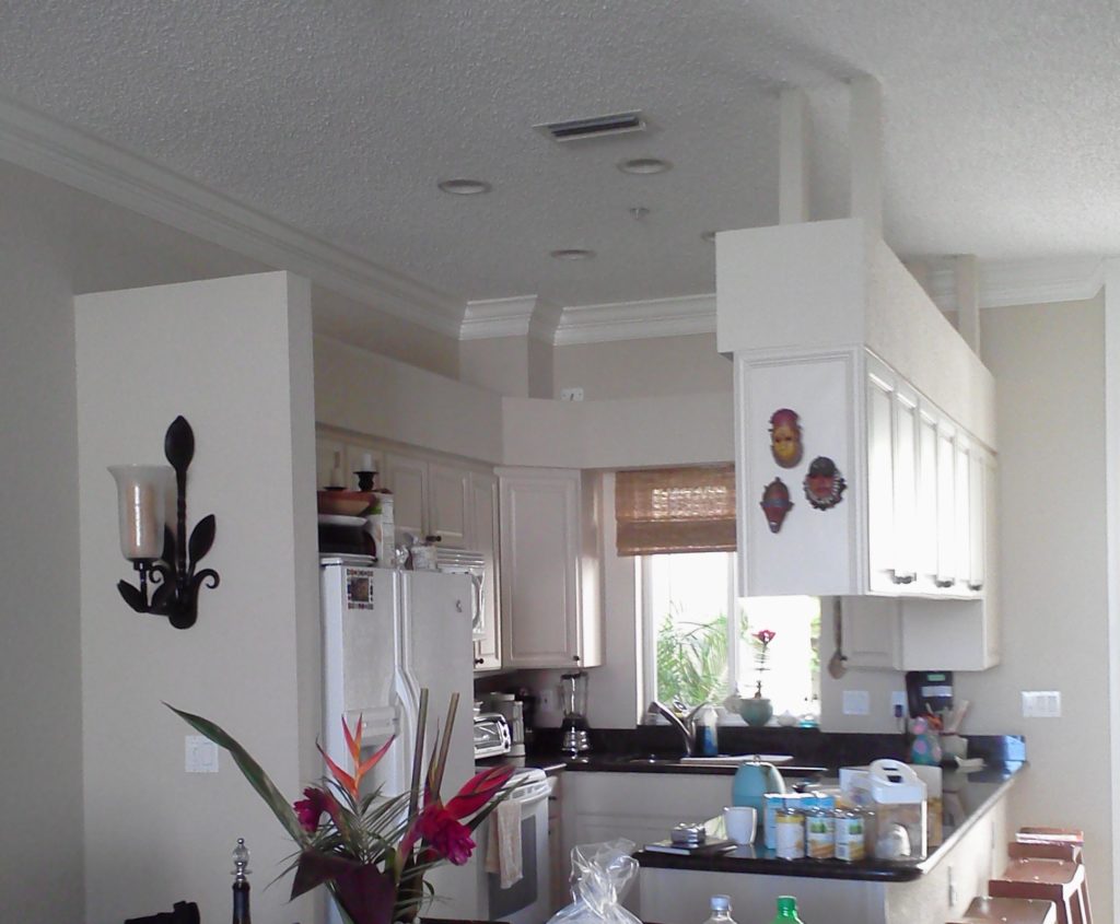 My first thought was that even though we would lose cabinets, the soffit structure had to go. We could make up that loss of storage by going higher with the cabinets and by adding a tall cabinet to the left of the refrigerator. I wanted to open up the space yet ensure that it was integrated with adjoining areas. The ceiling is so high we were able to increase the height of the cabinets without having to go all the way up which would have disrupted the existing crown molding. We also gained storage by adding the two end cabinets on either side of the seating area. The cabinet to the counter is also great storage and the open shelving to the right was included to showcase some of my client's pottery pieces. Scroll down to see the solution.
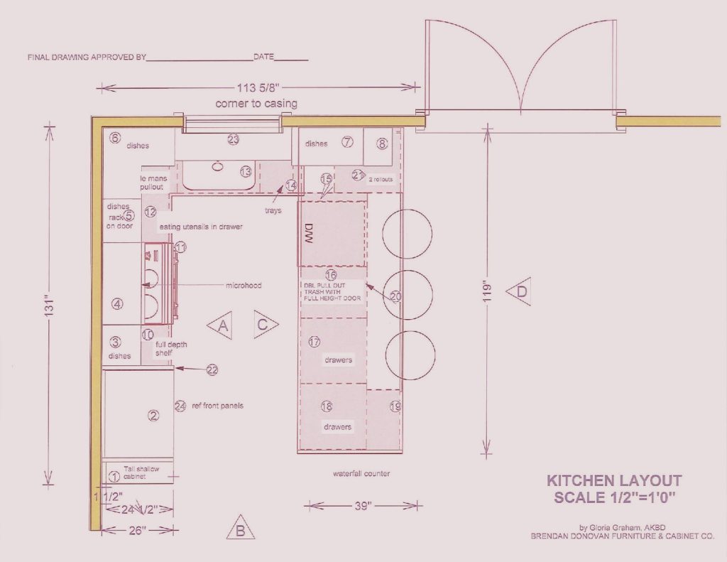
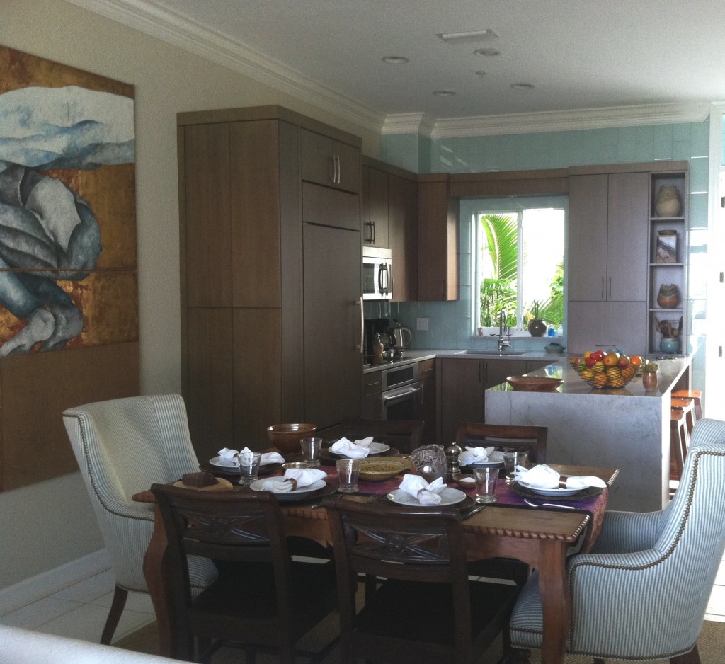 We used a warm stained bamboo with a subtle blue-green tint for the cabinetry. The back wall is aqua glass tiles to reflect the ocean. There is a pantry with touch latches to the left of the built-in refrigerator. An appliance garage conceals toaster oven to the right of the sink and open shelves feature my clients beautiful pottery creations.
My design was custom built by Brendan Donovan Furniture & Cabinet Co. Cabinet hardware is Top Knobs Sanctuary Collection in German Bronze. Refrigerator is Subzero with flush installation. The rest of the appliances are by Jenn Air. For this project we selected the Blanco Quatrus medium single sink because it fit the space as well as the styling of the kitchen so well. The faucet is Blanco Kontrole. Again this stylish Blanco faucet provided the look and pull out functionality we needed. In addition, the scale was appropriate for the space. Counter tops are grey granite from Cavastone fabricated by Stone Palace. They feature a contemporary "waterfall" detail at the end of the peninsula.All in all I would say mission accomplish and my clients agree!

