The New Brass

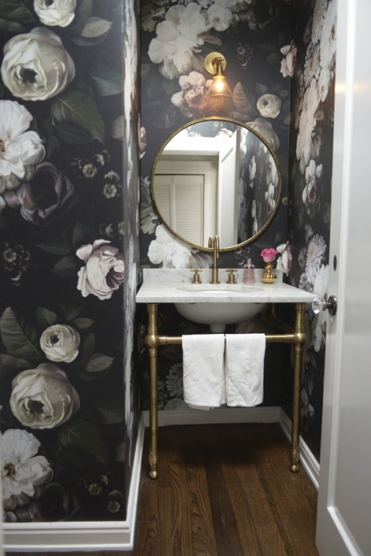
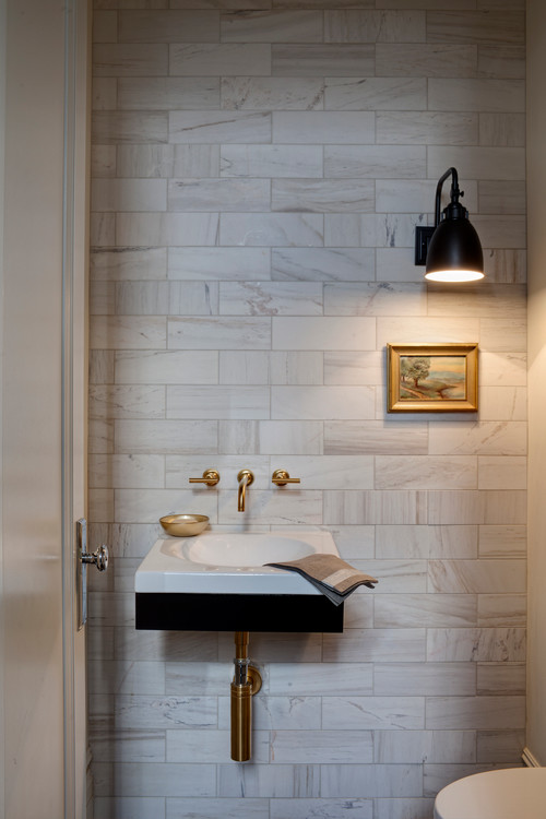
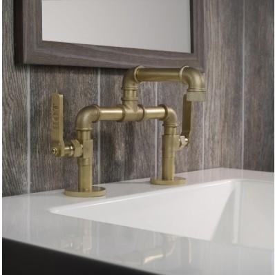
As you can probably imagine, I see my fair share of stainless steel and brushed nickel finishes in plumbing fixtures and cabinet hardware.  It's pretty much been the "go to" finish for ages.  Some clients will go for shiny chrome, which I happen to love as it enhances any contemporary design very nicely, thank-you-very-much.  It's also usually less expensive.  However today I would love to invite you to consider another option that has captured my attention of late.Watermark-Elan-Vital-02 It's what I call "the new brass".  There is just something about the look that appeals.  Perhaps it's because it's such a complete departure from stainless?  New brass looks like old brass which is its charm and it's definitely more at home in traditional types of design.  Classic design can be fresh new and yes, even modern.  The Elan Vital faucet, by Watermark Designs, shown above, features their New Age Brass finish and you can customize it however you wish, sort of like a Tinker Toy!  It's also available in 38 other finishes.powder-room-final-520x779There is just something about this little ensemble that I love.  It's greater than the sum of its parts.  You can find out all the deets here.A word of advice, if you're loving this look too and considering brass, make sure to specify "un-lacquered brass".  This finish will change over time developing a patina.  If you're not up for that, you can get lacquered brass which has a protective coating and keeps the finish stable.The following pic, courtesy of  Houzz.com is what I mean about traditional design crossing over into modern territory.  The marble, brass and even the artwork are all traditional elements arranged in a lean simplicity that screams (ok perhaps it whispers) modern. 

Note the door hardware is chrome and that's ok!  There is a perfect balance of brass.

Kitchen Case Study: Update and Integrate

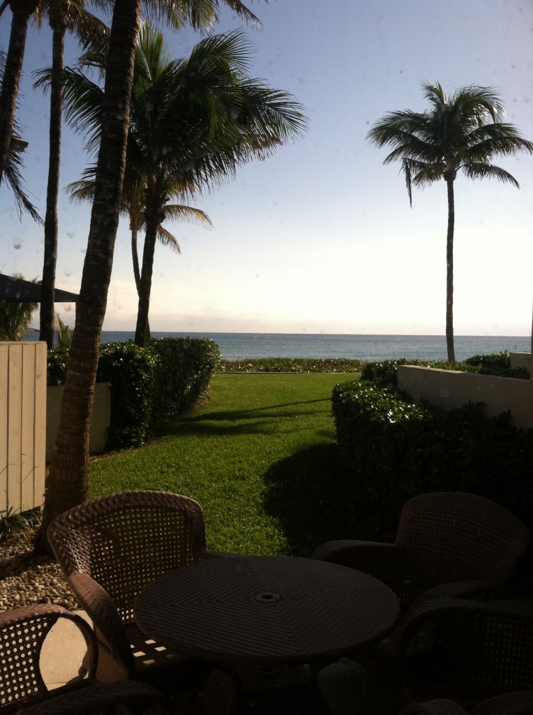
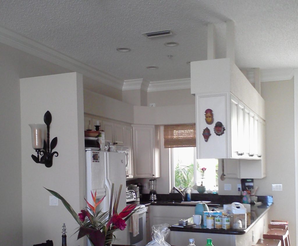
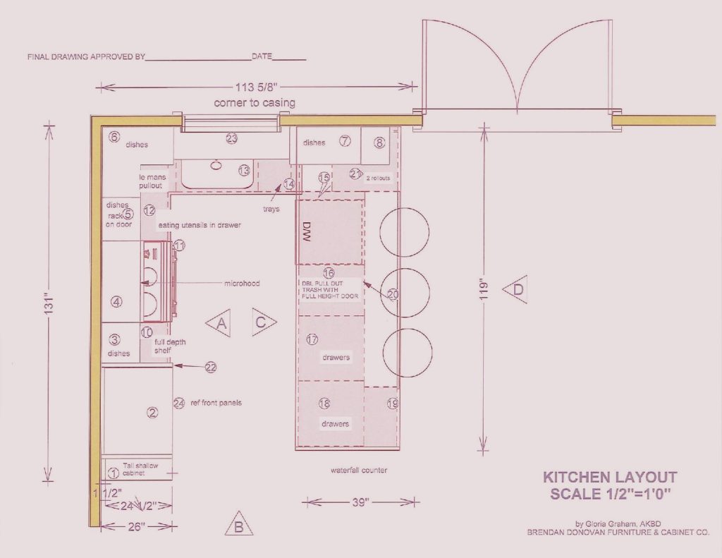
This is what we're dealing with, view out the back of the townhouse  One of the perks (not twerks) of my job is that I get to work in lovely homes on the beach.  If I'm having a "design panic moment" all I have to do is look out the window at the ocean and all is well.  This townhouse project came to me as a referral and is actually a winter home on the ocean in Delray Beach.  This homeowner is a potter with a keen eye for design and finishes.The kitchen was outdated and not very  functional.  My client enjoys cooking and entertaining and was seeking  to integrate her open kitchen with the stylish and artful adjacent dining and living room.The ChallengeMy first thought was that even though we would lose cabinets, the soffit structure had to go.  We could make up that loss of storage by going higher with the cabinets and by adding a tall cabinet to the left of the refrigerator. I wanted to open up the space yet ensure that it was integrated with adjoining areas.  The ceiling is so high we were able to increase the height of the cabinets without having to go all the way up which would have disrupted the existing crown molding.   We also gained storage by adding the two end cabinets on either side of the seating area.  The cabinet to the counter is also great storage and the open shelving to the right was included to showcase some of my client's pottery pieces.  Scroll down to see the solution.blogplan2-page-001 (1)


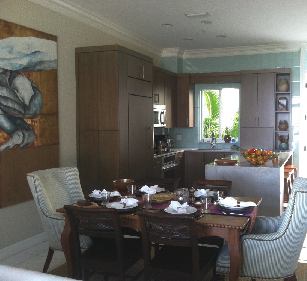
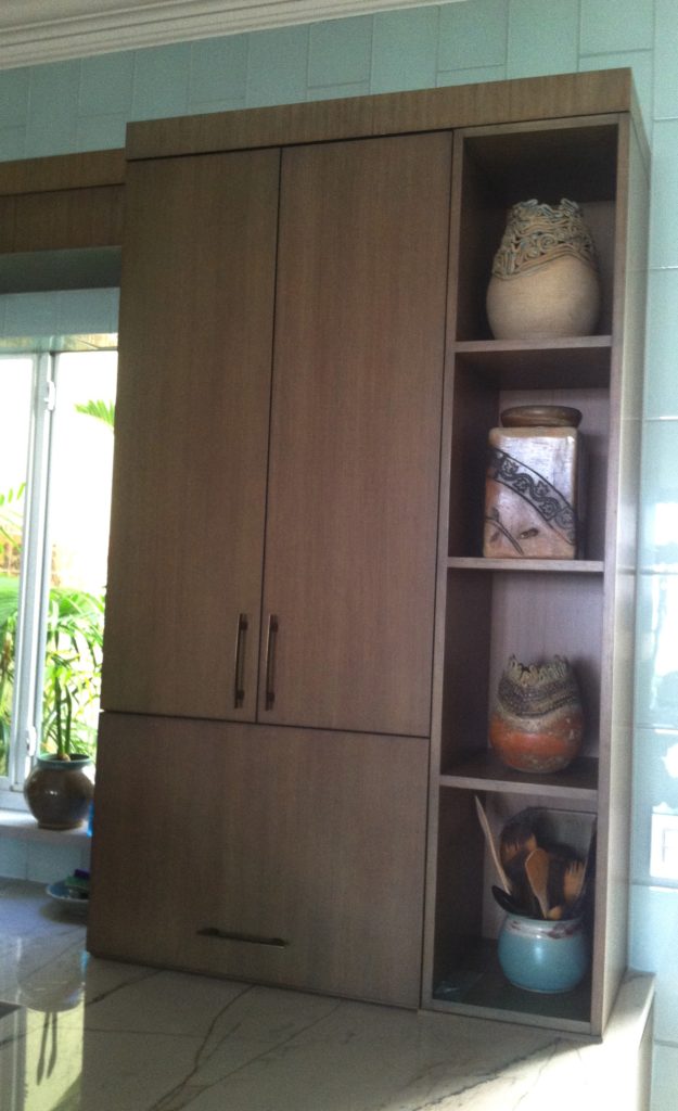
 THE SOLUTION!We used a warm stained bamboo with a subtle blue-green tint for the cabinetry.  The back wall is aqua glass tiles to reflect the ocean.  There is a pantry with touch latches to the left of the built-in refrigerator.  An appliance garage conceals toaster oven to the right of the sink and open shelves feature my clients beautiful pottery creations.

2013-01-18 10.01.34

My design was custom built by Brendan Donovan Furniture & Cabinet Co.  Cabinet  hardware is Top Knobs Sanctuary Collection in German Bronze. Refrigerator is Subzero with flush installation.  The rest of the appliances are by Jenn Air.  For this project we selected the Blanco Quatrus medium single sink  because it fit the space as well as the styling of the kitchen so well.  The faucet is Blanco Kontrole.  Again this stylish Blanco faucet provided the look and pull out functionality we needed. In addition,  the scale was appropriate for the space.  Counter tops are  grey granite from Cavastone fabricated by Stone Palace.  They feature a contemporary "waterfall" detail at the end of the peninsula.All in all I would say mission accomplish and my clients agree!

My New Treasure: In2ition Dual Shower Head

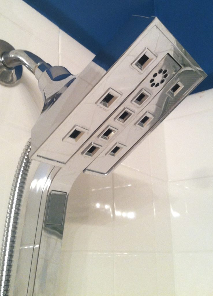
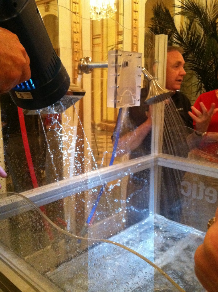
Hold on a minute! I was going to show you an amazing kitchen transformation today and I promise it’s still coming BUT I’m just bursting to tell you about my shower.  We have been doing some renovations around the old homestead.  Life seems to fall into a desperate fight for survival mode when you’re removing popcorn, installing flooring, molding, painting yadda yadda.  SO this special little box sat in my garage for way longer than it should have.  When the hubs finally got to it, we unveiled our beautiful new  In2ition Shower Dual Showerhead by Delta Faucet Company.  It was a generous gift and memento of a beautiful experience with my fellow Brizo Blogger 19 alumni in Memphis back in July.  The folks at Delta /Brizo graciously offered us the In2ition shower head in the style and finish of our choice.2013-09-18 21.32.23Why go for round when you can be square and hip all at the same time? Needless to say I went contemporary and I went chrome.  I learned all about the H20 technology having seen it in action in Memphis.  Click here in case you missed it.2013-07-18 17.05.27The hubs was the first to test it out and he was blown away, by the water pressure (just kidding).   Seriously, he loved it, but I really had no idea until I experienced it myself.  A handy little lever on the side controls the jets and water flow.  You can set your In2ition shower to one of three options: shower head and hand shower combined, shower head only, and hand shower only. The center section pops right out for handheld convenience.  The point of the H20Kinetic Technology is to make less water feel like more and it certainly does. 

Delta Faucet


 When I tell you it’s worth its weight in gold I’m not kidding but I don’t want you breaking and entering to get mine when you can find out where to get your very own right here.  Shop around because prices vary a lot.  This shower head comes with a lifetime faucet and finish warranty.  Lucky me ;).   Now I just have to remodel the rest of the bathroom...

Back on the Road with Brizo and St. Jude's

422083_567287066649432_194945505_nOnly days away from my next adventure, a reunion for all the bloggers who have been a part of Brizo’s Blogger 19.In case you don’t know, this is a bi-annual jaunt to fashion week sponsored by Brizo Faucets who teams up with fashion designer Jason Wu.  I was a part of the second group to go back in September of 2010.  Seems like eons ago!  There have been many blogging trips since then but it will be great to reconnect with all the blogosphere peeps.I love my Rodin faucet!  It looks just like this one, resides in my powder room and continues to impress guess with its Smart touch technology. The reunion will be held in Memphis and since this is the number one question I get, I’ll answer right off the bat, no I’m not going to Graceland!  Where we will be going is on a tour of the Brizo plant in Jackson, just outside of Memphis, where we will learn how their cutting edge products are produced.  I always love to get an inside peak at the how’s and whys.  It’s such a great tool to have for my clients.StJudelogo We will also be spending a day at the St. Jude’s Children’s Research Hospital which should be amazing.  I recently learned that since 1962 treatments invented at St. Jude have helped push the overall childhood cancer survival rate from 20% to 80%!  Families never receive a bill from St. Jude for treatment, travel, housing or food.Wheels up on the 16th.  Remember to follow me on FaceBook and Twitter.  Look for #blogger19reunion on Twitter.

Tip #3: Where can I save money and what items are worth the splurge?

Many of our clients begin kitchen remodeling projects in the summer.  Kids are out of school and our commitments tend to be less (for some of us) in the summer months.  Today's client query is one that I hear a lot.  Naturally we all want to get the most for our money in all our investments but where can you save money in a kitchen remodel and what items are worth the splurge?The answer to that is largely subjective as we all have differing needs and priorities.  That said, there are some principles that should never be compromised and those include efficient use of space, safety and the best quality you can afford.

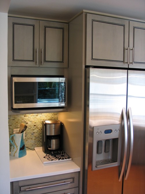
Contemporary Kitchen with standard depth refrigerator.  Courtesy of Houzz.com


refrigerator is a much better fit.  Courtesy of  Houzz.com

 SplurgeI must confess, there are some standards in the kitchen industry that are just plain wrong.  One of them is the standard depth refrigerator.  A standard base cabinet depth is 24" (25" including doors).  A standard refrigerator is about 33" deep!  It might look perfect standing solo at the appliance store but it could look like a beast in your kitchen!  Yes, they stick out.  Depending on the layout of the kitchen we can sometimes work around the depth by surrounding the fridge with extra deep side panels and a cabinet above pulled forward.  But if you're tight on space it is worth investing in what's known as a counter, or cabinet depth refrigerator.  This means that the cabinet box will be flush with your counter top and your "stick out" will just be the thickness of the door.  It makes a big difference.  Here GE shows the difference between standard, or free-standing and counter depth.  A standard GE french door refrigerator would be about 26 cubic feet and retails at about $2,100 vs. a comparable counter depth model which is around 21 cubic feet and retails at $2,700.00. Yes, you will have less cubic footage with a counter depth fridge and I suggest keeping the old fridge in the garage if that's an option.  If the kitchen is large enough you can add a beverage cooler.  When water, soda, beer and wine are taken out of the main fridge you get all kinds of space. There is also a third category if you've got the big bucks and that is true built-in or integrated.  Those are even shallower but they are also more than a foot taller to compensate.  Whether you opt for Sub Zero or GE. a built-in refrigerator is pricey but the most visually seamless, particularly if you add matching cabinet panels. 

This kitchen was created using stock cabinet.  Courtesy of  Houzz.com

 SaveYou can save money on your cabinets if you can keep to standard, or stock, sizes.  Simpler cleaner lines with minimal molding can also save you enough money to splurge on that refrigerator!  There are just two things to keep in mind.  Make sure the quality of the cabinetry you buy is sound and backed by a warranty.SplurgeMany professional kitchen designers will be happy to consult with you on the layout and selections for your kitchen.  An hourly fee is well worth it to have your plan validated by a pro.  In many cases, if you purchase your cabinetry through your kitchen designer, design services are included. 

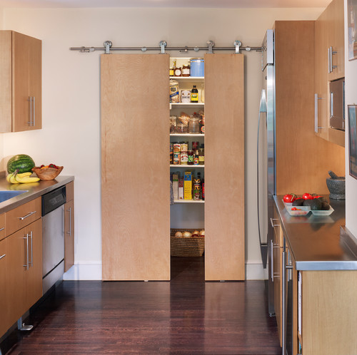
Here they saved on cabinetry by selecting clean simple slab doors with no moldings and
they splurged on the counter depth refrigerator and focal point pantry door.
Splurge
You may have heard me say this before but I'll say it again.  Buy a good quality faucet.  Your faucet is arguably one of, if not the most, used items in your kitchen.  Splurge up front and you won't be sorry.  Buy a cheap faucet and within a couple years you will have drips and leaks.  By the time you pay the plumber and replace the faucet you haven't saved anything. If you buy a stainless steel sink make sure the gauge 18 or lower to avoid denting and horrible water spots.


You can get this Solna faucet by Brizo for under $400.
Save
If you've decided on granite counter tops, think about using 2cm material with no build up so that your total cabinet thickness is 3/4".  The minimal look works especially well with contemporary designs.  You'll get the functional advantages of a stone counter top without the extra labor to build up the edge to 1 1/2".  The look happens to be great, especially in dark counter tops.  If funds are tight you can also leave the back splash for last.  The area between your counter and upper cabinets can be tile or otherwise and it can always be finished at a later date.  However if you have enough material leftover from your tops maybe you'll want to use it for the backsplash. A word of caution: if you're using a slide in style range you'll want to make sure it's compatible with the finished height of your cabinets.
Skinny top in Antique Brown from Granitegurus.com

 SaveI love unique artsy cabinet handles as much as the next person but did you know that you can spend anywhere from $1.99 to upwards of $50 a piece for them?  Aim towards the $5-$10 for really good quality knobs or pull.  If you happen to fall in love with one of the $50 buggers maybe you can use just a couple for a special area. 

Focal point hardware is on refrigerator (true built-in).  The rest are simpler designs
in the same finish.  It works!  Courtesy of Houzz.com

 Next up, Tip#4: Granite or Quartz?            
Blanco Makes a Splash!

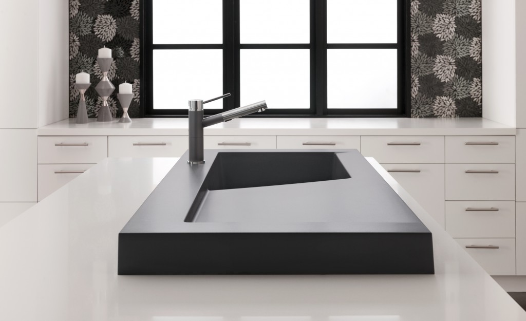
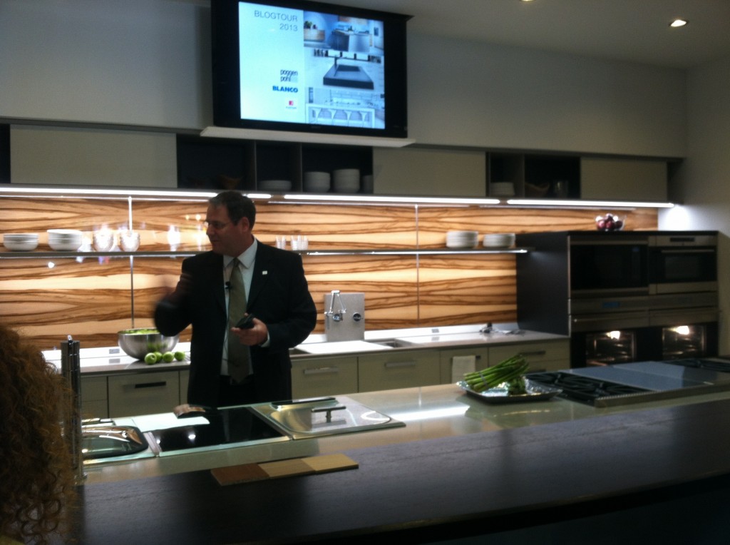
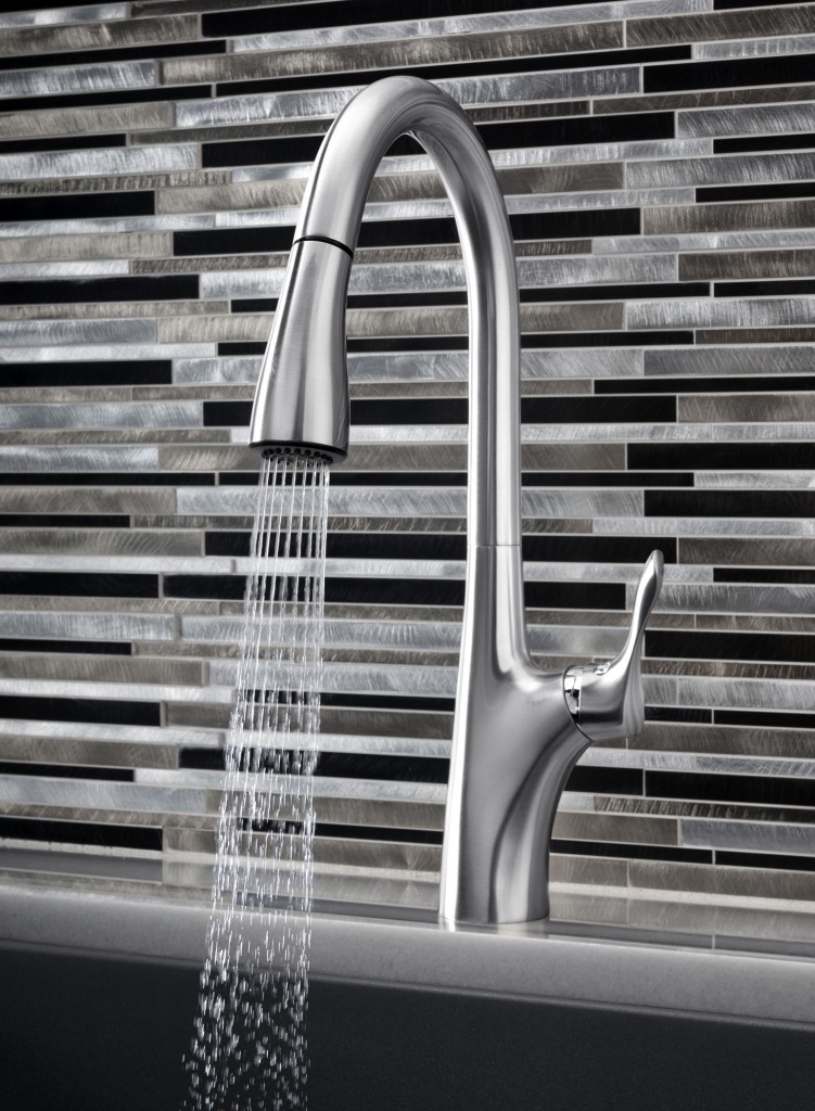
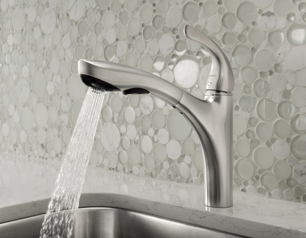
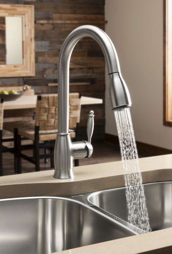
Modex SILGRANIT II sink in Cinder is kitchen architectureFor the last few years I have been honored to be a member of the Blanco Design Council.  This means I’m on the main line when it comes to inside information about their products. BLANCO, of course, is the German manufacturer of finely crafted sinks and faucets.  Their SILGRANIT II sinks are a particular favorite of mine and you should definitely know about them if you’re considering a kitchen remodel.  If you don’t know about SILGRANIT II, see my previous post here.   As a kick off to KBIS2013,  I got to see the newest BLANCO happenings  in New Orleans with a Cajun-styled experience called The Kitchen Unmasked.  This joint venture featuring Blanco, Poggenpohl and Silestone was held at the beautiful Nordic Kitchens showroom and was one of our stops on the Modenus Blog Tour.

The Kitchen Unmasked, at Nordic Kitchens

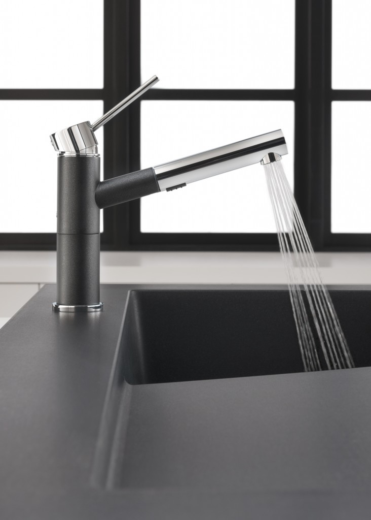
The latest SILGRANIT II color, Cinder, is all the rage.  It’s a stormy striking combo of dark gray with some black and rich brown thrown into the mix.  I think it’s the perfect color to go with all the new luscious shades of gray we’re seeing.  It’s on trend yet neutral at the same time. The new SILGRANIT II series of sinks also includes HYGIENIC+PLUS a patented formula that acts as a shield against dirt and bacteria. Independent laboratory tests confirm that the unique built-in hygiene protection reduces bacterial growth by an average of 98%.My favorite addition to the SILGRANIT II collection is the Modex sink (at top).  The next kitchen I design for myself (hoping) will have this sink.  I love it.  It adds a bit of architecture to the kitchen!  Modex features a unique 3” profile that sits on the counter and includes a large integrated cutting board.  It’s not just a sink, but a workstation.Speaking of work, did you know your faucet is the most abused item in your kitchen?  BLANCO's well known German engineering ensures that you have a product that will stand up to the test.  BLANCO also launched a new line of water saving faucets including Grace II, Alta, Highland and Napa. ALTANAPAHILANDGRACE“Our latest collection of faucets offer livable style,” stated Tim Maicher, Director of Marketing for BLANCO. “When we say livable style, we are referencing style that leads trends while integrating into any kitchen design. At the same time, we are talking about the faucets’ functionality. We engineer BLANCO faucets to last, to use less water, to provide unmatched cleaning and to be as easy to use as they are to maintain.” I’ve had a blast telling you about all the products I learned about on the Modenus Blog Tour.  A big thank you to Veronika Miller and her team at Modenus as well as all the fabulous sponsors including Blanco, Poggenpohl, Cosentino, National Kitchen & Bath Association, Kitchen & Bath Industry Show 2013, Mr. Steam, TOTO and Du Verre Hardware.   It truly was a most memorable and enjoyable experience to see New Orleans in this way.  To me, the best part of all was the people, both meeting the sweet good- natured, perservering locals as well as enjoying the community of those who I’m honored to call my peers.  I hope you’ve enjoyed following along and have learned a thing or two in the process that will help you know what to look for when shopping for kitchen and bath products. Click here to see ALL my photos and commentary from Blog Tour NOLA!