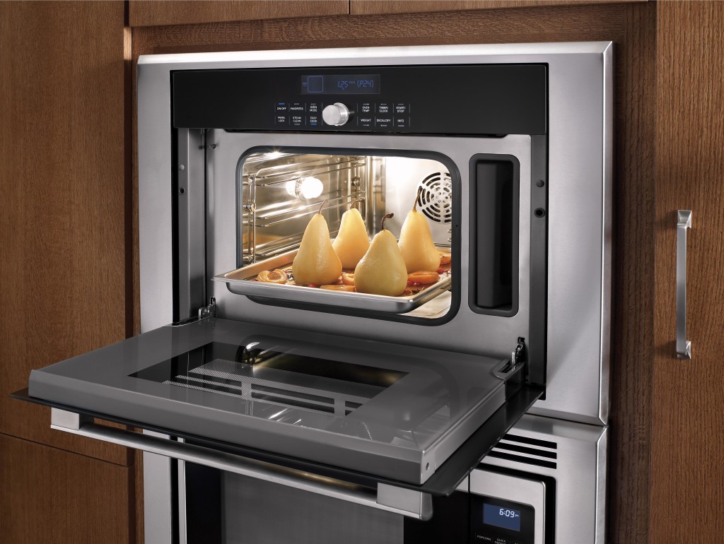
Every designer has a trademark. One of mine definitely is the microwave drawer. Why? It's safe, easy to use and very unobtrusive. Yes, a microwave drawer will cost you a bit more than the over-the-range type but it's oh so worth it!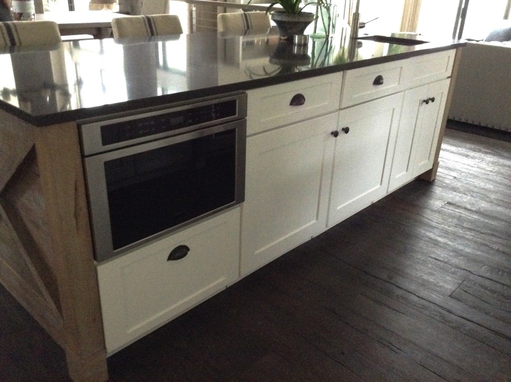 A little known fact is that all microwave drawers happen to be made by Sharp. Don't tell anyone I told you but whether you're springing for Wolf or Dacor they all come from the same place. The only difference is the exteriors which are made to match the collections by various brands.
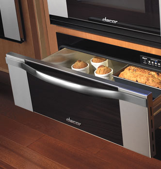 Microwave drawers come in 24" or 30" wide and are built into a base or tall cabinet. An island can also be the perfect location. Typically you end up with a nice big drawer below which is perfect for storing microwavable cookware.
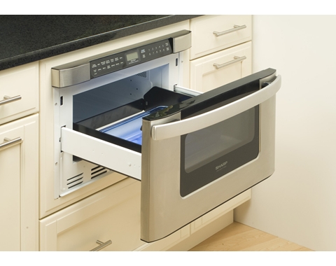 The ergonomics of lifting on to the counter top, out of a drawer, as opposed to reaching 4 1/2 feet up over a hot burner to access the contents is so much more safe and efficient.
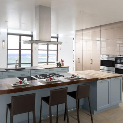
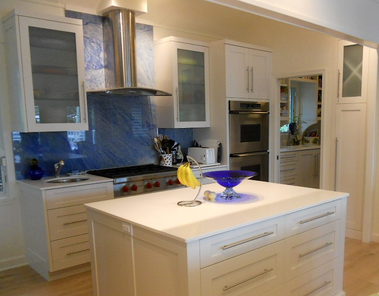 I would rather look at this instead of a microwave any day.
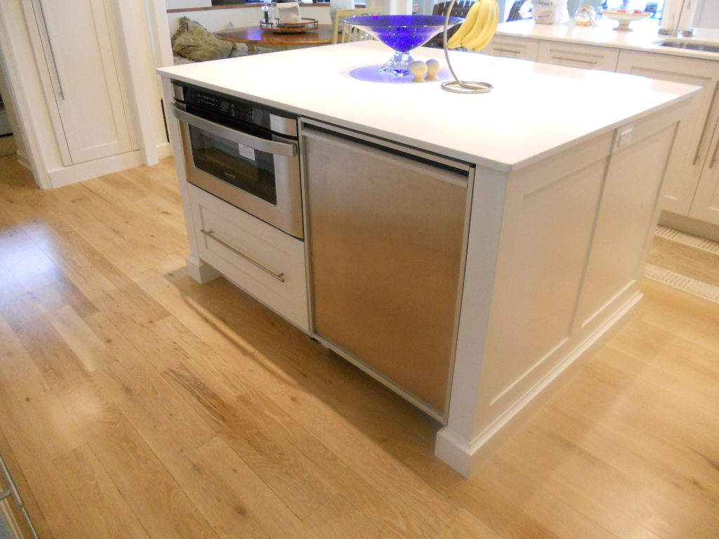 There are so many details involved in designing a new kitchen and bringing it to reality, so when it comes to budget you have to pick your battles. If space allows, the microwave drawer is a great investment and the safest option for any age.
5 Elements of an Artful Kitchen
Summer projects are underway in South Florida! In fact, it's the height of the busy season for most design professionals here.
I don't have to tell you that a new kitchen is a big investment, in fact the kitchen is the most expensive renovation you're ever likely to undertake. It stands to reason that you'd want a kitchen that is tailor-made for you whether you can afford custom or not. This is what we're all about at Artful Kitchens.
The concept of an "artful kitchen" has many different facets. It is not just about budget or the amount of space you have but the skill you employ using what is available to you. Here are five tips to consider along with some visual inspiration featuring products I saw this year at the Kitchen & Bath Industry (KBIS) trade show in Las Vegas. Implement these with style and confidence and you will be the proud owner of an artful kitchen!
1. Flawless Function
I'm all about artistic expression but a major part of creativity in the kitchen comes from devising flawless function. This quality is not something you see but something you can experience if artfully accomplished. When I say function, I mean work centers comprised of cooking, clean up and food prep areas.
Those are the basics but you could have more such as a beverage center (think coffee, tea, wine), a computer station or a baking center. If you have a two-cook kitchen, your layout should be designed so that any one of the major functions can be performed without anyone getting underfoot.
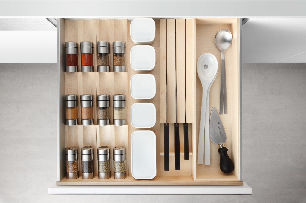
Following the guidelines set by the NKBA is a must to make sure all clearances are adequate. Sometimes we don't have a lot of choice about where to locate our sink or appliances but we can organize our utensils, dishes, pots and food items in a more efficient way. Don't forget the more flawlessly your kitchen functions the safer it is. You don't have to be an expert at this, just think about how you use your kitchen so that you will be a good collaborator when it comes time to work with a professional.
2. Personalization
This is, without a doubt, the biggest movement in the design world. An artful kitchen is your own personal statement customized to the way you live. It could be a steam oven because healthy eating is your passion or it could be a lovely furniture piece with glass doors to display your grandmother's china. Include the colors you love. Even though you must be mindful of your budget (everyone has one), strive to retain the essence of what you see as your dream kitchen.
3. Harmony
Harmony is one of the principles of design and a must for your kitchen. Whenever I design a two-toned kitchen I like to ensure that different finishes and details are carried through the space to create a cohesive whole. It's about how the floor relates to the cabinets and how the cabinet hardware relates to the faucet. You get the picture! It does not mean that everything has to match perfectly, it means elements should relate to and complement each other. It also does not mean that every element has to be perfectly symmetrical. In fact, consider this permission NOT to be! I find that the best rule of thumb is to follow the architecture and style of the home you're in. If, for example, the kitchen window is way off center you should work with that not against it. Never force solutions by sacrificing function.
4. Focal Point
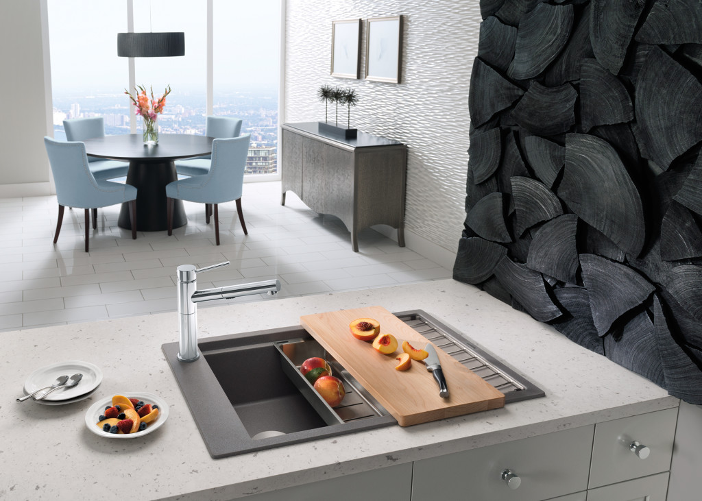
Every piece of great artwork has a focal point. It is the "star of the show", so to speak. In a kitchen it can be a sculptural range hood, a granite counter with big bold movement or actually a piece of art! It is the item that makes you say WOW when you enter the kitchen. Just remember less is more here. One great focal point is probably enough. Too much and the statement gets lost. Less is definitely more.
5. Texture
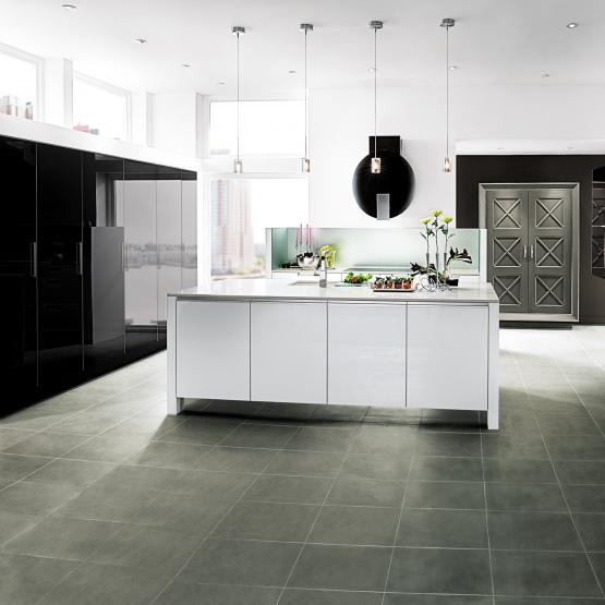
The element of texture involves at least two of our senses, touch and sight. The textures you are likely to come across include the glossy finishes popular in contemporary design, prominent wood grains which can be traditional or modern and smooth honed surfaces that are more matte. A flat slab cabinet door is a great choice if you plan to use a wood with a lot of pattern and graining. In this case the material is the decorative element of the cabinet. On the other hand, if you are traditional and you are using white cabinets you can select a door with some molding or detail. Also let the wild patterns either be on your cabinets or on your counter, both would be busy and distracting.
This is only the tip of the iceberg, so to speak. There are many more tricks and methods to create an artful kitchen. What are yours? Please keep in touch and contact me. Whether you need a quick consult or a full design layout I can help in person or virtually.
I'm located in the West Palm Beach area, so if you're local I can also help you shop for your kitchen products.
Bowled Over by Bolon
When did I visit Milan again? Oh yeah, April 2014. Time flies. You see the thing is, when you go to these sensory overloading mind boggling trade shows you bring it all home with you in the form of dvds, thumb drives, brochures, samples etc. The problem is when you get home it’s so busy all these bits end up sitting in a "some day" drawer. Well guess what? Today’s the day.
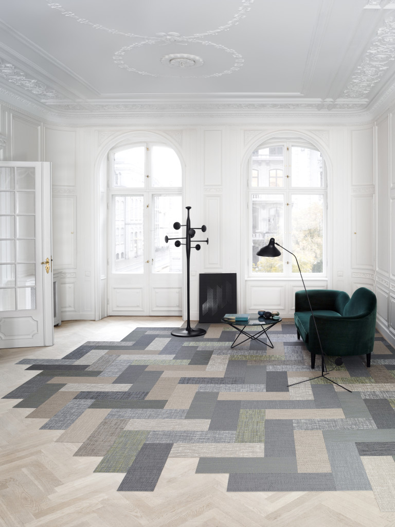 Back to Milan. I was there as a member of the Blanco Design Council (a fact that I am most proud of and grateful for) to attend the Salone di Mobile, the premiere European interior design and furniture trade show. Fast forward to today when I decided to fire up a thumb drive called Bolon. Let me tell you about it.
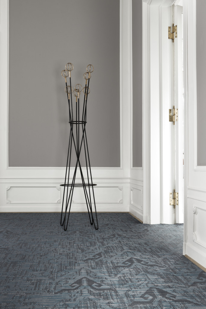 Bolon is a Swedish flooring manufacturer but there is so much more to it! The concept of fashion has a way of elevating even the most mundane of objects. That’s what’s so intriguing about Bolon, started in Stockholm in 1949 by Nils-Erik Eklund. He became a pioneer of the “green” movement when he decided he would make woven rag rug flooring from the waste product of other flooring manufacturers. The business succeeded, was passed on and has been run by his granddaughters Annica and Marie Eklund since 2003. That’s when fashion entered the picture. The term “floored by fashion” was coined and fashion icon Giorgio Armani decided he loved the product enough to use it in his shops, his home and on his yacht. Savvy marketing by this latest generation of Eklands seals the deal. You must admit this video, introducing their Silence line, is intriguing enough to make you want to know what this product is all about!It’s an original type of flooring that I would describe as woven vinyl with a backing. It can look natural or not, doesn’t seem particularly comfy on the bare foot but does appear to be bullet-proof, a definite plus for commercial spaces which is the main application.Today the focus is on global expansion and achieving a totally green product. Bolon’s list of clients includes not only Armani but also Google, Mercedes, Adidas, Reebok and Sheraton as well as leading architects and designers. All design and production happens in Ulricehamn, Sweden.
  Today the focus is on global expansion and achieving a totally green product. Bolon’s list of clients includes not only Armani but also Google, Mercedes, Adidas, Reebok and Sheraton as well as leading architects and designers. All design and production happens in Ulricehamn, Sweden.
 Bolon is available in rolls or tiles. You can vacuum it or for deep cleaning it can be scrubbed with a brush and an all purpose cleaner (there are machines that can do this too). Lastly vacuum again with a wet vac. If you want to delve into the specifics you can do that here. Interesting diversion, yes? Who knows what I'll unearth next! Stay tuned...
Tile Tuesday: The Many Meanings of "Encaustic"
What is encaustic painting?As an artist, I love the sensuousness of working in the encaustic medium which I discovered in 2008. Encaustic painting involves beeswax, resin and pigments in varying combinations. They are mixed together and applied to a panel in layers which are fused with a torch or heat gun. This is where the name comes from. The Greek work “encaustikos” means to heat or burn.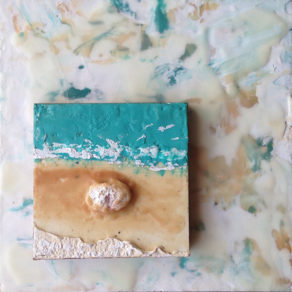 Encaustic painting predates oil painting and was used to create portraits on mummy casings dating back to 100BC in Egypt. These paintings are known as the "Fayum" portraits. Many have survived because beeswax is extremely stable so the pigments do not fade over time.
 The technique fell into obscurity but was resurrected in the 1950s by artist Jasper Johns. You remember this painting, no? It’s an encaustic painting! Fast forward to the twenty first century and you will find more and more artists working with wax and incorporating it into their repetoire.
  The Name GameIn the pursuit of all things tile, while on my trip to the Cevisama tile trade show with Tile Of Spain, I discovered something called “encaustic tile”. No one could actually tell me how it was connected to what I knew to be encaustic art so I decided to find out.
 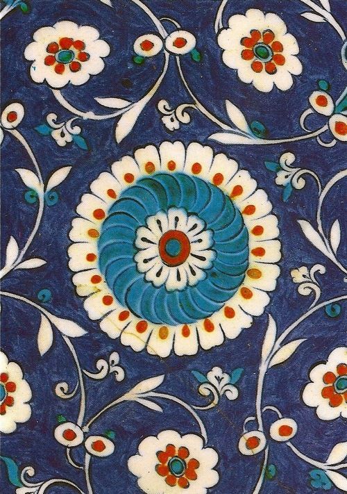 Guess what? There is no connection. Here’s what I discovered:Encaustic tile is also referred to as cement tile, inlaid tile and hydraulic tile. The name“encaustic” with reference to tile, comes from the nineteenth century. Turns out there is a third type of encaustic! It is also the name of a process of medieval enameling involving wax. Victorians thought that inlaid tile resembled this enamel work and began to refer to it as encaustic. The intricate patterns and designs of encaustic tile mimic the encaustic enameling process. It is a total misnomer but the name “Encaustic tile” stuck.
 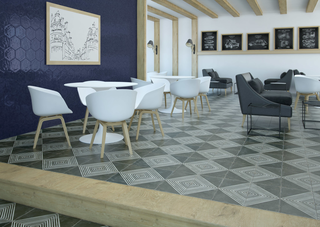 So what is encaustic tile?Cement tiles are not fired; there is no glaze layer on the surface of the tile. They derive their durability from the combination of finely dehydrated ground Portland cement layer and a more coarse layer of sand and cement. The pigment layer is hydraulically pressed into the surface and becomes a part of the tile. This merging of two layers creates the typically crisp clean patterns.
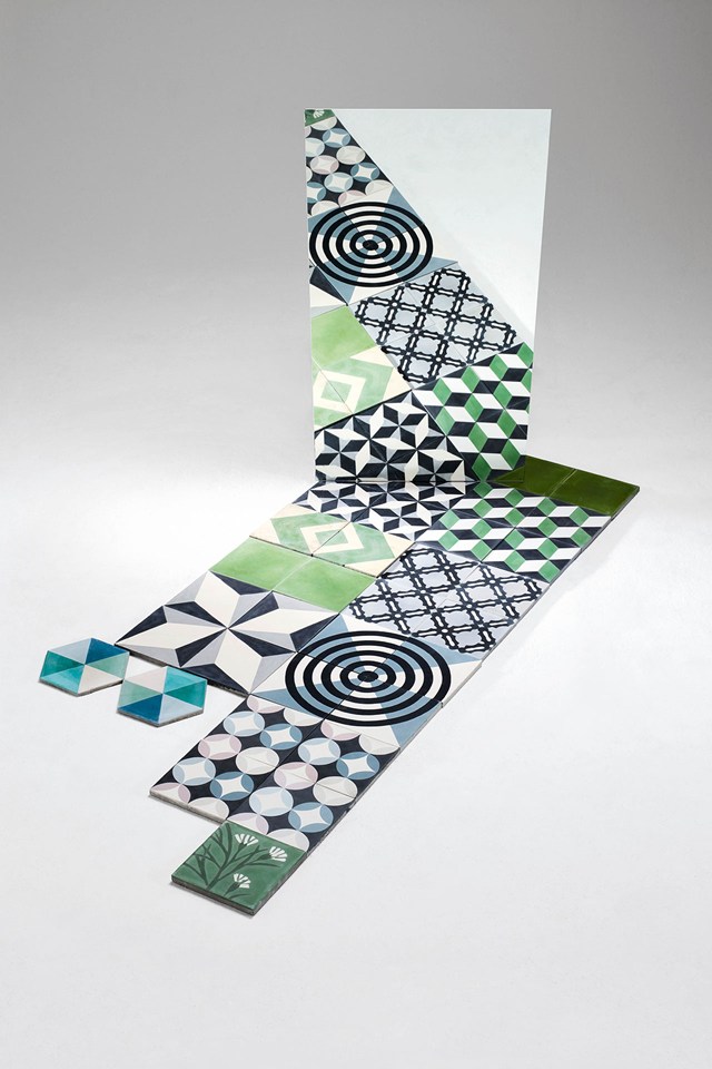 Originally these tiles were handmade but naturally today they are mass produced as described above. Encaustic, or cement tiles are known for their durability as floor tile and have lasted centuries. This explanation only scratches the surface as each country town and village in Italy, Spain, Mexico, Turkey etc. has its own history with the technique.
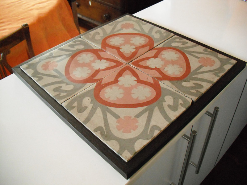 In my research I also came across the work of Benedicte Bodard. She lives in Barcelona where she salvages cement tile from dumpsters. With a little TLC ,she recreates them into furniture, wall hangings and more.So there you have it. If you have more info or would like to continue the conversation, email me or come by and visit on FaceBook.-------------------------------------------------------------------------------------------------------Update: Since posting this on Tuesday I have heard from designer Lundy Wilder of Villa Lagoon Tile. Not only is she an expert on cement tile, she even has a blog devoted to it! Here's what she had to add to the conversation: "Today's cement tiles are indeed still hand made all over the world. Ours are made in the Caribbean, Morocco, Vietnam, and Mexico. We have been to the factories (workshops is more fitting word) and know the owners well, all our cement tiles are made by hand.
Kitchen Work Centers, the New "Triangle"
Whether you are a design professional or an educated homeowner you’ve probably heard the term “kitchen work triangle”. In fact it’s probably one of the first things you learn when endeavoring to create a new kitchen. Who thought this up? It is actually the result of a study made at the University of Illinois in the 1950s! If you’re wondering if it could be outdated, just think of how much kitchens have changed since then in terms of products, appliances and how we use them.The National Kitchen and Bath Association (NKBA) defines the kitchen “work triangle” an imaginary straight line drawn from the center of the sink, to the center of the cook top, to the center of the refrigerator and finally back to the sink. The NKBA suggests the following guidelines for determining a work triangle:- The sum of the work triangle's three sides should not exceed 26 ft. and each leg should measure between 4 ft. and 9 ft.
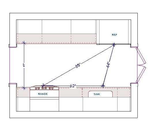 - The work triangle should not cut through an island or peninsula by more than 12 inches.- If the kitchen has only one sink, it should be placed between or across from the cooking surface, preparation area or refrigerator.Yes, this makes kitchen design sound a bit like solving a puzzle and, actually, it really is. I know my design is “right” when the layout works from every angle in terms of safety, ease of function and, of course, aesthetics.
 Some of the design solution is just good sound common sense but much of it should be directed by the individual needs of the client. I don’t “do” the triangle as a rule. Today we have multiple cook kitchens and no end of possible appliances. Modern kitchens are so unlike those of 60 years ago, so I use the more updated concept of “work centers”. The basic ones are food prep, cooking, clean up and storage.
 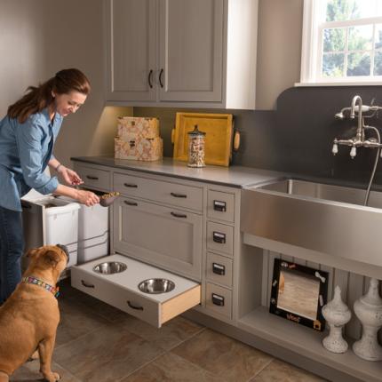 So while efficiency is still at the forefront, the thinking is a bit more evolved to address twenty first century needs.In a perfect world, work centers should be situated to allow someone to work in one area without getting in the way of someone using another. However, let’s face it, in a very small kitchen that is just not going to happen! The focus then is twofold: enough storage and enough counter space.
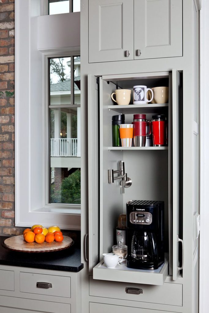 The types of work centers you can have is only limited by your imagination. Here are some good ones:-Beverage center- It can be coffee/tea, smoothies, wine or cocktails-Media center-It can be sit down area for menu planning, computer, charging station or TV-Baking center- You can trick this area out with customized storage for bake ware, bowls, utensils and a marble top for rolling dough.
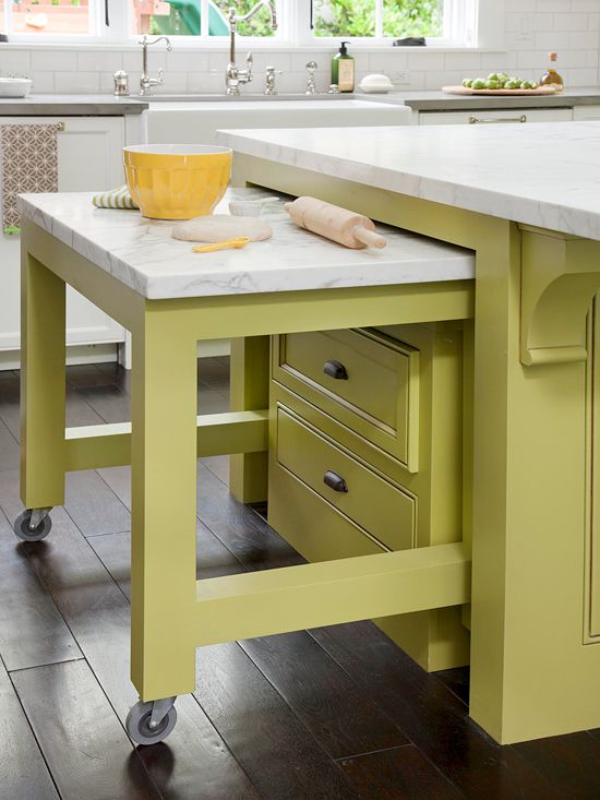 Remember that an “artful kitchen” employs what I call “practical creativity”. Function is the infrastructure, beauty comes next, the art is getting both just right.
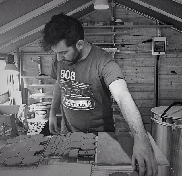
A Tile Tale Inspired by Life and Process: Meet Guy Mitchell

