The New English Kitchen

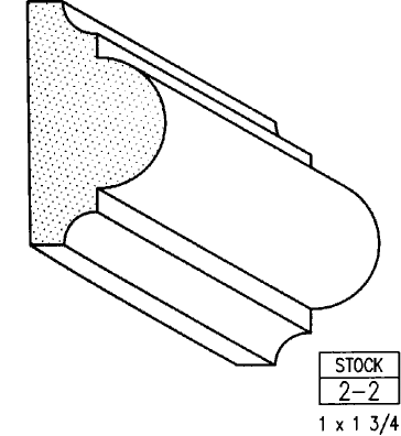
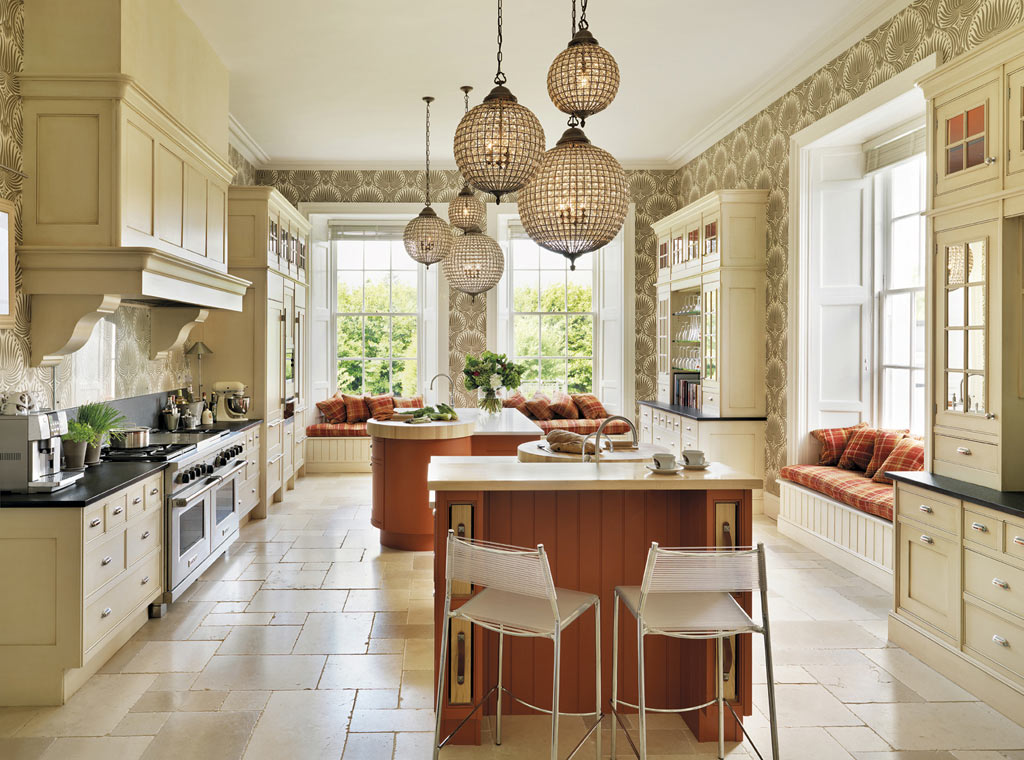
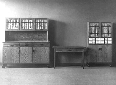
A bazillion years ago (circa 1994) when I first began my adventure in this business, the “English Kitchen” was all the rage in the high end market.  I learned to design, by hand,  in metric and things like astragal mouldings (yes moUldings with a “u”) were all the rage.  Distressed, fly specked finishes were hot and no one wanted a white kitchen unless it was encrusted with glazing.  I learned the English style by apprenticing with a true Englishman and gentleman who I shall be forever grateful to.

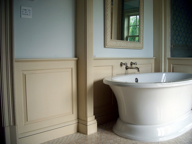
 astragal molding 

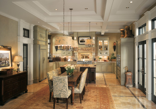
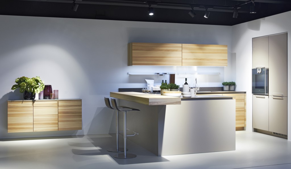
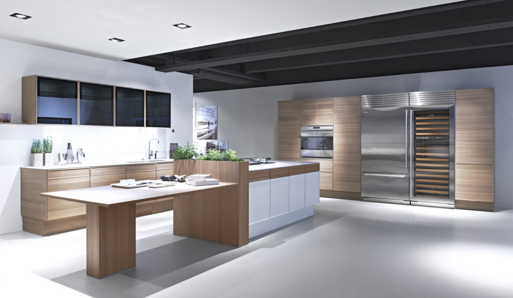
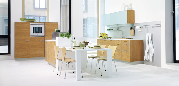
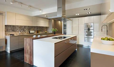
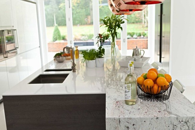
Those kitchens looked something like these photos from Houzz.com.  Back in those days I did not work for a top notch custom shop like Brendan Donovan's.  I worked for a top notch cabinet dealer so we actually imported this type of cabinetry from the UK.   This came with its own set of challenges, to say the least.  Just think of how long it would take to get a parts order and how expensive it was to transport!   Charming and beautiful in their own way, these kitchens are full of detail and working on something like this was good training ground for a budding kitchen designer such as myself. That was then.  Nicholas Anthony Showroom, LondonThis is now. Nicholas Anthony Luxury Designer KitchensToday ground zero for the latest in high end kitchen design in London is located in the West End, in and around Wigmore Street.  It's home to exclusive brands such as Bulthaup, Poggenpohl and the Nicholas Anthony showroom featuring the latest by SieMatic. Nicholas Anthony Showroom on Wigmore St., LondonThe new English style is exactly that, new!  Cleaner more modern design utilizing the latest technologies are now the order of the day.  With the advent of the internet I believe it really is a small world.  Ideas and trends fly over the web at the speed of light.  We all influence each other cross pollinating our designs but there is still an appeal in wanting what the other peeps have.   Many of us here want the new, slick, Euro styled kitchen and, dare I say, many Euros and Brits are amazed at our American sized appliances, namely the quintessential 36” refrigerator! Nicholas Anthony Luxury Designer Kitchens  I feel the advances in technology when it comes to laminates and counter top material lend themselves to these new clean- lined looks. Decorative detail is found in interesting wood grains and the random markings of stone rather than from moldings and corbels.  So what do you think? Are you yearning for the "olde world" look again?  Do you think it's coming back or are we here to stay for the time being?
Kitchen Love, Italian Style at Acheo and Poggenpohl

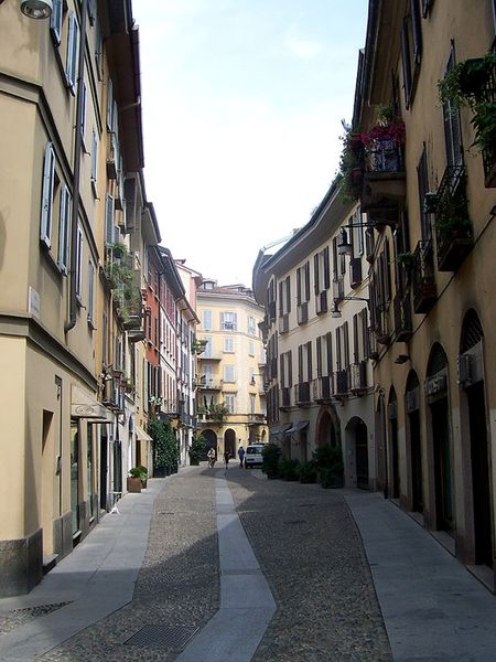
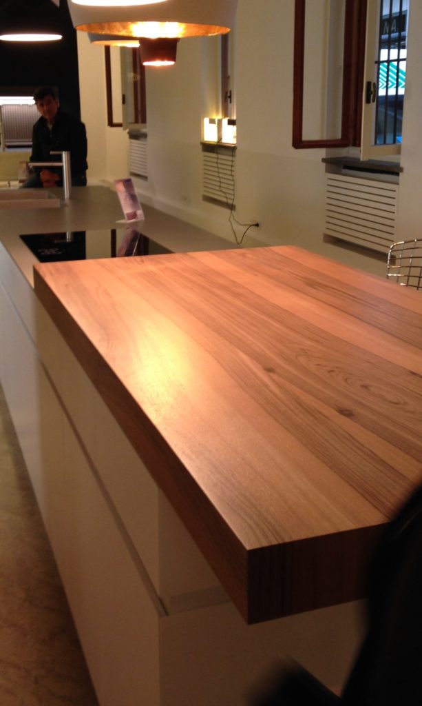
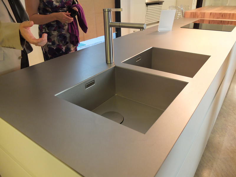
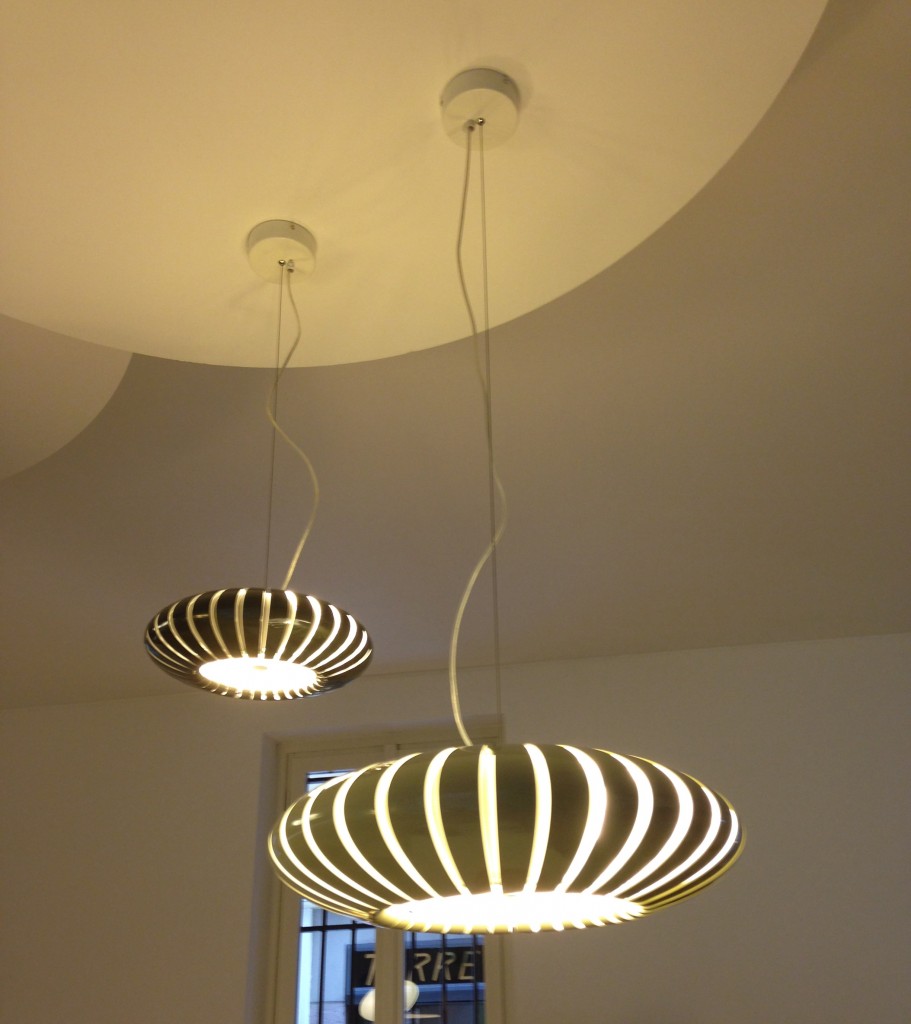
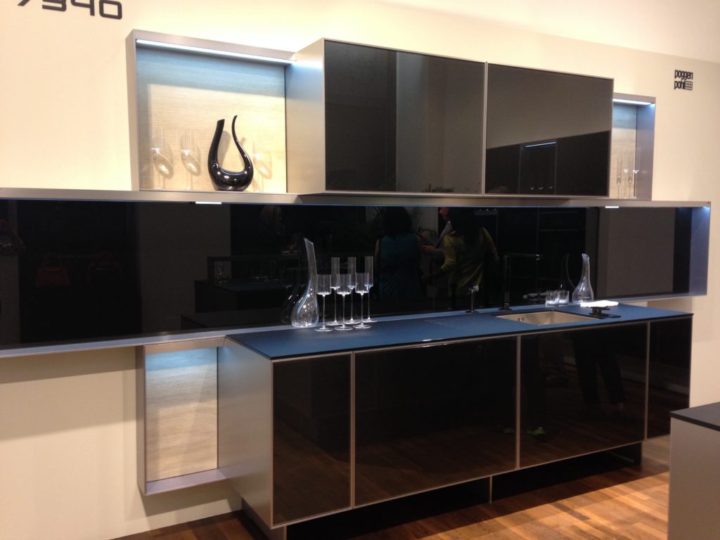
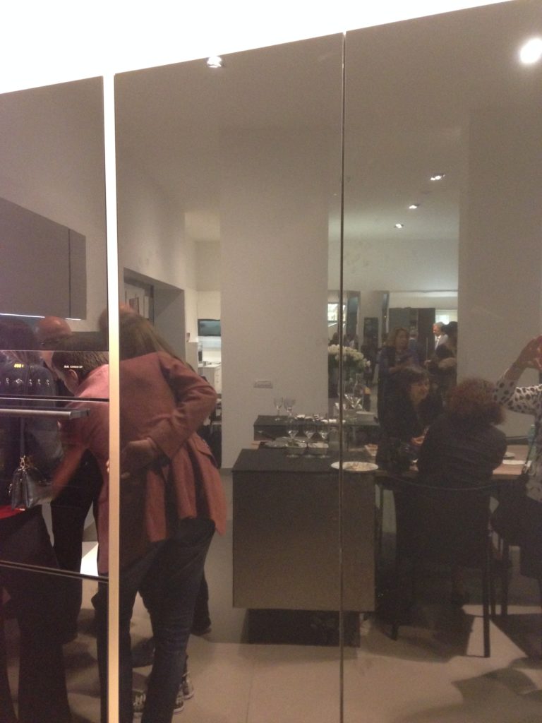
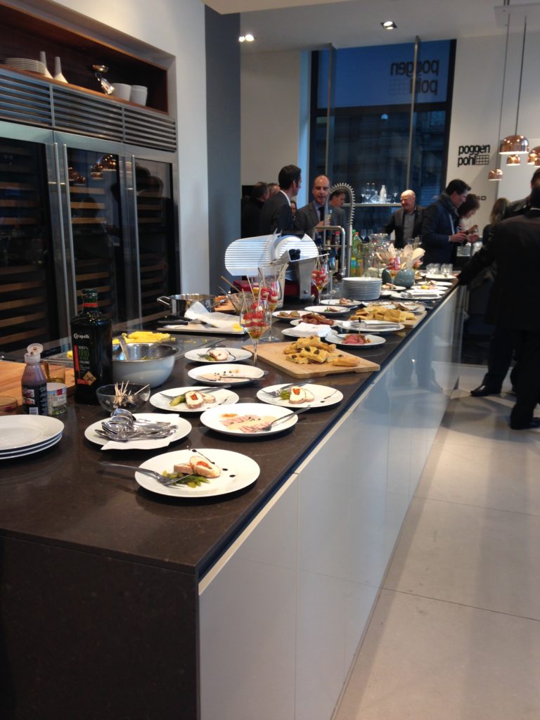
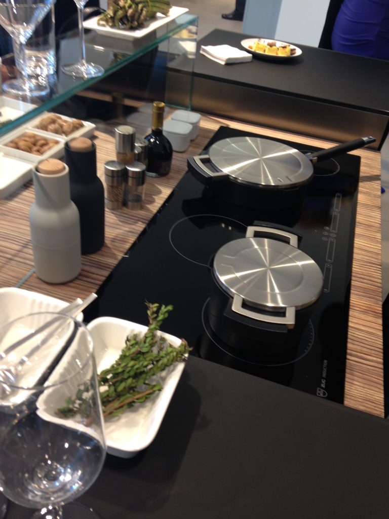
Ok so you got me, Poggenpohl is not Italian.  They are German, except when they're in Milan, then they're Italian.  Good enough? I can hardly believe I’ve been home for over a week!  Images and impressions are still swirling around in my head from the wonderful time I spent with Blanco and some fellow members of the Blanco Design Council in Milan.  Design Week was not limited to the extensive exhibition at the Rho Fairgrounds but also included events all over town.  We visited two memorable and cutting edge showrooms on our visit. 450px-5275MilanoViaMadonnina   The first was Acheo (pronounced AH-kee-oh), located in the Brera district.  Brera is also known today as the design district.  It is also one of the few really old areas of Milan which saw 80% destruction during WWII.  Acheo opened it’s showroom there in 2010.  Today they are a showcase of quintessential contemporary Italian design for the kitchen.Acheo,Milan,woodtops,blancoThey put on an impressive pre-dinner spread for us and the peeps from Modenus Blogtour Milan.food2acheo-LAll through our trip we saw many products not available here in the US.  Some will become available, perhaps in other versions.  One such item is this Durinox work top and sink (below) which is a part of the Blanco Steel Art collection.  Think stainless steel on steroids!!  Seriously, it is made with a finishing process used in the auto and aerospace industries so it is super scratch resistant and more than twice as hard as stainless steel.  It is available, as shown, in Europe from Blanco in Germany.  The sinks only will be available for undermount installation here in the US.BLANCOsink Acheo Showroom-LWe found that in Milan you could miss half the experience if you failed to look up!  Look at these cool light fixtures at Acheo!Acheo, Italianlightfixtures, milanThe other showroom we had the pleasure of visiting during our visit was Poggenpohl.  I think you could argue that they set the bar when it comes to innovation in contemporary cabinet design.  As I mentioned, Poggenpohl is a German company and they claim to be the oldest kitchen brand in the world! Poggenpohl, porschekitchen, milan Some years ago Poggenpohl  teamed up with the Porsche Design Studio to develop the P'7340 line of cabinets. Both companies focus their concentration on the overall line as well as  providing unsurpassed quality of product. Above is a Porsche Design Kitchen P'7340 by Poggenpohl.  It's hallmark is the aluminum frame which surrounds each box. Originally designed with men in mind, it has evolved into a brand appealing to discerning contemporary design devotees of either sex.  Chief Poggenpohl designer Manfred Junker was on hand to explain the intricacies of design detail that go into the product including their trademark, no handle, fronts.  In fact, he claims, they are the first to offer touch control on the refrigerator and dishwasher.  Here's what they have to say about that on their website: "Handleless fronts emphasize the clean, uncompromised lines of the kitchen furniture."Poggenpohl,touchcontrolrefrigerator, milanPoggenpohl took care of our tummies too.   After all, design spotting can work up one hell of an appetite!Poggenpohlmilan     This newest version of P'7340 (see below) features a contrasting counter top inset made of solid New Zealand pine with a wire brushed finish.Poggenpohl.PorscheDesignKitchen,P'7340,milanNext up:  FTK (Technology for the Kitchen)  This was the section of iSaloni featuring the latest trends and products in kitchen appliances.Click here for a peek at all my Milan photos!own and automatically completes the closing cycle

Hot Trends Make a Big Splash at KBIS 2014

As many of you know, the Kitchen and Bath masses gathered in Las Vegas February 4-6 for their annual pilgrimage to KBIS, the Kitchen & Bath Industry Show. This year the event was part of Design & Construction Week, a new concept, merging KBIS with IBS, the International Builder’s Show. As a result, it was bigger and better than ever. Let’s hope that what happened there does NOT stay there !Kitchen-by-Marie-Claire-Reimann-3-600x400Maybe I should limit that to kitchen and bath industry products and trends ;)   Uber interior design resource Modenus hosted their latest Blogtour group who covered the event in a big way! You can get the entire scoop here.So what is trending, you may ask? Here’s the latest scoop from Kitchen & Bath Design News and KBIS co-sponsors, the National Kitchen & Bath Association:loox-led-in-drawerLet there be light.  Yes we’re used to lights in the refrigerator but now we’re adding LED lighting to cabinetry as well.

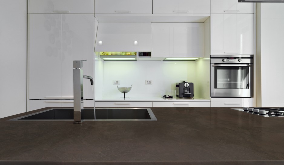
Make that matte.  Last year I noticed a growing interest in matte finishes and it’s even more so this year.  One such surface is the new Dekton by Cosentino.  It's an ultra compact surface including quartz, porcelain and glass.  This makes it perfect for both indoor and outdoor use, even better than quartz as it's UV resistant and can withstand extreme heat.

dekton-keranium-encimera

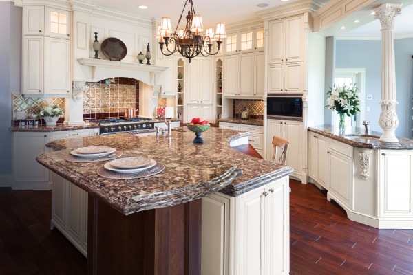
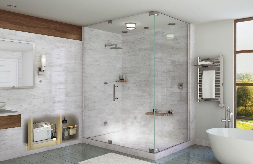
Keep it simple.   NKBA President John Petrie, CMKBDT tells us, "while transitional styles are still number one, we see kitchen design trending more contemporary this year, with clean , simple lines: less clutter and little ornamentation".Quartz rocks, especially if it’s patterned!  Homeowners have discovered quartz but they're not willing to give up the pattern and movement found in natural stone products like granite and marble.  New finishes by Cambria let you have the best of both worlds.Shirebrook from The Waterstone Collection by Cambria Cambria's  Waterstone Collection captures the depth and beauty of marble and granite while offering the superior strength and performance of quartz. (Here's something for you "traditionalists", they clearly didn't get the message about contemporary in this kitchen!)Gadgets, gadgets, gadgets, We may like our cabinetry look pared down but gimme the gadgets!  Technology reigns, ie anything  touch operated or digital.Temp20 Technology by Delta wins Best in Bath AwardThe new Temp20 Technology by Delta Faucets boasts a digital temperature display that saves you the shock or injury from water that's not the temperature you were expecting.   When the temperature is less than 80 degrees the LED display will glow blue.  It's magenta from 80-110 and red when it's above that.  You can get this feature on your Delta faucet  this spring.Home spa system by Mr. SteamA bath to come home to, trends in the bathroom focus on customization and spa ambiance.  In  the high end markets, free standing tubs are all the rage.  They are functional and sculptural at the same time. We are also understanding the benefits of hydrotherapy as in soaking tubs and steam baths.Additional features you may want to include in your new kitchens and baths include the following:-Induction cooktops (and now ranges too!)-Steam ovens-French-door refrigerators (duh, I think we all know that already!)-Bottom freezer drawers (ditto of above)-Touch activated faucets-Electronic (no touch) faucets-LED lighting-Charging stations-Pet stationsI believe all of the above are here to stay, at least in the foreseeable future, and the technology will only get better.

Get a Handle on Craftsman Design for Your Kitchen

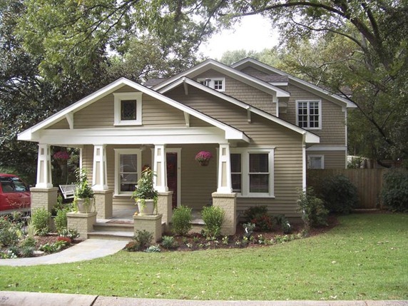
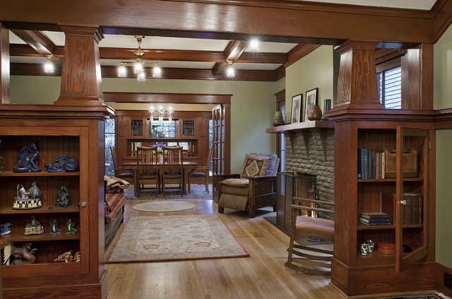
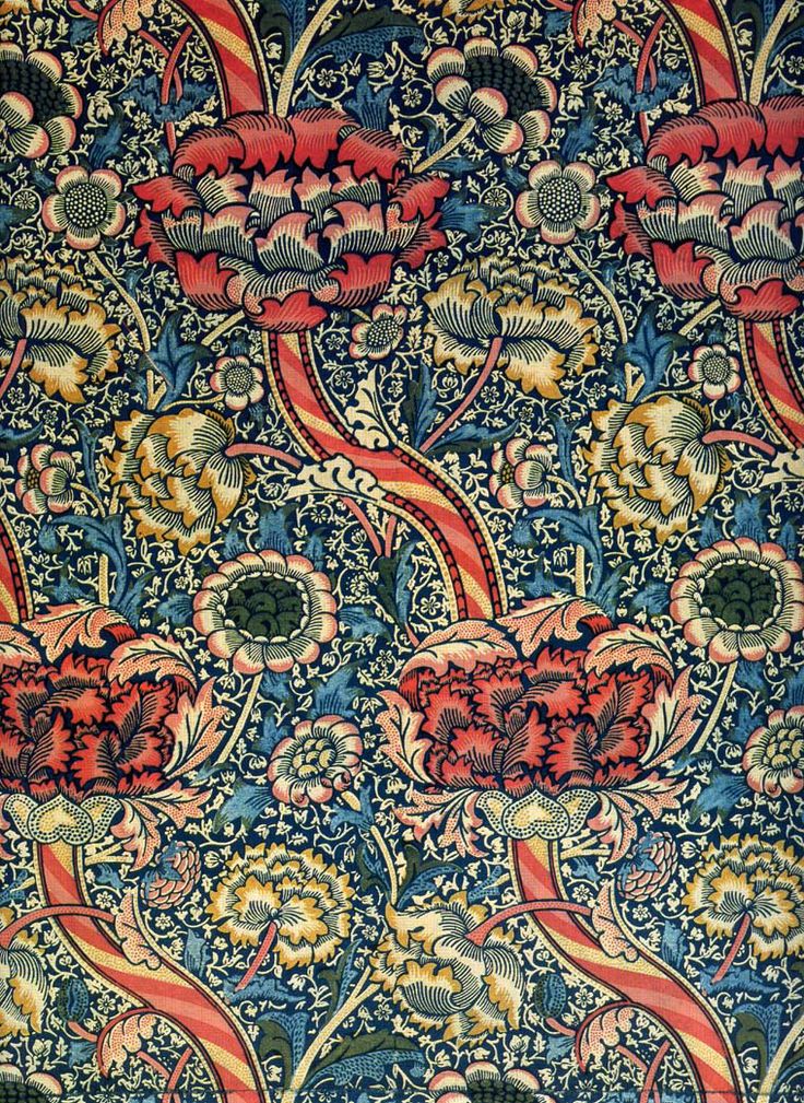
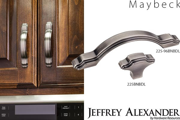
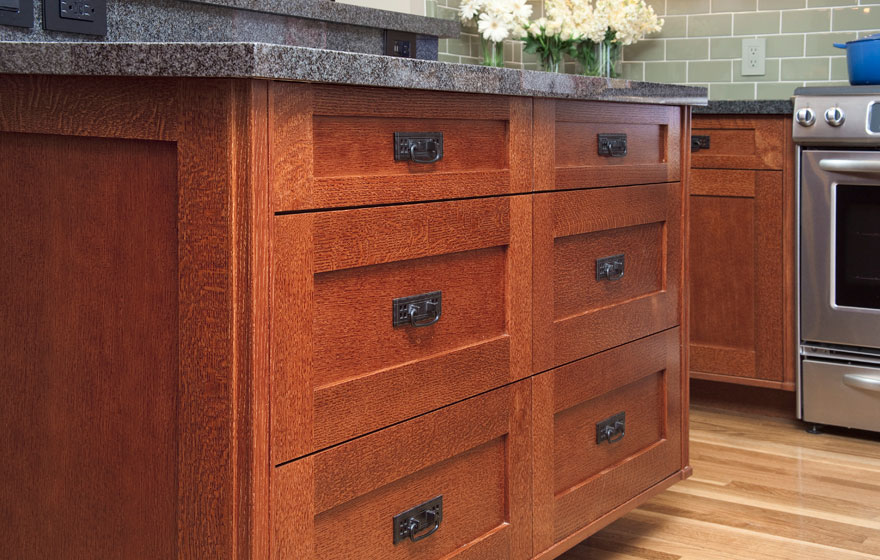
As you know by the last couple of posts I’m deeply in love with all things contemporary but then again I’m certainly no “one trick pony”. I have always been intrigued with Craftsman Design. Think bungalows, organic forms and warm rich woods. The quintessential Craftsman style bungalow Craftsman styling is warm and cozy with lots of natural elements and built-in book shelves. Textile design by American Arts & Crafts guru William Morris.  He is quoted as saying, "Have nothing in your home which is neither beautiful or useful."The Arts and Crafts Movement which occurred at the turn of the last century, was a response to the blossoming industrial age.  Mass production was coming into its own and a few intrepid souls were missing the personal human touch of household objects made by hand.  The leading proponent was William Morris, also known for his beautiful stylized floral prints.MaybeckOne of my “go to” hardware suppliers, Hardware Resources,  has just unveiled  cabinet hardware inspired by the period.  Named after Arts & Crafts architect Bernard Maybeck, these selections are a great way to jazz up existing cabinets and give you "the look".  Since they’re only inspired by, and not reproductions of, the Arts & Crafts Movement,  the design is fresh and new as well as being a stylized nod to the Craftsman style.  One beautifully styled knob and 3 cabinet pulls will be available in 5 trending finishes. In addition to the Maybeck design, by Jeffrey Alexander,  they will be introducing the Brenton (Elements)  and the Royce (also Jeffrey Alexander)  at the upcoming KBIS (Kitchen & Bath Industry Show). Shaker styled drawerfronts with a typical A&C handle.  Note warm woods and green tops! Photo by decore.comEmulating this look in cabinetry is easy.  The Shaker door style, which is all the rage, can be transformed to reflect the Arts & Crafts look by the addition of appropriate hardware.  You can get handles like these here.Here's your opportunity to get crazy with a tile back splash.  You will see a couple of motifs that scream A&C including the dragonfly and the ginko leaf.  Add some green to the mix and you've got it!You can get tiles like this one from etsy.com.  All you need is a few accent tiles.  Just make sure your field tile is a compatible thickness.If you're interested in this look or a stylized version of it I'd love to hear from you!

Royalty, New Beginnings and What's Going on in the Kitchen?

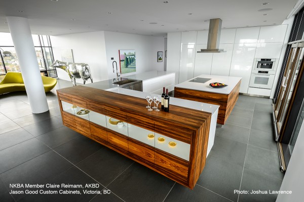
It’s Monday and a  little diversion is in order.  How about a bit of fun with the Royal Family? Little Prince Georgie isn’t the only new thing in the lives of Kate and Will.  They've just moved into new digs as well, Apartment 1A Kensington Palace to be exact.New baby, new life, new palace! Photo: Fox Business According to our friends at US Weekly, Kate’s been working on a massive renovation for the last 18 months or so, to the tune of one million pounds paid by taxpayers with another 500K, or so,  paid for by Will and Kate.    The update is said to include his and her baths as well as three state of the art kitchens! Kensington Palace under construction. Photo: Mirror NewsKate gets to peruse the antiques in the Royal Collection for her new home.  According to British news source The Daily Mail, Kate’s design selections are quintessentially English in sophisticated neutral shades but with a modern twist. Interesting to note that Kate has not availed herself of the services of a design professional and is overseeing the entire project (with the aid of her “small” staff) herself.I vote for this as English with a modern twist.  It's by Smallbone of Devizes.Kitchens for Living wonders what exactly you might find The Royals doing in the kitchen.  Well I don’t know what "the palace" will be like but whilst in their last cozy house in Anglesey, Wales they were known to make lots of tea and toast.  Apparently Kate does know her way around the heart of the home and prepares an awesome roast chicken as well.  She’s also fond of preparing her own jams. Kitchen by RoundhouseIf you’re English and nothing but the best will do for your new kitchen head over to the area in and around Wigmore St. located in the exclusive West End London area.  It is here that  you will find the finest of British bespoke (custom) cabinetry including Roundhouse, Neville Johnson, Boffi  Bulthaup and more.  If you're in sunny South Florida like me you can still get your English on at Brendan Donovan Furniture & Cabinet Co. (Ok I know he's Irish but he does English really well!)You can almost believe this is in England...by Brendan Donovan Furniture & Cabinet Co.Let us help you with your own bespoke cabinetry... 

Poggenpohl, Ultimate Form and Function

Poggenpohl new ash wood veneerWhether your in the market for a new kitchen or you're in the business of selling kitchens one of the first questions that comes up is, “what’s your style?” Are you traditional, transitional or contemporary?  If the answer is contemporary, the elements to look for include seamless integration, totally efficient function and clean sleek lines.  These happen to be the standards at Poggenpohl, founded over 120 years ago as the first German kitchen brand and now  the best known kitchen brand in the world – present in more than 70 countries around the globe.  Poggenpohl can show you what true European contemporary design is all about.1892_01Today they continue to think outside the box (pun intended) to offer some of the   most cutting edge cabinetry in the industry.          

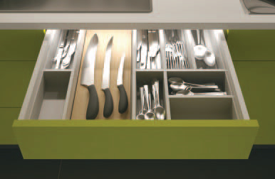
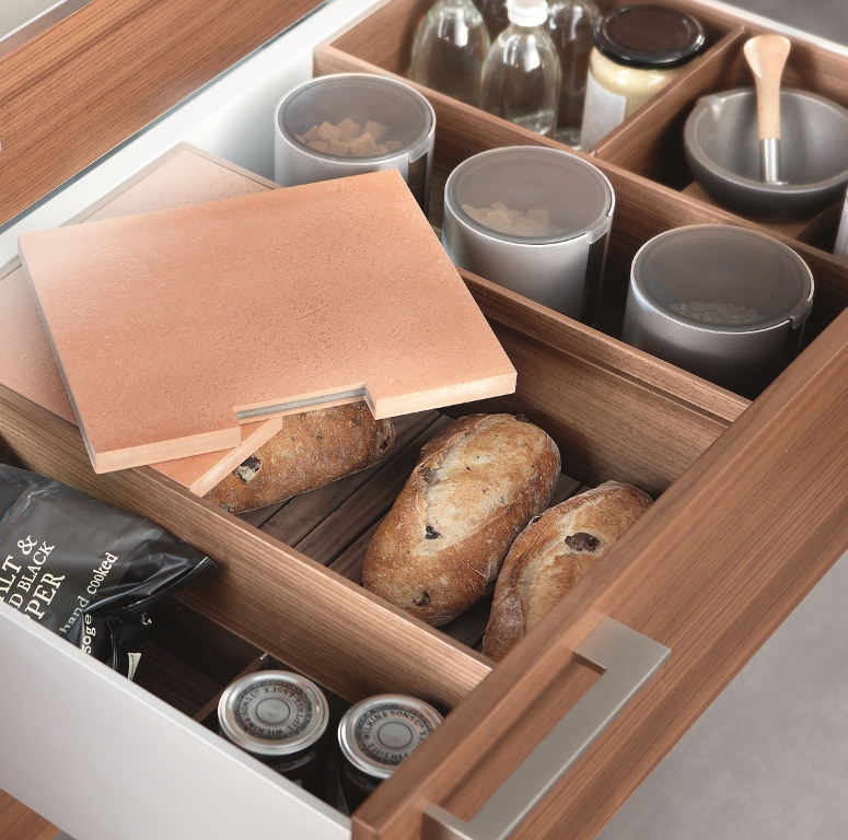
The new +EDITION collection from Poggenpohl combines the best of both worlds, crisp clean white lacquer with warm natural walnut wood veneer.  It is available in flat panel or thin frame detail door styles. New black glass upper wall cabinets include the same thin frame details with finished interiors and LED lighting.Behind the scenes storage is also a Poggenpohl hallmark.  A wide range of  available drawer inserts can be customized to your needs.  These kitchens are not designed, they’re engineered!  This includes not only cabinets but thin counter tops, offered in glass or stone, and even integrated glass front cooking appliances!  One can be sure that their kitchens are as pleasurable to look at as they are to work in.  I also love that although the elements are integrated they seem to also stand alone as individual sculptural statements.  (Spoken like a true kitchen designer channeling her inner artist.)A tricked out backsplash eliminates counter clutterA modern European kitchen utilizes the easy to reach back splash area under the upper cabinets.  Other elements to notice include horizontal graining, mid-height cabinetry and a mix of texture and materials. I enjoyed learning about Poggenpohl and their design philosophy as a part of the Modenus Blog Tour New Orleans.Next up:  We’re gonna get steamy at KFL!  Adding luxury and health benefits to your bathing experience with Mr. Steam