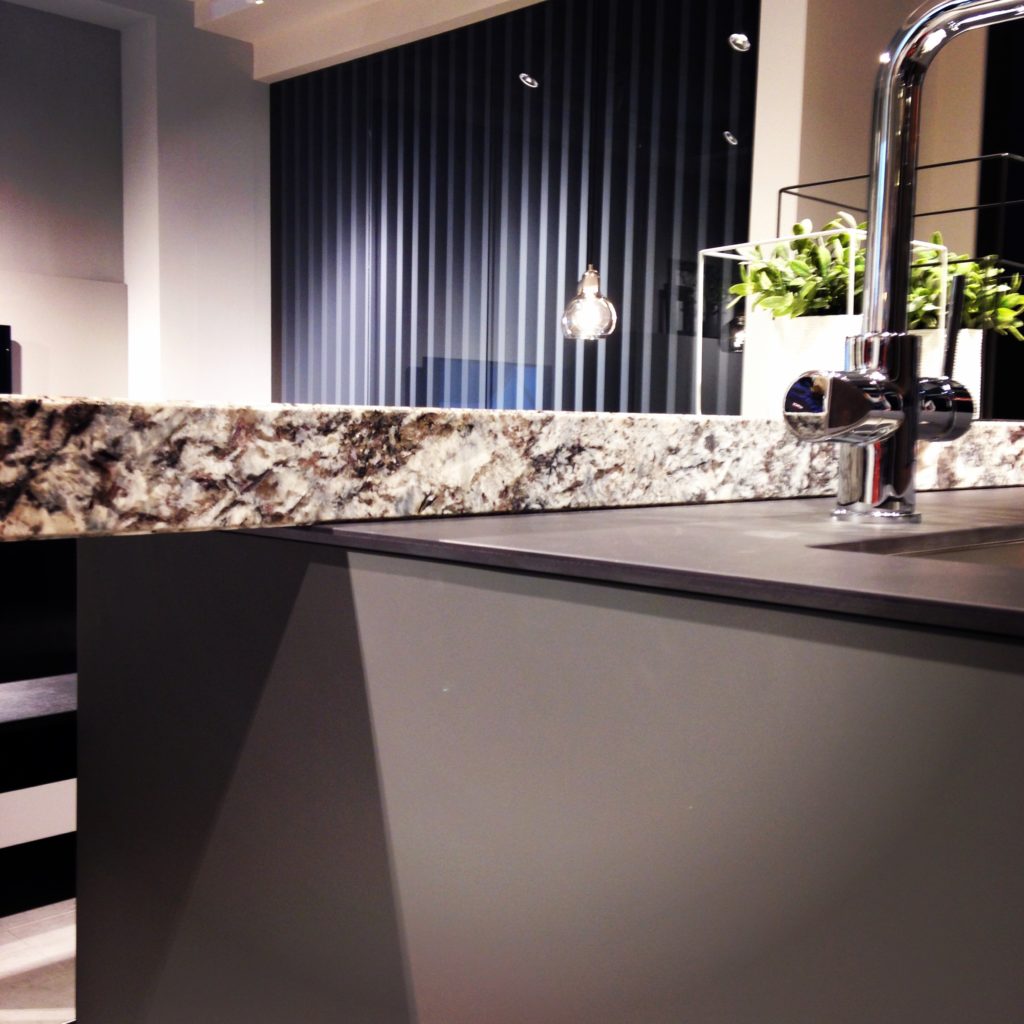
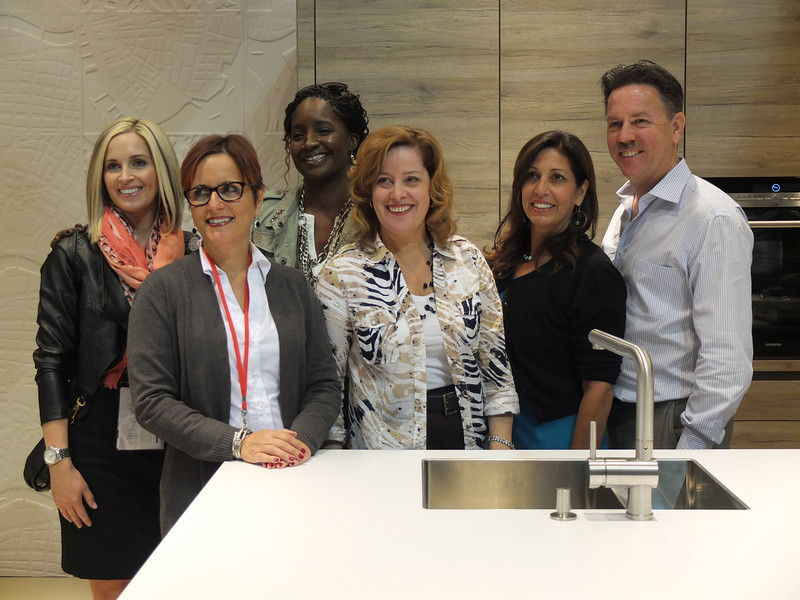
Day two of the Modenus Blog Tour was opening day for the 51st annual Kitchen and Bath Industry Show (KBIS). The Bloggers were given an inside peek into many of the booths at the show and as we toured, trends most certainly did emerge.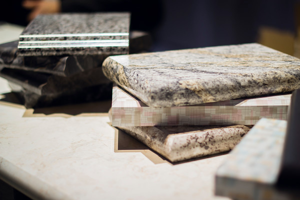 "There is a three year lag between Europe and North America when it comes to trends", says Warren Ramsland, President of Top Knobs. Taking that into account, there were many differences between what I saw here and what I witnessed in Italy at Euro Cucina last year. Perhaps the biggest European influence that continues to pick up steam is contemporary design for both the kitchen and bath.
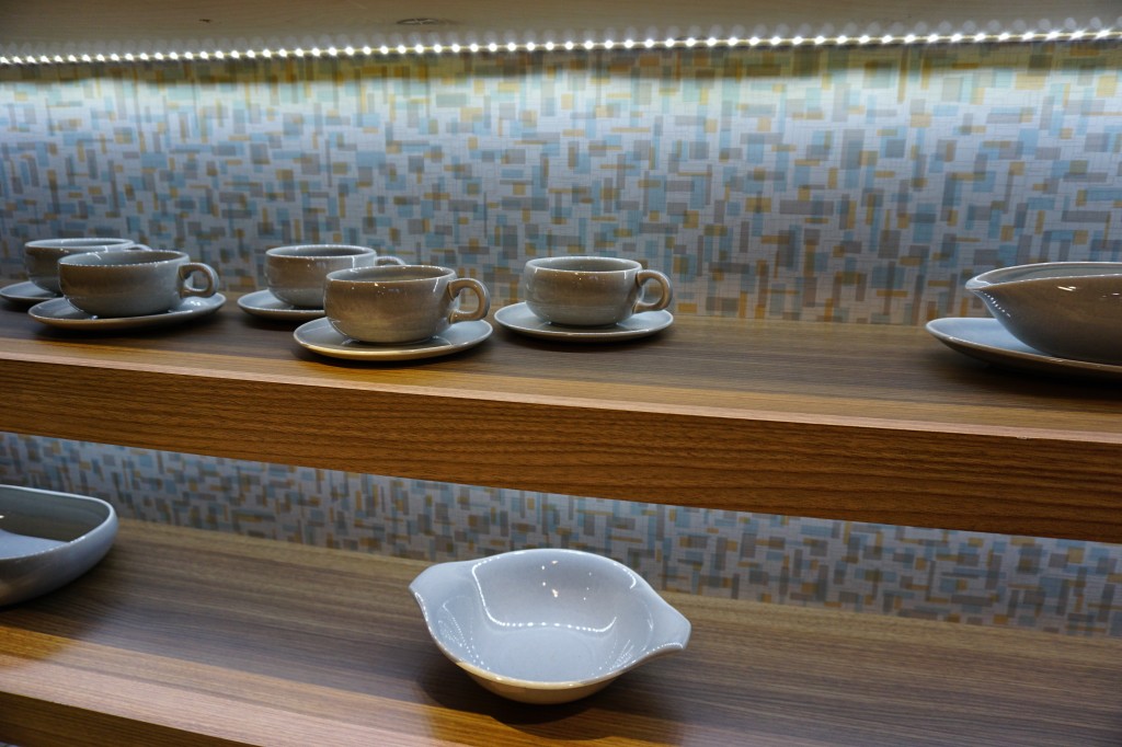 Laminates are enjoying a serge in popularity. This material is more widely used and experimented with by our friends across the pond but we're picking up speed. I was wowed by the offerings at Wilsonart who debuted their "Spirit of Mindfulness" collection of 27 exciting laminate colors and textures. Also introduced were a line of quartz counter tops in a great assortment of neutral, workable hues. By late spring, a selection of 50 patterns will showcase a full range of colors, textures and four structures: Fine and Small Scale, Medium Scale, Large Scale, and Veining and Movement. That is one of the things I love about quartz, the wide variety of pattern, or no pattern at all! I was impressed not only by the innovative product development at Wilsonart but also their philosophy. This press release statement says it all:"Fueled in part by a turbulent economy, today’s more budget-savvy and eco-conscious consumers have responded by making their homes the calm eye in the storm of life. For many, this translates to finding a spirit of mindfulness within themselves and expressing it in their surroundings."
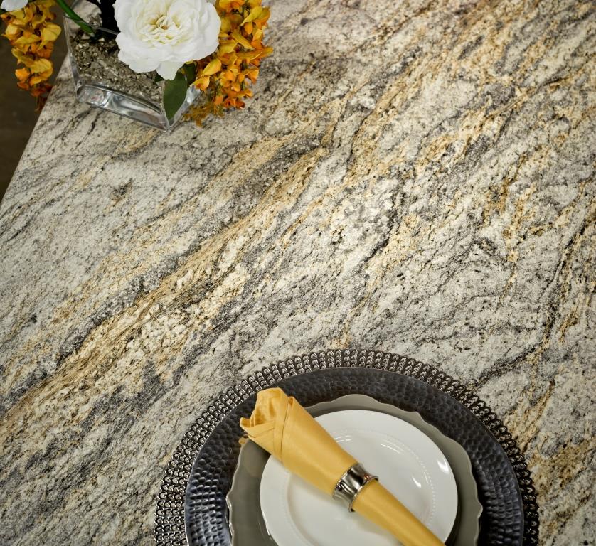 One of the new Wilsonart quartz options showing beautiful veining. Photo courtesy of WilsonartCheck out the Wilsonart Visualizer to help you pick your counter top color. It's easy, fun and very helpfulTechnology is also taking the kitchen and bath world by storm. There were numerous examples but two stood out for me. A company called TechTop took home the Best In Show Award for their counter top charging technology. Simply place your phone, tablet etc. on the counter top and viola' it will charge, no plug-in required.
 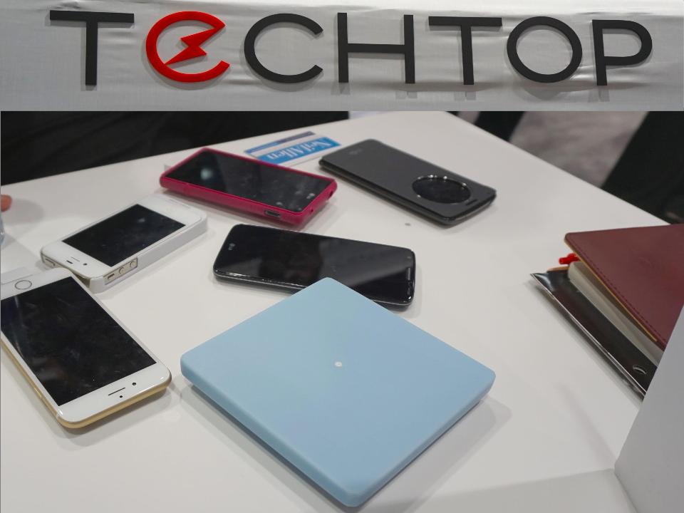 This great idea is from LG Hausy, yes it's the same "Life's Good" LG that makes appliances. They make counter tops too. I also loved this Solna articulating faucet by one of my favorite brands, Brizo. How convenient, right?!Fifty Shades of Gray has moved on to what I call "greige". It's the new warm toned beigey-gray which I saw everywhere! Palettes are definitely neutral. A great example is the Tangent collection by Walker Zanger. Love the mid-century inspiration which I also saw a lot of at the show.
 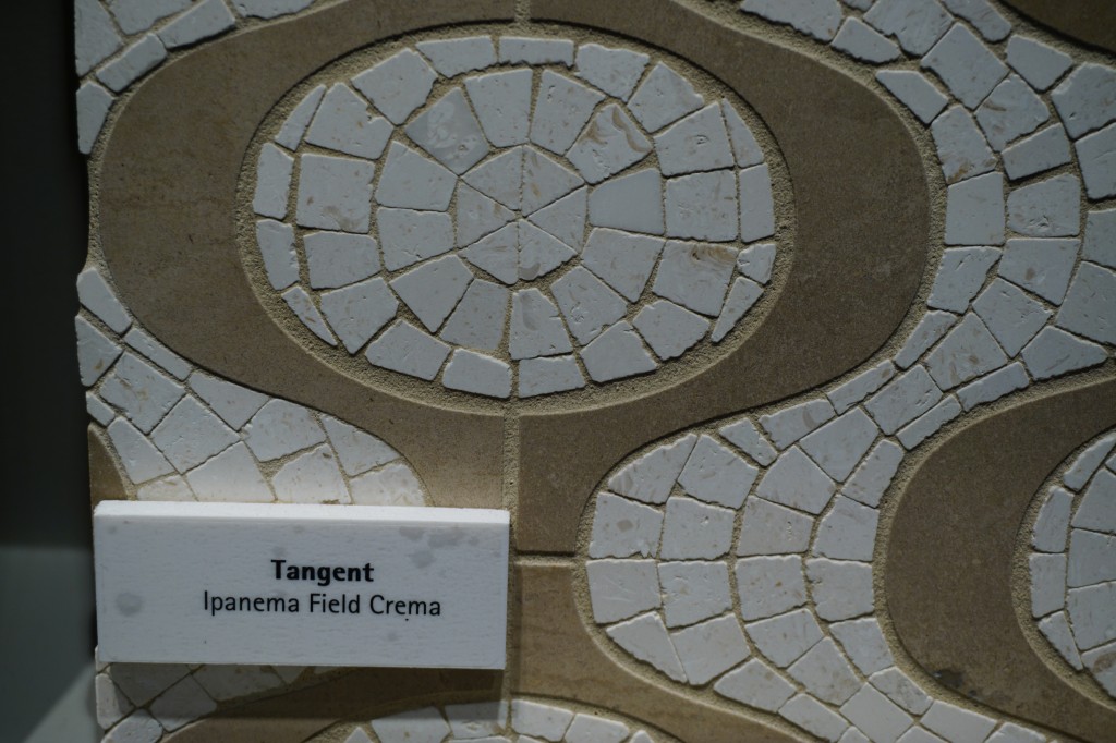 Walker-Zanger deals in tile, marble and stone artistry. Their collections are arguably the most innovative I've seen. Case in point is their Sterling Row collection, inspired by menswear and a favorite at the show. I found it to be extremely sophisticated, eye catching and innovative. The collection was a favorite at the show.
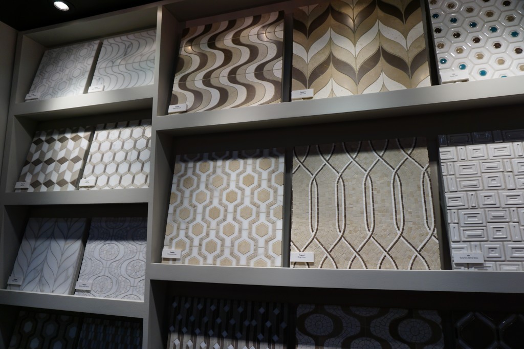
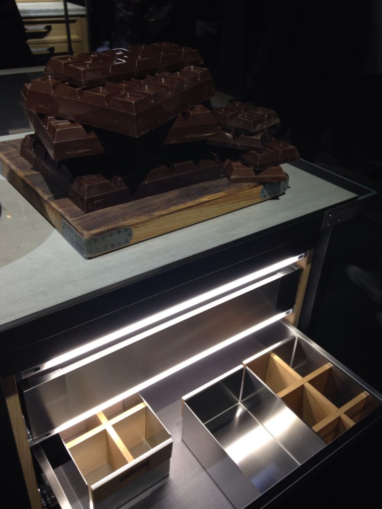
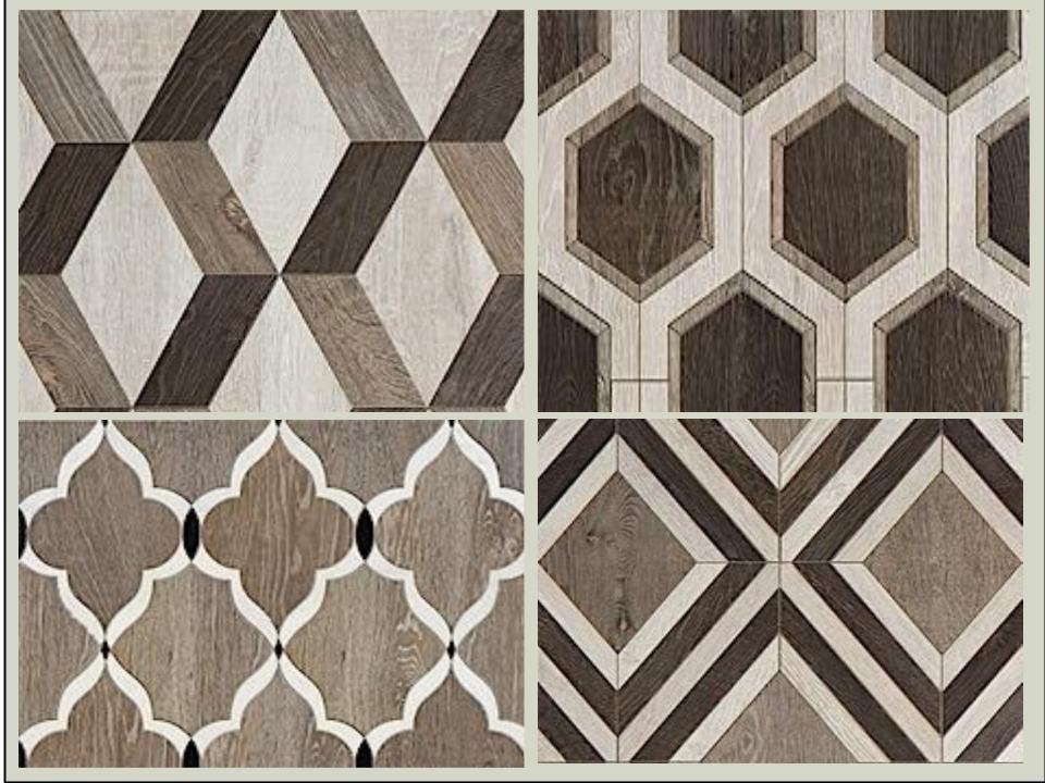 We saw more of the Sterling Row Collection later on the blog tour in The New American Home, so there's more to come!Perhaps the BIGGEST trend of the show was personalization. I mentioned this in the last post about Thermador but they were not alone. Here are a few more pics highlighting the concept. Frigidaire's SpaceWise Custom Flex refrigerators allow you to totally customize the shelves inside by moving the drawers and shelving to your desired configuration.
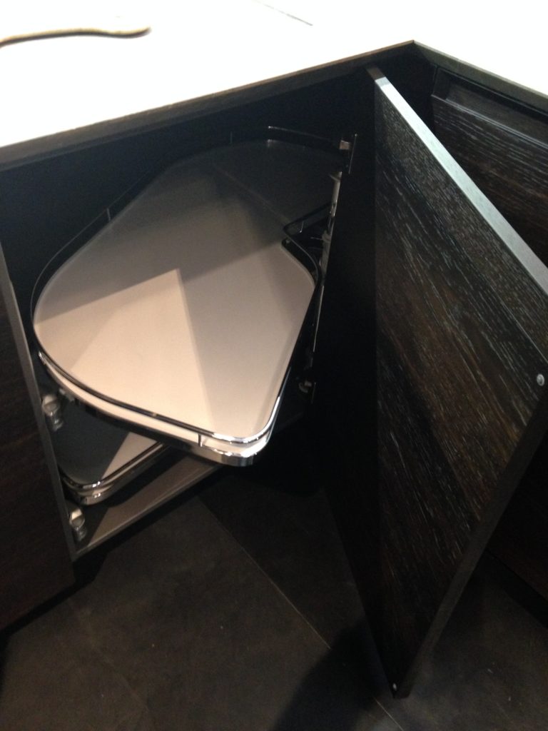
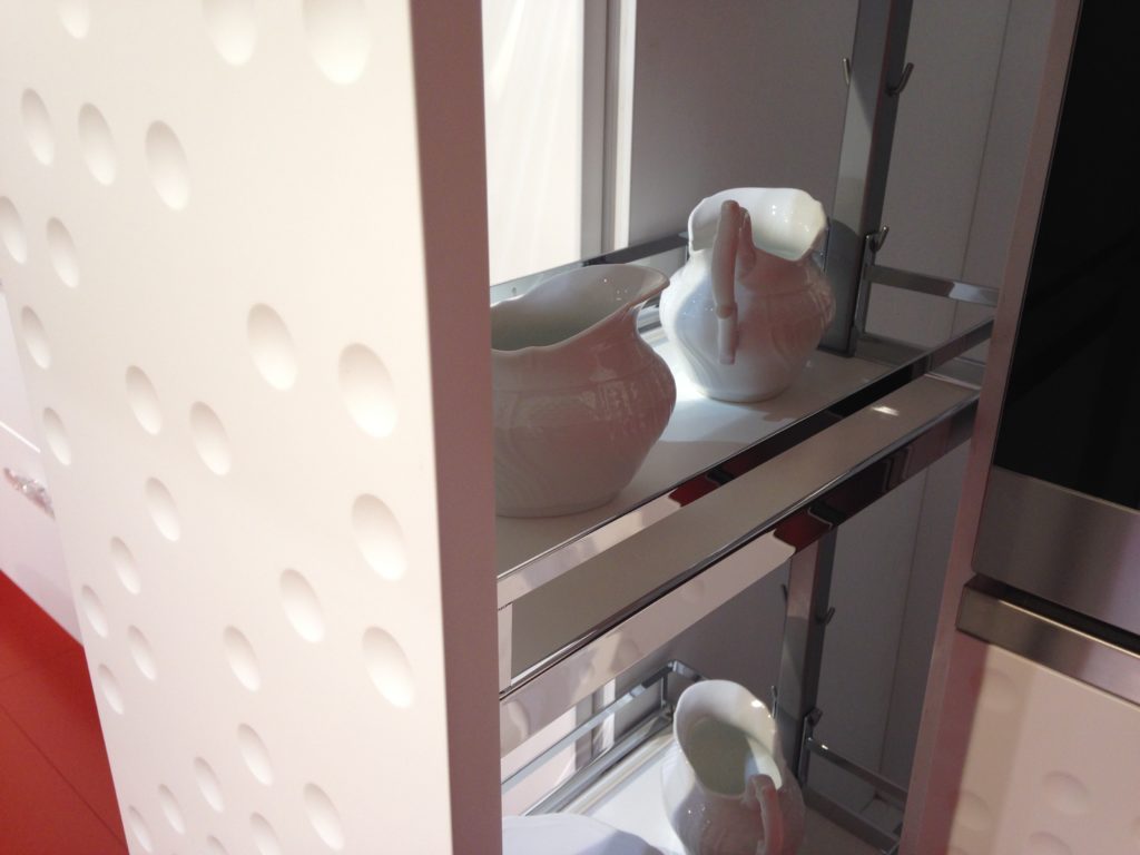
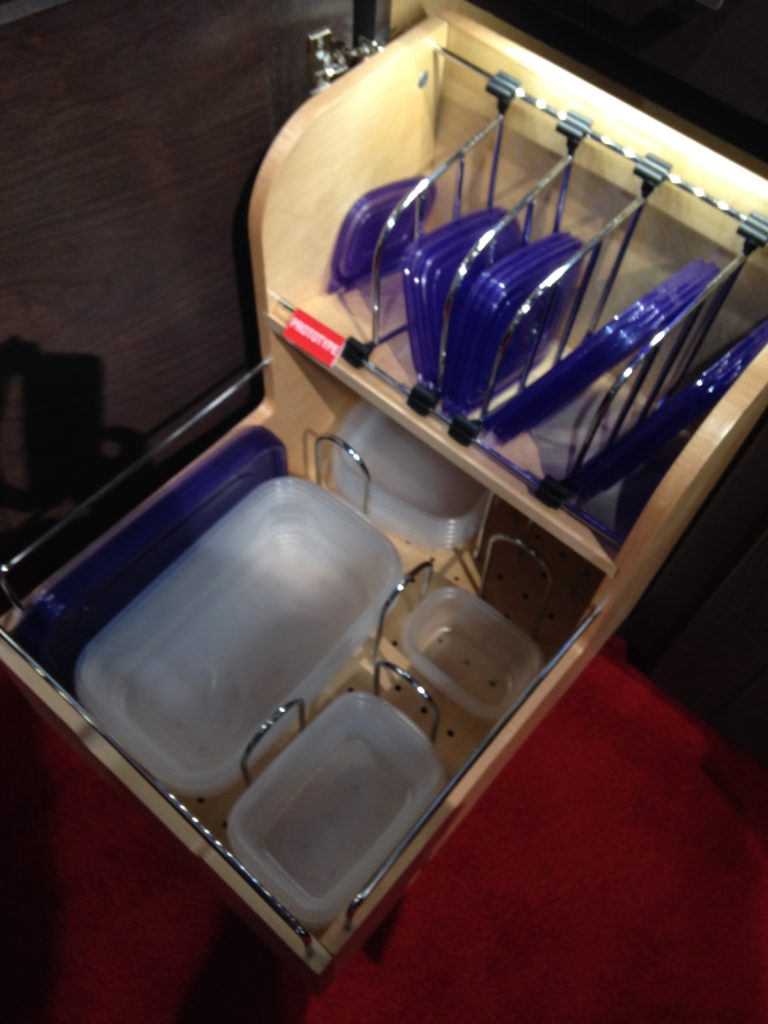
 How about this great storage system by Rev-A- Shelf? I know we all want this level of organization in our lives, yes? Right now this is a prototype but the response from the industry was good so I think we can expect to see this in the coming year.
 Enough for now? Well there's more to come.Up next: KBIS 2015 Part II where I'll tell you about all my great finds for the bath and more.
Perfect Party Mix: Poggenpohl, Blanco and More
One of the most delightful experiences I had on the recent Modenus Blog Tour during Design and Construction Week in Las Vegas (which I'm sure you've all been following on social media) was a penthouse cocktail party located in the Residences at Mandarin Oriental. 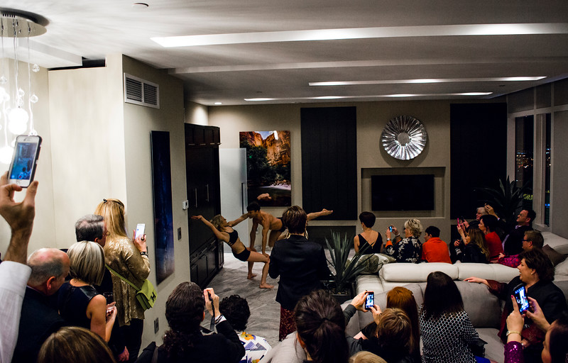 We toured three suites in the sky, more than forty floors up, all featuring products by Blanco, Poggenpohl and Cosentino, makers of Silestone and Dekton. These exclusive residences were host to private events for the press and the design community.
 The theme of the evening was "The Art of Performance". Products were complemented by elegant bronze sculptures by California-based contemporary figurative artist Richard MacDonald.
 We also had living sculptures in the form of two very talented (and flexible) dancers.
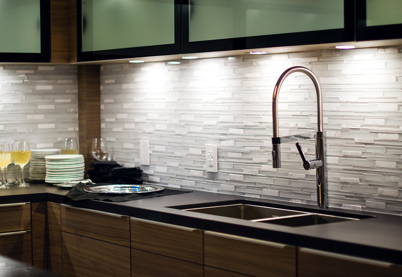
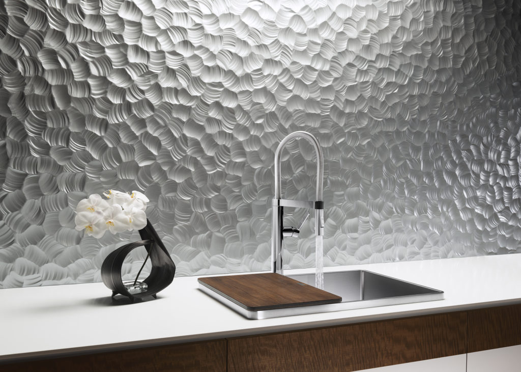
 Blanco's Precision Steel Art sinks were on show along with their edgy Culina faucets. Incidentally this popular sink style comes in a 16" smaller size perfect for prep or bar sinks.
 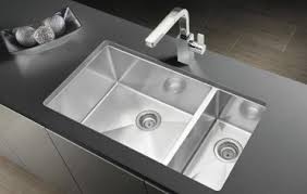 It features angular lines, something really original and different from your standard stainless steel sink.
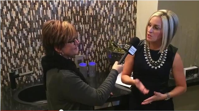 I had the pleasure of interviewing the lovely Christy Emens, Communications and Marketing Manager of Blanco. She touts "livable design" which is Blanco's version of personalization. This involves not only a variety of sink and faucet sizes, but also accessories to add convenience in the kitchen.
 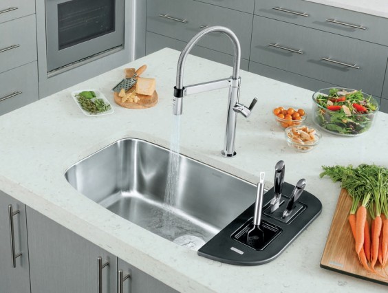 The Blanco One is a bit larger but still compact, plus you can trick it out with all kinds of goodies.Back to the party, The Art of Performance is all about how kitchens and baths can be beautiful as well as functional and I think they proved their point.
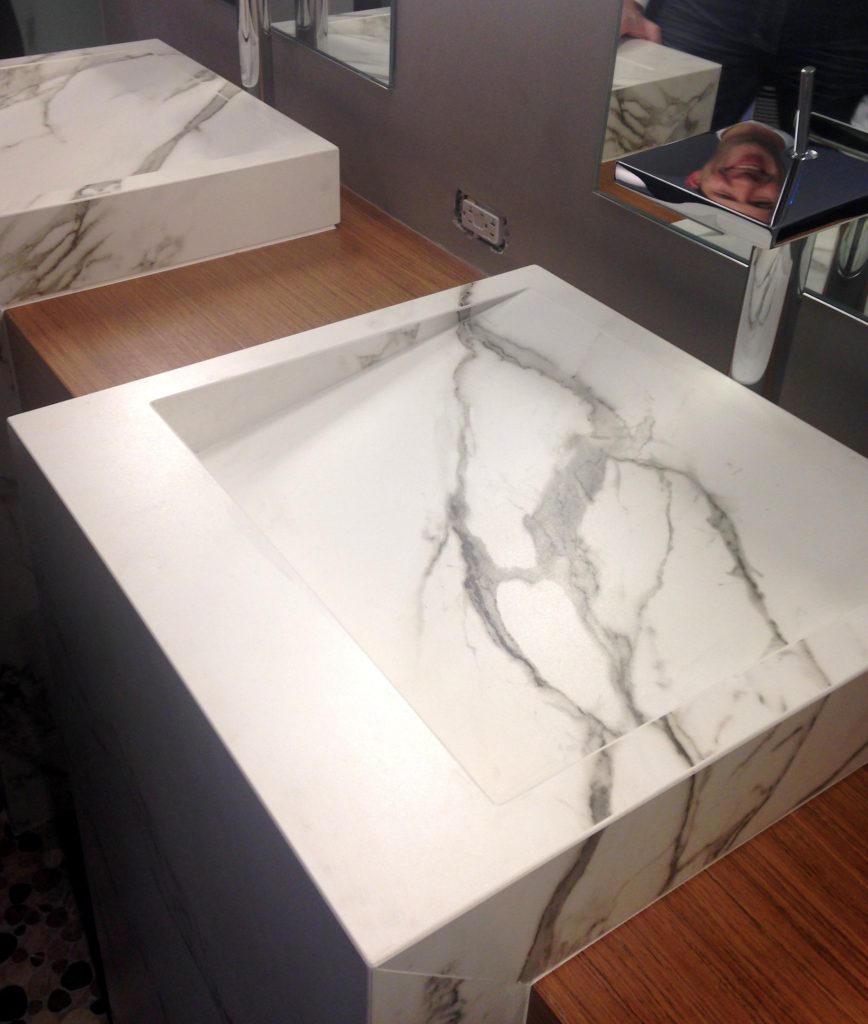 Cosentino showcased their new Dekton color, Aura. I love the continuous veining!
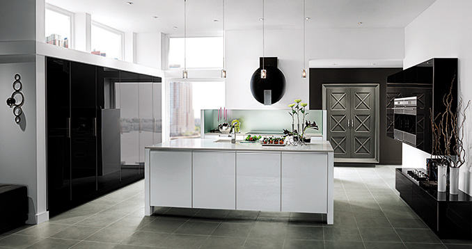
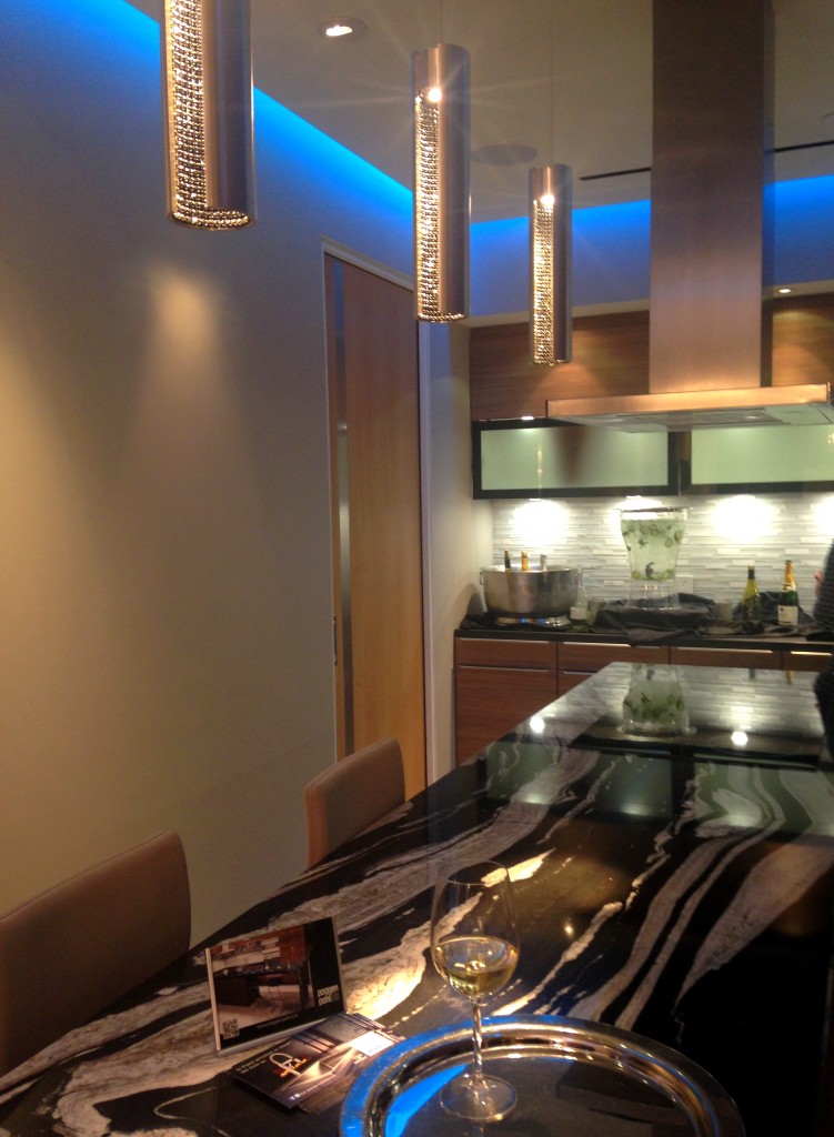 Poggenpohl's design statement continues the theme of "personalization", a major trend at the show. Your kitchen should be a reflection of your lifestyle.As a 123 year old company, Poggenpohl was instrumental in the development of the first modern day kitchens. The German company remains cutting edge in its design philosophy and use of materials. In 2014 they introduced Poggenpohl P´7350 Design by Porsche, the latest incarnation by Porsche Design Studio. The collection features a sleek new look achieved by the use of industrial mitering technology. Love!!
 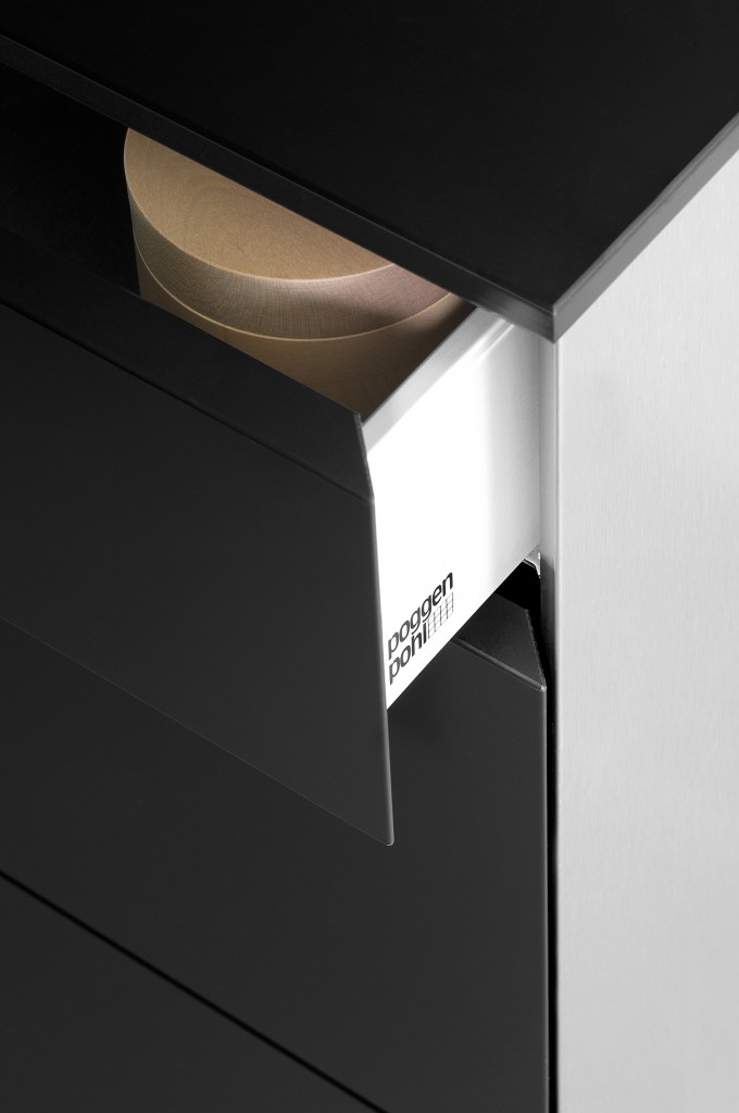 Back to the party. Poggenpohl kitchen designer Anne Kramer, says “Our vision is to personalize each kitchen to the homeowner’s needs for entertaining, for cooking, for storage and for lifestyle. Unlike traditional homes, these residences are at the height of the Las Vegas strip. A rarified atmosphere where anything is possible." I think they succeeded. Next up: The Big Show: KBIS Trend Recap
Blog Tour Preview
As you know, I'll be heading off on Sunday to immerse myself in all the magic of KBIS2015, courtesy of super design site Modenus. This is a HUGE show for our industry and you can be sure I'll be partying taking careful notes and lots of pics to share with my blog peeps! 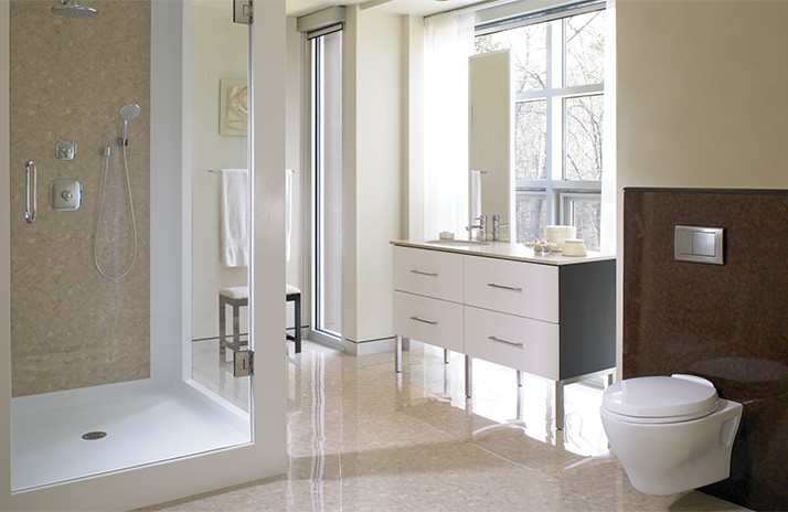 I'll be posting recaps here upon my return but if you'd like to follow along in real time please LIKE my new Face Book page, Kitchens for Living or you can follow me on Twitter and Instagram. If you're planning a new kitchen, listen up! We're about to unleash upon you all the latest product and design info you need to plan for your home.
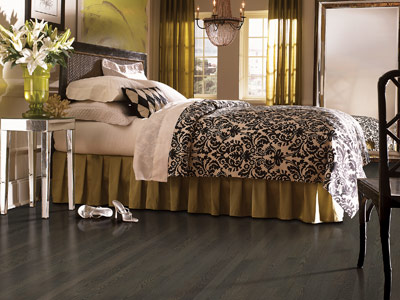 Don't forget to check Modenus to see what all the Blog Tour Bloggers are saying. These pics are a preview of the Blog Tour sponsor line up. That means that you'll be hearing more about this diverse group of industry favorites as I learn about them.
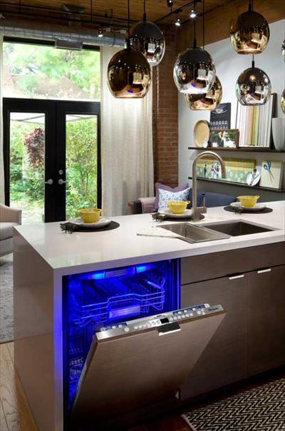
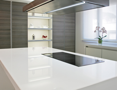
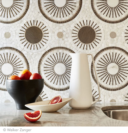
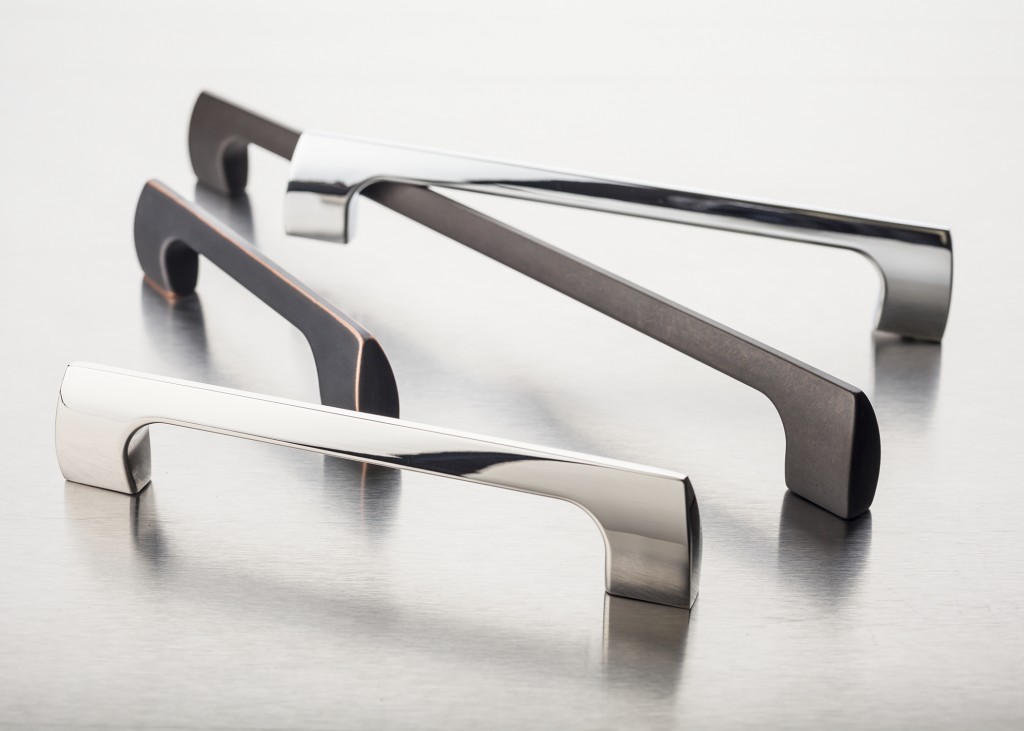
 Now if you made it all the way to the end of this blog post, ladies (and certain gents), you shall be rewarded.
  Stay tuned for more about all these brands and more!
Kitchen Love, Italian Style at Acheo and Poggenpohl
Ok so you got me, Poggenpohl is not Italian. They are German, except when they're in Milan, then they're Italian. Good enough? I can hardly believe I’ve been home for over a week! Images and impressions are still swirling around in my head from the wonderful time I spent with Blanco and some fellow members of the Blanco Design Council in Milan. Design Week was not limited to the extensive exhibition at the Rho Fairgrounds but also included events all over town. We visited two memorable and cutting edge showrooms on our visit. 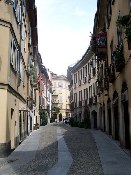 The first was Acheo (pronounced AH-kee-oh), located in the Brera district. Brera is also known today as the design district. It is also one of the few really old areas of Milan which saw 80% destruction during WWII. Acheo opened it’s showroom there in 2010. Today they are a showcase of quintessential contemporary Italian design for the kitchen.
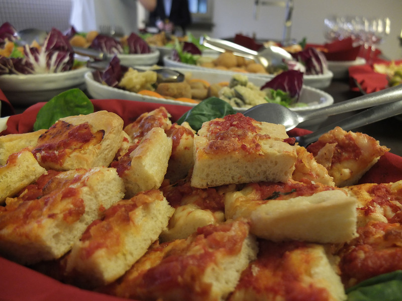
 They put on an impressive pre-dinner spread for us and the peeps from Modenus Blogtour Milan.
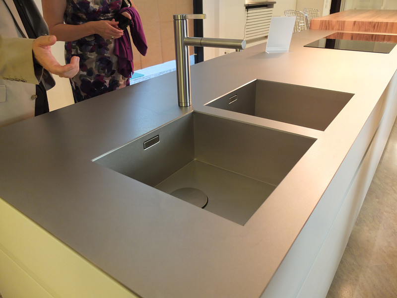
 All through our trip we saw many products not available here in the US. Some will become available, perhaps in other versions. One such item is this Durinox work top and sink (below) which is a part of the Blanco Steel Art collection. Think stainless steel on steroids!! Seriously, it is made with a finishing process used in the auto and aerospace industries so it is super scratch resistant and more than twice as hard as stainless steel. It is available, as shown, in Europe from Blanco in Germany. The sinks only will be available for undermount installation here in the US.
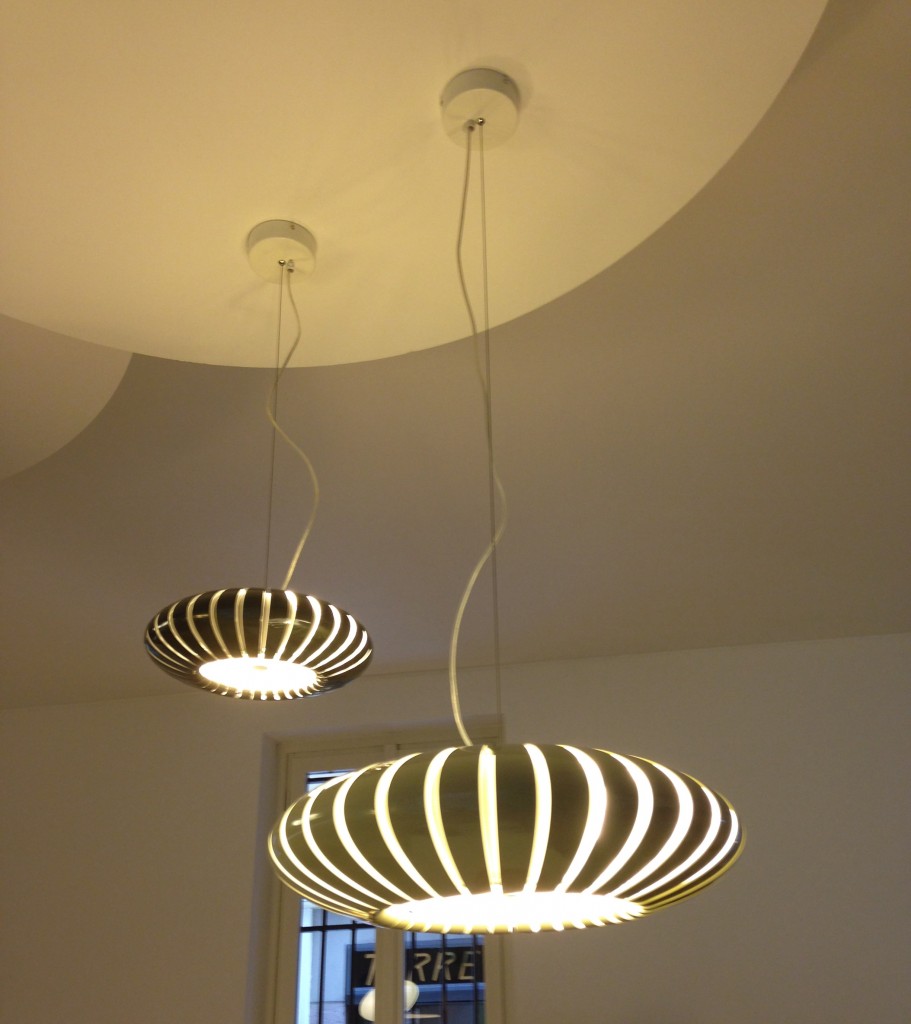
 We found that in Milan you could miss half the experience if you failed to look up! Look at these cool light fixtures at Acheo!
 The other showroom we had the pleasure of visiting during our visit was Poggenpohl. I think you could argue that they set the bar when it comes to innovation in contemporary cabinet design. As I mentioned, Poggenpohl is a German company and they claim to be the oldest kitchen brand in the world!
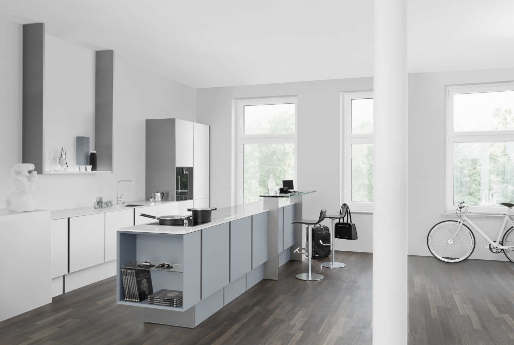
 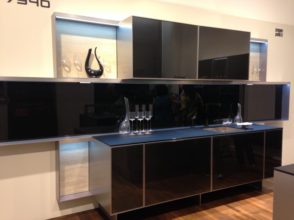 Some years ago Poggenpohl teamed up with the Porsche Design Studio to develop the P'7340 line of cabinets. Both companies focus their concentration on the overall line as well as providing unsurpassed quality of product. Above is a Porsche Design Kitchen P'7340 by Poggenpohl. It's hallmark is the aluminum frame which surrounds each box. Originally designed with men in mind, it has evolved into a brand appealing to discerning contemporary design devotees of either sex. Chief Poggenpohl designer Manfred Junker was on hand to explain the intricacies of design detail that go into the product including their trademark, no handle, fronts. In fact, he claims, they are the first to offer touch control on the refrigerator and dishwasher. Here's what they have to say about that on their website: "Handleless fronts emphasize the clean, uncompromised lines of the kitchen furniture."
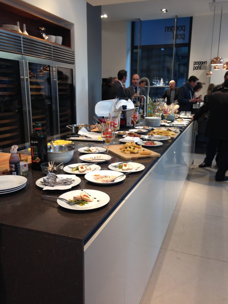
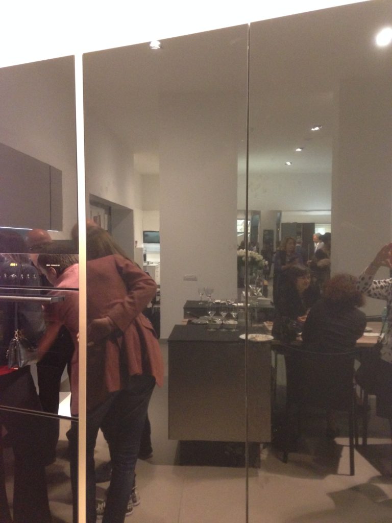 Poggenpohl took care of our tummies too. After all, design spotting can work up one hell of an appetite!
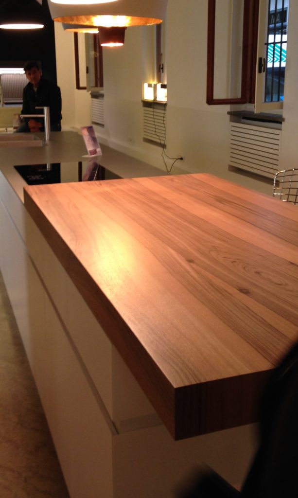
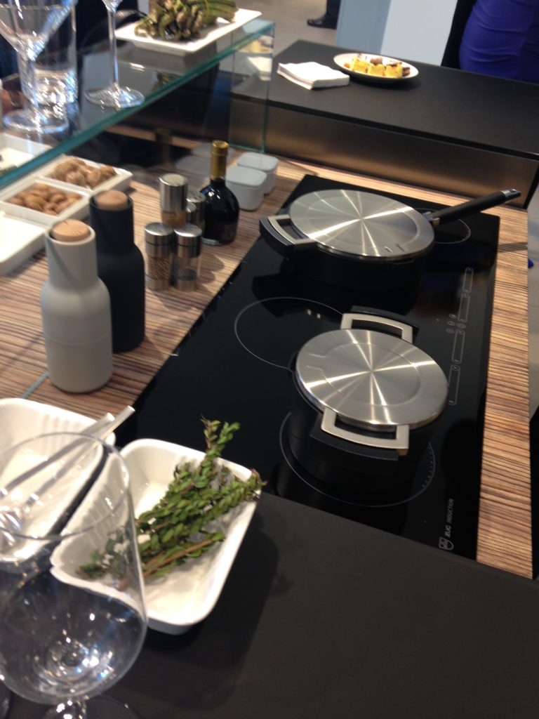
 This newest version of P'7340 (see below) features a contrasting counter top inset made of solid New Zealand pine with a wire brushed finish.
 Next up: FTK (Technology for the Kitchen) This was the section of iSaloni featuring the latest trends and products in kitchen appliances.Click here for a peek at all my Milan photos!own and automatically completes the closing cycle
Euro Cucina 2014
I'm home and just about recovered from my jet lag. All pics are up for your perusal. It was a fabulous trip and my heartfelt gratitude goes out to the golden peeps at Blanco, including travel mate Christy Emens as well as Lori Dolnick of Frank Advertising. I was honored to be included with fellow bloggers Marilyn Russell (DesignMagnifique), Kelly Morisseau (KellyMorisseau.com) and Grace & Ken Kelly of (kitchendesigns.com). Having been to many trade shows in the US over the years, I've always wanted to experience the bigger, global picture. Now I have and it was amazing.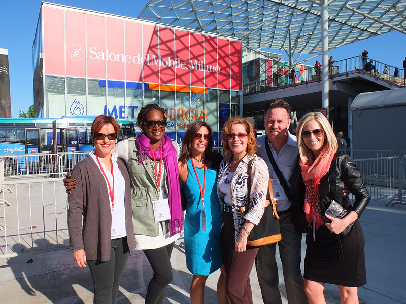 I arrived on Monday morning ready to explore. Lori and I took a stroll and stumbled upon a delicious lunch and a very cool design museum but first things first. I'm dying to tell you about all the products and trends I saw at the big show. Euro Cucina only comes along every two years as a part of the Salone del Mobile. Milano. There is also a whole section devoted to the bath called Salone Internazionale del Bagno. Kitchen gadgets and appliances are shown in the FTK section. I did a pretty good job of covering those but I estimate that was only about 20% of the entire show, the rest being furniture and other aspects of design. Here's what caught my eye.
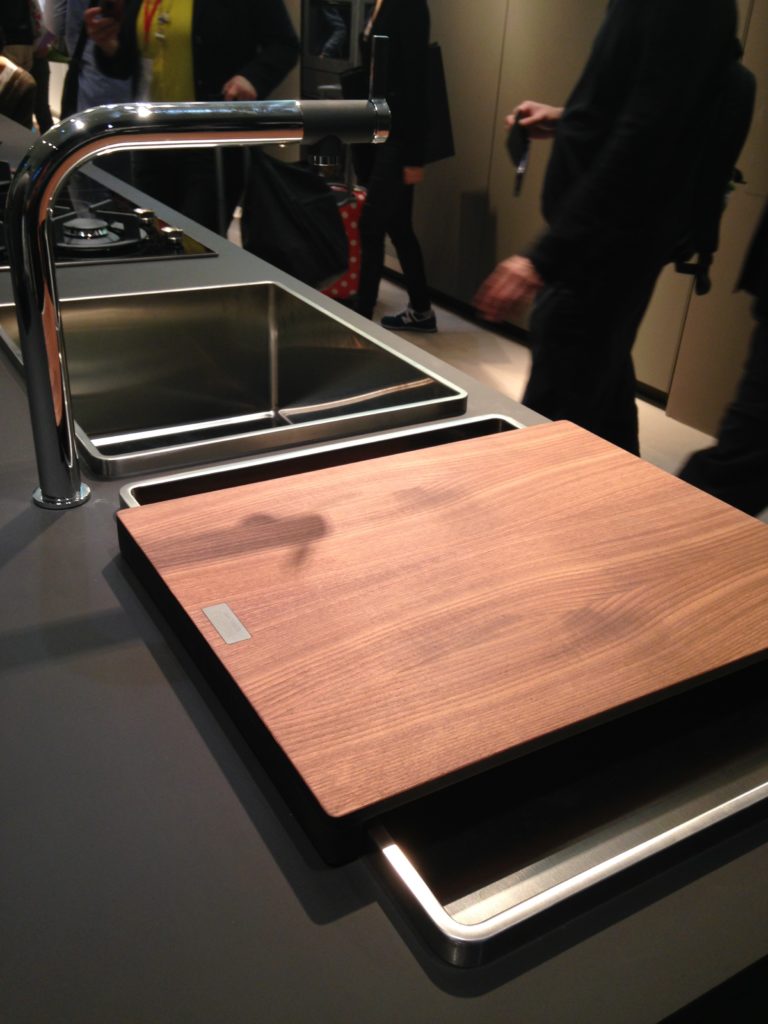
Counter tops were either very thin or chunky, like 1/2" for the thin and 3" for the chunky. I saw a lot of mixing of materials, in fact, that was probably the one biggest trend I saw for both counter tops and cabinets. It is also one that can easily be adapted to our US market. Counter top materials are much more adventurous than the usual granite or quartz that we are used to here. I saw wood, Corian, recycled composite material and more. The overlapping installation here was also quite common. The kitchen sink saw some new innovations including lots of accessories and different methods of installation. The inset style above, by Blanco, is factory installed by Leicht for a perfect fit. This particular one is not available to us in the US but we can get the Precision model with the distinctive square corner interior for undermount applications.
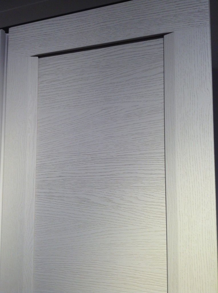
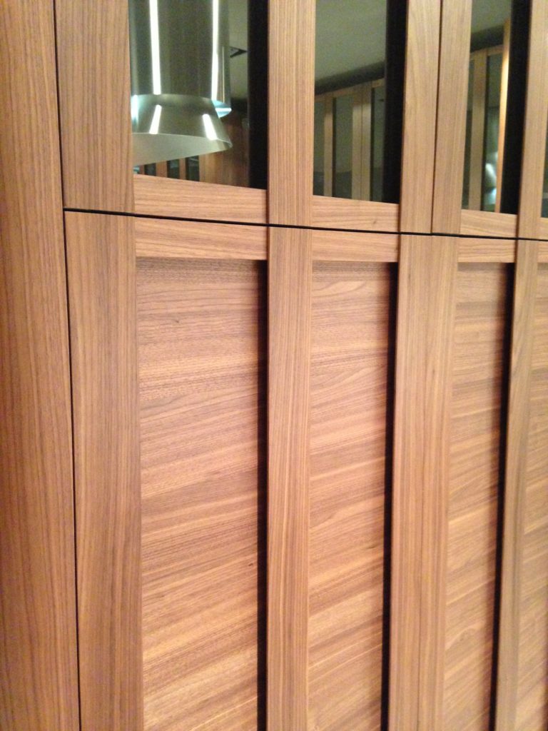 Cabinets featured lots of defined graining in woods such as white oak, rosewood and walnut in both horizontal and vertical directions, sometimes on the same door. I also saw some interesting variations on the popular slab and Shaker silhouettes.
 This is just the first in a series of posts about Milan and Salone Internazionale del Mobile. Upcoming posts will include our visits to Acheo and Poggenpohl showrooms and much more. So what do you think of these kitchen trends so far? I think some will make it over the pond but you can always know that whatever we do, we'll do it with an Americano twist. More later :)Click here for a peek at all my Milan photos!
Ancient Elements Create Artful Counters
I’m in love. Let me back up a moment. You all know how I like quartz counter tops and I will continue to sing their praises BUT this is LOVE. You're looking at a “petrified wood ammonite counter top”, made from natural wood turned to stone, over time, and ammonite shells. These components are fit together and formed into a slab using clear resins.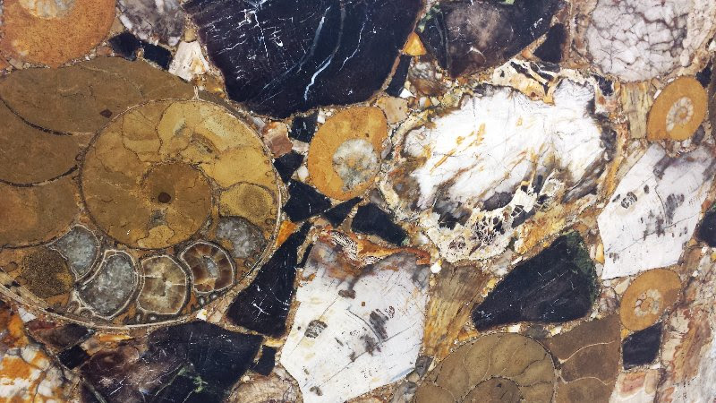 These fossils are sourced in Madagascar. The material is 3cm (1 3/16”), polished or honed and you can find this glorious slab at Stone Gallery Miami.
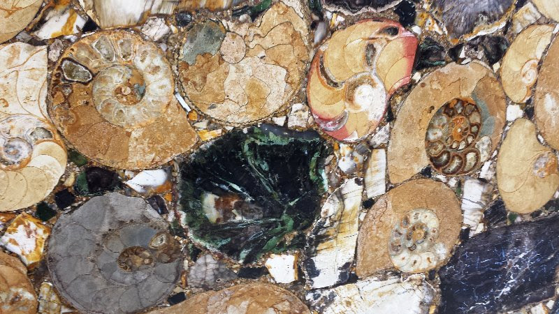 Slabs are approximately 110” by 65” and will run you in the neighborhood of $14,000. This is a quintessential example of Kitchen Art with a capital "A"!
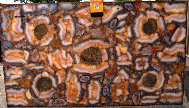 The above slab contains amethyst from Brazil. If you spec this $19,000 slab don't even think about not back lighting it. This example is showing the slab illuminated to highlight the natural color. All these slabs are solid 3cm material, no veneer here.Stone Gallery specializes in the most beautiful granites and marbles and it’s not all 14K a slab! Their showroom is located here in West Palm Beach but they have a brand new location in Miami. See the Kitchens for Living Local Resources Section for further info.

