Let’s face it, things change. As we navigate those twists and turns of fate we can only hope to move forward, seeing new things with a fresh eye. Like it or not, change is a constant. You can dread it (understandable) or you can choose to embrace it. That said, it has been more than five years since I began my adventure as Kitchens for Living. I believe I have been true to my promise to share the latest design trends and product info for the heart of your home. We have frequently ventured out of the kitchen and even around the globe! I am so grateful for all the wonderful and talented kindred souls I have met along the way, fellow bloggers, designers and great organizations such as Modenus, Blanco, Brizo, Tile of Spain and many more. This blog has afforded me the opportunity to travel and bear witness to marvelous destinations and inspiring trade shows. Before this starts sounding too sad, let me tell you I have never felt so excited about the future and eager to explore new opportunities.
  This will be the last post for Kitchens for Living. From now on I will be able to merge two of the things I love, kitchen design and art with my new site, Artful Kitchens. A big THANK YOU to Leslie Carothers of The Kaleidoscope Partnership for her guidance and insight which lead me to discover a new path full of promise and possibilities.
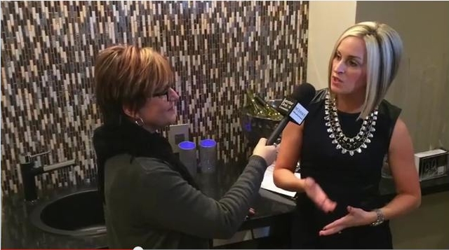
  Artful Kitchens will focus on all the ways you can use creativity to personalize your kitchen. Artful spaces reflect who you are and the way you live.
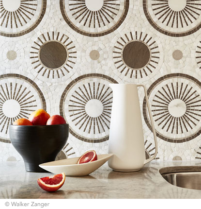
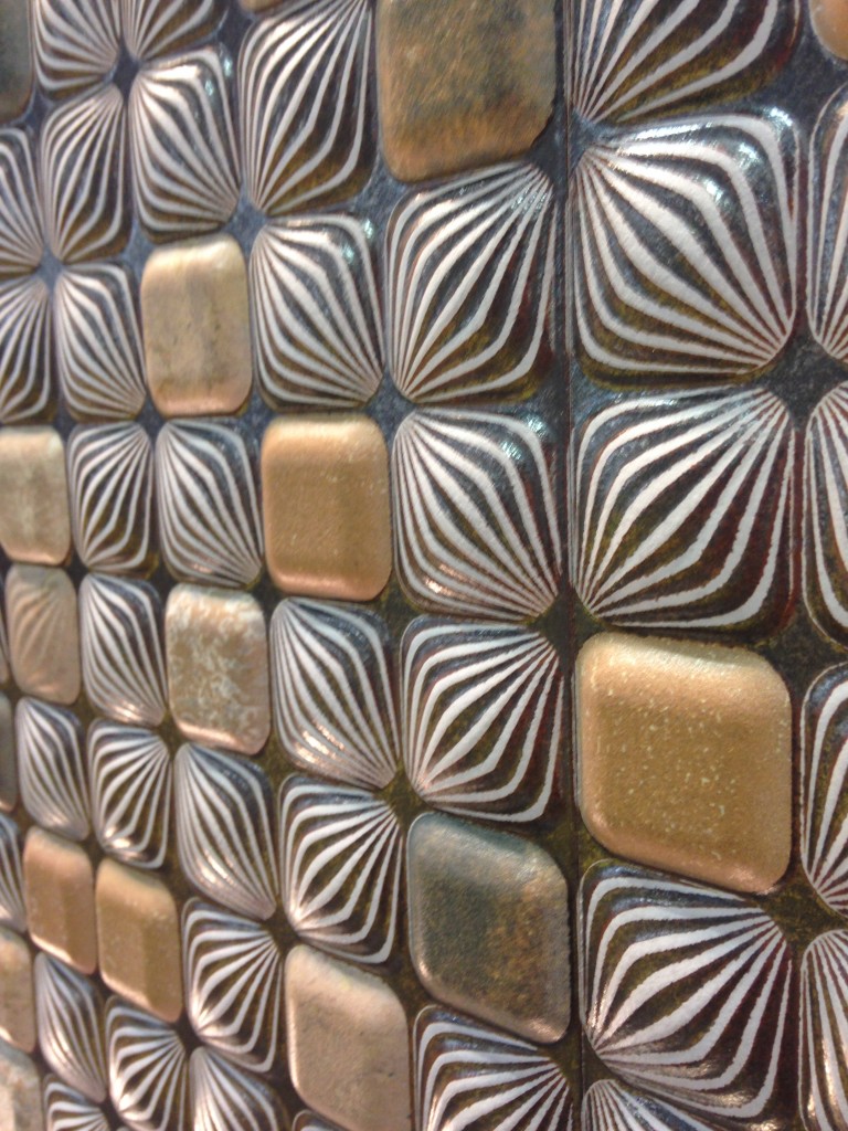
 The stunning tile above, by Walker Zanger, was featured at KBIS 2015 which I had the pleasure of attending with The Modenus Blog Tour Vegas.
 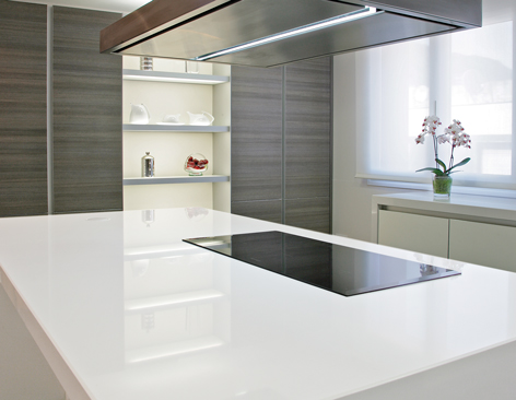 New products like this perfectly white quartz by Wilsonart enhance the kitchen with a feeling of crisp clean freshness!
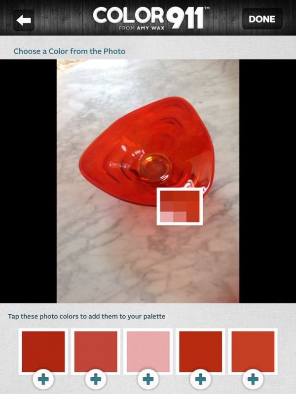
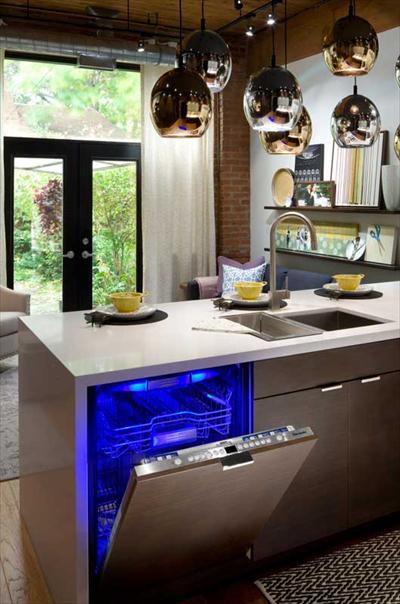 Color is a primary element of the Artful Kitchen. We'll be talking a lot about that in an upcoming interview with Amy Wax of Color 911
 We will continue to incorporate new products and technologies as they emerge and we will explore all the artful ways of creating a kitchen that reflects who you really are. I’m so excited, I hope you’ll join me and spread the word. Last but certainly not least, whether you are a brand or a consumer, I want to collaborate with you!
  Continue the conversation on Face Book or email me at ArtfulKitchensbyGlo@gmail.com
Frida, Diego and Their Kitchen
There’s new exhibit in town and I’m excited! Frida Kahlo and Diego Rivera from the Jacques and Natasha Gelman Collection & 20th Century Mexican Art from The Stanley and Pearl Goodman Collection opened Wednesday at the NSU Art Museum in Fort Lauderdale. Frida Kahlo and husband Diego Rivera are arguably the most well known twentieth century Latin American artists. This exhibit draws on their popularity to introduce us to some other names in Mexican art we should know. These include Lenora Carrington (1917-2011), Gerhard Gerzso (1915-2000), José Clemente Orozco (1883-1949) and many more. Works on show consist of paintings, sculptures, photographs and works on paper. The exhibit runs through May 31st. I am planning on going on March 27th when Kahlo scholar Dr. Salomon Grimberg will be speaking on Frida Kahlo: The Still Lifes-But let's talk about the kitchen!
  There are many published photos of Frida's kitchen which got me to wondering what it would look like today. Wouldn't it be great to have her essence around when you're making enchiladas? What are the elements you could include to give you that vibe?
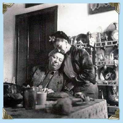 Frida learned to cook for Diego, oddly enough, from Diego's previous wife! She became an accomplished cook but also spent leisurely mornings in the kitchen reading the newspaper with Diego.
This kitchen is located in La Casa Azul, a home Frida was born in and continued to return to throughout her turbulent life. You can tour it if you find yourself in Coyoacán, Mexico City. Check out this article if you'd like to know more. 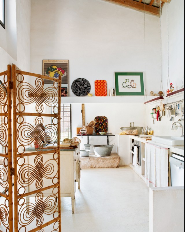 The rustic simplicity, white walls, high ceilings, windows and use of rustic materials make me think of Kahlo.
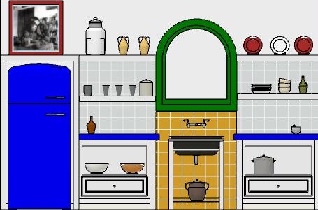 In this fantasy kitchen I used bright colors with a few contemporary twists in homage to the Mexican diva. Design elements of a "Frida kitchen" include the following:-Liberal use of tile-Open shelf storage-Bright colors-White walls-Rustic wood-Lots of light!If you've never seen the movie Frida, don't stop, click here immediately and get it!! Today I leave you with my favorite scene from the movie. I must warn you it's hot, steamy and not for the feint of heart. Consider yourself warned and enjoy ;) Happy Friday and have a fantastic weekend.
Wood-Mode and Top Knobs, Makings of a Dream Kitchen
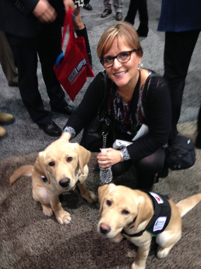
If you've spent any time researching cabinets for your new kitchen or bath you've probably come across then name Wood-Mode. It's the nation’s largest manufacturer of custom cabinetry for kitchens, baths and other rooms throughout the home and they've been around for 42 years. I learned that Wood-Mode has great name recognition in the industry for good reason. Their booth at KBIS was impressive and fun! Four yellow Lab pups were on hand to demonstrate one of their lifestyle concepts, The Pet Parlor.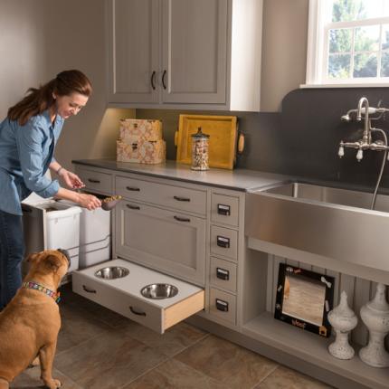 There's a place for everything from food storage, food bowls, bathing and more. Great idea, yes? To highlight it Wood-Mode had the most interesting gig going at the show. For all selfies posted with the dogs they donated $5 to the Susquehanna Service Dogs. This will be an ongoing partnership. They call it a PAWSitive partnership. You can read more about it here.
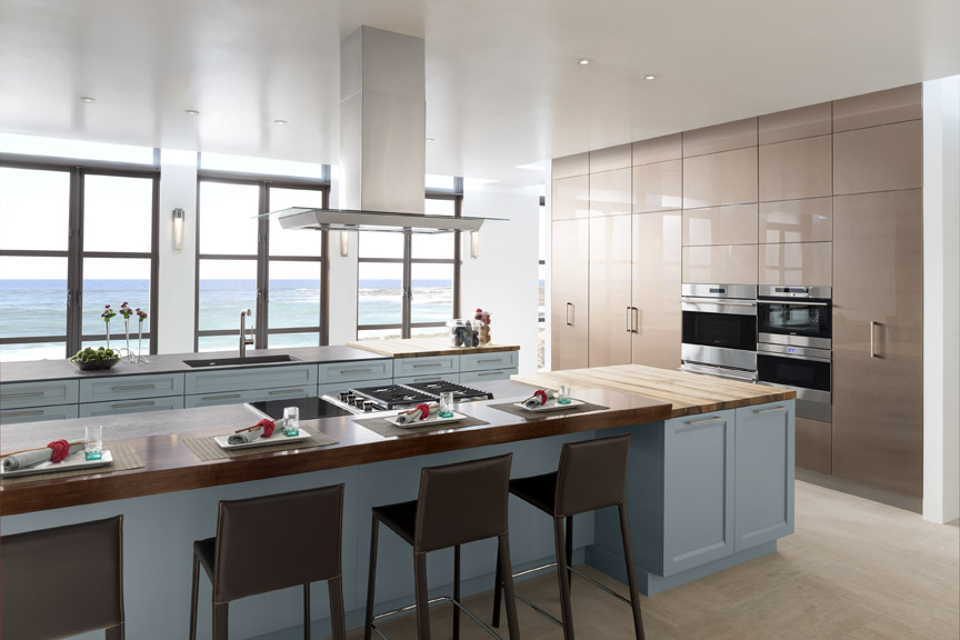
 Wood-Mode's newest lifestyle concept, Oceanside, is right after my own heart. This coastal style is a modern fresh mix of contemporary and transitional. The subtle aqua and sandy shades of beige are on point. The Oceanside approach includes a very open plan with efficient hidden storage. I see this as a reflection of the trends I saw in Italy last year, fewer or no upper cabinets but high function tall cabinets instead. The combination of materials and finishes add lots of visual interest.
 With over 200 doors to choose from as well as furniture finishing techniques and options for built-in storage, Wood-Mode can create the perfect solution for your lifestyle, whether is be Coastal, pet-perfect or both!
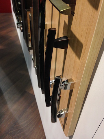 If you're going to be needing cabinets, you're also going to need to get into them. That's where Top Knobs comes in. Another brand with great name recognition, TopKnobs specializes in fine decorative hardware for the kitchen and bath. You can tell the quality of a cabinet knob or handle by the weighty feel of it and I have always noticed that about TopKnobs products. The other important thing the finish which they guarantee for life!
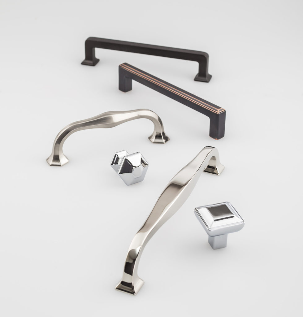 They introduced the Transcend Collection at KBIS. This includes the Podium, Ascendra and Contour Series which come in Brushed Satin Nickel, Polished Chrome, Polished Nickel, Sable and Umbrio.
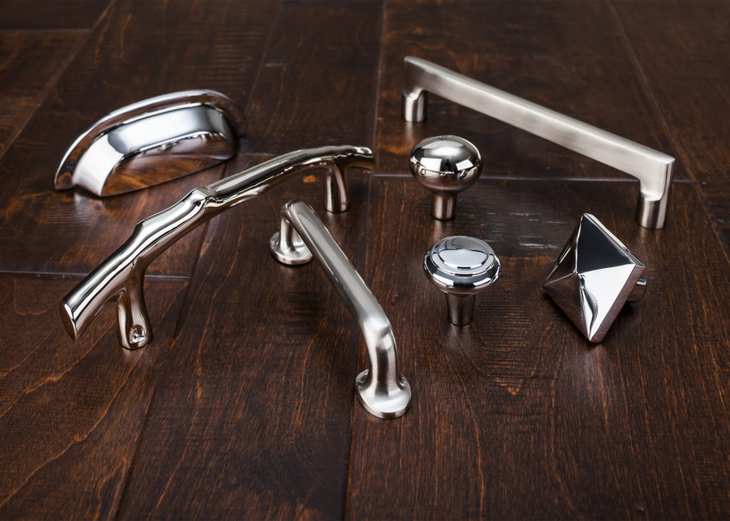 Also new at the show was Aspen II in three finishes, Polished Chrome, Polished Nickel and Brushed Satin Nickel. “The Aspen II collection combines old-world shape and style with contemporary finishes,” states Christine Zimmer, product manager for Top Knobs. “They bring to the market a unique look that designers can use in transitional spaces. Made with solid castings of artisan grade bronze, you can feel the quality of Aspen II in the palm of your hand.”With Wood-Mode and Top Knobs your dream kitchen can come to life!
New Year, New Kitchen?
Happy new year! We're back to the beginning again. There's just something about the early days of January that can make you believe all things are possible. That's the right frame of mind to be in when you start any new venture. It's all good; the editing comes later. There's a lot to look forward to in the new year. In less than three weeks I'm off again on my next big, great adventure. I will be traveling with the awesome folks from Modenus and a select group of my esteemed peers to the Kitchen & Bath Industry Show (KBIS) in Las Vegas. Follow me here, on Twitter, Instagram and on my NEW Face Book page to hear about all the new products and design trends. Wheels up on January 18th. Are you ready? Until then here's a little inspiration to get you started. 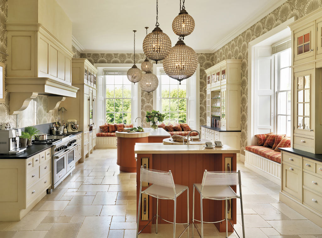 If your new kitchen is going to be an expression of who you are and how you live it's helpful to have a little inspiration. One of the things I frequently mention is the benefit of something I call "kitchen scrapbooking". When you get your first inkling that a new kitchen may be in your future, begin collecting pictures and ideas. Use magazines, the internet or your camera. Then pay attention to that inner voice. That's your intuition and your cue to tear, print or click that shutter. Look for everything from specific details to general feeling. Let's begin today. I will share with you all kinds of interesting tidbits. Keep a file (real or virtual) of your inspirational loot. Before you know it you'll have all kinds of useful information and you will begin to see the patterns in your selections. For example you may find that in 5 out of 7 pictures, you selected kitchens with white cabinets, or glass doors, or shiny finishes. Oh, and remember it doesn't even have to be a kitchen! Your heart-of-the-home can also be inspired by non-kitchen images such as art, architecture, nature and more. Here are some images to start you off.
I love the juxtaposition of modern and African tribal elements in this photo above of a Nolte kitchen. 
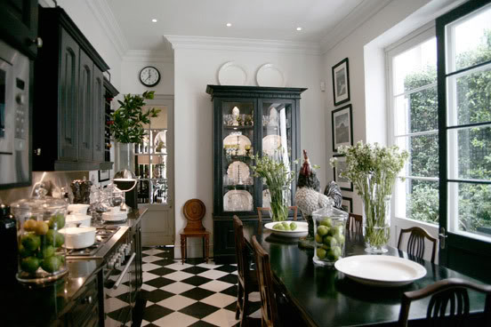
Lastly, I just love the feeling of this black and white kitchen. It represents a comfortable easy British Colonial aesthetic to me. How about you?
Color Your Kitchen for a Pop of WOW!
Whether your kitchen is New York City closet sized or vast and expansive, a skillful use of color can make it pop with interest or blend into adjacent areas. Bold colored cabinets are certainly a commitment to say the least but also remember that a little goes a long way.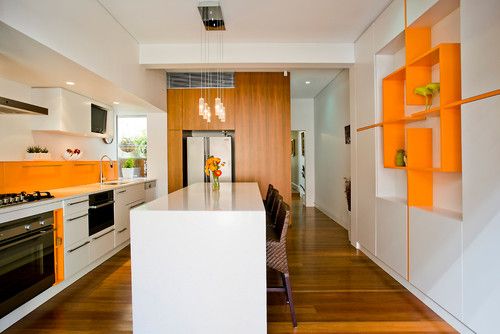 Just a few doors in a vibrant red or juicy green create a focal point of visual interest that might not even be as effective if you covered the whole kitchen in it.
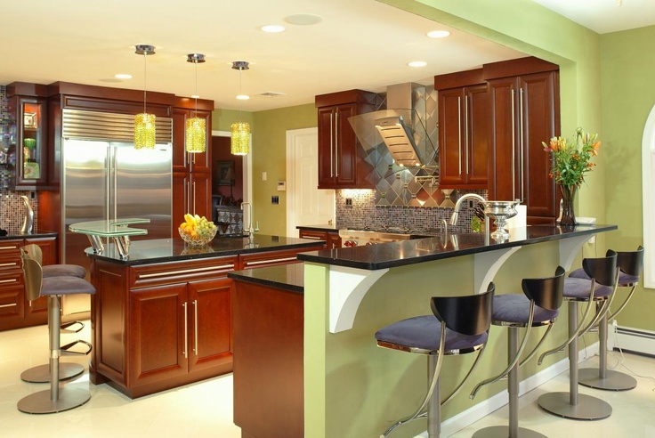 Another way to use colors is on your walls. After all they are the backdrop for your cabinets, plus they’re much easier to change if you need a new look.
 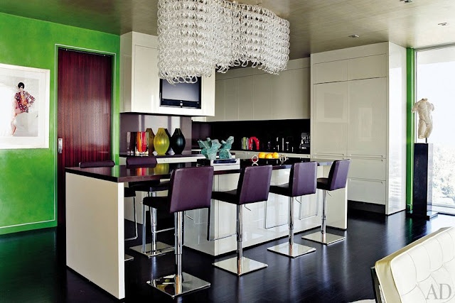 Fun accessories or a dramatic backsplash can do the color trick too! You can find more kitchen love on my Pinterest Kitchens board right here. If you have kitchen questions I'd love to hear from you. Leave a comment, drop a line...
The New English Kitchen
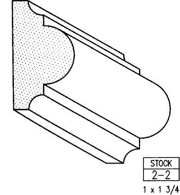
A bazillion years ago (circa 1994) when I first began my adventure in this business, the “English Kitchen” was all the rage in the high end market. I learned to design, by hand, in metric and things like astragal mouldings (yes moUldings with a “u”) were all the rage. Distressed, fly specked finishes were hot and no one wanted a white kitchen unless it was encrusted with glazing. I learned the English style by apprenticing with a true Englishman and gentleman who I shall be forever grateful to.
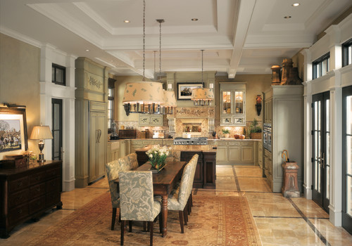
Those kitchens looked something like these photos from Houzz.com. Back in those days I did not work for a top notch custom shop like Brendan Donovan's. I worked for a top notch cabinet dealer so we actually imported this type of cabinetry from the UK. This came with its own set of challenges, to say the least. Just think of how long it would take to get a parts order and how expensive it was to transport! Charming and beautiful in their own way, these kitchens are full of detail and working on something like this was good training ground for a budding kitchen designer such as myself. That was then. 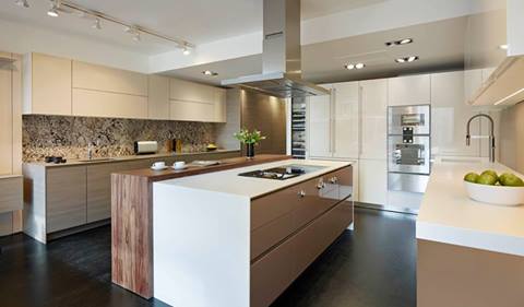 This is now.
 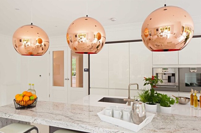 Today ground zero for the latest in high end kitchen design in London is located in the West End, in and around Wigmore Street. It's home to exclusive brands such as Bulthaup, Poggenpohl and the Nicholas Anthony showroom featuring the latest by SieMatic.
  The new English style is exactly that, new! Cleaner more modern design utilizing the latest technologies are now the order of the day. With the advent of the internet I believe it really is a small world. Ideas and trends fly over the web at the speed of light. We all influence each other cross pollinating our designs but there is still an appeal in wanting what the other peeps have. Many of us here want the new, slick, Euro styled kitchen and, dare I say, many Euros and Brits are amazed at our American sized appliances, namely the quintessential 36” refrigerator!
 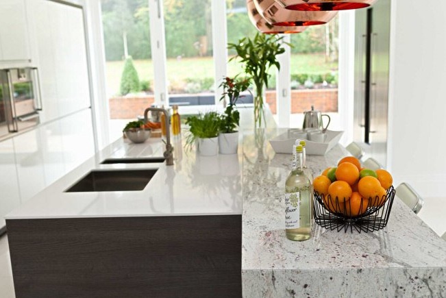 I feel the advances in technology when it comes to laminates and counter top material lend themselves to these new clean- lined looks. Decorative detail is found in interesting wood grains and the random markings of stone rather than from moldings and corbels. So what do you think? Are you yearning for the "olde world" look again? Do you think it's coming back or are we here to stay for the time being?

