I had the pleasure of meeting so many talented professionals last year on my great adventure with Tile of Spain, but that's another story.  One of the dynamic contacts that I made was Heather Fiore of Contemporary Stone & Tile Design and Stone World Magazines. In their Summer 2016 issue Heather interviews me and fellow designer/adventurer Michele Alfano, interior architect and founder of MODmadeNY Studio about the big movement towards large tile. What do you think? Is bigger always better when it comes to tile? Trends in Large-Format Tile
The New Look of Luxury at DCOTA
Every now and then I like to get out and about and mingle with the peeps in my industry. Last week I ventured a little outside of the bounds of strictly kitchen and bath design to experience The New Look of Luxury event held at the Design Center of the Americas (DCOTA). Suffice to say I was not disappointed. DCOTA is also home to luxury cabinet superstars SieMatic and Poggenphol. They were not open for this cocktail hour event but it was fun just to peek in the windows!
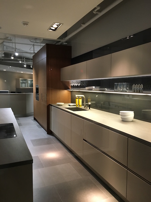
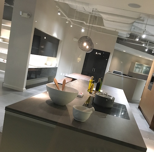
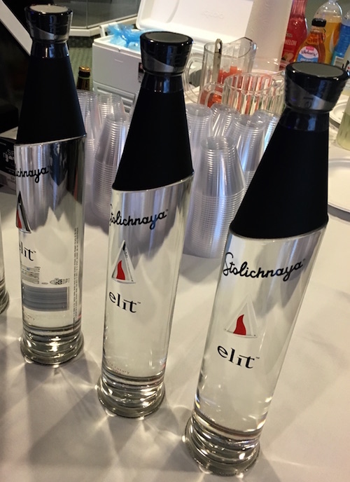
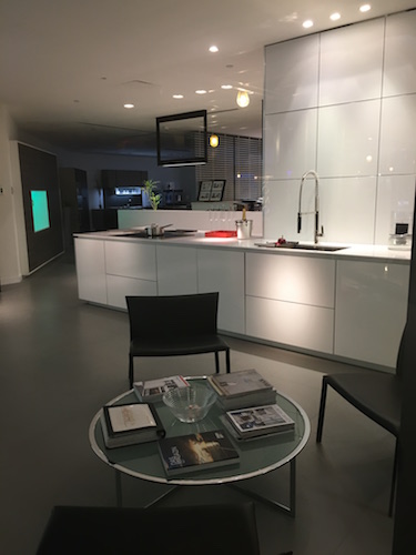 Refreshments were served to compliment the visual yumminess! High design even in this Elit vodka bottle by sponsor Stolichnaya.
 First stop, Inside The Art of Craftsmanship. THESE DOORS! OMG, stunning in both scale and creativity. You would have to have just the right space for one of these, preferably BIG. Surprisingly there is not much info out there on this Florida based company. Suffice to say it’s very exclusive… I started snapping pics with wild abandon before I noticed the “no photography” signs. Sorry.
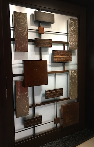
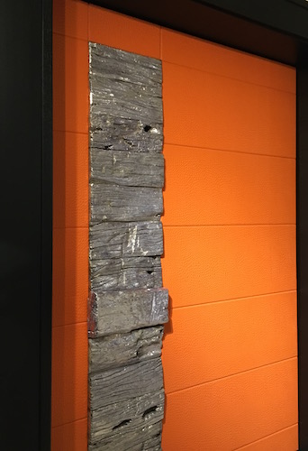
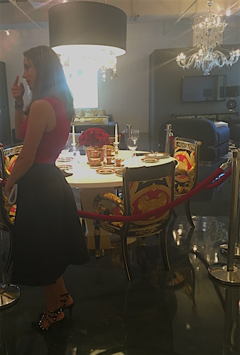
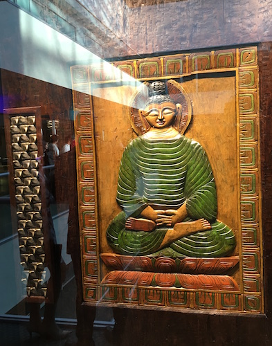 The DCOTA is located on the outskirts of Miami and you don’t go to Miami without paying respects to Versace. Their designs can be over-the-top but the Versace Home showroom was very tasteful, even including coordinated sales associates and the requisite champs.
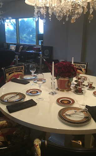
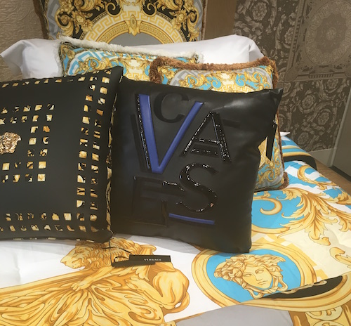
 My absolute favorite item at Versace was this super cool leather cushion which sells for $4,000, worth every penny (maybe)
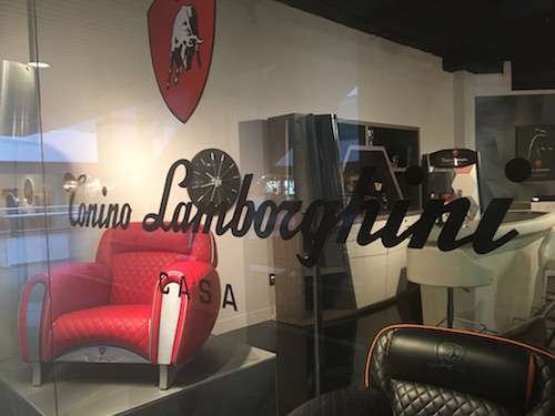
  Luxury has a sleek masculine look as well at Lamborghini Tonino Casa at FORMITALIAd. If you’re not partial to the Lamborghini look they offer Aston Martin and Mercedes Benz inspired furniture too.
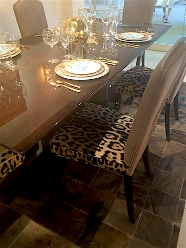
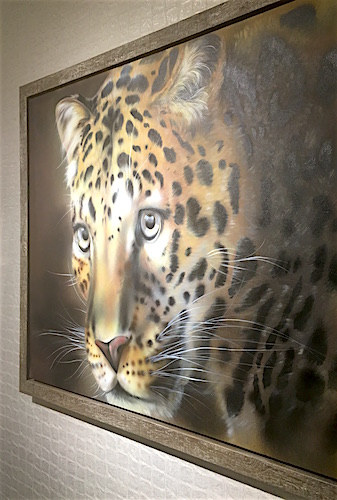
 Next on the tour was Casa Collezioni/Roberto Cavalli Home Interiors. I was looking forward to this as I loved their showings at last year’s Maison et Objet Americas. It’s elegant and edgy at the same time.
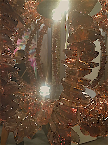
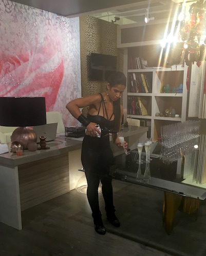
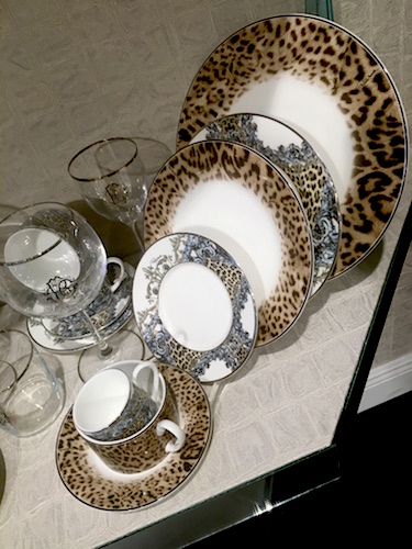
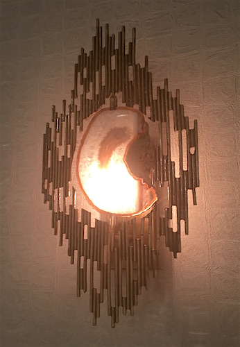
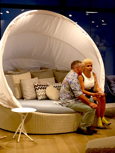
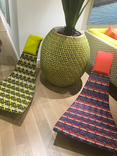
 Dedon, known as the premiere luxury furniture brand is innovative, colorful and comfy. All you need is the beach!
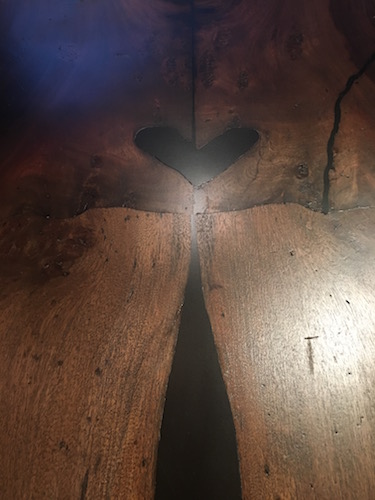
 Last but certainly not least we got lost in the world of E.M. Soberon. They focus on high end architectural furniture. They also happen to be known for harvesting wood from fallen trees, mostly in Mexico. This is a unique approach that also yields one of a kind results. Mr. Soberon designs most of the products but they will also work with clients and designers visions to create the perfect piece.
 I’m so glad I went to this event. A big thank you to Casa Collezioni for the invite. The big takeaway from this evening is that I need to continue to get out there and see what is possible. Who knows, perhaps it can inspire me to create the formerly impossible... DCOTA http://dcota.com/dcota-information/ is open to- the-trade Monday –Friday 9-5. If you are not “trade” you can still check it out if you are accompanied by a design professional.
The Best of KBIS 2016
Bam! Another show is in the books and although it's been a busy week "back at the ranch", I've been dying to share my finds with you right here on Artful Kitchens.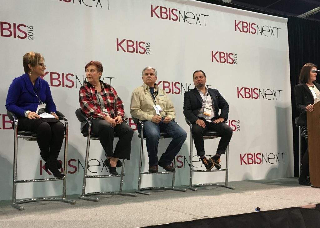 Las Vegas was host to three days of networking and education for the best of the Kitchen & Bath industry. As a member of the Kitchen & Bath Business Magazine's Advisory Board, I had the pleasure of appearing on the KBIS Next stage as a part of the panel discussion entitled Trials & Tribulations-Solutions to Your Biggest Kitchen & Bath Challenges. It was an exciting exchange of ideas between both the pros on the panel as well as a savvy and engaged audience.
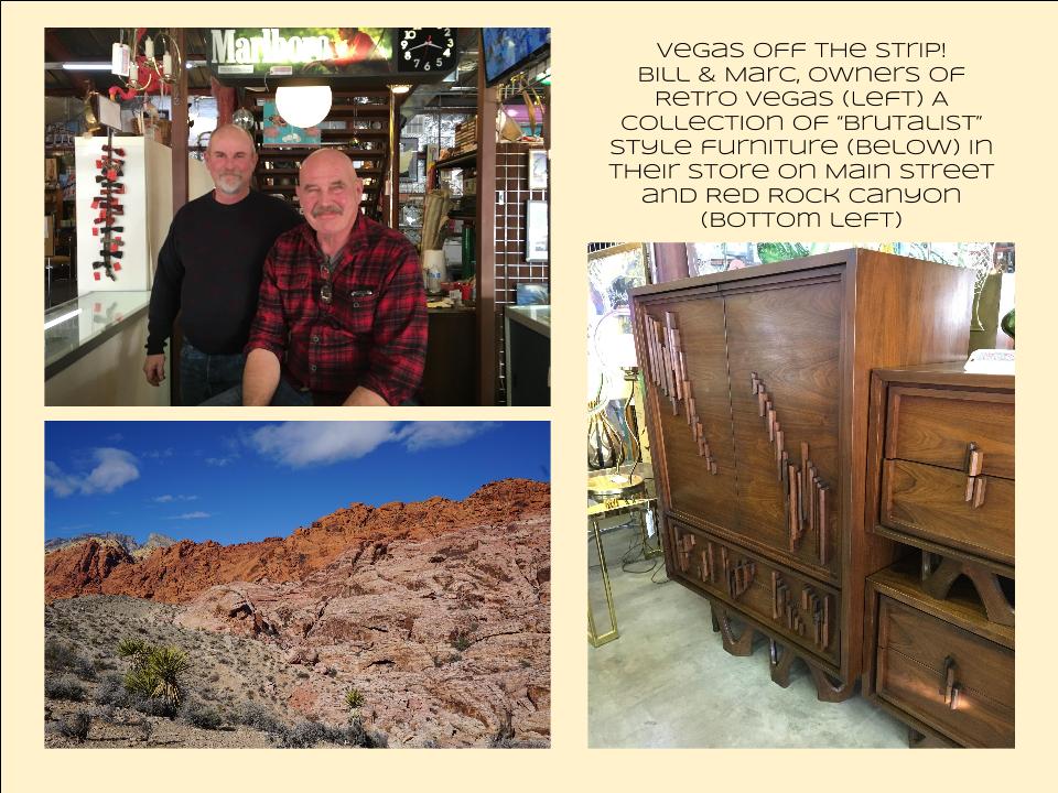
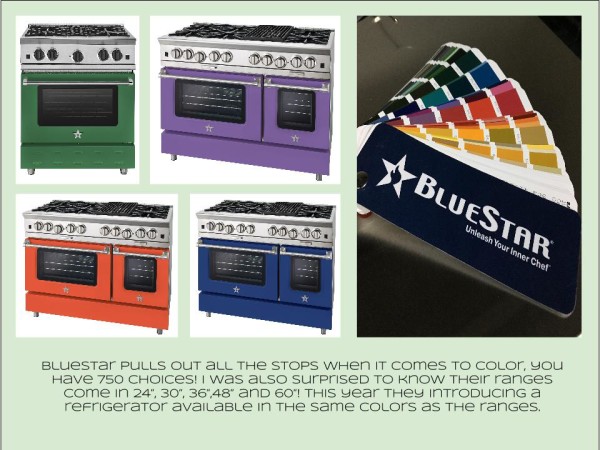
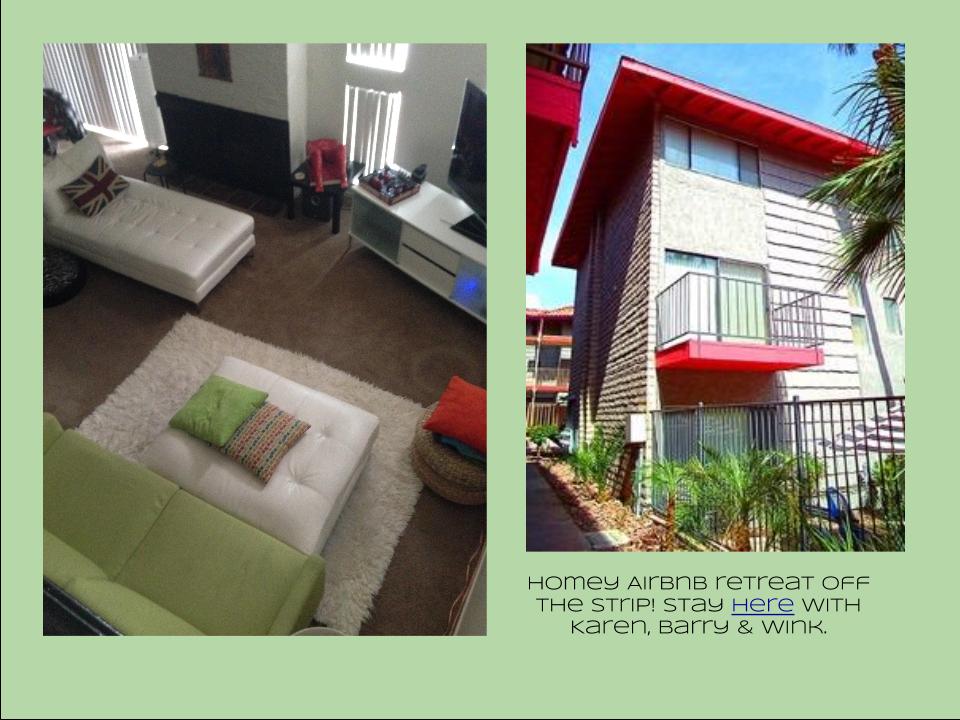 I also had the opportunity to spend some time in the Las Vegas I like best, off the strip! I hiked in the Red Rock Canyon and visited my friends at Retro Vegas on Main Street. My digs for this trip were with my dear pals Karen, Barry & Wink. They live in a midcentury modern gem that, rumor has it, was briefly home to Lucille Ball! They are avid Airbnb'ers and wonderful hosts. Check it out if you find yourself in Vegas. This location is so convenient to the Convention center I could walk, which I did, once. Mostly I Ubered. Enough walking happens on the show floor! So without further ado, here's my recap of the biggest and most notable trends and products that caught my eye at KBIS2016. ColorWhite still reigns. In fact paint giants Benjamin Moore and Sherwin Williams have both selected shades of white as their color of the year. You know I am a huge white fan. It is always the best backdrop for art and design. It also continues to be the favorite cabinet color in my area. Remember white is not just white, there are an infinite number of varieties you can have fun with. If you need more punch in your kitchen you could find some great options at the big show. I saw bright saturated colors in several appliance brands including Bertonazzi, Viking and BlueStar which offers 750 colors!
  Grey has not left the stage. The newest versions are warm, venturing into taupe territory. Textured wood grains such as cerused oak are really popular. Wood-Mode showed both traditional and contemporary versions of ribbon Mahogany.
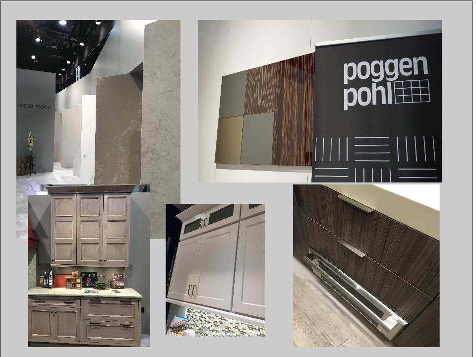
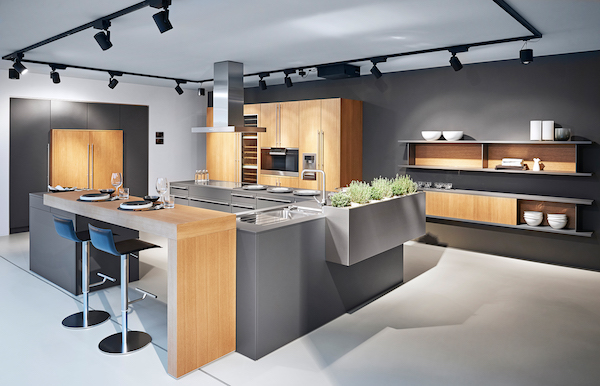 The Perfect TouchTouch latch technology was EVERYWHERE! If you prefer a sleek, uninterrupted look for your cabinets and appliances this is for you, a gentle nudge will open your cabinets. This is nothing new but it's taken off. I also loved the button that allows you to close this cabinet when you're done without resorting to dangerous acrobatics (I'm short).
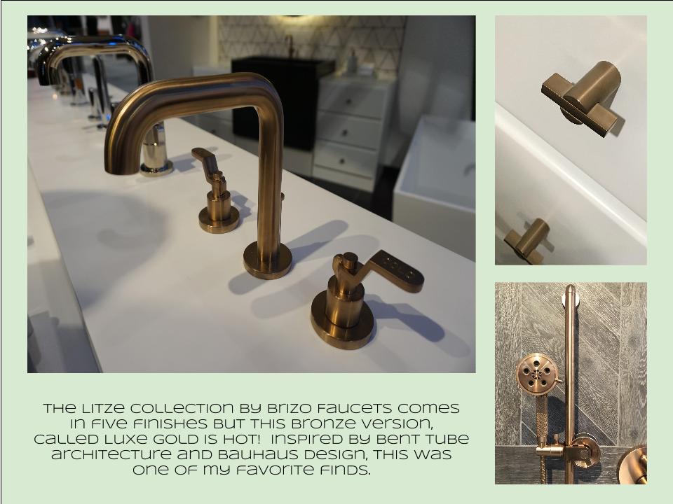
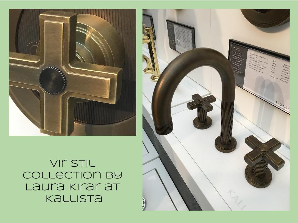 Feeling BrassyActually brass, copper, bronze and myriad versions are hot for plumbing fixtures and hardware. My favorites were the new BauHaus inspired Litze collection by Brizo Faucets. and Kallista's Vir Stil collection.
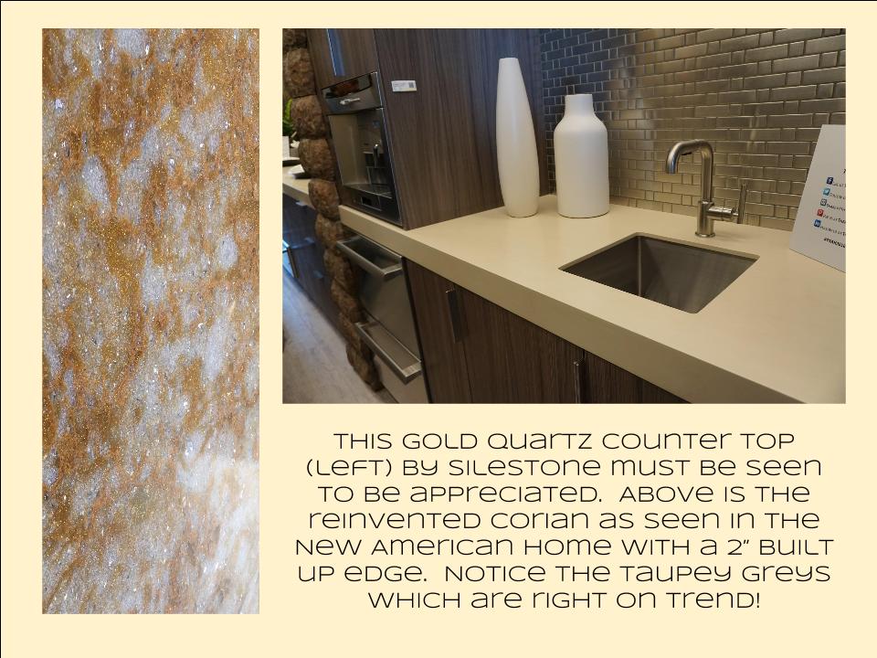
 Not Your Grandma's CorianIf you're like me Corian has been dead to you since about 1998. That sentiment has now ended in my book. I saw a 2"thick sleek contemporary version of Corian that was perfectly at home in The New American Home. The other exciting thing I saw in counter tops was this quartz by Silestone. Yes, it's GOLD! I just wish the photo could capture it's sparkly beauty.
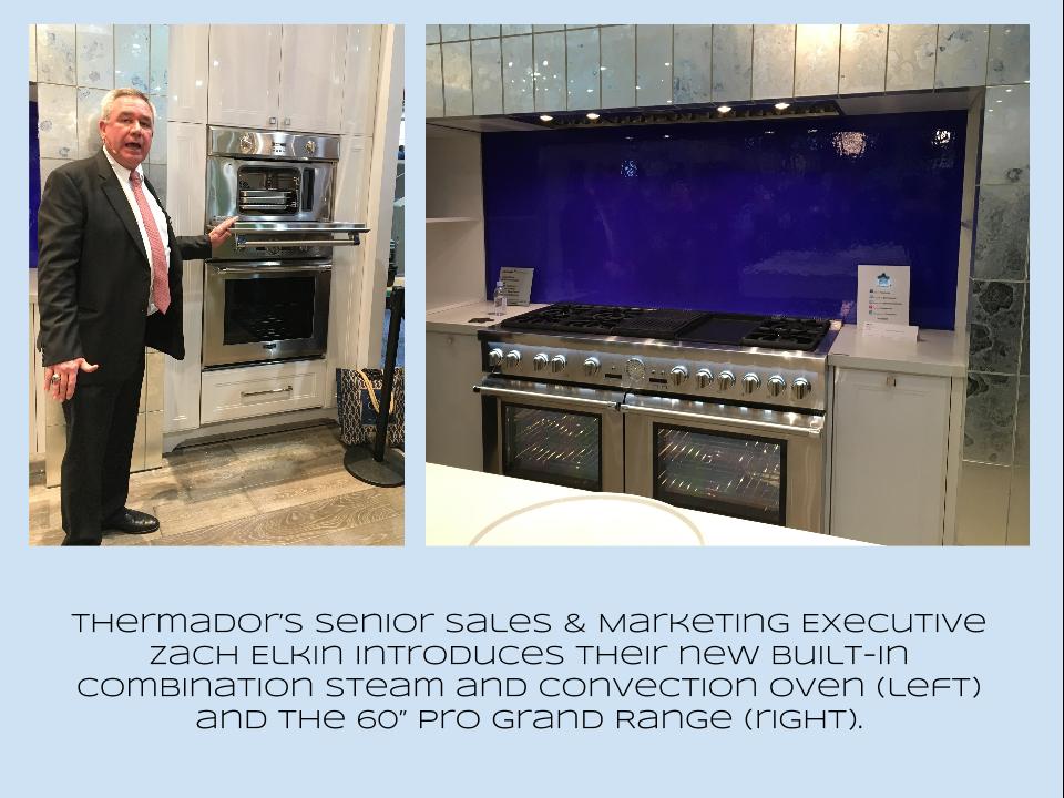
 Thrills from ThermadorAppliance brand Thermador held a press conference on the show floor to introduce a couple of impressive new products, the 60" pro range available with steam and a double oven featuring steam and convection. These are firsts in the industry.
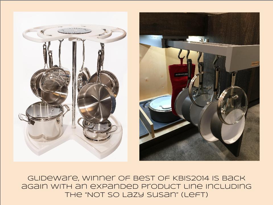
 Organize ItJust when I thought we had it all the category of organization it goes to the next level. There was a great representation of brands ranging from Hafele to Rev-A-Shelf to Hardware Resources but Glideware is taking the market by storm. If you've got a mess lurking somewhere I guarantee there's a way to make it neat and accessible
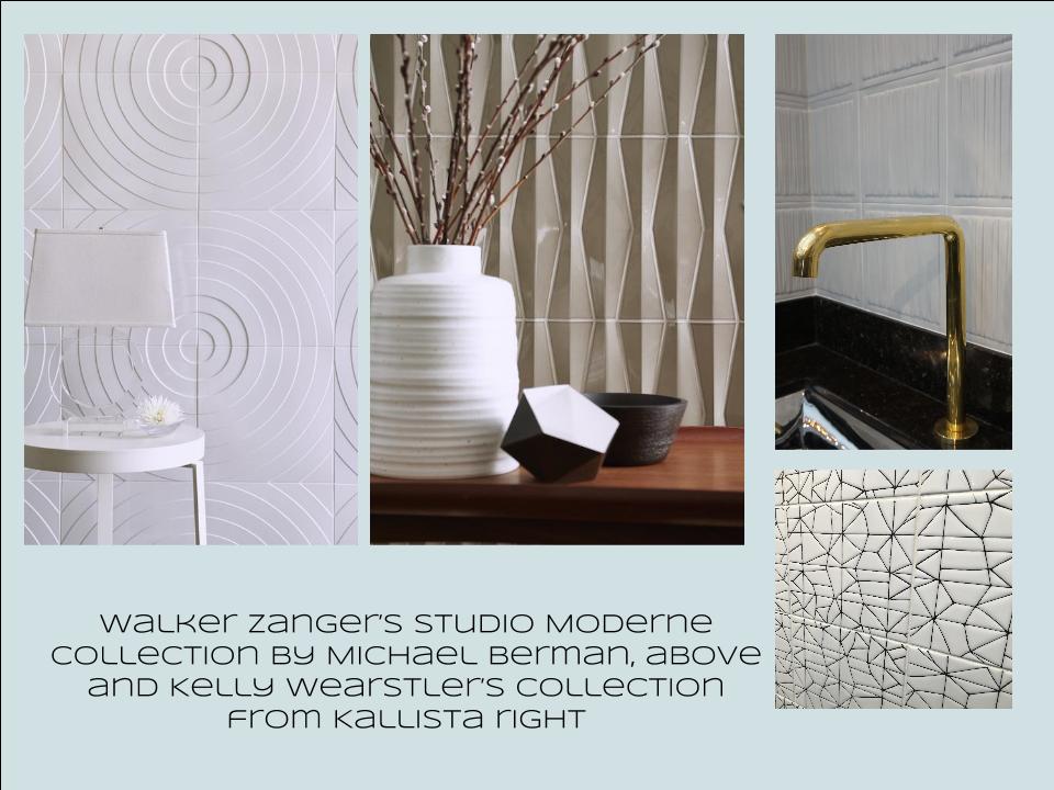
 Tile StyleMy two tile favorites were Michael Berman's Collection from Walker Zanger and, of course, Ann Sacks who are featuring a new line by L.A. design maven Kelly Wearstler. Love!
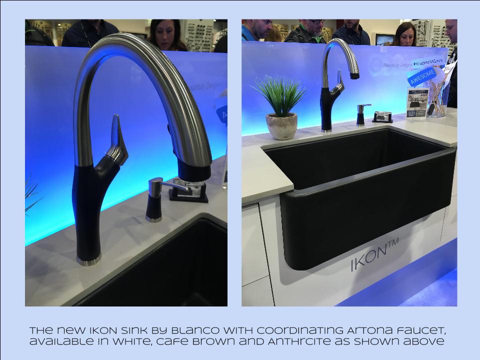
 I can IKONIf you read my blog you know I love me my Silgranit sinks, meet IKON the apron front version which easily works in any style kitchen from Traditional to Contemporary. Their Artona faucet perfectly complements the Silgranit sink.
 Stikwood Rocks!
Stikwood’s line of lightweight, real-wood planking offers designers and DIYers a peel-and-stick solution to achieve that perfect, sought-after blend of rustic and modern. It can be used on walls and ceilings and comes in tons of colors, even prints! I'm thinking this could be great on the back of a kitchen island.
Believe me, all this is just the tip of the proverbial iceberg. There was so much more to see and learn about at KBIS 2016. Check out this year's winners of Best of KBIS for more info and of course if you'd like any more info on what you see here email me at artfulkitchensbyglo@gmail.com
Kitchen Inspired At Art Basel
Where has the time gone? 2016 is off to a great start. I'll soon be heading to the annual Kitchen & Bath Industry Show in Las Vegas (KBIS) to immerse myself in everything new the industry has to offer. Today I'll finish up my pondering of events during Art Week in Miami by segueing back into the kitchen realm.If you read my previous post you know that last month we experienced THE major annual South Florida art happening, known as Miami Art & Design Week. Art Basel Miami is the main event but it's actually much more than that. It's fairs, performances and gallery openings all over Miami. I promised to share with you my finds from Context and Art Basel Miami Beach but today I thought I'd make a pit stop in the kitchen because, after all, that's what I do! It's not surprising that elements of the kitchen can inspired artistic expression.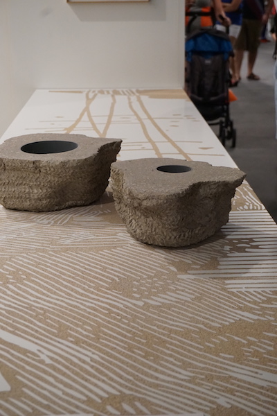 Cooking implements, cabinetry etc. are symbolic representations of our past, childhood memories, emotional connections and especially the heritage of women. The above sculptural installation by Spanish artist Asier Mendizabal features a beautiful Zenish looking pattern, on closer inspection it is a garden variety laminate top with the surface stripped off in spots to create this effect. I bet you never thought of doing this to an old counter top, but how beautiful! Mendizabal is noted for his use of a wide variety of materials from fabric to wood to metal and, yes, laminate.
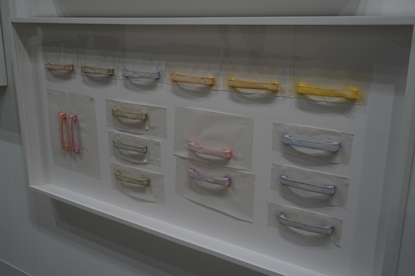 I immediately recognized this work by Korean artist Do Ho Suh to be cabinet pulls! I, of course, am loving the repetition and the lovely color palette but what's it all about? Contemporary art publication Daily Serving explains the Rubbing/Loving series perfectly, "the work records the artist’s former New York apartment through a series of painstakingly executed rubbings. By covering every surface of his apartment with sheets of tracing paper and rubbing it with blue colored pencil, Suh and his team meticulously documented the various textures and patterns of the floors, walls, and built-in appliances. The entire process is chronicled in a short film on the series, also on display in the gallery." In this case he used pastels instead of colored pencil.
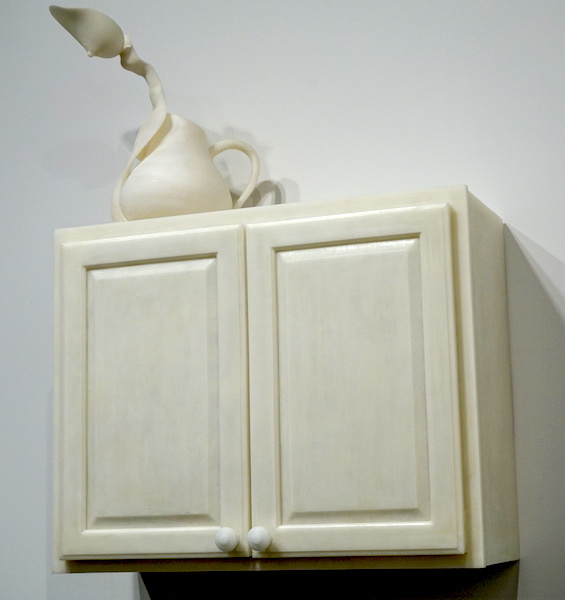 Janine Antoni's sculpture, to quench, come under the category of feminist art in my opinion. A graceful breast over seeing the kitchen and also a lovely balance of rectangular form and soft curves. Doesn't it also make you wonder what is in the cabinet?Ok so this is straight up conceptual art but art that you love can be a big element of the artful kitchen. I would like to invite you to add that artistic element to your own kitchen. What better place than the heart of the home to locate something you love to gaze upon! Are you game?
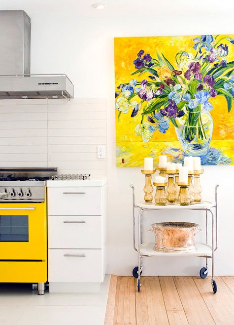 If so I'd love to help you, kitchens and art are my passions. Whether it's the ideal spot for a beloved painting or a sculpture gracing a perfectly placed opening we can do it and we can make it totally you. Take a peek at my "Kitchen Art" Pinterest board for some creative inspiration. Whether you already have the artwork or are looking for the perfect piece it would be my pleasure to work with you. Let's connect and create! Email me at ArtfulKitchensbyGlo@gmail.com
Art Basel Miami 2015: Part I -Art Miami
It's hard to believe another edition of Art Basel Miami Beach is in the books. This year I dove in with both feet knowing that really seeing all of Art Basel is the proverbial "unicorn project". My best advice is GO! See what happens. You'll see what you're meant to see. Today I don my "art critic hat" to share my experience with you. This year's event began for me with Art & Design Uncorked hosted by the Mistresses of Media known as Modenus. It was a reunion of design peeps from their blog tour events but all art and interior design pros were welcome too. It would be hard to top the venue which was no less than The Ritz Carlton, Coconut Grove. Nice! Cocktail party, new friends, reconnections, a full day of useful and relevant talks topped off with a dinner cruise on Biscayne Bays (I thought to myself, what wait, isn't this were Dexter dumped the bodies!?!?). Anyway Miami is my hometown and it was nice to be back and see it from this perspective.
 The hubs entered the picture on Wednesday evening, traveling down to meet up so we could hit the ground running on Thursday morning. First stop, Art Miami. Art Basel is held not only in the Miami Beach Convention Center but also at satellite venues around the city. Collectively these fairs are known as Art Week Miami. In addition to art, Design Miami is held right along side of Art Basel. Like I said, you can't see everything and, alas I missed this part, but it's on my list for next time.
 One big fair is located in the arts district known as Wynnwood. Art Miami and sister fair Context can be found there, just look for the big white tents! The work included a wide variety of painting, sculpture and some kinetic pieces as well. All contemporary, conceptual, a feast for the eyes and definitely food for thought. Here are some of my favorites.
 Mayme Kratz embeds natural elements into translucent resin yielding a smooth surface with lots of visual depth. I am drawn to and intrigued by repetition-so I love it!
 Look, repetition again! Some of my images may surprise you if you think all or most contemporary art is abstract. There was a lot of figurative art, even photo realism in the mix. Mary A. Waters is an Irish artist who is in love with the paintings by the masters. This is her interpretation of Bia de Médici by renaissance painter Agnolo Bronzino. His oil painting was created in 1542. I have always loved the original. Bia is a renaissance version of my daughter at that age.
 Chotvichai's work is very striking and deals with issues of gender and identity. Perhaps the topic is not so original but her methods are. Interestingly, her works are typically self portraits, like the one above. She's very fascinating to read about and you can find more here.
 Susan Grossman's drawing is highly detailed yet, in a way, unspecific, leaving it to the viewer to fill in the blanks.
 So this Lego sculpture wins in my book for whimsy and humor. If you look really closely and open the little door there is a little man sitting on his little "throne". I wonder how many times his privacy was violated during the show!
 I'm so sorry I can't tell you who the mastermind is behind this, possibly A Wei Wei? He has been working with Legos of late but that's just a guess. If you know please give it up!
 Definitely one of the best in show for me was this sculpture by English artist Jose Martin. I love the delicious texture and super saturated Alizarin Violet color, not to mention the awesome name, an all around winner!!
 I've been dying to incorporate stitchery into my art and Russian artist Tanya Akhmetgalieva does just that. She also works in many other diverse media including video.
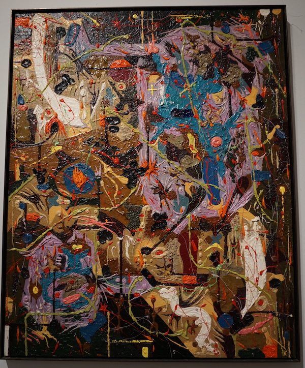 This great example of Abstract Expressionism is by an artist from the Phillipines. Alfonso Ossorio also happened to be one of the pioneers of assemblage (sort of a 3D collage) in the early 60s. I love the vibrant colors in this painting. They draw me in and beckon me to learn more about this interesting artist which you can do here.
 You know I love me my mermaids and just look at the exquisite writhing repetition! Wow.
 Originally from Germany, Hans Hofmann is another Abstract Expressionist who ended up in New York. As you can see, he was a master of color. Hofmann made his living for much of his life, teaching art and running his own schools.
 This French photographer crafts his images using thousands of high resolution close ups to create large compositions. You could get lost in this piece! The detail is incredible with an interesting combination of crisp focus and hazy swirly movement.
 Lo and behold another art history classic, none other than the sweet work of Marc Chagall, nothing fancy, just simple and immensely appealing. Chagall was born in Russia, died in France at the age of 97 and experienced everything in between. There's no mistaking his style. Interestingly, in the 1950s, Picasso was quoted as saying, "when Matisse dies, Chagall will be the only painter left who understands what color really is."
 Sibylle Peretti frequently uses images of children in her work to represent vulnerability, innocence and an unadulterated vision of the world. What I find intriguing in this piece is the materials she used, the cracks and sparkles, as well as the beautiful shading and composition.
 Marc Sijan is what's known as a "hyper-realist sculptor". I would say so! Most of his subjects are not as attractive as this one. They are like "real" peeps. Rumor has it (not really it's on his website) he lives a secluded life in the woods of Wisconsin and no one really knows too much about him personally. I do know that he is considered the best at what he does.
 Chirico was an Italian artist mostly known for his Surrealist paintings. He did very few sculptures of which this is one. I love the symmetry of it and it makes me think of the complex history of culture and humanity.
 Jannick Deslauriers attempts to capture and fix organic matter which is inevitably subject to decay. I just think it's beautiful, and sometimes that is enough.Looking at A LOT of art involves A LOT of walking and, for me, is a mental workout of sorts. That said, with half the day gone, we were ready to finish the day by visiting Context, right next door to Art Miami.I'm going to call part one done. I'd love to hear your thoughts, impressions or questions. Art lives by inspiring connections, encouraging dialogue and perhaps making you think in a way you never did before. Talk to me!! Next up, Part II, We head next door to Context
Architecture Inspired Furniture: Brasilia by Broyhill
I often tout the benefits of designing to the architecture of a building. Integrating your interiors with your architecture makes for a look that is always right. This is the best way to avoid a strictly trendy or out-of-place look.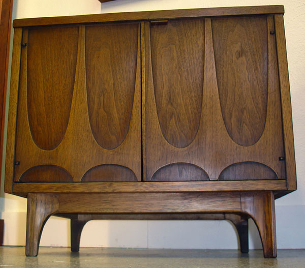 For example, if you have a MidCentury ranch style home, honor that and incorporate it with your furniture, cabinets and finishes. If your choices go with the house they'll never go out of style. Look to the structure for cues. If you have arched windows then complement them with a few arch details in the kitchen.
 One style that exemplifies this concept on a grand scale is Brasilia furniture by Broyhill. Contemporary architecture of Brasilia, the capital of Brazil circa 1956-1960, was the inspiration for this style of furniture. The line was first introduced at the 1962 World's Fair in Seattle. It is easy to see how the city influenced the furniture inspired by it.
 One place you can find Brasilia furniture today is at Retro Vegas on Main Street in Las Vegas Nevada. Owner Bill Johnson says, "The principal architect of Brasilia, Oscar Niemeyer, loved the parabolic arch and used it frequently.In addition, the aerial view of the city was designed to look like a plane or bird from which Broyhill used a bird symbol in some of the tiles and fabrics on their pieces.
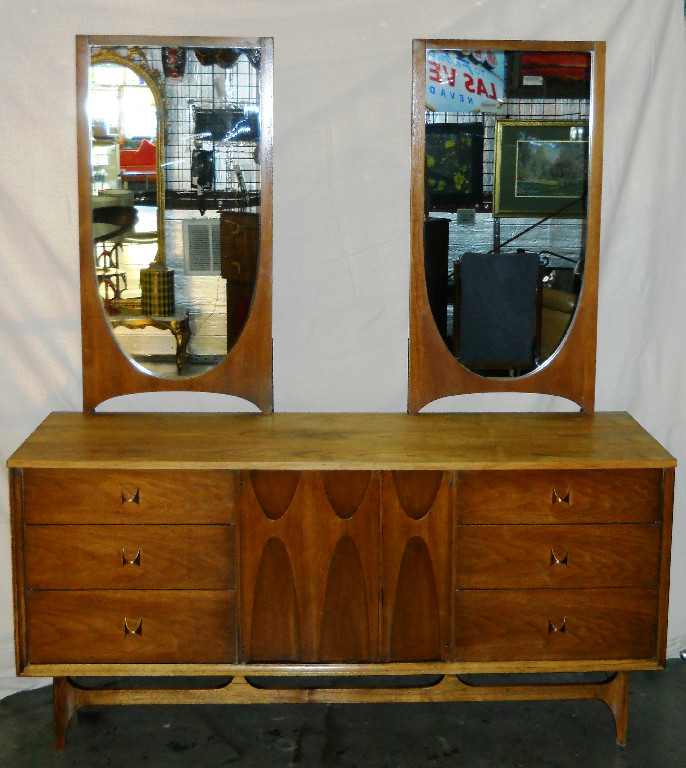 For more on the latest pieces and prices at Retro Vegas, please visit their website www.retro-vegas.com

