Day two of the Modenus Blog Tour was opening day for the 51st annual Kitchen and Bath Industry Show (KBIS). The Bloggers were given an inside peek into many of the booths at the show and as we toured, trends most certainly did emerge.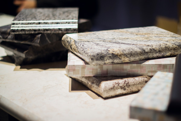 "There is a three year lag between Europe and North America when it comes to trends", says Warren Ramsland, President of Top Knobs. Taking that into account, there were many differences between what I saw here and what I witnessed in Italy at Euro Cucina last year. Perhaps the biggest European influence that continues to pick up steam is contemporary design for both the kitchen and bath.
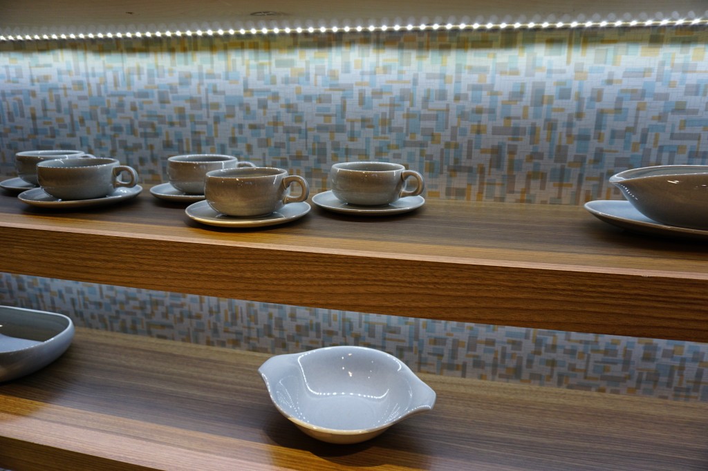 Laminates are enjoying a serge in popularity. This material is more widely used and experimented with by our friends across the pond but we're picking up speed. I was wowed by the offerings at Wilsonart who debuted their "Spirit of Mindfulness" collection of 27 exciting laminate colors and textures. Also introduced were a line of quartz counter tops in a great assortment of neutral, workable hues. By late spring, a selection of 50 patterns will showcase a full range of colors, textures and four structures: Fine and Small Scale, Medium Scale, Large Scale, and Veining and Movement. That is one of the things I love about quartz, the wide variety of pattern, or no pattern at all! I was impressed not only by the innovative product development at Wilsonart but also their philosophy. This press release statement says it all:"Fueled in part by a turbulent economy, today’s more budget-savvy and eco-conscious consumers have responded by making their homes the calm eye in the storm of life. For many, this translates to finding a spirit of mindfulness within themselves and expressing it in their surroundings."
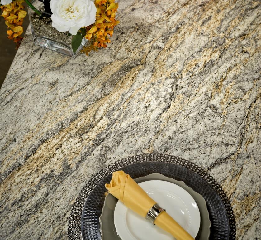 One of the new Wilsonart quartz options showing beautiful veining. Photo courtesy of WilsonartCheck out the Wilsonart Visualizer to help you pick your counter top color. It's easy, fun and very helpfulTechnology is also taking the kitchen and bath world by storm. There were numerous examples but two stood out for me. A company called TechTop took home the Best In Show Award for their counter top charging technology. Simply place your phone, tablet etc. on the counter top and viola' it will charge, no plug-in required.
  This great idea is from LG Hausy, yes it's the same "Life's Good" LG that makes appliances. They make counter tops too. I also loved this Solna articulating faucet by one of my favorite brands, Brizo. How convenient, right?!Fifty Shades of Gray has moved on to what I call "greige". It's the new warm toned beigey-gray which I saw everywhere! Palettes are definitely neutral. A great example is the Tangent collection by Walker Zanger. Love the mid-century inspiration which I also saw a lot of at the show.
 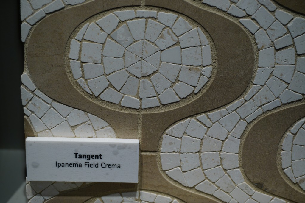 Walker-Zanger deals in tile, marble and stone artistry. Their collections are arguably the most innovative I've seen. Case in point is their Sterling Row collection, inspired by menswear and a favorite at the show. I found it to be extremely sophisticated, eye catching and innovative. The collection was a favorite at the show.
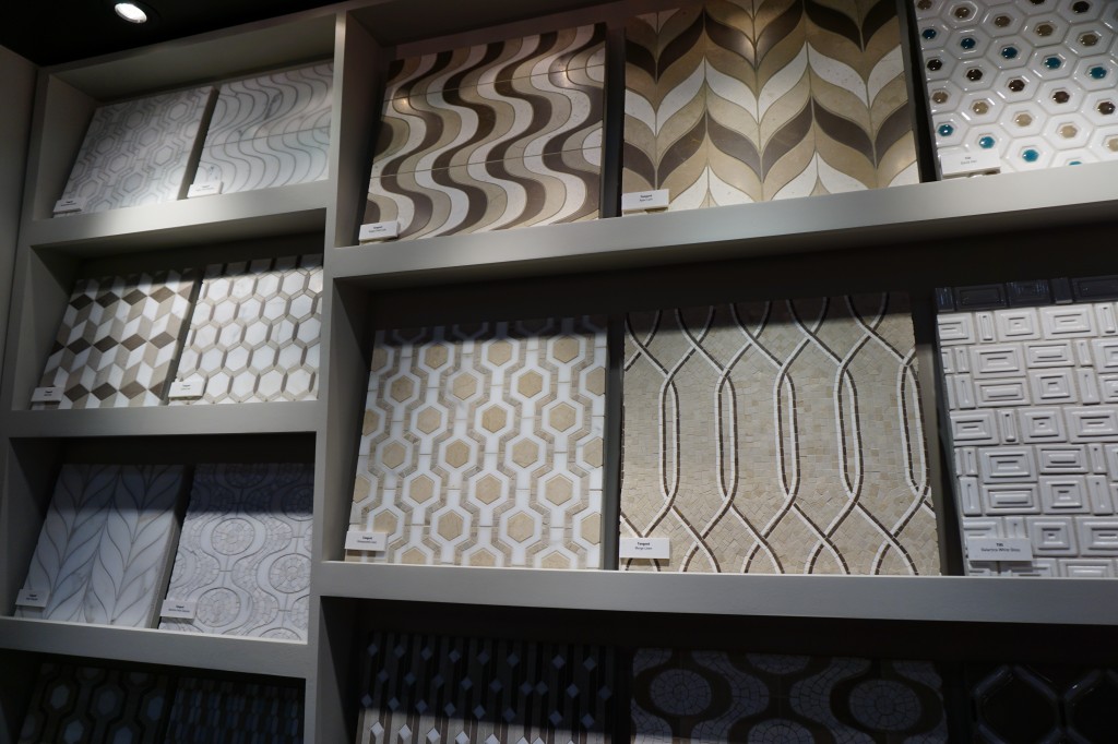
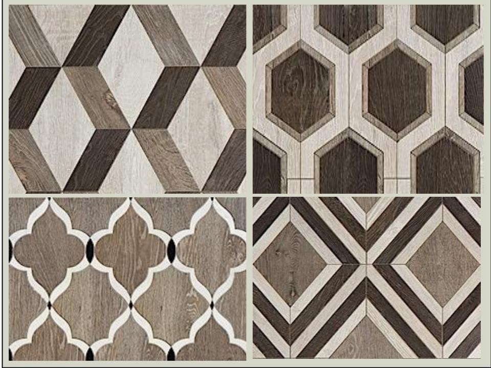 We saw more of the Sterling Row Collection later on the blog tour in The New American Home, so there's more to come!Perhaps the BIGGEST trend of the show was personalization. I mentioned this in the last post about Thermador but they were not alone. Here are a few more pics highlighting the concept. Frigidaire's SpaceWise Custom Flex refrigerators allow you to totally customize the shelves inside by moving the drawers and shelving to your desired configuration.
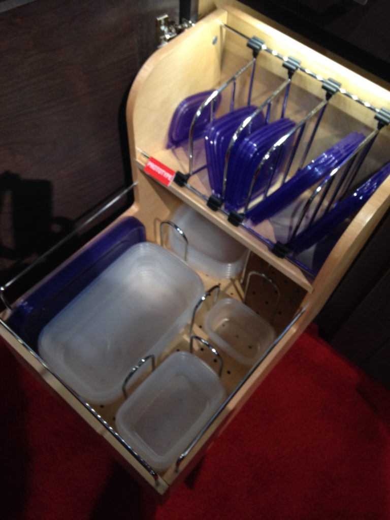
 How about this great storage system by Rev-A- Shelf? I know we all want this level of organization in our lives, yes? Right now this is a prototype but the response from the industry was good so I think we can expect to see this in the coming year.
 Enough for now? Well there's more to come.Up next: KBIS 2015 Part II where I'll tell you about all my great finds for the bath and more.
The Ultimate Designer Kitchen
What do a luxurious high-end handbag and a kitchen have in common? Give up? Fendi! One of the most impressive exhibits I viewed earlier this year at EuroCucina in Milan was the one featuring Fendi. As you can imagine, a show like EuroCucina (a part of the even larger Salone Internazionale del Mobile) encompasses pretty much everything you could ever think of when it comes to kitchen design. Not only that, I saw things I've never imagined in my wildest dreams! The Fendi's Casa Ambiente Cucina line fits squarely in that category.  Styling can be described as elegant and sophisticated with details that call to mind to a fancy buckle or luxurious lining on your favorite expensive bag. Speaking of linings, I was impressed with the cabinet interiors too. In this case beauty isn't only skin deep it extends to what's inside. This includes clear (yes CLEAR) roll outs and LED illumination which activates when you open the door or drawer.
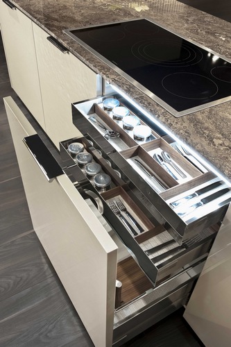 Fendi Kitchens made its debut at Salone two years ago with its first line of kitchen designs known as Ambienta Cucina, produced for them by SCIC, a high-end Italian kitchen manufacturer.
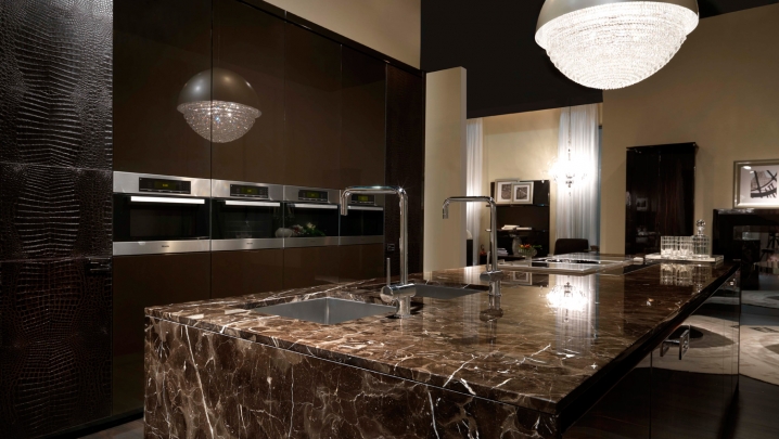 The Fendi exhibit was kept strictly under wraps, no peeking from outside and once you were cleared to enter photography was verboten! Big burly bouncer type guys were on hand to enforce the no pic policy. Sadly I witnessed one enthusiastic viewer caught in the act. She was made to show her phone and delete all photos in presence of bouncer! I thought the whole point of showing at a trade show was to garner publicity, no?
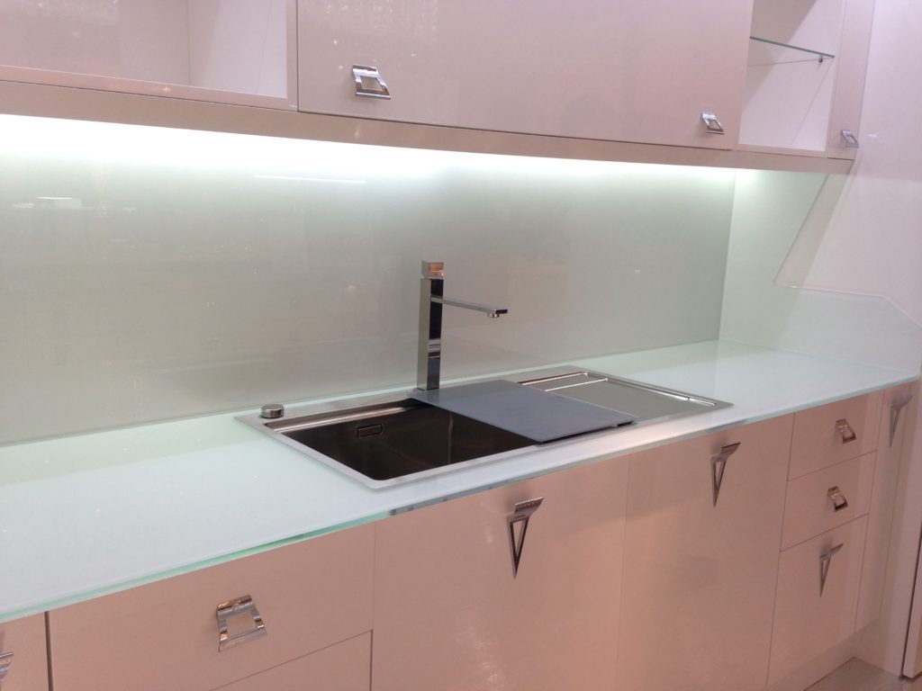 Fendi Casa Ambiente Cucina can be ordered in the U.S. exclusively through the Luxury Living Group in Los Angeles, Miami, and New York. Their offerings are truly a marriage of quality and fine design
 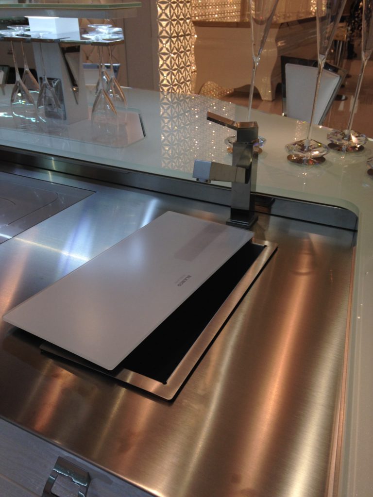 Check out Kitchens for Living On the Road to view all my pics and comments from Eurocucina 2014 and more!
An Off-The-Cuff Art Table
I think all of you know I'm a nut about art. Some of you may know that my particular passion of late is encaustic art. This particular type of painting is hot, literally. It's painting with beeswax, resin and pigments and you can get the full scoop here. Last year I had the pleasure of attending the 7th International Encaustic Conference in Provincetown Mass. You will find pics from that trip here scroll down to "Encaustic Boy".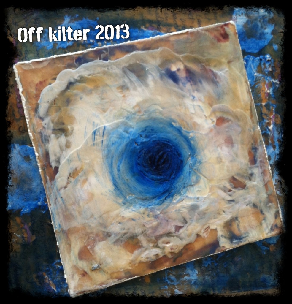 Anyway, I digress. What I really wanted to show you is this cool table that Pat in the shop at Brendan Donovan Furniture & Cabinet Co. made for me. I gave him the exact height I needed to work standing up. It has a shelf below for storage and casters so I can move it where I want it. He made it out of leftover bamboo and I didn't even finish it as I figured it would just end up covered in paint anyway. I realize not every one has "a Pat" so let me tell you about a website I just discovered through the tech whiz Eric Schimelpfenig of SketchThis.net . It's called Open Desk and it allows you to create your own furniture or have someone make it for you. Apparently there are lots of Pats all over the world who can make you your own art table, or whatever. You could even take a stab at it yourself!
 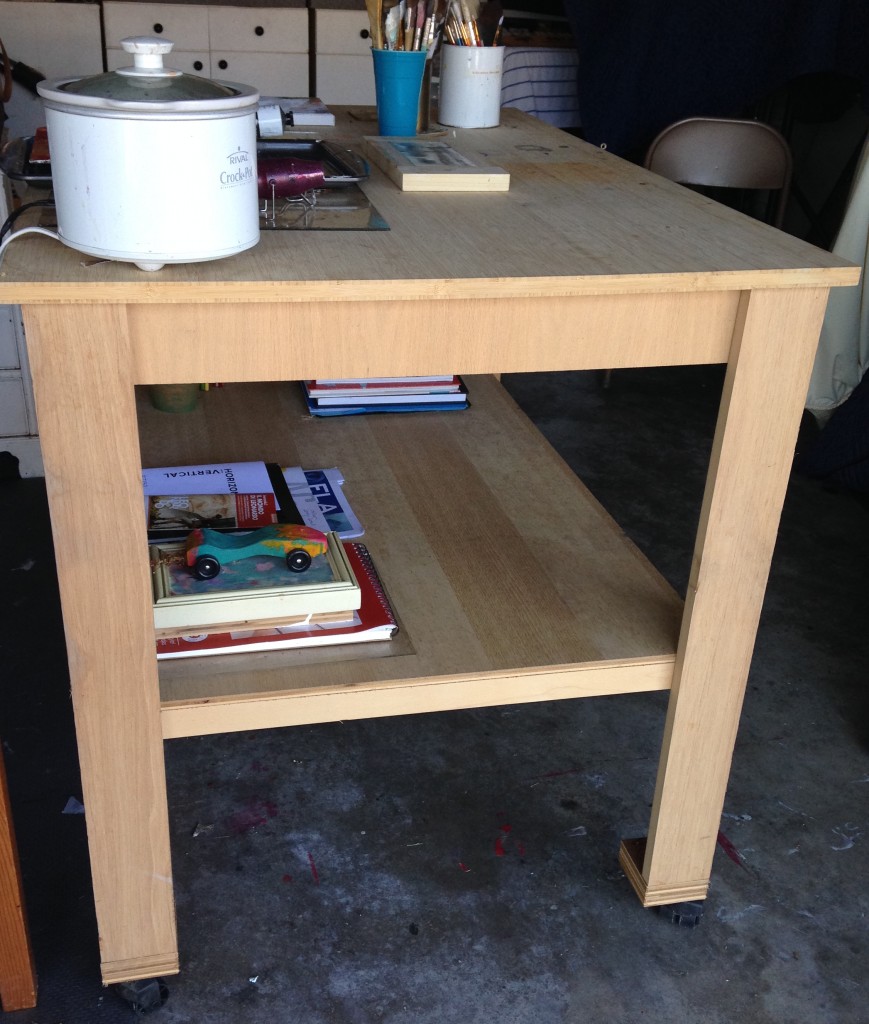 Pretty cool, huh?
 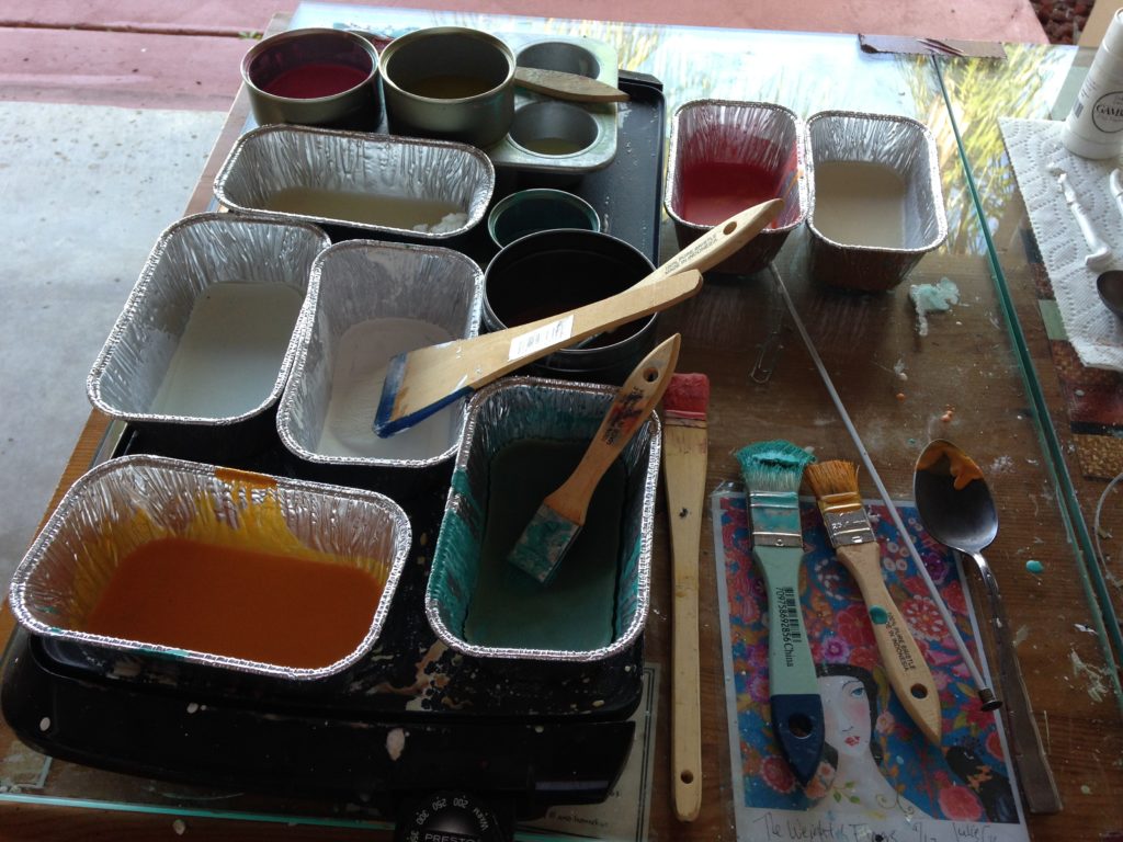 Oh and this is what the encaustic set up looks like. Soon it will get too hot to work in my garage.
  Can't leave without a "shout out" to Baby Girl who has successfully concluded her high school career. Onward and upward. I'm so proud. Next post we will get back to business, after my long weekend birthday celebration in the Keys where I will be doing this.
STOCK CABINETS IN CUSTOM SPACES
 Sometimes I’m called upon to do the impossible, or almost. It's easy for a home owner to blow the budget when purchasing a new residence or fixing up an old one. Trust me, everything always costs more than you think it will! If you're starting out remember to pad that budget. Sometimes I’ll get a perfect storm consisting of a very custom architectural arrangement and a homeowner who chooses to spend a minimal amount. That means custom cabinetry is out. No fear! I had a situation recently in which this exact thing happened. In fact I often have to make stock cabinets work to meet the budget. It’s sort of like a puzzle, a cabinet box rubiks cube, if you will. There are three basic components to a cabinet job and they all have to be friends with each other. They are:1) Design2) Product3) InstallationIn this case I had to come up with a design for a wet bar in this area utilizing stock sized cabinets and then, most importantly, our professional installer had to make it work which did require some fancy bladework. Here’s how we solved this one.
 We utilized two 30” high 12” by 12” upper cabinets as bases (on the bottom) in order to avoid the nasty angles in the back. These cabinets are fine at 12” deep as they will be used to store liquor bottles. (You definitely don’t need to be losing your booze in the backside of an oddly shaped cabinet!) We used a 24” wide sink base cabinet to accommodate the bar sink and since there is no room for drawers in the layout we’re adding a roll out shelf on the bottom underneath the plumbing.The top is where it gets tricky. We used a standard glass door cabinet over the sink, raised a bit to lend a little more spaciousness over the sink. Our installer altered the two upper cabinets on either side to accommodate those angles and I ordered an extra panel of interior cabinet material to finish the remade interior. Crown moulding and moulding under the uppers to conceal undercabinet lights finish off the traditional look. Yes, in this case the installation is a bit more expensive than normal but the savings from using stock cabinetry more than made up for it.
 One thing I say is that there is always a solution and this is a prime example. We had to give up a little space by going stock but custom base cabinets would have been an awkward shape and I'm not sure the benefit would have been worth the extra cost. The example you see here included cabinets, assembly, delivery, the remaking of the upper cabinets, installation and glass. The price was $3,400. Counter tops, lighting and plumbing fixtures were by others.
CRAZY KITCHEN AWARD
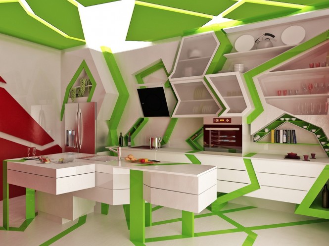
Welcome to Kitchens for Living's first annual CRAZY KITCHEN AWARD. Criteria include impracticality, power to confuse and disorient and of course creativity. With that in mind this one takes the prize. The Cubism Art Movement was the inspiration behind this wacky design by Gemelli Design Studio, out of Sofia, Bulgaria, of course. Here's the rationale:"Often the kitchen design is mainly aimed to its ergonomics. However this can lead to loss of its originality. Our goal was to create a glamorous kitchen combining multiple perspectives as a masterpiece of art affected by the cubism and surrealism styles. We believe that this advanced kitchen is a part of a more coloured, spectacular and interesting world and, at the same time functional." Really? What can I say? You know I'm always striving to insert anything to do with art into this blog. As Marlene Dietrich once said, "I can't help it."
Elements Converge In Dream Kitchen
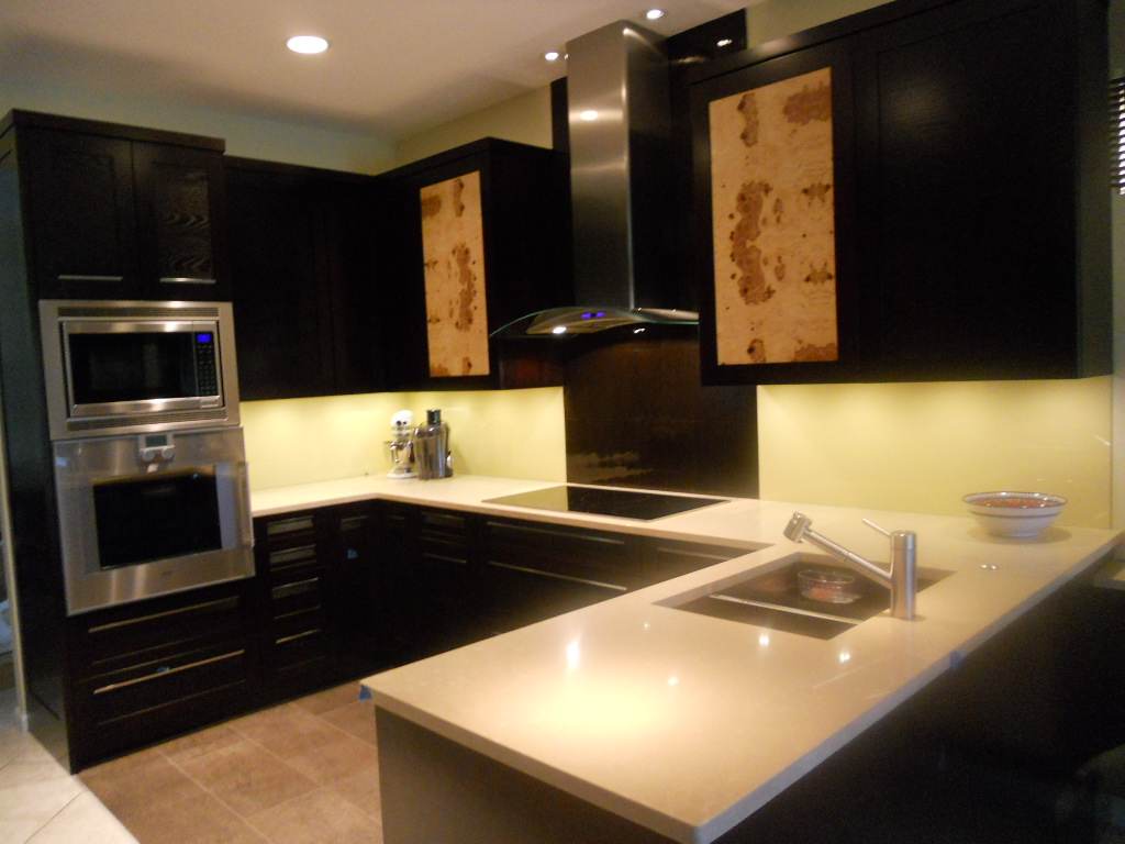
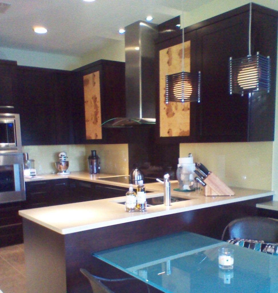 Another year is winding down. We have been blessed again with many interesting projects. As we are in “finishing up mode” I thought I’d share with you one of the best of 2011. This project was a true collaboration. Our clients, a couple of sweet snowbirds from Chicago, were very hands on which made it fun to see this kitchen take shape. The existing space was on the small side, the cabinets a little dated.
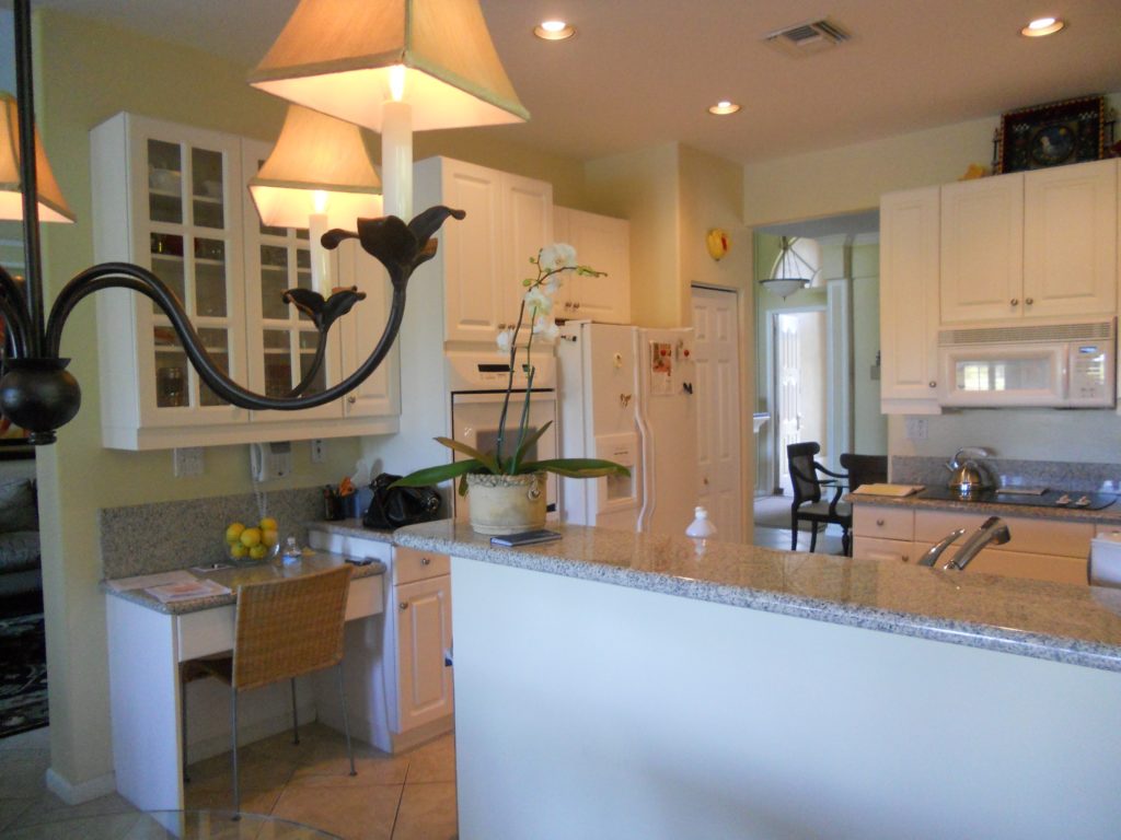
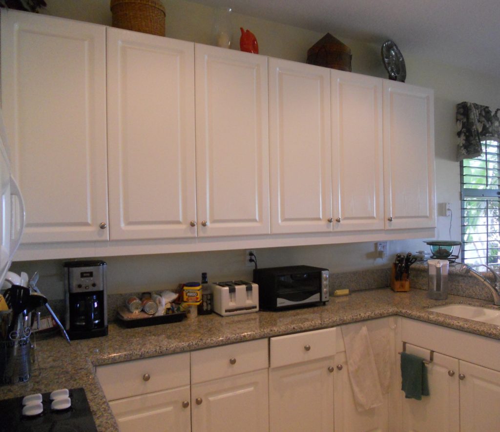 Our assignment was to add a whole range of state-of-the-art appliances and a clean unique contemporary feel that would flow into the existing family room. Naturally storage and function were also of the utmost importance but the real challenge was in fitting it all in!!
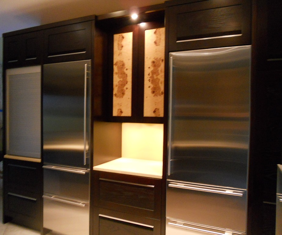
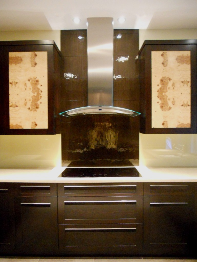
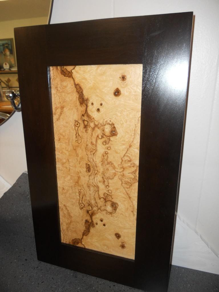
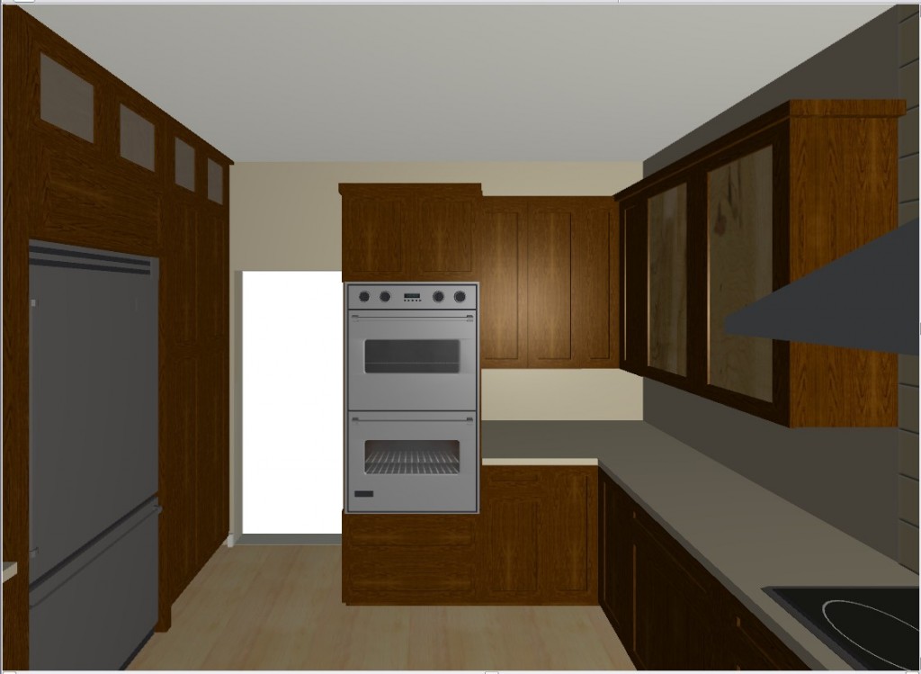 They chose a rich coffee bean stain for the cabinets to match existing cabinetry in the family room. The cabinet fronts were not ordinary doors, no way. Together, with our clients, we designed the Soldono and the Soldono Pacifica Doors just for this job. The Soldono custom door features a cherry frame around a horizontal grained oak center panel all stained in a rich espresso color. The center panel is beveled on one end with stainless steel grip strip inset on the frame. No hardware sticking out in this kitchen! A select few of the upper cabinets sport the Soldono Pacifica custom door which received center panels in olive ash burl veneer for a huge shot of “unique”.
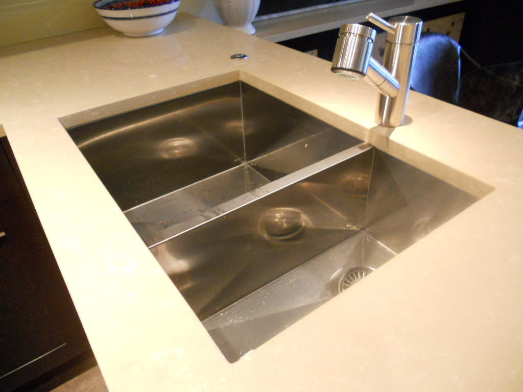
  Stainless steel serves as an accent finish and is found in the appliances and in the monster-multi-functional Hafele appliance garage. Refrigerators are Subzero, ovens are by Gaggenau, cooktop is by Miele and the dishwasher drawers are by Fisher Paykel. Thank you to Linda Roberts at House of Appliances for her guidance. Counter tops are Caesarstone quartz by Stone Palace and the backsplash is painted glass by Florida Shower Door & Mirror, Inc. Clearly they do much more that shower doors! Perhaps the "piece de resistance" however is the glass tile behind the hood. It truly looks like water cascading down the wall behind the hood! The sink is a Precision by Blanco and the glass theme is picked up again with the glass table. You can find a listing of all the trades on the Local Resources page here at Kitchens for Living.

