There is a fresh new concept on the scene when it comes to kitchen appliances. For years the challenge has been to make them go away, visually, that is. Integrating your refrigerator and dishwasher using matching cabinet panels can be the perfect solution in some situations but let's take another look, shall we?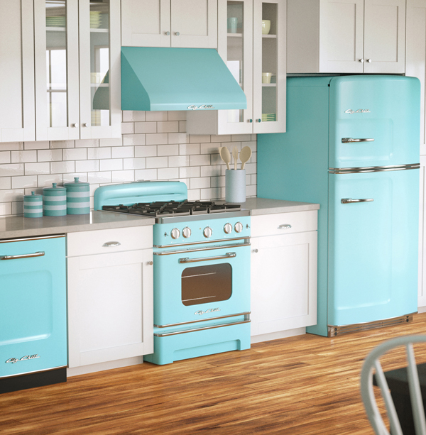 What if you crave something different, you have yen for retro design and you LOVE color? If this is you, Big Chill has you covered. This Colorado based appliance maker was founded in 2001 by Orion Creamer and Thom Vernon, two guys looking for vintage style with modern functionality.
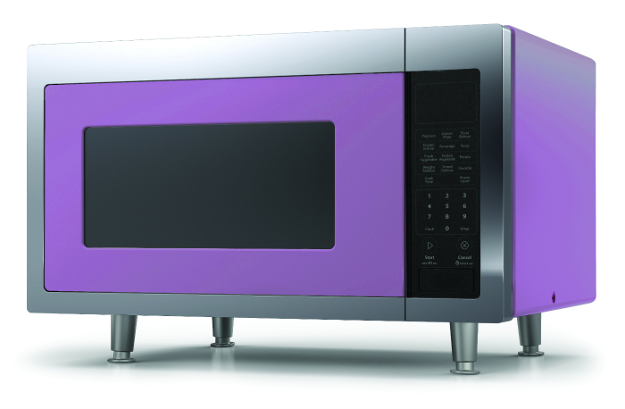 In the early days of the company Thom and Orion studied vintage styling from the 50s, particularly automotive detailing as well as the materials that were used. Their wish was to replicate the quality of products from this bygone era and blend it with the latest technology. I am impressed with the wide variety of appliances offered by Big Chill! Think the 48" pro range, induction cooking, large capacities as well as compact counter top microwaves.
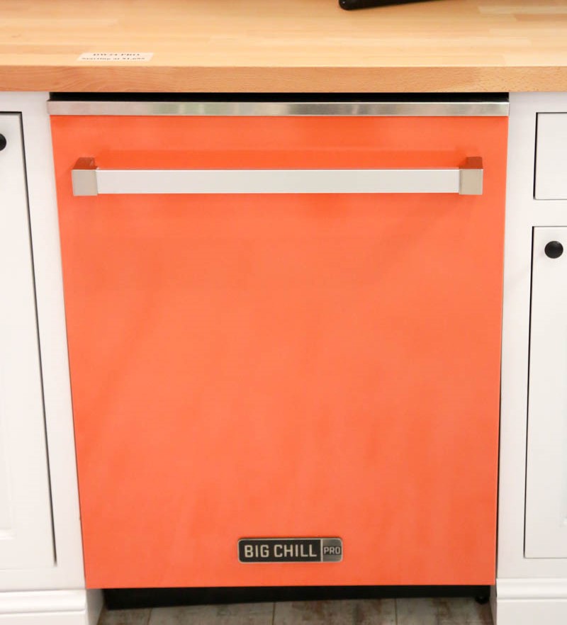 Also, if you're not a fifties fan they have two other lines, Classic with 1920s detailing and Pro offering the same bold color selection in twenty first century design. Speaking of color, if none of their many options is just right for you, custom colors are available too. You can find dealers throughout the US but if they're not in your neck of the woods you can purchase on line with free shipping in the month of August. For much more info check out their website and blog.PS. I have no affiliation with Big Chill. This just came across my radar and I had to share!
5 Elements of an Artful Kitchen
Summer projects are underway in South Florida! In fact, it's the height of the busy season for most design professionals here.
I don't have to tell you that a new kitchen is a big investment, in fact the kitchen is the most expensive renovation you're ever likely to undertake. It stands to reason that you'd want a kitchen that is tailor-made for you whether you can afford custom or not. This is what we're all about at Artful Kitchens.
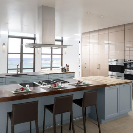
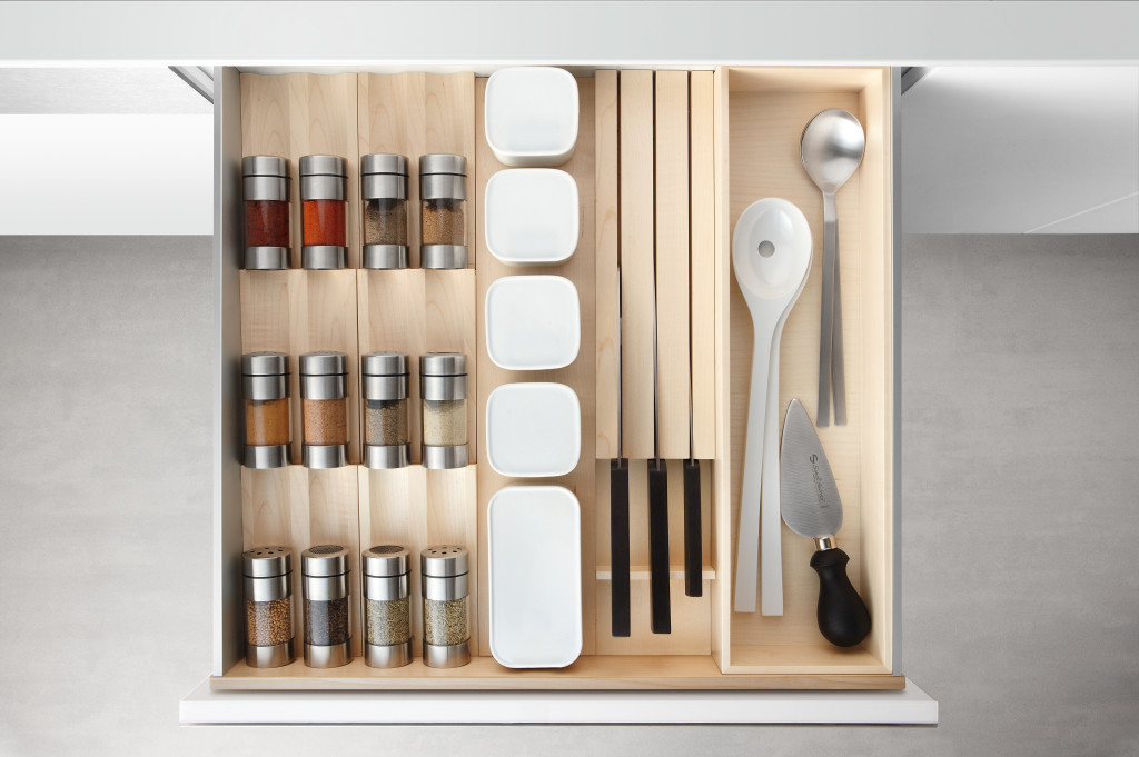
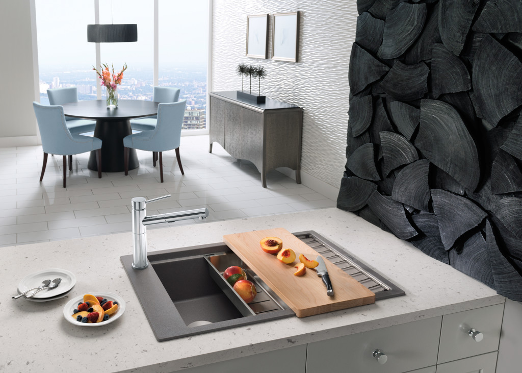
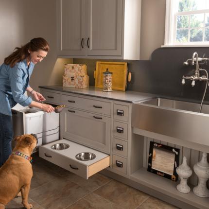
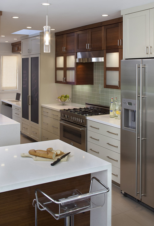
The concept of an "artful kitchen" has many different facets. It is not just about budget or the amount of space you have but the skill you employ using what is available to you. Here are five tips to consider along with some visual inspiration featuring products I saw this year at the Kitchen & Bath Industry (KBIS) trade show in Las Vegas. Implement these with style and confidence and you will be the proud owner of an artful kitchen!
1. Flawless Function
I'm all about artistic expression but a major part of creativity in the kitchen comes from devising flawless function. This quality is not something you see but something you can experience if artfully accomplished. When I say function, I mean work centers comprised of cooking, clean up and food prep areas.
Those are the basics but you could have more such as a beverage center (think coffee, tea, wine), a computer station or a baking center. If you have a two-cook kitchen, your layout should be designed so that any one of the major functions can be performed without anyone getting underfoot.
Following the guidelines set by the NKBA is a must to make sure all clearances are adequate. Sometimes we don't have a lot of choice about where to locate our sink or appliances but we can organize our utensils, dishes, pots and food items in a more efficient way. Don't forget the more flawlessly your kitchen functions the safer it is. You don't have to be an expert at this, just think about how you use your kitchen so that you will be a good collaborator when it comes time to work with a professional.
2. Personalization
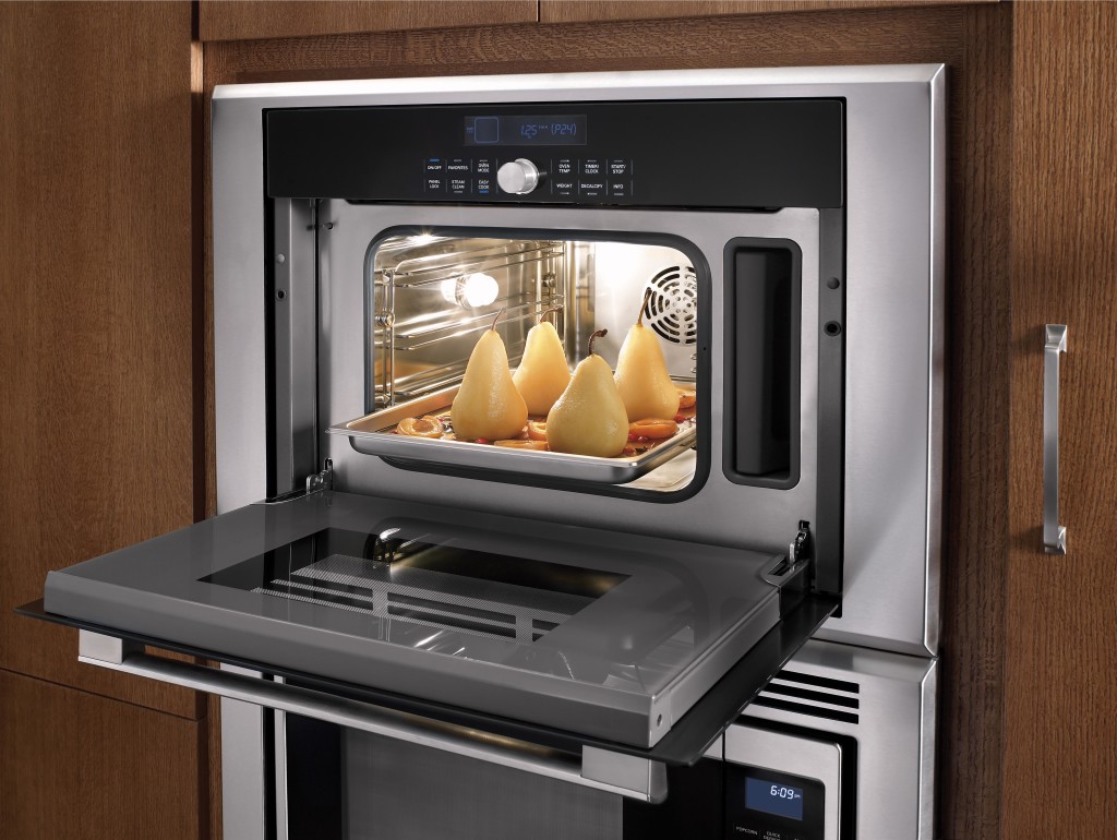
This is, without a doubt, the biggest movement in the design world. An artful kitchen is your own personal statement customized to the way you live. It could be a steam oven because healthy eating is your passion or it could be a lovely furniture piece with glass doors to display your grandmother's china. Include the colors you love. Even though you must be mindful of your budget (everyone has one), strive to retain the essence of what you see as your dream kitchen.
3. Harmony
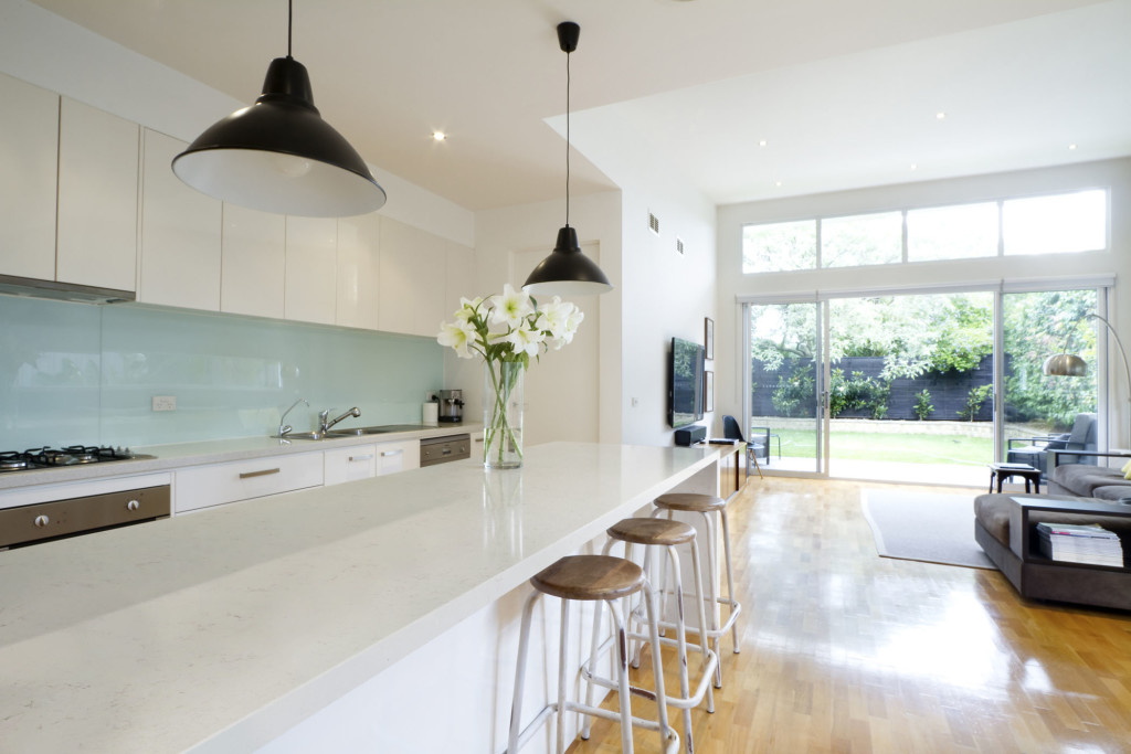
Harmony is one of the principles of design and a must for your kitchen. Whenever I design a two-toned kitchen I like to ensure that different finishes and details are carried through the space to create a cohesive whole. It's about how the floor relates to the cabinets and how the cabinet hardware relates to the faucet. You get the picture! It does not mean that everything has to match perfectly, it means elements should relate to and complement each other. It also does not mean that every element has to be perfectly symmetrical. In fact, consider this permission NOT to be! I find that the best rule of thumb is to follow the architecture and style of the home you're in. If, for example, the kitchen window is way off center you should work with that not against it. Never force solutions by sacrificing function.
4. Focal Point
Every piece of great artwork has a focal point. It is the "star of the show", so to speak. In a kitchen it can be a sculptural range hood, a granite counter with big bold movement or actually a piece of art! It is the item that makes you say WOW when you enter the kitchen. Just remember less is more here. One great focal point is probably enough. Too much and the statement gets lost. Less is definitely more.
5. Texture
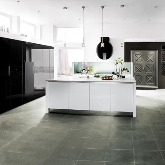
The element of texture involves at least two of our senses, touch and sight. The textures you are likely to come across include the glossy finishes popular in contemporary design, prominent wood grains which can be traditional or modern and smooth honed surfaces that are more matte. A flat slab cabinet door is a great choice if you plan to use a wood with a lot of pattern and graining. In this case the material is the decorative element of the cabinet. On the other hand, if you are traditional and you are using white cabinets you can select a door with some molding or detail. Also let the wild patterns either be on your cabinets or on your counter, both would be busy and distracting.
This is only the tip of the iceberg, so to speak. There are many more tricks and methods to create an artful kitchen. What are yours? Please keep in touch and contact me. Whether you need a quick consult or a full design layout I can help in person or virtually.
I'm located in the West Palm Beach area, so if you're local I can also help you shop for your kitchen products.
Tile Tuesday: In Valencia Art is a Way of Life
Welcome to today's installment of Tile Tuesday! The second half of my adventure with Tile of Spain took us to Valencia, location of Cevisama the annual trade show held to showcase the latest innovations introduced by the Spanish tile industry. We traveled by train east from Sevilla to Valencia, which is situated on the coast about 300 miles south of Barcelona. At first glance Valencia appears to be very modern with a predominance of what I call “the new Spanish architecture” featuring waves, curves and a visually interesting asymmetry.
 But there is an older Valencia to explore as well. The heart of the city features structures such as The “Iglesia de San Juan del Hospital” which dates back to the 1200s! The current city grew from this center. What a crazy combination of styles! You can see Roman, Gothic, Renaissance and more because different sections were constantly added to the original structure.
 Again we had a passionate knowledgeable tour guide who did not allow us to leave one inch of Valencia uncovered!
 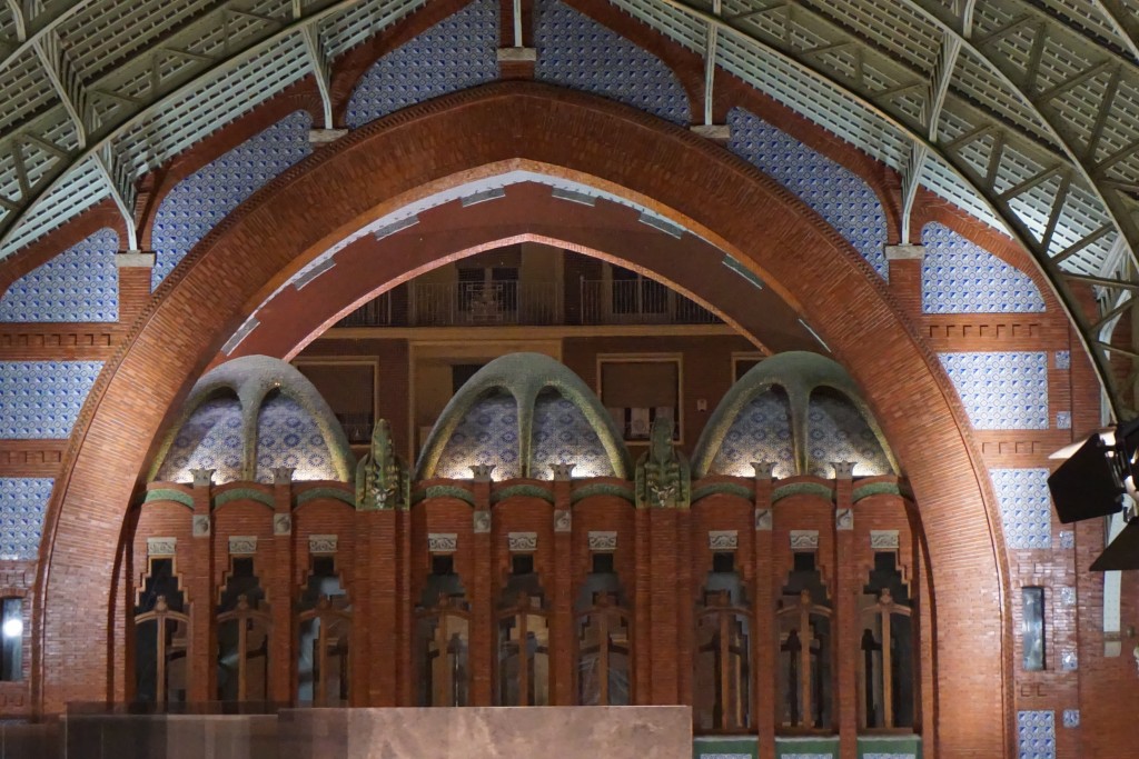 One of my favorite spots was the Mercado de Colón, a beautiful example of the Art Nouveau style. Glass and tile adorn this early twentieth century marketplace, now a gathering place full of interesting bars and restaurants.
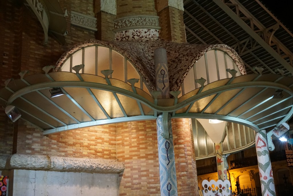 Hallmarks of the Art Nouveau style include free flowing organic shapes, rich earth tones and lots of tile! At the turn of the nineteenth century there was no aspect of living that was not touched by the movement. It was a global trend as well. In Germany it was known as Jugendstil, in Spain Arté Joven and Secession in Austria. The American version evolved into the what we know as the Arts and Crafts Movement, a simplified, more linear version. According to Art Nouveau philosophy, art should be a way of life. No wonder I'm always intrigued by it!
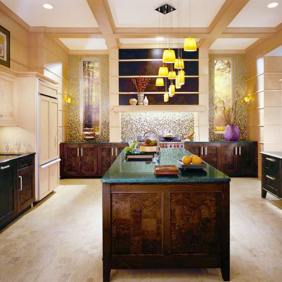
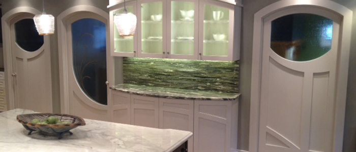 If you're looking to "Nouveau" your kitchen here are somethings you can include:-Rich brown wood stains-Green, green and green
-Some curvy shapes (more affordable to do this with your counter top than with cabinets)-Oak wood floors or cabinets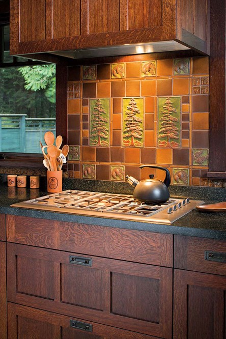 -Certain flora and fauna like the dragonfly, the ginko leaf and the thistle are all images often seen in Art Nouveau styling-Ceramic tile backsplashes (preferably with the above motifs)Next Tile Tuesday: More Cevisama and the future of tile.
BigTrends from KBIS2015 Part I
Day two of the Modenus Blog Tour was opening day for the 51st annual Kitchen and Bath Industry Show (KBIS). The Bloggers were given an inside peek into many of the booths at the show and as we toured, trends most certainly did emerge.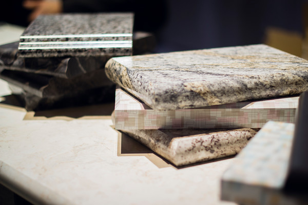 "There is a three year lag between Europe and North America when it comes to trends", says Warren Ramsland, President of Top Knobs. Taking that into account, there were many differences between what I saw here and what I witnessed in Italy at Euro Cucina last year. Perhaps the biggest European influence that continues to pick up steam is contemporary design for both the kitchen and bath.
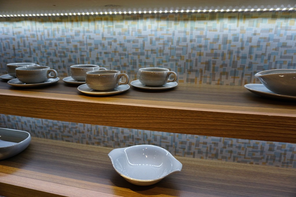 Laminates are enjoying a serge in popularity. This material is more widely used and experimented with by our friends across the pond but we're picking up speed. I was wowed by the offerings at Wilsonart who debuted their "Spirit of Mindfulness" collection of 27 exciting laminate colors and textures. Also introduced were a line of quartz counter tops in a great assortment of neutral, workable hues. By late spring, a selection of 50 patterns will showcase a full range of colors, textures and four structures: Fine and Small Scale, Medium Scale, Large Scale, and Veining and Movement. That is one of the things I love about quartz, the wide variety of pattern, or no pattern at all! I was impressed not only by the innovative product development at Wilsonart but also their philosophy. This press release statement says it all:"Fueled in part by a turbulent economy, today’s more budget-savvy and eco-conscious consumers have responded by making their homes the calm eye in the storm of life. For many, this translates to finding a spirit of mindfulness within themselves and expressing it in their surroundings."
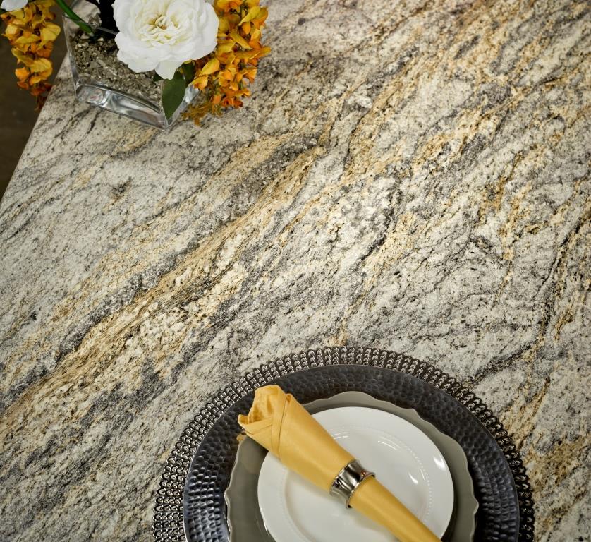 One of the new Wilsonart quartz options showing beautiful veining. Photo courtesy of WilsonartCheck out the Wilsonart Visualizer to help you pick your counter top color. It's easy, fun and very helpfulTechnology is also taking the kitchen and bath world by storm. There were numerous examples but two stood out for me. A company called TechTop took home the Best In Show Award for their counter top charging technology. Simply place your phone, tablet etc. on the counter top and viola' it will charge, no plug-in required.
  This great idea is from LG Hausy, yes it's the same "Life's Good" LG that makes appliances. They make counter tops too. I also loved this Solna articulating faucet by one of my favorite brands, Brizo. How convenient, right?!Fifty Shades of Gray has moved on to what I call "greige". It's the new warm toned beigey-gray which I saw everywhere! Palettes are definitely neutral. A great example is the Tangent collection by Walker Zanger. Love the mid-century inspiration which I also saw a lot of at the show.
 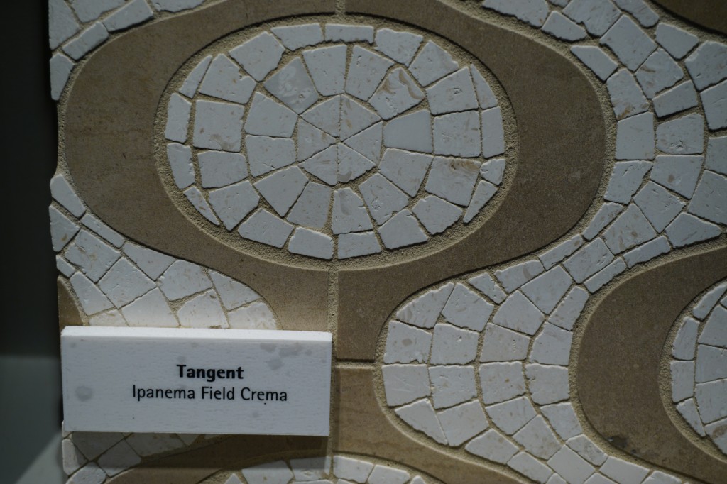 Walker-Zanger deals in tile, marble and stone artistry. Their collections are arguably the most innovative I've seen. Case in point is their Sterling Row collection, inspired by menswear and a favorite at the show. I found it to be extremely sophisticated, eye catching and innovative. The collection was a favorite at the show.
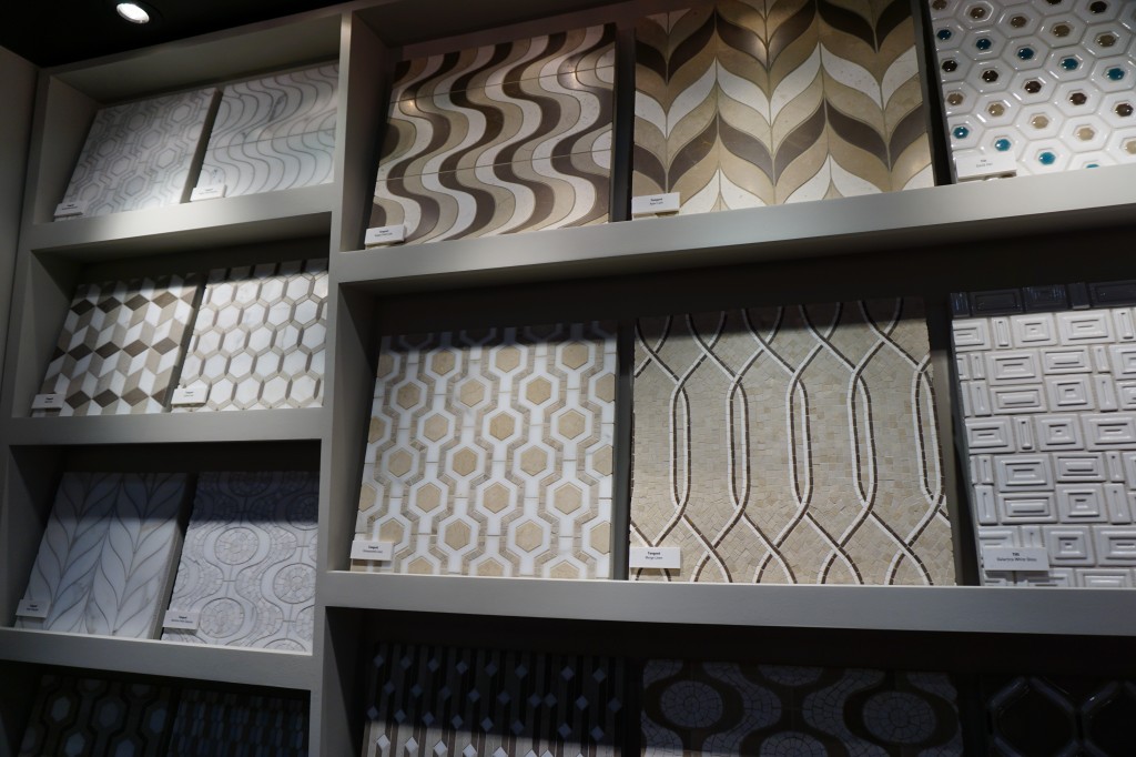
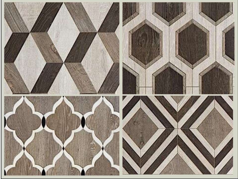 We saw more of the Sterling Row Collection later on the blog tour in The New American Home, so there's more to come!Perhaps the BIGGEST trend of the show was personalization. I mentioned this in the last post about Thermador but they were not alone. Here are a few more pics highlighting the concept. Frigidaire's SpaceWise Custom Flex refrigerators allow you to totally customize the shelves inside by moving the drawers and shelving to your desired configuration.
 How about this great storage system by Rev-A- Shelf? I know we all want this level of organization in our lives, yes? Right now this is a prototype but the response from the industry was good so I think we can expect to see this in the coming year.
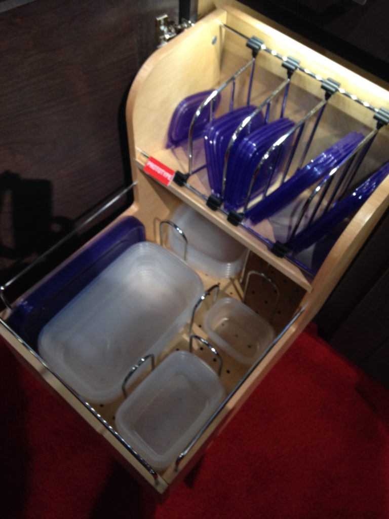 Enough for now? Well there's more to come.Up next: KBIS 2015 Part II where I'll tell you about all my great finds for the bath and more.
Men in the Kitchen
Circa 1954, Betty is in the kitchen, apron tied just right. Pearls in place. She’s the queen of her domain turning out pineapple upside down cakes while her hubs brings home the bacon (for her to cook). In most cultures throughout history, the heart of the home has been a woman’s domain. Even today though roles have shifted and functions of the kitchen have changed, it’s the woman who usually makes the decisions when it comes to the kitchen. I say USUALLY because even 10 or 15 years ago the man of the house only had a voice when it came to his office or his bar, now he is collaborating on the design of the kitchen. It was going to happen sooner or later. According to this article by The Wall Street Journal, the men are catching up and we're letting them. I wonder why it is that the upper echelons of “chefdom” belong to men but the foot soldiers of meal preparation are the women churning out meal after meal in middle America and beyond? Perhaps it's time to sit back and let the boys pamper us. Truth be told I have always aligned myself with men who know their way around the kitchen.
Now that I've got your attention, over the next few posts we will be examining the elusive phenomenon known as "men in the kitchen". We will look at a man navigating the challenges of a tiny city kitchen, the suburban family guy in the kitchen, the Gen Y bachelor and even and up and coming professional chef ! Good? Yes I knew you were in the mood for something completely different. Oh and by the way if you like the photo above it's available as wall paper here and is courtesy of wallsave.com. Next Up: How a man cooks in the city that never sleeps...
Tip 2: New Cabinets, All or Nothing?
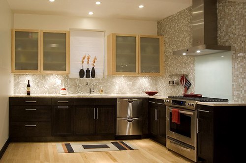
Anyway where were we?? Ah yes, I was sharing with you five big questions I get from clients. The first post in the series was about under cabinet lighting and here is number 2:2) Some of my cabinets are still really good, can I save money and just get more to match? While at first thought this may seem like a great way to save money, usually it's not. Even if your cabinet doors are simple, chances are you've had them a long time so the color may have changed. Also, each cabinet manufacturer makes their products slightly different so unless you can locate the original cabinet maker matching will be a challenge. Styles also get discontinued. If you're going to use a custom cabinet maker to replicate what you have you might as well just get new cabinets (unless he's a very very good friend). If you work within standard sizing parameters you can get some very good quality cabinets in today's competitive market. That said, there are some situations in which you can have the best of both worlds. Two toned kitchens are very popular. If you are replacing some cabinets, consider getting something totally different but complimentary to what you already have. Every situation is unique and it's worth investing in a little consultation with a kitchen design professional to see what can work for your case. The design solution below works because the lighter maple of the upper cabinets is picked up in the flooring. Usually I prefer to see a darker finish on the bottom rather than on the top. Darker colors are visually "weightier" so there is a "grounding" effect when you use them on the bottom. The operative word is "usually". Never say never as shown in the photo above. I love it. It works beautifully in this design. Lesson is don't be rigid. Think outside the box, pardon the pun!
A word about refacing- Refacing your cabinets means you will be replacing your drawer fronts and doors. The cabinet boxes themselves will remain including the drawer boxes. The thing to consider is that most of the cost of a cabinet is in the doors and drawer fronts. Along with that all exposed surfaces such as the ends and the frame around the front will have to be veneered or laminated to match the new doors. Depending on your existing cabinets, this could be a very labor intensive process resulting in less savings than you would have thought. One situation where I would recommend reface instead of replace is if you have already have great countertops which you now have a vested interest in saving. Then perhaps it would be worth it. Also, bear in mind, a reface doesn't allow you to improve your layout or add drawers. Whether new cabinets or just new doors and drawer fronts, remember that a clean simple flat slab style door is always the easiest on the wallet.Next up: #3: Where can I save money and what items are worth the splurge?

