This month is the ten year anniversary of hurricane Katrina. All my memories of New Orleans come to the forefront and today I pay homage to the grand adventure that was Blog Tour NOLA.I still think about this visit to New Orleans and what a full rich experience it was, encompassing so much more than design. In 2013 I had the exciting opportunity to meet this special city in a most comprehensive and in depth way thanks to the innovative design resource Modenus. I also had the pleasure of meeting and touring with some super talented design pros who remain my friends.
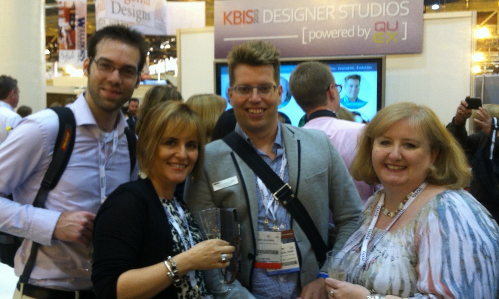 KBIS was held in NOLA that year and was a key part of the agenda however, thanks to our sponsors, we also saw, tasted (culinary heaven), touched and felt the culture of New Orleans. As I read and hear about the Katrina aftermath today, I am reminded of our visit to the Lower Ninth Ward and the realization that in the bleakest of times there is hope.
 Art documents culture and artists have found beauty and expression in the midst of destruction. This morning I was touched by this story of creativity that has blossomed in the Crescent City. You can listen to it on NPR. It mentions the Ogden Museum of Southern Art which we also visited!
 One of my favorite NOLA moments was on Frenchmen Street where we popped into The Spotted Cat and roamed neighboring Frenchmen Street Art Market.
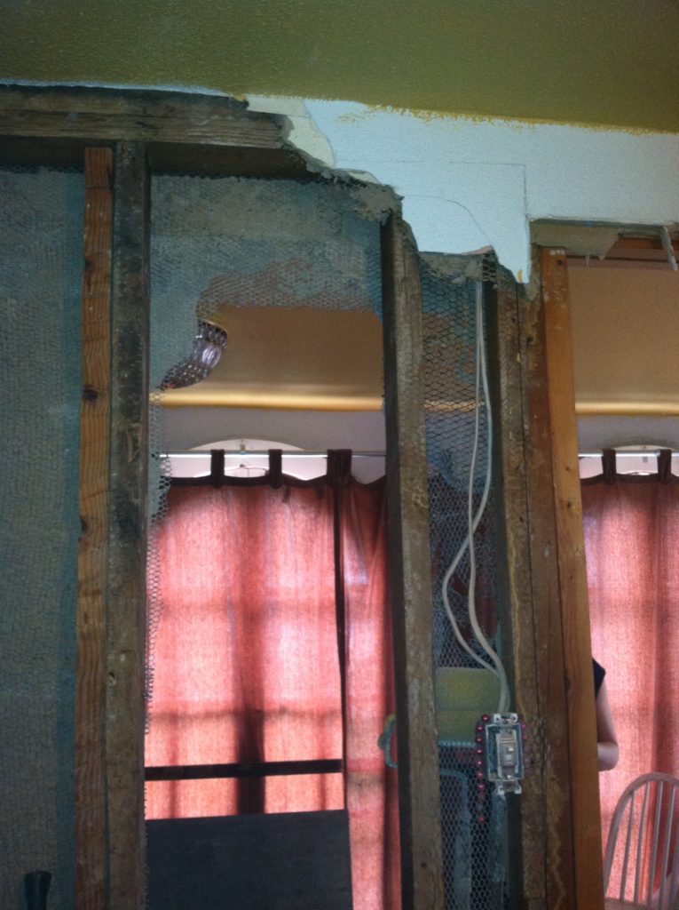 The day we visited the Lower Ninth, St. Paul's Homecoming Center, World Vision and KBIS united to tell the world through this press event that recovery was still in process and despite the fact that so much more needed to be done there was hope and progress.
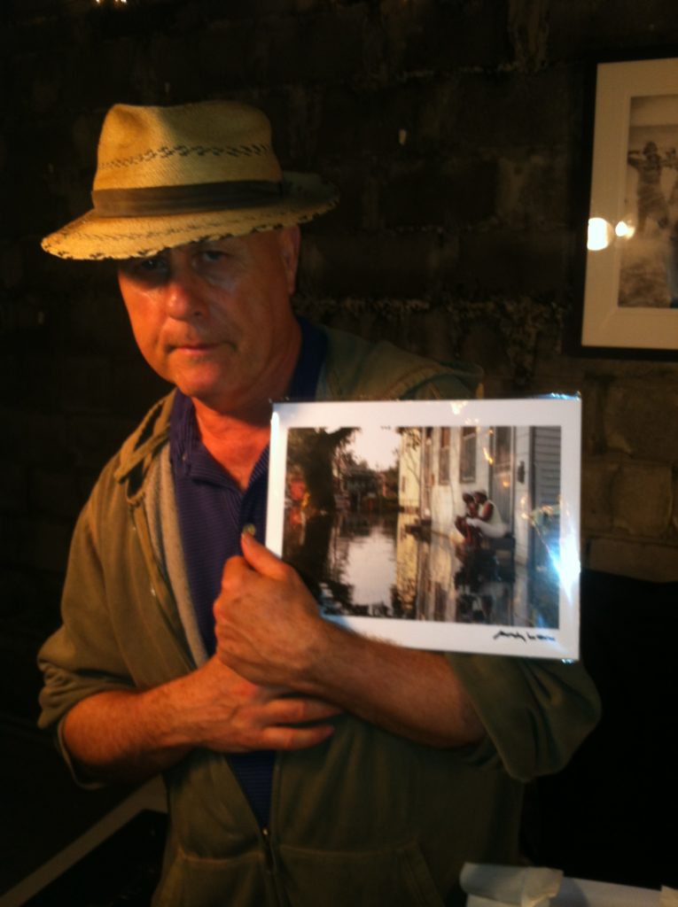
 Today I proudly display the photo (below) by New Orleans photographer Andy Levine in my home. It was taken by him in the aftermath of Katrina. Thank you Modenus for the lasting gift of this special blog tour I was honored to be a part of. If you'd like to go back and see what I wrote of my experiences, including the culinary treats, in 2013 it starts here.
  Also, I must say , if you like Houzz you will love the new Modenus. It's a straight up honest design resource that facilitates connections between designers and homeowners as well as being a beautiful source of inspiration. Check it out! PS I got through this whole post without mentioning BEIGNETS once! Oooops.
5 Elements of an Artful Kitchen
Summer projects are underway in South Florida! In fact, it's the height of the busy season for most design professionals here.
I don't have to tell you that a new kitchen is a big investment, in fact the kitchen is the most expensive renovation you're ever likely to undertake. It stands to reason that you'd want a kitchen that is tailor-made for you whether you can afford custom or not. This is what we're all about at Artful Kitchens.
The concept of an "artful kitchen" has many different facets. It is not just about budget or the amount of space you have but the skill you employ using what is available to you. Here are five tips to consider along with some visual inspiration featuring products I saw this year at the Kitchen & Bath Industry (KBIS) trade show in Las Vegas. Implement these with style and confidence and you will be the proud owner of an artful kitchen!
1. Flawless Function
I'm all about artistic expression but a major part of creativity in the kitchen comes from devising flawless function. This quality is not something you see but something you can experience if artfully accomplished. When I say function, I mean work centers comprised of cooking, clean up and food prep areas.
Those are the basics but you could have more such as a beverage center (think coffee, tea, wine), a computer station or a baking center. If you have a two-cook kitchen, your layout should be designed so that any one of the major functions can be performed without anyone getting underfoot.
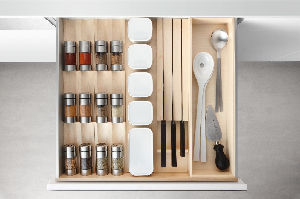
Following the guidelines set by the NKBA is a must to make sure all clearances are adequate. Sometimes we don't have a lot of choice about where to locate our sink or appliances but we can organize our utensils, dishes, pots and food items in a more efficient way. Don't forget the more flawlessly your kitchen functions the safer it is. You don't have to be an expert at this, just think about how you use your kitchen so that you will be a good collaborator when it comes time to work with a professional.
2. Personalization
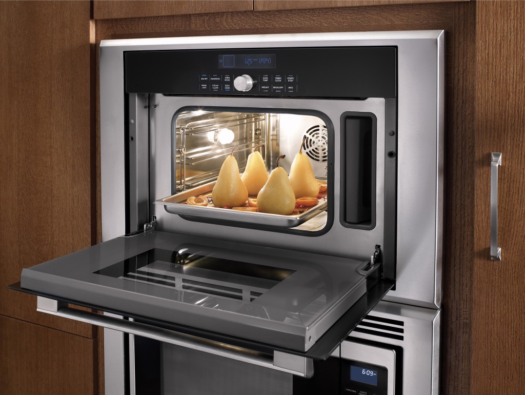
This is, without a doubt, the biggest movement in the design world. An artful kitchen is your own personal statement customized to the way you live. It could be a steam oven because healthy eating is your passion or it could be a lovely furniture piece with glass doors to display your grandmother's china. Include the colors you love. Even though you must be mindful of your budget (everyone has one), strive to retain the essence of what you see as your dream kitchen.
3. Harmony
Harmony is one of the principles of design and a must for your kitchen. Whenever I design a two-toned kitchen I like to ensure that different finishes and details are carried through the space to create a cohesive whole. It's about how the floor relates to the cabinets and how the cabinet hardware relates to the faucet. You get the picture! It does not mean that everything has to match perfectly, it means elements should relate to and complement each other. It also does not mean that every element has to be perfectly symmetrical. In fact, consider this permission NOT to be! I find that the best rule of thumb is to follow the architecture and style of the home you're in. If, for example, the kitchen window is way off center you should work with that not against it. Never force solutions by sacrificing function.
4. Focal Point
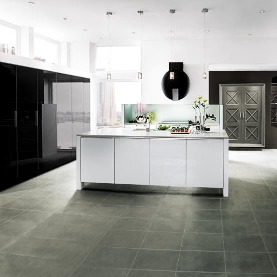
Every piece of great artwork has a focal point. It is the "star of the show", so to speak. In a kitchen it can be a sculptural range hood, a granite counter with big bold movement or actually a piece of art! It is the item that makes you say WOW when you enter the kitchen. Just remember less is more here. One great focal point is probably enough. Too much and the statement gets lost. Less is definitely more.
5. Texture
The element of texture involves at least two of our senses, touch and sight. The textures you are likely to come across include the glossy finishes popular in contemporary design, prominent wood grains which can be traditional or modern and smooth honed surfaces that are more matte. A flat slab cabinet door is a great choice if you plan to use a wood with a lot of pattern and graining. In this case the material is the decorative element of the cabinet. On the other hand, if you are traditional and you are using white cabinets you can select a door with some molding or detail. Also let the wild patterns either be on your cabinets or on your counter, both would be busy and distracting.
This is only the tip of the iceberg, so to speak. There are many more tricks and methods to create an artful kitchen. What are yours? Please keep in touch and contact me. Whether you need a quick consult or a full design layout I can help in person or virtually.
I'm located in the West Palm Beach area, so if you're local I can also help you shop for your kitchen products.
An Artful New Adventure!
Let’s face it, things change. As we navigate those twists and turns of fate we can only hope to move forward, seeing new things with a fresh eye. Like it or not, change is a constant. You can dread it (understandable) or you can choose to embrace it. That said, it has been more than five years since I began my adventure as Kitchens for Living.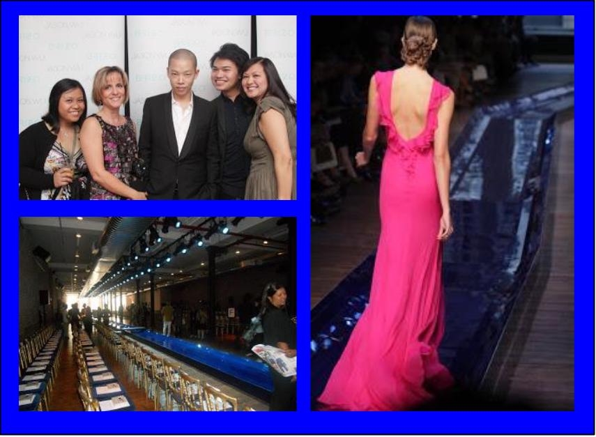 I believe I have been true to my promise to share the latest design trends and product info for the heart of your home. We have frequently ventured out of the kitchen and even around the globe! I am so grateful for all the wonderful and talented kindred souls I have met along the way, fellow bloggers, designers and great organizations such as Modenus, Blanco, Brizo, Tile of Spain and many more. This blog has afforded me the opportunity to travel and bear witness to marvelous destinations and inspiring trade shows. Before this starts sounding too sad, let me tell you I have never felt so excited about the future and eager to explore new opportunities.
 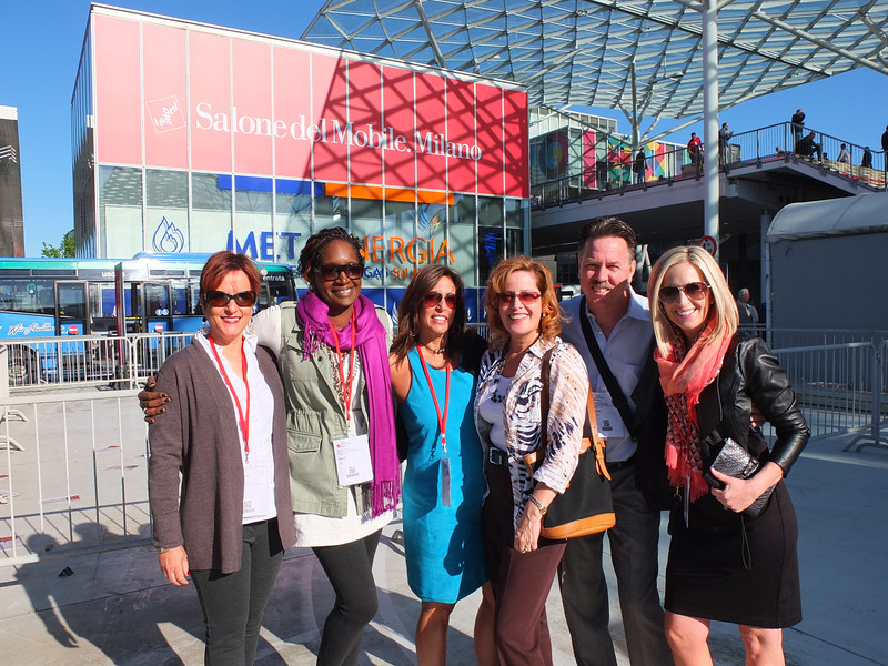 This will be the last post for Kitchens for Living. From now on I will be able to merge two of the things I love, kitchen design and art with my new site, Artful Kitchens. A big THANK YOU to Leslie Carothers of The Kaleidoscope Partnership for her guidance and insight which lead me to discover a new path full of promise and possibilities.
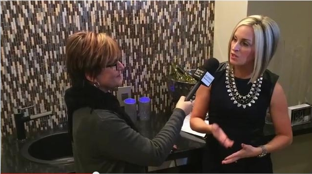
  Artful Kitchens will focus on all the ways you can use creativity to personalize your kitchen. Artful spaces reflect who you are and the way you live.
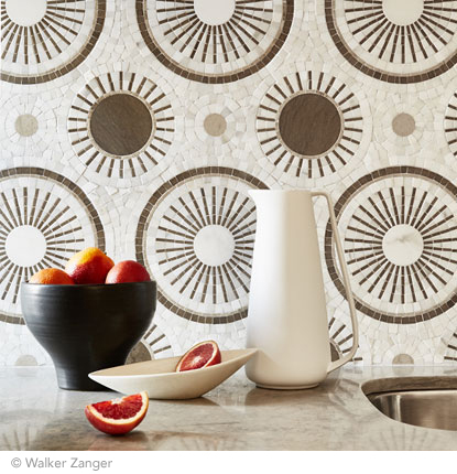
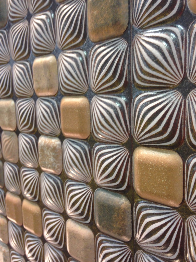
 The stunning tile above, by Walker Zanger, was featured at KBIS 2015 which I had the pleasure of attending with The Modenus Blog Tour Vegas.
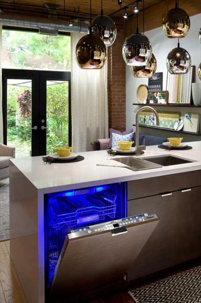
 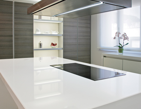 New products like this perfectly white quartz by Wilsonart enhance the kitchen with a feeling of crisp clean freshness!
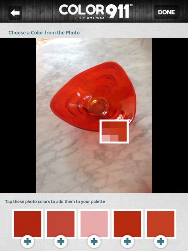
 Color is a primary element of the Artful Kitchen. We'll be talking a lot about that in an upcoming interview with Amy Wax of Color 911
 We will continue to incorporate new products and technologies as they emerge and we will explore all the artful ways of creating a kitchen that reflects who you really are. I’m so excited, I hope you’ll join me and spread the word. Last but certainly not least, whether you are a brand or a consumer, I want to collaborate with you!
  Continue the conversation on Face Book or email me at ArtfulKitchensbyGlo@gmail.com
Wood-Mode and Top Knobs, Makings of a Dream Kitchen
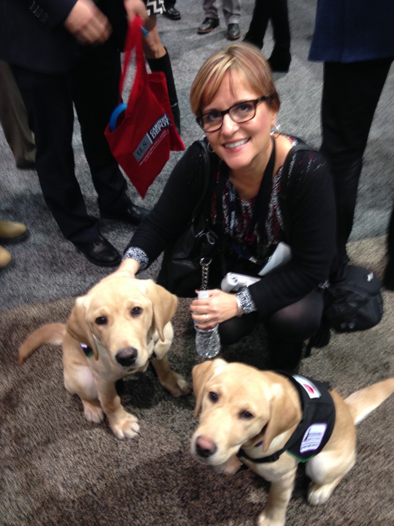
If you've spent any time researching cabinets for your new kitchen or bath you've probably come across then name Wood-Mode. It's the nation’s largest manufacturer of custom cabinetry for kitchens, baths and other rooms throughout the home and they've been around for 42 years. I learned that Wood-Mode has great name recognition in the industry for good reason. Their booth at KBIS was impressive and fun! Four yellow Lab pups were on hand to demonstrate one of their lifestyle concepts, The Pet Parlor.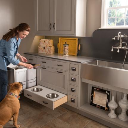 There's a place for everything from food storage, food bowls, bathing and more. Great idea, yes? To highlight it Wood-Mode had the most interesting gig going at the show. For all selfies posted with the dogs they donated $5 to the Susquehanna Service Dogs. This will be an ongoing partnership. They call it a PAWSitive partnership. You can read more about it here.
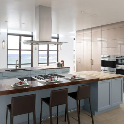
 Wood-Mode's newest lifestyle concept, Oceanside, is right after my own heart. This coastal style is a modern fresh mix of contemporary and transitional. The subtle aqua and sandy shades of beige are on point. The Oceanside approach includes a very open plan with efficient hidden storage. I see this as a reflection of the trends I saw in Italy last year, fewer or no upper cabinets but high function tall cabinets instead. The combination of materials and finishes add lots of visual interest.
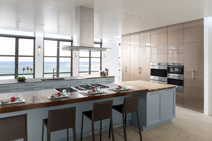 With over 200 doors to choose from as well as furniture finishing techniques and options for built-in storage, Wood-Mode can create the perfect solution for your lifestyle, whether is be Coastal, pet-perfect or both!
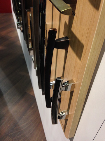 If you're going to be needing cabinets, you're also going to need to get into them. That's where Top Knobs comes in. Another brand with great name recognition, TopKnobs specializes in fine decorative hardware for the kitchen and bath. You can tell the quality of a cabinet knob or handle by the weighty feel of it and I have always noticed that about TopKnobs products. The other important thing the finish which they guarantee for life!
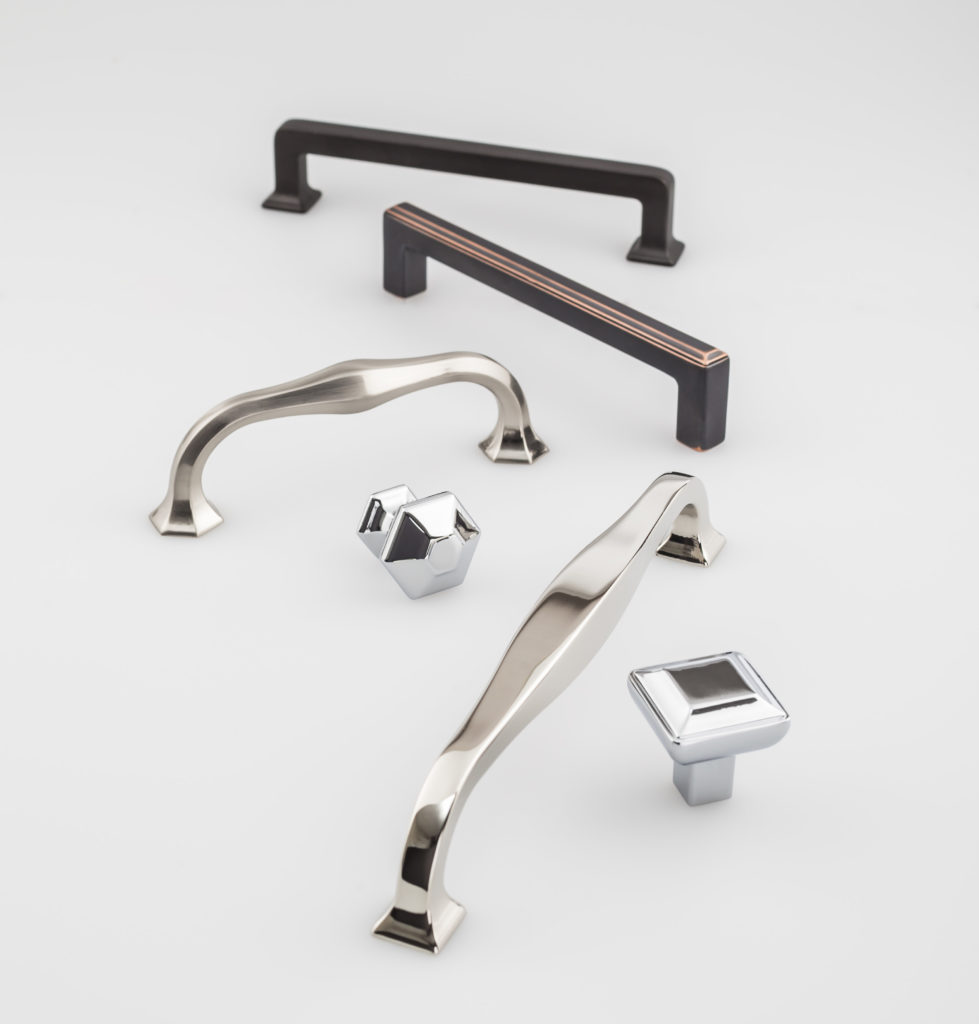 They introduced the Transcend Collection at KBIS. This includes the Podium, Ascendra and Contour Series which come in Brushed Satin Nickel, Polished Chrome, Polished Nickel, Sable and Umbrio.
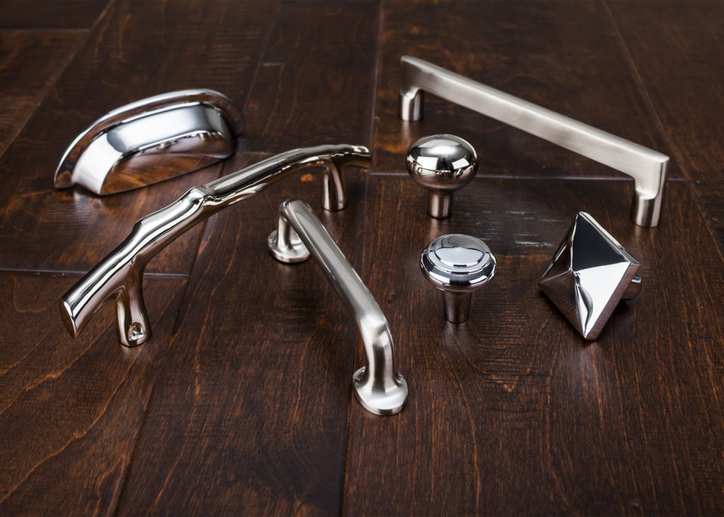 Also new at the show was Aspen II in three finishes, Polished Chrome, Polished Nickel and Brushed Satin Nickel. “The Aspen II collection combines old-world shape and style with contemporary finishes,” states Christine Zimmer, product manager for Top Knobs. “They bring to the market a unique look that designers can use in transitional spaces. Made with solid castings of artisan grade bronze, you can feel the quality of Aspen II in the palm of your hand.”With Wood-Mode and Top Knobs your dream kitchen can come to life!
Honor Mother Nature with Style at TOTO
"People First Innovation" is the guiding principle behind Toto, the world’s largest manufacturer of bathroom fixtures and fittings. TOTO is an un paralleled luxury brand creating beautiful and functional fixtures for the bath. What really impresses me is that at the same time the are heavily focused on water conservation, a leading global concern that needs more attention here in the US.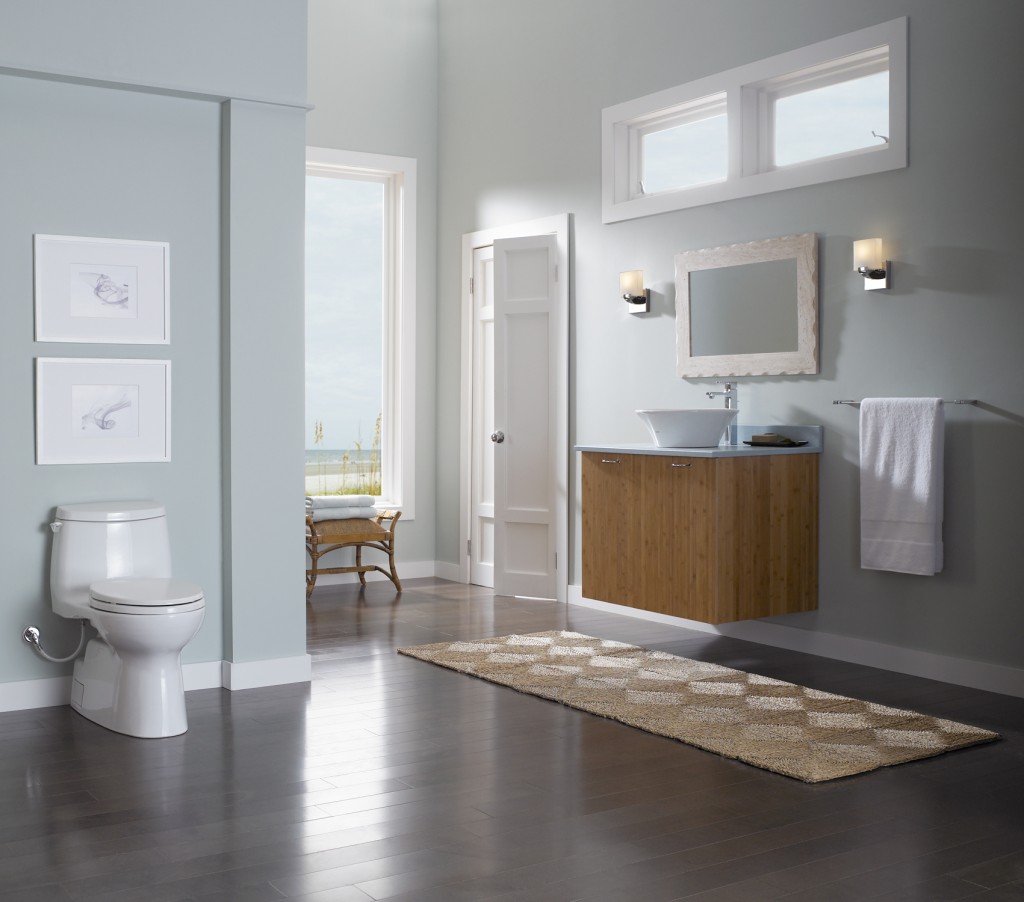 In 1989, in response to the state’s dramatic drought conditions and the growing need for water conservation, TOTO USA was established in California. Today they operate three manufacturing facilities in the US. I was amazed to know that 80% of all toilets on the Las Vegas strip are, you guessed it, TOTO! The brand first started nearly one hundred years ago in Japan. Today there is still a zen aesthetic to both the design and experience of the product.
 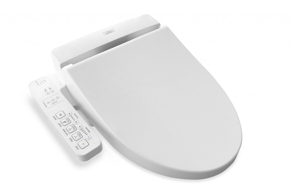 The Washlet is a must have in my opinion. There are lots of choices to make when creating a new bathroom. A few judiciously selected "special items" can make your bathroom awesome and this is one I'd pick. TOTO reinvented the toilet seat by creating the Washlet, which gives people a new way to be cleaner and more comfortable every day. Washlet seats can be installed on virtually any toilet and use pure, clean water –along with several TOTO technologies – to make their users cleaner and more refreshed. Ok we're taking personalization to a new level here but you must admit... In case you're wondering, there are many public restrooms you can visit and see for yourself. Here's where they are. If you do, get back to me. It would make a great blogpost ;) Speaking of blog posts, I also found this great post by engadget.com A Westerner's Guide to Japanese Toilets .In addition to this, TOTO uses a lot of technology designed to preserve both the environment as well as your water and energy bill. This even includes something called SanaGloss. TOTO’s patented, super smooth glaze that repels visible and invisible waste, making it difficult to adhere to porcelain. I'm all for less toilet cleaning!
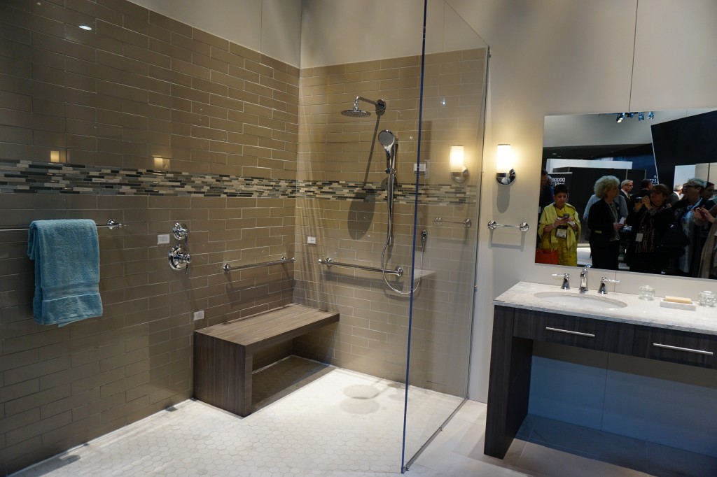 Accessible design and real showers were a part of TOTO's interactive booth at KBIS2015!
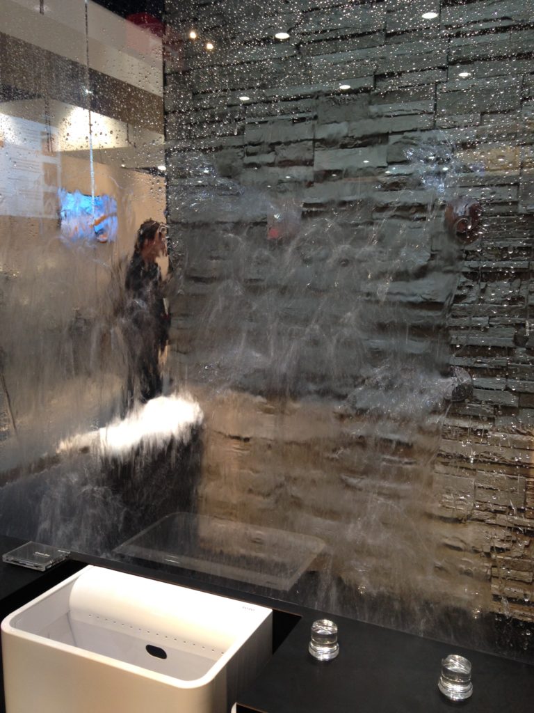
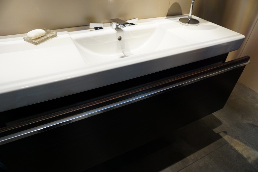 Up next: The other item not to be missed for your bath, Mr. Steam! You can easily plan it into your bathroom renovation.
Big Trends from KBIS Part II
The Modenus Blog Tour recaps continue! Last post I shared some of my kitchen trend discoveries from KBIS2015, the 51st Kitchen & Bath Industry Show held last month in LasVegas. Today I've got the scoop on what's trending in the bath.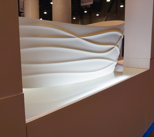 I have to say it, personalization is also at the top of the list for bathroom style and function. I saw lots of new options for faucet finishes. Were you getting tired of brushed nickel? Nice to see something new in that arena.
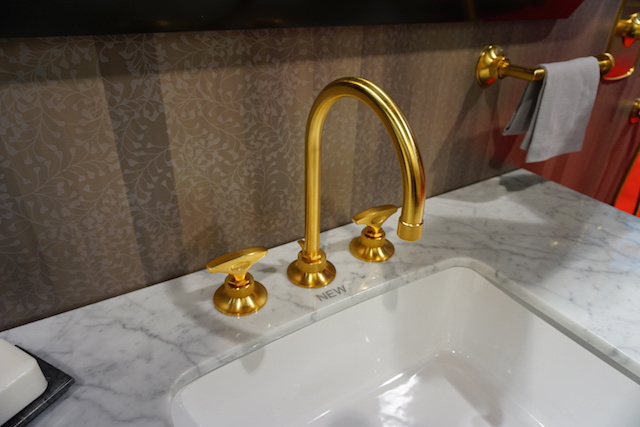 I saw a lot of contemporary design for the bath, minimal clean lines, simplicity but with quality materials.Affordability is definitely achievable. For example you can have the quality of Kohler with their basic Sterling line or luxury of their exclusive Kallista line.
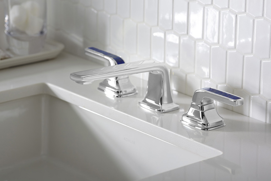 Brizo introduced its new Rook collection for the bath, with a subtle reference to chess. Its their latest suite of luxury faucets, fittings and accessories for the bath. This collection combines a low spout architecture and crisp octagonal details for a stately yet modern design.
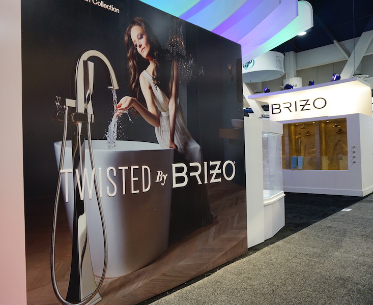
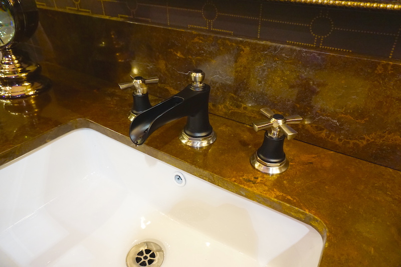 Brizo also has something for you if you're a little "twisted" and I love it. It's the Virage Collection
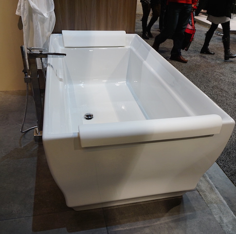
  Free standing tubs and tub fillers- The popularity of free-standing tubs created a whole new plumbing fixture, the tub filler. They were everywhere!
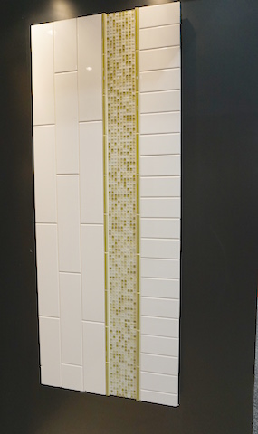
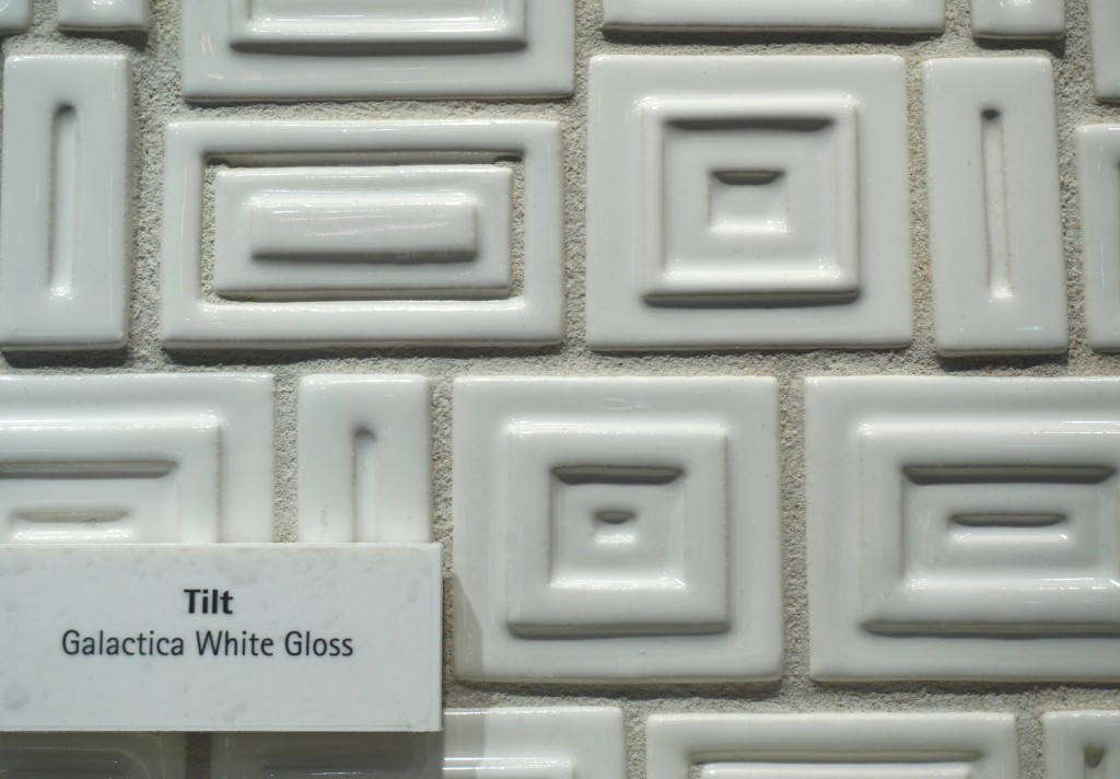
 Creativity with tile- It's not just subway tile anymore although there are even a lot of interesting variations on this popular style.
 I can't leave you today without a nod to the number one booth in my opinion. I wasn't alone as it was also voted most innovative booth of the show. The award went to AquaBrass for their Buckminster Fuller inspired geodesic dome. This innovative concept wowed me but they went all the way with my favorite combination art + design. With and artist on site creating beautiful artful bathtubs! This was to introduce their new Kanvas collection. It brings art to the bathroom in a limited series of hand-painted freestanding bathtubs, each one signed by the artist. The tubs are stone resin and offer a choice of three hand-painted exteriors: bright and bold Graffiti has a youthful, urban edge; nature-inspired Pax invites bathers to a soothing Zen-like experience; and architectural Mosaik brings timeless elegance with its classic yet modern look.
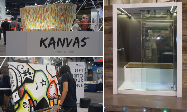 Aquabrass also introduced something that's going right on my dream list. The Aquazone, a revolutionary shower and bath concept that provides the best of both worlds. Molded into a single, space-saving wet zone unit requiring only 60"X60" of space. North American-built, its strong, one-piece construction is solid Lucite acrylic with a reinforced base. And with two integrated wheels and six adjustable levelers, it rolls into place easily, saving time, materials and labor costs.
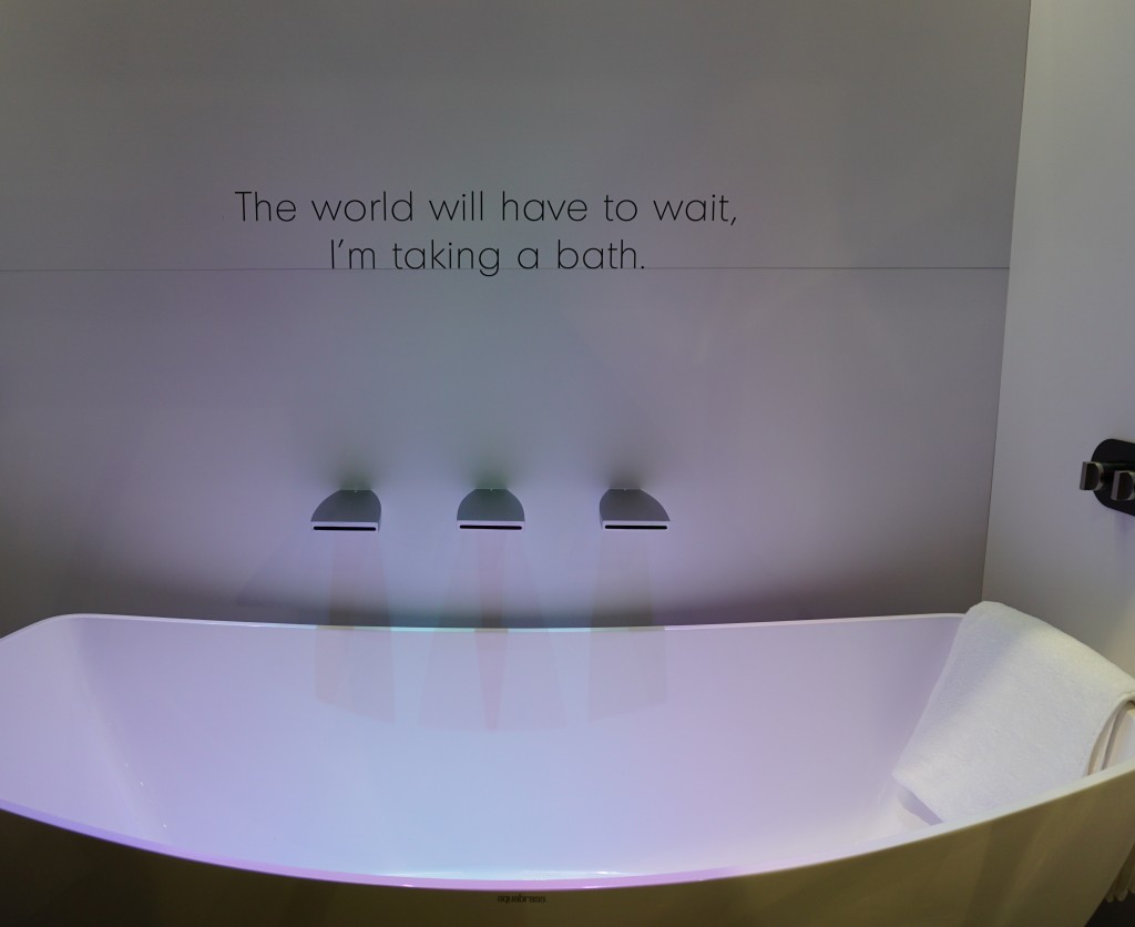 Not only was the booth full of great new products and finishes with the occasional thoughtfully placed message, they thought outside of the box and into the dome!! Kudos to the creators and congrats.Up next: We're not done in the bathroom yet! Here's the Jeopardy question: "The number one plumbing fixture supplier in the world" Who is ??????

