The Best of KBIS 2016

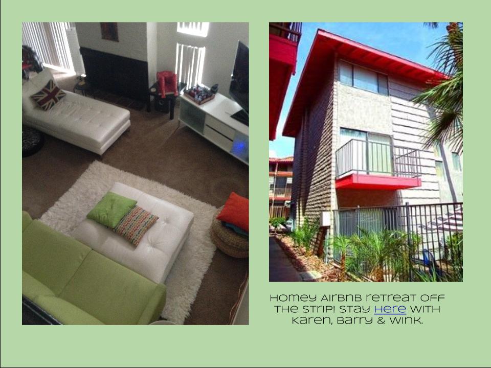
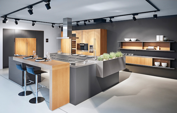
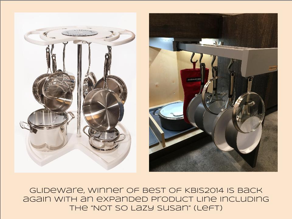
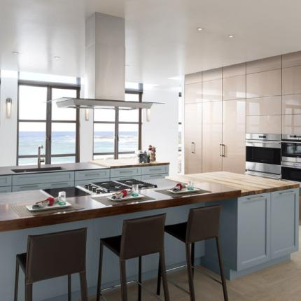
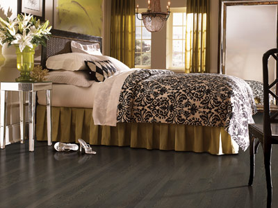
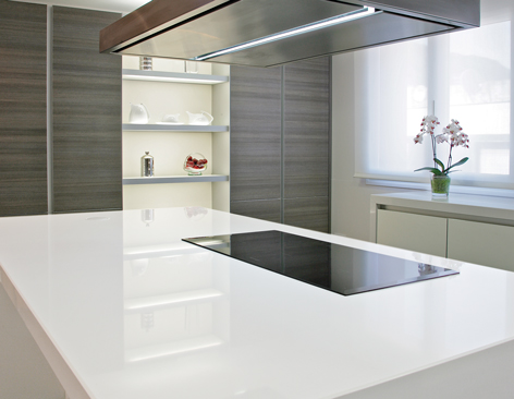
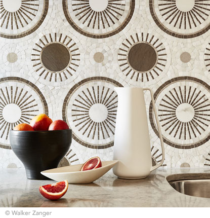
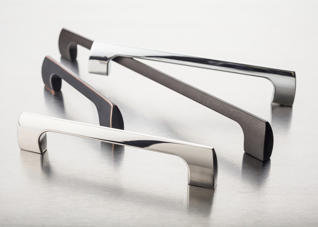
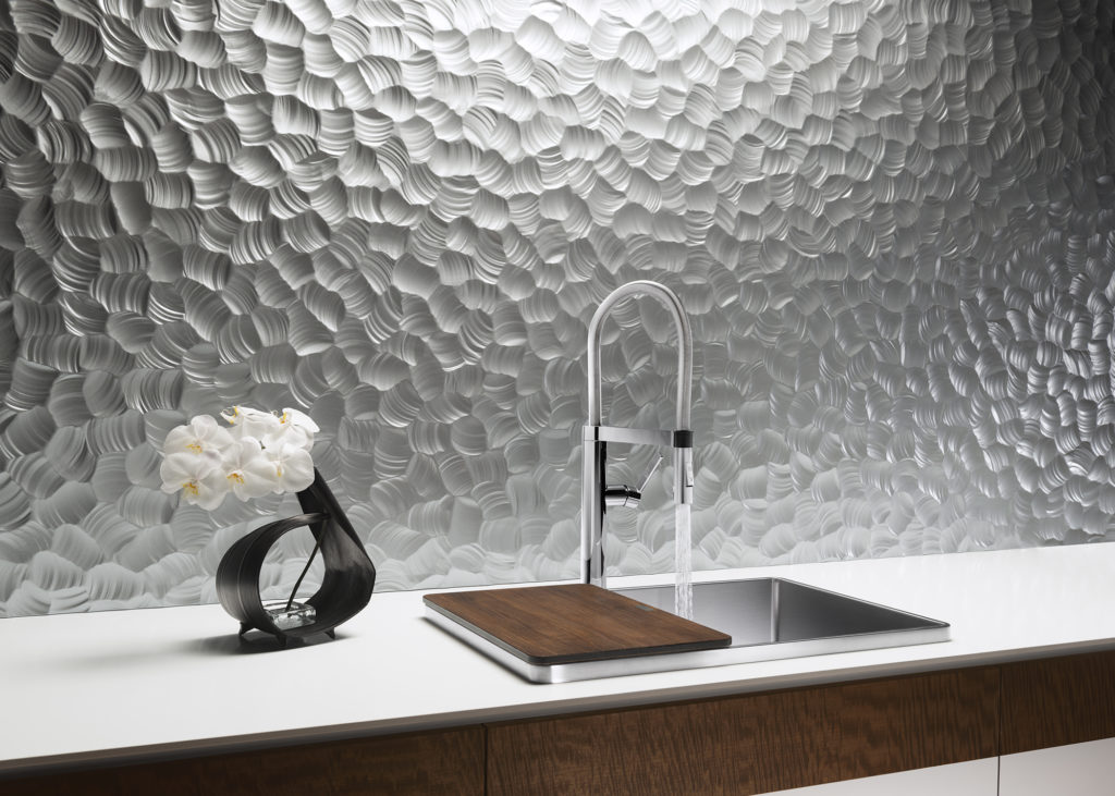
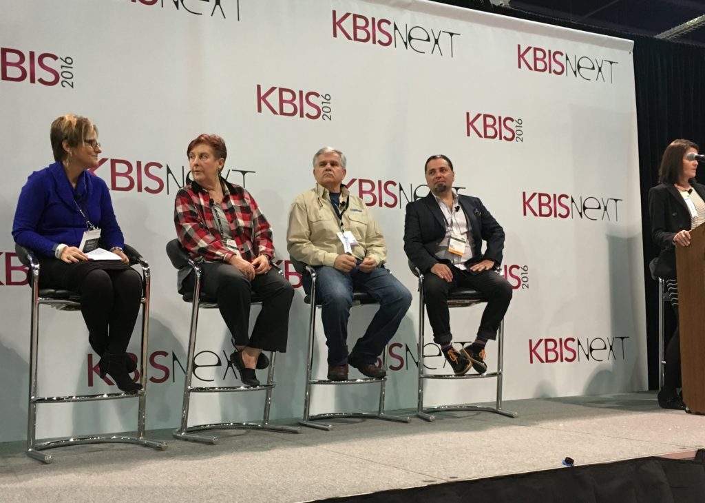
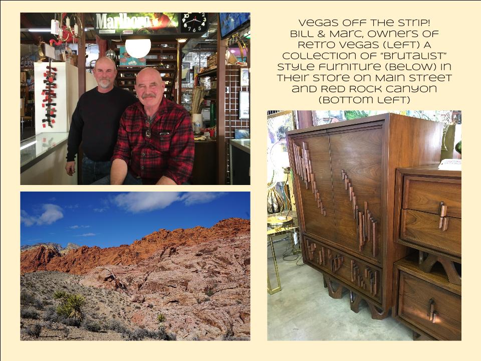
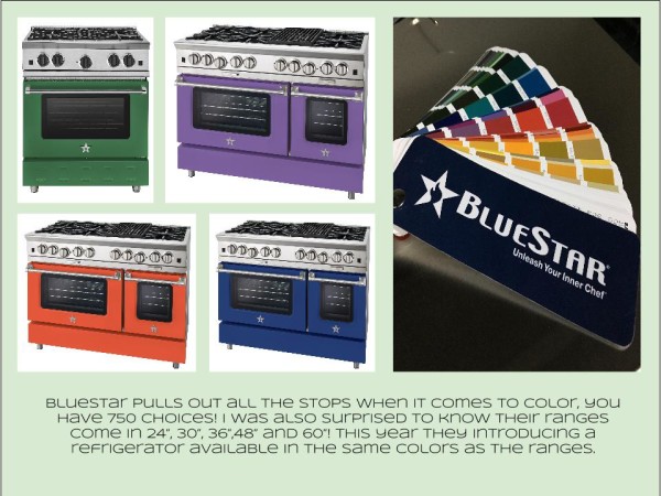
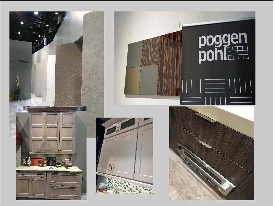
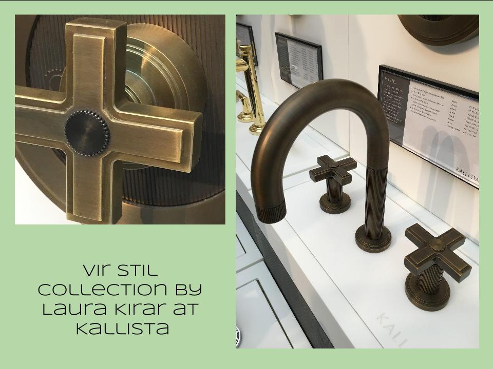
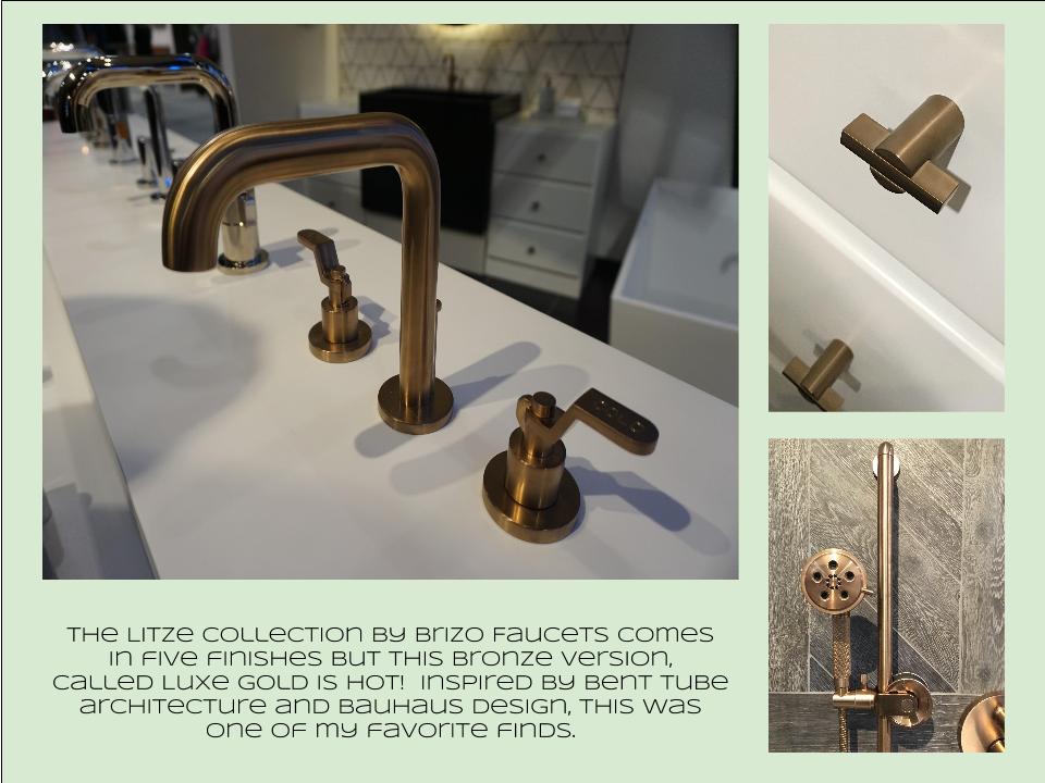
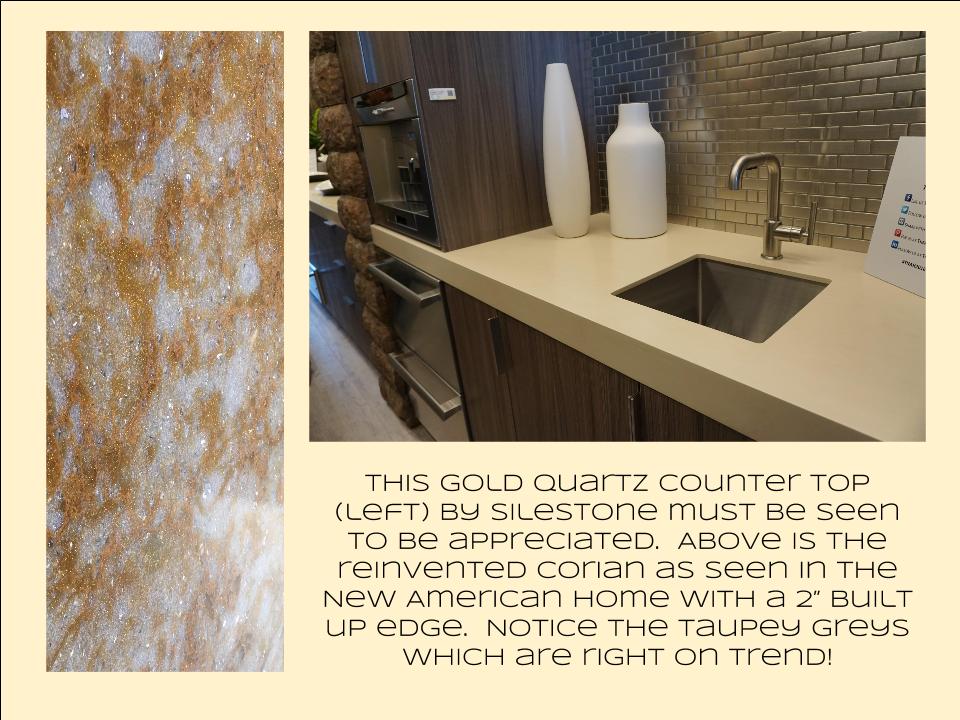
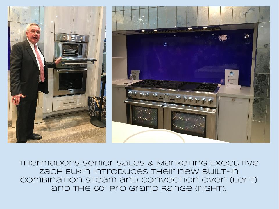
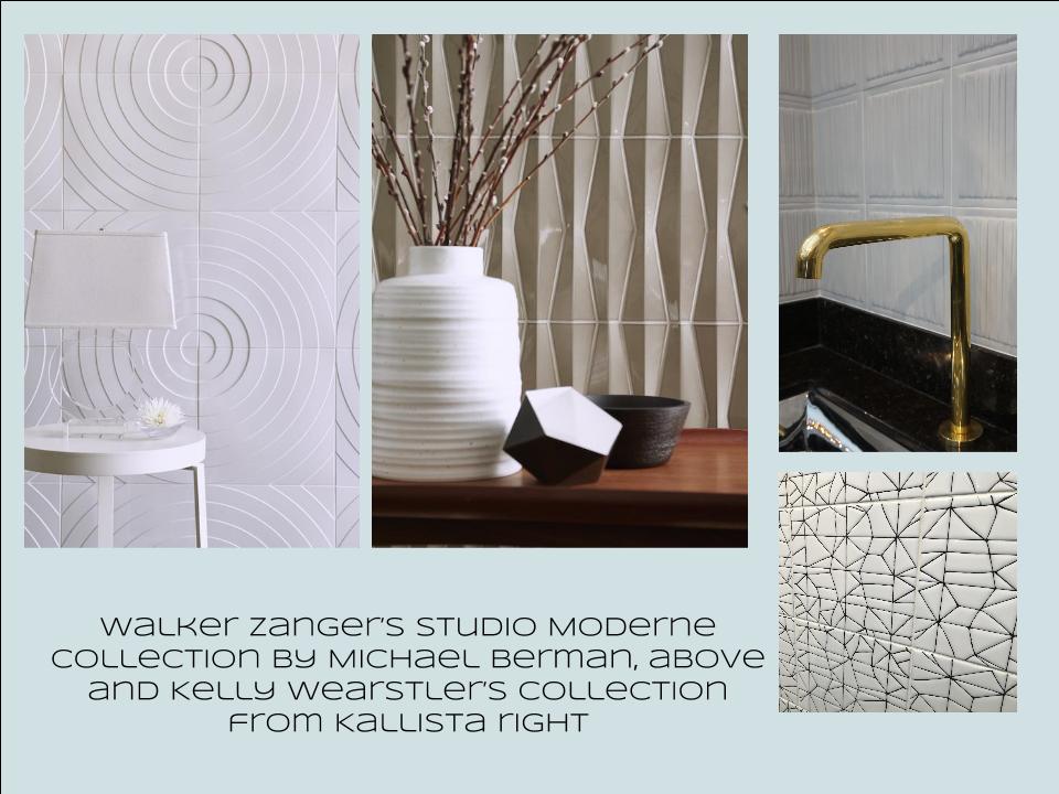
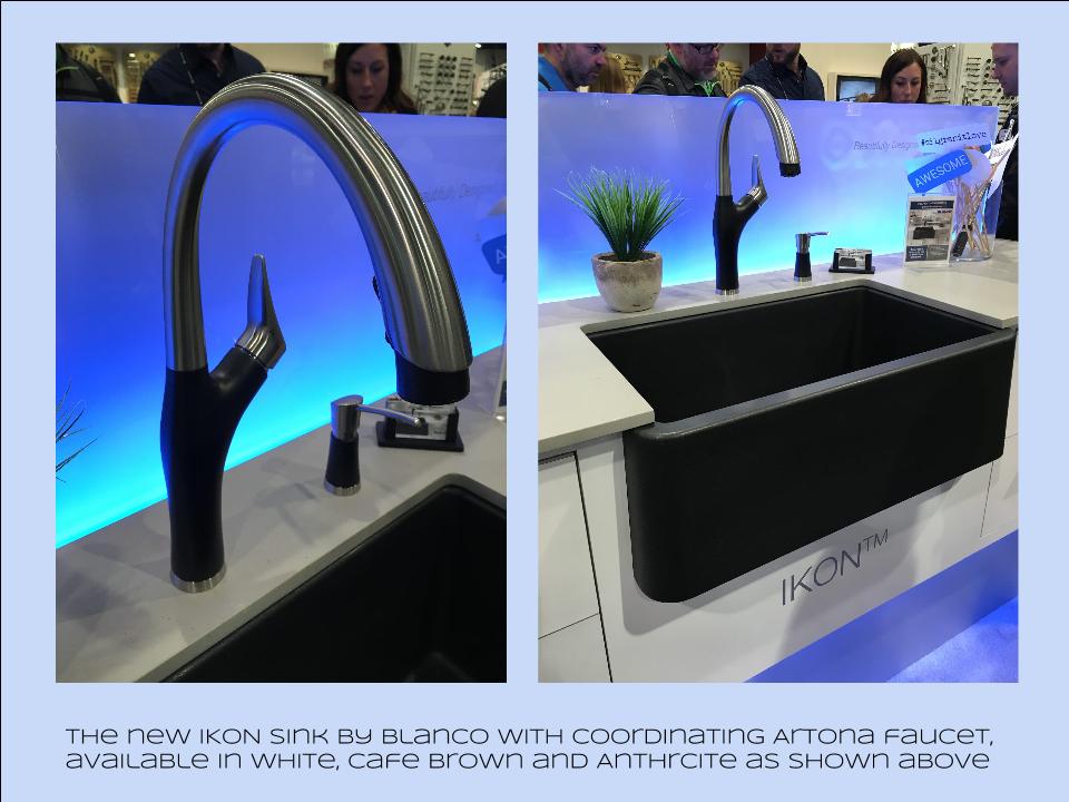
Bam!  Another show is in the books and although it's been a busy week "back at the ranch", I've been dying to share my finds with you right here on Artful Kitchens.2016-01-19_184543141_4F428_iOS (2)Las Vegas was host to three days of networking and education for the best of the Kitchen & Bath industry.  As a member of the Kitchen & Bath Business Magazine's Advisory Board,  I had the pleasure of appearing on the KBIS Next stage as a part of the panel discussion entitled Trials & Tribulations-Solutions to Your Biggest Kitchen & Bath Challenges. It was an exciting exchange of ideas between both the pros on the panel as well as a savvy and engaged audience.Vegas Off the Strip Karen (1)I also had the opportunity to spend some time in the Las Vegas I like best, off the strip! I hiked in the Red Rock Canyon and visited my friends at Retro Vegas on Main Street. My digs for this trip were with my dear pals Karen, Barry & Wink.  They live in a midcentury modern gem that, rumor has it, was briefly home to Lucille Ball!  They are avid Airbnb'ers and wonderful hosts.  Check it out if you find yourself in Vegas. This location is so convenient to the Convention center I could walk, which I did, once.  Mostly I Ubered. Enough walking happens on the show floor!  So without further ado, here's my recap of the biggest and most notable trends and products that caught my eye at KBIS2016. ColorWhite still reigns.  In fact paint giants Benjamin Moore and Sherwin Williams have both selected shades of white as their color of the year.  You know I am a huge white fan. It is always the best backdrop for art and design. It also continues to be the favorite cabinet color in my area.  Remember white is not just white, there are an infinite number of varieties you can have fun with.  If you need more punch in your kitchen you could find some great options at the big show.  I saw bright saturated colors in several appliance brands including Bertonazzi, Viking and BlueStar which offers 750 colors!  color (2)Grey has not left the stage.  The newest versions are warm, venturing into taupe territory. Textured wood grains such as cerused oak are really popular. Wood-Mode showed both traditional and contemporary versions of ribbon Mahogany.Cabinets Poggenpohl_Diamond Grey_Oak Honey BrownThe Perfect TouchTouch latch technology was EVERYWHERE!  If you prefer a sleek, uninterrupted look for your cabinets and appliances this is for you, a gentle nudge will open your cabinets. This is nothing new but it's taken off.  I also loved the button that allows you to close this cabinet when you're done without resorting to dangerous acrobatics (I'm short).Untitled drawing (5)Feeling BrassyActually brass, copper, bronze and myriad versions are hot for plumbing fixtures and hardware.  My favorites were the new BauHaus inspired Litze collection by Brizo Faucets. and Kallista's Vir Stil collection.LitzeNot Your Grandma's CorianIf you're like me Corian has been dead to you since about 1998.  That sentiment has now ended in my book.  I saw a 2"thick sleek contemporary version of Corian that was perfectly at home in The New American Home.  The other exciting thing I saw in counter tops was this quartz by Silestone.  Yes, it's GOLD!  I just wish the photo could capture it's sparkly beauty.CountersThrills from ThermadorAppliance brand Thermador held a press conference on the show floor to introduce a couple of impressive new products, the 60" pro range available with steam and a double oven featuring steam and convection.  These are firsts in the industry.ThermadorOrganize ItJust when I thought we had it all the category of organization it goes to the next level. There was a great representation of brands ranging from Hafele to Rev-A-Shelf to Hardware Resources but Glideware is taking the market by storm.  If you've got a mess lurking somewhere I guarantee there's a way to make it neat and accessibleRev A ShelfGlidewareTile StyleMy two tile favorites were Michael Berman's Collection from Walker Zanger and, of course, Ann Sacks who are featuring a new line by L.A. design maven Kelly Wearstler. Love!Tile (1)I can IKONIf you read my blog you know I love me my Silgranit sinks, meet IKON the apron front version which easily works in any style kitchen from Traditional to Contemporary. Their Artona  faucet perfectly complements the Silgranit sink.-BlancoStikwood Rocks!
Stikwood’s line of lightweight, real-wood planking offers designers and DIYers a peel-and-stick solution to achieve that perfect, sought-after blend of rustic and modern. It can be used on walls and ceilings and comes in tons of colors, even prints! I'm thinking this could be great on the back of a kitchen island.

stikwood

Believe me, all this is just the tip of the proverbial iceberg.  There was so much more to see and learn about at KBIS 2016.  Check out this year's winners of Best of KBIS for more info and of course if you'd like any more info on what you see here email me at artfulkitchensbyglo@gmail.com

5 Elements of an Artful Kitchen

Summer projects are underway in South Florida!  In fact, it's the height of the busy season for most design professionals here.

Oceanside_OA5 (3)

I don't have to tell you that a new kitchen is a big investment, in fact the kitchen is the most expensive renovation you're ever likely to undertake. It stands to reason that you'd want a kitchen that is tailor-made for you whether you can afford custom or not. This is what we're all about at Artful Kitchens.
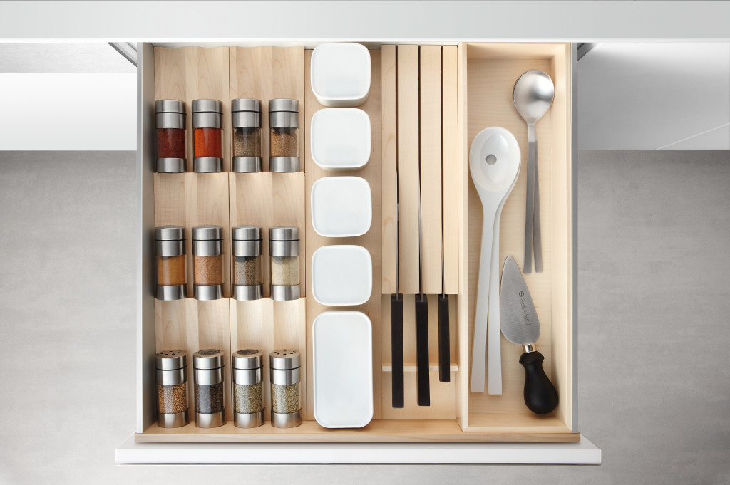
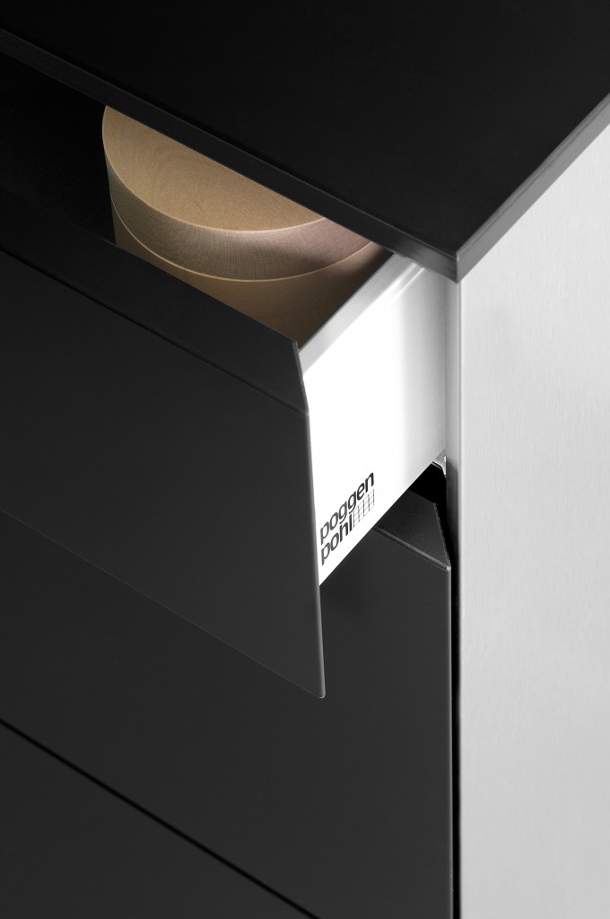
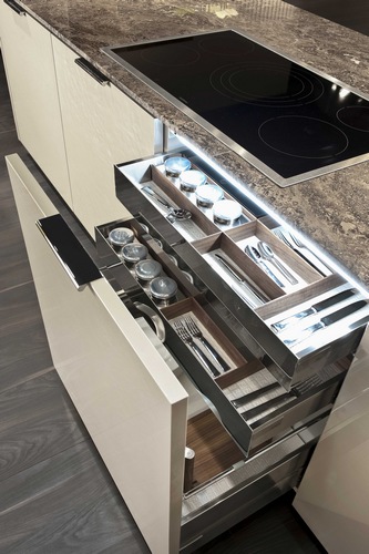
Flawless function behind the scenes from Poggenpohl
The concept of an "artful kitchen" has many different facets.  It is not just about budget or the amount of space you have but the skill you employ using what is available to you. Here are five tips to consider along with some visual inspiration featuring products I saw this year at the Kitchen & Bath Industry (KBIS) trade show in Las Vegas. Implement these with style and confidence and you will be the proud owner of an artful kitchen!


1. Flawless Function

I'm all about artistic expression but a major part of creativity in the kitchen comes from devising flawless function. This quality is not something you see but something you can experience if artfully accomplished.  When I say function, I mean work centers comprised of cooking, clean up and food prep areas.Steve Jobs quote

Those are the basics but you could have more such as a beverage center (think coffee, tea, wine), a computer station or a baking center.  If you have a two-cook kitchen, your layout should be designed so that any one of the major functions can be performed without anyone getting underfoot.

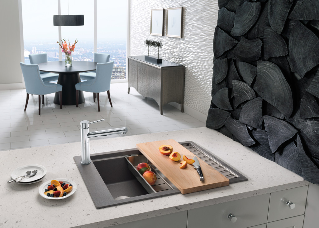
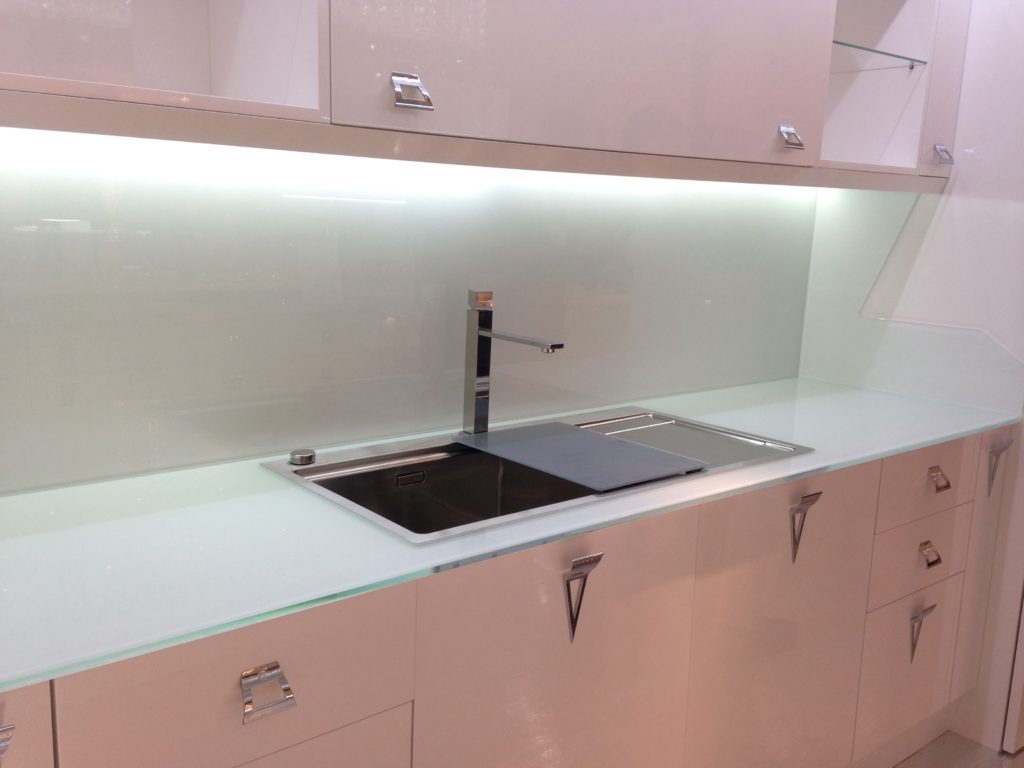
Precis sink by Blanco

Following the guidelines set by the NKBA is a must to make sure all clearances are adequate. Sometimes we don't have a lot of choice about where to locate our sink or appliances but we can organize our utensils, dishes, pots and food items in a more efficient way.  Don't forget the more flawlessly your kitchen functions the safer it is. You don't have to be an expert at this, just think about how you use your kitchen so that you will be a good collaborator when it comes time to work with a professional.

quote by Gloria Graham Sollecito, AKBD

2. Personalization

This is, without a doubt, the biggest movement in the design world.  An artful kitchen is your own personal statement customized to the way you live.  It could be a steam oven because healthy eating is your passion or it could be a lovely furniture piece with glass doors to display your grandmother's china. Include the colors you love.  Even though you must be mindful of your budget (everyone has one), strive to retain the essence of what you see as your dream kitchen.

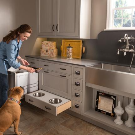
The Pet Parlor concept can be built into your laundry or utility room

3. Harmony

Harmony is one of the principles of design and a must for your kitchen.  Whenever I design a two-toned kitchen I like to ensure that different finishes and details are carried through the space to create a cohesive whole.  It's about how the floor relates to the cabinets and  how the cabinet hardware relates to the faucet. You get the picture!  It does not mean that everything has to match perfectly, it means elements should relate to and complement each other. It also does not mean that every element has to be perfectly symmetrical.  In fact, consider this permission NOT to be! I find that the best rule of thumb is to follow the architecture and style of the home you're in.  If, for example, the kitchen window is way off center you should work with that not against it.  Never force solutions by sacrificing function.

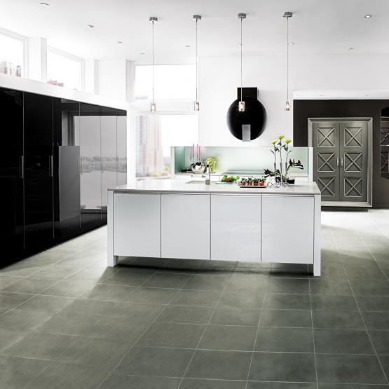
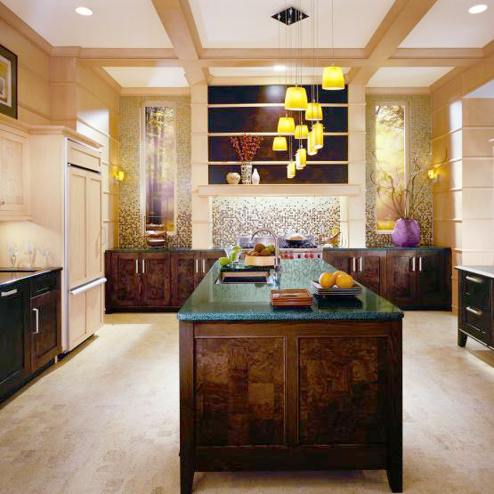
Wood-Mode Contemporary penthouse kitchen


4. Focal Point

Every piece of great artwork has a focal point.  It is the "star of the show", so to speak.  In a kitchen it can be a sculptural range hood, a granite counter with big bold movement or actually a piece of art! It is the item that makes you say WOW when you enter the kitchen.  Just remember less is more here.  One great focal point is probably enough.  Too much and the statement gets lost. Less is definitely more.

Transitional kitchen by Wood-Mode

5. Texture

The element of texture involves at least two of our senses, touch and sight.  The textures you are likely to come across include the glossy finishes popular in contemporary design, prominent wood grains which can be traditional or modern and smooth honed surfaces that are more matte.  A flat slab cabinet door is a great choice if you plan to use a wood with a lot of pattern and graining.  In this case the material is the decorative element of the cabinet.  On the other hand, if you are traditional and you are using white cabinets you can select a door with some molding or detail.  Also let the wild patterns either be on your cabinets or on your counter, both would be busy and distracting.

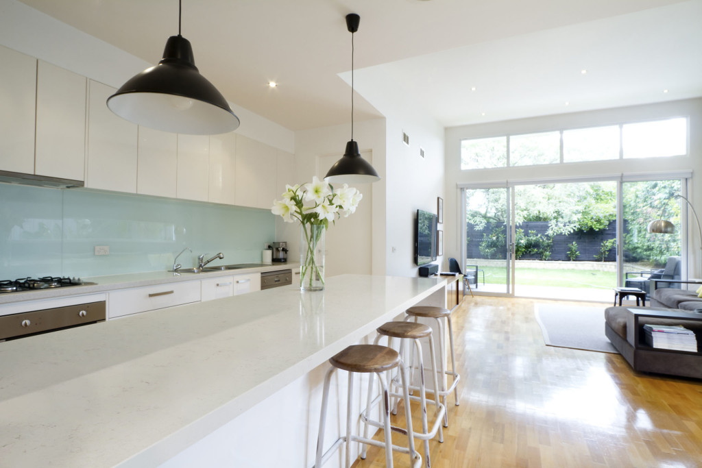
Contemporary kitchen with Sileston Nebula Alpha

This is only the tip of the iceberg, so to speak.  There are many more tricks and methods to create an artful kitchen. What are yours?  Please keep in touch and contact me. Whether you need a quick consult or a full design layout I can help in person or virtually.

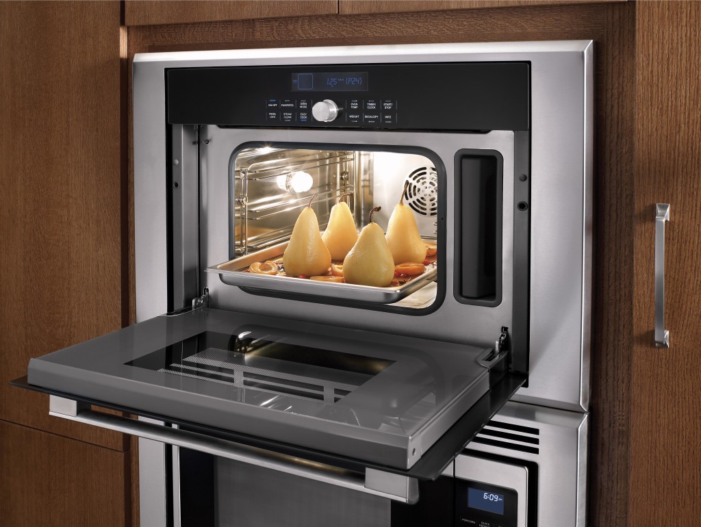
Steam oven by Thermador

I'm located in the West Palm Beach area, so if you're local I can also help you shop for your kitchen products.


Perfect Party Mix: Poggenpohl, Blanco and More

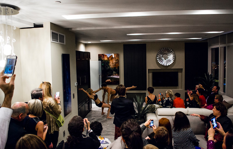
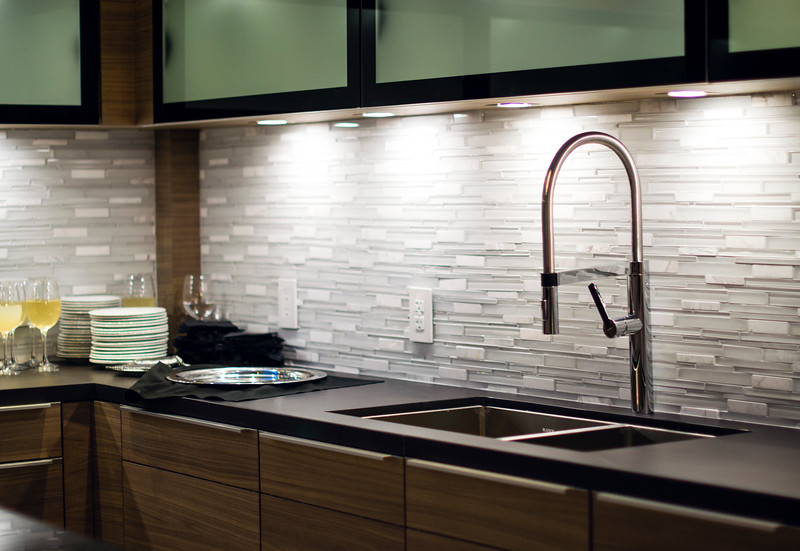
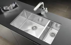
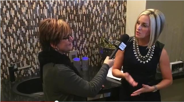
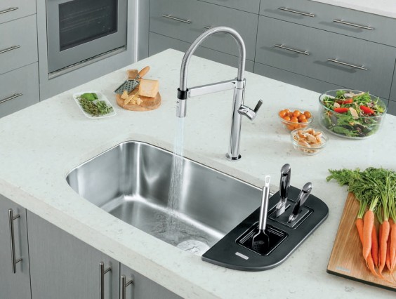
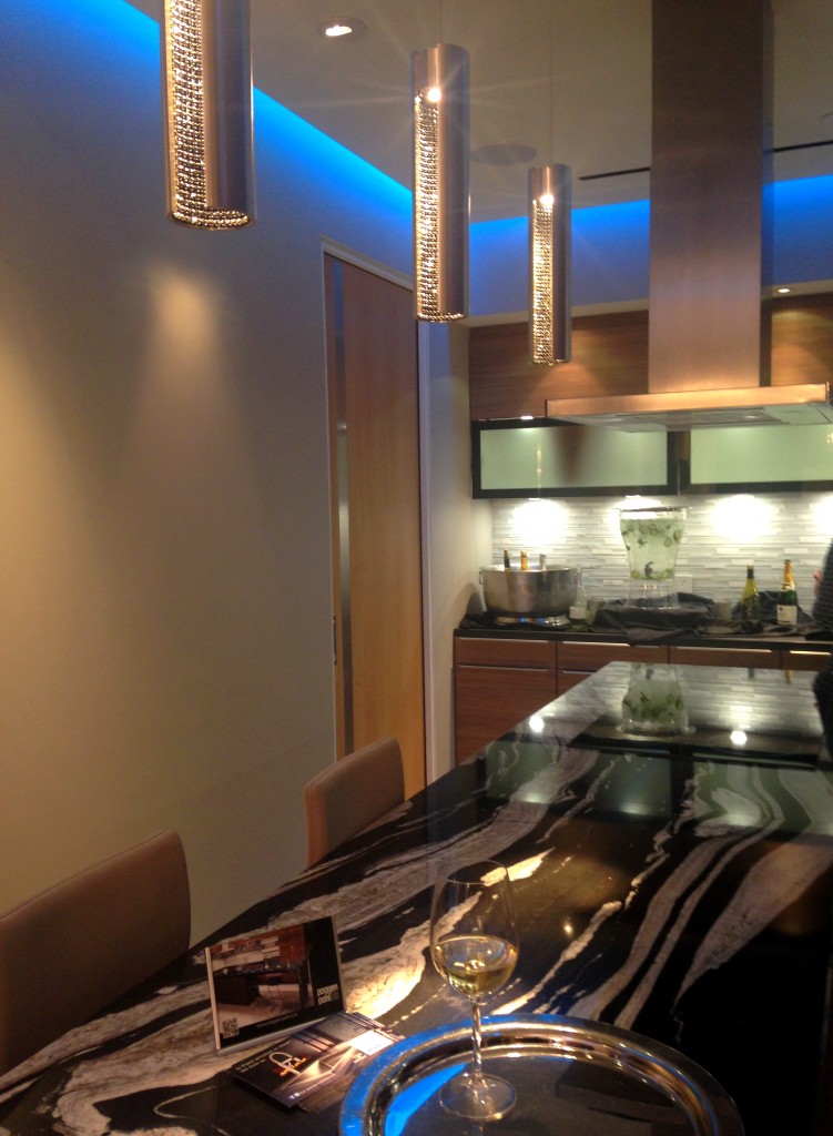
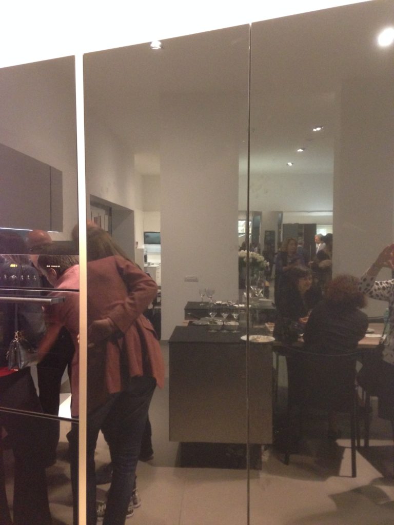
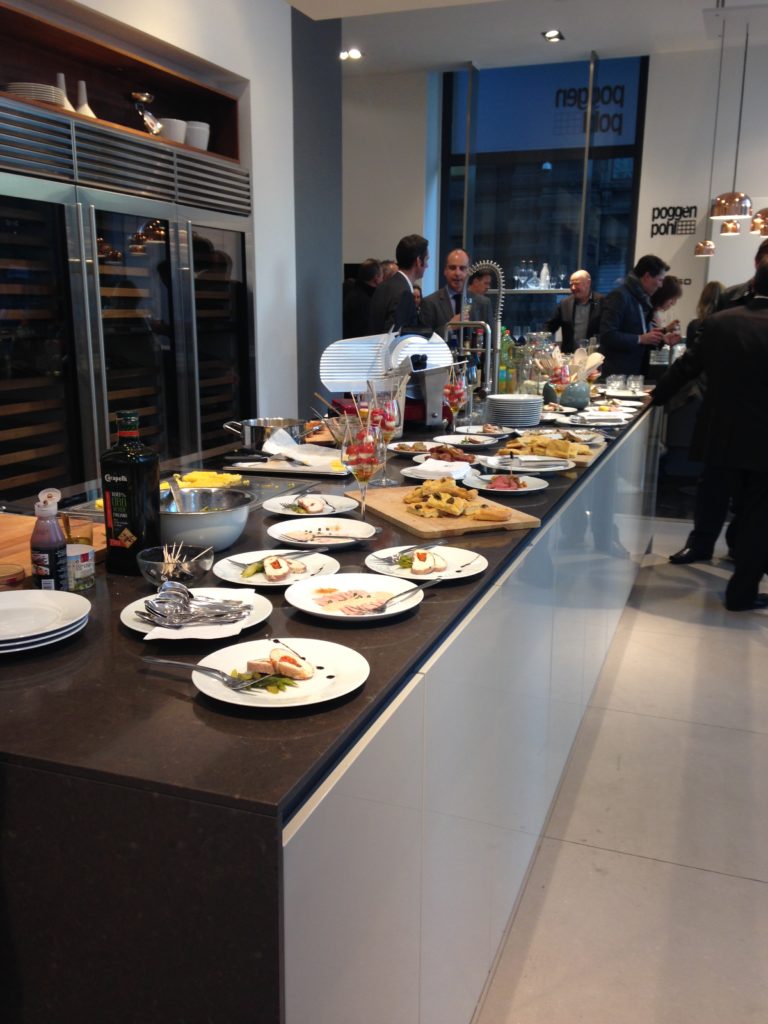
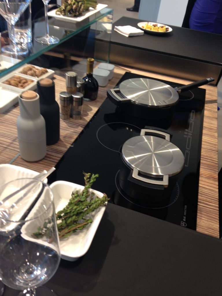
One of the most delightful experiences I had on the recent Modenus Blog Tour during Design and Construction Week in Las Vegas (which I'm sure you've all been following on social media) was a  penthouse cocktail party located in the Residences at Mandarin Oriental. Beautiful functional kitchens and baths, party penthouse in the sky, living sculpture, what a mix!!We toured three suites in the sky, more than forty floors up,  all featuring products by Blanco, Poggenpohl and Cosentino, makers of Silestone and Dekton.  These exclusive residences were host to private events for the press and the design community.Blanco, Poggenpohl, blogtourvegas, modenusThe theme of the evening was "The Art of Performance".  Products were complemented by elegant bronze sculptures by California-based contemporary figurative artist Richard MacDonald.Richard MacDonald, bronze,sculpture,ChasenWestPhotography,modenus,blogtourvegasWe also had living sculptures in the form of two very talented (and flexible) dancers.Richard MacDonald, Modenus,blogtourvegas,chasenwestphotographyBlanco's Precision Steel Art sinks were on show along with their edgy Culina faucets.  Incidentally this popular sink style comes in a 16" smaller size perfect for prep or bar sinks. Steel Art Precision Sink by Blanco It features angular lines, something really original and different from your standard stainless steel sink.Blanco, Residences at Mandarin Oriental, Modenus Blog Tour, #blogtourvegasI had the pleasure of interviewing the lovely Christy Emens, Communications and Marketing Manager of  Blanco. She touts "livable design" which is Blanco's version of personalization.  This involves not only a variety of sink and faucet sizes, but also accessories to add convenience in the kitchen. Blanco One, Blanco,kitchen sinks,culina faucetThe Blanco One is a bit larger but still compact, plus you can trick it out with all kinds of goodies.Back to the party, The Art of Performance is all about how kitchens and baths can be beautiful as well as functional and I think they proved their point.Cosentino, Dekton, Aura, blogtourvegas,modenusCosentino showcased their new Dekton color, Aura.  I love the continuous veining!A bit of penthous Poggenpohl.  What could be better?Poggenpohl's design statement continues the theme of "personalization", a major trend at the show. Your kitchen should be a reflection of your lifestyle.As a 123 year old company, Poggenpohl was instrumental in the development of the first modern day kitchens.  The German company remains cutting edge in its design philosophy and use of materials.  In 2014 they introduced Poggenpohl P´7350 Design by Porsche, the latest incarnation by Porsche Design Studio.  The collection features a sleek new look achieved by the use of industrial mitering technology. Love!! PoggenpohlBack to the party.  Poggenpohl kitchen designer Anne Kramer, says  “Our vision is to personalize each kitchen to the homeowner’s needs for entertaining, for cooking, for storage and for lifestyle. Unlike traditional homes, these residences are at the height of the Las Vegas strip. A rarified atmosphere where anything is possible." I think they succeeded. Next up: The Big Show: KBIS Trend Recap

Blog Tour Preview

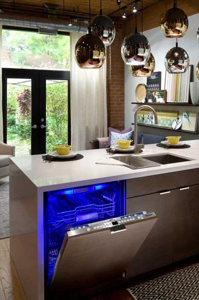
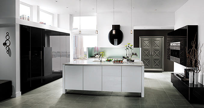
As you know, I'll be heading off on Sunday to immerse myself in all the magic of KBIS2015, courtesy of  super design site Modenus.  This is a HUGE show for our industry and you can be sure I'll be partying taking careful notes and lots of pics to share with my blog peeps! Toto's Aquia wall hung toilet blends luxury, necessity and ecology in a most sophisticated way. I'll be posting recaps here upon my return but if you'd like to follow along in real time please LIKE my new Face Book page, Kitchens for Living or you can follow me on Twitter and Instagram. If you're planning a new kitchen, listen up!  We're about to unleash upon you all the latest product and design info you need to plan for your home.Mohawk Carpet also offers a line of beautiful hardwood floors! Who knew?Don't forget to check Modenus to see what all the Blog Tour Bloggers are saying. These pics are a preview of the Blog Tour sponsor line up.  That means that you'll be hearing more about this diverse group of industry favorites as I learn about them.Thermador sapphire dishwasherWilsonart is introducing quartz counter tops!tangent_astral88_Square_01Penthouse view kitchen by WoodMode features black gloss finish accented by white island and gray armoire.  TopKnobs Holland Series from the Mercer Collection, I think "sleek" is the operative wordP7350 design by Porsche Design StudioBlanco's Attika sink with walnut cutting board accessory and Culina faucet. Now if you made it all the way to the end of this blog post, ladies (and certain gents), you shall be rewarded. Mr. Steam manStay tuned for more about all these brands and more!

The Ultimate Designer Kitchen

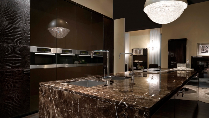
What do a luxurious high-end handbag and a kitchen have in common?  Give up?  Fendi! One of  the most impressive exhibits I viewed earlier this year at EuroCucina in Milan was the one featuring Fendi.  As you can imagine, a show like EuroCucina (a part of the even larger Salone Internazionale del Mobile) encompasses pretty much everything you could ever think  of when it comes to kitchen design.  Not only that, I saw things I've never imagined in my wildest dreams!  The Fendi's Casa Ambiente Cucina line fits squarely in that category. Fendi Villa LiviaStyling can be described as elegant and sophisticated with details that call to mind to a fancy buckle or luxurious lining on your favorite expensive bag.  Speaking of linings, I was impressed with the cabinet interiors too.  In this case beauty isn't only skin deep it extends to what's inside.  This includes clear (yes CLEAR) roll outs and LED illumination which activates when you open the door or drawer.FF Villa Ada detail 10 Fendi Kitchens made its debut at Salone two years ago with its first line of kitchen designs known as Ambienta Cucina, produced for them by SCIC, a high-end Italian kitchen manufacturer.118_luxury-living-exclusive-retailer-for-fendi-casa_4377The Fendi exhibit was kept strictly under wraps, no peeking from outside and once you were cleared to enter photography was verboten! Big burly bouncer type guys were on hand to enforce the no pic policy.  Sadly I witnessed one enthusiastic viewer caught in the act.  She was made to show her phone and delete all photos in presence of bouncer! I thought the whole point of showing at a trade show was to garner publicity, no?2014-04-08 13.19.58Fendi Casa Ambiente Cucina can be ordered in the U.S. exclusively through the Luxury Living Group  in  Los Angeles, Miami, and New York. Their offerings are truly a marriage of quality and fine design  2014-04-08 13.20.19Check out Kitchens for Living On the Road to view all my pics and comments from Eurocucina 2014 and more!

Kitchen Love, Italian Style at Acheo and Poggenpohl

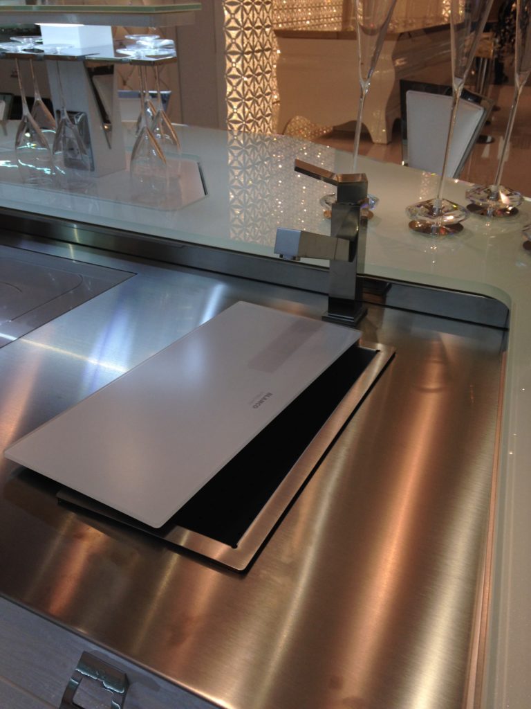
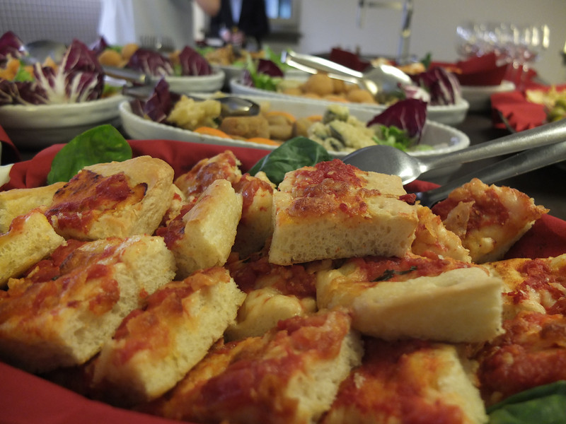
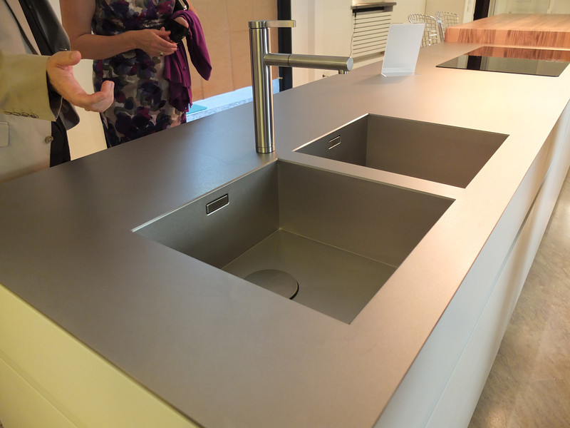
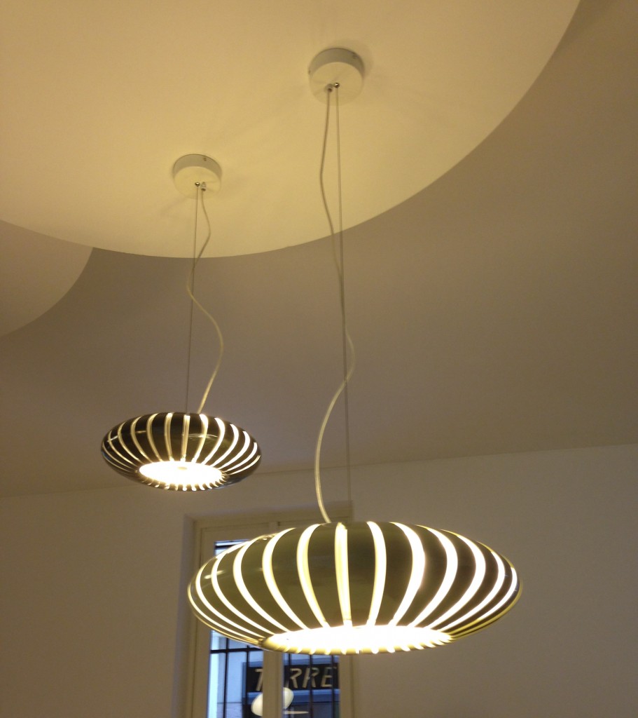
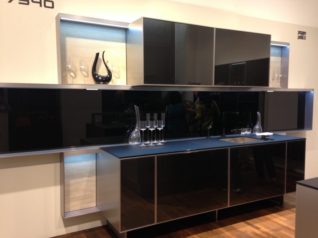
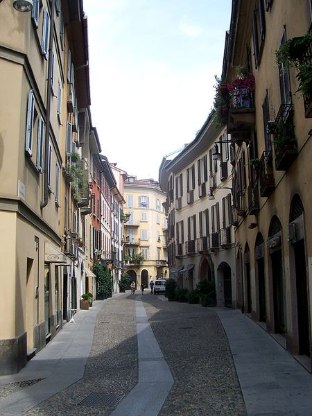
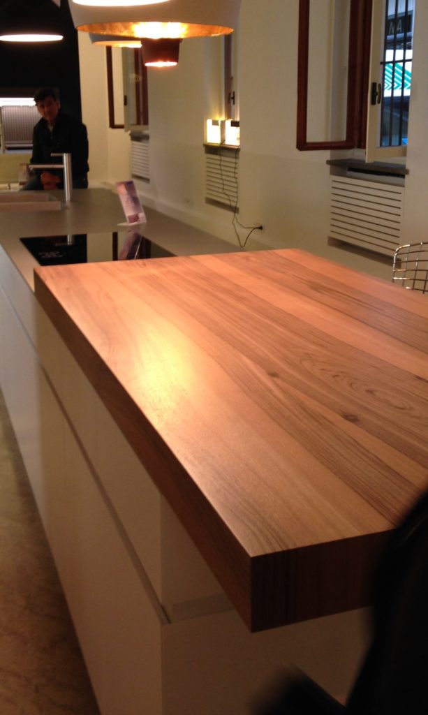
Ok so you got me, Poggenpohl is not Italian.  They are German, except when they're in Milan, then they're Italian.  Good enough? I can hardly believe I’ve been home for over a week!  Images and impressions are still swirling around in my head from the wonderful time I spent with Blanco and some fellow members of the Blanco Design Council in Milan.  Design Week was not limited to the extensive exhibition at the Rho Fairgrounds but also included events all over town.  We visited two memorable and cutting edge showrooms on our visit. 450px-5275MilanoViaMadonnina   The first was Acheo (pronounced AH-kee-oh), located in the Brera district.  Brera is also known today as the design district.  It is also one of the few really old areas of Milan which saw 80% destruction during WWII.  Acheo opened it’s showroom there in 2010.  Today they are a showcase of quintessential contemporary Italian design for the kitchen.Acheo,Milan,woodtops,blancoThey put on an impressive pre-dinner spread for us and the peeps from Modenus Blogtour Milan.food2acheo-LAll through our trip we saw many products not available here in the US.  Some will become available, perhaps in other versions.  One such item is this Durinox work top and sink (below) which is a part of the Blanco Steel Art collection.  Think stainless steel on steroids!!  Seriously, it is made with a finishing process used in the auto and aerospace industries so it is super scratch resistant and more than twice as hard as stainless steel.  It is available, as shown, in Europe from Blanco in Germany.  The sinks only will be available for undermount installation here in the US.BLANCOsink Acheo Showroom-LWe found that in Milan you could miss half the experience if you failed to look up!  Look at these cool light fixtures at Acheo!Acheo, Italianlightfixtures, milanThe other showroom we had the pleasure of visiting during our visit was Poggenpohl.  I think you could argue that they set the bar when it comes to innovation in contemporary cabinet design.  As I mentioned, Poggenpohl is a German company and they claim to be the oldest kitchen brand in the world! Poggenpohl, porschekitchen, milan Some years ago Poggenpohl  teamed up with the Porsche Design Studio to develop the P'7340 line of cabinets. Both companies focus their concentration on the overall line as well as  providing unsurpassed quality of product. Above is a Porsche Design Kitchen P'7340 by Poggenpohl.  It's hallmark is the aluminum frame which surrounds each box. Originally designed with men in mind, it has evolved into a brand appealing to discerning contemporary design devotees of either sex.  Chief Poggenpohl designer Manfred Junker was on hand to explain the intricacies of design detail that go into the product including their trademark, no handle, fronts.  In fact, he claims, they are the first to offer touch control on the refrigerator and dishwasher.  Here's what they have to say about that on their website: "Handleless fronts emphasize the clean, uncompromised lines of the kitchen furniture."Poggenpohl,touchcontrolrefrigerator, milanPoggenpohl took care of our tummies too.   After all, design spotting can work up one hell of an appetite!Poggenpohlmilan     This newest version of P'7340 (see below) features a contrasting counter top inset made of solid New Zealand pine with a wire brushed finish.Poggenpohl.PorscheDesignKitchen,P'7340,milanNext up:  FTK (Technology for the Kitchen)  This was the section of iSaloni featuring the latest trends and products in kitchen appliances.Click here for a peek at all my Milan photos!own and automatically completes the closing cycle