Julia Child was a pioneer in the world of haute cuisine at a time when celebrity "chefdom" was a decidedly manly occupation. She didn’t care. The kitchen was her natural habitat and she had her own ways of making it work for her whether she was whipping up a soufflé or flaming a creme brûlée.  Child is credited with bringing French cuisine to America in the 1960s and was host of The French Chef on PBS which aired from 1963-1973. Interestingly, she did not learn to cook until she met her husband Paul Child, an American diplomat with a refined palate. Julia also worked for the government during WWII as a research assistant in the Secret Intelligence division of the OSS (Office of Strategic Services). It was in this capacity that she created her first recipe which was for shark repellent! It worked and is still in use today. After the war the couple settled in Paris where Paul worked for the US Foreign Service and Julia attended the renowned Le Cordon Bleu cooking school. She had fallen in love with French cuisine. Julia stood 6’2”, never had any children and left this world in 2004, two days shy of her 92nd birthday. She was quoted as saying, “with enough butter, anything is good”. Apparently her health was none the worse for it.
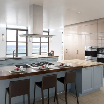
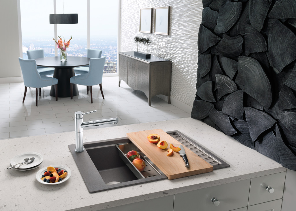
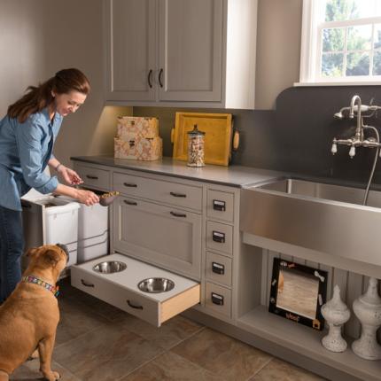
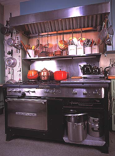
 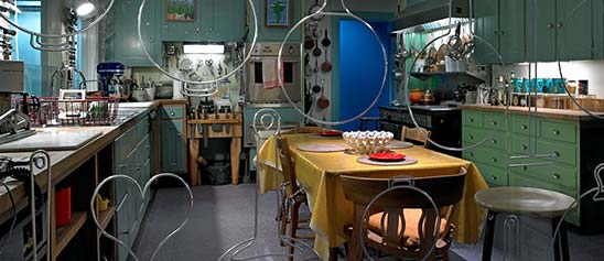 Julia’s real life kitchen was donated, moved and reassembled in the Smithsonian's National Museum of American History in 2001. The layout was devised by Julia and her husband and customized to her cooking needs, including higher counter tops to accommodate her height. Pots and cooking utensils are all placed exactly as they were in her home. Today Julia would be utterly amazed at the advancements in appliances, materials and new storage options. Although her kitchen goes back 50 years she had ideas and practices that are very relevant today. Here is what I think today’s kitchen would look like through the eyes of The French Chef.
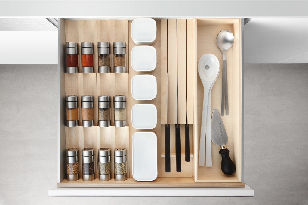
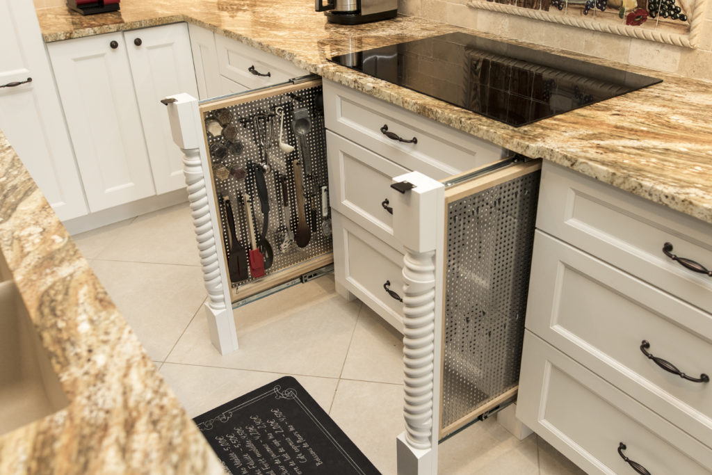
 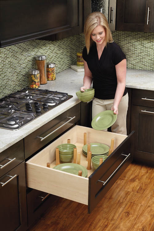 Organization and Easy AccessJulia was known for her handy and efficient peg board system. Companies like Rev-A-Shelf have taken this concept and expanded it so that it doesn’t have to be on the wall. Moving pegs allow these inserts to be customized. This is especially handy for dish storage in new kitchens that feature fewer upper cabinets. A "Julia kitchen" includes a place for everything and everything in it’s place.
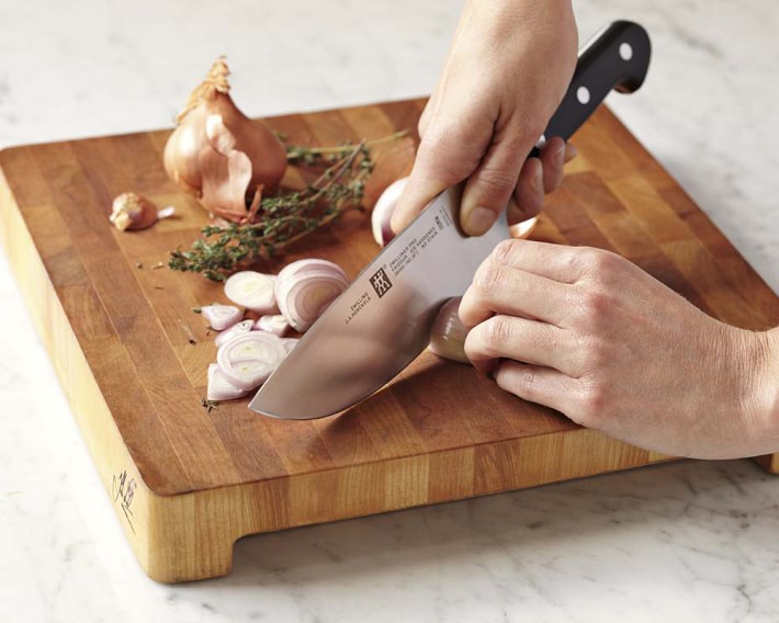
  To Make the Cut You Must Have Great KnivesA self-proclaimed knife freak, Julia collected them all her life and never met one that was sharp enough for her! Check out this delightful anecdote from the New England Historical Society and you'll see what I mean. I agree that there is nothing more frustrating in the kitchen than dull knife. The winner in my book is J.A. Henckels International 8" Classic Chef's Knife in terms of quality and value for the money.
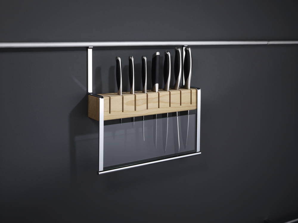
 Having a great knife is half of the equation, now we have to store them. Julia preferred to house them on a magnet attached to the wall. Today she would love this railing system by Clever Storage that allows you to take advantage of the space between upper and lower cabinets. It's safe, attractive and accessible. Win!
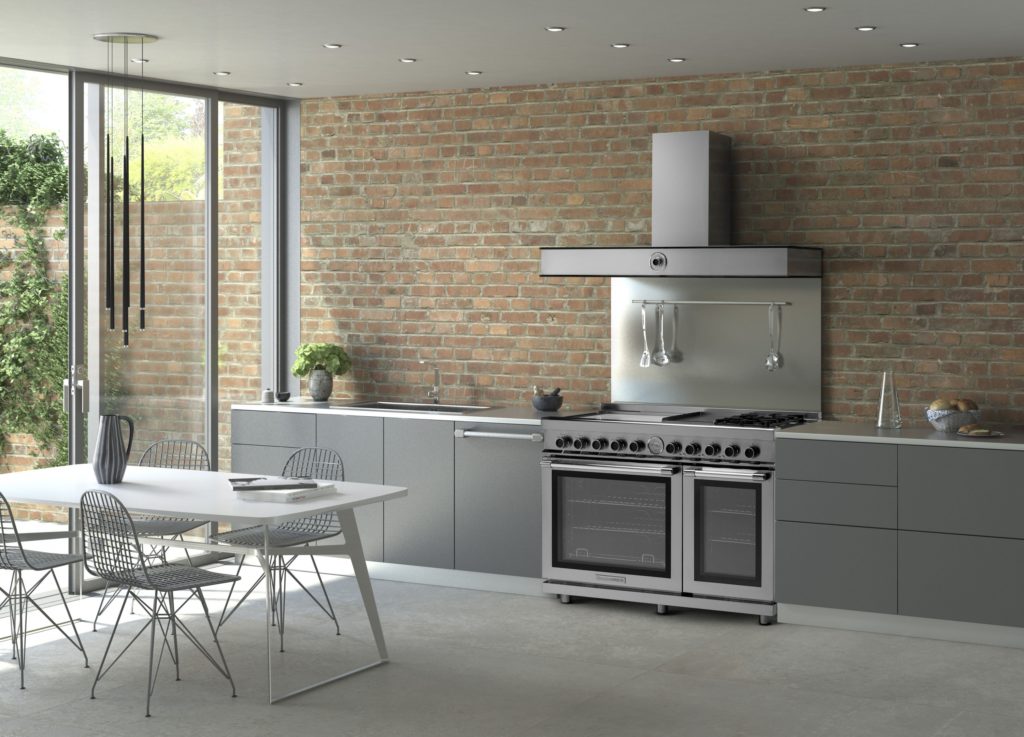
  The Mother Ship of RangesJulia used a 1950s six burner used commercial gas range by Garland. This company is still in business so you can get a modern version today but I’m betting Julia would fall for the TriFuel range by Tecnogas Superiore for its state of the art versatility. In fact, it was just announced Product Innovator Award winner for 2016 by Kitchen & Bath Business Magazine. It features dual gas burners plus four induction zones and an electric griddle. Below are dual gas ovens equipped with two convection fans and a broiler.
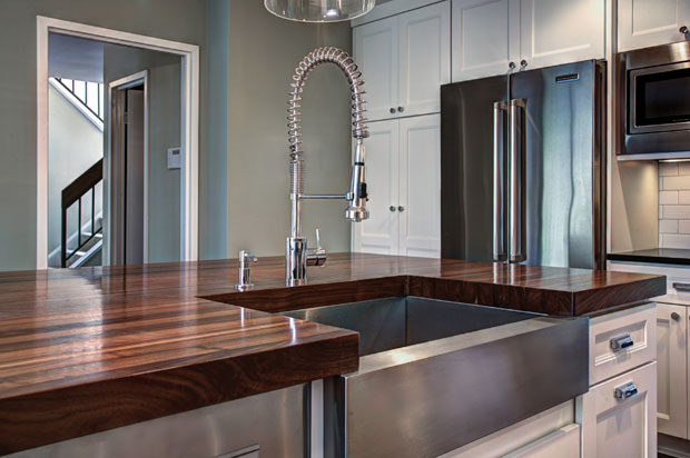
 The Beauty of Butcher BlockThe French Chef was fond of her extra high maple counter tops for food preparation. You may not want an entire kitchen with wood tops but, if you can, it's great to have a section of it for food prep. Wood butcher block counters are a natural eco-friendly choice, absorb noise, are gentle on dishes and can be refinished. In addition to this, wood has inherent antibacterial qualities and can add a beautiful warmth to your kitchen. If you're going to use your counter for food prep it should have an oiled finish which does need to be maintained.
  Last but not least never enter the kitchen without a sense of humor and adventure Child was never without it! She said, “in cooking you’ve got to have a what-the-hell attitude!”-If you'd like to experience cooking like a French chef you can stay at what was once Julia and Paul's part-time residence in Provence, France courtesy of Airbnb.
Summer, the Season for Outside Cabinets
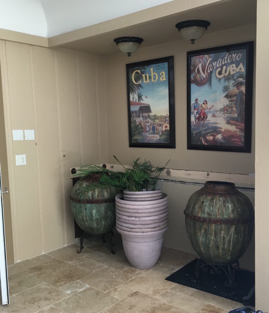
Summer is in full swing! I must confess I'm one of the few who loves a hot steamy Florida summer. Recently I got a call from a potential client with some extra space to fill outside by the pool (lucky them right?) Adjacent to the dining room and tucked into an alcove a new idea sprang to mind! How about an outside wine bar? Perfect for entertaining and here in Florida we can enjoy this scenario most of the year. There are a few things to remember if you're thinking of investing in outsider cabinetry.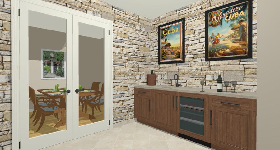 The Right Stuff- Cabinets for the outside should be exterior grade, ready to stand up to humidity and temperature changes. Some good options include Mahogany, Cypress and Teak. These can be pricey, especially the latter two but there are other options. Why not consider a painted finish? As long as you're using an exterior grade paint over and exterior quality MDF you're set! Your friendly local custom cabinet maker can help you with any of these options.
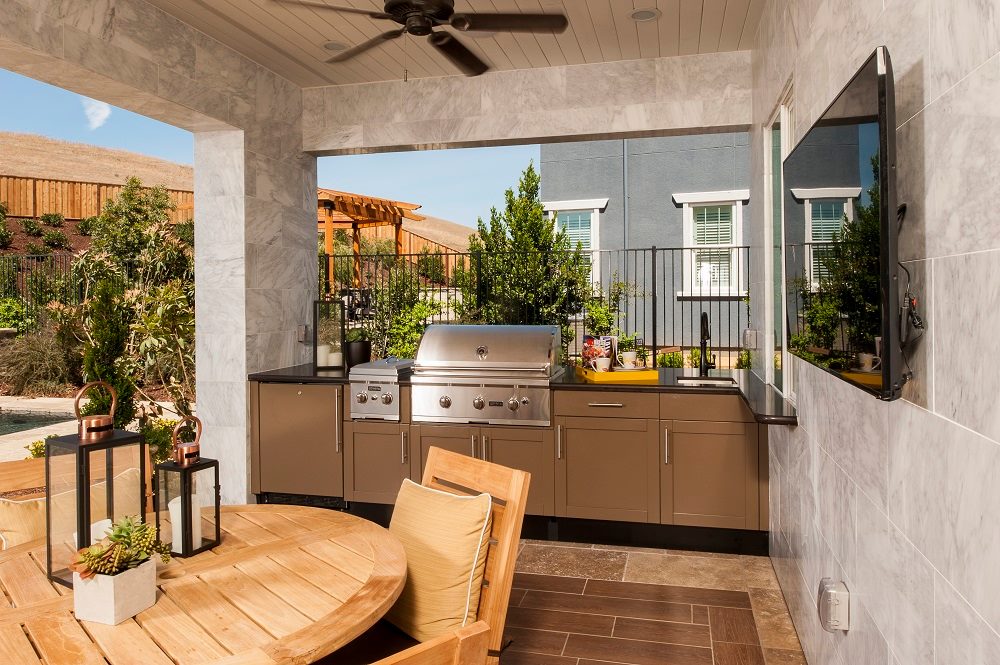
  There are also cabinet lines that are manufactured for the outdoors. Danver Stainless Outdoor Kitchens makes powder coated stainless steel cabinetry for barbecues, outside kitchens and, yes, outdoor wine bars!! They tout their all powder coat finishes for low maintenance, protection from harsh weather conditions and a safeguard form chlorine (salt air) and muriatic acid which is used to clean pavers.
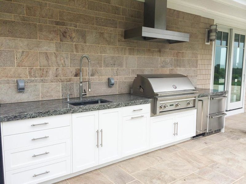
  We say "outside" but I recommend your bar area have at least an overhead cover. You gotta protect the goods, right? Protected or not, perhaps the most durable way to go is with a product called King StarBoard® ST. It is a special, high-density polyethylene sheet that provides a super tough surface for many applications. I like that it comes in colors and that color goes all the way through, no chipping ever!
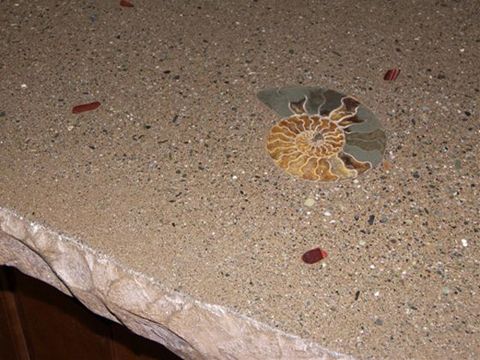 I also love Dekton by Cosentino, a highly durable scientifically complicated package of counter top loveliness. Just have a look at these new colors!
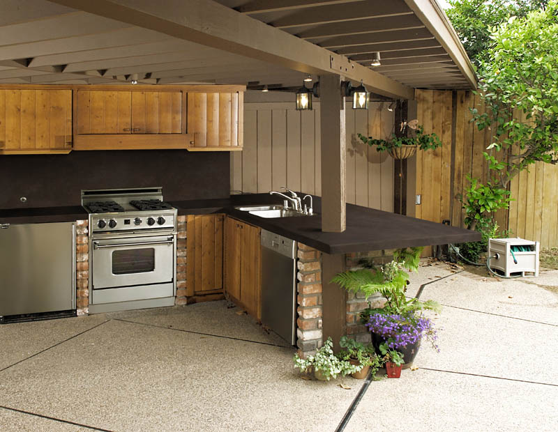 Back to my client, here's what I envision for this space (at top). The stone wall lends a wine cellar feel while being totally suitable for this outside application. Here I'm showing the stone also on the adjoining wall but it would work equally well only over the bar. Last but not least, favorite art makes it your own with a personal touch. Just make sure your work is framed professionally so moisture doesn't enter into the picture, so to speak. If you'd like to explore creating your own little slice of heaven outside I'd love to help you. You know where to find me ;) Cheers and happy summer!
Cambria Celebrates Launch of Two New Additions
Have I ever mentioned how much I love quartz countertops? If not, I have been remiss. Quartz tops, composed of 93% quartz and 7% resins, are the ultimate in durability, come in a variety of looks and are so easy to care for. What could be better? My favorite brand when it comes to quartz counter tops is Cambria. I love their selection of patterns and colors plus they make it so easy, all the colors are the same price! I was thrilled to be invited, earlier this month, to the local launch of two new additions to their luxurious Marble Collection, Ella and Brittanicca.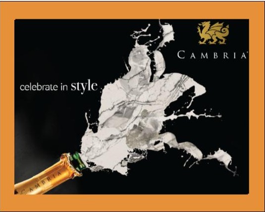 The event was held at the Pavillion Grille in Boca Raton. The stage was set with style, elegance and a chance to view the two new offerings up close and personal. It's easy to see that these latest marble looks were inspired by the seashore. Crazy beautiful veining brings to mind patterns created on the sand.
 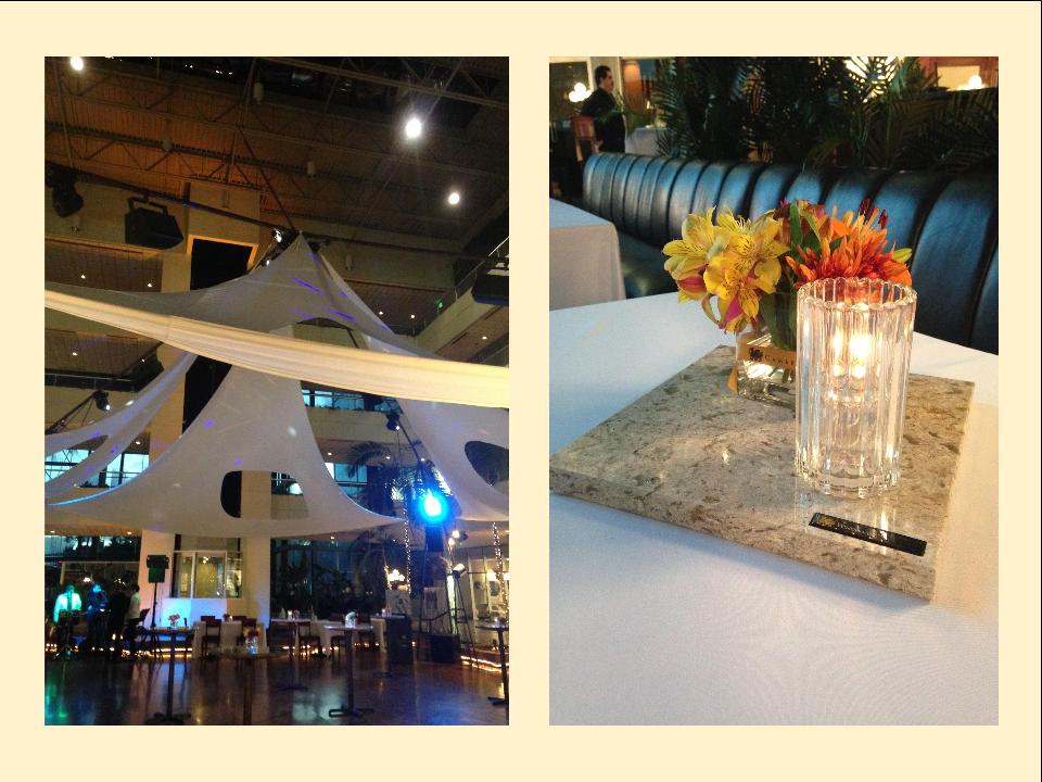 Here is a quote from Cambria describing one of the new colors. "Vast and expansive, Brittanicca™ offers a velvety marbled background of neutral white that provides a stage on which gray streams meander among intertwining ashen veins dotted with veiled charcoal sparkles." It's perfectly poetic, yes?
 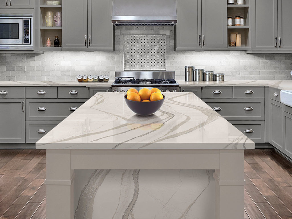 The second star of the evening, Ella, has a finer pattern but is also reminiscent of marble. The background is rich and creamy. Both of these options are a great way to get the opulent look of marble with easy to care for durability.
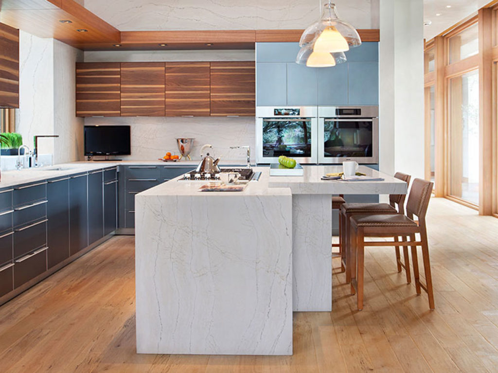 Both new finishes are a part of Cambria's Oceanic Collection.
5 Elements of an Artful Kitchen
Summer projects are underway in South Florida! In fact, it's the height of the busy season for most design professionals here.
I don't have to tell you that a new kitchen is a big investment, in fact the kitchen is the most expensive renovation you're ever likely to undertake. It stands to reason that you'd want a kitchen that is tailor-made for you whether you can afford custom or not. This is what we're all about at Artful Kitchens.
The concept of an "artful kitchen" has many different facets. It is not just about budget or the amount of space you have but the skill you employ using what is available to you. Here are five tips to consider along with some visual inspiration featuring products I saw this year at the Kitchen & Bath Industry (KBIS) trade show in Las Vegas. Implement these with style and confidence and you will be the proud owner of an artful kitchen!
1. Flawless Function
I'm all about artistic expression but a major part of creativity in the kitchen comes from devising flawless function. This quality is not something you see but something you can experience if artfully accomplished. When I say function, I mean work centers comprised of cooking, clean up and food prep areas.
Those are the basics but you could have more such as a beverage center (think coffee, tea, wine), a computer station or a baking center. If you have a two-cook kitchen, your layout should be designed so that any one of the major functions can be performed without anyone getting underfoot.
Following the guidelines set by the NKBA is a must to make sure all clearances are adequate. Sometimes we don't have a lot of choice about where to locate our sink or appliances but we can organize our utensils, dishes, pots and food items in a more efficient way. Don't forget the more flawlessly your kitchen functions the safer it is. You don't have to be an expert at this, just think about how you use your kitchen so that you will be a good collaborator when it comes time to work with a professional.
2. Personalization
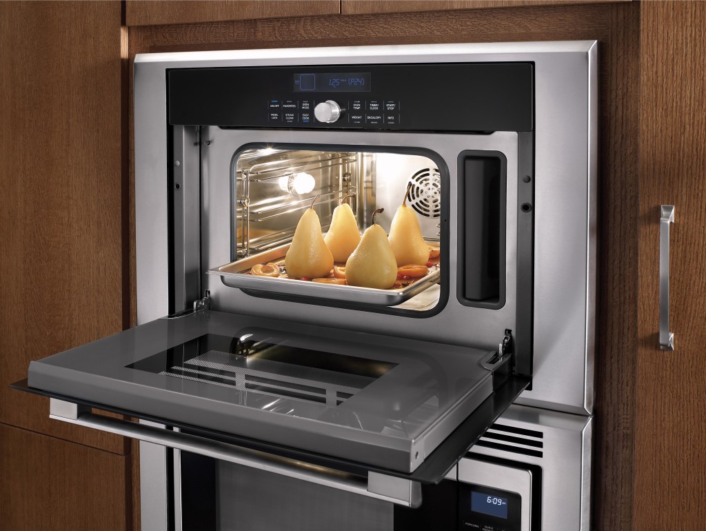
This is, without a doubt, the biggest movement in the design world. An artful kitchen is your own personal statement customized to the way you live. It could be a steam oven because healthy eating is your passion or it could be a lovely furniture piece with glass doors to display your grandmother's china. Include the colors you love. Even though you must be mindful of your budget (everyone has one), strive to retain the essence of what you see as your dream kitchen.
3. Harmony
Harmony is one of the principles of design and a must for your kitchen. Whenever I design a two-toned kitchen I like to ensure that different finishes and details are carried through the space to create a cohesive whole. It's about how the floor relates to the cabinets and how the cabinet hardware relates to the faucet. You get the picture! It does not mean that everything has to match perfectly, it means elements should relate to and complement each other. It also does not mean that every element has to be perfectly symmetrical. In fact, consider this permission NOT to be! I find that the best rule of thumb is to follow the architecture and style of the home you're in. If, for example, the kitchen window is way off center you should work with that not against it. Never force solutions by sacrificing function.
4. Focal Point
Every piece of great artwork has a focal point. It is the "star of the show", so to speak. In a kitchen it can be a sculptural range hood, a granite counter with big bold movement or actually a piece of art! It is the item that makes you say WOW when you enter the kitchen. Just remember less is more here. One great focal point is probably enough. Too much and the statement gets lost. Less is definitely more.
5. Texture
The element of texture involves at least two of our senses, touch and sight. The textures you are likely to come across include the glossy finishes popular in contemporary design, prominent wood grains which can be traditional or modern and smooth honed surfaces that are more matte. A flat slab cabinet door is a great choice if you plan to use a wood with a lot of pattern and graining. In this case the material is the decorative element of the cabinet. On the other hand, if you are traditional and you are using white cabinets you can select a door with some molding or detail. Also let the wild patterns either be on your cabinets or on your counter, both would be busy and distracting.
This is only the tip of the iceberg, so to speak. There are many more tricks and methods to create an artful kitchen. What are yours? Please keep in touch and contact me. Whether you need a quick consult or a full design layout I can help in person or virtually.
I'm located in the West Palm Beach area, so if you're local I can also help you shop for your kitchen products.
An Artful New Adventure!
Let’s face it, things change. As we navigate those twists and turns of fate we can only hope to move forward, seeing new things with a fresh eye. Like it or not, change is a constant. You can dread it (understandable) or you can choose to embrace it. That said, it has been more than five years since I began my adventure as Kitchens for Living. I believe I have been true to my promise to share the latest design trends and product info for the heart of your home. We have frequently ventured out of the kitchen and even around the globe! I am so grateful for all the wonderful and talented kindred souls I have met along the way, fellow bloggers, designers and great organizations such as Modenus, Blanco, Brizo, Tile of Spain and many more. This blog has afforded me the opportunity to travel and bear witness to marvelous destinations and inspiring trade shows. Before this starts sounding too sad, let me tell you I have never felt so excited about the future and eager to explore new opportunities.
  This will be the last post for Kitchens for Living. From now on I will be able to merge two of the things I love, kitchen design and art with my new site, Artful Kitchens. A big THANK YOU to Leslie Carothers of The Kaleidoscope Partnership for her guidance and insight which lead me to discover a new path full of promise and possibilities.
 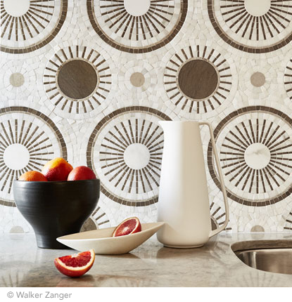 Artful Kitchens will focus on all the ways you can use creativity to personalize your kitchen. Artful spaces reflect who you are and the way you live.
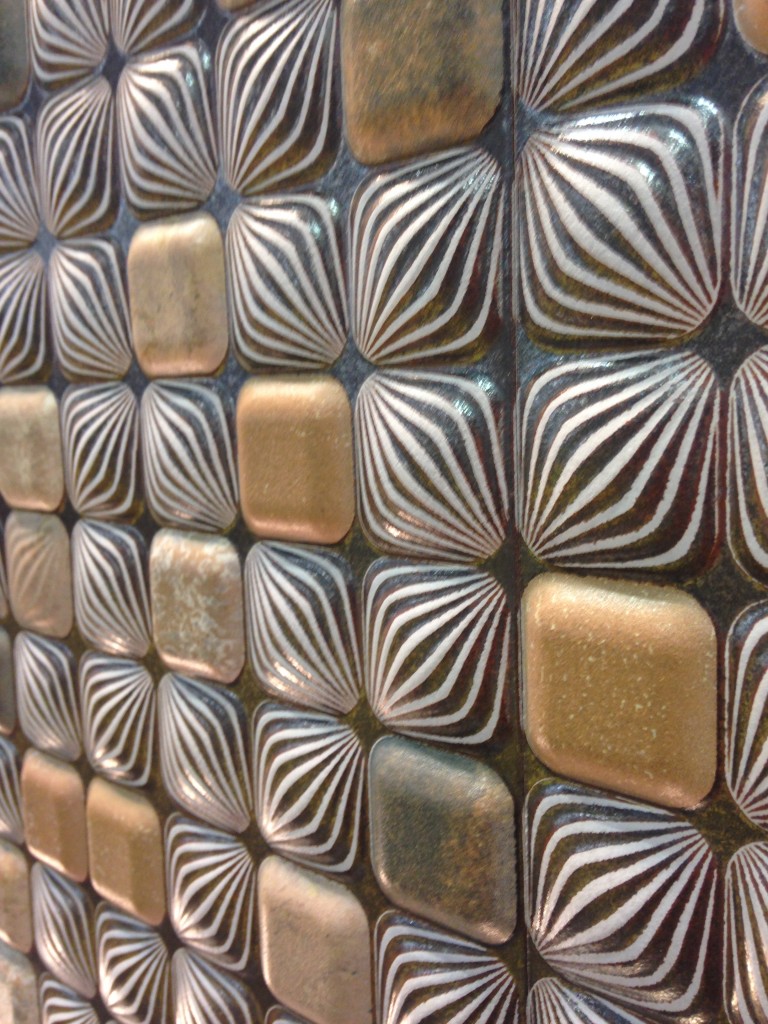
 The stunning tile above, by Walker Zanger, was featured at KBIS 2015 which I had the pleasure of attending with The Modenus Blog Tour Vegas.
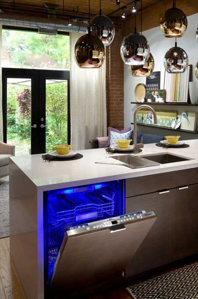
 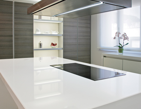 New products like this perfectly white quartz by Wilsonart enhance the kitchen with a feeling of crisp clean freshness!
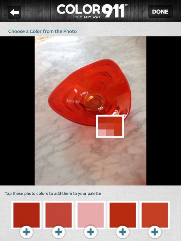
 Color is a primary element of the Artful Kitchen. We'll be talking a lot about that in an upcoming interview with Amy Wax of Color 911
 We will continue to incorporate new products and technologies as they emerge and we will explore all the artful ways of creating a kitchen that reflects who you really are. I’m so excited, I hope you’ll join me and spread the word. Last but certainly not least, whether you are a brand or a consumer, I want to collaborate with you!
  Continue the conversation on Face Book or email me at ArtfulKitchensbyGlo@gmail.com
Tile Tuesday: Beauty & Knowledge
Welcome the the third installment of Tile Tuesday. If you missed the last two you can catch them here and here.The second half of my adventure with Tile of Spain took us to Valencia, the location of Cevisama, annual trade show held to showcase the latest innovations introduced by the Spanish tile industry. Attending Cevisama was an introduction to a whole world of possibilities! If you’ve been following Tile Tuesday, you already know that ceramic tile is a part of the Spanish culture dating back to Roman and Moorish times. Tile is nothing new but the uses and innovations in the ceramic industry certainly are! In the coming weeks we’ll talk about some of the big trends I saw that you can incorporate into your own kitchen.
 Before we do that let’s cover some good to know, sometimes misunderstood, facts about tile. For your viewing pleasure I have inserted a little eye candy to keep you on your toes!WHAT IS IT?Ceramic tile is a perfect balance of the classical elements of earth (clay), air, water and fire. All are involved in its creation. All tile is made of either red or white clay.
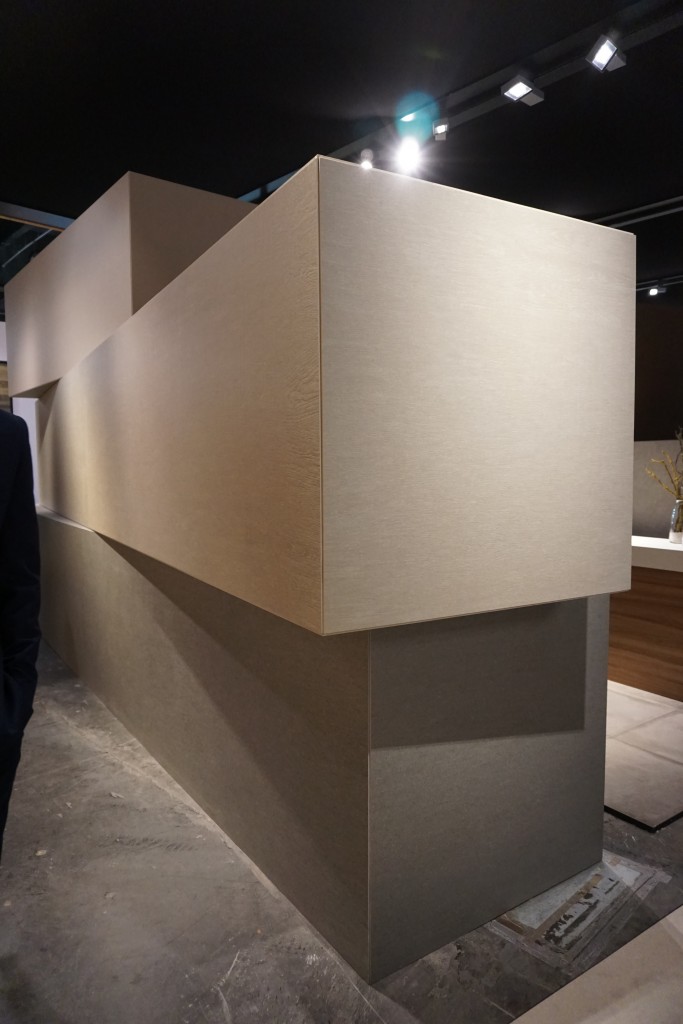 CERAMIC, PORCELAIN OR BOTH?One big question I get regards porcelain vs. ceramic. Guess what? Porcelain tiles ARE ceramic tiles. There is only one technical difference. A tile must have a water absorbtion rate of .05 to be classified as porcelain.
 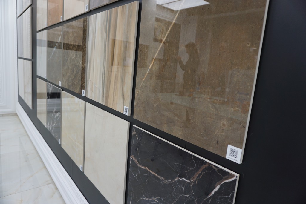 Typically porcelain tiles are denser, less porous and as a result more durable than other ceramics. You can also get them “rectified” which means crisp sharp perfectly squared edges that mean a tight fit with minimal grout lines.IS PORCELAIN THE SAME COLOR ALL THE WAY THROUGH?In the past I believed that a porcelain tile was the same color all the way through so that a small chip would be no big deal but I learned that is not always true. You CAN get something called “through-body porcelain” which means that if the tile is not glazed, the color and texture are consistent all the way through the tile. However porcelain tiles can also have surface glazes and textures that are not “through-body”.
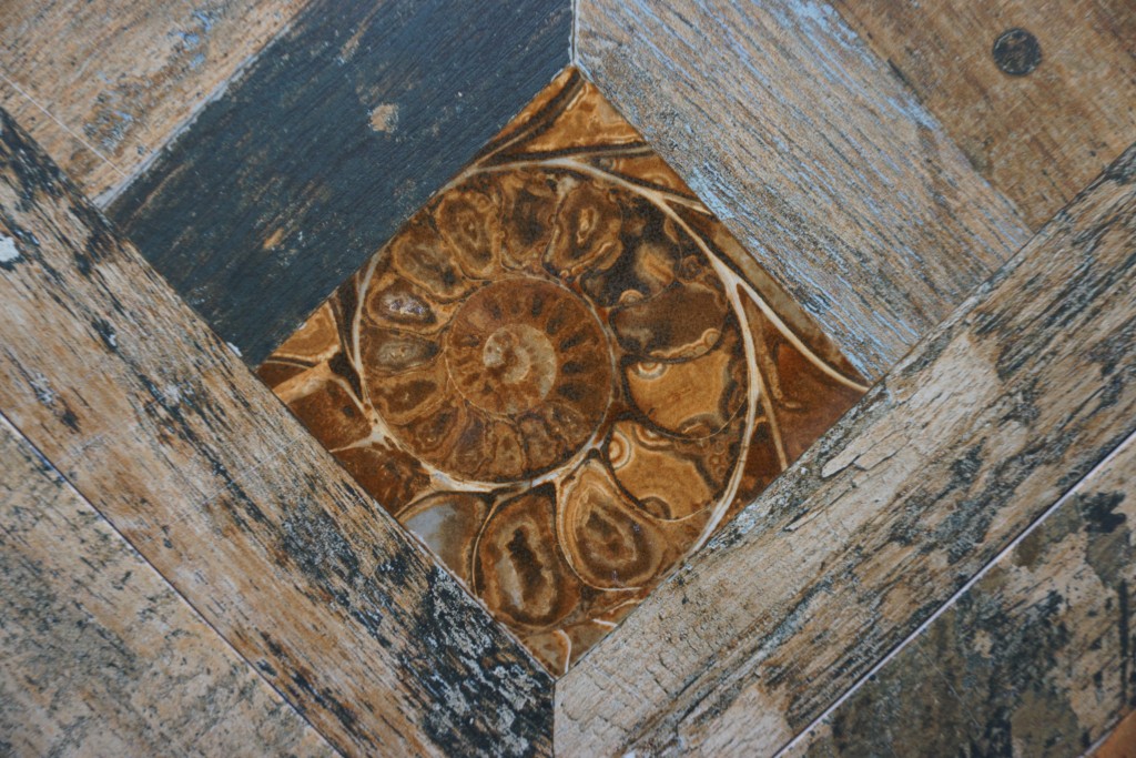 WHERE DOES IT GO?Tiles used for exterior applications are porcelain but not all porcelain tiles are recommended to be used outside. Generally you can put just about any type of tile on the wall but you’re much better off with porcelain on the floor for durability. Remember, although beautiful, glossy finishes are always more slippery than honed, or matte finishes. Got it? Good. Since you made it all the way to the end, I have a special treat for you.
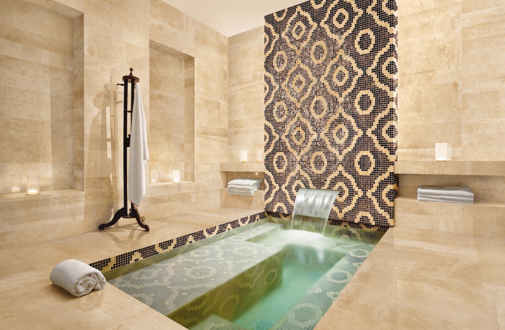 Next Tile Tuesday: Uncovering Valencia with Tile of Spain, perhaps another video slideshow??

