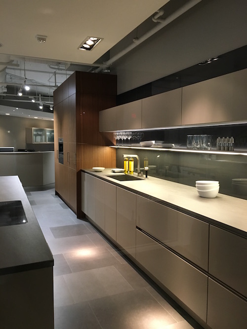
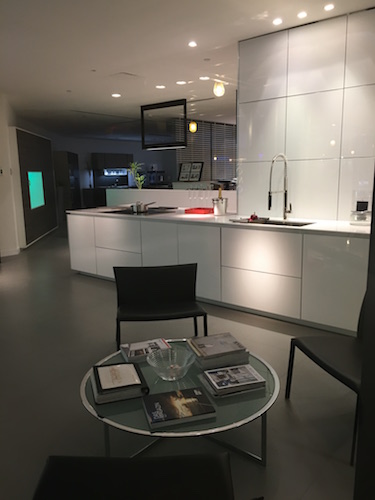
Every now and then I like to get out and about and mingle with the peeps in my industry. Last week I ventured a little outside of the bounds of strictly kitchen and bath design to experience The New Look of Luxury event held at the Design Center of the Americas (DCOTA).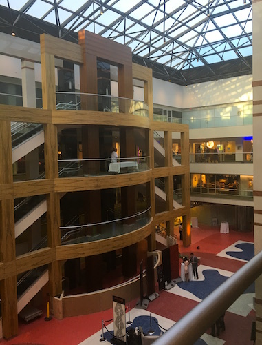 Suffice to say I was not disappointed. DCOTA is also home to luxury cabinet superstars SieMatic and Poggenphol. They were not open for this cocktail hour event but it was fun just to peek in the windows!
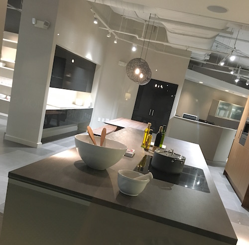
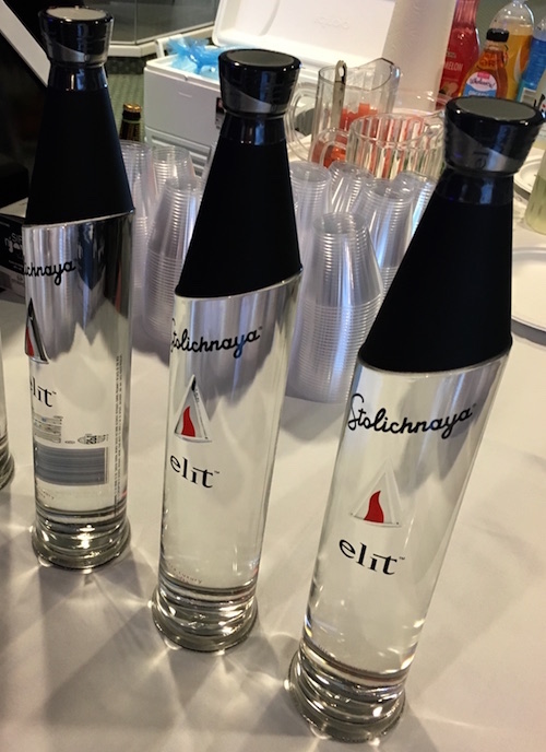
 Refreshments were served to compliment the visual yumminess! High design even in this Elit vodka bottle by sponsor Stolichnaya.
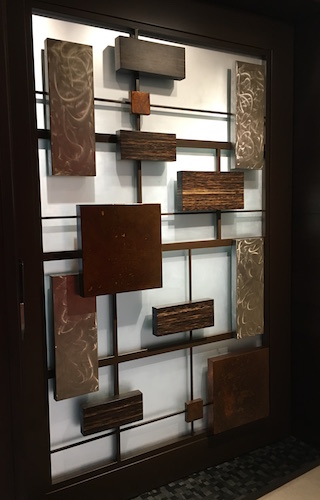
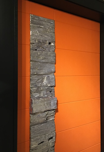
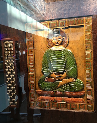
 First stop, Inside The Art of Craftsmanship. THESE DOORS! OMG, stunning in both scale and creativity. You would have to have just the right space for one of these, preferably BIG. Surprisingly there is not much info out there on this Florida based company. Suffice to say it’s very exclusive… I started snapping pics with wild abandon before I noticed the “no photography” signs. Sorry.
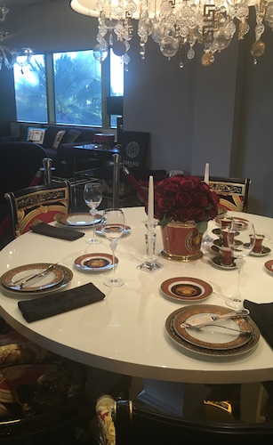
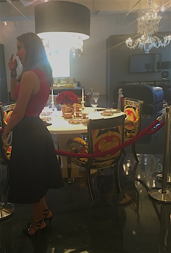
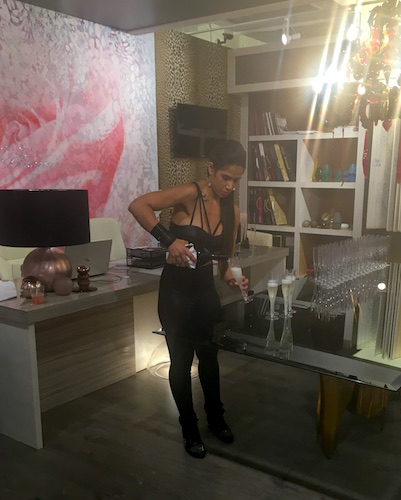
 The DCOTA is located on the outskirts of Miami and you don’t go to Miami without paying respects to Versace. Their designs can be over-the-top but the Versace Home showroom was very tasteful, even including coordinated sales associates and the requisite champs.
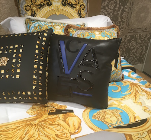
 My absolute favorite item at Versace was this super cool leather cushion which sells for $4,000, worth every penny (maybe)
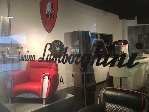
  Luxury has a sleek masculine look as well at Lamborghini Tonino Casa at FORMITALIAd. If you’re not partial to the Lamborghini look they offer Aston Martin and Mercedes Benz inspired furniture too.
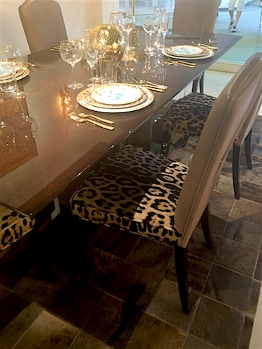
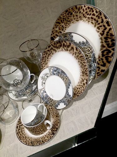
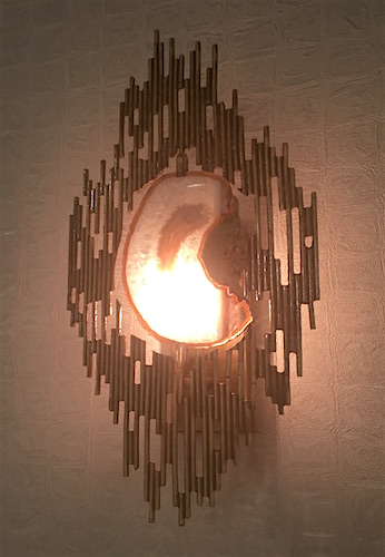
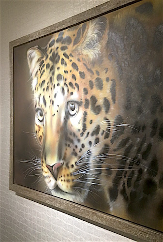
 Next on the tour was Casa Collezioni/Roberto Cavalli Home Interiors. I was looking forward to this as I loved their showings at last year’s Maison et Objet Americas. It’s elegant and edgy at the same time.
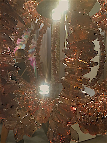
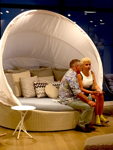
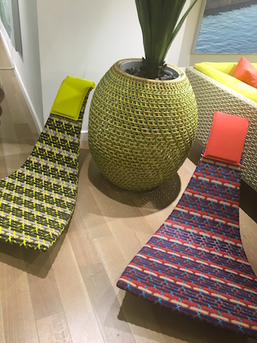
 Dedon, known as the premiere luxury furniture brand is innovative, colorful and comfy. All you need is the beach!
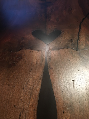
 Last but certainly not least we got lost in the world of E.M. Soberon. They focus on high end architectural furniture. They also happen to be known for harvesting wood from fallen trees, mostly in Mexico. This is a unique approach that also yields one of a kind results. Mr. Soberon designs most of the products but they will also work with clients and designers visions to create the perfect piece.
 I’m so glad I went to this event. A big thank you to Casa Collezioni for the invite. The big takeaway from this evening is that I need to continue to get out there and see what is possible. Who knows, perhaps it can inspire me to create the formerly impossible... DCOTA http://dcota.com/dcota-information/ is open to- the-trade Monday –Friday 9-5. If you are not “trade” you can still check it out if you are accompanied by a design professional.
The Best of KBIS 2016
Bam! Another show is in the books and although it's been a busy week "back at the ranch", I've been dying to share my finds with you right here on Artful Kitchens.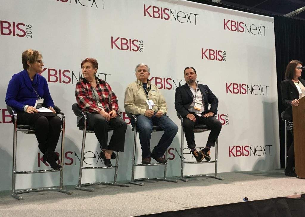 Las Vegas was host to three days of networking and education for the best of the Kitchen & Bath industry. As a member of the Kitchen & Bath Business Magazine's Advisory Board, I had the pleasure of appearing on the KBIS Next stage as a part of the panel discussion entitled Trials & Tribulations-Solutions to Your Biggest Kitchen & Bath Challenges. It was an exciting exchange of ideas between both the pros on the panel as well as a savvy and engaged audience.
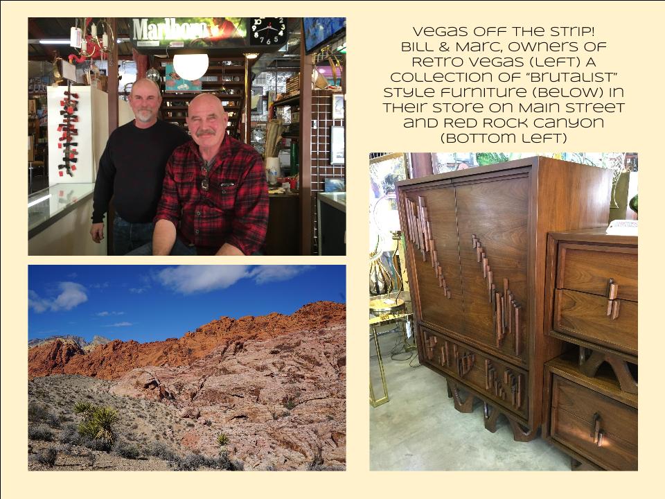
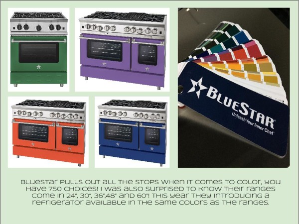
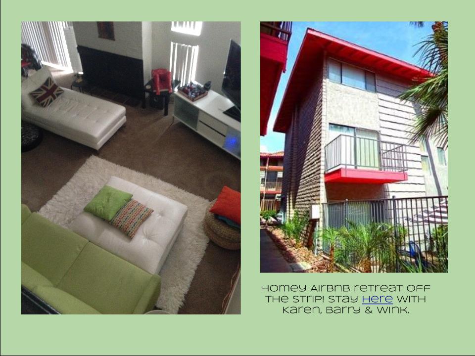 I also had the opportunity to spend some time in the Las Vegas I like best, off the strip! I hiked in the Red Rock Canyon and visited my friends at Retro Vegas on Main Street. My digs for this trip were with my dear pals Karen, Barry & Wink. They live in a midcentury modern gem that, rumor has it, was briefly home to Lucille Ball! They are avid Airbnb'ers and wonderful hosts. Check it out if you find yourself in Vegas. This location is so convenient to the Convention center I could walk, which I did, once. Mostly I Ubered. Enough walking happens on the show floor! So without further ado, here's my recap of the biggest and most notable trends and products that caught my eye at KBIS2016. ColorWhite still reigns. In fact paint giants Benjamin Moore and Sherwin Williams have both selected shades of white as their color of the year. You know I am a huge white fan. It is always the best backdrop for art and design. It also continues to be the favorite cabinet color in my area. Remember white is not just white, there are an infinite number of varieties you can have fun with. If you need more punch in your kitchen you could find some great options at the big show. I saw bright saturated colors in several appliance brands including Bertonazzi, Viking and BlueStar which offers 750 colors!
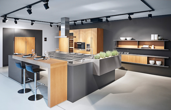
  Grey has not left the stage. The newest versions are warm, venturing into taupe territory. Textured wood grains such as cerused oak are really popular. Wood-Mode showed both traditional and contemporary versions of ribbon Mahogany.
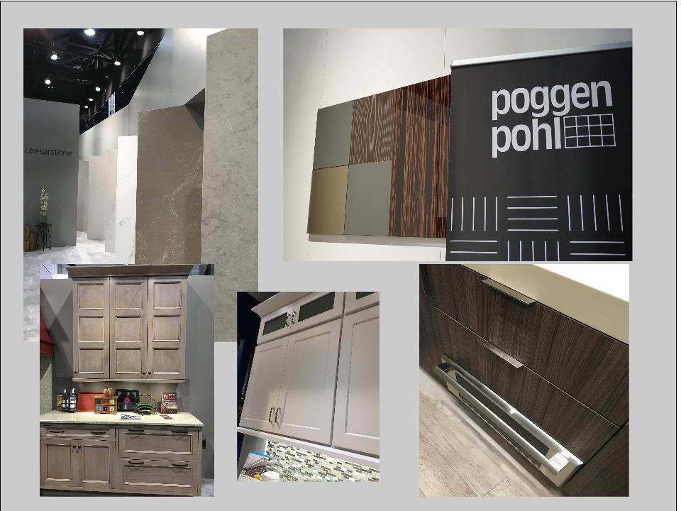
 The Perfect TouchTouch latch technology was EVERYWHERE! If you prefer a sleek, uninterrupted look for your cabinets and appliances this is for you, a gentle nudge will open your cabinets. This is nothing new but it's taken off. I also loved the button that allows you to close this cabinet when you're done without resorting to dangerous acrobatics (I'm short).
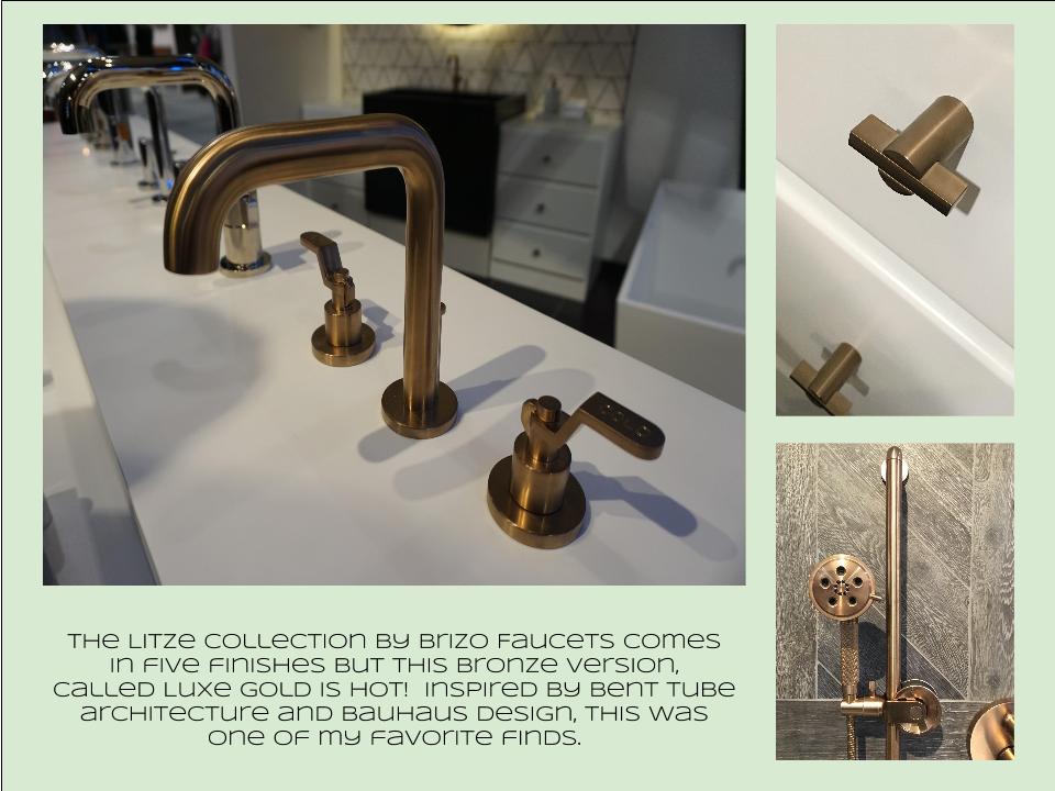
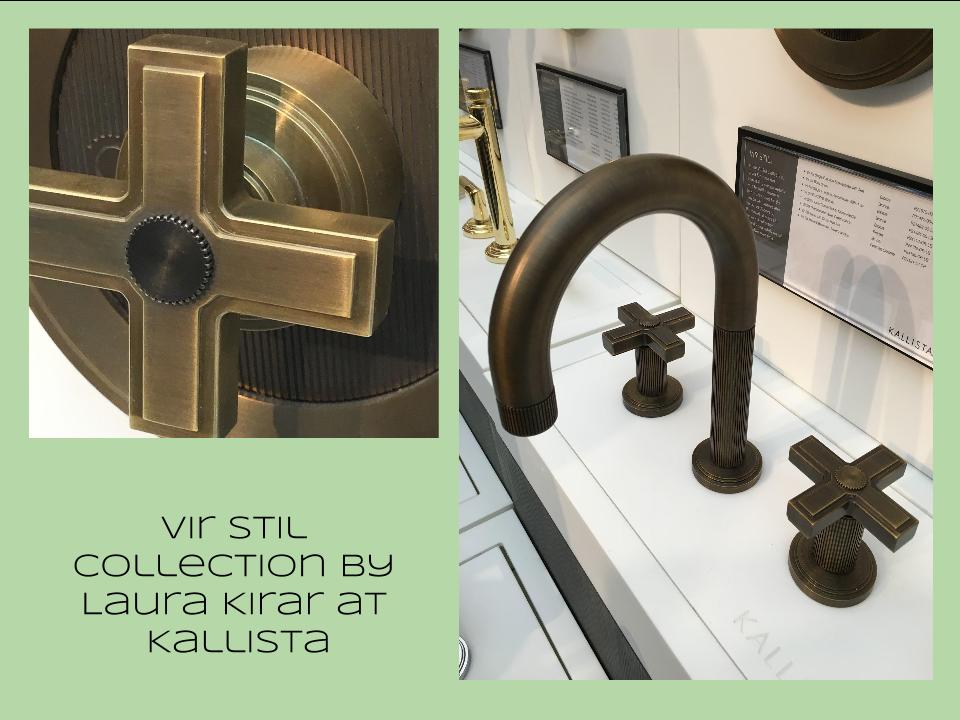 Feeling BrassyActually brass, copper, bronze and myriad versions are hot for plumbing fixtures and hardware. My favorites were the new BauHaus inspired Litze collection by Brizo Faucets. and Kallista's Vir Stil collection.
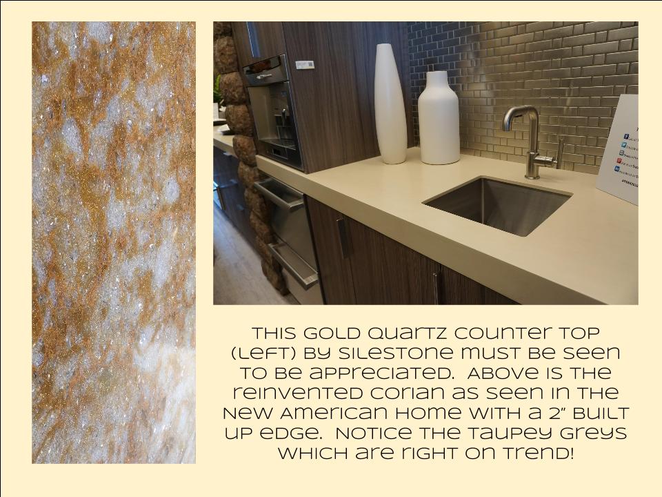
 Not Your Grandma's CorianIf you're like me Corian has been dead to you since about 1998. That sentiment has now ended in my book. I saw a 2"thick sleek contemporary version of Corian that was perfectly at home in The New American Home. The other exciting thing I saw in counter tops was this quartz by Silestone. Yes, it's GOLD! I just wish the photo could capture it's sparkly beauty.
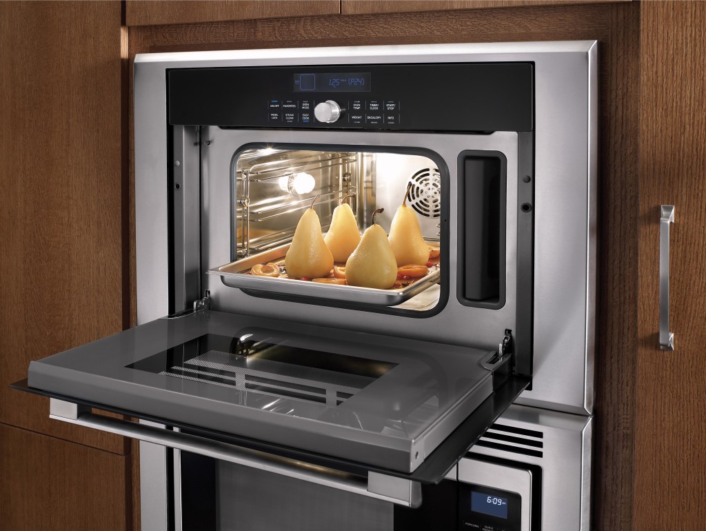
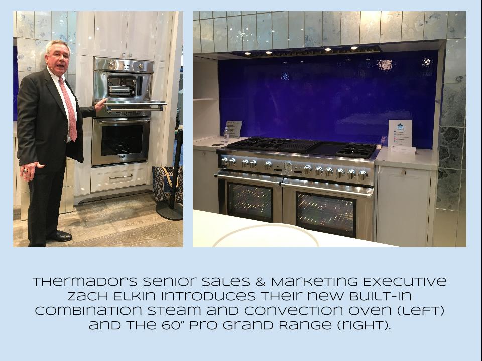
 Thrills from ThermadorAppliance brand Thermador held a press conference on the show floor to introduce a couple of impressive new products, the 60" pro range available with steam and a double oven featuring steam and convection. These are firsts in the industry.
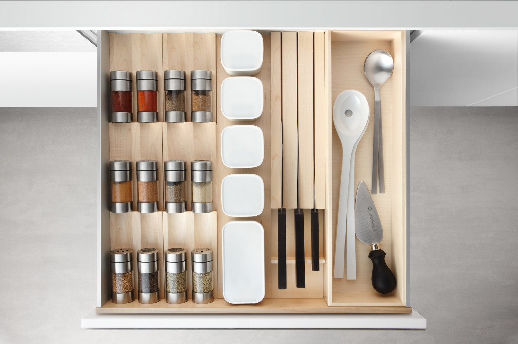
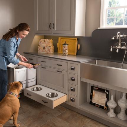
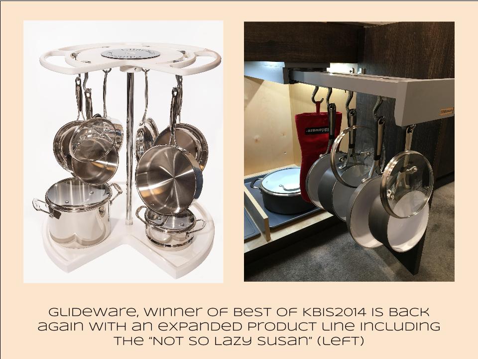
 Organize ItJust when I thought we had it all the category of organization it goes to the next level. There was a great representation of brands ranging from Hafele to Rev-A-Shelf to Hardware Resources but Glideware is taking the market by storm. If you've got a mess lurking somewhere I guarantee there's a way to make it neat and accessible
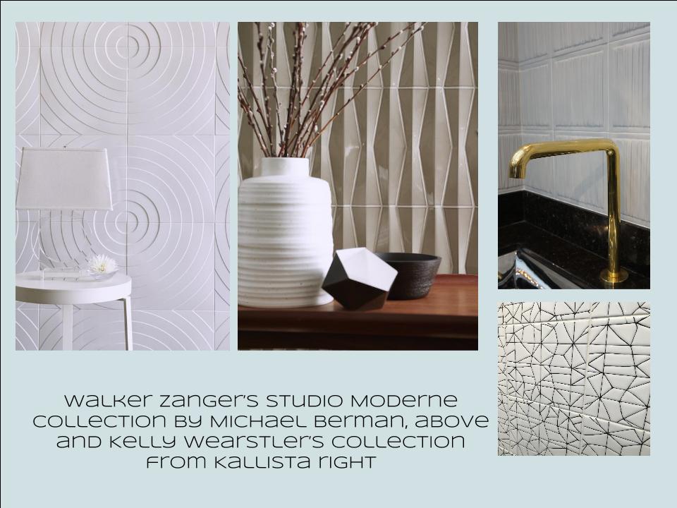
 Tile StyleMy two tile favorites were Michael Berman's Collection from Walker Zanger and, of course, Ann Sacks who are featuring a new line by L.A. design maven Kelly Wearstler. Love!
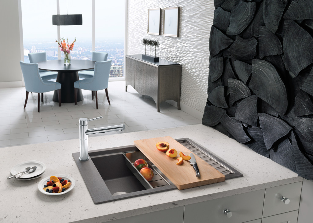
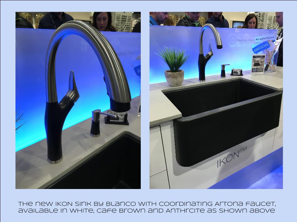
 I can IKONIf you read my blog you know I love me my Silgranit sinks, meet IKON the apron front version which easily works in any style kitchen from Traditional to Contemporary. Their Artona faucet perfectly complements the Silgranit sink.
 Stikwood Rocks!
Stikwood’s line of lightweight, real-wood planking offers designers and DIYers a peel-and-stick solution to achieve that perfect, sought-after blend of rustic and modern. It can be used on walls and ceilings and comes in tons of colors, even prints! I'm thinking this could be great on the back of a kitchen island.
Believe me, all this is just the tip of the proverbial iceberg. There was so much more to see and learn about at KBIS 2016. Check out this year's winners of Best of KBIS for more info and of course if you'd like any more info on what you see here email me at artfulkitchensbyglo@gmail.com
Architecture Inspired Furniture: Brasilia by Broyhill
I often tout the benefits of designing to the architecture of a building. Integrating your interiors with your architecture makes for a look that is always right. This is the best way to avoid a strictly trendy or out-of-place look.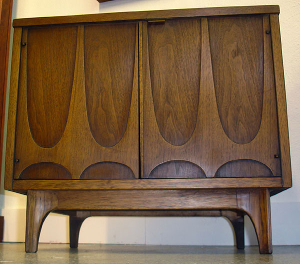 For example, if you have a MidCentury ranch style home, honor that and incorporate it with your furniture, cabinets and finishes. If your choices go with the house they'll never go out of style. Look to the structure for cues. If you have arched windows then complement them with a few arch details in the kitchen.
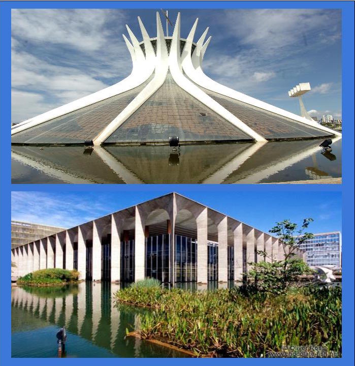 One style that exemplifies this concept on a grand scale is Brasilia furniture by Broyhill. Contemporary architecture of Brasilia, the capital of Brazil circa 1956-1960, was the inspiration for this style of furniture. The line was first introduced at the 1962 World's Fair in Seattle. It is easy to see how the city influenced the furniture inspired by it.
 One place you can find Brasilia furniture today is at Retro Vegas on Main Street in Las Vegas Nevada. Owner Bill Johnson says, "The principal architect of Brasilia, Oscar Niemeyer, loved the parabolic arch and used it frequently.In addition, the aerial view of the city was designed to look like a plane or bird from which Broyhill used a bird symbol in some of the tiles and fabrics on their pieces.
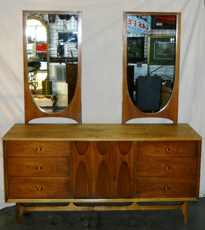 For more on the latest pieces and prices at Retro Vegas, please visit their website www.retro-vegas.com
Applying the Elements of Design to Your Kitchen
Elements of design are the building blocks of art for good reason. They also happen to work when it comes to planning and laying out your kitchen. Whether you are all about luxury or bound to the basics, awareness of these fundamentals can make all the difference.
Read more5 Elements of an Artful Kitchen
Summer projects are underway in South Florida! In fact, it's the height of the busy season for most design professionals here.
I don't have to tell you that a new kitchen is a big investment, in fact the kitchen is the most expensive renovation you're ever likely to undertake. It stands to reason that you'd want a kitchen that is tailor-made for you whether you can afford custom or not. This is what we're all about at Artful Kitchens.
The concept of an "artful kitchen" has many different facets. It is not just about budget or the amount of space you have but the skill you employ using what is available to you. Here are five tips to consider along with some visual inspiration featuring products I saw this year at the Kitchen & Bath Industry (KBIS) trade show in Las Vegas. Implement these with style and confidence and you will be the proud owner of an artful kitchen!
1. Flawless Function
I'm all about artistic expression but a major part of creativity in the kitchen comes from devising flawless function. This quality is not something you see but something you can experience if artfully accomplished. When I say function, I mean work centers comprised of cooking, clean up and food prep areas.
Those are the basics but you could have more such as a beverage center (think coffee, tea, wine), a computer station or a baking center. If you have a two-cook kitchen, your layout should be designed so that any one of the major functions can be performed without anyone getting underfoot.
Following the guidelines set by the NKBA is a must to make sure all clearances are adequate. Sometimes we don't have a lot of choice about where to locate our sink or appliances but we can organize our utensils, dishes, pots and food items in a more efficient way. Don't forget the more flawlessly your kitchen functions the safer it is. You don't have to be an expert at this, just think about how you use your kitchen so that you will be a good collaborator when it comes time to work with a professional.
2. Personalization
This is, without a doubt, the biggest movement in the design world. An artful kitchen is your own personal statement customized to the way you live. It could be a steam oven because healthy eating is your passion or it could be a lovely furniture piece with glass doors to display your grandmother's china. Include the colors you love. Even though you must be mindful of your budget (everyone has one), strive to retain the essence of what you see as your dream kitchen.
3. Harmony
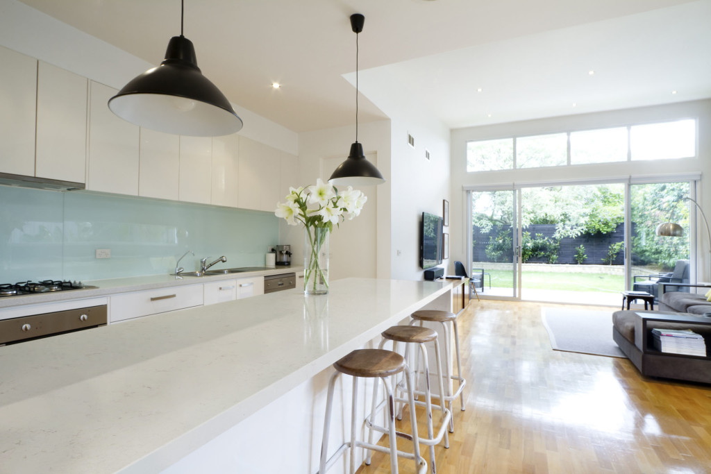
Harmony is one of the principles of design and a must for your kitchen. Whenever I design a two-toned kitchen I like to ensure that different finishes and details are carried through the space to create a cohesive whole. It's about how the floor relates to the cabinets and how the cabinet hardware relates to the faucet. You get the picture! It does not mean that everything has to match perfectly, it means elements should relate to and complement each other. It also does not mean that every element has to be perfectly symmetrical. In fact, consider this permission NOT to be! I find that the best rule of thumb is to follow the architecture and style of the home you're in. If, for example, the kitchen window is way off center you should work with that not against it. Never force solutions by sacrificing function.
4. Focal Point
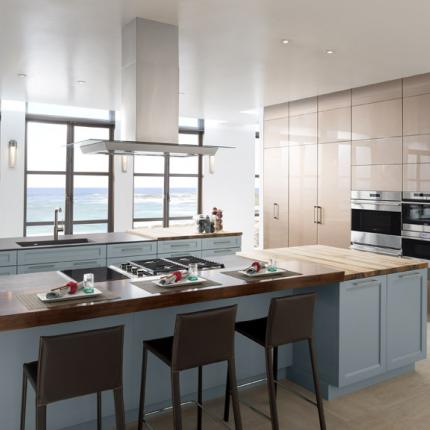
Every piece of great artwork has a focal point. It is the "star of the show", so to speak. In a kitchen it can be a sculptural range hood, a granite counter with big bold movement or actually a piece of art! It is the item that makes you say WOW when you enter the kitchen. Just remember less is more here. One great focal point is probably enough. Too much and the statement gets lost. Less is definitely more.
5. Texture
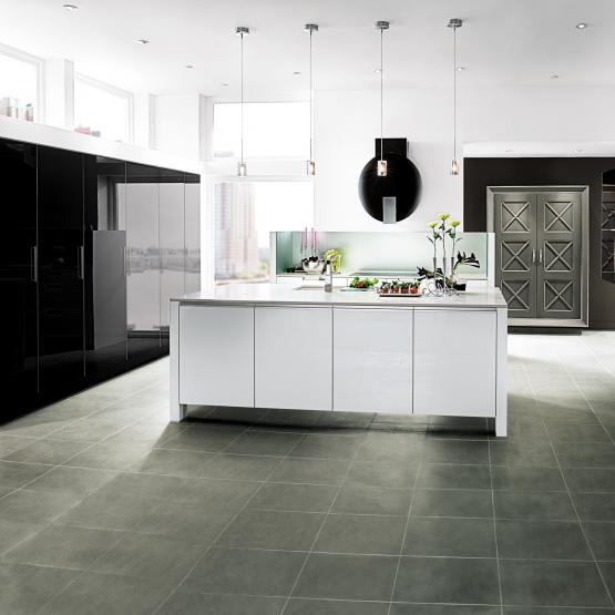
The element of texture involves at least two of our senses, touch and sight. The textures you are likely to come across include the glossy finishes popular in contemporary design, prominent wood grains which can be traditional or modern and smooth honed surfaces that are more matte. A flat slab cabinet door is a great choice if you plan to use a wood with a lot of pattern and graining. In this case the material is the decorative element of the cabinet. On the other hand, if you are traditional and you are using white cabinets you can select a door with some molding or detail. Also let the wild patterns either be on your cabinets or on your counter, both would be busy and distracting.
This is only the tip of the iceberg, so to speak. There are many more tricks and methods to create an artful kitchen. What are yours? Please keep in touch and contact me. Whether you need a quick consult or a full design layout I can help in person or virtually.
I'm located in the West Palm Beach area, so if you're local I can also help you shop for your kitchen products.
Tile Tuesday: In Valencia Art is a Way of Life
Welcome to today's installment of Tile Tuesday! The second half of my adventure with Tile of Spain took us to Valencia, location of Cevisama the annual trade show held to showcase the latest innovations introduced by the Spanish tile industry.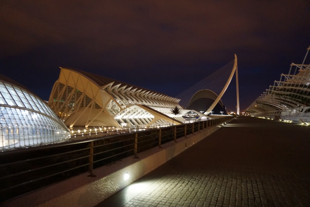 We traveled by train east from Sevilla to Valencia, which is situated on the coast about 300 miles south of Barcelona. At first glance Valencia appears to be very modern with a predominance of what I call “the new Spanish architecture” featuring waves, curves and a visually interesting asymmetry.
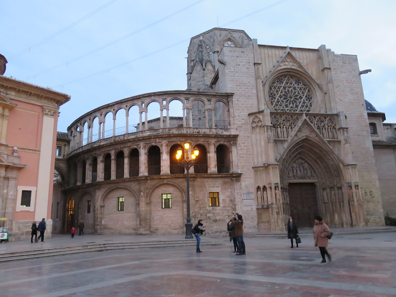 But there is an older Valencia to explore as well. The heart of the city features structures such as The “Iglesia de San Juan del Hospital” which dates back to the 1200s! The current city grew from this center. What a crazy combination of styles! You can see Roman, Gothic, Renaissance and more because different sections were constantly added to the original structure.
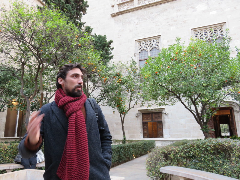 Again we had a passionate knowledgeable tour guide who did not allow us to leave one inch of Valencia uncovered!
 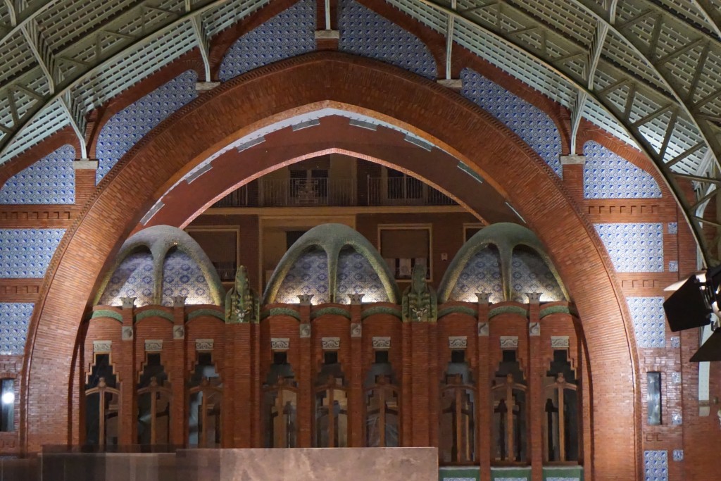 One of my favorite spots was the Mercado de Colón, a beautiful example of the Art Nouveau style. Glass and tile adorn this early twentieth century marketplace, now a gathering place full of interesting bars and restaurants.
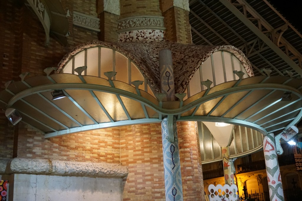 Hallmarks of the Art Nouveau style include free flowing organic shapes, rich earth tones and lots of tile! At the turn of the nineteenth century there was no aspect of living that was not touched by the movement. It was a global trend as well. In Germany it was known as Jugendstil, in Spain Arté Joven and Secession in Austria. The American version evolved into the what we know as the Arts and Crafts Movement, a simplified, more linear version. According to Art Nouveau philosophy, art should be a way of life. No wonder I'm always intrigued by it!
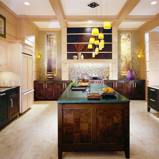
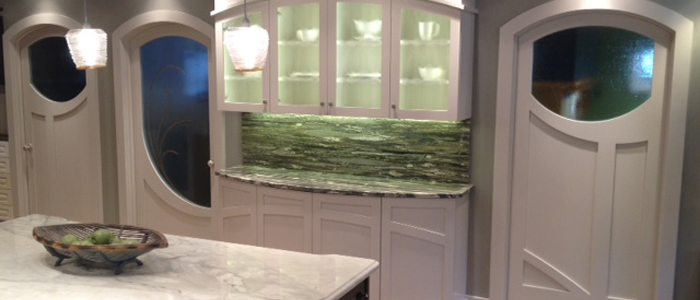 If you're looking to "Nouveau" your kitchen here are somethings you can include:-Rich brown wood stains-Green, green and green
-Some curvy shapes (more affordable to do this with your counter top than with cabinets)-Oak wood floors or cabinets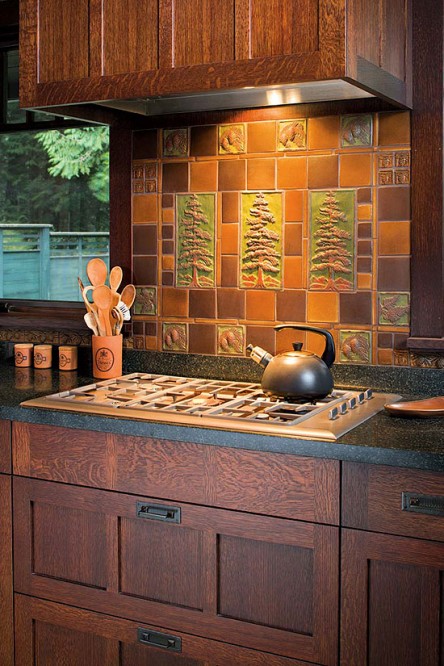 -Certain flora and fauna like the dragonfly, the ginko leaf and the thistle are all images often seen in Art Nouveau styling-Ceramic tile backsplashes (preferably with the above motifs)Next Tile Tuesday: More Cevisama and the future of tile.


